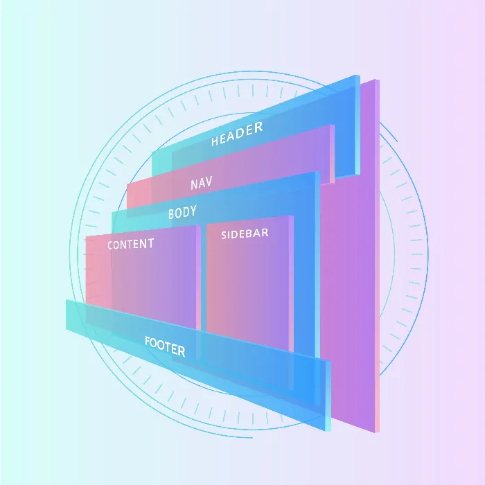
In this tutorial, you will learn how to create a complex, nested layout using Flexbox in HTML and CSS. Often, we encounter the challenge of managing multiple containers and developing an appealing layout that is both functional and aesthetically pleasing. Flexbox allows you to easily realize layouts without having to deal with complicated CSS positioning rules. Let's get started and create an example of a nested layout that utilizes the basics of Flexbox.
Key Insights
- Understanding the Flexbox properties, especially flex-grow, flex-shrink, and flex-basis, is crucial to creating flexible layouts.
- By intelligently using these properties, you can ensure that your layout adapts to different screen sizes and varying content.
Step-by-Step Guide
Step 1: Create Basic Structure
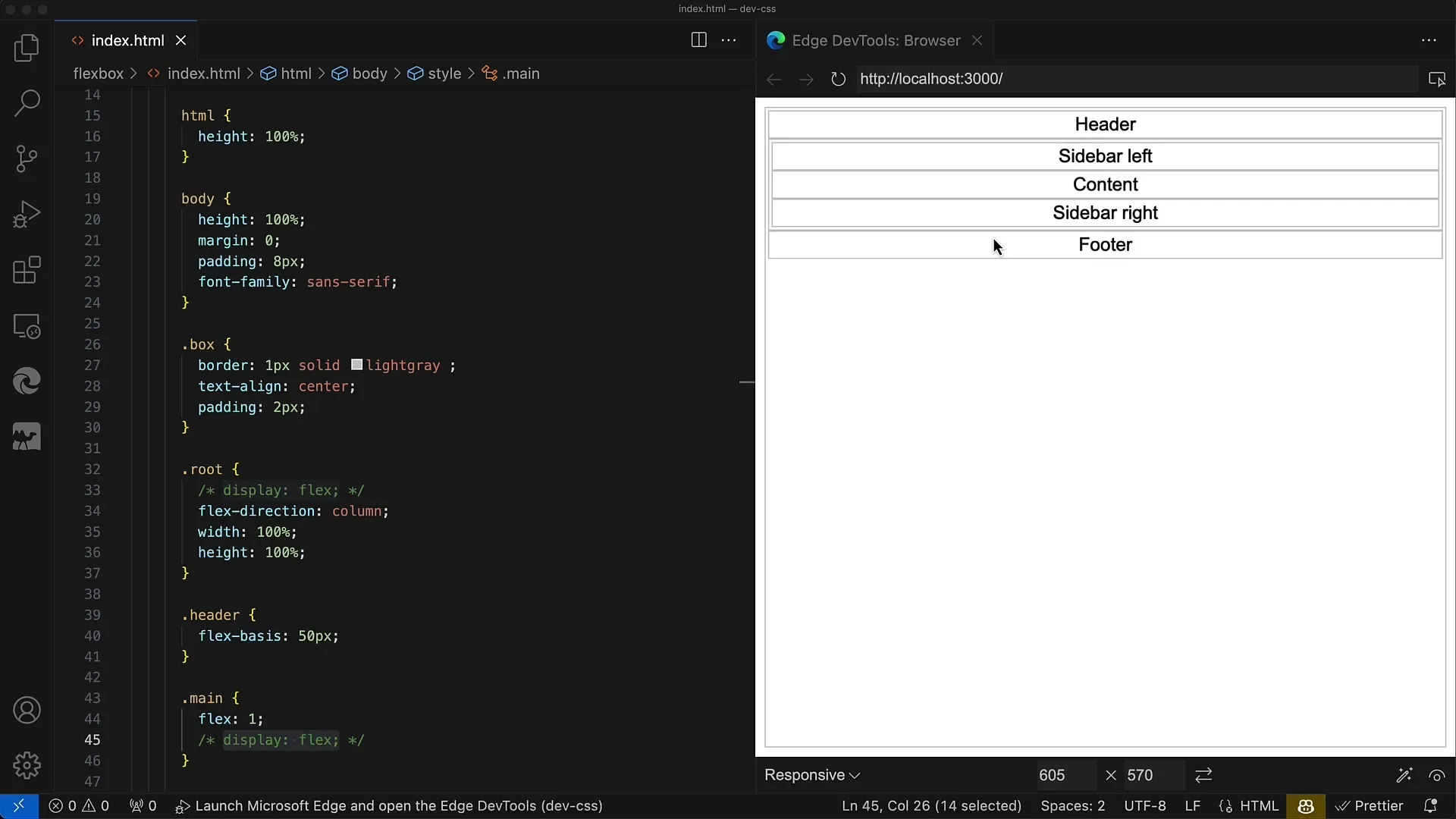
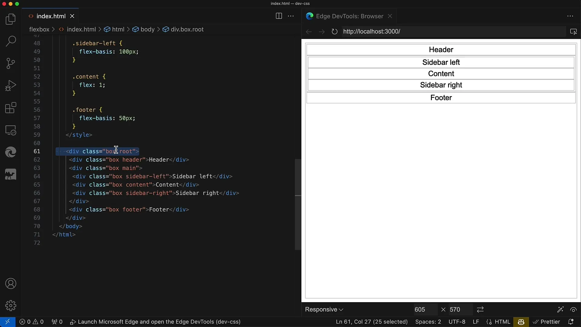
We start with the basic HTML structure. Create an element for the entire container, which we call root. Below that, add Header, Main, and Footer as direct children. The Main area will then contain further sub-elements, including Sidebars and Content.
Step 2: CSS Styling for the Container
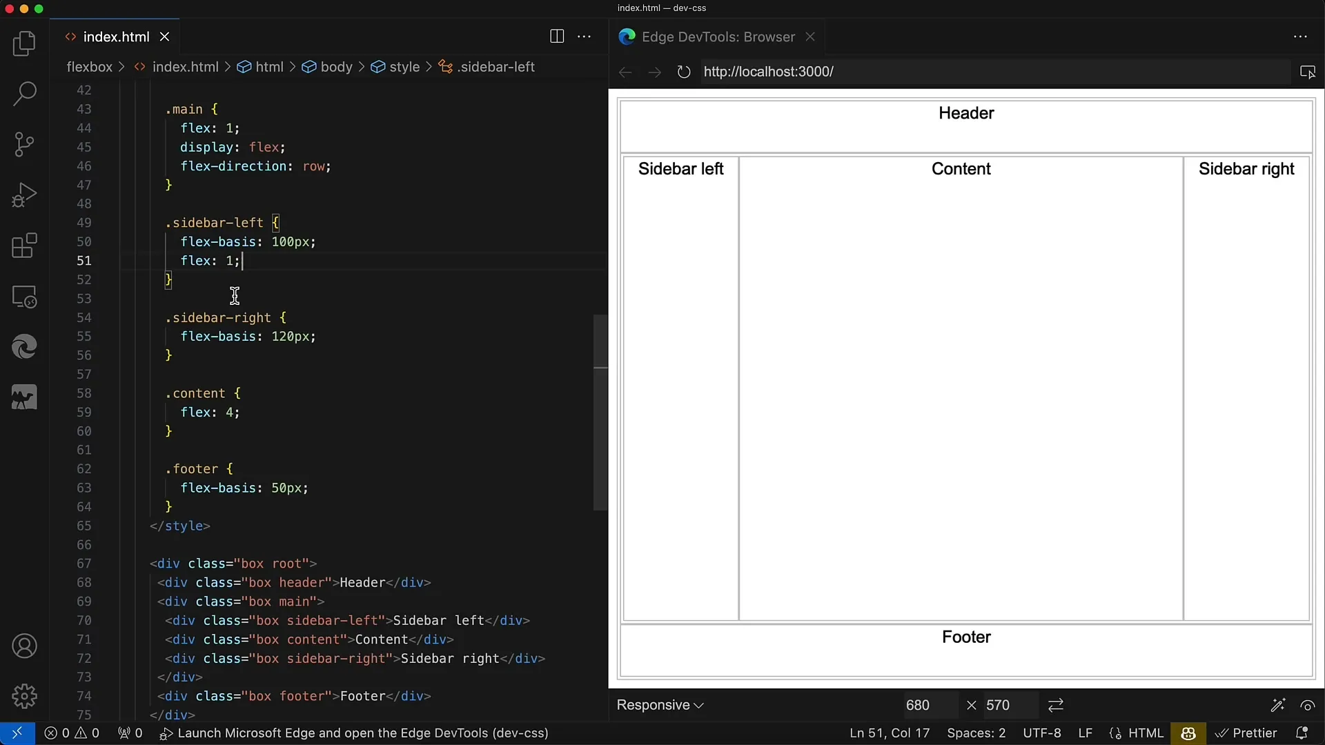
Now, add CSS properties to your root container. Set display: flex and flex-direction: column to ensure that the direct children (Header, Main, Footer) are vertically arranged. You can also adjust Padding and Margin to optimize the visual effect.
Step 3: Styling for the Main Area
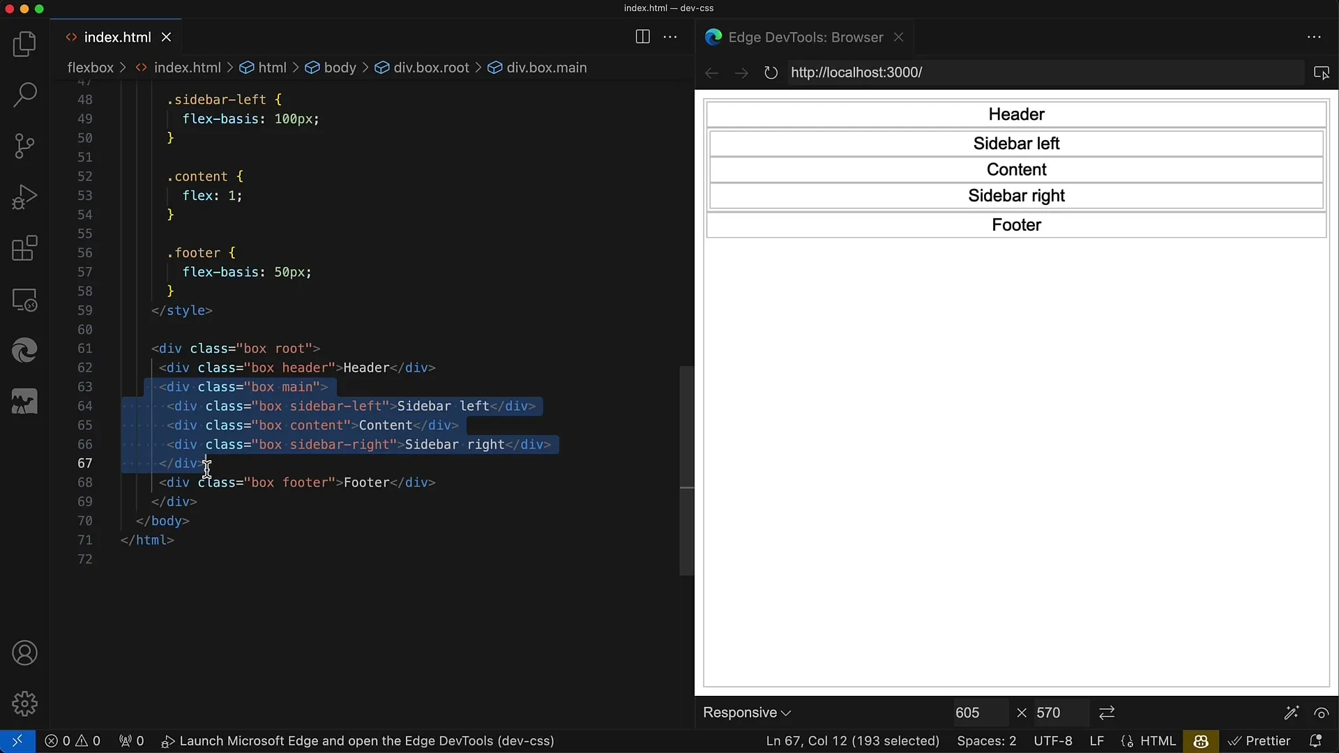
To make the Main area more flexible, also set display: flex for this container. This will allow you to horizontally arrange its child elements (Sidebar left, Content, Sidebar right). Make sure to use flex-direction: row (the default value).
Step 4: Flex Properties for Sidebars and Content
Next, add flex properties for the Sidebars and Content area. For the Sidebar left, you could set flex: 0 0 120px to ensure that this Sidebar always has a fixed width. For the Content area, set flex: 1 to allow it to flexibly occupy the remaining space.
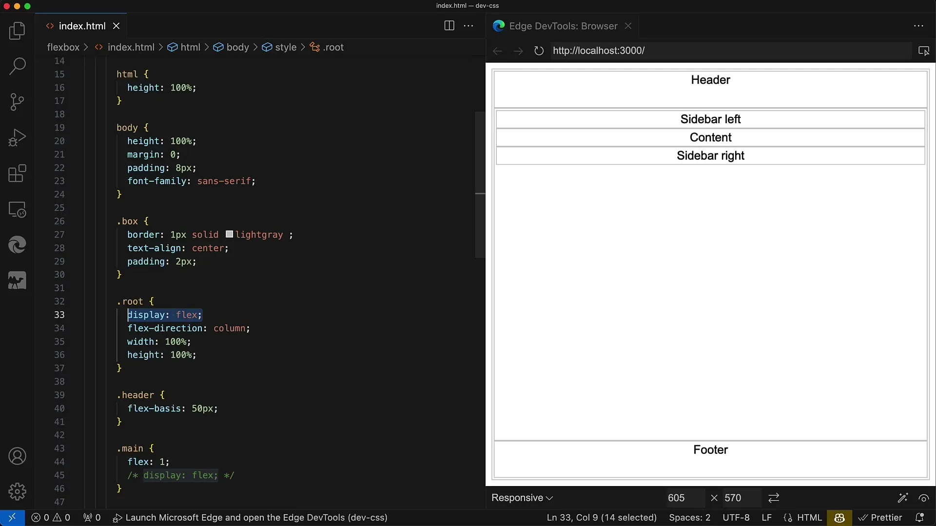
Step 5: Customize Footer
The Footer will also be adjusted using the Flexbox properties of the Root Container. Typically, the Footer remains static at the bottom. Make sure to adjust the width and height accordingly to ensure a clear separation between the different areas.
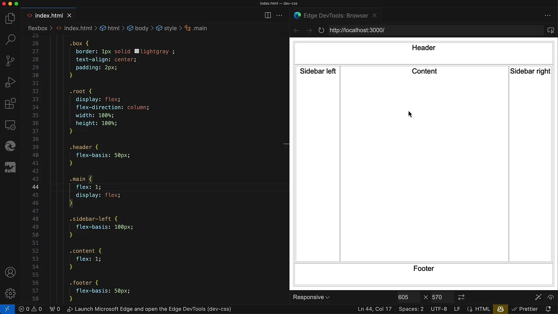
Step 6: Fine-Tune Sidebars
Once the layout structure is in place, you can make further style adjustments to the Sidebars. Play around with the flex values to adjust the width of the Sidebars, and consider Responsive Design considerations to ensure that your layout looks good on different screen sizes.
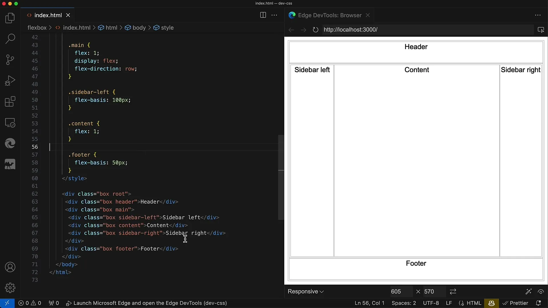
Step 7: Test and Adjust
Once the basic styles are implemented, test your layout on various devices and screen sizes. Pay attention to how the Content area behaves in different scenarios and adjust the flex properties accordingly to ensure an optimal user interface.
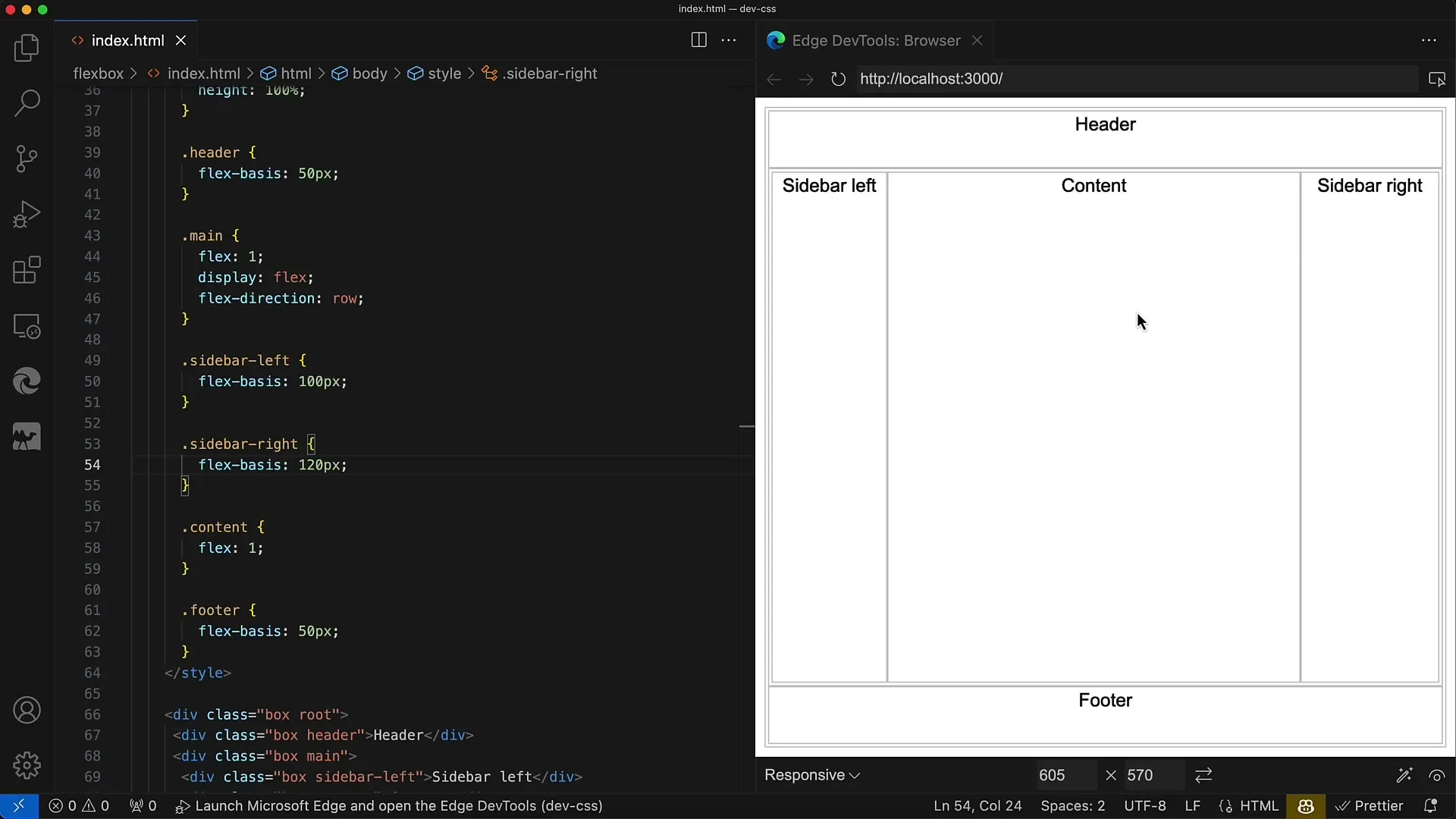
Step 8: Add More Nesting
Once you are satisfied with the layout, you can delve deeper into the structure and create additional nested Flexbox containers in the Header, Sidebars, or even the Content area. This gives you the flexibility to design more complex layouts as well.
Summary
With Flexbox, you have the possibility to create sophisticated, nested layouts that are both adaptable and visually appealing. The key to success lies in understanding and applying the flex properties to effectively control your layout. This allows you to design user interfaces that flexibly adapt to different content and screen sizes.
Frequently Asked Questions
How does Flexbox work?Flexbox is a layout model in CSS that allows you to control containers and their children with a flexible and adaptable arrangement.
What is the difference between flex-grow, flex-shrink, and flex-basis?flex-grow controls how much space an element can take up in the container, flex-shrink determines how much it can shrink, and flex-basis determines the original size of an element before the distribution of additional space.
Can I use Flexbox for responsive layouts?Yes, Flexbox is perfect for responsive layouts as it can adapt to different screen sizes by dynamically adjusting the flex properties of elements.
How deep can I nest with Flexbox?There is no fixed limit to the number of nestings you can perform with Flexbox. You can create as many Flex containers within other Flex containers as you need to design complex layouts.
