Welcome to your final video on the Flexbox layout in CSS and HTML. In this last tutorial, we will summarize the core concepts you have learned, and I will give you some suggestions on what you can do next. We have covered the principles of the Flex layout, and I hope you are ready to apply this knowledge to your own projects. Let's now go through the key takeaways.
Key Takeaways
When working with Flexbox, you should consider the following points:
- Activating the Flexbox layout with display: flex
- Defining the main axis
- Distributing free space in the main direction using Flexbox parameters such as flex-grow, flex-shrink, and flex-basis
- Aligning elements in both the main direction and cross direction
- Using the flex-wrap property to wrap elements when space is insufficient
These concepts are fundamental for creating dynamic and responsive layouts.
Step-by-Step Guide
Let's start with a brief summary of the steps you have gone through.
Step 1: Activating the Flex layout
To activate Flexbox in your project, you first need to declare the element you want to populate as a Flex container. You do this using the CSS property display: flex. This is the first and most crucial step as it forms the basis for all further settings.
Step 2: Defining the main axis
In the next step, you determine the direction of the Flex layout by using the flex-direction property. This property determines how the flexible elements in the container are arranged – either in a row (horizontal) or in a column (vertical).
Step 3: Distributing space
Flexbox also allows you to distribute space between and around your elements. This is where the properties flex-grow, flex-shrink, and flex-basis come into play. With flex-grow, you can specify how much space a flexible element should occupy in the main direction. flex-shrink determines how an element shrinks when space is limited. And finally, flex-basis defines how much space your element should initially occupy.
Step 4: Aligning elements
Another important point is aligning the elements within the Flex container. This is done by using the justify-content property for the main direction and align-items for the cross direction. This allows you to ensure that your elements are perfectly centered or positioned in any other desired way.
Step 5: Handling overflow by wrapping
If there is not enough space, you can use the flex-wrap property to wrap your elements to the next line or column. This is particularly useful in responsive designs as it ensures that your layouts look good on all screen sizes.
Step 6: Practical application of Flexbox
Now that you have the theoretical foundations, it's time to put your knowledge into practice. Try using Flexbox in your own projects. You can create great layouts for forms, galleries, chats, and much more. There are countless ways to use Flexbox, and I recommend being creative and developing your own solutions.
Step 7: Looking ahead to CSS Grid
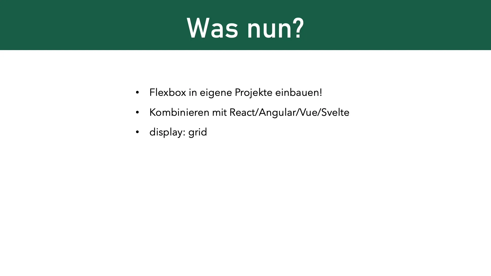
Another technology worth exploring is CSS Grid. This layout module simplifies the creation of grid structures in your design. You can use Grid in combination with Flexbox to create complex layouts that are both flexible and responsive. It's an interesting option that you should definitely incorporate into your toolbox.

Step 8: Conclusion and Encouragement for Further Application
Finally, I want to encourage you to implement what you have learned in your own projects. Use Flexbox for responsive layouts, experiment with different settings, and discover which approaches work best for your specific requirements.
Summary
In this guide, you have learned the basic concepts of Flexbox, how to activate and apply it, as well as gained an insight into CSS Grid. I hope you will use the tools you have learned here in your own projects.
Frequently Asked Questions
How do I activate Flexbox in my CSS?To activate Flexbox, use the CSS property display: flex in your container.
Which properties do I use to distribute space between elements?You can use the properties flex-grow, flex-shrink, and flex-basis to distribute space between the elements.
Can I combine Flexbox with other technologies?Yes, you can combine Flexbox with any front-end framework like React, Angular, or Vue.
What is the difference between Flexbox and CSS Grid?Flexbox is ideal for arranging elements in one dimension (either rows or columns), while CSS Grid is better suited for arranging in a two-dimensional grid.
Why should I use Flexbox?Flexbox allows you to create flexible, responsive layouts and bypass many of the issues associated with traditional CSS layout techniques.


