In web development, centering elements and text is often an essential requirement. Before the introduction of Flexbox, this was a challenge that required many different CSS techniques to achieve the desired results. Flexbox, on the other hand, provides a flexible and efficient way to center elements both horizontally and vertically in a container. In this guide, you will learn how to do this with a simple Flexbox layout.
Key Takeaways
- Flexbox is ideal for centering elements.
- With the properties display: flex, align-items, and justify-content, you can center elements both horizontally and vertically.
- The flex direction can be set to rows or columns, influencing the arrangement of elements.
Step-by-Step Guide
Step 1: Create the Flex Container
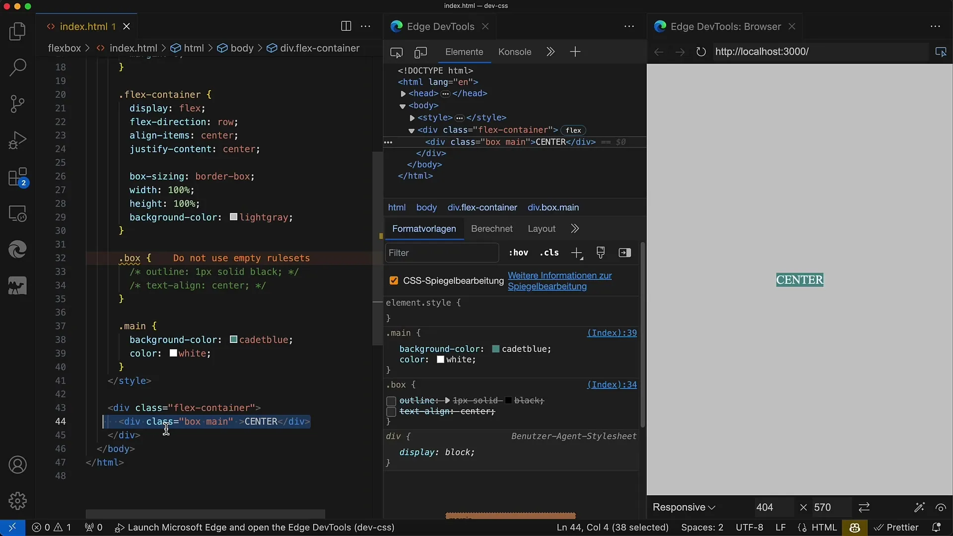
First, you need a flex container. This container will be the starting point for your Flexbox layout. In your HTML document, add a div that will act as the container. Use the class "flex-container" for this purpose.
Step 2: Define Container Properties
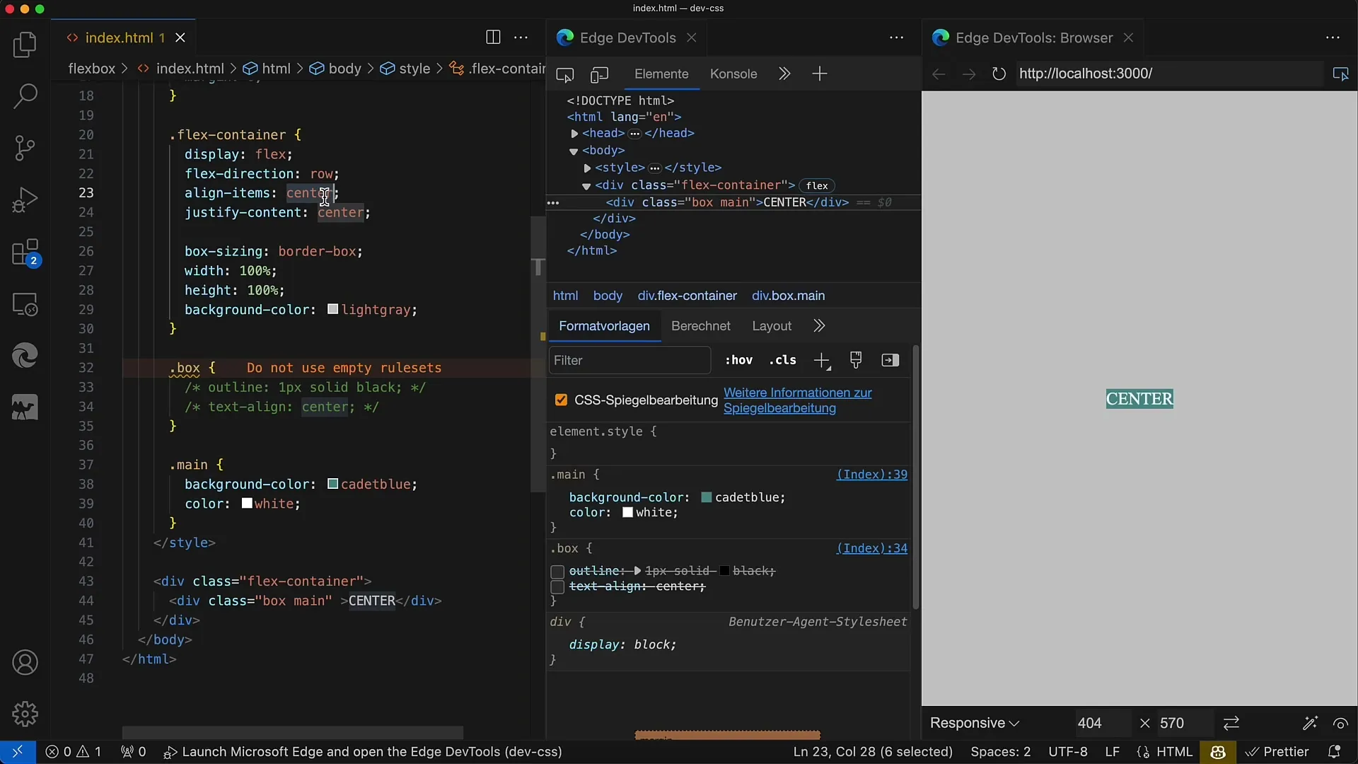
Once you've created your flex container, you need to add some CSS properties to it. Set the display property to flex to activate Flexbox. You can also set the flex-direction to determine the main axis for arranging the children. In this example, we use row, meaning the elements will be arranged in a row.
Step 3: Centering the Elements
To center the child elements horizontally and vertically within the container, you need to use the align-items and justify-content properties. Set align-items to center to achieve vertical centering, and also use justify-content set to center to ensure horizontal centering.

Step 4: Check the Result
Now you should be able to see the result. All child elements in the flex container should be centered both horizontally and vertically. This is particularly useful when you want to evenly distribute text or other content within the container.
Step 5: Variations of Centering
By changing the align-items or justify-content properties, you can influence the alignment of your elements. For example, using align-items: flex-start will move the vertical centering to the top of the container. Experiment with these values to get a feel for how Flexbox works.
Step 6: Add Multiple Elements
If you have multiple elements in the container, you will find that they are also centered as long as you use the Flex properties mentioned above. You can add multiple divs with the class box, and they should all be centered easily.
Step 7: Adjust Flex Direction
An interesting property of Flexbox is the flex direction. You can use flex-direction: column to now arrange the elements in a column instead of a row. The result should show that the alignment still works despite changing the flex direction.

Summary
In this guide, you have learned how to use Flexbox to center elements in CSS. By using the basic properties display: flex, align-items, and justify-content, you have discovered a powerful way to elegantly and easily arrange content on the screen.
Frequently Asked Questions
How do I center a single element with Flexbox?Use a Flex container, set display: flex, align-items: center, and justify-content: center.
Can I change the Flex direction?Yes, you can adjust the Flex direction using flex-direction: row or flex-direction: column.
What happens when I add more than one child element?All child elements will remain centered in the container as long as the Flexbox properties are not changed.


