Web applications are chat layouts, an essential component of many platforms. In this guide, you will learn how to create a simple chat layout using HTML and CSS with the use of Flexbox. Flexbox allows you to create layouts that are flexible and responsive, which is crucial in today's world. Below I will explain the steps necessary to create a user-friendly chat layout.
Key Takeaways
- Flexbox is ideal for arranging elements in a layout.
- With CSS classes, you can style different messages based on sender and receiver.
- Input elements and buttons can be positioned flexibly.
Step-by-Step Guide
First, let's look at the HTML structure you need for our chat layout.
You start by creating a div with the class root, which serves as a container for your layout. Within this div, there are additional containers such as messages and the input area.
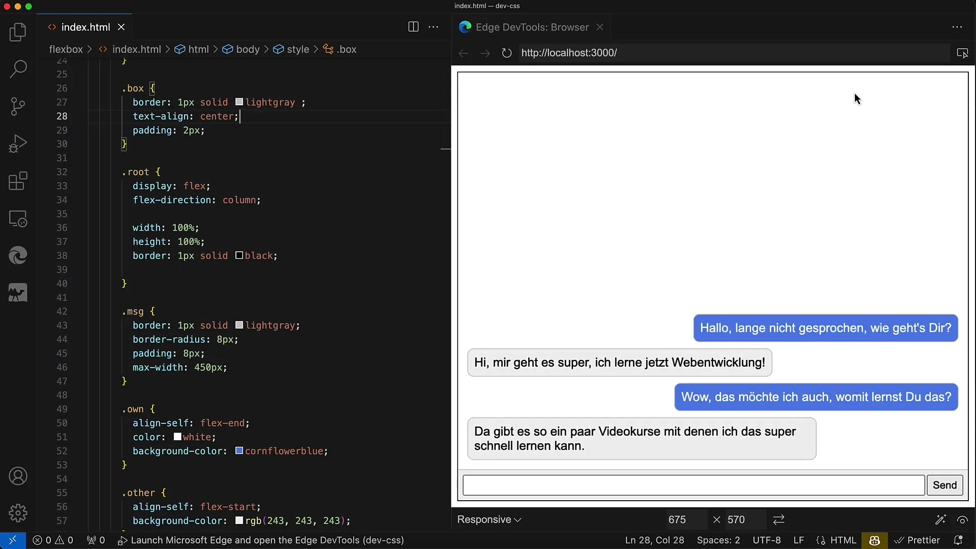
To display the messages, create another div with the class messages. Here, the messages are displayed one below the other. Each message is represented by div elements with the class MSG, where you switch between own (for own messages) and other (for messages from the chat partner).
Now let's focus on the input area. This should be housed in a div with the class MSG Input. Add display: flex to this area to arrange the input fields and the button. Set the flex-basis for the container element to 40 pixels, as this represents the height.
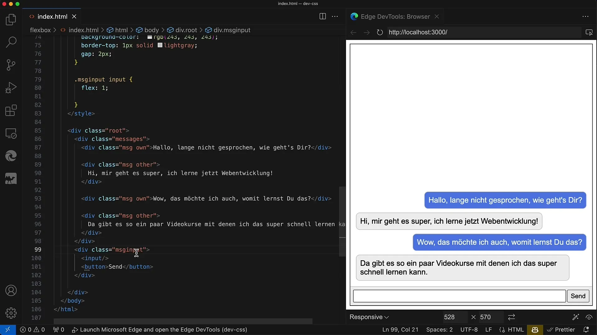
Within this input area, it is important to set align-items to stretch so that the input field and the button are evenly stretched. Additionally, add some padding and a background color to highlight the elements.
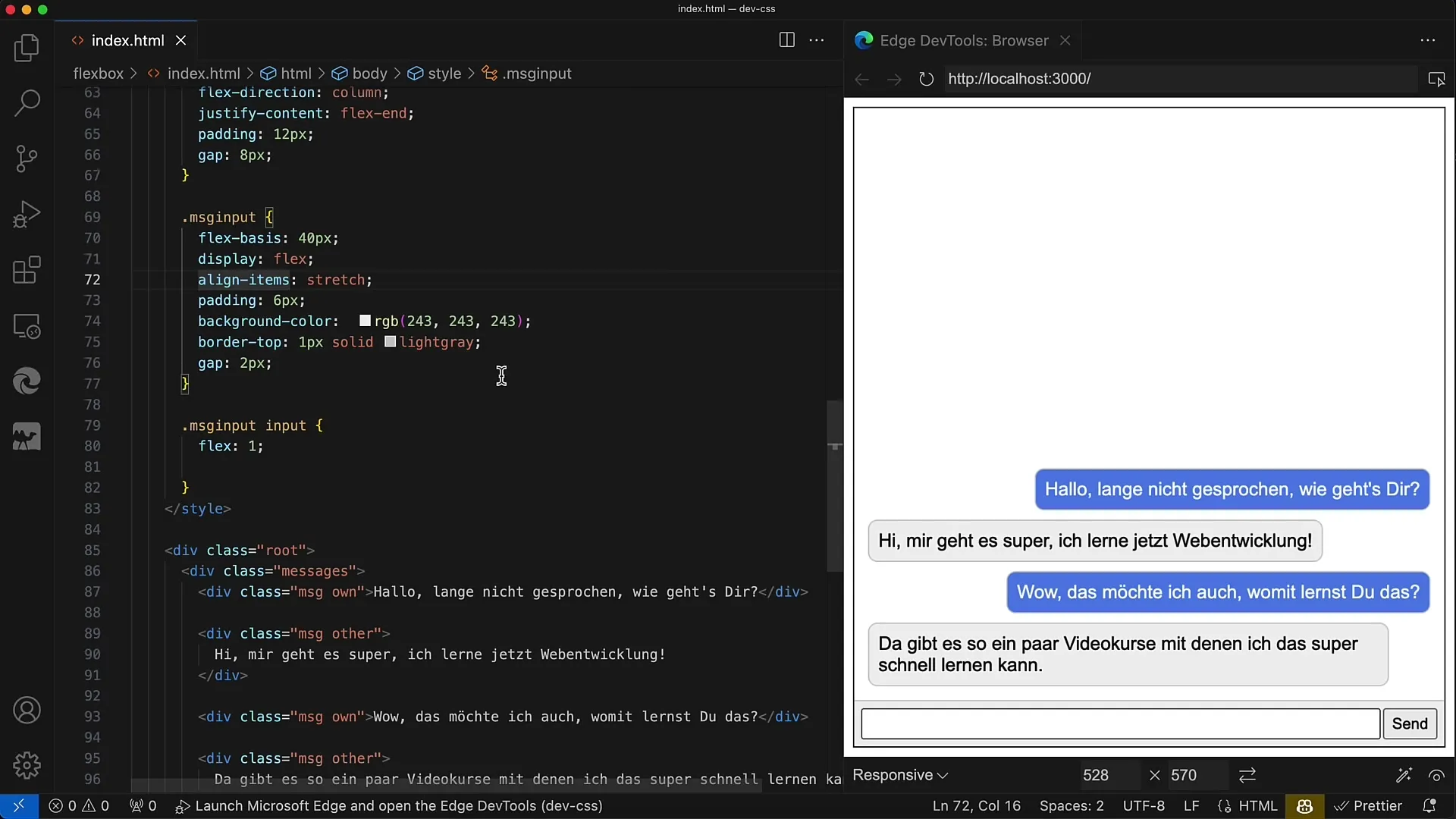
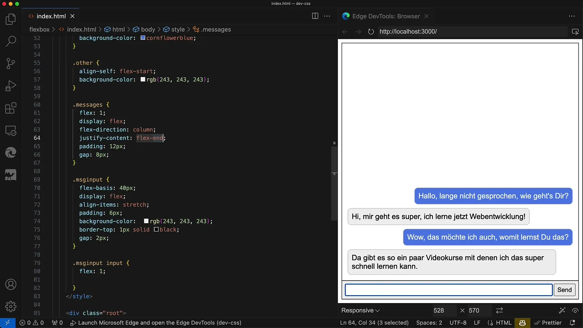
Now moving on to the messages area. Here as well, it's advisable to use display: flex. Make sure the container takes up the remaining available height by setting flex: 1. Within this area, you should display the messages in a vertical arrangement, hence flex-direction: column.
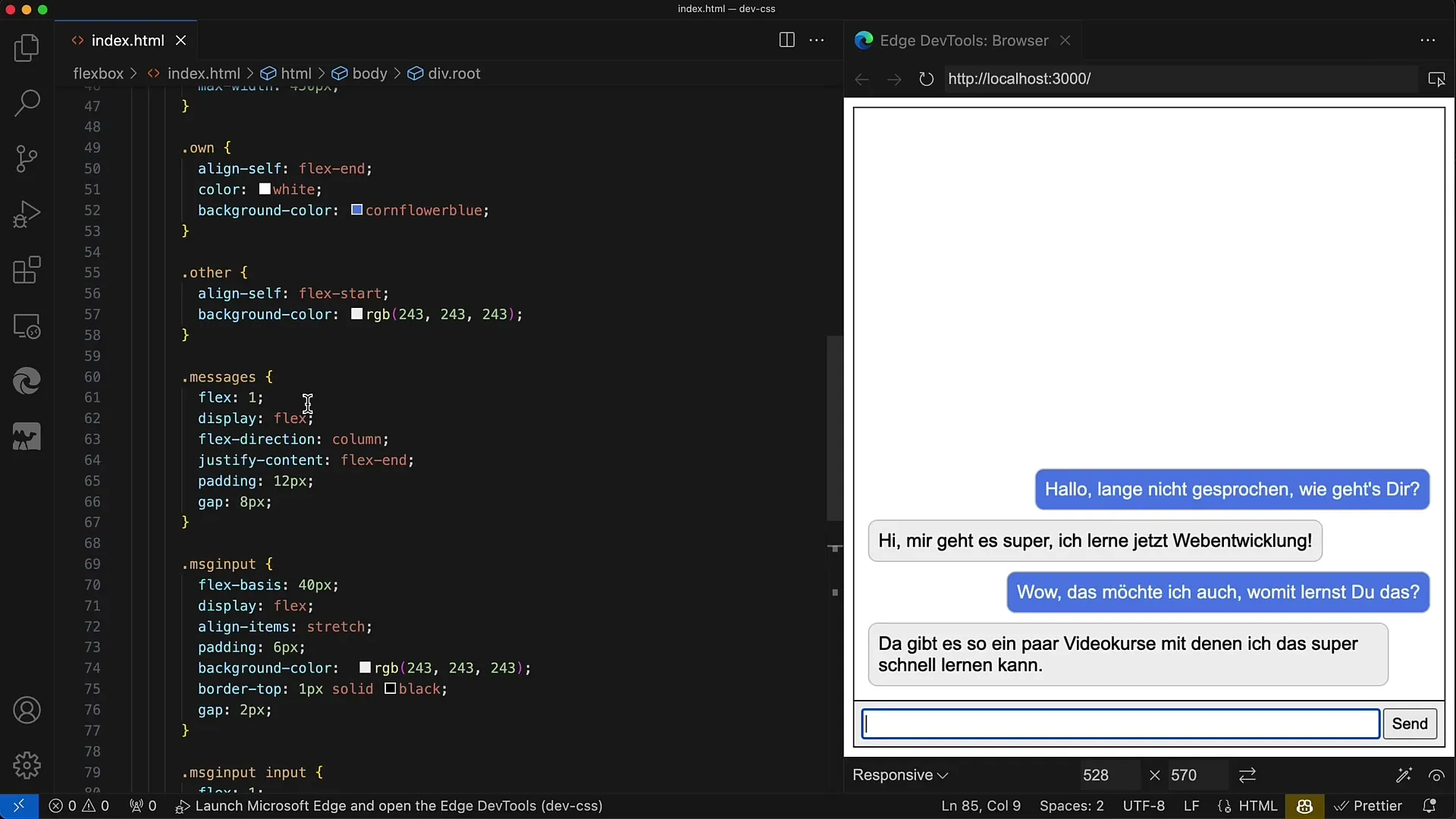
To control the layout of the messages, set justify-content to flex-end. This will make incoming messages appear at the bottom of the container, which is more intuitive for users when drafting new messages.
Next, you'll style the messages themselves. Make sure each message has rounded corners. You can set properties like border-radius and padding. Furthermore, define a maximum width, e.g., 450 pixels, to prevent the messages from becoming too wide.
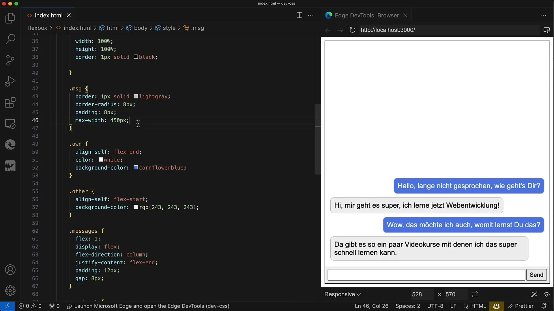
For the different types of messages (own and other), it's important to apply different CSS classes. For own messages, use align-self: flex-end to make them right-aligned, while for other messages, use align-self: flex-start to make them left-aligned.
Finally, ensure that the input field has flex: 1 to take up the entire available space in the input area. The button should only take up the space required for the text accordingly.
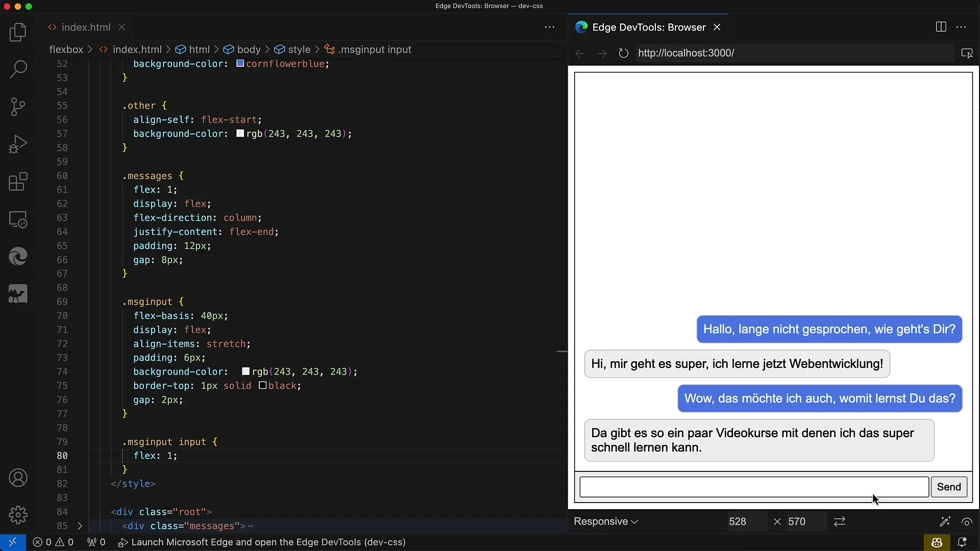
The layout is now fundamentally ready. The final considerations involve the logic you may want to add to the web app to process inputs and messages.
Summary
In this guide, you have learned how to create a simple chat layout using Flexbox. You have learned the structure of the HTML document as well as the CSS styles necessary for the different sections.
Frequently Asked Questions
What is Flexbox?Flexbox is a CSS module that enables flexible arrangement of elements in a layout.
How can I sort the messages?By applying different CSS classes for own and other messages, you can arrange them to the right and left.
Can I make the layout responsive?Yes, by using Flexbox, the layout dynamically adjusts to the screen size.
