Sometimes it only takes a few clicks to bring typography to life. Classic type effects are timeless and versatile – perfect for logos, posters, invitations, or social media posts. In this tutorial, I will present you with five simple and quick effects to creatively design your text in Photoshop. Whether it's shadows, gradients, a 3D look, or shiny accents – these techniques save time and still deliver impressive results. Let's get started and take your typography to the next level!
1. Typesetting: Placing Text in Shapes
Step 1: Basic Principle of Typesetting in Photoshop
Typesetting in Photoshop is quite simple. All you need is a work path on which the text will be inserted.
You can easily draw a shape using the rectangle tool. Then, with the text tool, click inside the rectangle and write or paste your text.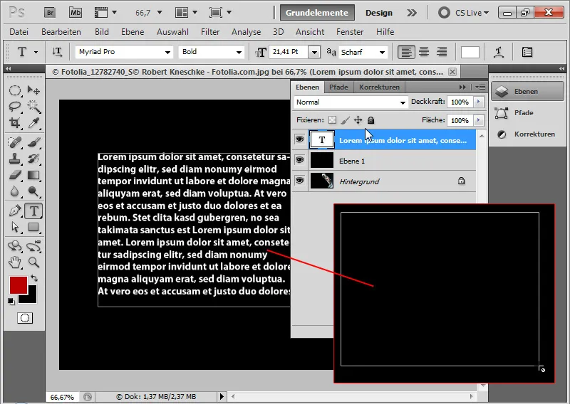
Step 2: Using Custom Shapes for Typesetting
That's the basic principle. I can now modify my paths with the pen tools as desired to create a shape for the text. It's even easier when shapes are already available as presets. Using the custom shape tool, I select the speech bubble shape and drag it onto the canvas. Then, I click inside the speech bubble with the mouse and write my text. The text fits perfectly into the speech bubble shape.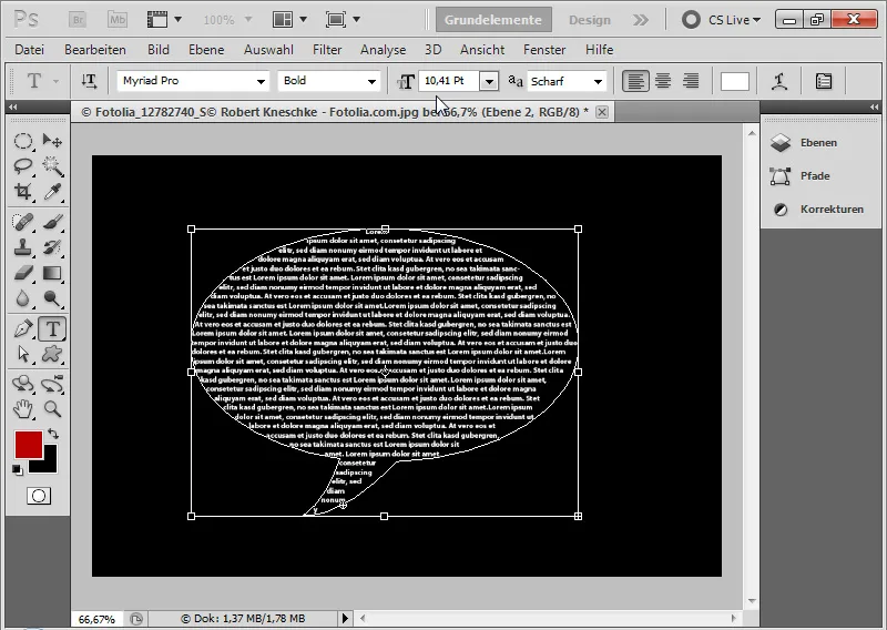
By using the paragraph and character panels, I can further fine-tune by setting justification, adjusting character spacing, choosing line spacing based on the size of the shape, etc. As a result, the text in a heart shape can look like this: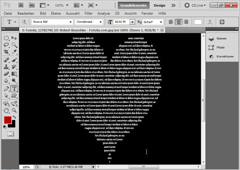
2. Text Flow: Letting Text Flow around Objects
Step 1: Basic Principle of Text Flow
While Adobe InDesign has a dedicated panel for text flows with fantastic options like find edges, in Adobe Photoshop, an alternative method must be found to make text flow around objects. The solution is to use a work path that matches the contours of the object where the text will be placed. The basic principle behind it is similar to typesetting.
For this tutorial, I have chosen an image from Fotolia.de (Image source: © Robert Kneschke - Fotolia.com).
Now, I want my text to elegantly flow around the person. The image has a black background that is not isolated. Since the background is black, I will simply use the magic wand tool to select the background.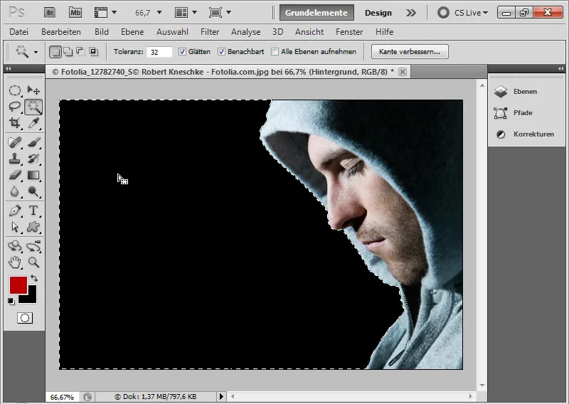
Step 2: Refining the Selection and Creating a Work Path
Since the selection goes up close to the person, I further refine the selection by using the menu Select > Modify Selection > Contract by 10 pixels. Note: It is always advisable to limit the selection to the size of the desired text frame. With Alt and the selection tool, I can contract selections, and with Shift and the selection tool, I can expand them. Therefore, before creating the work path, I should optimize the selection to the text frame size.
Now, I open my path panel and create a work path from the selection by clicking on the corresponding icon.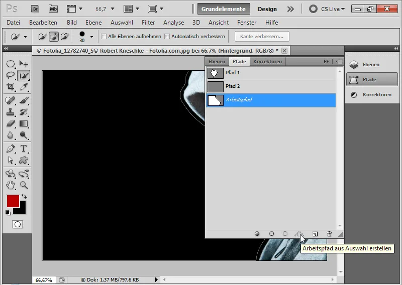
Step 3: Inserting Text
In the final step, I simply click with the text tool inside the shape and insert or write my text. The work path now serves as the text frame.
Even with my text tool, I can still edit the text frame. Result: The text elegantly flows to the left around the person.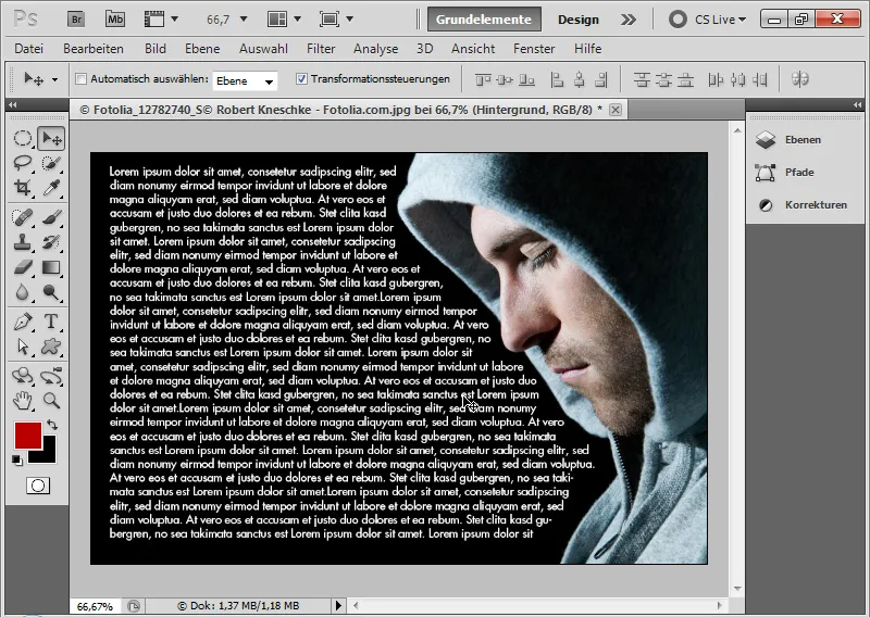
3. Text on a Path
Placing text along a path is quite simple.
Step 1: Drawing a Path
With the pen tool, I simply draw the desired path where the text will be placed.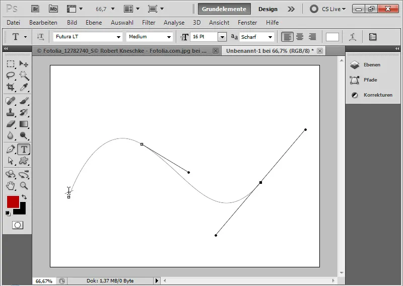
Step 2: Placing Text
Using the text tool, I hover over the path until a slightly dotted line appears. Now, I can start typing.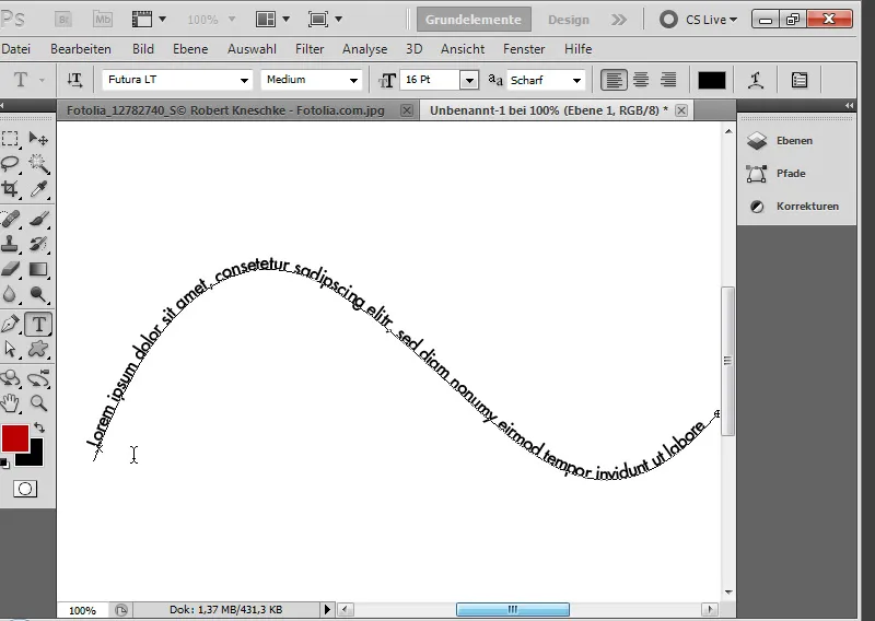
Step 3: Text Alignments
I can still make text formations using the Character Panel.
With the Direct Selection Tool, I can also grab my text path and move the starting point of the text flow, as well as determine whether the text should be displayed above or below the path.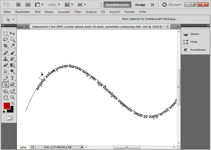
Step 4: Path via Shape Tools
I can also create paths using the Shape Tools. I create a new path in the Paths Panel and draw a hand shape using a Shape tool, in this example, the Custom Shape Tool.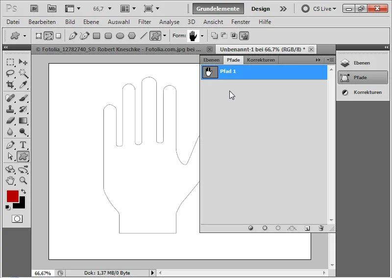
Now I can place my text inside it as well.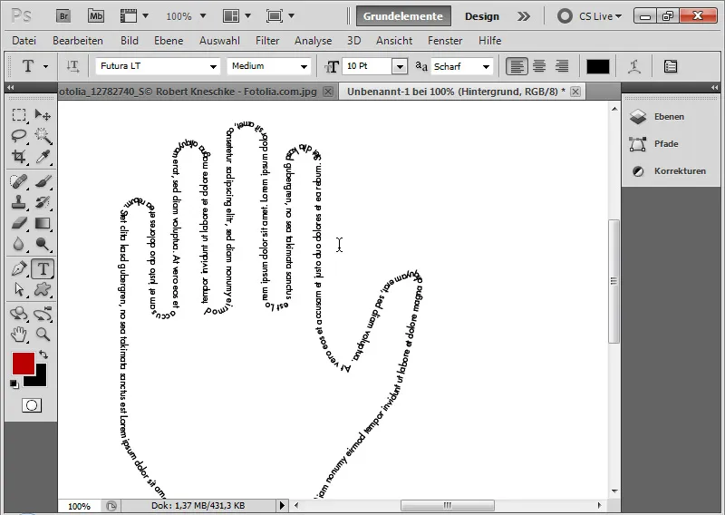
Step 5: Creating Paths from Selections
This way, I can also create selections from images and convert them into a path to use for typographic text flows.
Using the Quick Selection Tool, I select the background of this image (Image source: iofoto – Fotolia.com). I invert the selection with Shift+Ctrl+I and create an Work Path from the selection. I then use this path again for my text.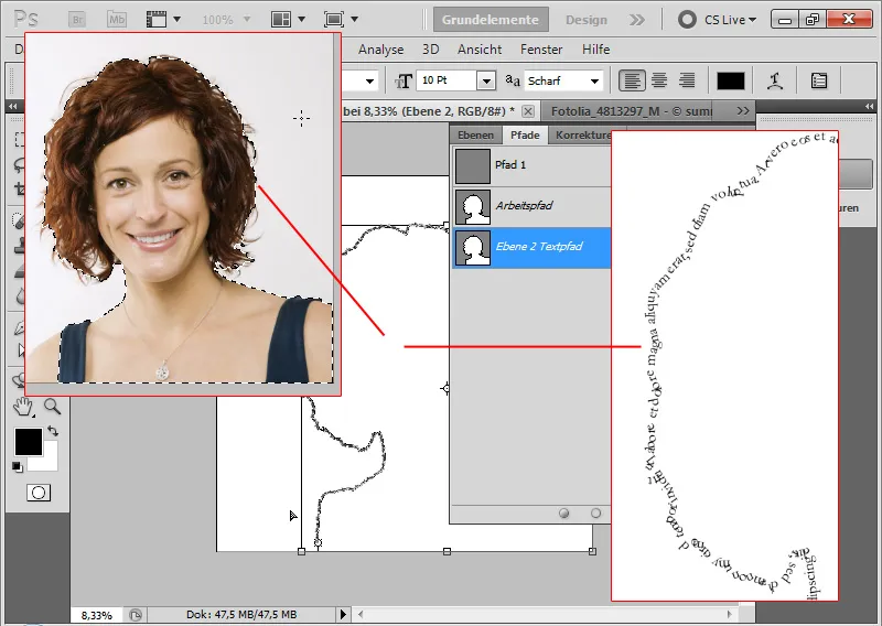
Step 6: Accentuating Outlines with Typography
The same can be done with images that have more complexity in color, like this tree image (Image source: archaeopteryx_stocks).
Using the Quick Selection Tool, I select the tree and again create a Work Path from the selection: I click on the Create Work Path from Selection icon in the Paths Panel. Now I can also use this path for my text.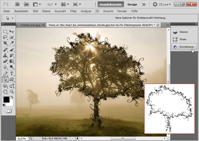
4. Grouping Text with Images via Clipping Masks
A classic typographic effect is filling text with a pattern, texture, or image. The image that should be displayed inside my text is placed in my document directly above my text layer in the Layers Panel.
Using the shortcut Ctrl+Alt+G or with Alt and Click between the text and image layer, I create the Clipping Mask. Now the image appears only where the text is. It is cropped to the content of the underlying layer.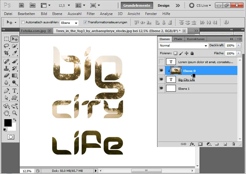
This text effect is commonly seen, simply without Fill Options on a black or white background, on product catalogs, on flyers and more with a lifestyle background - recently spotted on a product catalog of a television manufacturer. Even "The Buy And Hold Bible" by Gerd Kommer features this simple effect on the book cover.
The clipping mask effect is often used with material textures. The Fill Options (Bevel/Emboss with Drop Shadow and more) then create a marble text, a metal text, or the like, used to promote the latest stone collections of provider xy at the nearby specialty store.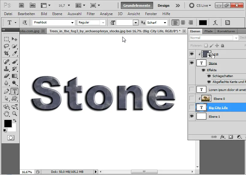
5. Filling Outlines with Brush Presets via Work Paths
A very simple yet effective technique is filling text outlines with Brush Presets.
Step 1: Choose Font, Write Text, and Create Work Path
First, I select a font that is as wide as possible. I write the letters PSD in my document with a 120-point Franklin Gothic Heavy.
By Right-clicking on the text layer in the Layers Panel> Create Work Path, I can create a Work Path from my text. It is stored in the Paths Panel.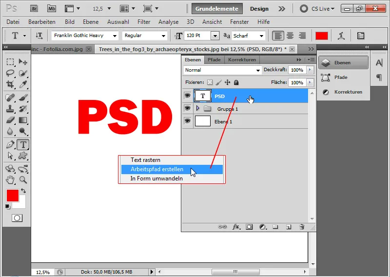
Step 2: Set Brush Preset
I can hide the text layer. In the Brush Presets Panel, I choose a brush tip that will be used to fill the outline of my text. I choose a Leaf Brush.
Pressing F5 opens the Brush Panel. There, I can adjust the shape of my brush.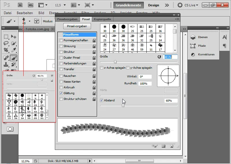
In:
• the Brush Tip Shape tab, I set a Spacing of 60 percent at a Size of 40 Px. This setting is optimal for my text size, ensuring that the spacing between individual brush strokes is smooth in transition.
• the Shape Dynamics, I set a Angle Jitter of 25 percent. This creates a rotation of my brush preset.
• the Color Dynamics, I set 12 percent for Hue Jitter and 12 percent for Brightness Jitter. This gives a nice subtle irregularity in the red hue, creating a beautiful autumn effect in the font.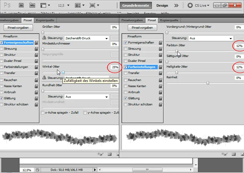
Step 3: Activate work path and create a new layer
Now I create a new layer and activate the work path in the Paths panel. By clicking on the second icon in the footer of the Paths panel, I fill the path contour with the set brush. It is important that the brush tool is also activated.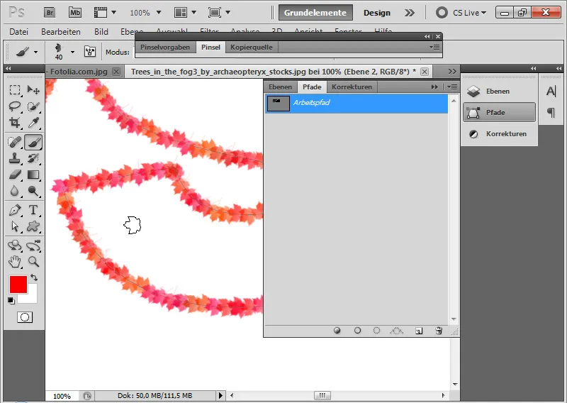
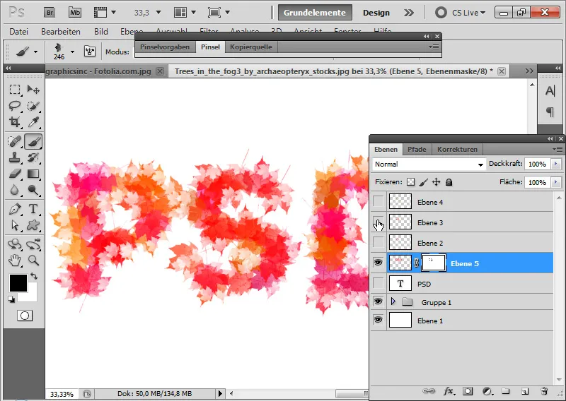
If I increase the brush size a bit more, it results in a pleasant size variation of the effect. In this way, the brush settings can be used to adapt the contour fill to the respective needs. In this example, with a somewhat autumnal touch.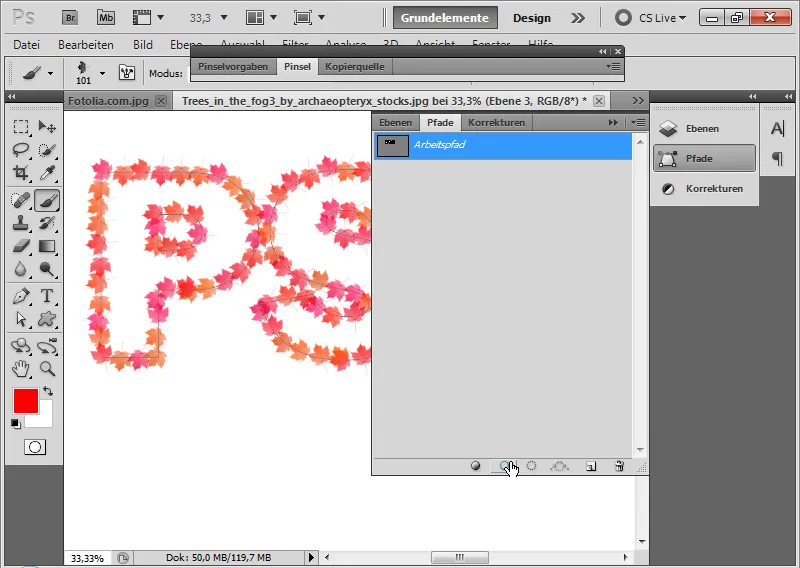
Step 4: Variation in the brush preset
If I now use a flower brush as a preset and increase the hue jitter percentage a bit, I get a light, yet beautiful summer effect.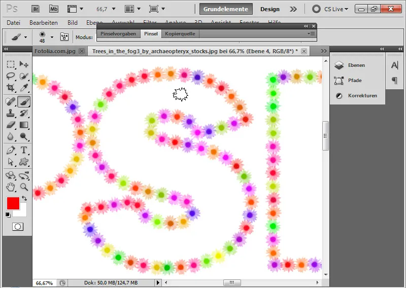
Step 5: Further editing
With contour fills, quick type effects can be easily implemented. However, the previous effect usually still requires some further editing to make it look attractive as a whole.
One possible further edit for an autumnal look could be simply filling the inside of the text with my leaf brush on a new layer and selecting the previously created brush contour by pressing Ctrl and Click on the layer thumbnail of this layer and using it as a layer mask for my new layer.
This way, I use the previous contour as a layer mask and thus also obtain a contour effect for my text.