In this exercise, you dive deeper into the Flexbox properties of CSS, specifically into the distribution of space between child elements within a Flex Container. Here, you will learn how to adjust the Flex value so that certain elements take up more space than others. This approach requires a little bit of mathematics, but don't worry - it's easier than it sounds!
We will go through a simple example together, showing how you can effectively design the layout of your elements by adjusting the Flex properties.
Key Takeaways
- Flexbox allows for a flexible and customizable arrangement of elements.
- The Flex value is crucial for the distribution of space between child elements.
- By setting the values correctly, you can make certain elements appear more dominant.
Step-by-Step Guide
First, let's look at the existing layout and prepare everything for the exercise.
You have a container already set to display: flex. We set the width of the container to 400 pixels and the height to 200 pixels. This allows you to view the elements clearly.
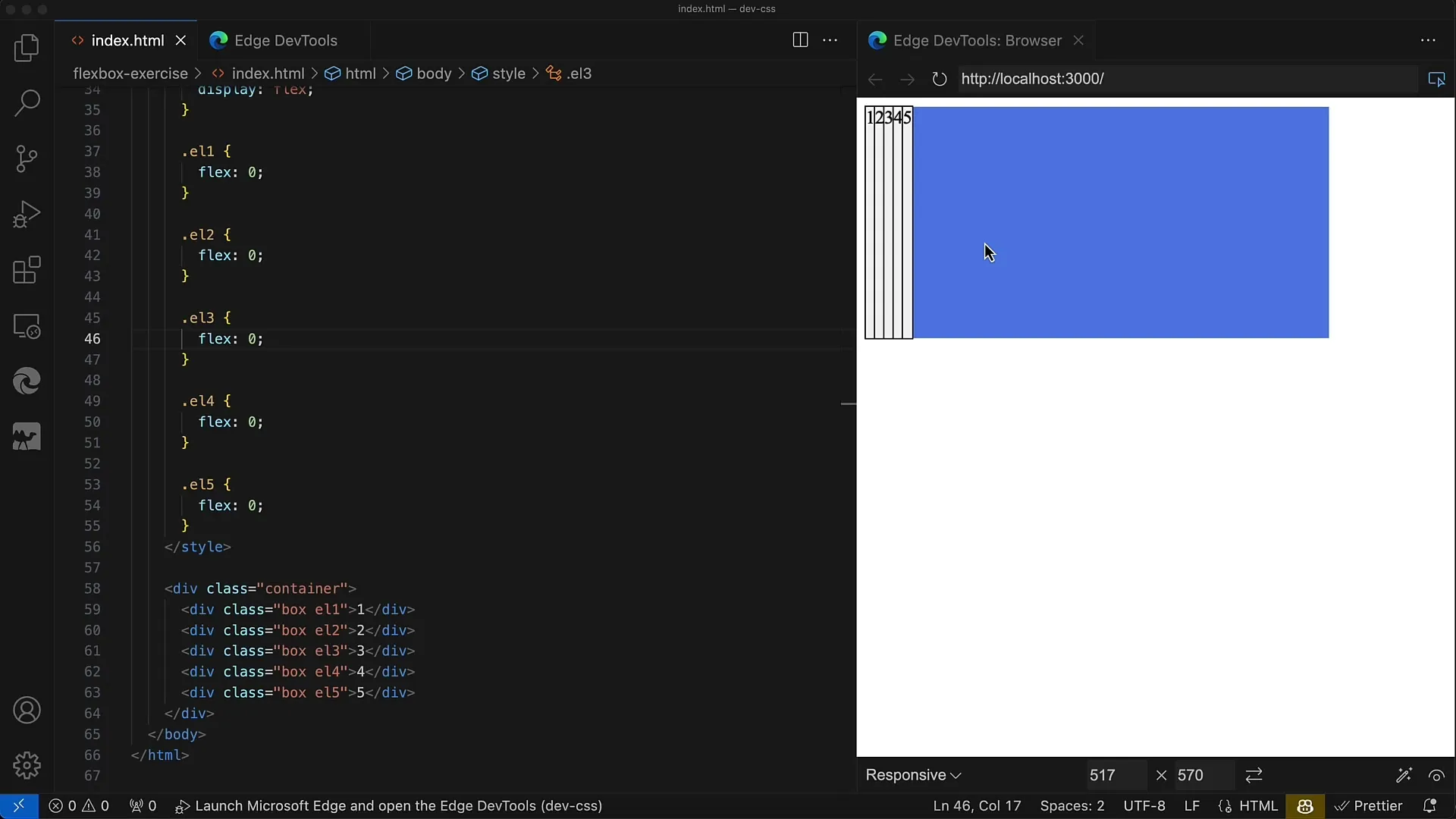
In the container, we have five div elements, each marked with the class Box. Each of these div elements has an outline to show the boundaries and a background color that is white smoke.
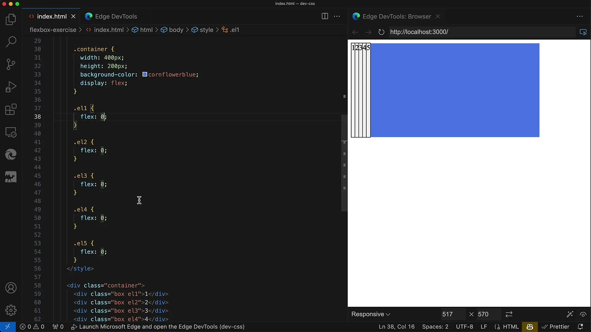
The task is for the middle div, i.e., the one with the class L3, to occupy half of the space in the container. That equals 200 pixels. The remaining four div elements should evenly divide the remaining 200 pixels.
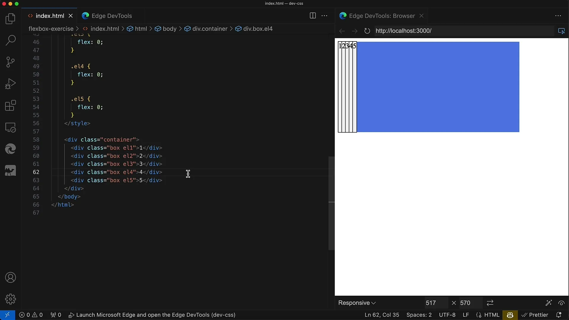
This means, each of these four div elements will then receive 50 pixels (200 pixels divided by 4). You need to adjust the Flex values accordingly so that the third element receives more space.
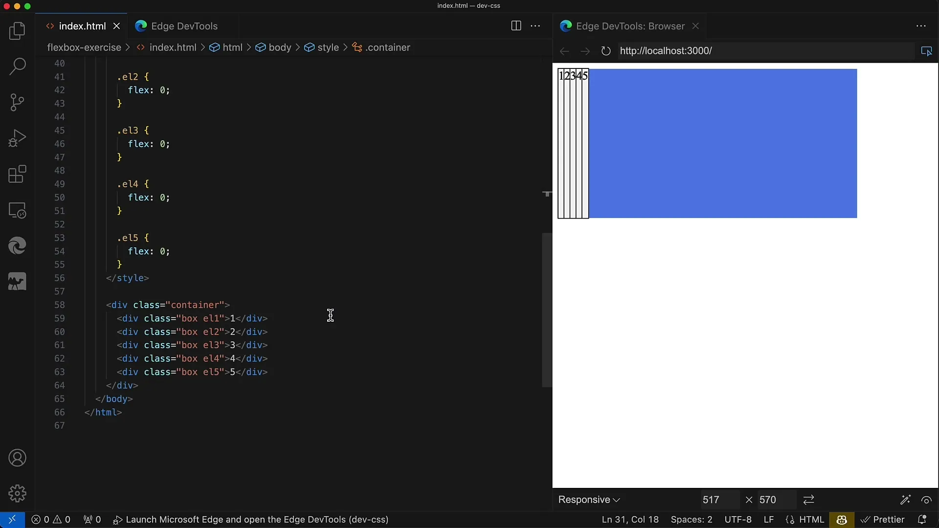
Now it's time to set the Flex properties. First, you set the Flex value to 1 for all child elements except the middle one. However, the middle element receives a Flex value that allows it to occupy more space. In this case, you use the value 4.

After setting the values, you need to save your changes and view the result. In your browser's developer tools, you can see if the layout looks as you envisioned.
The middle div should now have a width of 200 pixels, while the remaining four div elements are each 50 pixels wide. When calculating the Flex values, it is important to keep the sum of Flex values equal.
This means: When you add up the Flex values of Elements 1, 2, 4, and 5 (i.e., 1 + 1 + 1 + 1), you get 4. The middle element has a Flex value of 4, resulting in a total of 8.
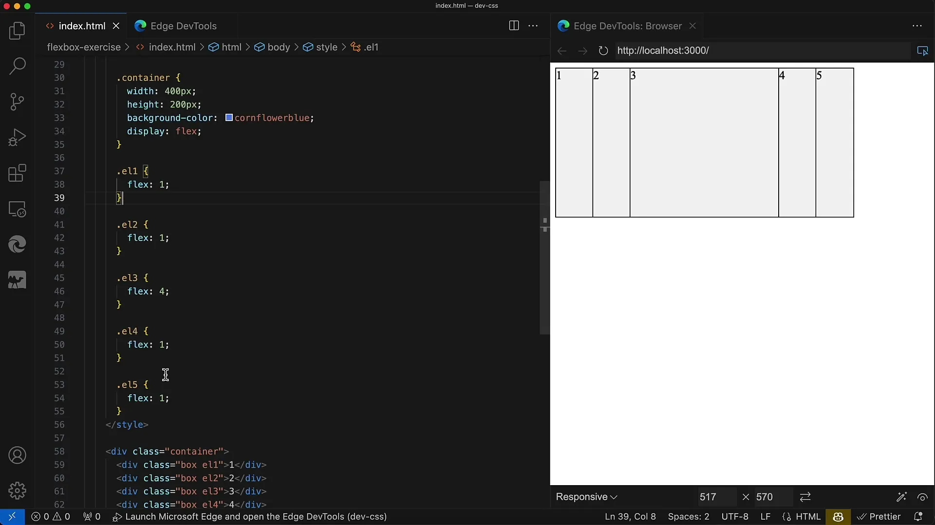
To understand how much space you assign to each element, you can use the total width of the container (400 pixels). Dividing by 8 for the Flex units means that 1 Flex unit corresponds to 50 pixels. By dividing 400 pixels by 8, you get 50 pixels for the other four elements and 200 pixels for the middle element.
This means, you can perfectly control the layout by adjusting the Flex values. This creates a balanced design that is both adaptable and clear.
Summary
In this exercise, you have learned how to set the Flexbox properties in a way that efficiently utilizes the space of child elements inside the container. By understanding Flex values and their mathematical application, you can precisely determine how much space each element should occupy. With this method, you are well-equipped to create more complex layouts.
Frequently Asked Questions
How do I set the Flex value for a child element?You can set the Flex value using the CSS property flex in your stylesheet.
Why is the sum of Flex values important?The sum determines the distribution ratio of space between the elements.
Can I use different Flex values?Yes, you can assign each element an individual Flex value to control the layout.
