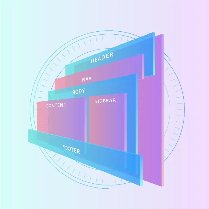
In this tutorial, I'll show you how to create a responsive layout with two sidebars and a main area using Flexbox in CSS and HTML. Flexbox allows you to flexibly position elements so that they dynamically adjust to the screen size. Whether you want to create a simple website or a complex design, Flexbox technology offers you many possibilities. Let's start with a concrete example!
Key Takeaways
- With Flexbox, you can create a responsive layout where different elements are evenly distributed across the available width.
- The flex properties determine how much space each element occupies in relation to the others.
Step-by-Step Guide
Step 1: Setting up the basic structure
To work with Flexbox, you first need a basic HTML structure. Create an HTML file and add basic tags such as <html>, <head>, <body>, and </body>. Then, add the container elements for your sidebars and main content inside the <body> tag.

Step 2: Adding CSS for styling the layout
Now, you want to give some style to your layout using CSS. You can work either in a <style> tag in your <head> or in a separate CSS file. Add some simple colors to distinguish different areas clearly.
Step 3: Activating Flexbox
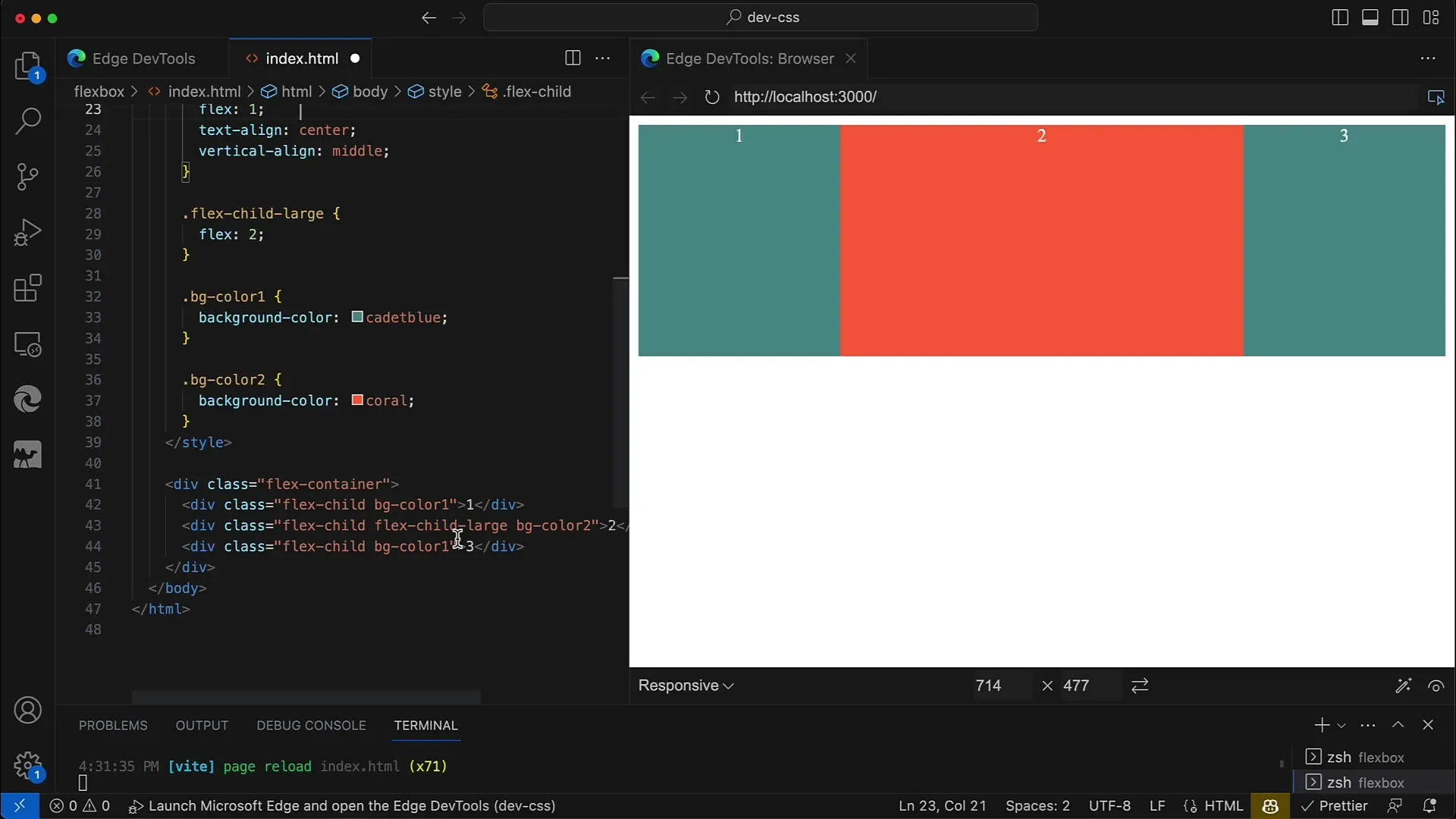
To activate Flexbox, apply the property display: flex; to the container. This turns the container's direct children into flex items. You may also want to set the direction: Use flex-direction: row; for a horizontal layout.
Step 4: Setting flex properties for children
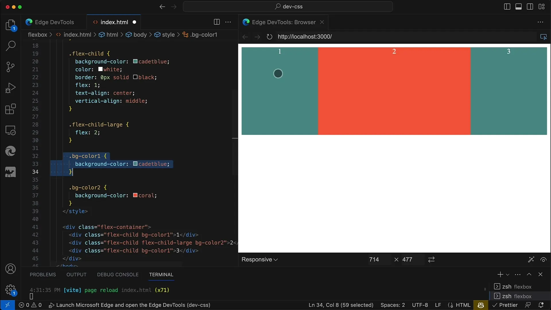
Next, set the flex properties for the children elements. Here, you can specify how much space each element should take relative to the others. For example, the main element could have flex: 2; and the two sidebar elements could have flex: 1; each, ensuring that the main element takes up twice as much space as each sidebar.
Step 5: Adjusting responsive width
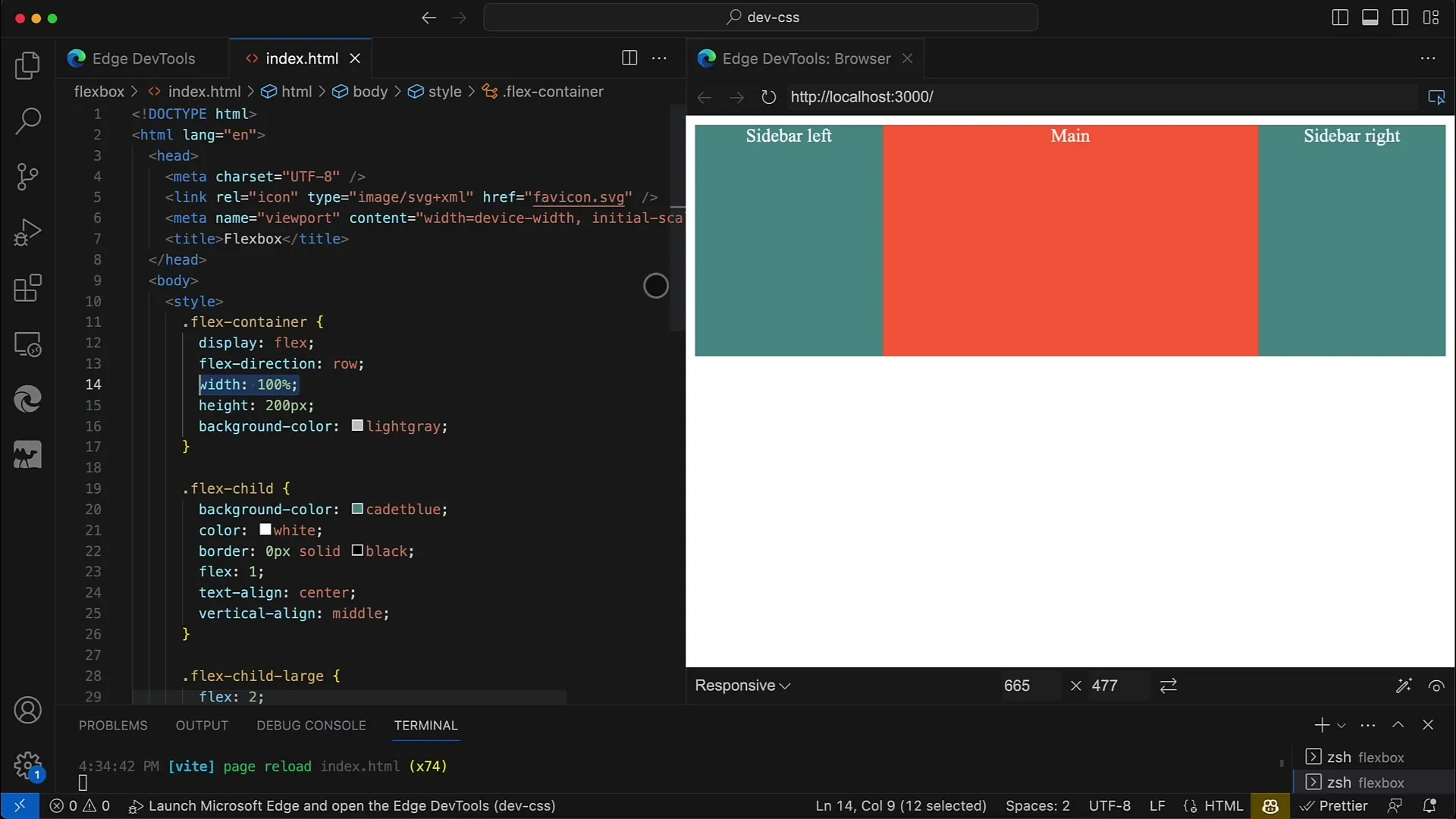
To ensure your layout is responsive, set the container to width: 100%;. This makes the layout adapt to the width of the browser window. Also, choose a height to optimize the layout views.
Step 6: Defining fixed widths for sidebars
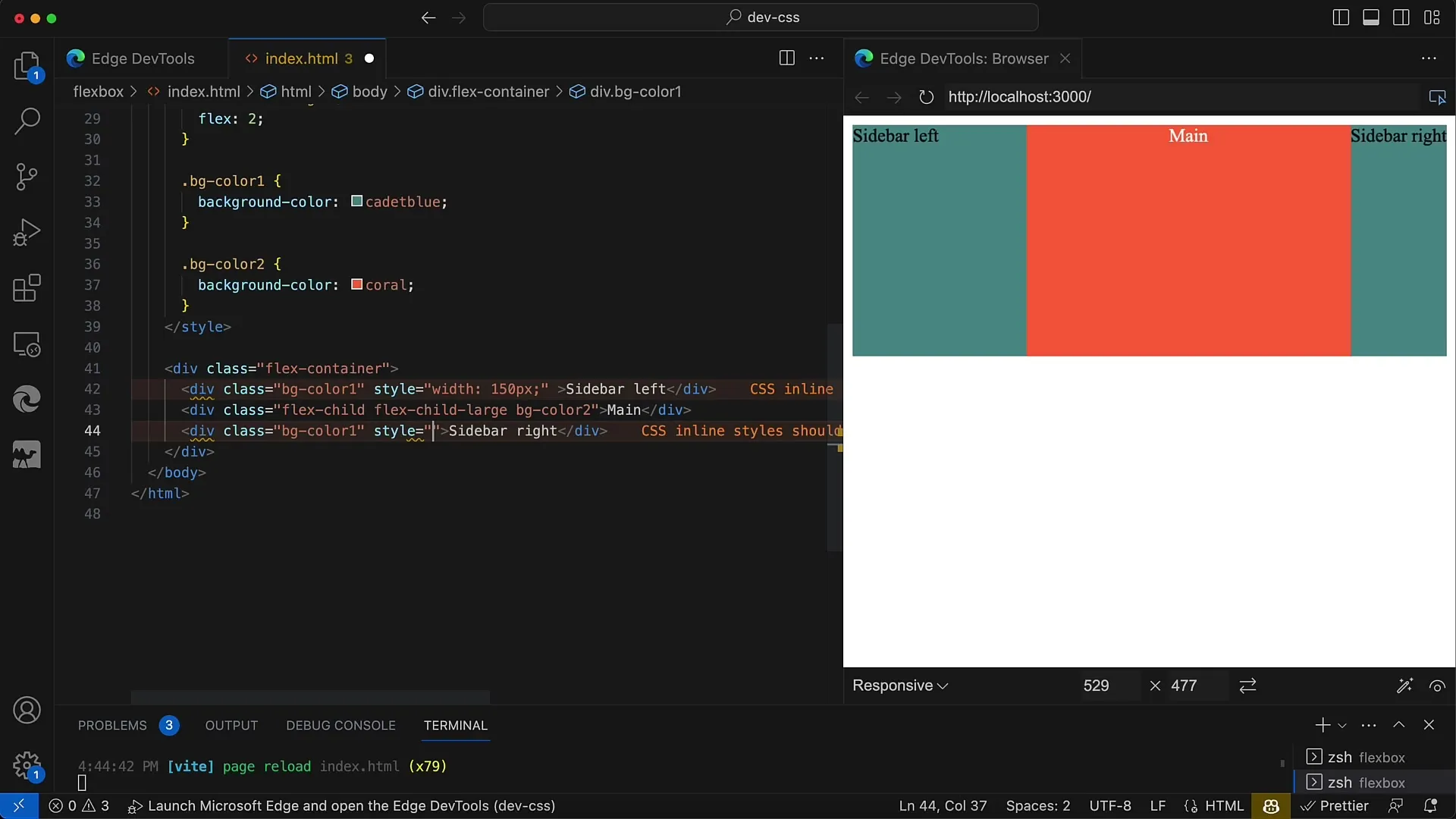
If you want to define a sidebar with a fixed width, you can complement the Flex layout with the fixed width of the sidebar. Simply remove the Flex property from the sidebar so that it only has the minimum width.
Step 7: Further adjustments and testing
Now, you should check your layout in the browser to ensure everything looks correct. Experiment with different Flex values and widths to see how the layout responds. Resize the browser window to test the design's responsive properties.
Step 8: Implementing vertical layout
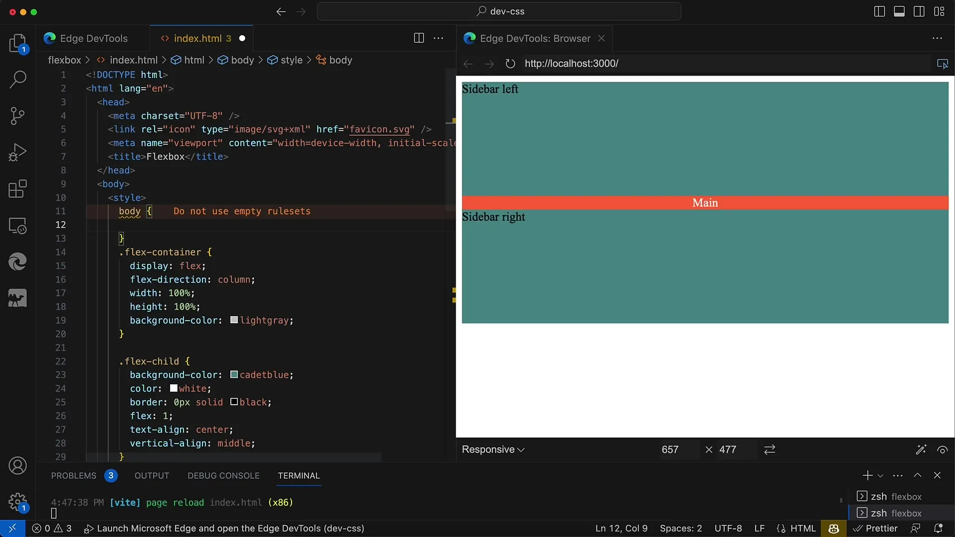
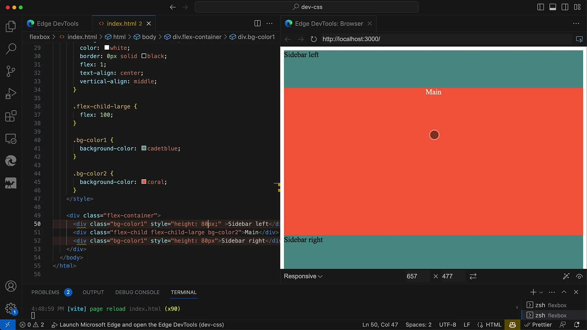
Optionally, you can rearrange your layout to create a vertical layout. To do this, change the Flex container to a column by using flex-direction: column;. This step is necessary if you want more design options.
Step 9: Adding browser support
Don't forget to check browser support as you work. Some older browser versions require prefixes for Flexbox. Add the necessary prefixes if needed to ensure your layout looks good everywhere.
Step 10: Make final adjustments and save
Check all controls and make sure your layout looks good in different screen sizes. Save all changes and take screenshots of your layout to track your progress.
Summary
In this tutorial, you have learned how to create a simple, responsive layout using Flexbox. The flex properties allow you to easily control the size and arrangement of your elements. With the steps described above, you can design a layout with two sidebars and a main area that elegantly adapts to different screen sizes.
Frequently Asked Questions
How does Flexbox work?Flexbox is a modern layout module in CSS that allows distributing space between elements and dynamically reordering them.
Can I use Flexbox for vertical layouts as well?Yes, you can use Flexbox for vertical layouts by changing the flex-direction to column.
How do I test the responsiveness of my design?You can resize your browser window or use developer tools in your browser to simulate different screen sizes.
