It's Stefan here again and you know that all good things come in tens! That's why today I'd like to introduce you to the "Top Ten Double-Clicks" in Adobe InDesign. Because wherever we can save a click, we also save time in the end.
So let's start together: with number 10:
Yes, you should all be familiar with this trick by now. You have highlighted the selection tool as I did here above. Double-click on a text field, as you can see here, and InDesign will automatically switch to the text tool the moment you double-click and you can start typing as you like.
Continue to position 9:
Most of you will also already be familiar with the polygon tool, which is this almost complete stop sign in the toolbar, and you can use it to create incredibly exciting shapes. Triangles for example, unbelievable, that's really phenomenal ;-),
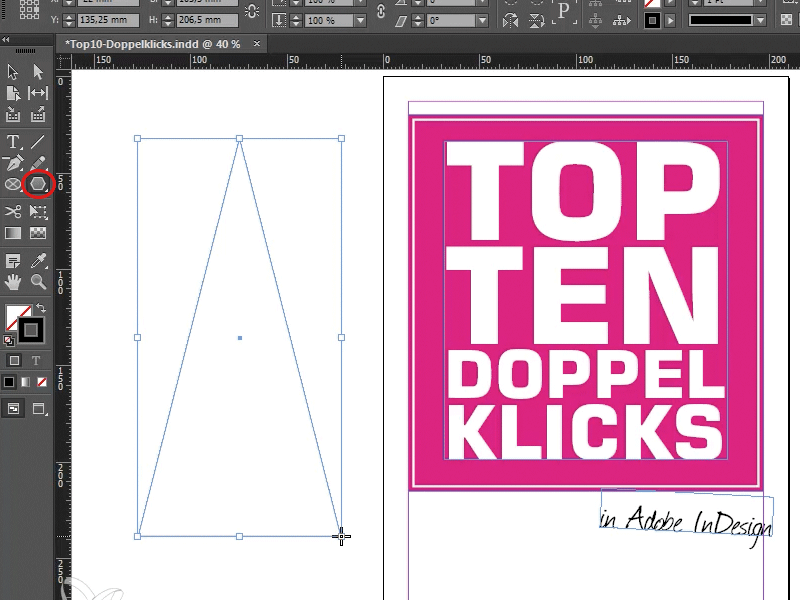
But of course you can do even more with it. Namely: You can also make a ten-corner, for example. We know that all good things come in tens, and we're going to put that into practice in no time at all. I'll delete the triangle and you can double-click on the polygon tool to define how many sides your polygon should always have in total in this polygon settings dialog. Let's enter 10.
Then I confirm, and if I now draw a polygon, we have our 10-corner.
So: double-click on the polygon tool and the sides are defined!
Let's continue with position 8:
Here we are dealing with a real classic. You may be familiar with it: You have created a nice article, as I have done at this point, and have probably also marked a text field, e.g. the headline. Let's take a look at the paragraph format palette. There we see: Ah ok, there are two paragraph formats available - heading and body text. But sometimes you want to edit a paragraph format without applying it directly.
I click out so that none of the paragraph styles are activated, ...
...and with Ctrl/cmd+double-click on the desired format (in my case now with the heading selected on the body text) the dialog opens and as you can see, it is not applied.
If I did not do this, it would look like this: I double-click on the body text, open the dialog, and promptly the heading is shot.
So Ctrl+double-click on Formats and you don't apply it, you just open the dialog.
7th place:
Sometimes it feels like you can't see the wood for the trees, and it looks something like this:
This is what it might look like and you think to yourself "Jesus, yes where am I right now ...". No problem, there's the hand tool. Double-click on it and you'll see the whole page. The same also works with the shortcut Ctrl+0 (cmd+0), I click on it once: the result is exactly the same!
As you can see, we are setting a very fast pace here; if we continue like this, we will be through with our remaining points in 5 minutes.
6th place:
You may be familiar with the text frame options. You can call them up by right-clicking and then on Text frame options or by pressing Ctrl+B (cmd+B) as a shortcut. This is what the dialog looks like:
But there is a much simpler way. Simply press Alt, and hold on tight: Who would have thought it, a double-click and the dialog is also promptly there. Practical thing!
Number 5, one of my favorites:
You may know how to use guides. You can easily pull them out using the ruler and drag them into the working document. Or alternatively you can go to Menu>Layout>Guidelines and then open the Guideline dialogor actually the Menu>Layout>Create Guideline... dialog, that's the right one.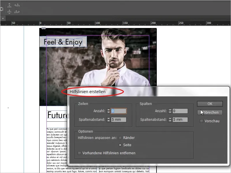
Or now the shortcut: Attention! Simply double-click on the desired position on the ruler and you will immediately have a guideline. If you hold down the Shift key while double-clicking, you will get a clean guideline at the next line. It will look like this: Here we've got it a bit "crooked". Now I hold down the Shift key, double-click, and then we have our guide line exactly on the 238.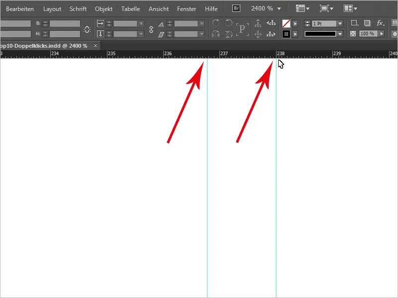
Let's double-click on the hand tool again and throw out our guides once more. So, we continue ...
... with position 4
I'm going to create a new page and place an image. A double-click is also used here. Because a single click naturally selects the picture frame, but a double-click on it selects the picture content. As you may know, you can move the image content within the frame.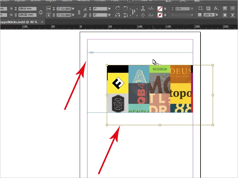
With a double click you always have the picture content, with a single click you have the picture frame.
Next step, number 3:
I'm now back here on our first page and would like to take a closer look at this.
If you have the page palette open, you can see the pages here. Double-clicking on a new page firstly opens the page. But it also opens the selected view, i.e. this image section on page 2. Double-click:
... and you will see exactly the same place. This means that the zoom level does not change. Double-click again and you are back on the Overview.
Well, what else do we have? Two points are still open, we'll get through them in no time.
We're getting closer to the top, because we're now in 2nd place.
That really is a very, very practical double-click. I'd like to show you how it works. We draw a text frame and have a text in it via Menu>Font>Placeholder text. This is what it looks like.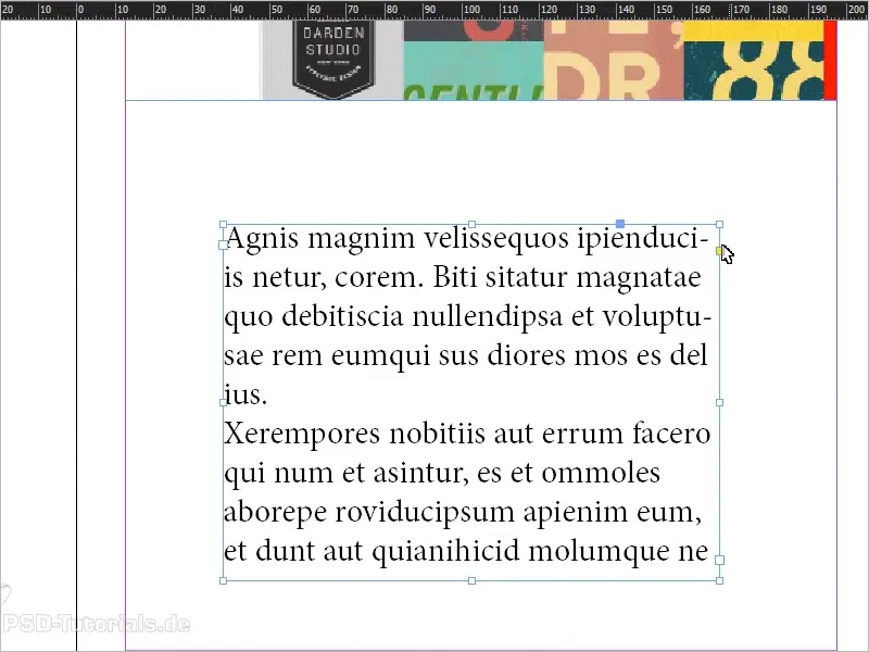
Now, of course, we have a placeholder text that adapts exactly to this text frame, but this is not usually the case. Now, for example, I have an overset:
Double-click on this handle down here and what happens? The text frame is scaled up to exactly the size that the text needs to feel comfortable. The reverse is also true: We have a text field that is too large and lots of white space here. Double-click on the lower-middle handle and the text field is adjusted to the size of the text.
But sometimes it looks completely different. Let me write here: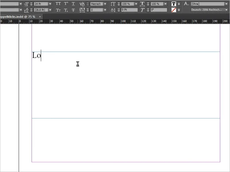
Now we have a huge difference: The line is not filled in. If I now click on the handle in the bottom right-hand corner, the text field is adjusted exactly. But if I click on the handle at the bottom center, only the height is reduced, whereas the width remains untouched.
This also works if I press Ctrl+Z and try the side handle: it keeps the height of the text field.
To be honest, I do this a lot, so I think it's a great function. You don't always want to have that strange empty space that takes up space here. Then you click here and then you click next to it and then you've marked the wrong thing, so that's really one of the best double-clicks in InDesign there is.
And now we come to our last double-click quick tip - that's a real tongue twister, you have to try it: "double-click quick tip".
The number 1:
It's about the following: We now have an image here and if you open the shortcut panel once, you will see that we have two embedded images here. Double-clicking on them brings up the link information, for example. It is a jpg, on which page it is located, color space, size, the ICC profile and who knows what else. You can look it all up, learn it by heart and then recite it to your neighbors.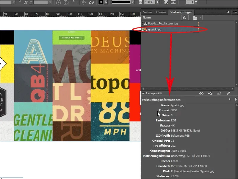
Or, also quite good: you can hold down the Alt key and double-click on a link to open it in your default program (very important: the default program that is set when opening a jpg file). On my Windows computer, the whole thing looks like this, the Windows preview for images opens, ...
... but if you have, for example, Photoshop as the default program for a jpg file, which is not the norm, then this file would open in Photoshop.
Another example: I will now place a txt file as dummy text. This is not currently displayed in the shortcut panel, you can add this via Menu>Edit>Preferences. In the file handling, you have the option of activating a check box for the links: Create link when placing text and table files.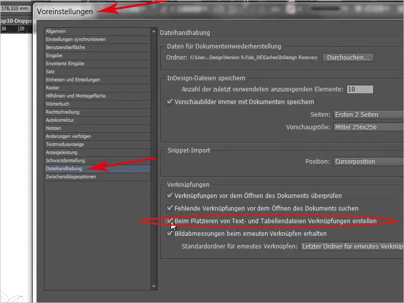
Let's just do that. Once again, I drag the txt from my desktop to my workspace. Now we have the blindtext.txt here ...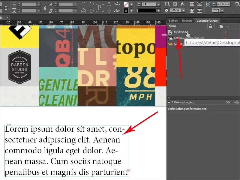
... Alt+double-click here too and here you can see the txt document:
It's a pretty powerful thing, or what do you think? Yes, and that's it for our little double-click odyssey. I hope you've enjoyed watching it and use one or two of the double-click tricks- here's another great word :o) - for your next projects.
On that note, we'd like to give a little credit to indesignsecrets.com, who created this great list for the first time.
Thank you for listening/reading.
See you next time.
Your Stefan
