In this tutorial, I will show you how to successfully copy the Color Grading of an image and transfer it to another image. With the right technique, you can enhance your images and give them a professional, consistent look. This step-by-step guide will walk you through the process of color matching to make your images look harmonious and convey the desired mood.
Key Takeaways
When transferring Color Grading, it is important to capture and utilize the right color values correctly. By using the color table and gradient curves correctly, you can achieve a harmonious look for your images.
Step-by-step Guide
First, open the image from which you want to copy the Color Grade. This is the first step to analyze the desired colors and atmosphere.
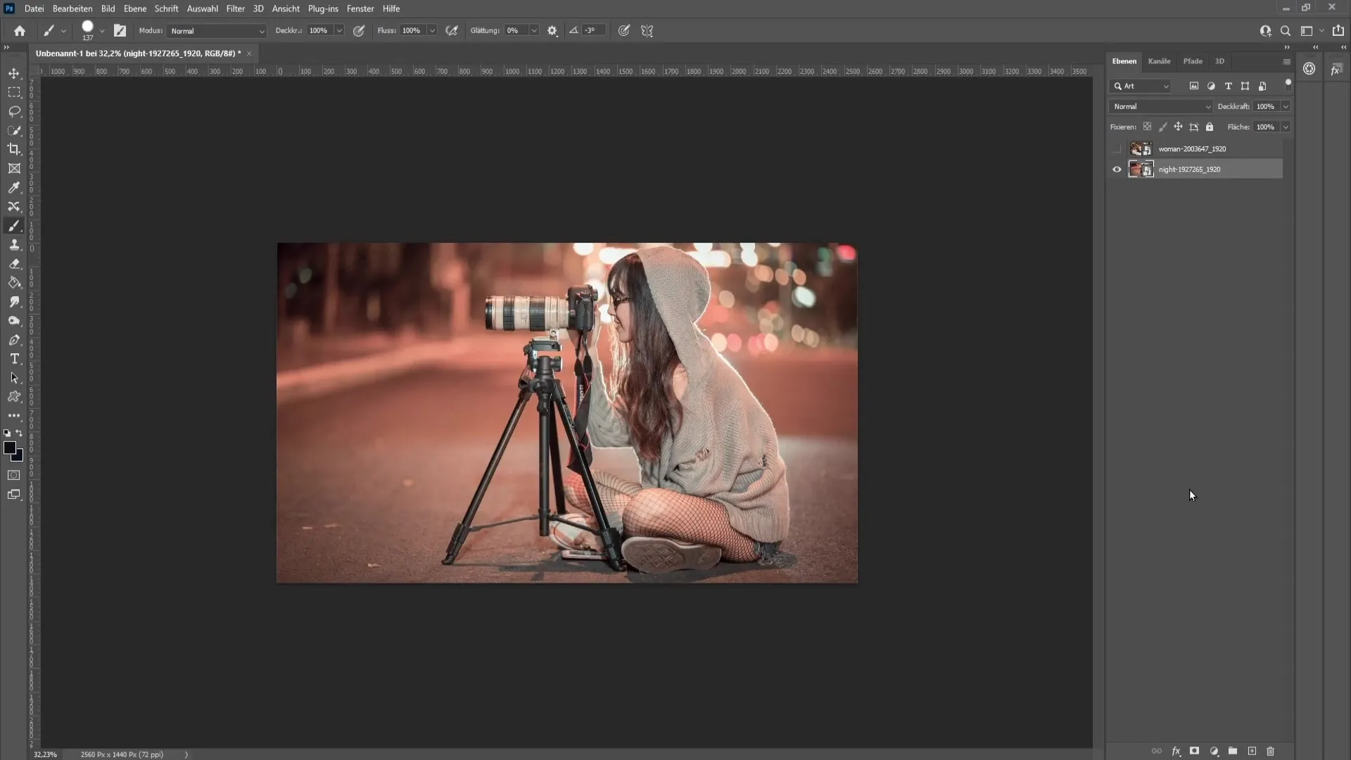
To copy the Color Grade, you first need to go to the layer of the image. After selecting the image, click on "File" in the top left and choose "Export". In the opening menu, select "Save for Web".
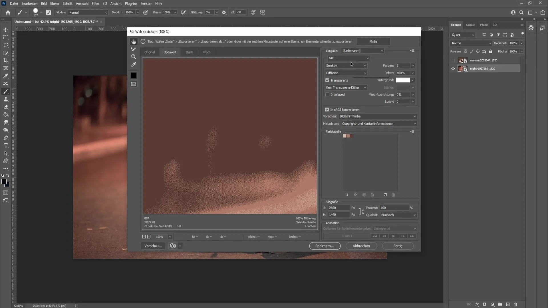
Now make sure that the format is set to "GIF". In the Colors box, make sure that "3" is specified as the number of colors. Then click on the color table button in the top right and select "Save Color Table".
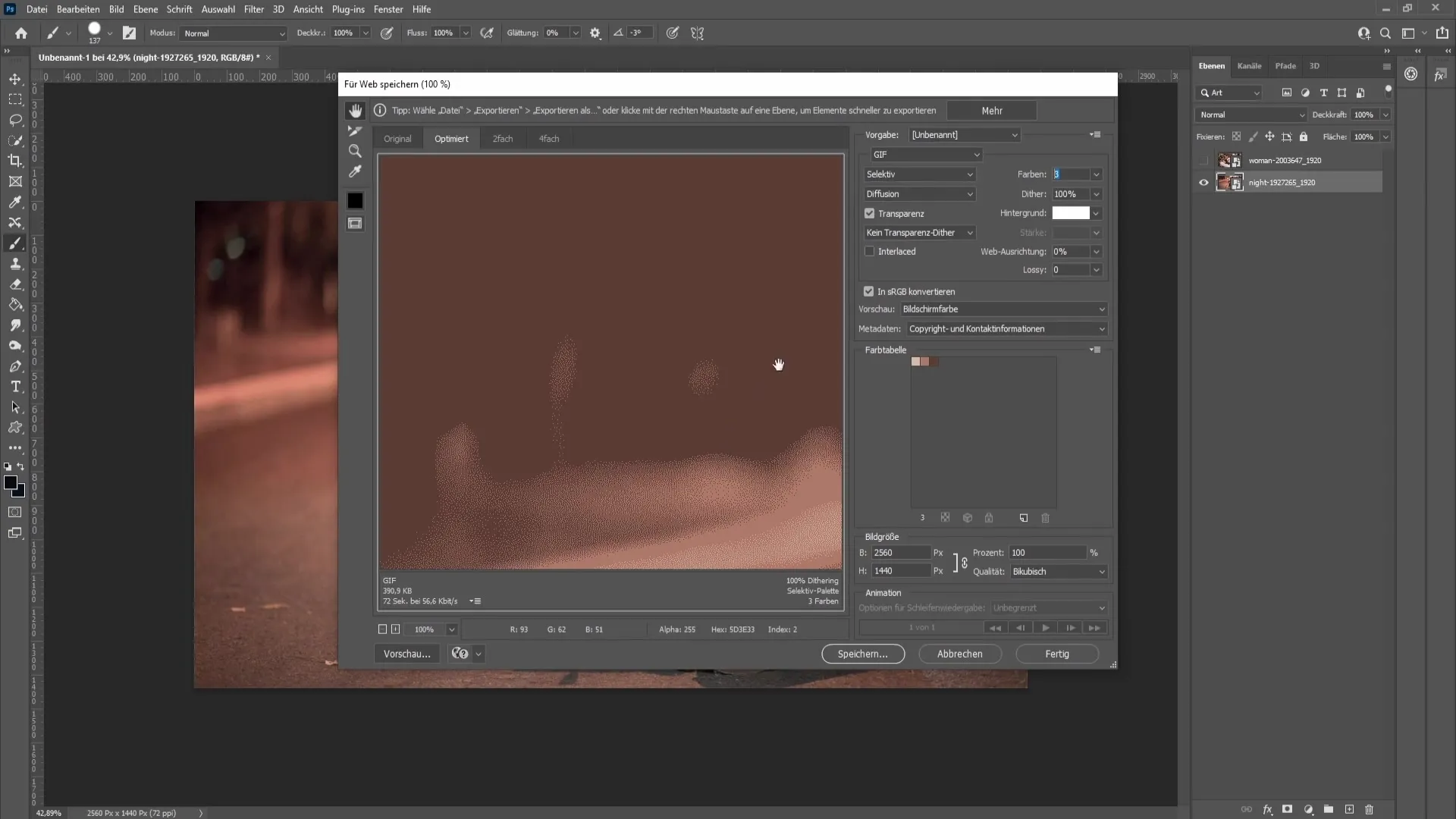
Give the color table a unique name, for example, "Look", and save it to your desktop. With this file, you have the necessary color values for your grading.

After saving, you can close the dialog and return to your workspace. It is now important to open the color table window. If it is not visible, you can access it through "Window" and then "Swatches".
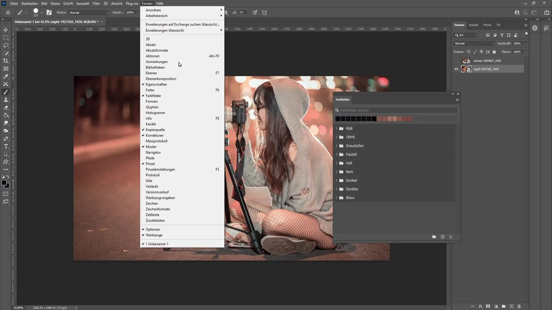
In the Swatches window, click on the three dots in the upper right corner and select "Load Swatches". Choose the format "A" and load the previously saved file "Look". This way you import the three colors from the original image.
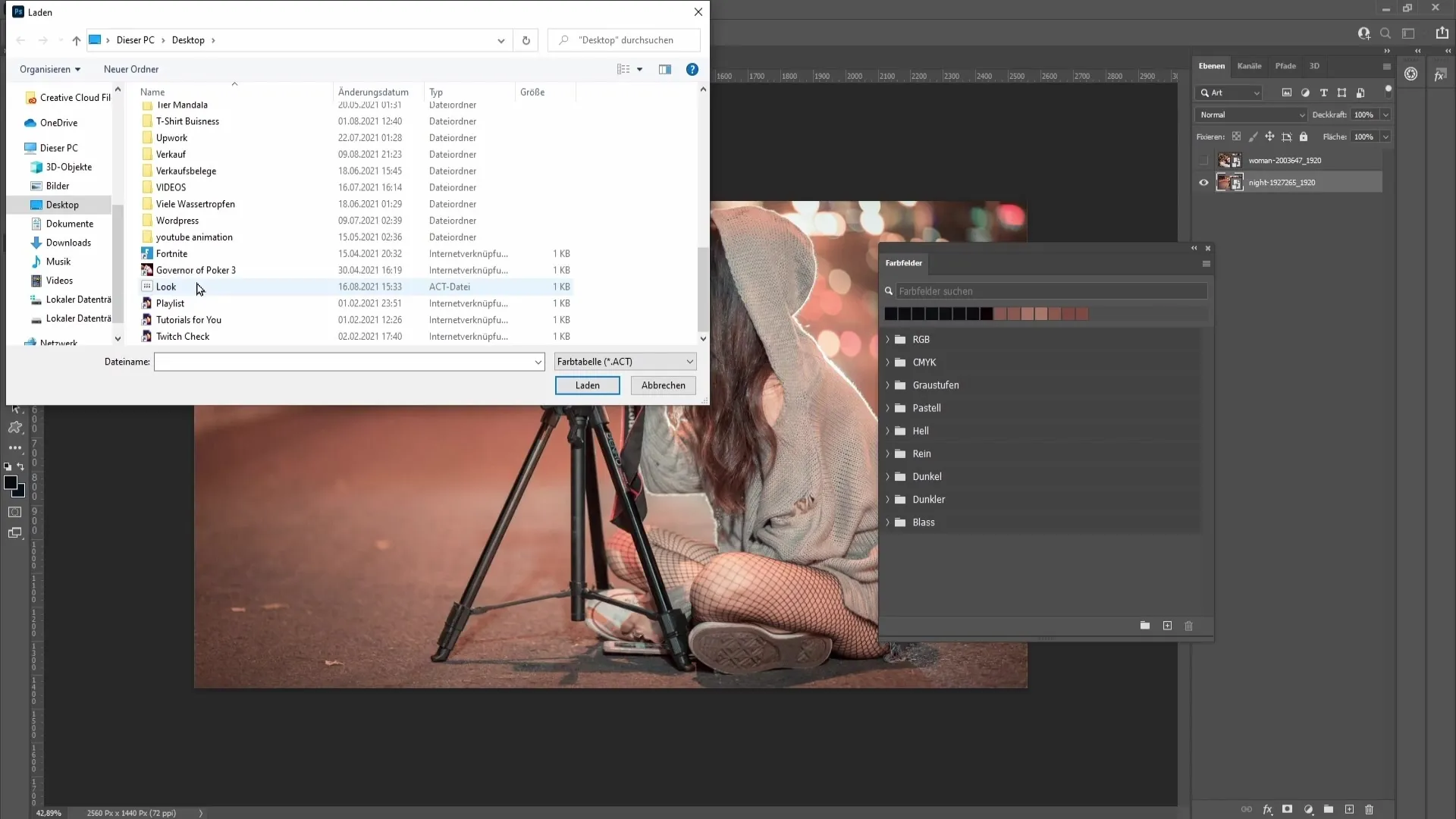
Once you have imported the colors, you can hide the image from which you copied the colors. Instead, activate the target image on which you want to apply the Color Grading.
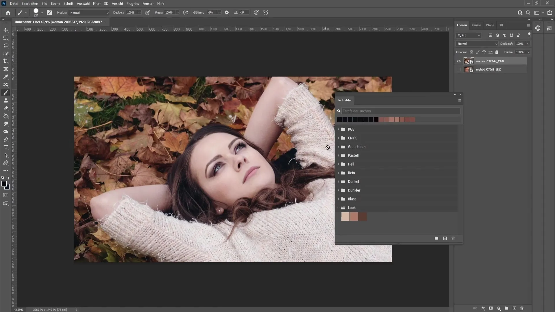
Now apply a new adjustment layer to the selected image. At the bottom of the Layers window, you will find an icon for the "Layer Mask". Click on it to open the corresponding window.
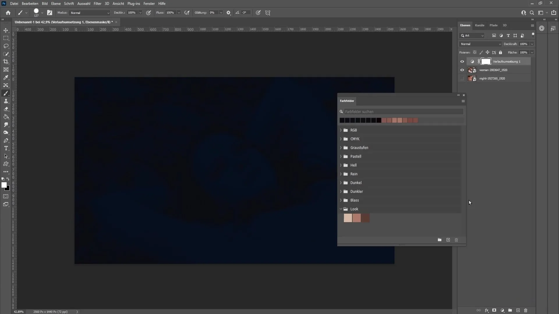
Here, double-click on the color boxes to set the imported color values. Start with the brightest color you saved earlier and note the brightness value.
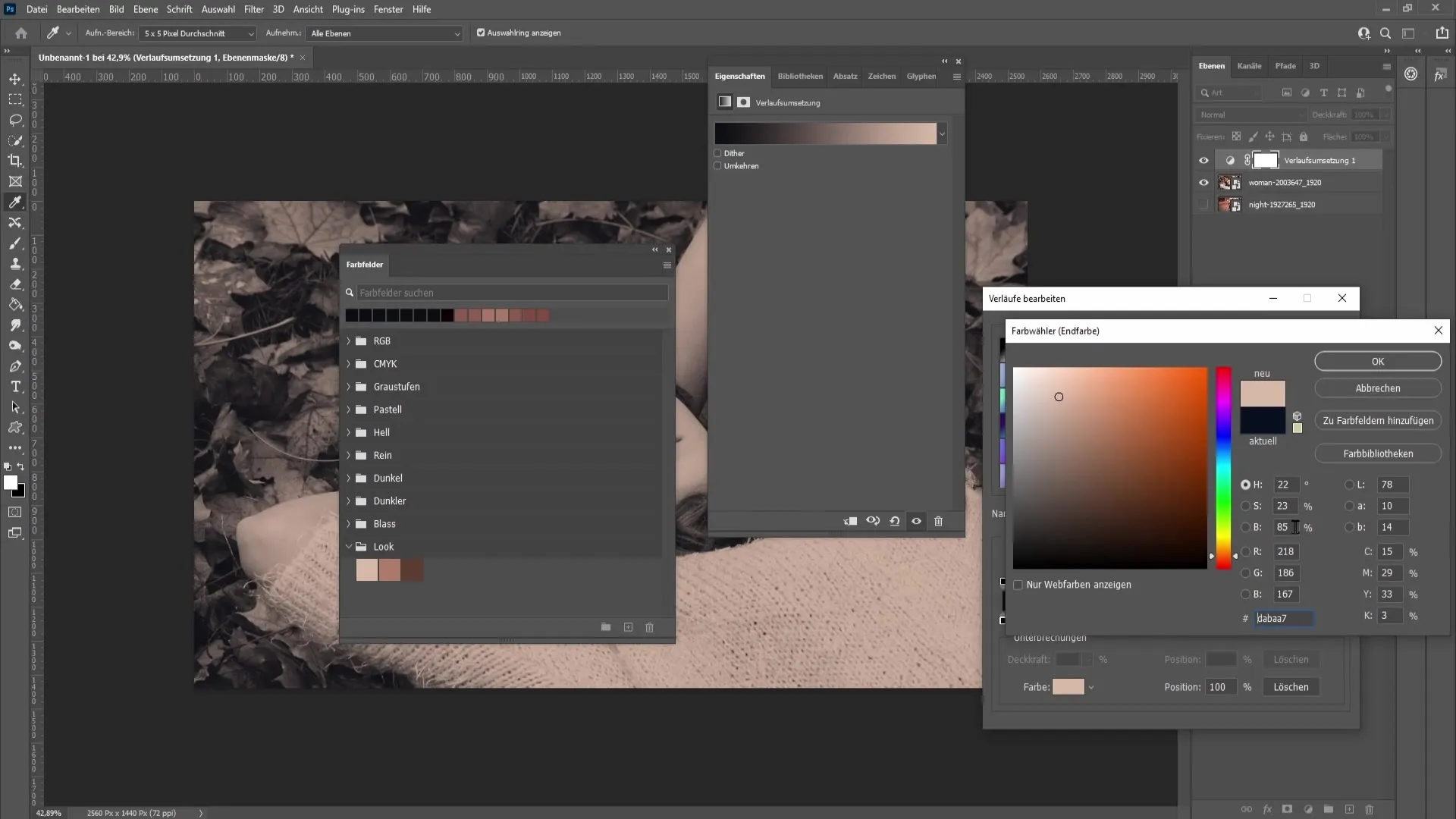
Now enter this color value into the corresponding boxes. Repeat this step for the middle and darkest colors you selected from the previous image.
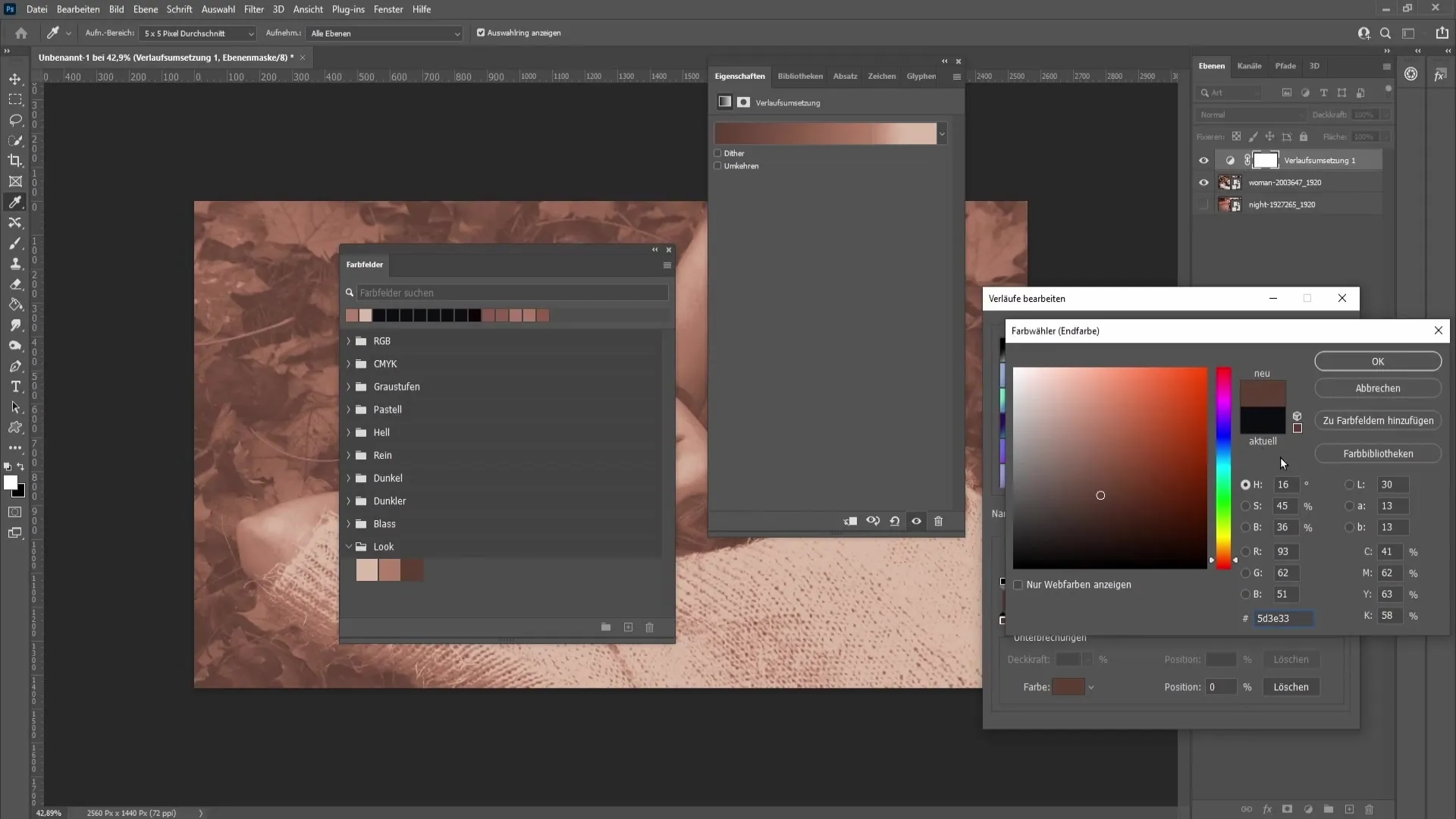
Now set the entire layer to "Soft Light". You will see that the look of the image has already been adjusted.
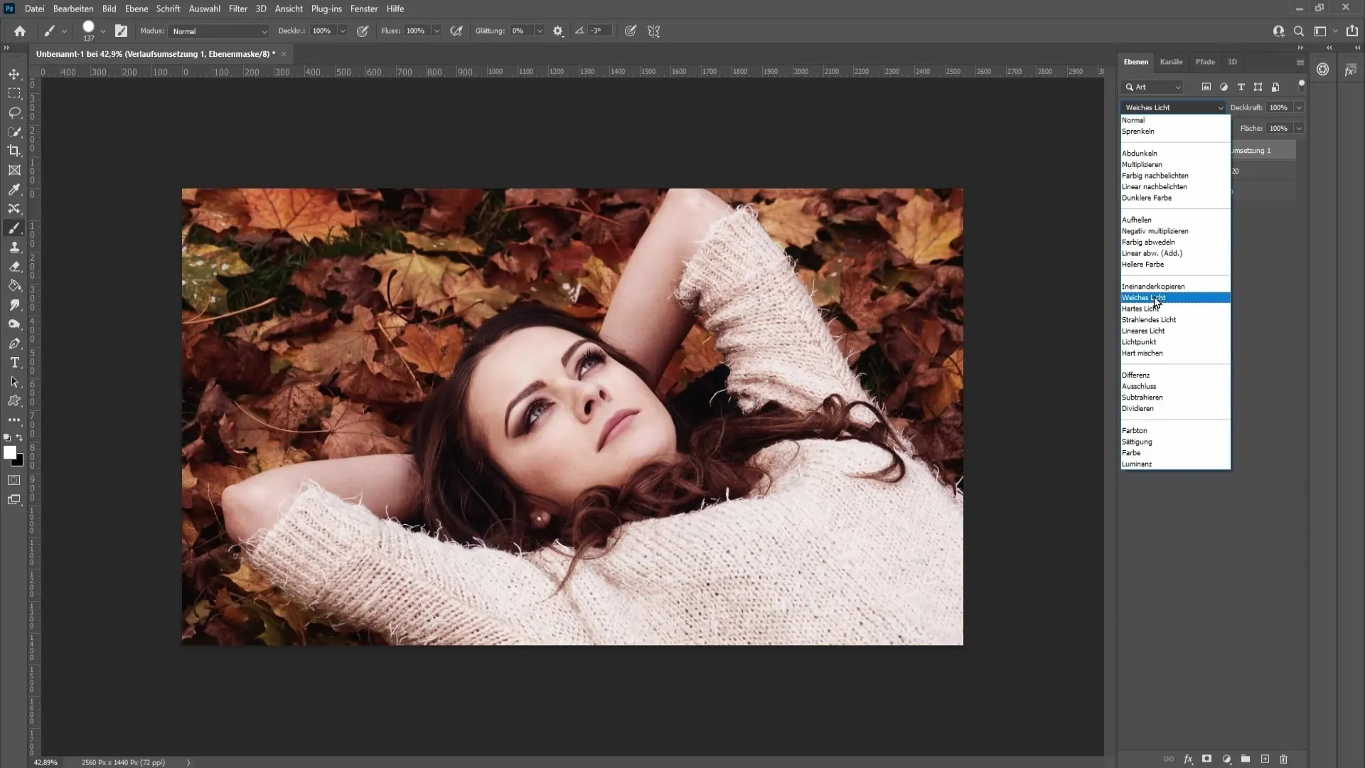
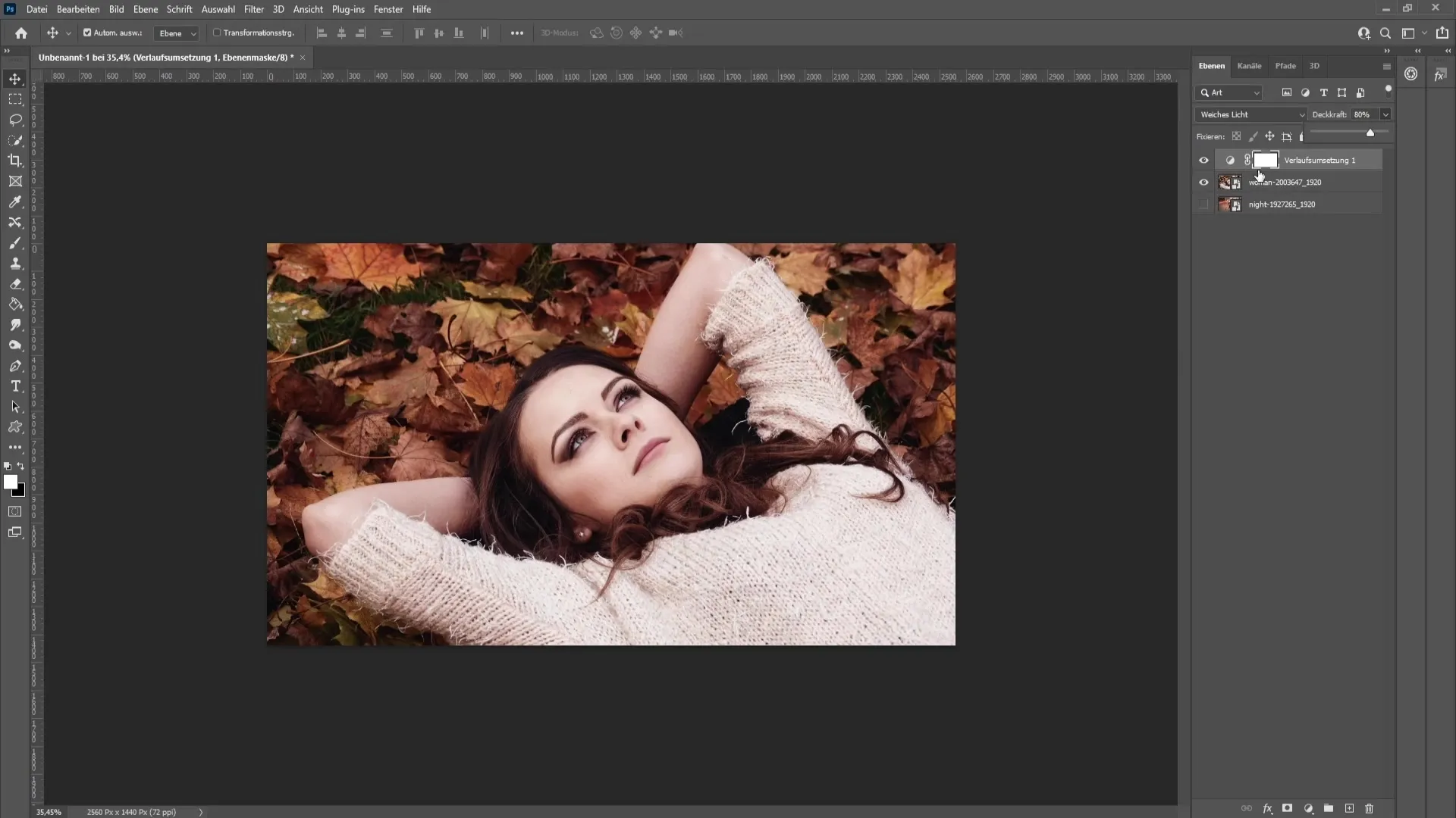
If the result appears too strong, you can reduce the opacity of the same layer to achieve a smoother effect. This helps to fine-tune the look perfectly.
To further optimize the image, you may want to take the darkest points, midtones, and brighter areas of the image from the original image. For this, create a new layer and select a brush with a hardness of 100%.
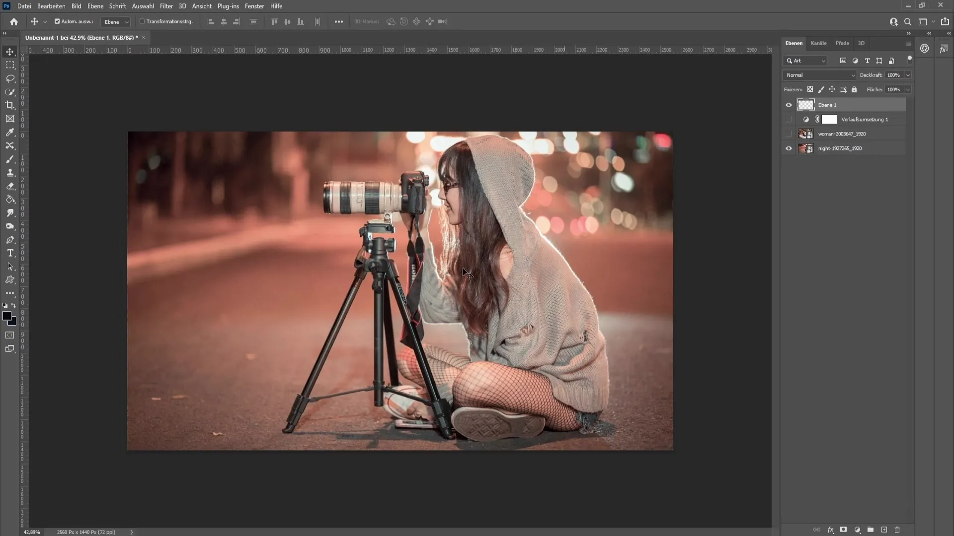
First, with the Alt key pressed, select the darkest point in the image and apply it with the brush. Then do the same for the brightest areas. Make sure the pixel averaging is set to "5x5" for accurate selection.
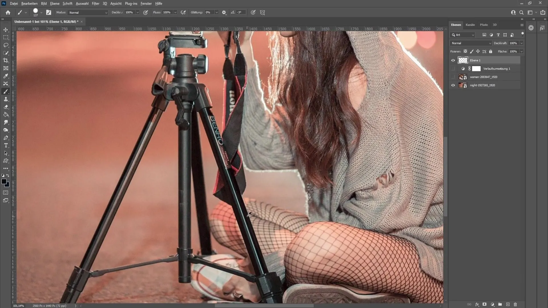
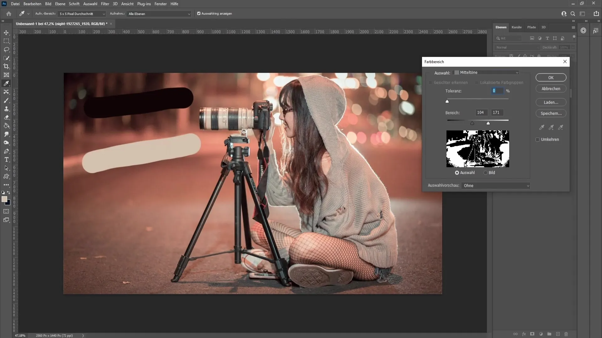
After applying the dark and light values, it's time to capture the midtones. Go to "Select" and then "Color Range". Here, select the midtones and set the tolerance to 0%.
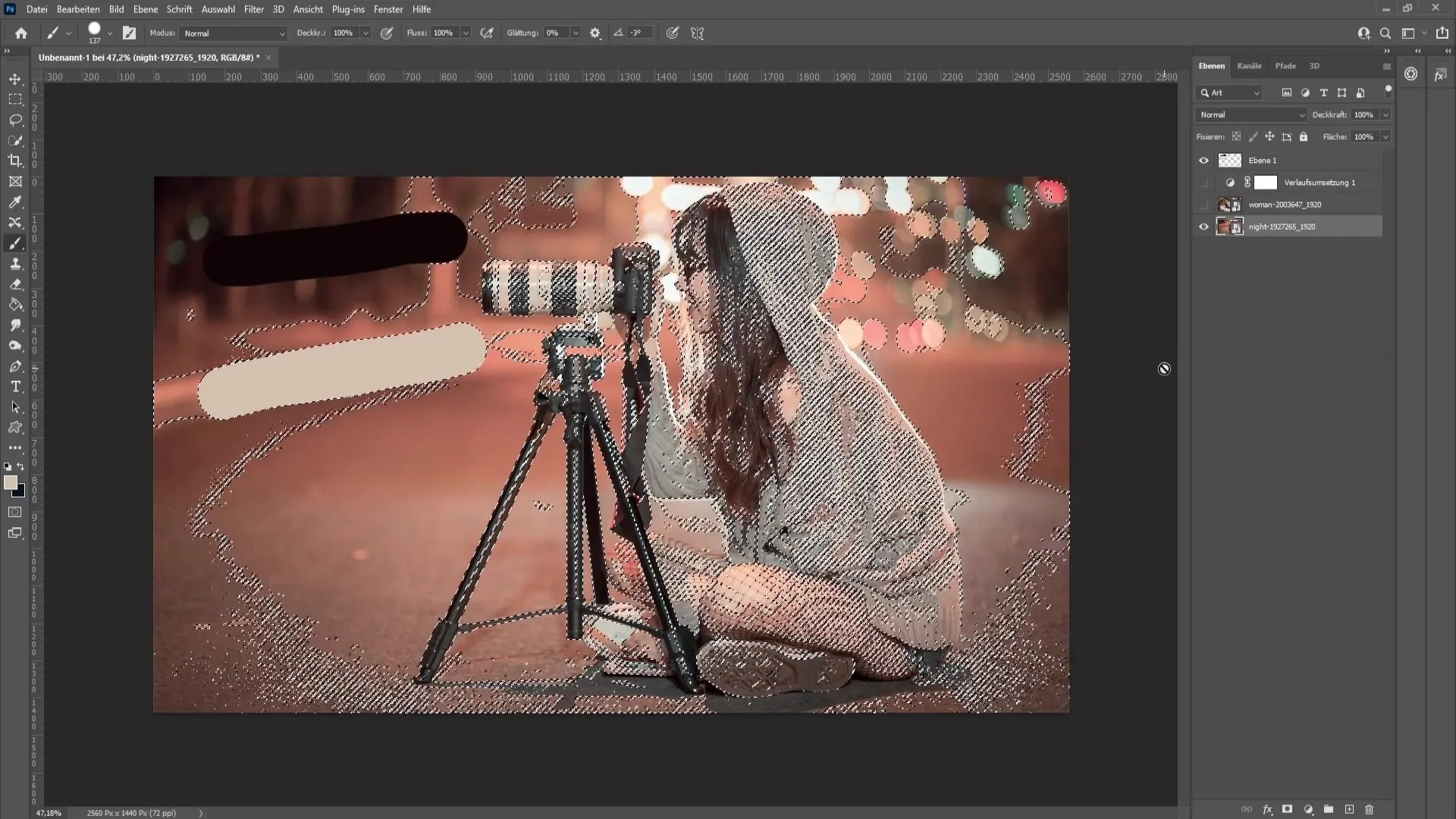
Copy this selection by pressing "Control + J" (or "Command + J" on Mac). This will create a new layer with only the midtones.
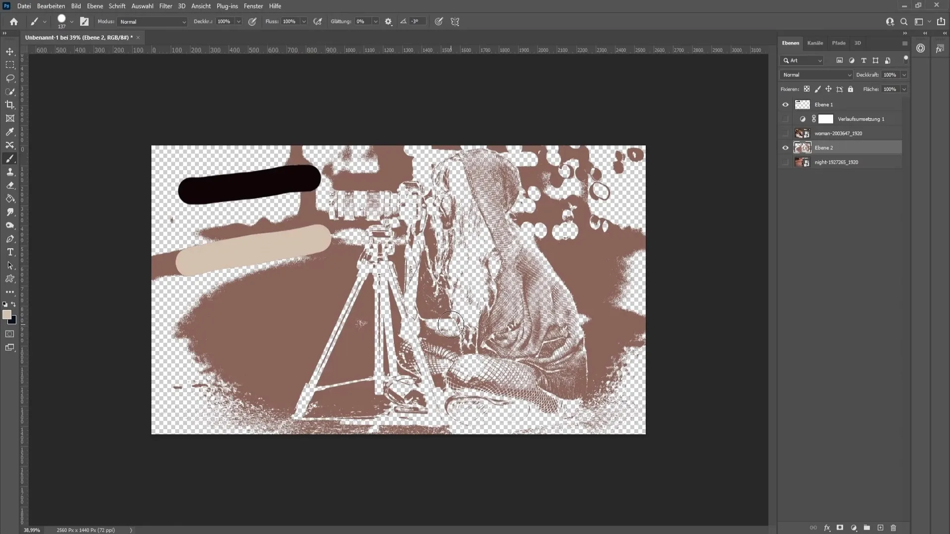
Now calculate the average of these midtones using the "Blur" filter and then "Average". This will give you a uniform hue that you can use for adjustments.
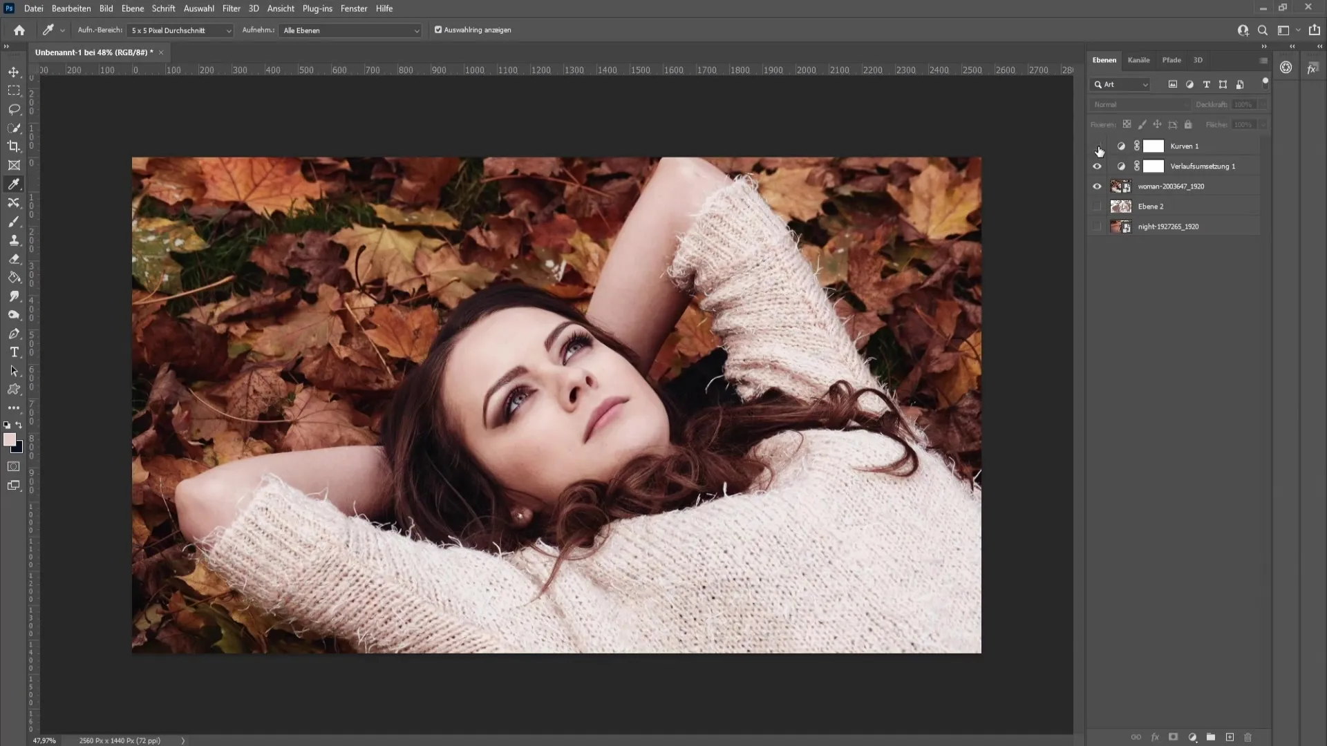
Apply a new curve adjustment layer to the top layer. Again, use the pipette to select the brightest and darkest areas for this adjustment.
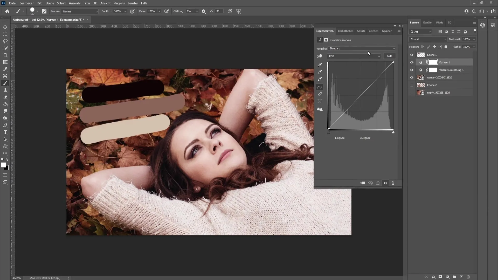
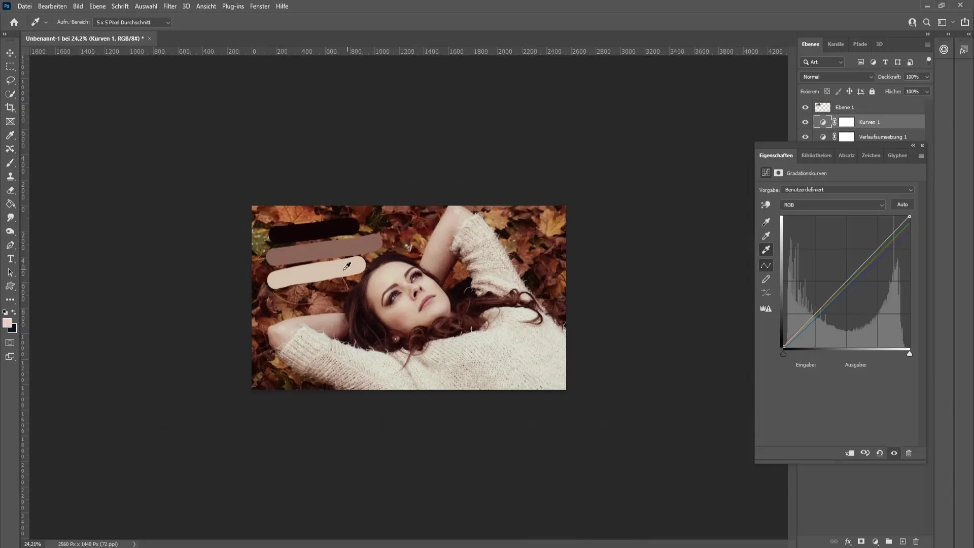
Make sure to also address the midtone adjustment in the image. Click continuously with the pipette to capture the desired hue and achieve the perfect result.
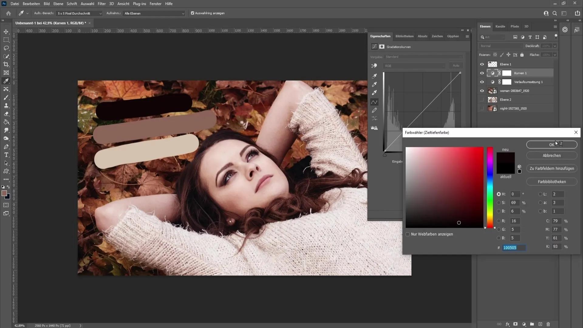
While making these adjustments, ensure that they are harmonious. It may be necessary to click multiple times in different areas to find the best look.
Once you have made all adjustments, you can reduce the opacity of the curves adjustment layer to ensure balance of all effects. It's ideal to stay around 80% opacity to achieve a natural look.
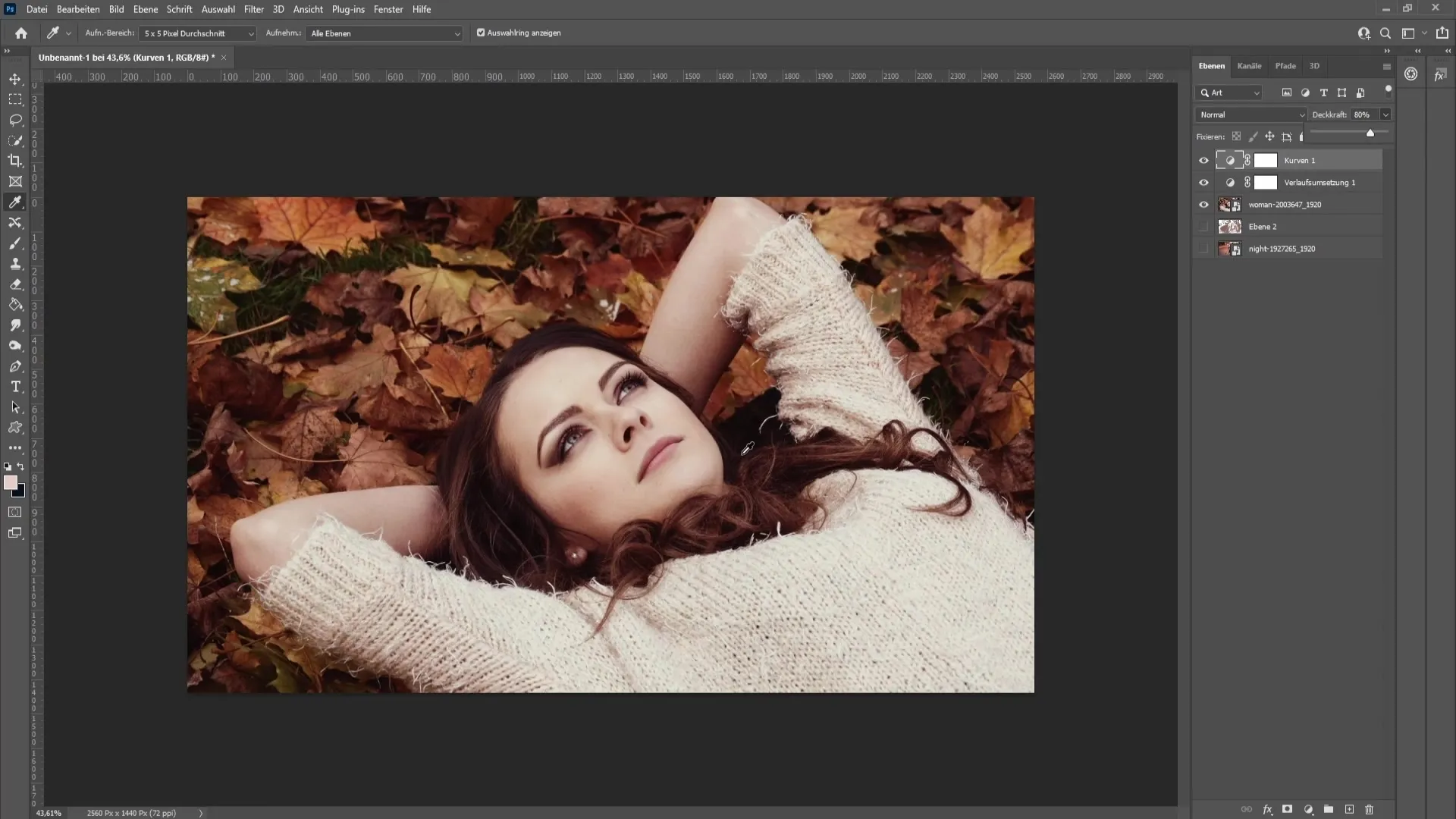
Now compare your image before and after editing. You will notice how much the look has changed and how the skin tones and overall color values appear much more harmonious.
Summary
In this tutorial, you have learned how to copy the color grade of an image and apply it to another image. By working correctly with color swatches and using curve adjustments, you can achieve impressive aesthetic results.
Frequently Asked Questions
What is Color Grading?Color Grading describes the process of adjusting the colors in an image to create a specific mood or look.
How do I choose the best colors for my Color Grading?It is advisable to pick colors from an image that already has the desired look. Use the pipette to determine precise values.
Can I apply this technique to videos?Yes, similar techniques can also be applied in video editing software to achieve consistent color tones.
Can I use multiple curve adjustments?Absolutely! You can apply multiple curve adjustments to balance different exposure settings and color nuances in your image.


