Note: The tutorial "Creating contours to prepare for the fire" is a text version of the accompanying video training by Marco Kolditz. The texts may therefore have a colloquial style.
Steps 1-10
Step 1
To prepare for your fire in the picture, you need somewhat coarser, i.e. thicker, clearer contours. You want to place the fire along the contours of the picture. This means along the face, the back of the hand, along the shoulder, etc.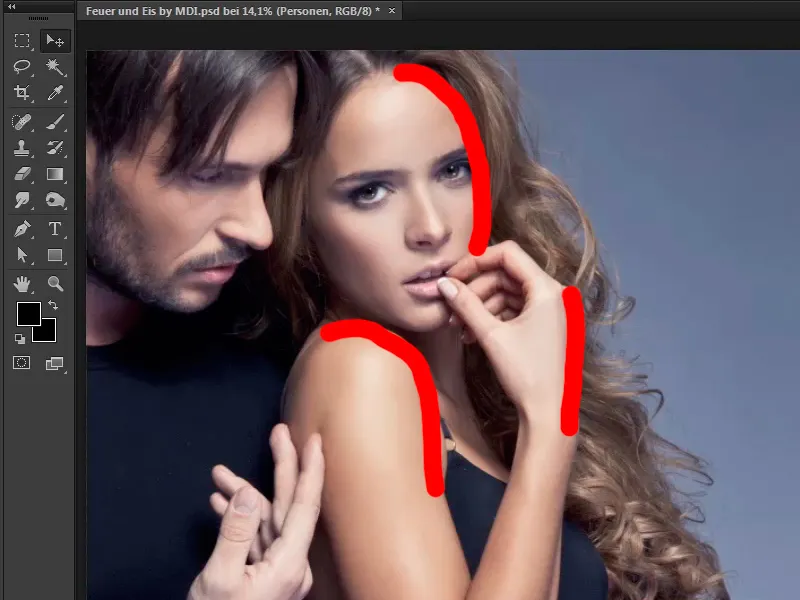
Step 2
How do you do this? First, you will duplicate the image layer, i.e. create a copy. To do this, press the Alt key and simply drag the layer on top of itself. In this case, drag the layer over itself.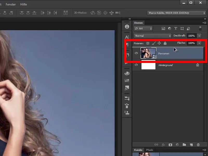
And now you have created a copy, as the name suggests.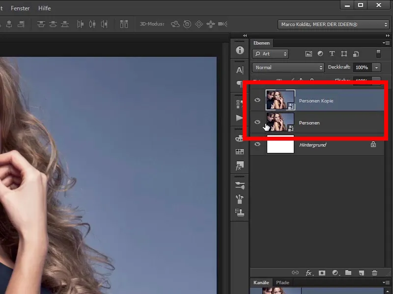
Step 3
Double-click on this layer name to rename the layer; ...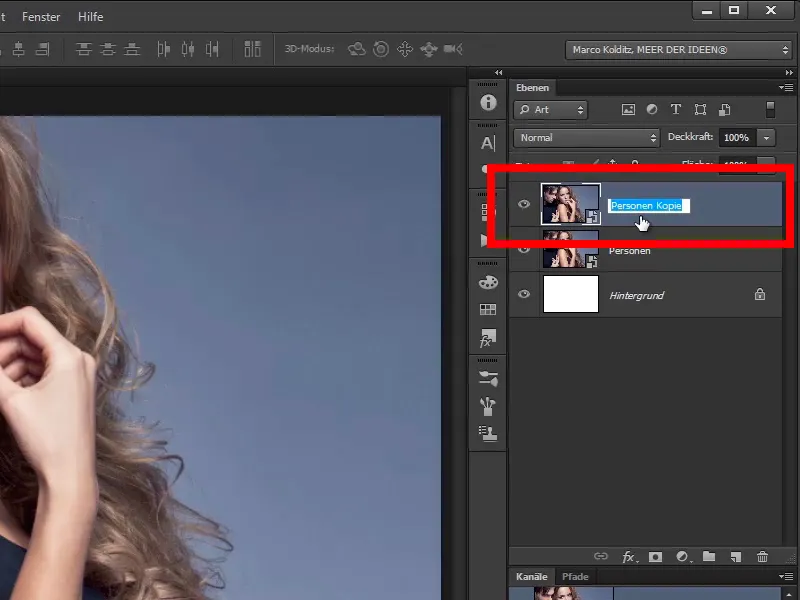
... in this case, for example, "Rough contours".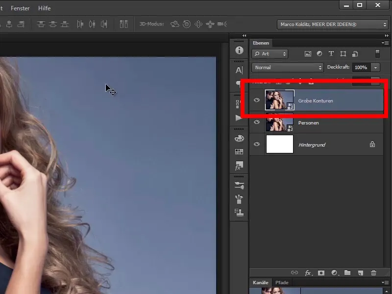
Step 4
And now apply a very exciting filter to it via Filter>Filter Gallery.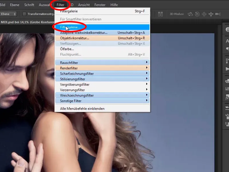
Step 5
This huge dialog box will then open, which will probably be a bit bigger for you. Below you can see that Photoshop is already calculating something.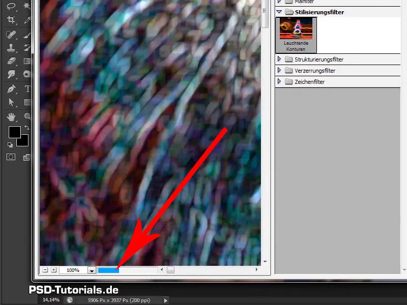
Step 6
Namely this preview, which of course tells you far less than it actually should. This is because you are in 100% zoom mode and can therefore see the image 1:1.
Step 7
With a few clicks on the minus symbol, you can now assess the image much better.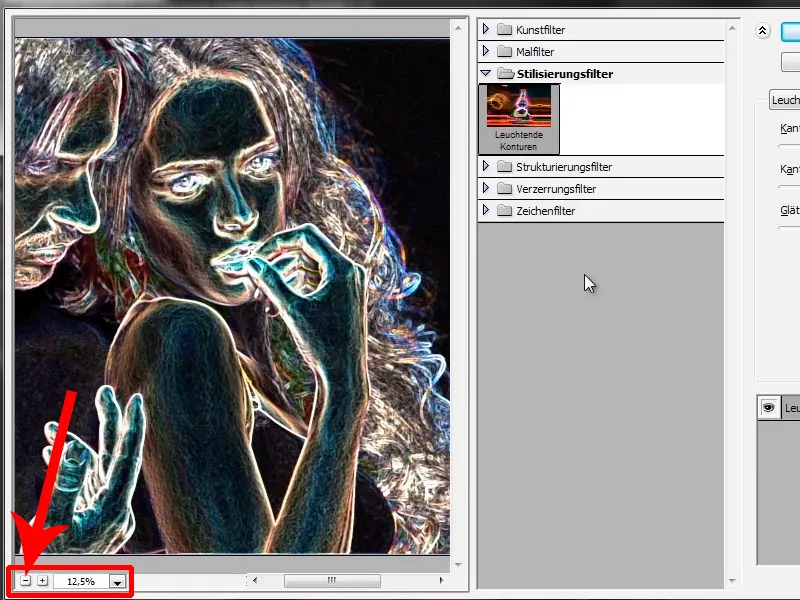
Step 8
Now, if you happen to be in the art filters or the painting filters...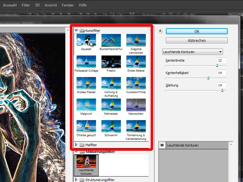
Step 9
... just have a look at the stylization filters and click on Luminous contours.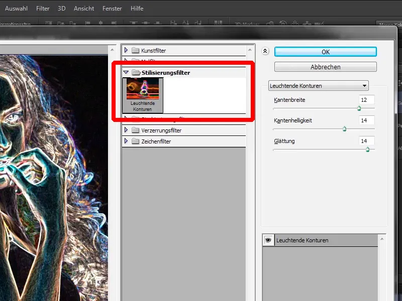
Step 10
And what does this filter do? As you can see, the filter recognizes hard edges in the image and draws glowing borders and edges along these contours.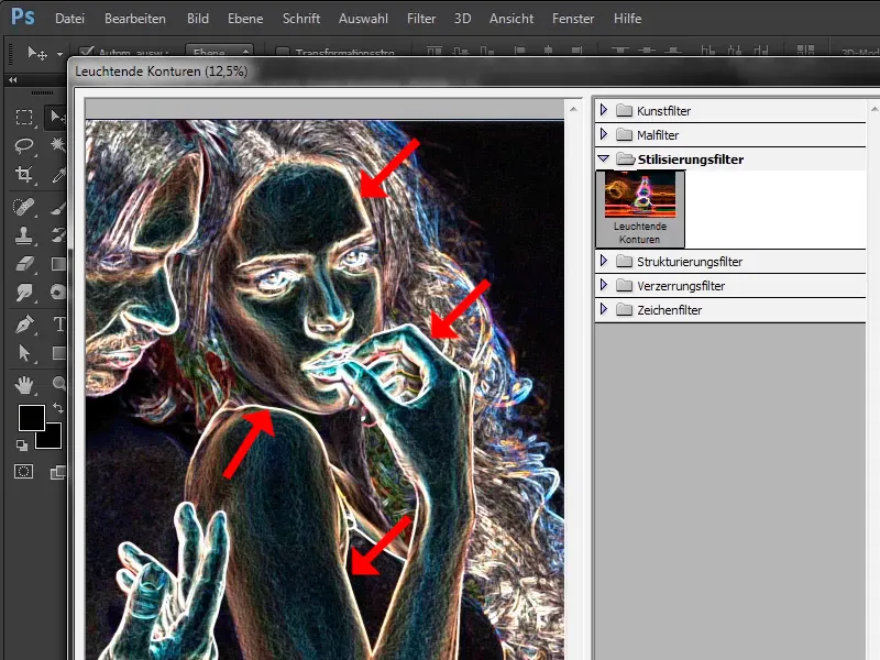
Keep at it: Steps 11-20
Step 11
You can now fine-tune these using the options on the right-hand side. It's actually pretty self-explanatory.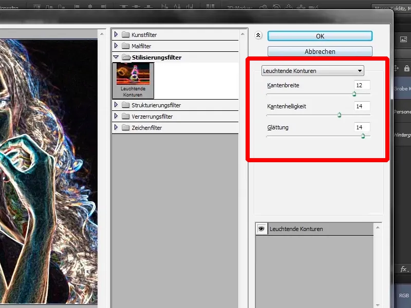
Step 12
You can set the edge width accordingly with the edge width; you can see this by dragging the slider all the way to the left, which makes the edges thinner.
- Edge width : 2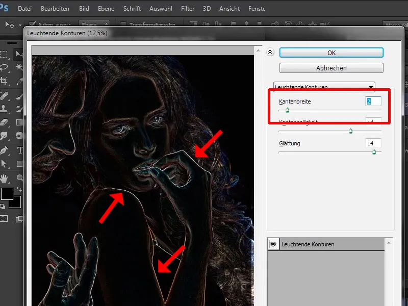
Step 13
This also creates a very exciting effect if you want to simulate a pencil drawing, for example. You can use this effect wonderfully, but in this case, drag the slider to the right to 12.
Incidentally, this is the value that Marco Kolditz uses here. All these values are already set correctly:
- Edge width: 12
- Edge brightness: 14
- Smoothing: 14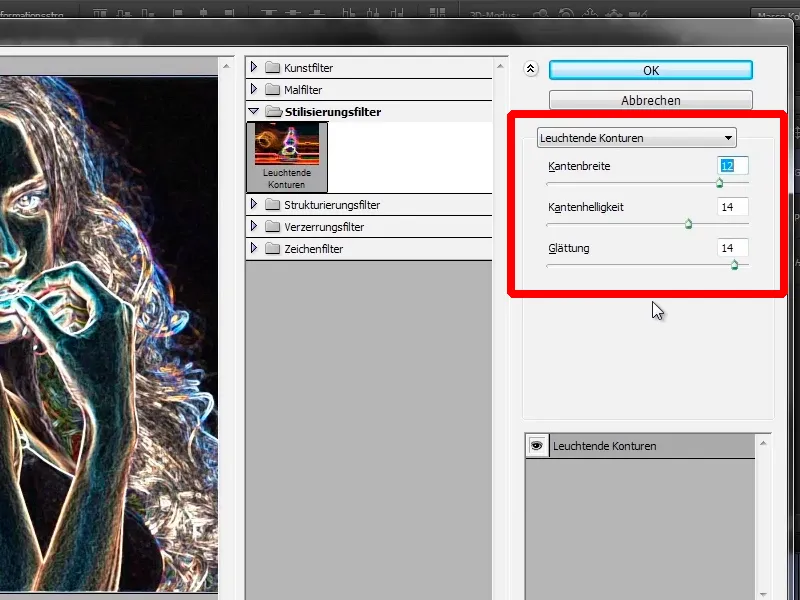
Step 14
Very important note: These values work for this image, i.e. for the image that is currently being edited here. If you want to use this effect on your own images at some point, try out these sliders individually. These values really only apply to this image. It always depends on how large the image is, i.e. what resolution it has, whether the desired subject is far away from the camera or very close to the camera, etc. So the values are always completely individual.
These are therefore always very individual values. In general, always get into the habit of not just blindly adopting any values from tutorials, but adapting them individually to your images.
Next step, edge brightness. If you drag the slider to the left, the image will probably become darker. Photoshop calculates it again, and as you can see, the image actually gets darker.
- Edge brightness: 2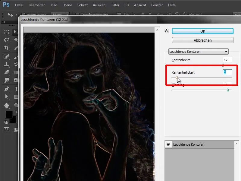
Step 15
Of course we can't do anything with it like this, so you drag it back to the right to 14.
- Edge brightness: 14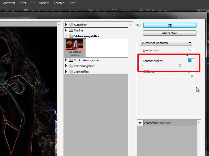
Step 16
The Smoothing area makes edges smoother again. This means that if you pull the slider all the way back to the left to 1, the contours in the image become very rough - including the skin, which then has these unsightly squares.
- Smoothing: 1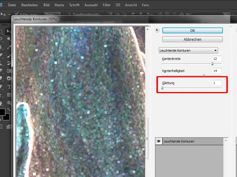
Step 17
This does relatively little for this image, so move it back to the right to 14 and it now looks relatively good.
- Edge width: 12
- Edge brightness: 14
- Smoothing: 14
Now confirm this filter with OK.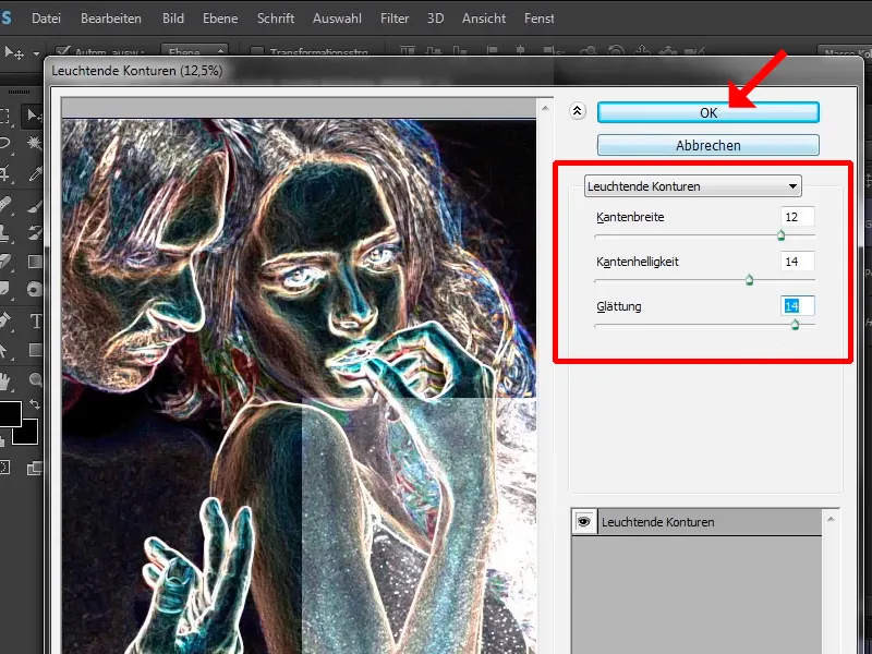
Step 18
You can see that this filter has been applied by Photoshop. You now have a layer with your "Rough contours" and you have a smart object.
Step 19
Every time you place an image in Photoshop via File>Place or drag it directly into Photoshop, it becomes a Smart Object.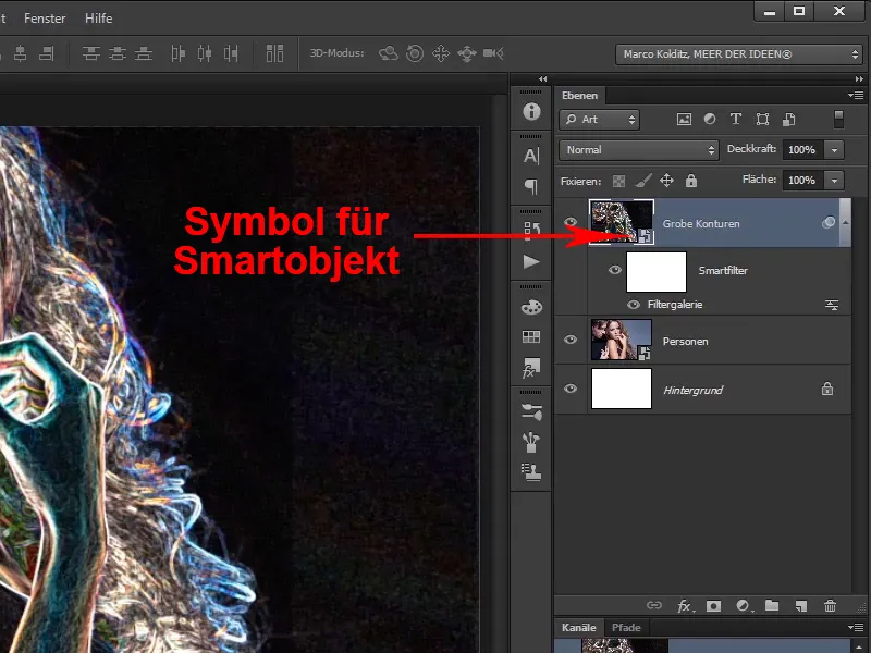
Step 20
This means that all filters that you apply to this smart object can be changed at any time afterwards. Here you can see the Filter Gallery filter, for example.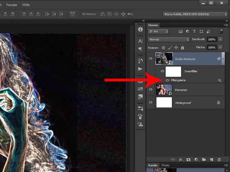
Continue with steps 21-30
Step 21
If you double-click on it, this dialog box opens again with the previously set values, which you can still change.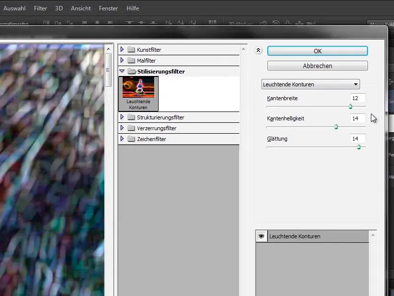
Step 22
In this case, it doesn't make much sense, because you are guaranteed not to change anything again and you will remove this layer in the course of this training anyway.
Now you will first convert this layer back into a normal layer, which is called a rasterized layer. This means that you remove the smart object functionalityfrom the layer by right-clicking on the "Rough contours" layer and selecting Rasterize layer.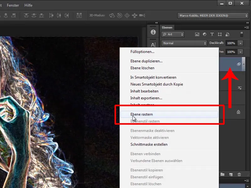
Step 23
You now have a normal pixel layer again, on which you could even draw.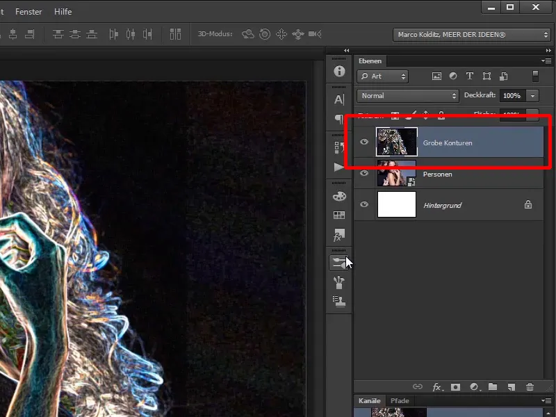
Step 24
Now use the key combination Ctrl+Shift+U to desaturate this layer. It was still relatively colorful and now you only need the light areas.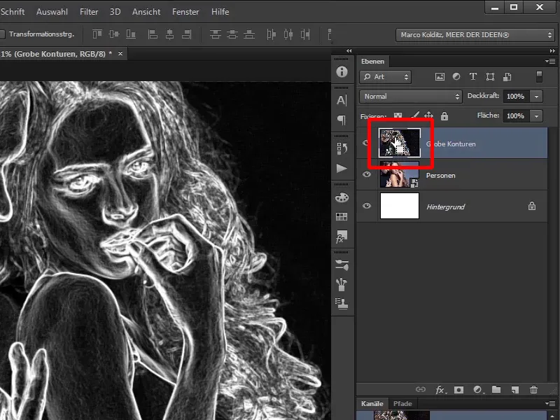
Step 25
Now take a black brush and deliberately work a little destructively, i.e. you will paint into the image with black paint and full opacity of 100%. The brush can be a little harder: Hardness 90%.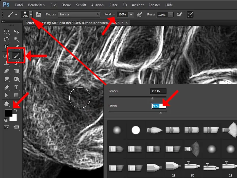
Step 26
By the way, if you hold down the Alt key and the right mouse button, you can reduce and enlarge the brush by moving the mouse from left to right and adjust the hardness of the brush by moving the mouse up and down.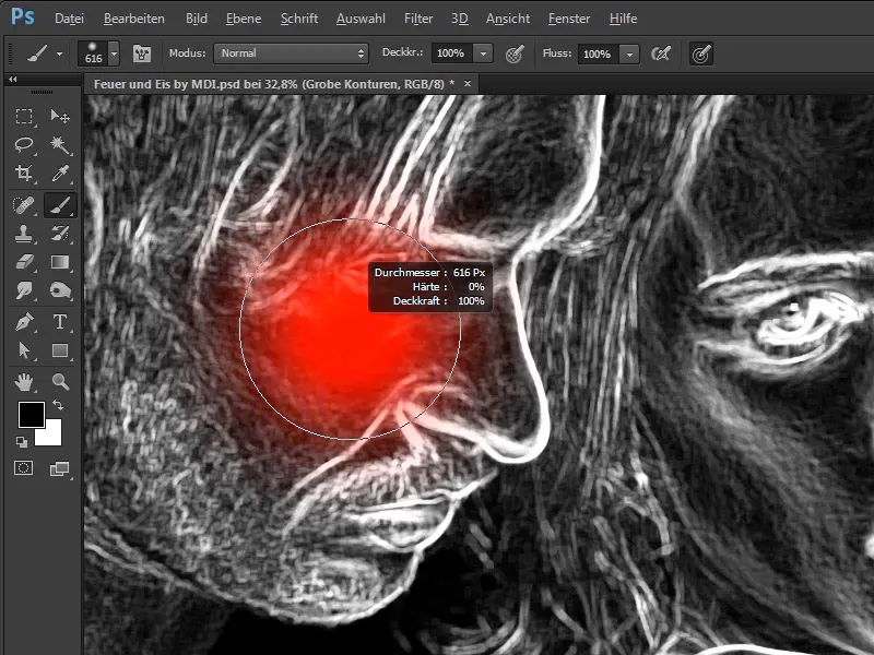
Step 27
Now simply press the right mouse button and set the brush size manually:
- Size: 164 Px
- Hardness: 74%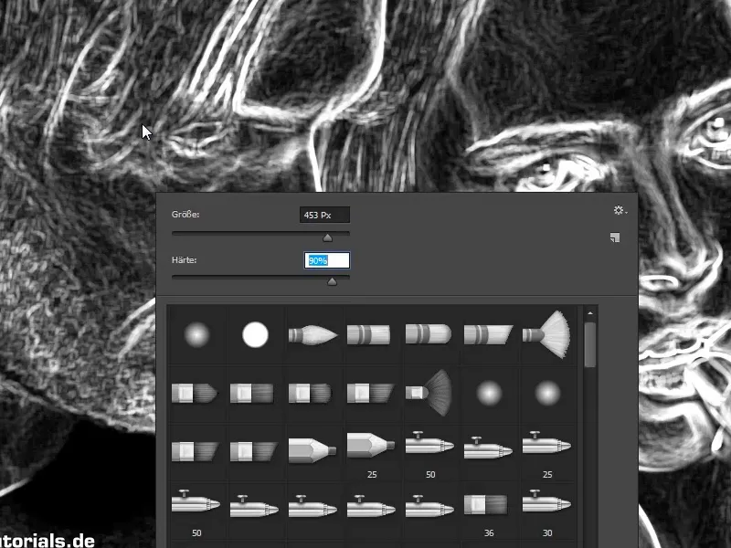
Step 28
You will now brush the man out of the picture, because we don't need him in this case. This will leave you with just the woman later, as you will need her contours.
Pay attention at this point: You have to look at what is hair from the man and what is hair from the woman.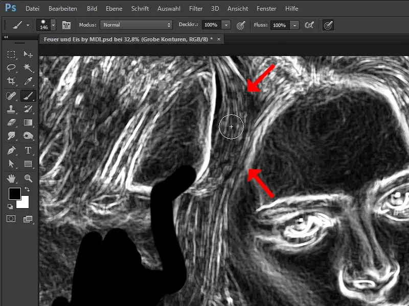
Step 29
This is clearly the man's hair, so you can paint over it.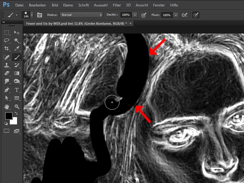
Step 30
You don't have to work with too much pixel precision, because the aim is to roughly retouch out the man or to create a so-called luminance selection in this way, but this will come as soon as you have removed the man.
Zoom into the image a little here too. This edge of the shoulder is of course important, the fingers must also be removed.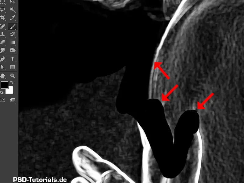
Just keep working: Steps 31-40
Step 31
By the way, Marco works with a graphics tablet, i.e. with a pen and a tablet that is pressure-sensitive. This means that if he presses less, the brushstrokes are narrower; if he presses harder, the brushstrokes are thicker. Of course, it is much more comfortable to work with this than with the mouse alone.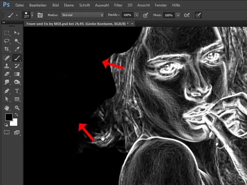
Step 32
On the right-hand side you can see a few more little pixels: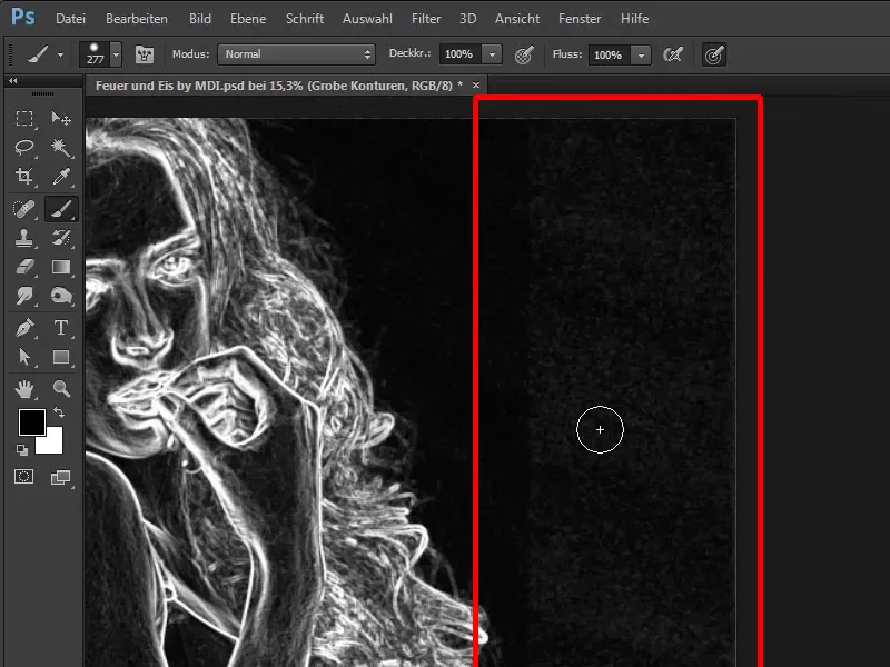
Step 33
Here you can see that the original photo has also been manipulated a little. Marco shows you this very briefly, as a little digression. You create a tone value correction.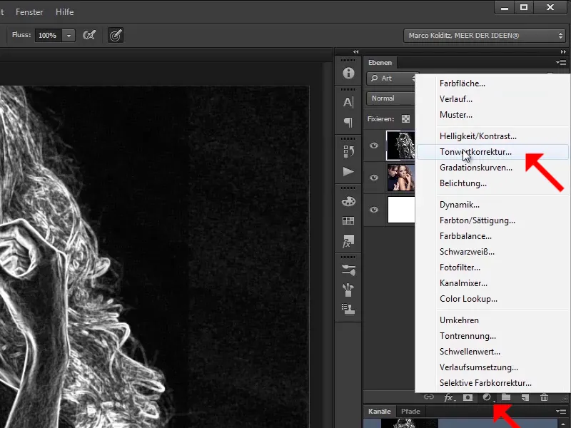
Step 34
He now simply makes everything brighter and you can see that the original image was probably tampered with.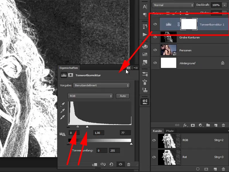
Perhaps something from the studio was visible here or the image was simply too small.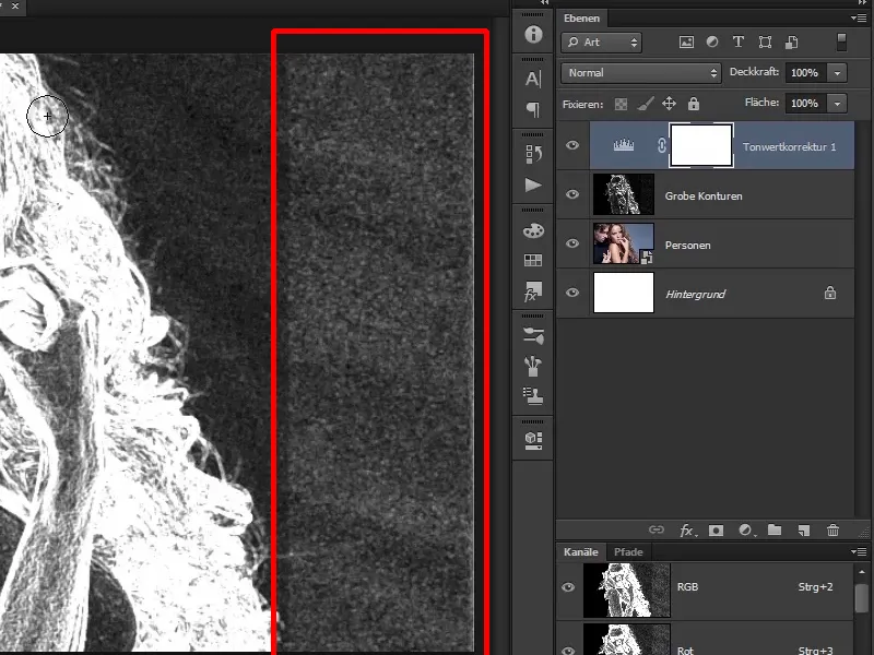
Step 35
For example, the photographer has taken the area here and dragged it to the right, thus extending the image a little.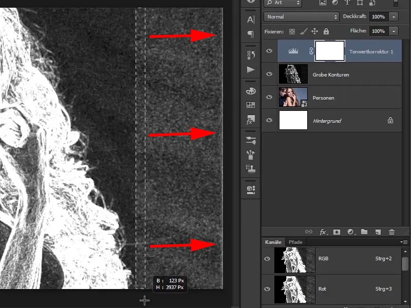
Step 36
In any case, you can see that "help" was given here. You delete the adjustment layer again by dragging the layer with the tonal correction onto the garbage can symbol.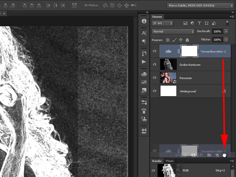
Step 37
You will now also paint over this area with black, very roughly, but not touching the hair. It looks quite good like this.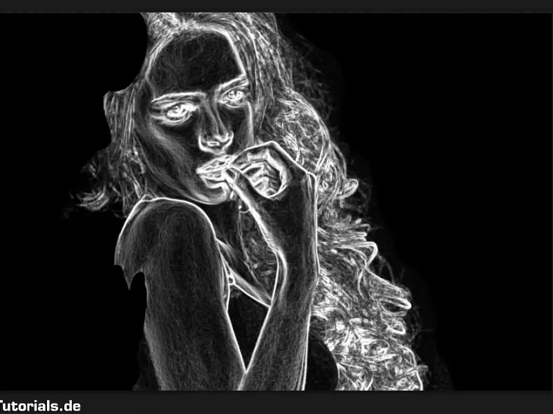
Step 38
Now duplicate this layer once again - hold down the Alt key and drag this layer over itself and rename it to "Fine structures".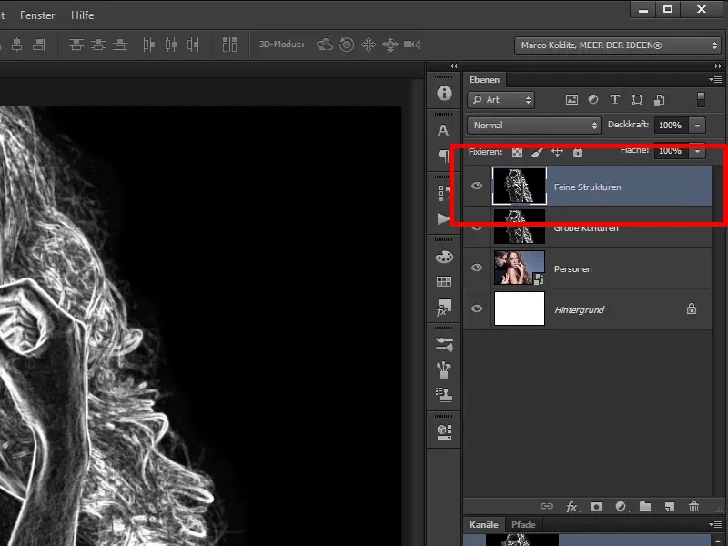
Step 39
What are "fine structures"? Well, on the one hand, you want the "Coarse contours", which are the light lines.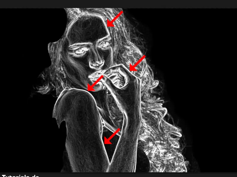
Step 40
On the other hand, you also want to keep the "fine structures", which are the structures on the skin that you can use again later.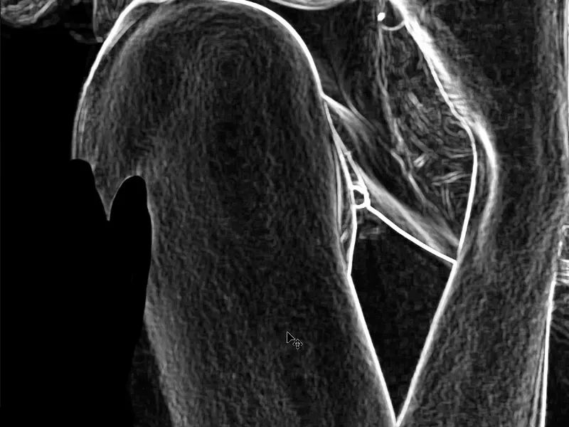
The following are steps 41-50
Step 41
In other words, you will hide this "fine structures" layer again briefly, and now you will continue working on this "rough contours" layer. This means that you will remove all these fine structures. You have them on the "Fine structures" layer.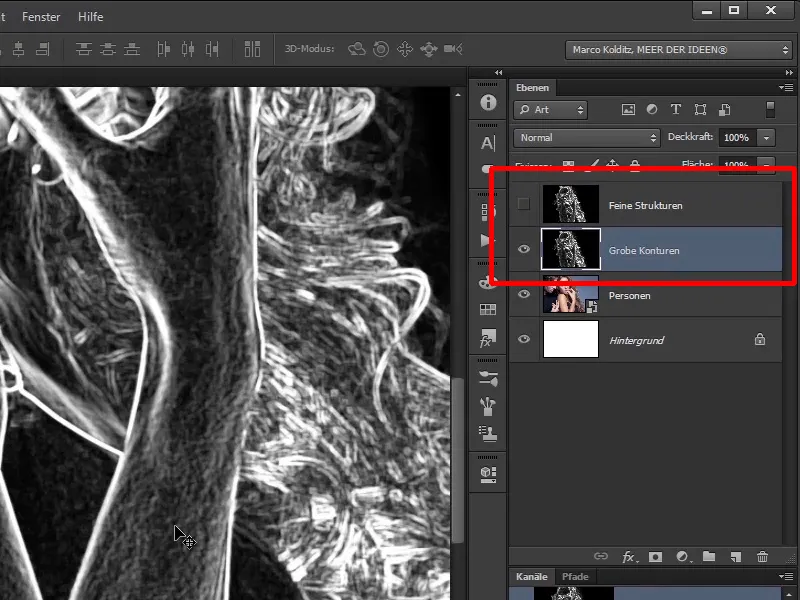
Step 42
How can you do this? You can either use the black brush again, but you run the risk of painting over the light contours, or you can go to the "Coarse contours" layer and select the post-exposure tool. This is that tool.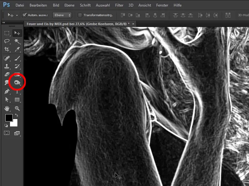
Step 43
You may see the Dodge tool or the Sponge tool instead of the Highlights tool. Then simply click on the symbol and hold the mouse button down a little and these other tools will appear and you can select the post-processing tool.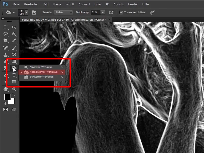
Step 44
Very important: Select the depths at the top of the area and an exposure of 71%.
- Range: Depths
- Exposure: 71%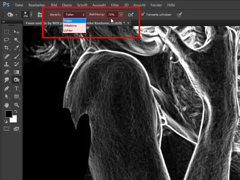
Step 45
The Depths area basically determines what you want to darken. In this case, you want to darken the already dark areas in the image even further. If you were to go to Highlights, you would edit the white lines.
In this case, depth is sufficient and now you simply paint over the skin. As you can see, we can even paint over the white contours, but we should still avoid doing this. But in general - if you ever get into this area, don't darken it too - the contours will remain, unlike if you use the brush as normal.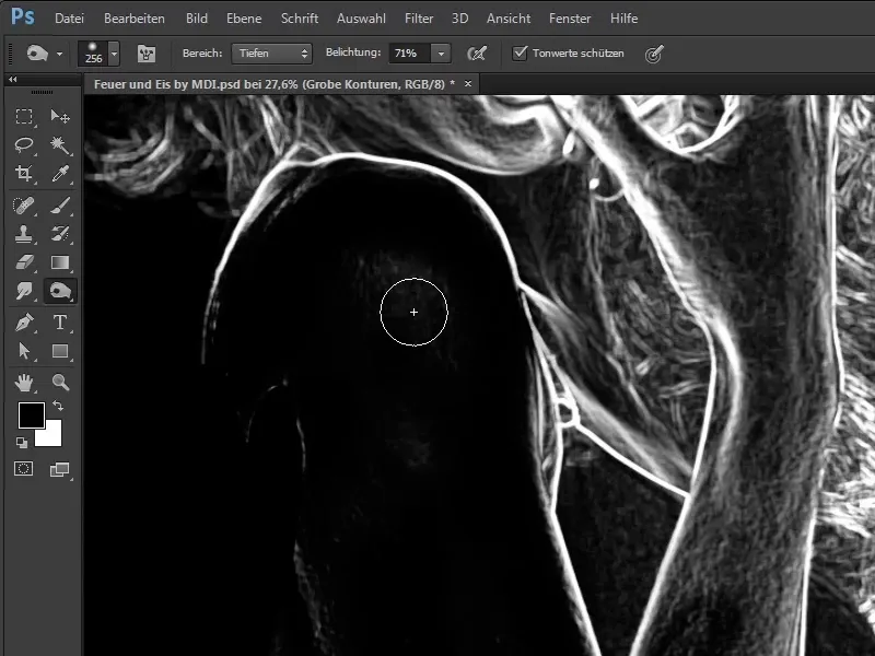
Step 46
Use the pencil more often, because if you only click and drag down once, the area will not darken completely. This means you have to click and drag on the same spot several times. This way you can now remove these fine structures. You can drag a little more roughly by hand and what remains are these light contours.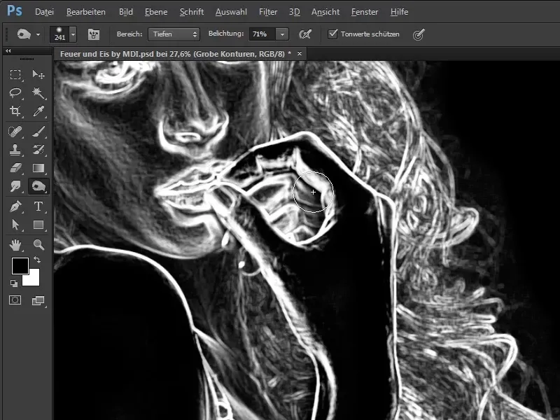
Step 47
The same goes for the lips and face. The cheek area towards the nose and the chin area should be preserved a little, who knows, maybe you want to add a little fire there. Also the bridge of the nose and the entire forehead. Zoom out of the picture a little and you will see that the neck area can also be freed from the fine structures. Be a little more careful with the hair and only paint over it once, otherwise the entire hair will disappear and of course you don't want that. This way you only have the rough contours.
Step 48
And if you now hide the "rough contours" layer and show the fine structures layer, you will see that you still have the fine structure in the skin and you can draw it back into the picture later.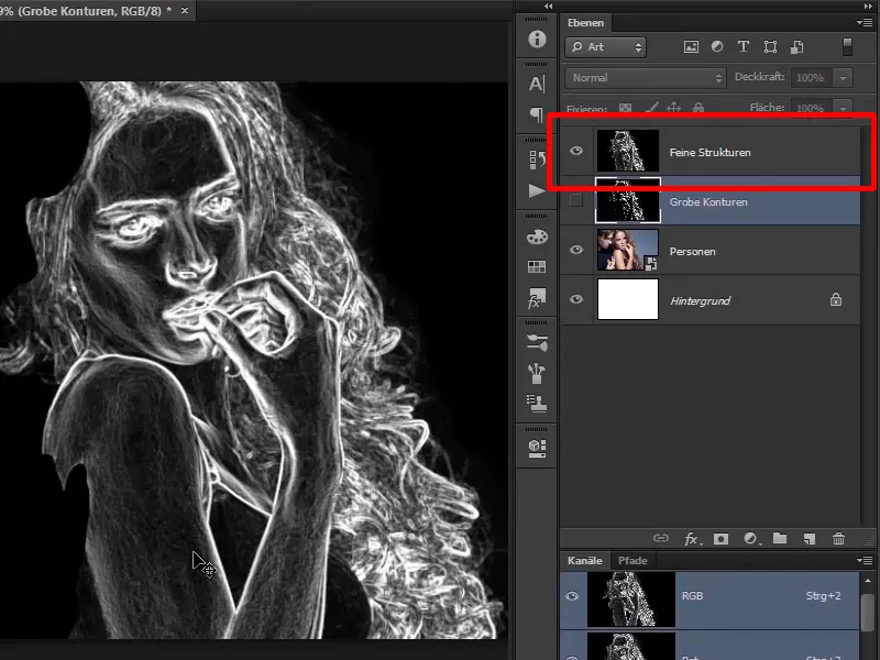
Step 49
What's important now is the "Rough contours" layer, which you can use to wipe the fire into the image. Before you do this, drag the light areas onto a separate layer so that you have completely removed the black.
This is very easy to do: Hold down the Ctrl key and click on the RGB channel of the "Rough contours" layer.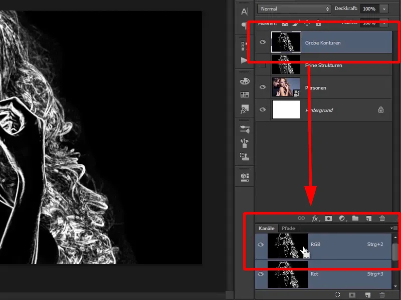
Step 50
This channel palette is displayed via Window>Channels.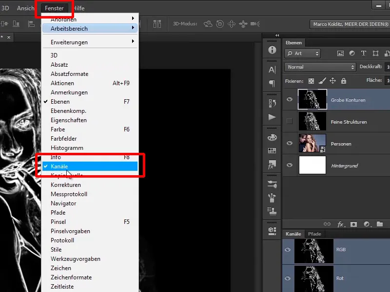
Have fun with steps 51-60
Step 51
As already mentioned, select the "Rough contours" layer, then click on the RGB channel while holding down the Ctrl key to create a so-called luminance selection.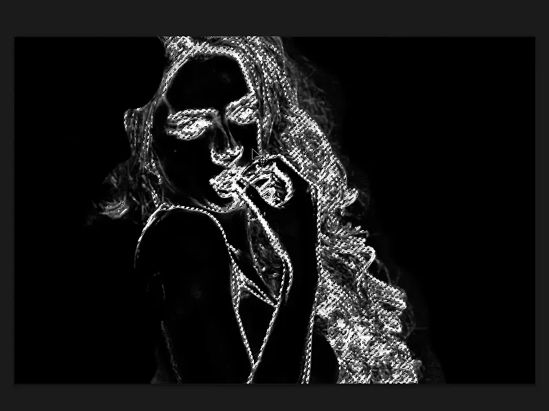
Step 52
A luminance selection includes all bright areas in the image down to the midtones and the closer you get to the midtones, the more transparent this selection becomes. Then click on a new layer.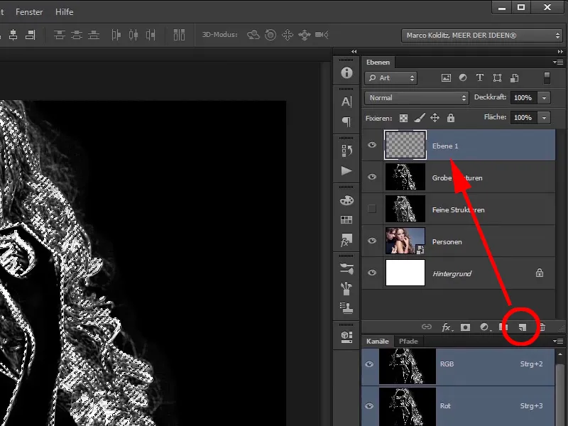
Step 53
Simply fill this layer with white, in this case you can press Ctrl+Backspace. You have now filled the layer with white.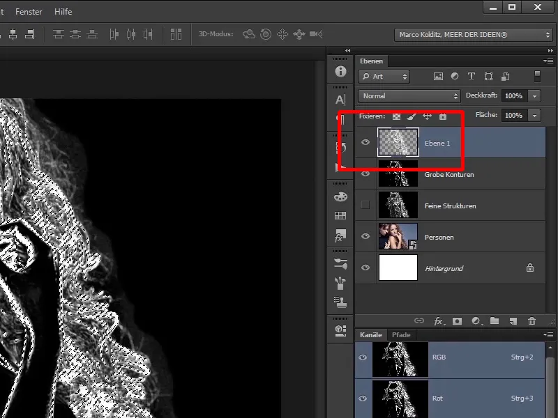
Step 54
Ctrl+Backspace always fills with the background color and Alt+Backspace with the foreground color - in this case black.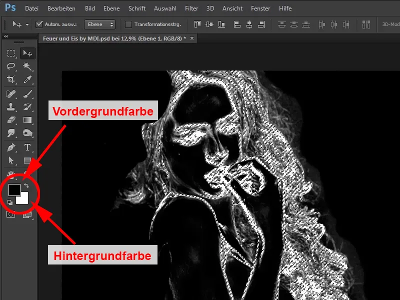
Step 55
If you undo this again, you can also simply create the new layer and then go to Edit>Fill Area.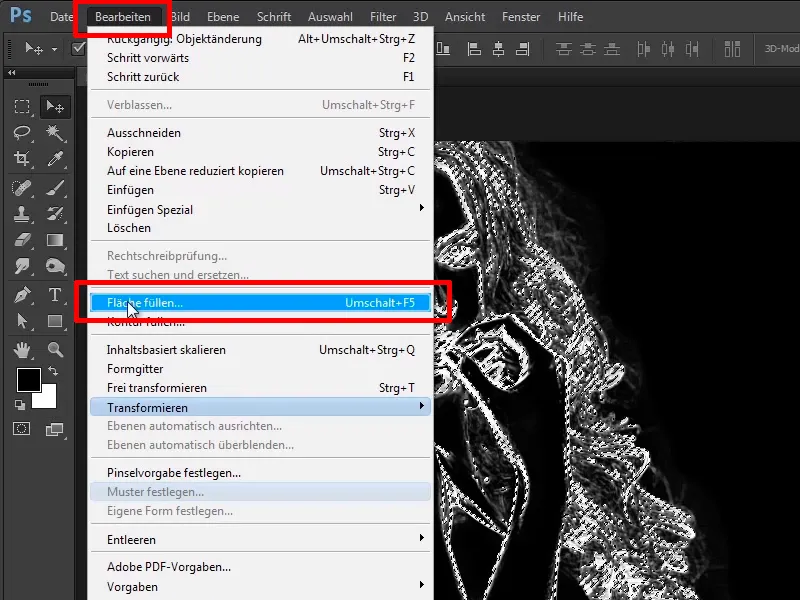
Step 56
And then select white, for example, and confirm with OK.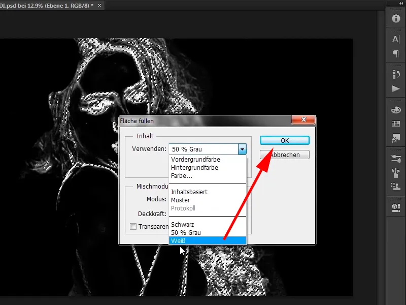
Step 57
However, Marco has gotten used to the keyboard shortcuts and in his eyes this is much faster. Now press Ctrl+D again to cancel this selection. If you now hide all layers except for layer 1, you will see that you really only have the light areas and that is what you actually wanted to achieve.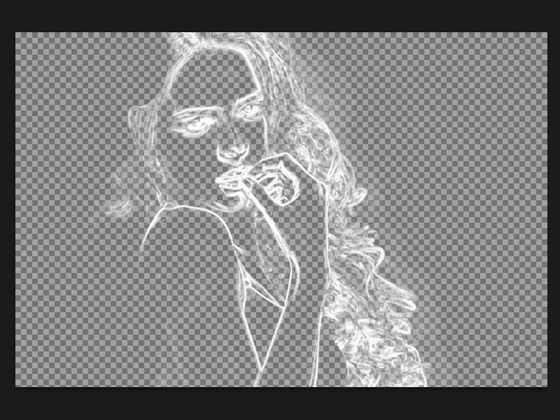
Step 58
You also hide this again, because you now do the same again with the "Fine structures" layer, i.e. you click on "Fine structures" and click on the RGB channel again while holding down the Ctrl key.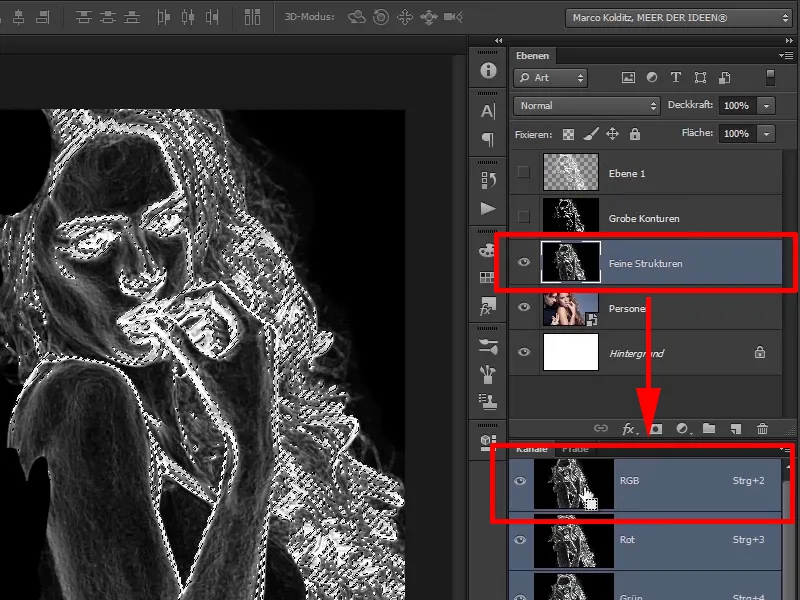
Step 59
Create a new layer...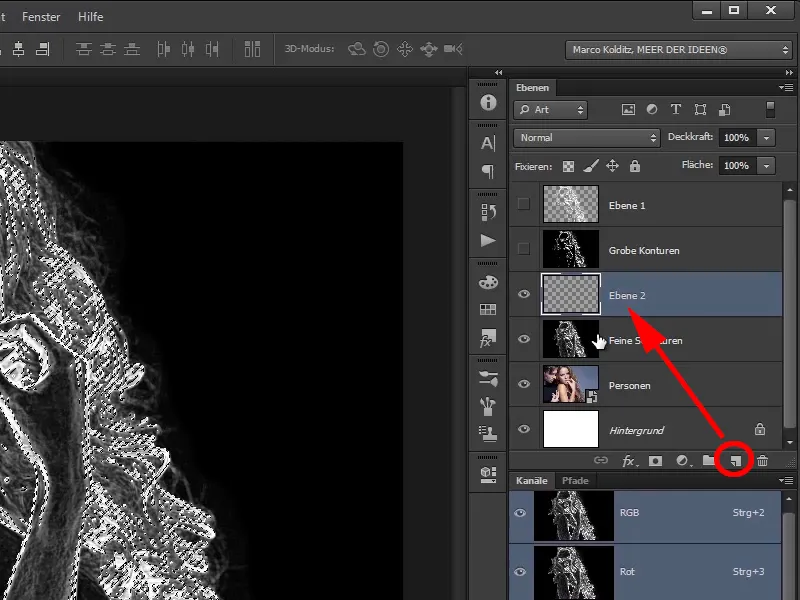
... and fill it with the background color white using Ctrl+Backspace.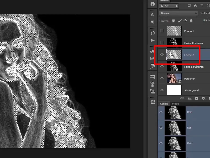
Step 60
Now drag "Layer 2" to the top and combine the two layers "Rough contours" and "Fine structures" into a group as a backup. You can do this by selecting these two layers: You click on the top layer, hold down the Ctrl key, then click on the bottom layer and drag both onto the folder icon.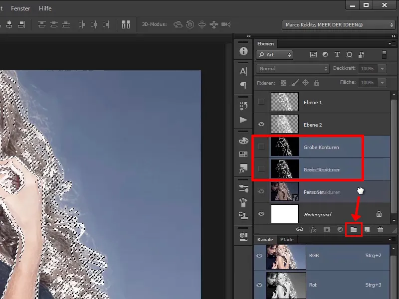
The last steps
Step 61
The group has now been created. As before, you can double-click on the name to rename the folder to "Backup Luminance Layers", for example. You can also do the same by selecting the two layers and pressing Ctrl+G.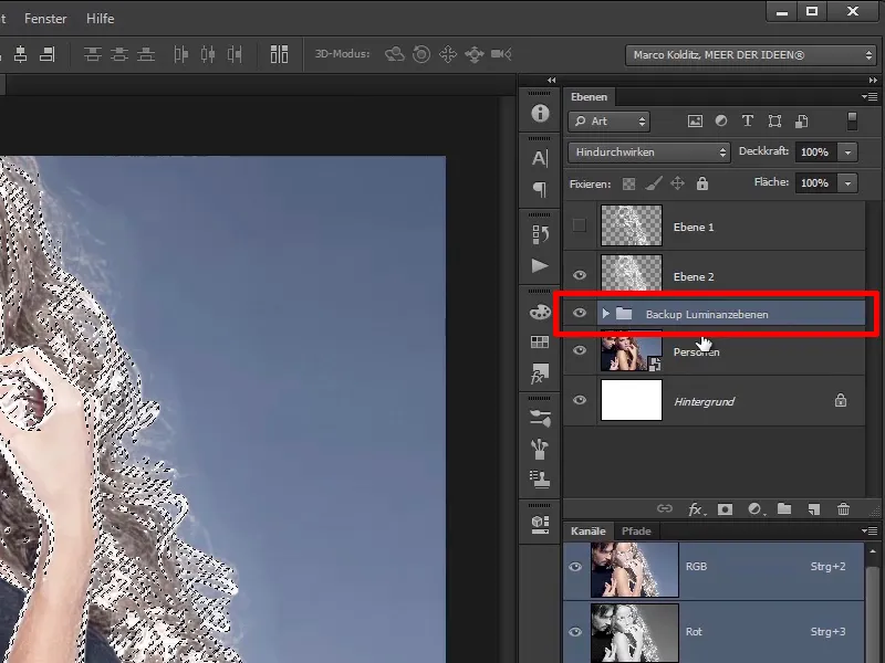
Step 62
Rename the two upper files to "Rough contours" and "Fine structures."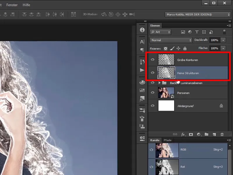
Step 63
Between the "Rough contours" and "Fine textures" layers and the "Fine textures. "People" image, create a colored area layer. Click on the "Backup luminosity layers" folder layer and select the colored area using the Create new fill or adjustment layer icon.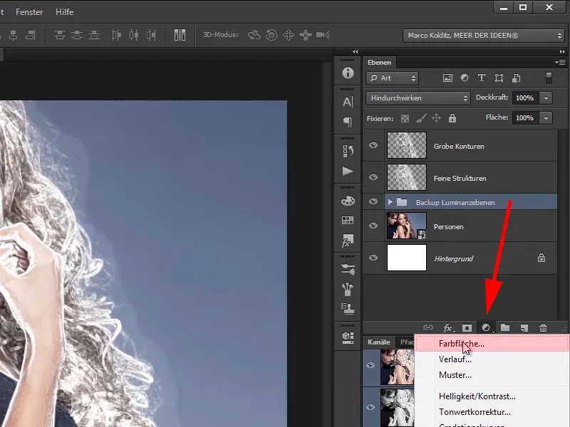
Step 64
Then create a red area #410101, for example, and confirm with OK.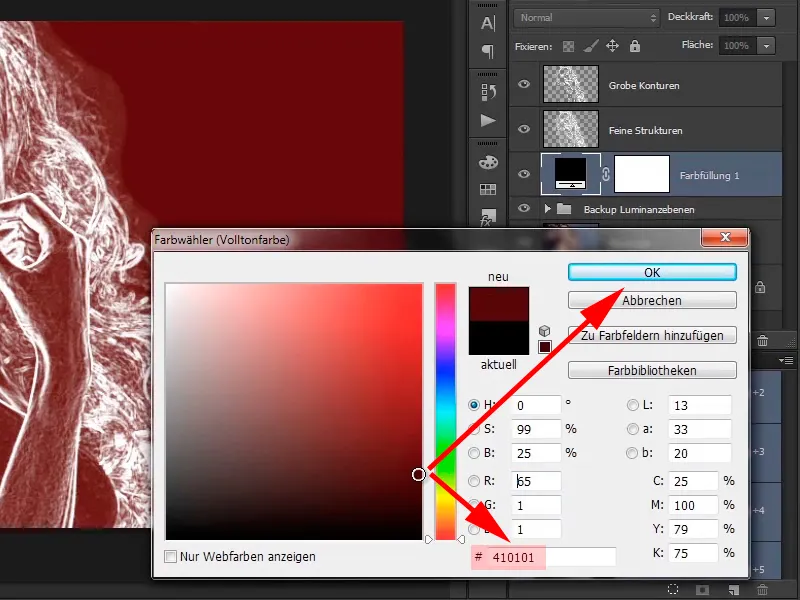
Step 65
Name it Auxiliary layer because it will help you to wipe the fire into the image. This makes it much easier to paint the flames into the picture.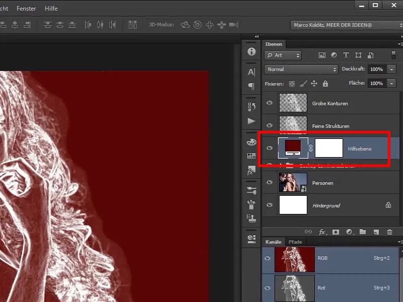
Marco will show you how to do this in the next tutorial.
