In this guide, you will learn how to use the Flexbox properties align-items and align-self in CSS to control the alignment of individual elements within a Flex Container. While align-items sets the alignment for all direct children of a container, align-self allows you to make differentiated settings for each child element. We will walk through the concepts step-by-step, so that by the end, you will know exactly how to effectively use these properties.
Key Takeaways
- align-items defines the alignment of all children of a Flex Container.
- align-self allows for the individual alignment of single Flex elements within the container.
- Stretch is the default value for align-items and ensures that the children fill the available space.
Step-by-Step Guide
First, let's look at how the basic configuration of the Flex Container looks and how we can influence the alignment of children through align-items.
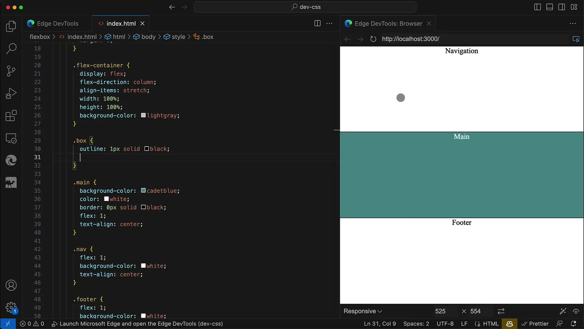
Here you define a container with display: flex;. In this container, you can then set the alignment through align-items, for example, to stretch, which means that the children will be stretched across the entire height or width of the container.

You can use various values for align-items, including flex-start, center, and flex-end. If you now set align-items to stretch, you will see that all child elements fill the entire space of the container. To demonstrate this, we remove a fixed width from the child elements so that they occupy the complete space.
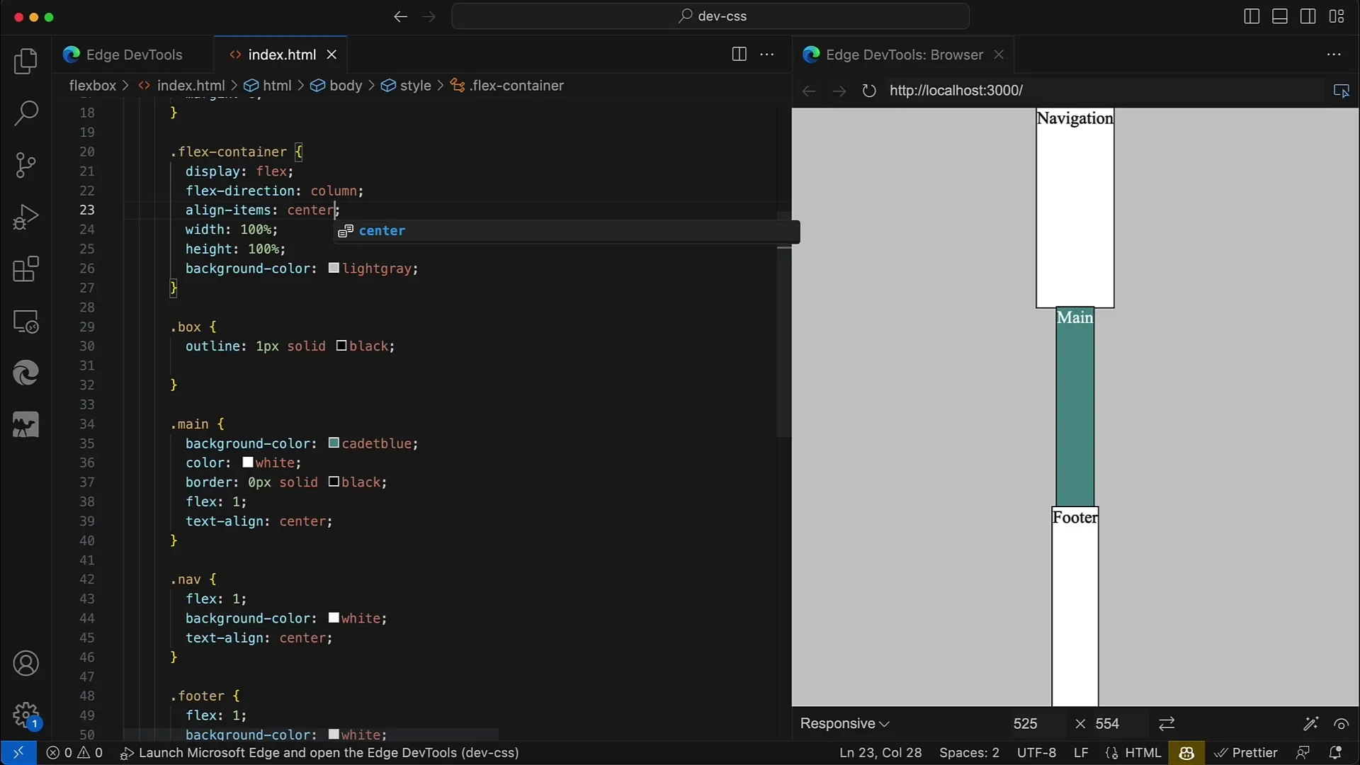
Now suppose you set align-items to center. Suddenly, we notice that the elements no longer occupy the entire space, but instead retain the minimum width needed. This shows you how important the correct value for align-items is to achieve the desired layout.
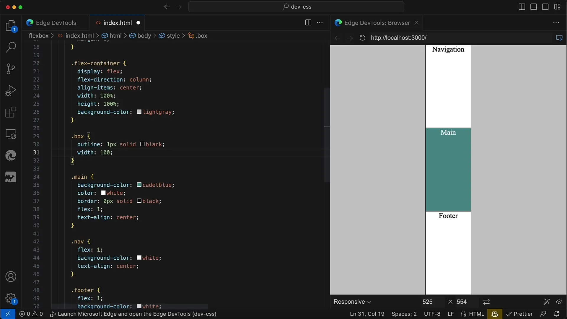
If you add back a fixed width, for example, 200px, you will see that the elements become wider and the layout remains stable. You can also use width: 100% to achieve a similar effect.
Now we get to the core of our guide: dealing with align-self. This CSS property allows you to set the individual alignment of each child element, regardless of the setting of the parent container. Therefore, we set align-items to center and then add specific settings for align-self.
For the navigation element, you want it to be aligned all the way to the left. Set align-self: flex-start for the navigation and save your changes. You should see the navigation element move all the way to the left.
For the main element, we set align-self: center. It should remain in the center, making the distance to the other elements visible.
Now, we align the footer element with align-self: flex-end downwards. This way, all settings result in a diagonal line from the top-left to the bottom-right of your layout.
If you now set align-self to stretch for the main element, it means that it will take up the entire space on the horizontal axis, causing the other elements to collapse in their height.

Similarly, you can also change the direction by setting flex-direction: row for your container. The approach for aligning individual elements remains the same, only the axis changes. Here, we start with flex-start and align the elements accordingly following the stretch principle.
An important point is that you can use align-self as many times as necessary to give each element individual alignment, thus maintaining complete control over the layout of the container and its children.
By applying Flexbox properties strategically, you can create a visually appealing layout that is also optimized for different screen sizes.

Summary
In this guide, we have thoroughly covered the Flexbox properties align-items and align-self. You have learned how to design the alignment of elements in a Flex Container, both generically via the container and individually for each single element.
Frequently Asked Questions
What values can I use for align-items?You can use values such as flex-start, center, flex-end, and stretch.
How does align-self work?align-self allows you to control the alignment of a single element within a Flex Container, regardless of the container's overall alignment.
Can I apply align-self to multiple elements at once?Yes, you can adjust align-self individually for each element.
How does stretch affect the size of the elements?The value stretch ensures that the elements take up the entire available space in the horizontal or vertical axis.


