This guide focuses on one of the most powerful functionalities of CSS Flexbox: Flex-Wrap. Flexbox significantly simplifies the arrangement and alignment of elements in website layouts. When space in the container is limited, Flex-Wrap allows child elements to break into a new line instead of shrinking. This helps in creating visually appealing and responsive designs. We will explore how Flex-Wrap works, its various values, and usage examples.
Main Takeaways
- Flexbox enables responsive styling of websites.
- With flex-wrap, you can control how child elements wrap when space is limited in the container.
- There are three main values for flex-wrap: nowrap, wrap, and wrap-reverse.
- Proper configuration of align-items and justify-content can further optimize the layout.
Step-by-step Guide
Step 1: Create the Flex Container
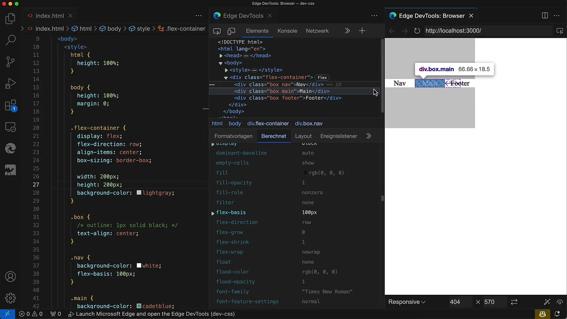
First, you should create a flex container. Set the display value to flex for the element containing the child elements.
Step 2: Activate Flex-Wrap
To enable wrapping behavior, you need to set the flex-wrap property to wrap. This will cause child elements to wrap into the next line when space is insufficient.
Step 3: Adjust Child Elements
Now add child elements to test how they behave when wrapped. You can partially set their width; the key is to ensure the container is smaller than the total sum of child elements' widths.
Step 4: Check Flex-Wrap
Once you've added the child elements, check the container's behavior. You should see the last child elements wrapping into the next line when there is insufficient space in the container.
Step 5: Adjust Flex Direction
You can also set the flex direction to column if you want to work in a vertical layout. In this case, the layout will behave differently and adjust for height as well.
Step 6: Align Child Elements
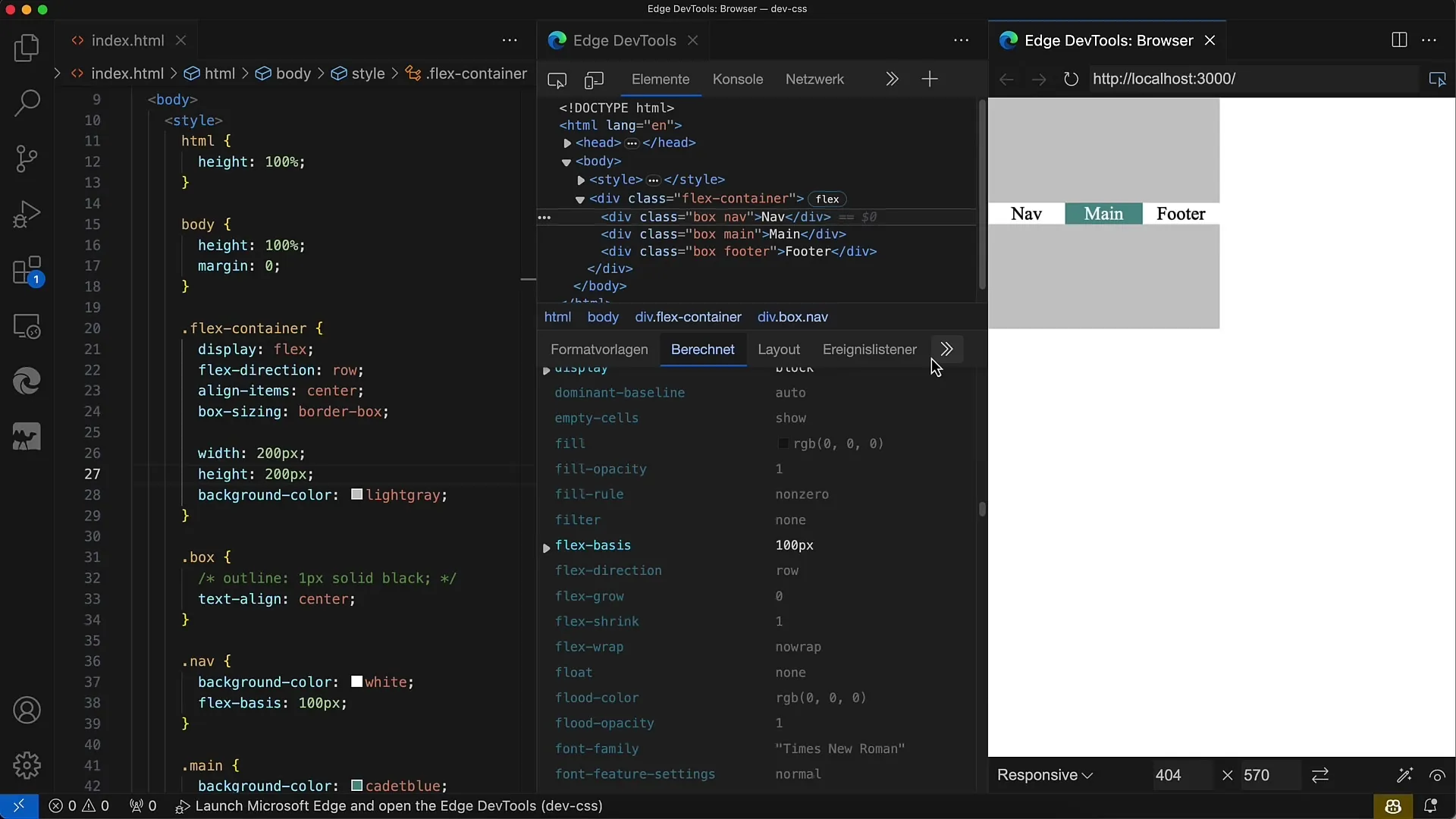
Use align-items to position the child elements within the rows. You can set it to values like flex-start, flex-end, or center to control vertical alignment.
Step 7: Set Justify-Content
The justify-content property helps you control the space between child elements on a line. There are various options like space-between, space-around, or flex-start. Try these out to see how your layout responds.
Step 8: Browser-Responsive Design
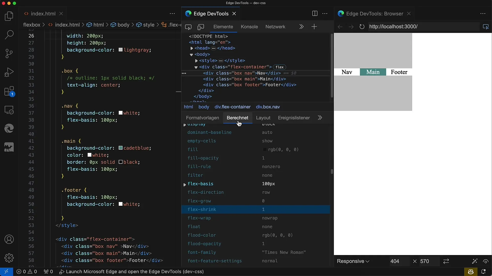
One of the strengths of FlexWrap is its responsiveness. You can make the container wider or narrower and observe how the child elements rearrange depending on the available space. This is particularly important when creating designs for different device sizes.
Step 9: Use Wrap-Reverse
To display elements in reverse order, set flex-wrap to wrap-reverse. This will move the child elements from bottom to top in the next line.
Step 10: Implementation in Various Layouts
Flex-Wrap can be used in a variety of layouts, from large galleries to simple boxes. Tailor the dimensions and layout as needed to achieve the best results.
Summary
In this guide, you learned how to utilize the Flex-Wrap property in CSS. Flexbox provides a great way to create responsive web designs. With just a few lines of CSS, you can easily position and adjust child elements to create an appealing layout that looks great on various screen sizes.
Frequently Asked Questions
What is Flexbox?Flexbox is a layout module in CSS that enables flexible arrangement and alignment of elements within a container.
How does flex-wrap work?The flex-wrap property controls how child elements in the flex container wrap when space is insufficient.
What values can flex-wrap take?flex-wrap can take the values nowrap, wrap, and wrap-reverse.
How can I make the layout responsive?By using Flexbox and flex-wrap, you can adapt content based on the available space in the container.
What impact does align-items have on the layout?align-items determines how child elements are vertically aligned within the rows.
