In web development, the layout plays a crucial role in creating appealing and user-friendly websites. A commonly used tool for layout is Flexbox, which allows you to arrange elements flexibly and responsively. However, often spacing between elements is necessary to create a clear and pleasant structure. This is where the CSS property gap comes into play, offering an elegant solution for addressing spacing issues, particularly in Flexbox layouts. In this tutorial, I will show you how to effectively use the gap property.
Key Takeaways
- The gap property allows you to define spacing between child elements in a Flex container.
- gap is simpler and more effective than using margin.
- You can use gap independently of the padding values of container elements to achieve a clean layout.
Step-by-Step Guide
1. Create a Basic Flexbox Layout
First, you need to create a simple Flexbox layout with three elements. Define the container and set display: flex; to activate Flexbox.
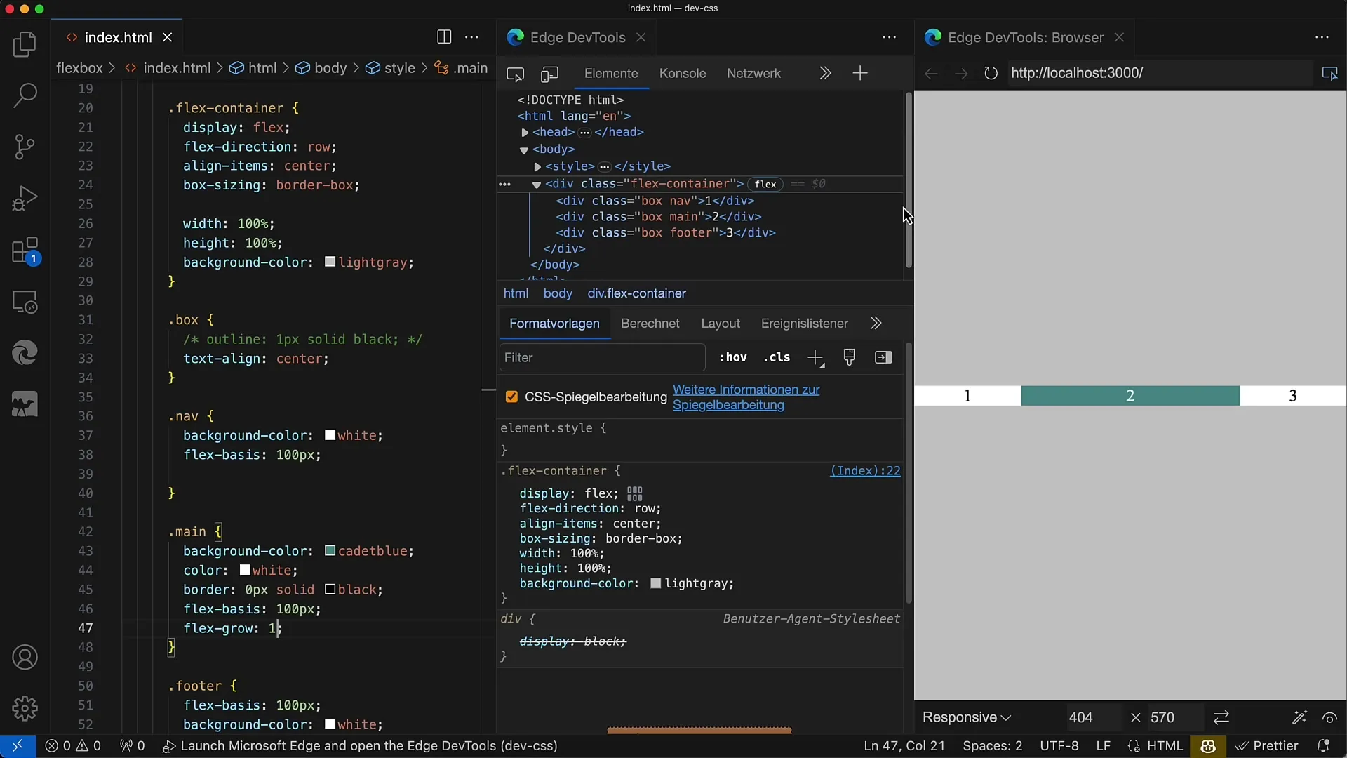
Here we have our three flexible boxes arranged in a row. The first and third elements have the same base size, while the middle element takes up the available space.
2. Enable Flex-grow for the Middle Element
To ensure that the middle element takes up more space, we set the flex-grow property to 1 for this element, while the other two elements have a base size of 100.
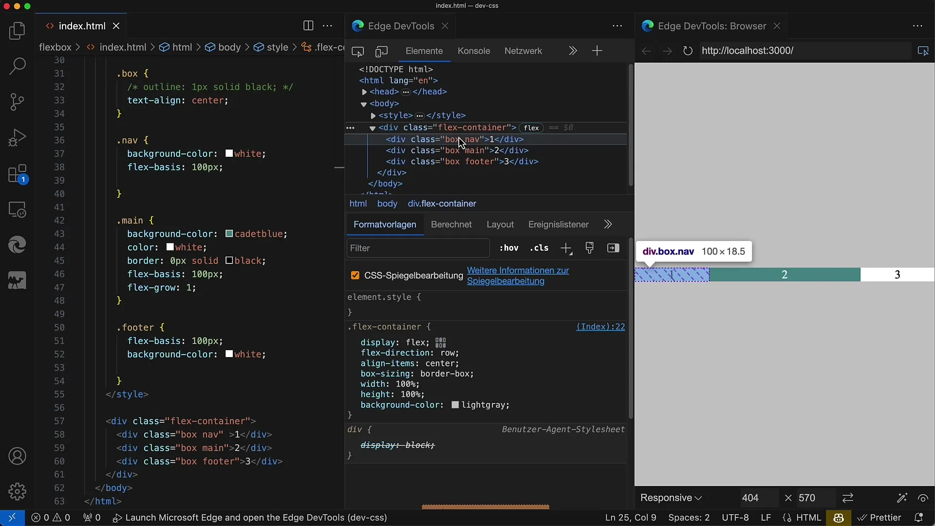
When you change the width of the layout, you will see that the middle element adapts while the outer elements remain constant.
3. Add Spacing Between Elements
Currently, our boxes have no spacing between them. To make it visually appealing, you want to add spacing between the elements. You could use margin, but that quickly leads to issues, especially with handling the last element.
It is common to apply a margin-right value of 8px to all boxes. Unfortunately, this causes the last element to have additional spacing as well.
4. Eliminate Margin for the Last Element
If you use margin-right on each element, you have to reset it to 0 on the last element, which can be cumbersome. Therefore, the approach of spacing elements with margin is not optimal.
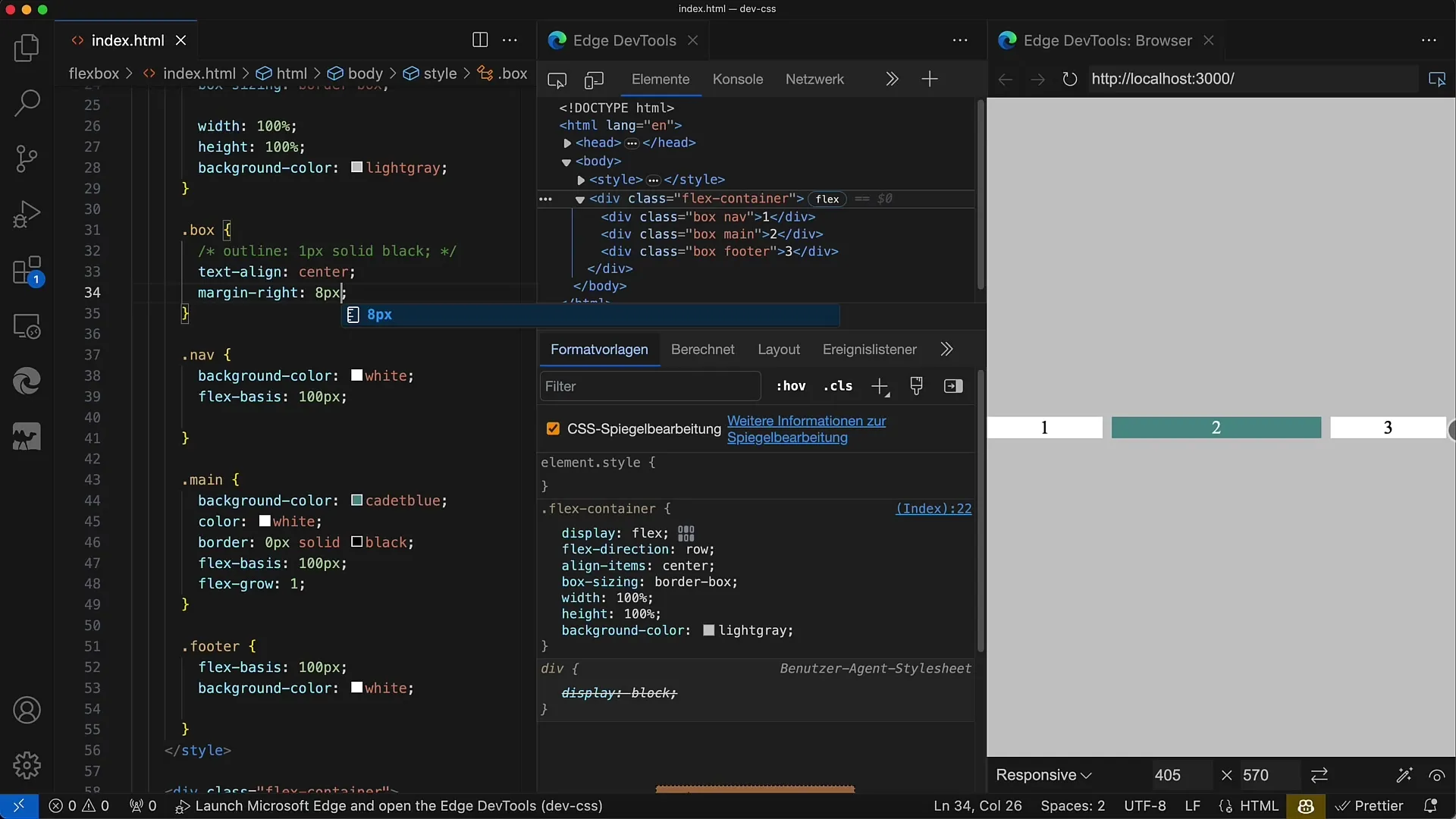
At this point, it becomes evident that using gap is much more elegant.
5. Introduce the Gap Property
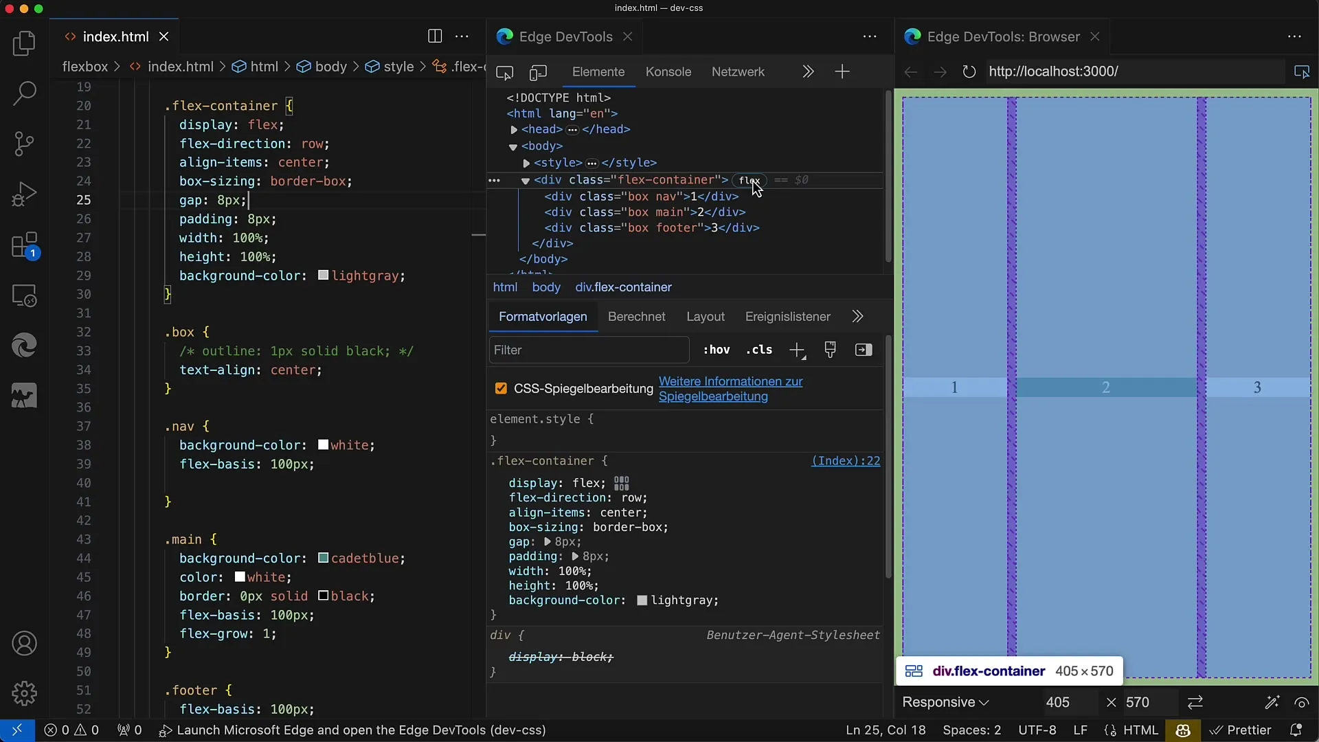
To improve the situation described above, you can use the gap property. Set gap: 8px; for your Flex container. This simple CSS will automatically create the desired spacing between child elements.
The advantage of gap is that you no longer need to manage margins for the last element. The spacing is uniformly applied everywhere.
6. Add Padding
In addition to spacing between elements, you may also want to define an outer margin around the container. For this, you can use padding.
By using padding: 10px;, you will get a uniform spacing around the entire Flexbox.
7. Test the Layout
Now that you have defined the gap and padding values, test your layout by changing the container's width. You will see that the spacing between elements remains constant regardless of the container's size.
The layout is now well-structured and visually appealing.
8. Utilize the Developer Tools
To understand and visualize the spacing, it can be helpful to use the Developer Tools of your browser. Here you can see the gap settings and make sure that everything works as expected.
When you hover over the Flex container, you will see the hatched areas that represent the spacing through the gap property.
Summary
With the gap property in Flexbox layouts, you can elegantly and effectively create spacing between child elements without having to rely on cumbersome margin rules. Its use helps ensure a clean and tidy layout.
Frequently Asked Questions
How does the gap property work?The gap property adds a fixed spacing between the child elements of a Flex container.
Why should one use gap instead of margin?Gap avoids issues with the last element and ensures a consistent distribution of spacings.
Can I use gap in Grid layouts?Yes, gap can be used in both Flexbox and Grid layouts.
