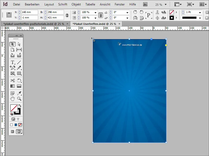
The name lettering next to the logo looks a little pale. Now you can help yourself by using small effects to make this lettering stand out from the background, for example. To do this, double-click on the group in the effects panel, which will open the effects dialog box. In this dialog box, you can give the font a small drop shadow with 50% opacity.
Anchoring information on a striped background is not necessarily the best idea. Therefore, it is best to separate it with a new object with a calmer background. To do this, draw a new graphics area using the rectangle tool. If you draw it in the document size right away, you can transform it more easily later.

The advantage is that you can scale the object by holding down the Alt key and it will remain centered on the page. After scaling, fill it with white area color. A light texture will be added later.
The white area serves as a text information base. But for the essential information that immediately catches the eye, you should use other elements. To do this, first draw another rectangle across the entire document.
You may need a new color to fill the rectangle. You can create this using the color fields palette. As a poster always has a signal effect, it can be a striking color, in our case a shade of orange.
This rectangle is then scaled again using the Alt key. This enlarges or reduces the object from the center point.
This rectangular area is supplemented by smaller objects. From the bleed, you can draw another rectangle up to the white area.
This area is also given an orange tone. However, a slightly darker shade. Therefore, first duplicate the previously created orange color by dragging it onto the new symbol in the color fields palette. This color copy is modified and saved under its own name.
Use Ctrl+O to move the rectangular area you have just created further back on the page.
To create the visual impression of a 3D surface, you still need a tiny detail. A small triangular area has been created between the two rectangular planes and filled with a customized shade of orange.
Use the polygon tool again and double-click on the tool thumbnail. Set the 3 sides in the dialog box and, after confirming, you can draw the triangle and assign a different color for a better view. Make sure that you place this object in the correct layer, otherwise it will not be visible.
Rotate the object in the right direction using the selection tool and the Shift key. Then switch to the direct selection tool, click on the anchor point of the tip of the triangle while holding down the Shift key to activate it first and then move this point to the corner of the upper rectangle.
This corner will also be colored in a shade of orange, but a little darker. The best way to do this is to edit the dark, orange color and create a further gradation of the hue.
This gives the construct of these objects a spatial effect.
Copy the objects you have just created by first selecting them with the Shift key pressed and then moving them to the new position on the opposite page with Shift+Alt. Once the objects have been moved, you can flip them horizontally using the context menu.
Please also make sure that the objects extend to the bleed.
You can refine the display by assigning additional shading to the objects. To do this, first call up the object formats via Window>Formats.
Create a new object format in the object formats dialog box using the New icon.
Double-click on the object entry to open the settings dialog. There you can specify which properties you want to assign to this format. You can specify the basic attributes such as object color or object contour, if desired, or deactivate these options and only specify an effect for the object.
For the moment, a simple effect setting for the drop shadow displayis sufficient. If you click on the preview at the bottom left, the effect is immediately applied to the currently selected object. Once all the settings have been made, confirm the dialog box by clicking OK.
Now you can quickly apply the same effect to any object by simply selecting the corresponding object format.
The advantage of the object formats is that any necessary effect adjustments can be quickly applied to all objects that have been formatted with these settings. If, for example, the opacity of the drop shadow is increased from 25 to 50 %, this affects all affected objects at the same time.
The two triangular areas were also provided with such a drop shadow as a test. However, these do not require any additional shading, which is why you first select both objects with the Shift key and then double-click on the Object entry in the Effects panel.
The settings menu for these objects will then open and you can uncheck the drop shadow. This effect setting is then deactivated for the two selected objects.
The rectangle at the top must also be placed at the top of the layer structure, otherwise the drop shadow will not work properly and may be swallowed up by other objects.
You can also assign a very similar effect to the rays. To do this, you must first select the group.
In the effects panel, double-click on the group to open the settings dialog box.
In this dialog box, you can also assign a small shadow with reduced opacity to these objects.
To prevent you from accidentally selecting these stripes during further editing, you can lock this group in the layer control panel.
Now you can create or enter the main title of the poster. To do this, simply draw a text field with the text tool and enter the title there. The text is centered and created in a font size of approximately 90 points. In the example, the font Bitter in Regular was used with a line spacing of 88 points in white.
You can also optionally add a drop shadow here to better differentiate the text from the background. Simply use the drop shadow object format that you have already set up for the rectangular areas. The font will then have the same attributes.
The event year should have a special meaning, which is why it is subsequently enlarged to 120 points.
However, this creates new problems: The area is too small for the amount of text and the text lines themselves are now too close together.
Therefore, you first enlarge the area graphics. However, as the other graphic objects are not included when the front rectangle alone is enlarged, the individual enlargement is excluded. Therefore, use the layer control panel to select all relevant objects. Use the Shift key to select the individual objects.
All objects can now be scaled at the same time.
The text can then be adjusted again. To do this, increase the line spacing to a value of around 120 points.


