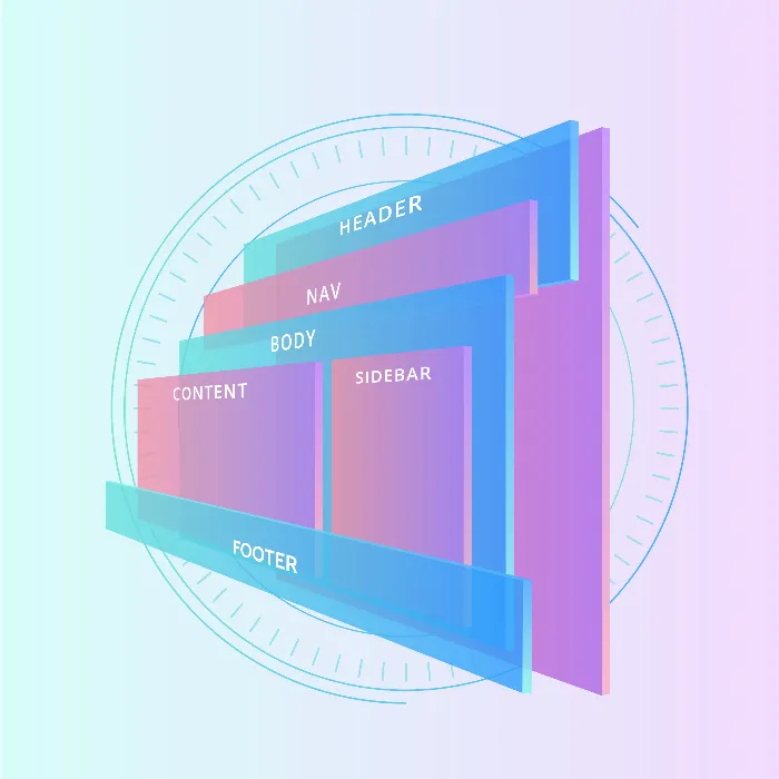
In this tutorial, I will show you how to create a flexible layout with three columns and three rows using CSS Flexbox. This layout is not only easy to implement but also dynamically adjusts to the available screen space. Flexbox greatly simplifies the design of responsive designs and eliminates the need for older layout techniques such as Floats or inline-block.
Key Takeaways
- Flexbox allows you to style layouts with just a few lines of CSS.
- Next, I will show you step by step how to create and customize a 3-column, 3-row layout.
Step-by-Step Guide
Step 1: Initialize Your HTML Structure
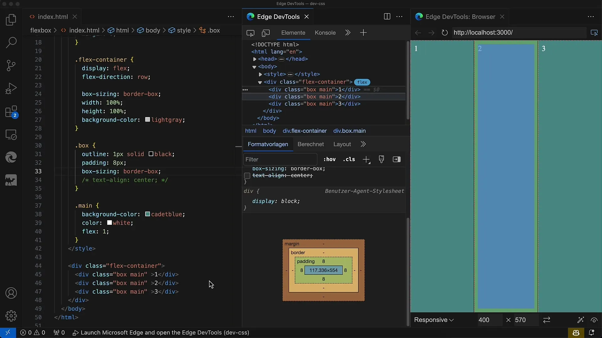
First, create the basic structure of your webpage with three div elements. Each div receives the class "Box". These will be organized within a flex container later on.
Step 2: Style the Boxes
Now add CSS to give the boxes a lighter design with padding and a border. Use box-sizing: border-box; for easier handling of dimensions.
Step 3: Set the Flex Container
You must now define the parent container as a flex container. Set display: flex; and flex-direction: row; to arrange the boxes in a row. Each box element should set the flex value to 1 so they evenly take up the available space.
Step 4: Adjust Flex Values
Since all boxes have a flex value of 1, the space will be evenly distributed among all three boxes. You can test this by resizing the browser window.
Step 5: Modify Flex Properties
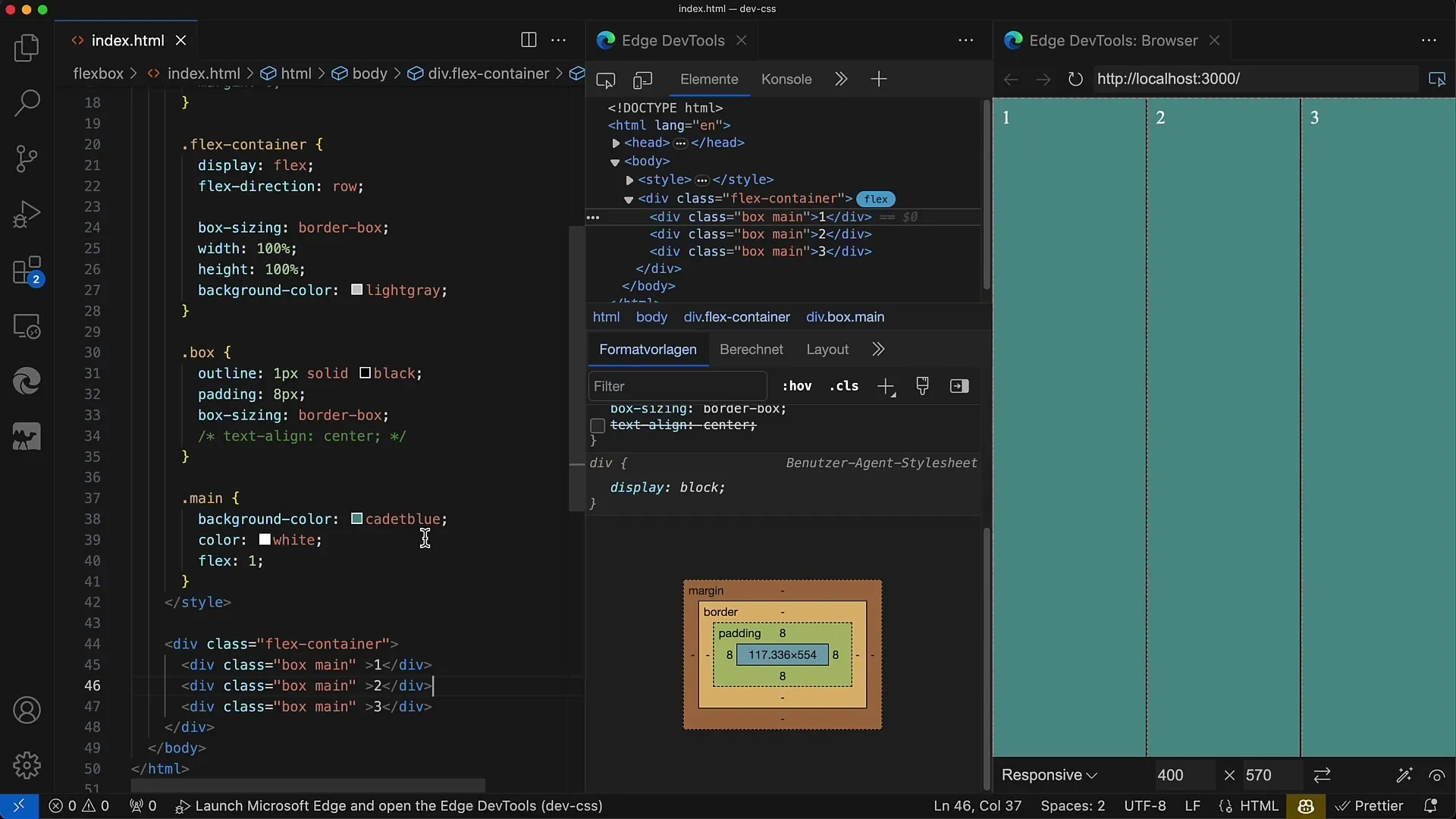
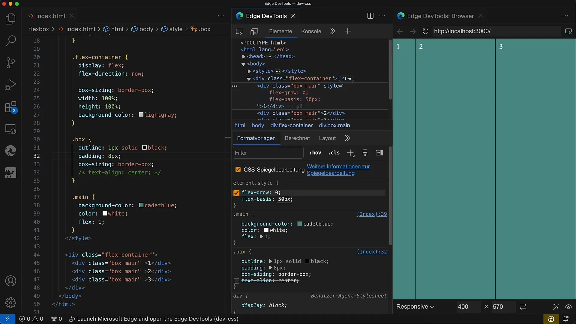
If you want to have more precise control over the flex parameters, you can, for example, set flex-grow: 0; for specific boxes. This means that these boxes will not take up additional space when the container expands.
Step 6: Adjust Flex Basis
For boxes where you want to set the base width, you can use flex-basis: 50px;. This will give the box a fixed width, and the remaining space can be flexibly distributed among the other boxes.
Step 7: Set Heights in the Boxes
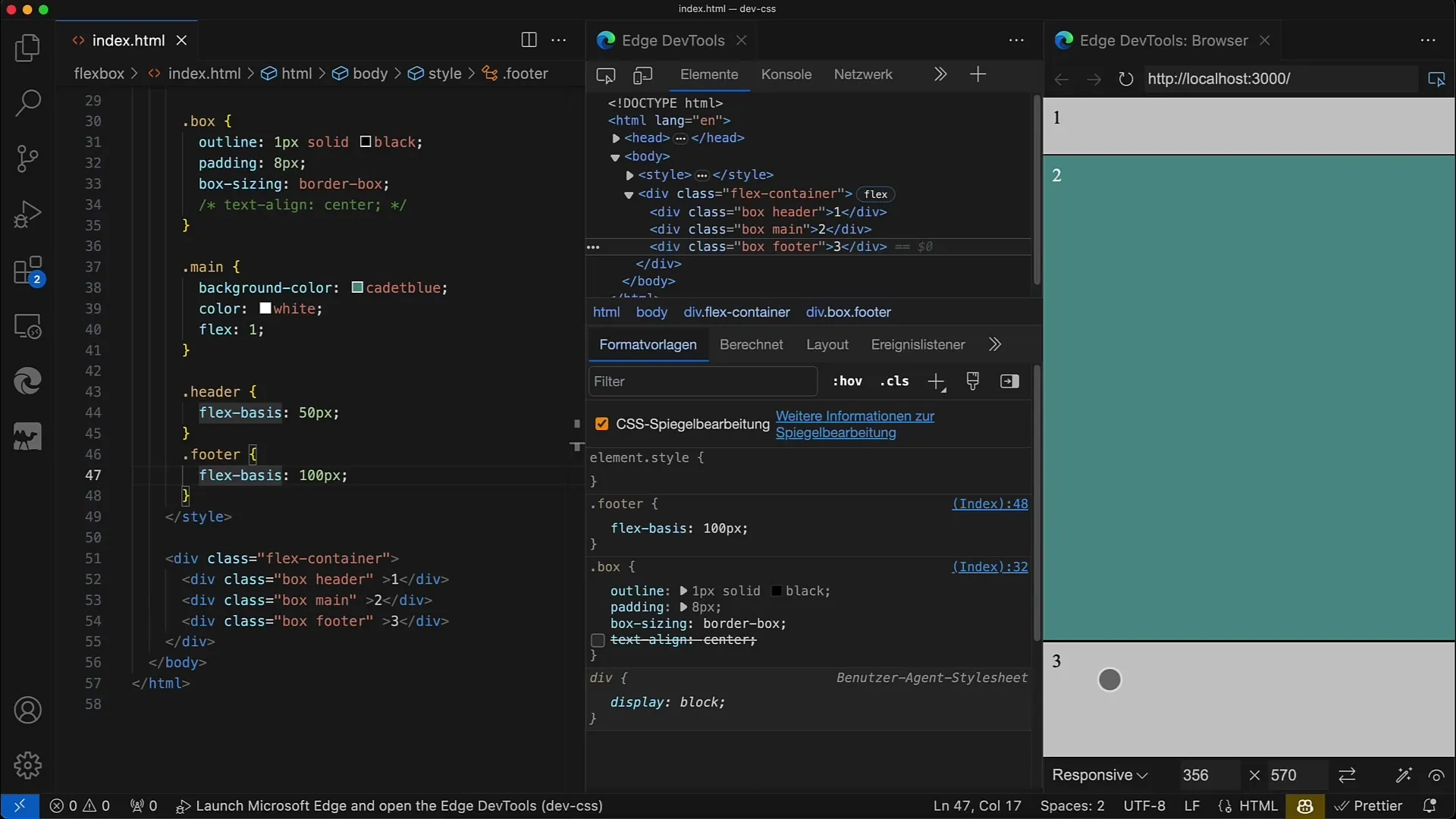
You can set specific heights for different boxes by adjusting the flex-basis. For example, set flex-basis: 50px; for the top box and flex-basis: 100px; for the bottom box.
Step 8: Adjust Container Height
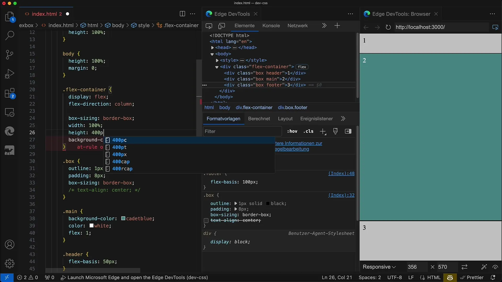
To ensure that the boxes adjust accordingly, you must also limit the height of the flex container. For example, set height: 400px; so that the middle box takes up the remaining space.
Step 9: Optimize Layout Design
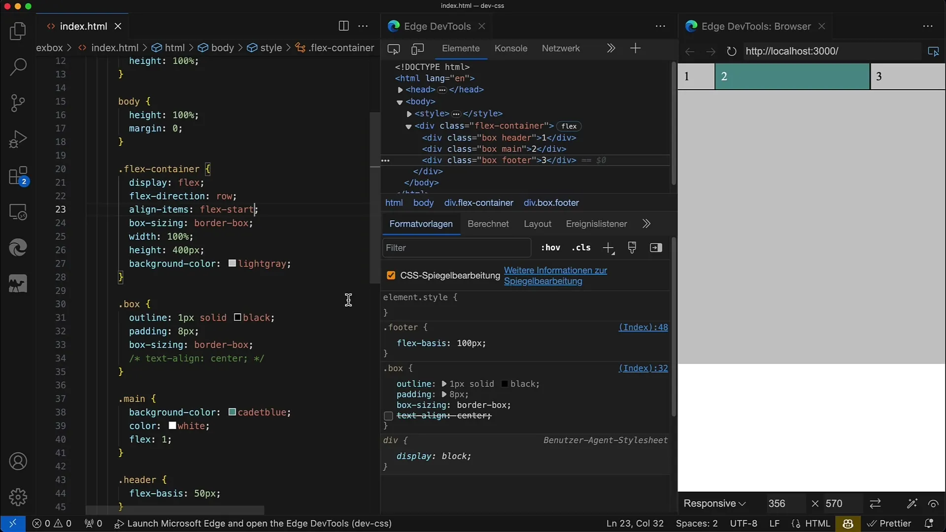
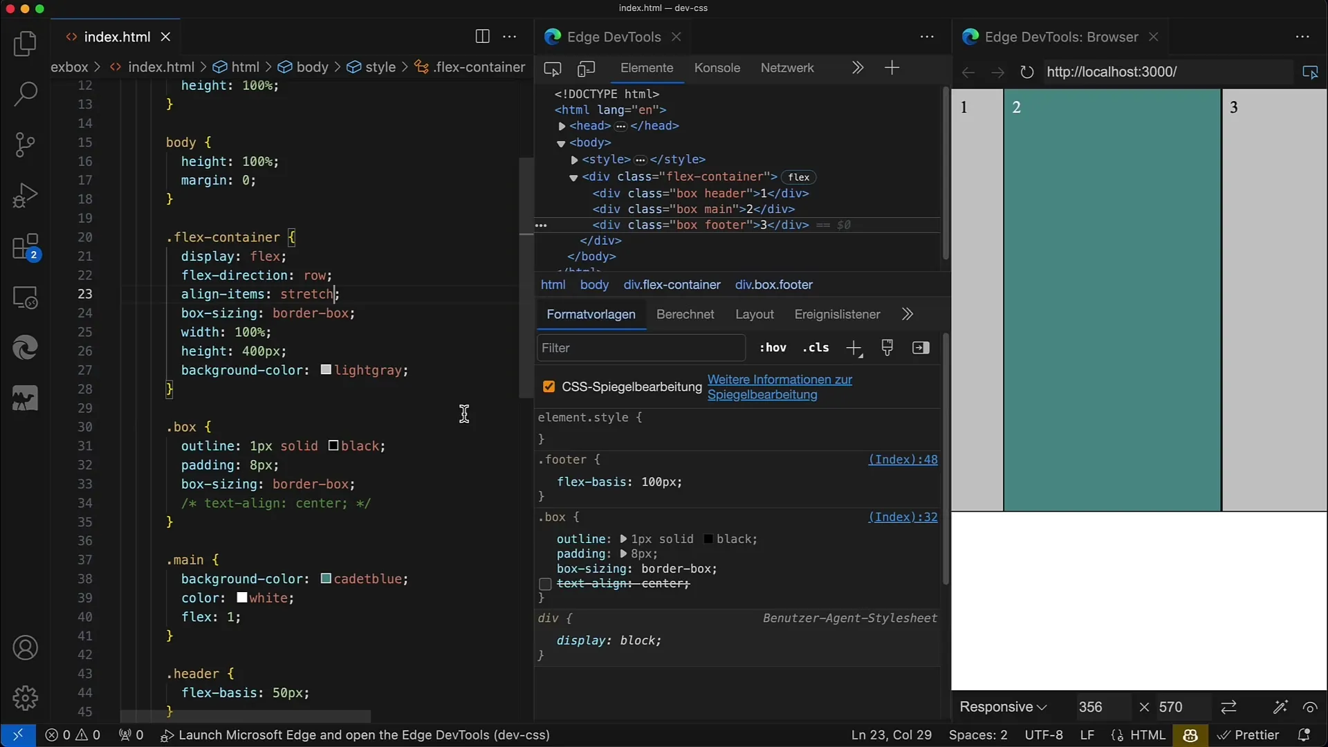
If you want to further enhance the layout, you can adjust the Flexbox properties for the layout as needed. A simple justify-content or align-items can make significant differences in the layout design.
Step 10: Test Responsive Design
Check if your layout looks good on mobile devices as well. Use your browser's developer tools to test different screen sizes and ensure it responds accordingly.
Summary
You have now learned how to create and customize a flexible layout with Flexbox in CSS and HTML. By adjusting the Flex values and setting specific heights and widths, you can easily implement responsive designs. Flexbox greatly simplifies the entire process.
Frequently Asked Questions
How does Flexbox work?Flexbox is a CSS module that enables a flexible layout structure that is easy to adjust.
What are the key Flexbox properties?The key properties are display: flex;, flex-direction, flex-grow, flex-shrink, and flex-basis.
How do I make my layout responsive?By using percentage values or flexible units and adjusting the Flexbox properties, your layout can be made responsive.
