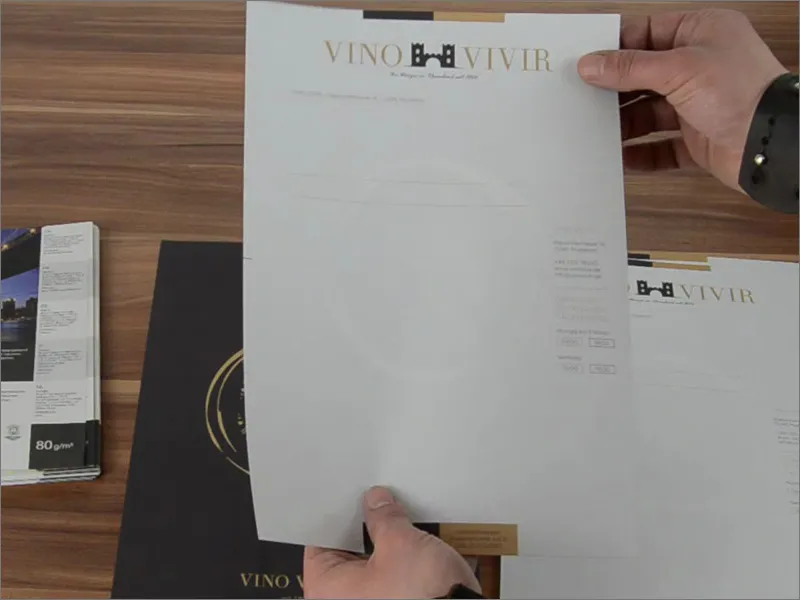
Hello everyone and welcome back, this is Stefan from PSD-Tutorials.de. I'd like to welcome you to the next big step in our huge print project that we're about to tackle. Today in focus - what are we designing? You can already see it here in front of you: Letterhead, printed on the front and back. You might think that stationery is hardly used anymore since the digital revolution, but you'd be wrong, because business stationery is still very much in demand as a print product. They represent the company and are viewed by everyone you come into contact with in writing. This can of course be for all sorts of reasons, such as an invitation to a wine tasting in our example, but it can also be an invoice or a reminder if the customer doesn't pay, or perhaps product announcements or open days... There are of course dozens of reasons to send out a letter, just like newsletters these days. And now that you know what exactly we will be designing in the training, it's time to get down to business.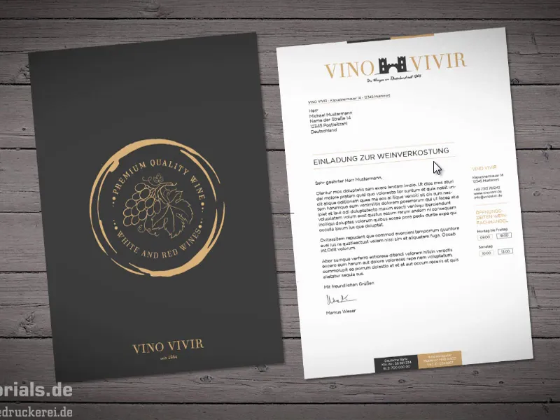
Choosing paper
The next question: What do we use to design? Logically, in InDesign CC. That's obvious, of course. And the next big question: What are we designing on? And what we design on, let's find out now. After all, we're talking about stationery here. They are generally used in A4 format, which is why we'll take another look at our partner print shop diedruckerei.de and see what they have to say about stationery.
On the homepage, we find the appropriate stationery tab (1). Then he asks us how colorful we want our paper to be. We have a two-sided color print, i.e. 4/4-color (2). "It couldn't be more colorful," they write, "Both sides are printed completely with the 4 basic CMYK colors." We click on that.
Now he asks us for the format. We have decided on the DIN A4 format: 21 cm wide, 29.7 cm high (3). By the way: When you see dimensions like this, you can remember that the width is always given first. So if you don't see "width" or "height" and it only says "210 mm" and "297 mm", then you know that the first thing is always the width. That's where we go.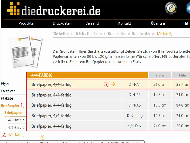
Now we see further information that can be very useful: "printed in four colors on both sides", "many paper variants to choose from" - and that is of course very interesting for us, because the big lesson from the previous training was that it has a decisive influence on how the color brilliance and color reproduction is in terms of appearance if you use different types of paper. You have seen that we have chosen a very traditional and elegant design, and then it would actually be quite interesting to perhaps simply switch to recycled paper in addition to the normal offset paper that we are familiar with from the office. This is made from 100 percent recycled paper and has been awarded the Blue Angel eco-label. The interesting thing is that this type of paper produces a small, light structure. Of course, we have no idea what something like this looks like on the desktop. And this is where something comes into play that is actually very interesting and incredibly helpful: so-called paper sample books.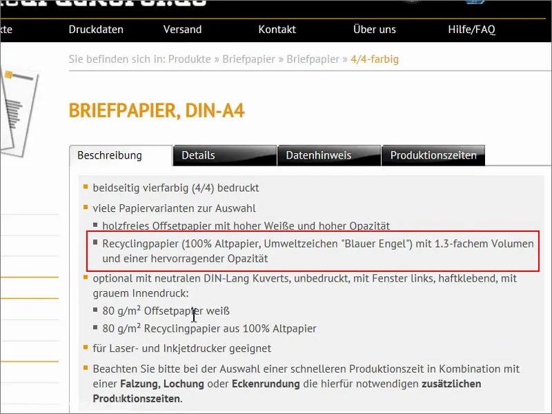
The paper sample book
They look like this. Most print shops have a paper sample book like this. They like to send them out to customers so that they can imagine what the feel of the paper is like, the grammage, the opacity, i.e. how opaque it is. And, of course, different finishing techniques are also shown in these paper sample books.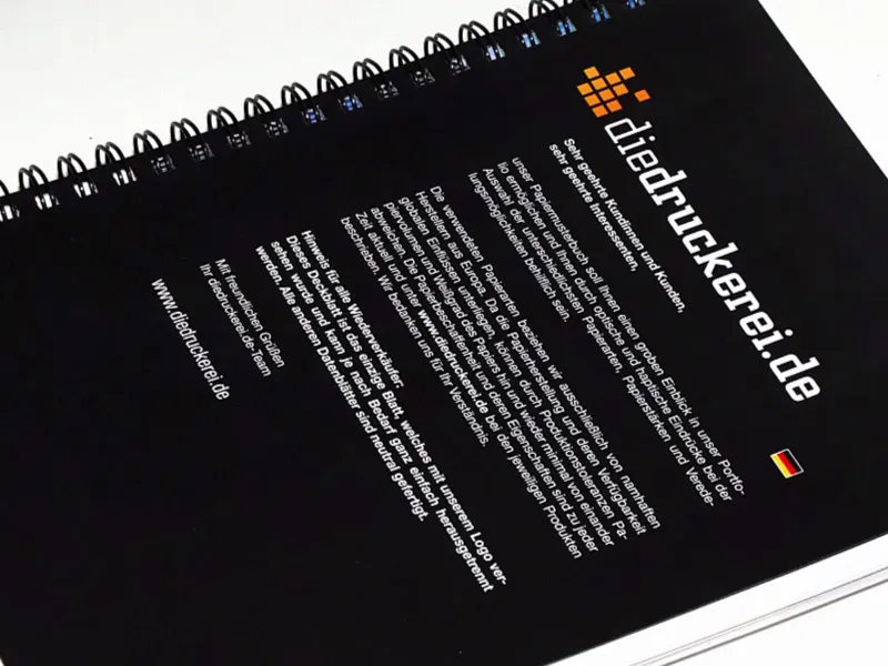
Our recycled paper looks like this. This is a page from this paper sample book. Here you can also see this Blue Angel eco-label, and unfortunately you can't quite see it in the photo, but here the paper has a very delicate structure that gives the overall appearance an antique look. Quite interesting in our case, to be honest. Fits perfectly, and that's why I can switch again here.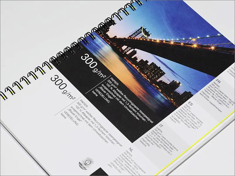
There you can see the clues, for example. So you can always see what kind of paper you have in front of you and what finishing options are available. And that's why I would definitely recommend this: Have a look around at your print shop or at diedruckerei.de or online-printers so that you can get your hands on a paper sample book. It's worth its weight in gold when designing.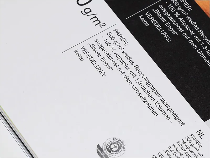
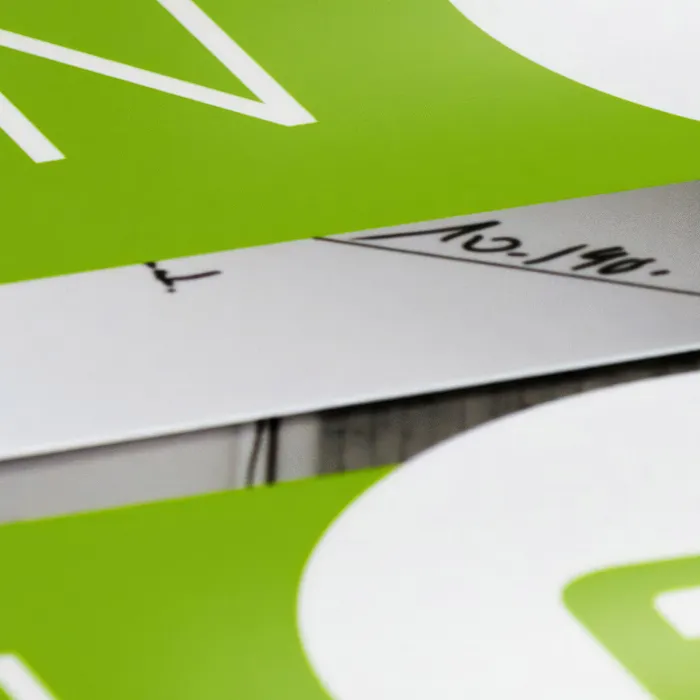
By the way, you can get something like this in such wonderfully beautiful sample boxes. You have the sample book in there and also other shape examples such as Plexiglas and various other surface materials, all of which have been put into such a beautiful box. A great added value for any designer. And here's a little tip on the side: as a designer, it's a good idea to know a little about image processing and photography, as this is often the working material for visual communication. And to get this illuminated image, I simply threw the entire sample package into the bathtub. Why in the bathtub? Quite simply - you then take the camera, put a flash on it, take a photo and then you have a pretty well-lit photo. It couldn't be easier. You don't need a studio or anything like that. Just put it in the bathtub, press the shutter button once and the photo is ready. Cool, isn't it?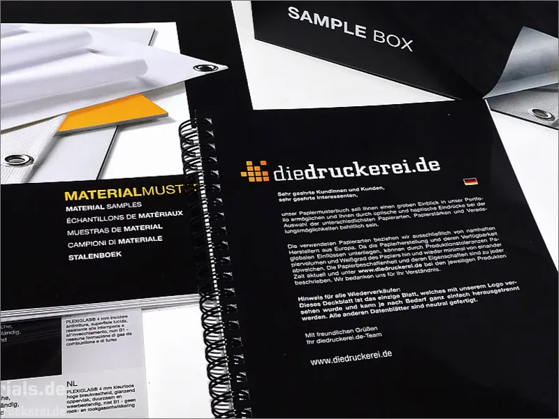
If you'd like to have a sample box like this, let's take a look at where you can get one: In the sidebar at the bottom right you'll find "Our product samples", where you can order a catalog, the sample book or the entire sample box.
So if you haven't done this yet - you can do it right now, it's an absolute added value and a tip, and it simplifies the design immensely, because we will need to use this paper sample box from time to time throughout our training.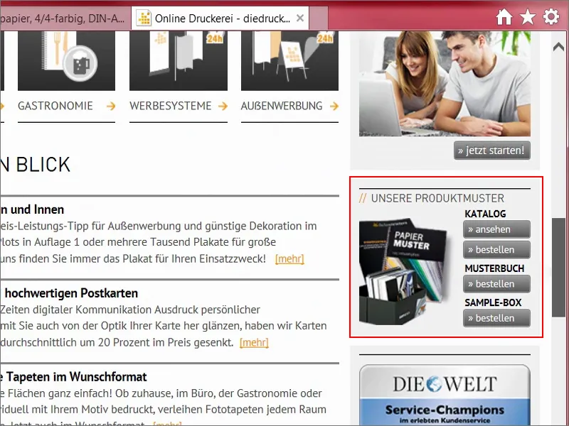
Print parameters and letter template
Let's now take a closer look at the print parameters. Under Details we can see the data format including 2 mm bleed. The quasi-standard here is actually 3 mm, but obviously the cutting is particularly precise here. Even 2 mm is enough.
Here again the final format 210 mm x 297 mm. Here we also have a preview, as well as a data sheet or templates, but we don't need any of that, because creating A4 paper is pretty easy.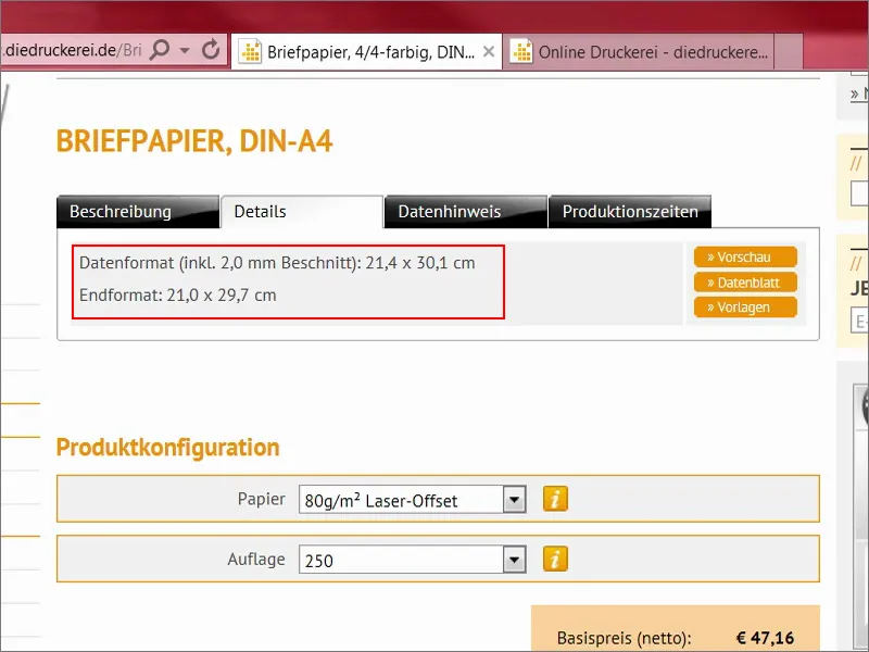
Let's take another look here: There is also the 2 mm bleed that we need to create. At least 300 dpi at original image size, fonts must be fully embedded or converted to curves. We have already saved this in the export dialog of the last training.
Color mode: PSO Uncoated ISO12647. Color application maximum 300 percent - we will come back to these points later in other examples. That's enough for now. So now I open my InDesign.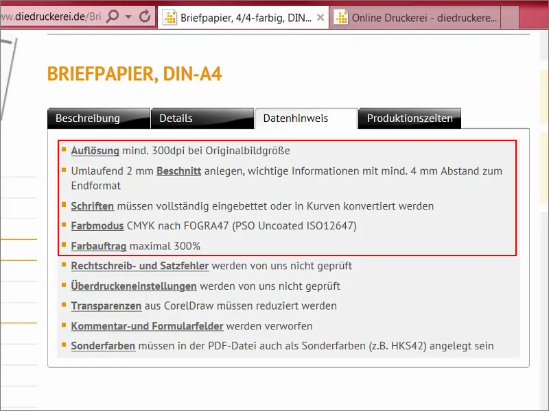
Stationery - overview of the result and creating a new document
Here we have the template as I have already created it. We can also see the two color fields that are used and a lot of guidelines, because the whole thing should also be structured according to the DIN standard. What does that mean?
Well, it's hard to believe, but even the preparation of letterheads is subject to standardization in Germany. We will take a closer look at this in a moment, after we have created the document.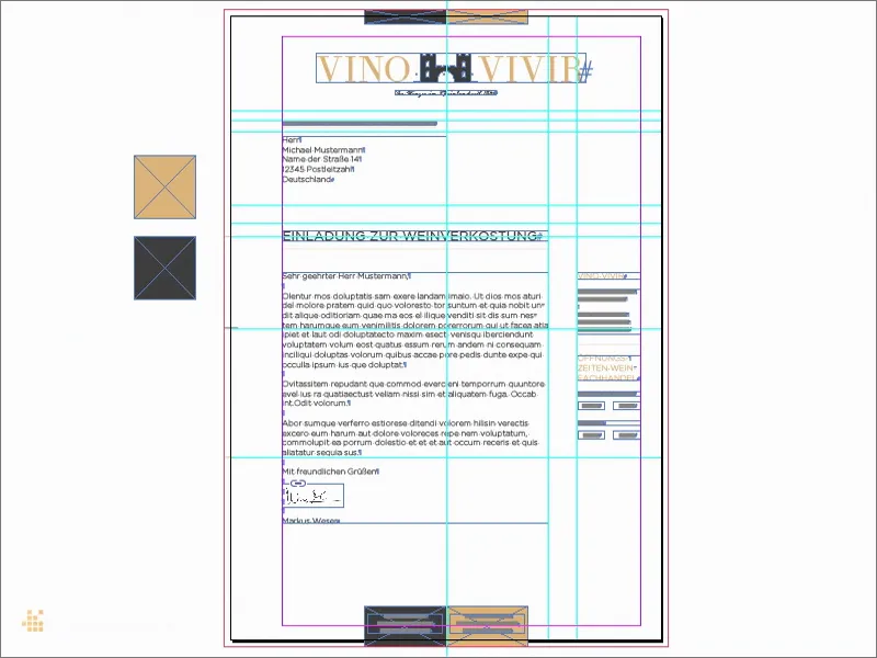
I select File>New>Document... (1) We don't need a double page (2). By the way, if you activate the preview functionat the bottom here (3), you can see directly in the background what is happening. We can also show the bleed and info area, and then we select the DIN A4 format here (4). Columns one, that's okay. Margins - this is where it gets interesting.
Let's take another quick look at what the print shop says: "important information with at least 4 mm space to the final format". We now enter exactly these four millimetres (5) ... If you have activated the chain symbol, it will change this on all sides. And another bleed of 2 mm (6), use the chain symbol here too. Now I confirm the whole thing. This is the template we can now work with.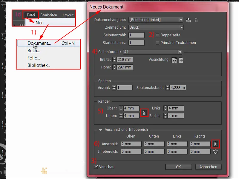
Define color fields
First, we define the two colors that best characterize the corporate design of our winegrower. That's why I'm going to go to the color fields above and create a new color field (1). The CMYK values can now be entered here. Of course, you can try to find the right color manually. This is sometimes not so easy, because you know that what you see here on the screen is not the same as what you end up with in print. That's why professional graphic designers simply consult color fans or color sample books. The colors are printed on certain types of paper and shown in different color gradations. In the professional field, you select the appropriate value within these color sample books and then simply enter the values directly here instead of trying to define them appropriately here on the desktop. I've already defined the colors I want, and the first one is a soft black (2) ... I'll add that. And then there's another value, our ochre shade (3) ... Add. Done.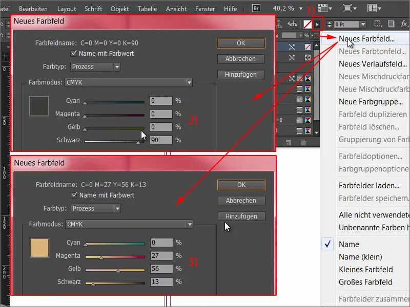
Now we see two new color fields that we can work with.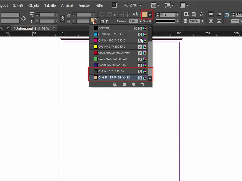
Designing a letter according to DIN 5008
What else do we need? Of course, we want to design a letter that complies with the DIN standard. That's why we're going to switch back to the browser and go to Wikipedia to enter DIN 5008 (1).
This is the DIN standard for writing and design rules. And let's make it easy for ourselves. Below, under "Examples of rules", we find two variants with measurements, namely the measurement of the business letter in form A (2) and in form B (3). The difference is that form A is defined with a raised address field (i.e. 32 mm below the top edge of the image) and form B with a lowered address field, i.e. 50 mm.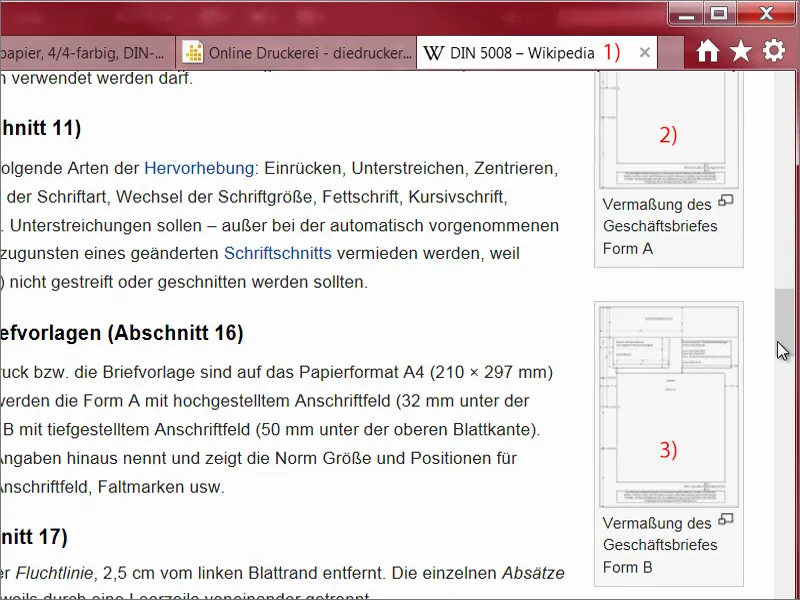
This is what we need. This is an SVG graphic (1). This means that everything you see here are vectors. Let's save that (2).
The problem with SVG graphics is that InDesign somehow doesn't really get along with SVG. They don't like each other. So I simply move the file into Illustrator, save it as an AI file, and then InDesign can handle it too.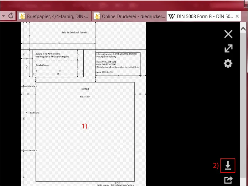
I can simply pull the prepared file out of my library (1). I'll make sure that we're in the corners at the top, not at the bleed, but at the end of the letter, i.e. the final format. Here it is. Let's take another look at the right-hand corner, it's here too. Let's take another look at the bottom corner, where it is also positioned, as well as on the left (2).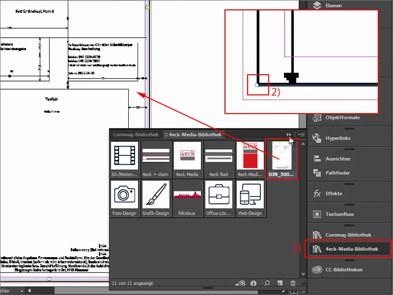
Now we can also work with reference values to simplify the whole game. If you're wondering why the whole thing looks so pixelated, as if it were 300 years old, then I can reassure you: You right-click on it, then select display performance and display with high quality, and then the rendering will be optimized.
InDesign does this for performance reasons, so that the performance and feel of the program interface doesn't suffer when scrolling through several pages if you have placed large images there. But we can now put that up on this one page.
And now take a look at what we see: We see all the hints we need. Quite practical, to be honest, because we now have all the key figures at a glance on our document. I lock this level (1). Now you can easily show and hide it (2). I'm only locking it so that we don't accidentally move it.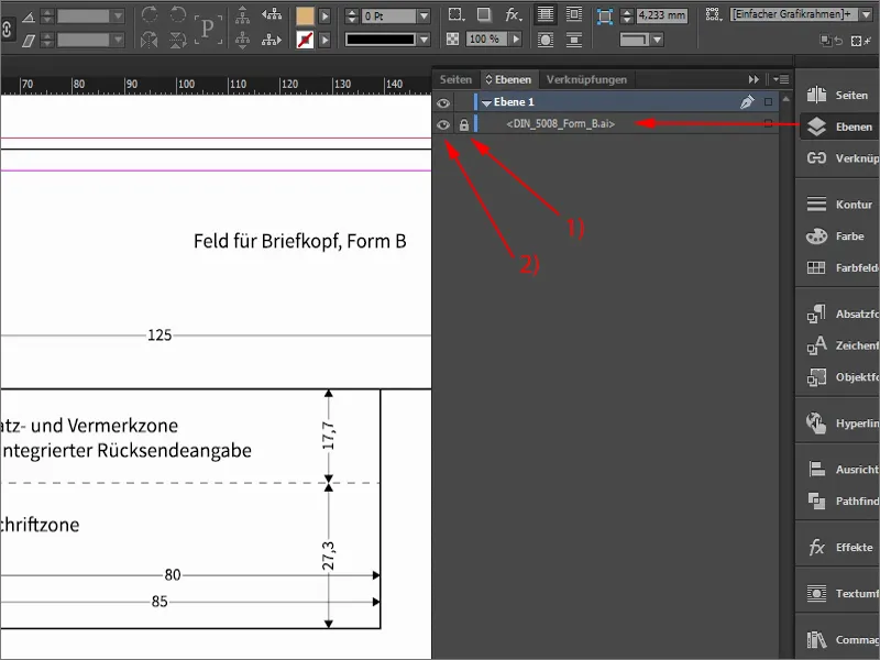
First, we'll split the whole thing in two, i.e. we'll separate the head from the body. Sounds a bit like Heracles or something, fighting a multi-headed hydra, but our hydra is quite tame. We simply draw a guide line (1) from the ruler and enter 50 mm at the top (2). I defined this boundary because this is where the head area ends. Now I can hide the disturbing element (3) and we can see: This is the area in which we will now move for the design.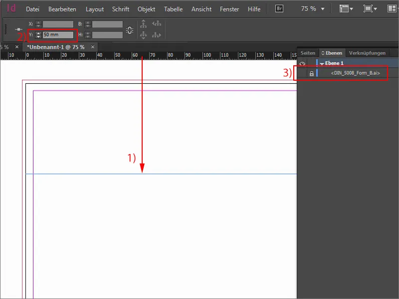
Placing the first design elements
The second thing I often do is to draw a guideline for half of it (1). Then I select the rectangle tool (2), click once, and take a width of 40 mm and a height of 7 mm (3). The color fits. I push the rectangle out to the top of the bleed (4).
There is a very simple reason for this: when cutting here, it could be that the knife is not quite precise, it moves within these 2 mm. And to prevent a white stripe from appearing through the background, you always pull such elements out to the bleed.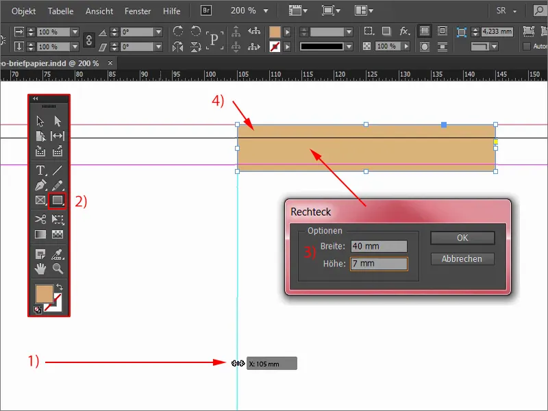
I need the whole thing again. So I select the object and hold down the Alt keyso that the cursor becomes a double cursor (1). This allows me to create a copy. If I also hold down the Shift key, I can move along this axis without accidentally changing the height, for example. This also works in the downward direction, but it's fixed, so I can hardly move it.
It's quite practical: Alt and Shift, move, release, change the color (2) - and we have our little border at the top, which will then look like a ribbon at the end, closing off the letterhead at the top and bottom.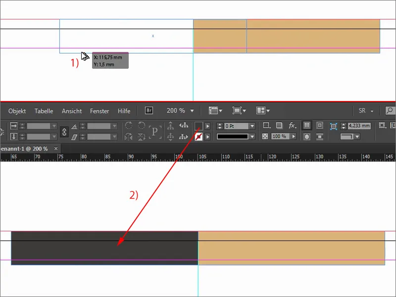
Incorporate logo, text and claim
What else do we need? At the top, of course, you definitely expect to find the logo somewhere. After all, we're dealing with a winegrower, so of course you have to be careful which font goes with it.
I'll show you again in the original how it looked there. We have this font here, with an ancient castle in the middle and a small claim underneath.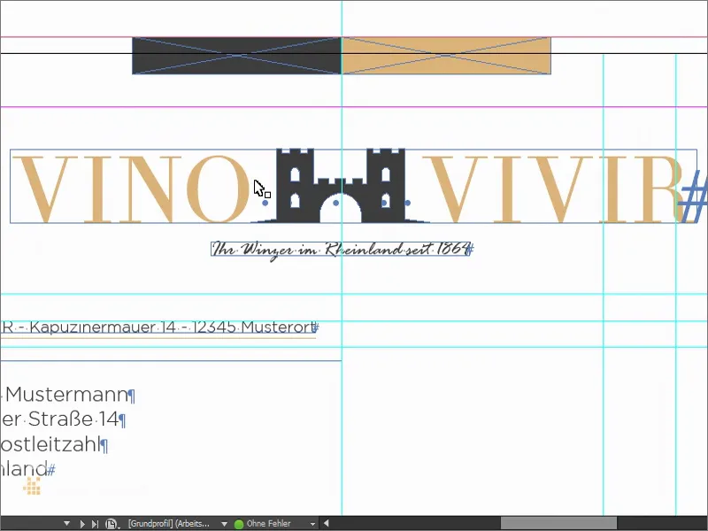
So I draw my text field (1) in any size I like. I set the font size in capitals (2) to 50 pt (3) and assign the corresponding color (4). So let's write "vino" with seven spaces in between, followed by "vivir". This comes from Latin, of course: "to experience wine". Let's use Theano Didot (5) as the font.
Now take a look at this font. Maybe you'll notice something! Maybe it even looks familiar to you! And that is: These very, very delicate upstrokes and thick downstrokes, the beautiful Serifs - we all know them, at least in a similar look ...
If you've ever seen the cover of Vogue, you'll recognize it: Aha, they use a similar font. It has a very timeless, beautiful, aesthetic character. I really like it. And we'll stick with it.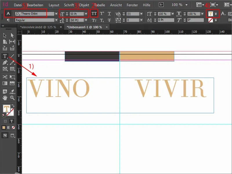
Then we can simply double-click on a handle to make the text field as large as it needs to be. Let's move it into the middle a little.
And then I'll get a graphic, a vector file that I got from Fotolia. This castle ... I push it in and align it so that it's centered between the "O" and "V". But I want the castle battlements to be clearly raised above the entire height of the versal.
Let's take a look at the whole thing. I'll change the view with the W button. And now it's important that we somehow find a center here. If I change the view again, we can see that our center line is here, and I would actually have to align the whole thing like this in order to be mathematically centered. But that looks pretty stupid, to be honest. And it's like so often: it's more about the optical center than the mathematical center, and that's why I'm going to position the whole thing like this using Shift and the right arrow key. Now we have the middle battlement in the center. This is the image I want, the archway is nicely bisected in the middle. That's how it should be.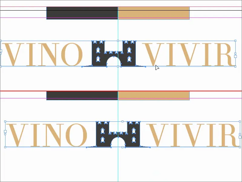
But we're not finished with our traditional character yet, because we want to emphasize the whole thing a little more. I've chosen a castle here, which at first glance might not necessarily suggest anything to do with wine. You might think of grapevines or wine bottles or glasses or something like that. That's why I wanted to emphasize once again that this is really about wine.
I'll draw another text field, in Rage Italic. A very, very nice font. And we write in there: "Your winemaker in the Rhineland since 1864". That's a kind of statement: "We really have been around for a century and a half. We don't sell cellar spirit wines, no, we sell precious, exquisite wine, noble and high-quality." This is the image we want to convey. The text is a little too large for my taste in 12 pt, so I reduce it to 11 pt, which is perfectly adequate. I set the color to our 90 percent black. Then reduce the size of the text field and center it. Perhaps a little lower.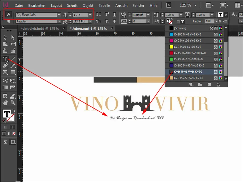
This aligns everything nicely to the center axis. You can also try aligning it flush left or flush right. I have tried all variants, I liked it best with the centered alignment.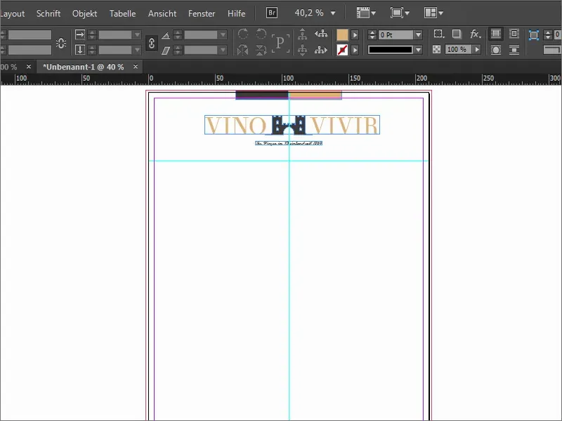
Defining further guidelines
Now it's time to get down to business. We work with a few guides. To do this, I show this great template again.
I now always draw a guideline from the top and then enter the corresponding values: The address field should actually start at 55 mm, but I add +2.5 (1). As you can see, these fields can also calculate. Then we are at 57.5 (2). This is exactly where I will start to draw the address field.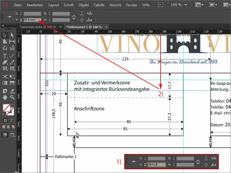
I'll set the next auxiliary line to 90 mm (1), then we'll be right here at the end of the address zone. And then we continue with an auxiliary line at 98.5 mm (2), where the content of the letter begins.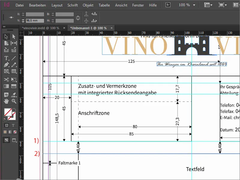
Now we add folding marks. This is of course practical if you have a letter like this and you know exactly where to fold. The first auxiliary line is at 105 mm (1), the second 105 mm further on at 210 mm (2).
And of course it's super great if you have a letter like this and you know exactly how to insert the sheet into the hole punch so that there are nice symmetrical holes in the right place to be able to file the letter in a folder. We therefore draw out an auxiliary line and set it to 148.5 mm (3) - this is the line for the hole mark.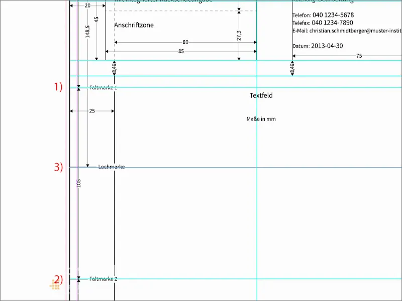
Now it's time for the other side. I'll draw guide lines from the left. The first one comes to 25 mm (1), then we have the left boundary, where the letter actually begins. We continue with the end of the letter. We set this to 155 mm (2). This means that we will write the letter in this area.
Another auxiliary line at 169 mm (3). This is the beginning of the margin column, where additional information such as telephone number, address, e-mail and so on will be placed.
The end of the margin column, with a guideline at 200 mm (4).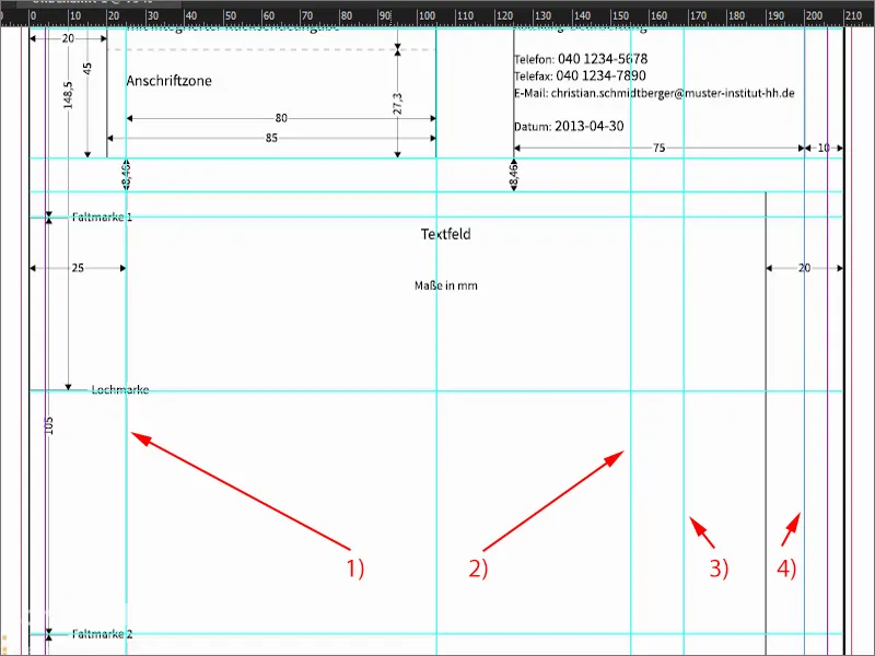
I'll Blender the template again. As you can see, the guidelines are an absolute enrichment. You can do the math yourself. I've already predefined the values for you so that you don't have to spend ages doing the math.
This is what it looks like. A bit tricky, you might think, but we have now clearly defined where we start ...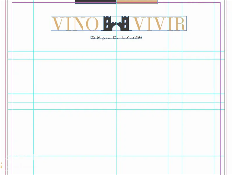
Address fields
Here I draw a text field (1) so that it sits accurately on the guidelines. Here you should now write in the house font that you ideally use. In my case, I decided to use a very special font, which I think is somehow related to Batman. It bears the name Gotham - Gotham Light Regular (2).
So I enter the data here and use 11 pt (3). Of course, this is only an example for us, as it will not be printed. We then need this as an empty text field.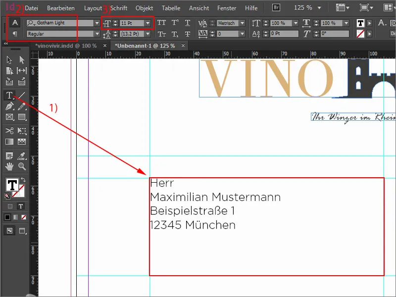
We continue here at the top with a text field (1), which I also drag to the middle. We now position the sender line there. This is done in a size between 6 and 8 pt (2). I'll use 8 pt and of course the Gotham Light Regular (3).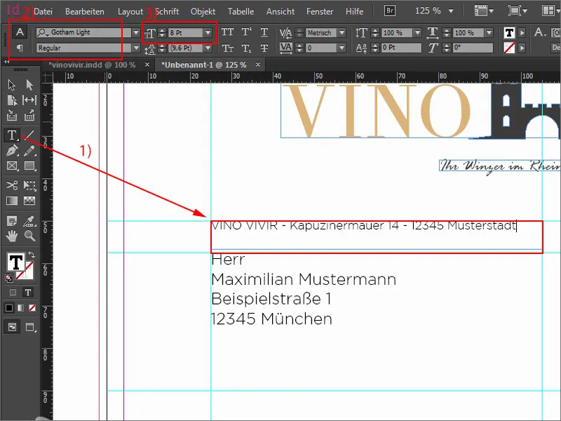
What I always like here is when you work with very delicate lines. I draw a line with the line drawing tool (1) in our ochre tone (2). For the thickness, 0.5 pt (3) is enough. You really have to be careful not to make it too thick. But you mustn't make it too thin either, otherwise you might not be able to see it on the paper printout afterwards. Of course, the line still belongs under the sender - and I adjust its width.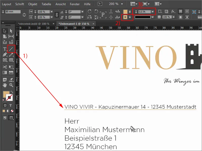
Subject line
Let's continue with the subject line. I zoom out and look for the corresponding auxiliary lines. Here, too, I draw a line with 0.5 pt (1). And now I'll draw a large text field (2) where the subject line will go. This is actually just another visualization for you of how it would appear there. Of course, you won't see anything there in print, because the subject line is entered at the end on the computer when the letter is actually drafted. Again, Gotham Light, this time with 18 pt. and all in capitals (3).
Now I take this line and create a copy of it in the same way as I have already shown you, i.e. with the Alt and Shift keyspressed. I move both a little lower ... The bottom line too (4). Done.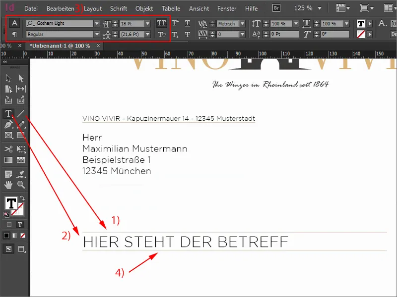
Text area and contact details
Now I'll put a fictitious letter here. By the way, I'm constantly switching the view back and forth with the W key- a super important shortcut. I set the text field (1) to 122 mm (2) and drag it downwards. Again the Gotham Light (3) - "Dear Mr. Sample Man", and then add the placeholder text so we have a feel for what that looks like. 12 pt is too big for me again, so I'll use 11 pt (4), which is enough.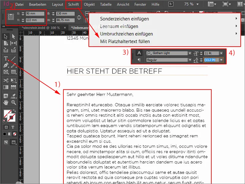
The only thing missing is our contact details, because what belongs on every business letter? Of course - the name of the company, the address, telephone, web, e-mail, possibly a branch or the account details. These things simply have to be included, because you want to be able to contact the sender somehow. So that's our next step.
I'll add a text field at the top here. Gotham Light Regular, set in capitals, in ochre and with 11 pt (1). I'm doing this so precisely because you shouldn't use too many different fonts, but also not too many font sizes. It is therefore important to always keep an eye on the font sizes we are working with. So here is 11 pt.
Below the contact details. I have a very simple way of dealing with the spacing: Create a copy, hold down the Alt and Shift keysand drag it down. And now press the Shift keyand down twice - that's the spacing I use as a guide.
I make the text field larger. The color is now black and I set the size to 8.5 pt. I turn off the capital letters (2).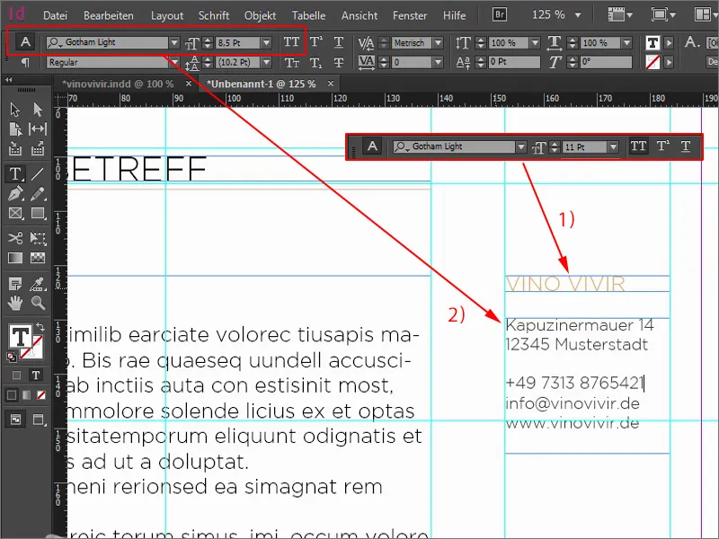
Good, now I have a font size of 8.5 pt. I think that we should also use 8.5 pt. in the sender field, where we previously had 8 pt.
We now have an overset (1) because we had previously reduced the text field to the size that was necessary. With a double-click it fits again, we just have to slide the line a little lower and adjust its width (2).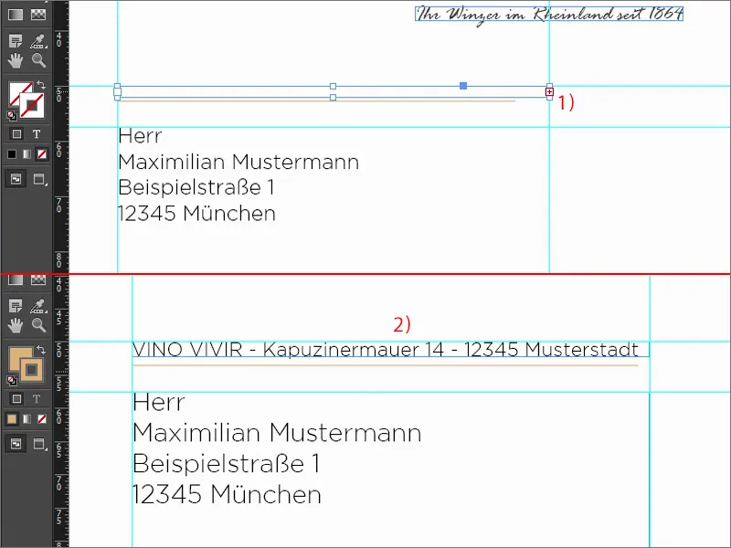
Draw a line here (1). Hold down the Shift keyto make it straight. Then increase to 0.5 pt (2). And here we use the same procedure again: Using the Shift key, move down two steps (3).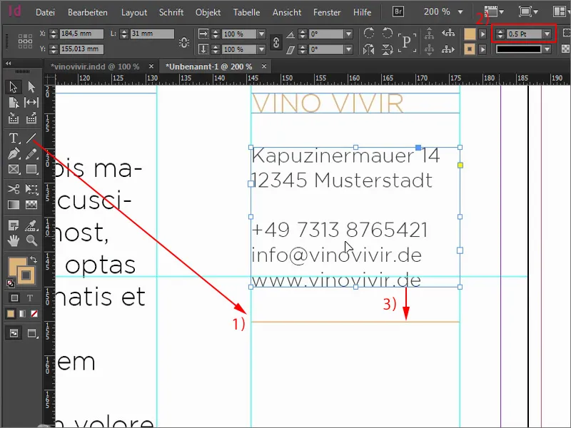
Then we copy the two, place this on the line and go down two steps again. Always keep the Shift keypressed, then it works quite simply. Here, of course, we change the text. We also have a specialist wine shop that we want to publicize a little. So: "Opening hours wine shop". Move the text field underneath two steps down again. We write "Monday to Friday" in there and reduce the size.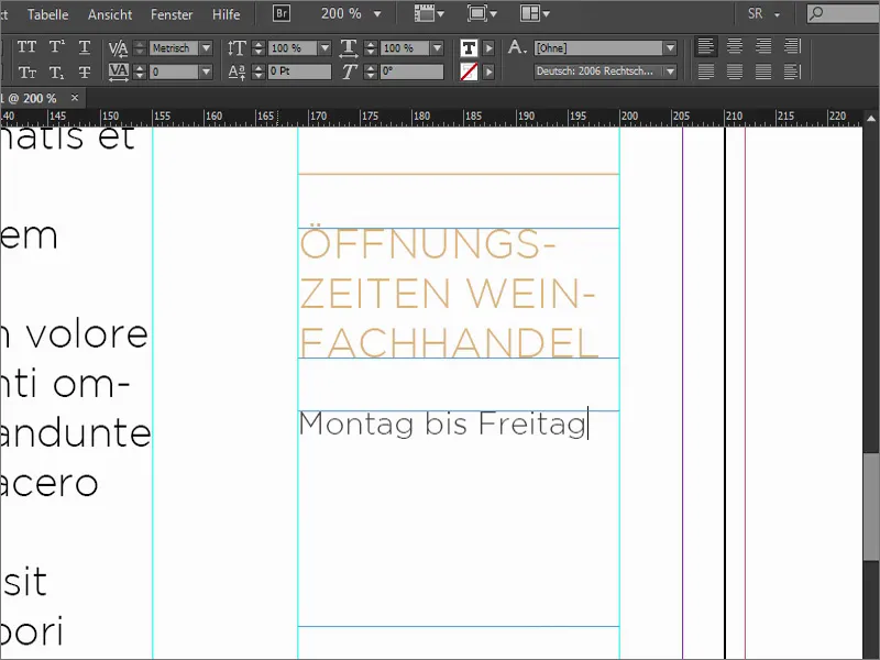
For the opening hours, I draw a rectangle (1), without an area, but with an outline of 0.5 pt. (2). I align the edge in the outline panel. It is currently centered, but I would like it to be on the inside (3).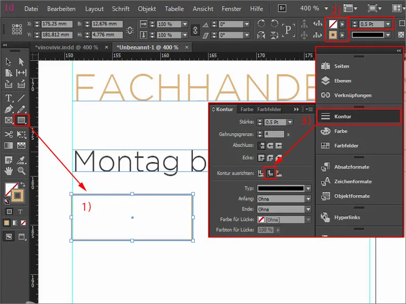
Now I take the text field and click once. I copy the "Monday" from above so that we don't have to set the font again. Here we write "09:00" (1) and center it (2). Now this graphic frame has become a text frame and I can simply right-click to open the text frame options (3).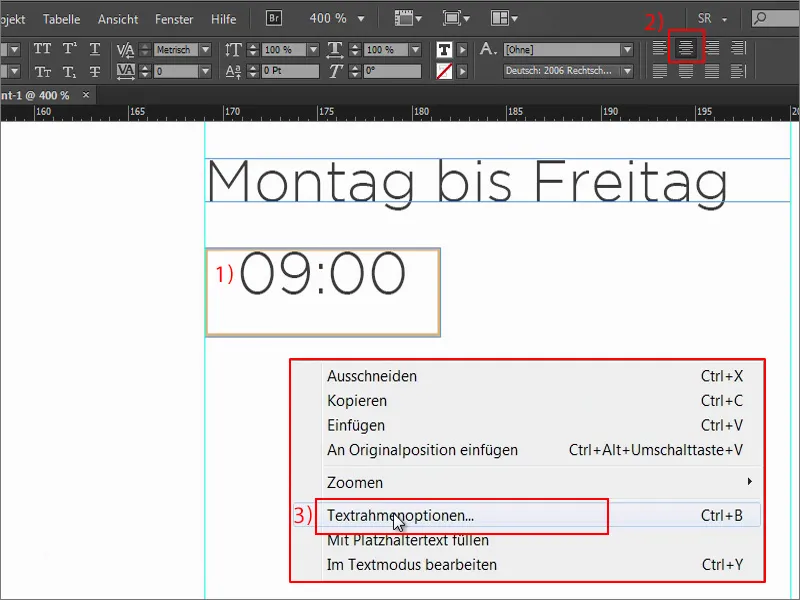
I define a distance there. Left 2 mm, right 2 mm (1). Let's open the preview functionand you can see what happens: These are these borders here, i.e. 2 mm from the left and 2 mm from the right. Make the text field a little larger ...
What still doesn't fit? It's now quite high up, so go back in via Ctrl+B. For Vertical alignment click on Center (2), then the text jumps nicely into the middle. It should look like this.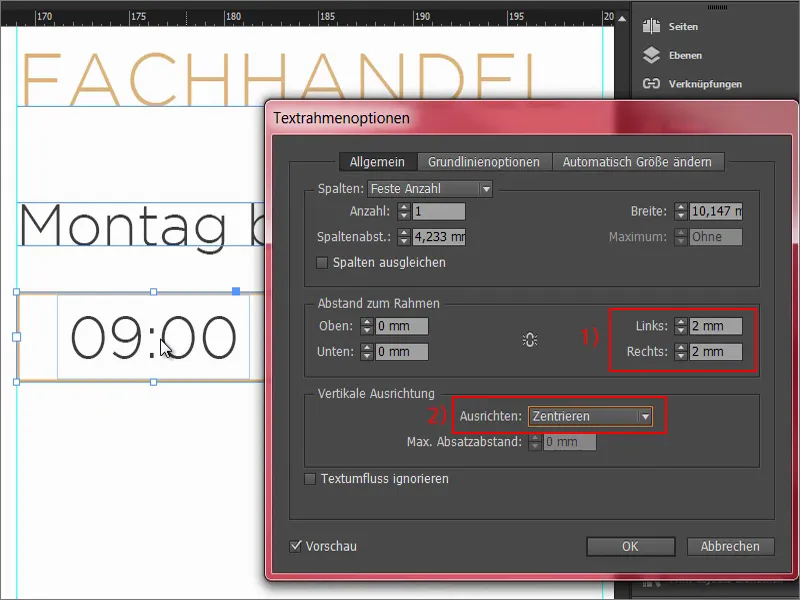
We create a copy of this, so hold down the Alt keyagain and drag to the right. We write in there: "18:00". And we change the color of the outline to our soft black, i.e. our 90 percent black (1).
We make a copy of the elements again with Alt and Shift. The guidelines already show us that we are symmetrical. And then we simply change the data ...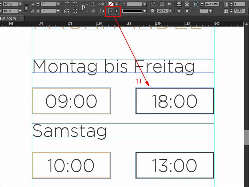
Intermediate result
This is what the whole thing looks like. It wasn't that difficult, was it? In any case, we've now created a large building block. Of course, this is also printed, but not the letter. There's too much text anyway, so I'll take some away so that it doesn't look too overwhelming.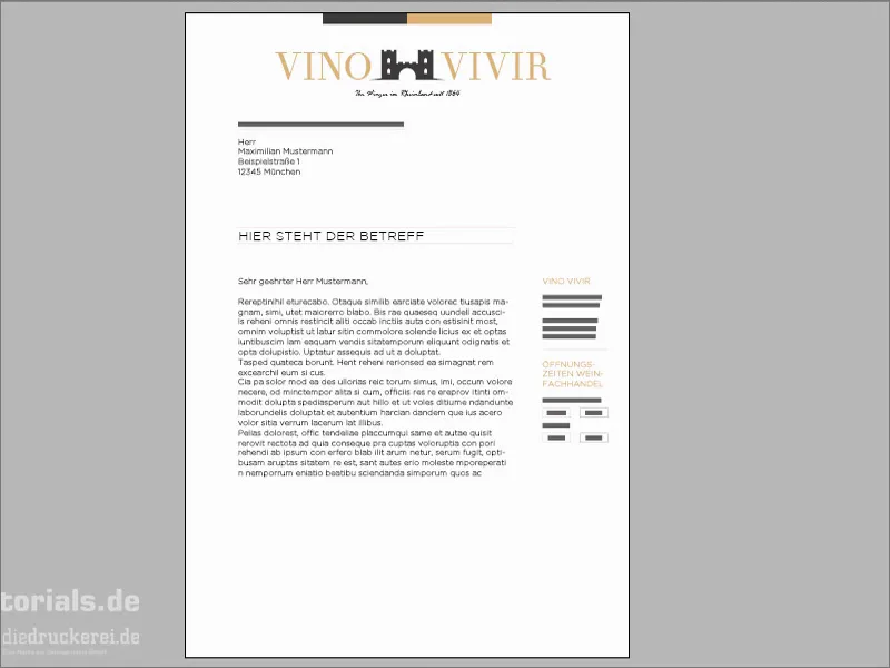
Insert further design elements
What is still missing? We need to continue the ribbon from the top down ... A new rectangle, click once. I set the width to 40 mm and the height to 20 mm. I position this again on the bleed at the red line. Then a copy of it - make sure that it is symmetrically aligned. The left-hand area is again black.
Finally, we only need two pieces of information at the bottom, namely the extract from the commercial register and, of course, the account details. To do this, simply draw a text field, select the font, font size 8 pt, color in white, otherwise you can't read anything ...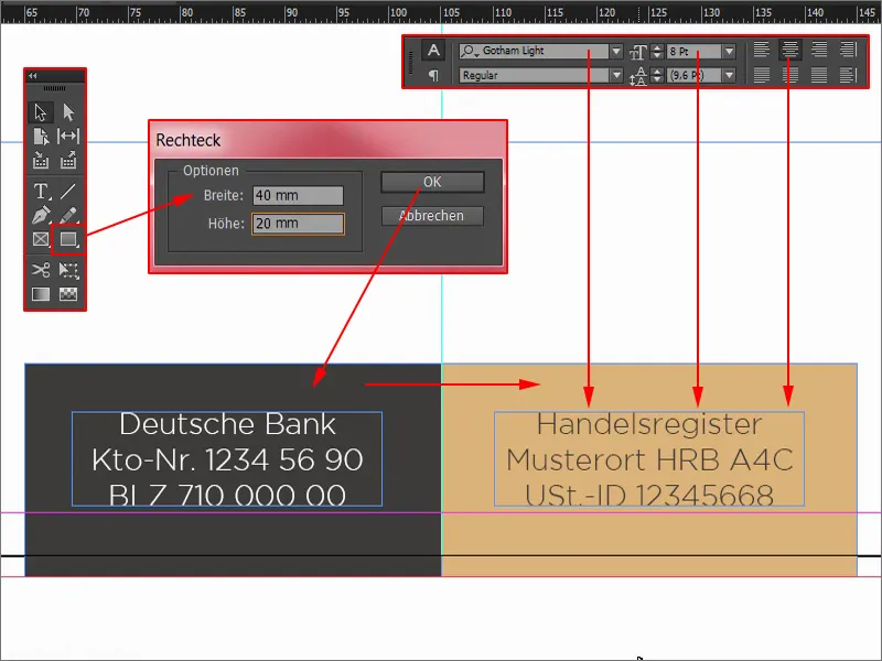
Now let's use a little trick: I'll remove the bleed at the bottom here again (1) so that I can work centered. I select the front element and the back element and align the whole thing using the Align panel: Align to vertical center axis (2). Then I move it back to the bleed.
Another copy of the text field, which I move over. The whole thing then in reverse color. And then there's the extract from the commercial register. And that's it.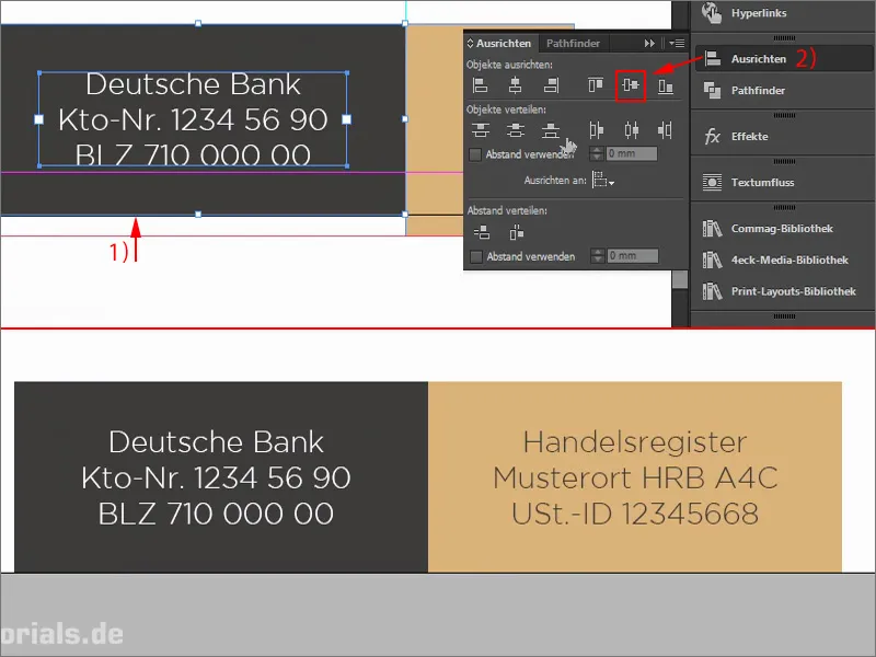
Before we forget: The hole marks are still missing. The first mark goes on the 105 mm auxiliary line. Draw a line once with 0.5 pt (1). Make a copy of it and position it here. I change the color to our black (2). Continue the whole thing to the last mark here at the bottom at 210 mm. Set the color here to ochre again (3). I think it would be a nice gimmick to simply reduce the length of the stamps a little, perhaps to 4 mm (4). That's how it would look. At the top too.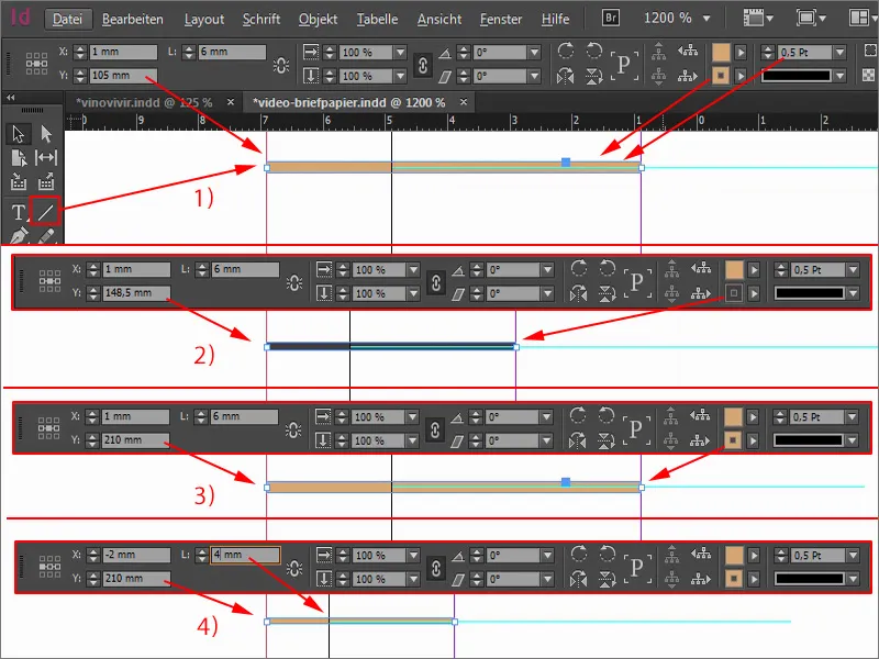
Designing the back
Let's move on to the back. This is done pretty quickly. I open the pages paneland add a new page (1).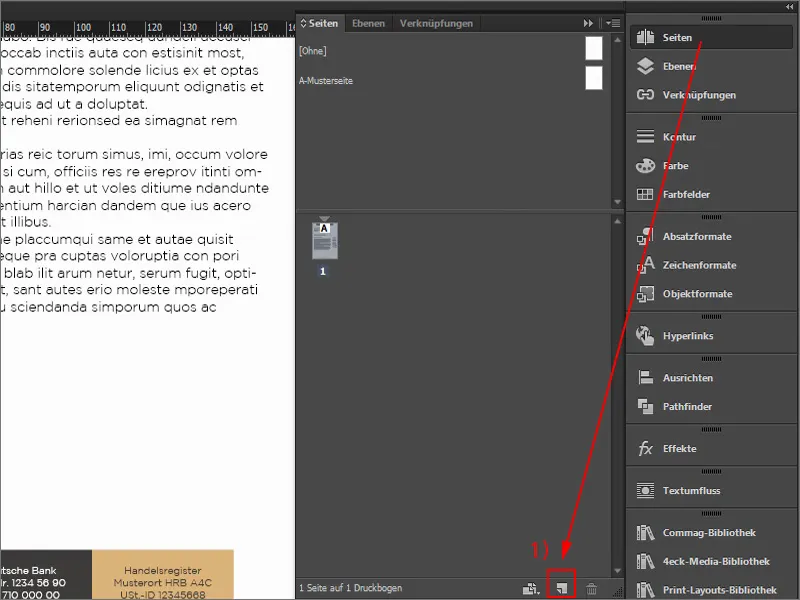
The first thing we need is a large color area. I draw a rectangle and fill it.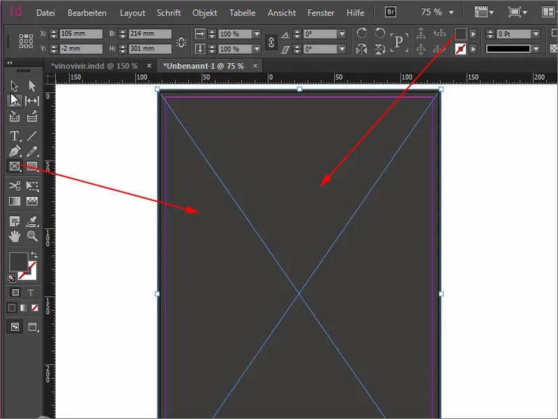
Now I'll get another element from my library that I purchased from Fotolia.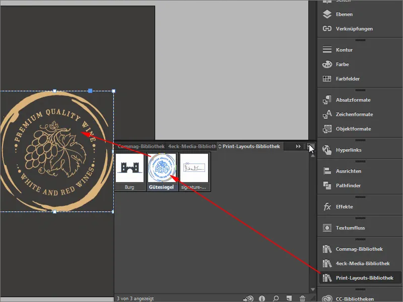
What I don't like here is that the "Premium Quality Wine" is somehow not quite centered, even though it is aligned straight. Let me rotate it by -8°.
Why is it so crooked? If this also happens to you, then it's because you haven't selected the reference point in the middle (1). I undo this with Ctrl+Z, select the center and rotate by -8.5° (2). Now it takes the center as the reference point, and I like the font much better.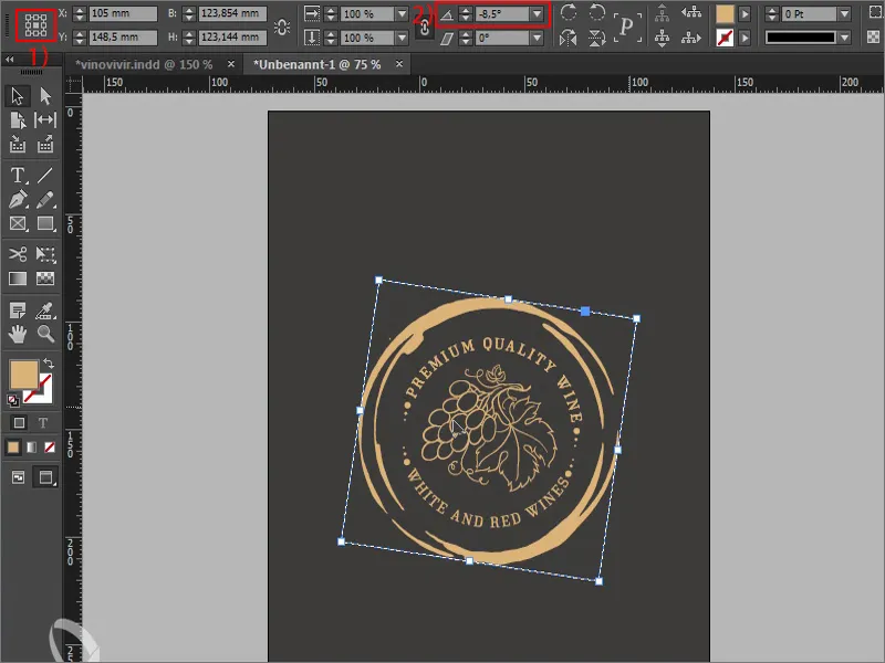
A small note at this point: this great seal of approval, which is somehow supposed to suggest quality, that this is a premium segment, tends to hang a little too low. It's not really in the middle, although in purely mathematical terms it is very much in the middle. So it sits in the middle, but we are often under a misconception here - vertically aligned shapes are perceived by us as larger than those that are aligned horizontally.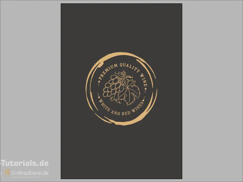
I have brought you a graphic to illustrate this. These two lines are exactly the same length. It's hard to believe, but it's actually the case. This line here is perceived as being significantly longer (1) than this one here (2). This is something we have to take into account.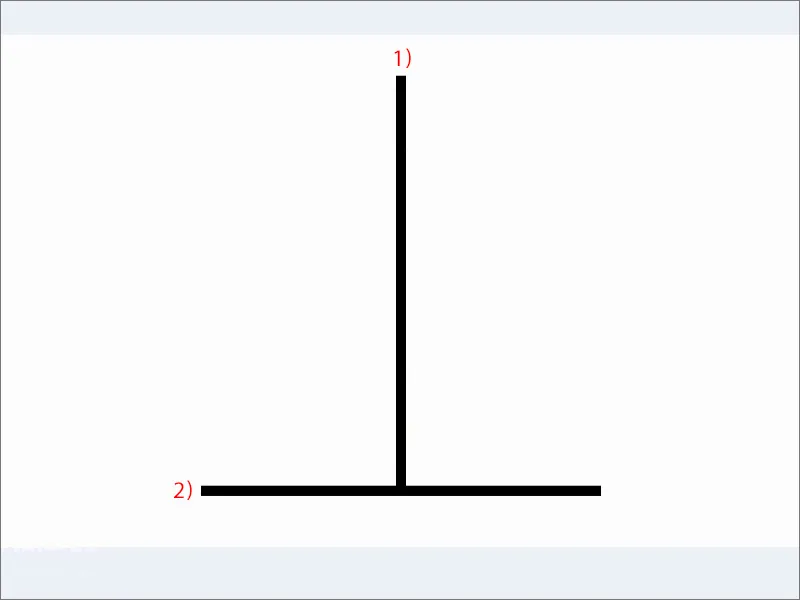
You should observe the same thing with the layout. You can see that quite well here. The geometric center is here (1), but it is not really the center, because this is exactly the effect that comes into play - the optical center is slightly higher (2).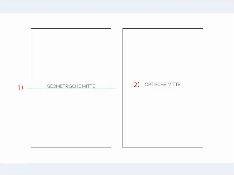
This means that when working in our layout, it would be a good idea to simply move this wine seal a little higher so that it corresponds more to the visual center than the mathematically correct center. This happens quite often in design. You simply have to consider the design aspect and check how it looks rather than making everything mathematically correct.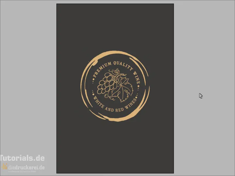
We are still using our logo down here. I'll just grab it from above. So Ctrl+C, copy once, paste down here. I take out the spaces, centered alignment. 50 pt is of course too big for the back, about 30 pt should be enough for us (1). I'll move that down a little. A copy of this, and I write in it - without capitals and with 11 pt (2): "since 1864". Align it in the middle, add a little more space at the bottom. Wonderfully beautiful back. That really is the highlight of these letters.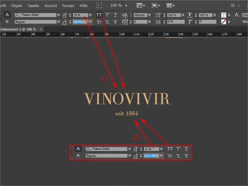
With an appearance like this, you really make sure that you suggest with the noble and high-quality natural tones: This is really premium segment, this is quality, this is of the highest quality and exquisite, what we offer here. This is exactly the image we want to convey.
We continue with the export. To do this, we delete the text field, the address field and the subject, as these are assigned individually.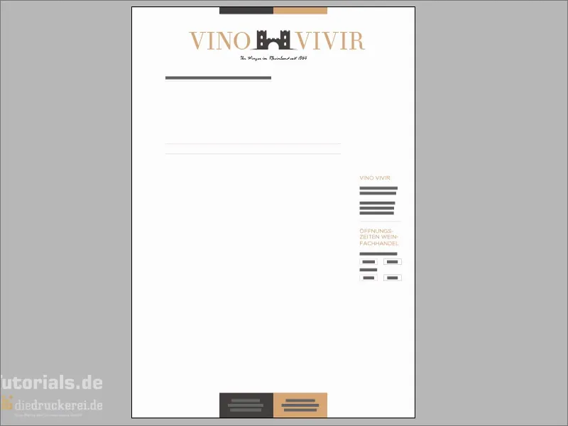
Export
Press Ctrl+E to open the export dialog. This is of course great if you work with shortcuts, as everything is quicker.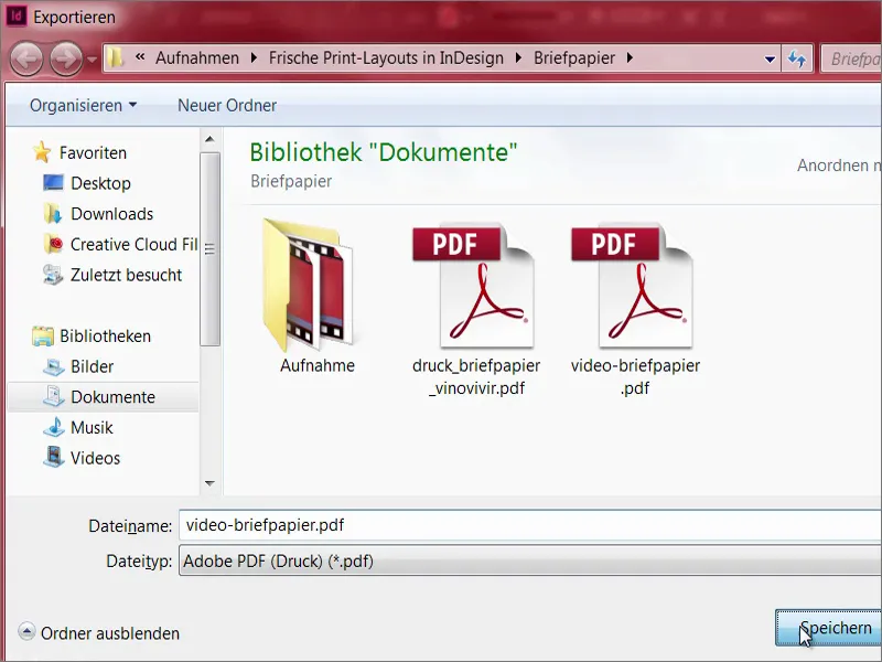
Diedruckerei.de ISO uncoated (1), we had already created this before. Export ... and we have our beautiful stationery.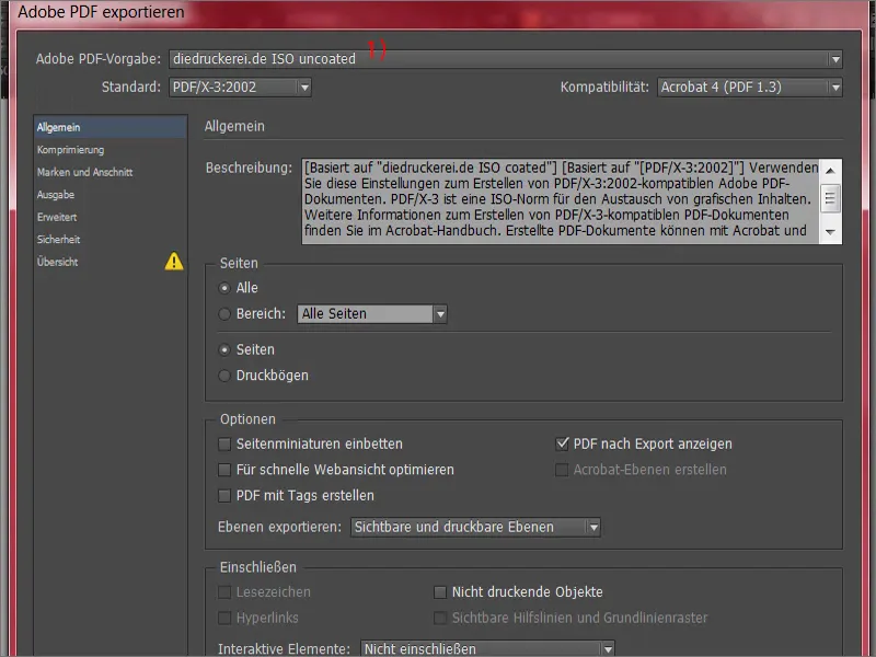
Transferring the print data to the print shop
Now it's off to the print shop. Let's scroll down further. Here we can choose which paper we want to use. There are different grammages. What exactly is a grammage? It is an indication of the thickness of the paper. Letters are usually printed with a grammage of 80 to 120 g/m² (1). The drop-down menu covers exactly this range. However, if you want to use recycled white, as we do, then we are at 80 g/m² anyway. Flyers, for example, tend to be printed on 135 g/m² and business cards can be 200 to 300 grams.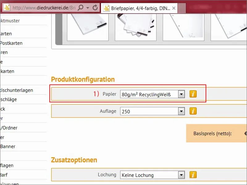
How do you actually arrive at these values? That is perhaps quite interesting. If you put an A4 sheet of paper on a scale, the bottom line is 5 grams. And since 16 of these A4 sheets fit on a printed sheet that has the area of one square meter, 5 times 16 equals 80 grams per square meter. It's that easy to work out. Opacity is also important here, i.e. the opacity that you have to pay attention to so that nothing shows through afterwards.
For the print run, we need 1,000 pieces (1). This is quite practical, as you can even specify the perforation (2), which we have already created. The fold (3) can also be predefined. Corner roundings (4) are also possible. This is what I like best, a 7 mm radius, which is of course the ultimate eye-catcher. You don't see round corners on every corner, but I think it's really quite cool, but unfortunately it's not suitable for this noble purpose. Then it's on to the order (5).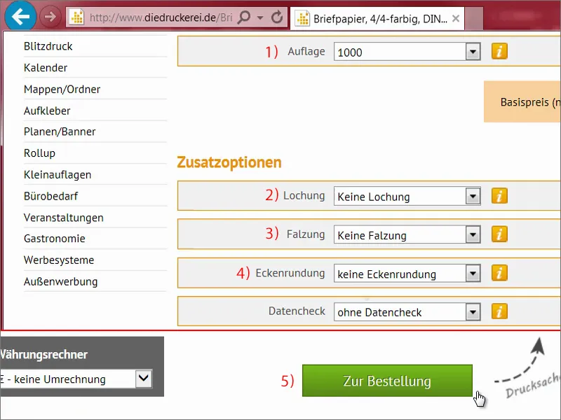
Check everything again in the shopping cart, then click Next, and continue with the billing address. We select our prepayment, continue. And then it goes down to the bottom here. There's also a newsletter that you can try out. And now it's time to buy.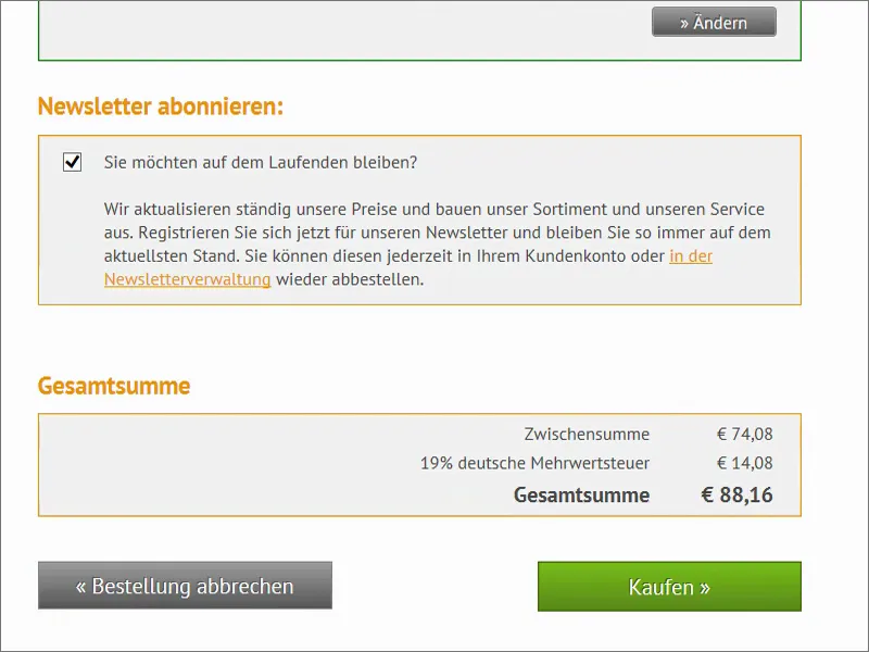
Here we can now upload the document (1). At the bottom it goes to the data check. We now select Everything in one document (2). You could also export this separately as front and back and then output it again separately here, but we have everything in one document. We have uploaded all the data and then it's time to finalize (3).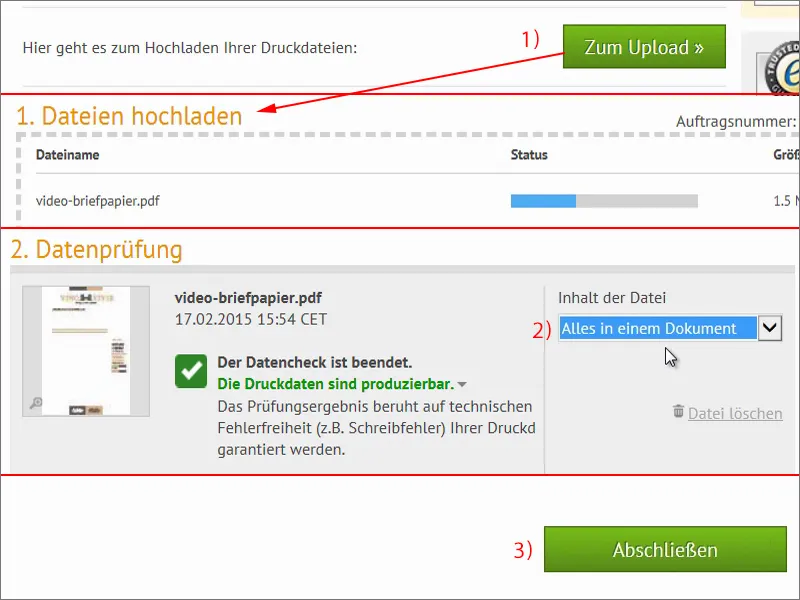
Unboxing the stationery
Now the time has finally come. The letter carrier was here and brought me this box. Four kilos - let's take a look inside. Before I do, I want to tell you that there's a huge difference between what's in here and what you see on your monitor now, because it's not made of A4 paper. I'll take out one pile here and put the rest to one side. Now take a look at this. At first glance, the stationery looks incredibly neat. It looks clean, the edges are all wonderfully beautiful, razor-sharp I would say, you even have to be a bit careful not to cut yourself.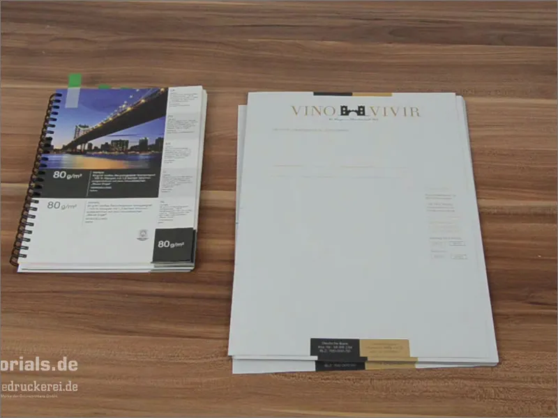
I brought the paper sample book here once. We have the 80 gram recycled paper here and it feels just like our letter. The paper has the wonderful property that it gives us a structure. What do I mean by that? This paper has a very slight grain, which gives it a very old-fashioned character. Of course, it doesn't fit everywhere, but for our winegrower from the Rhineland, who sells wine, it fits like a glove. That's why this recycled paper is incredibly good here. Always compare it with the examples in the paper sample books, depending on what you need.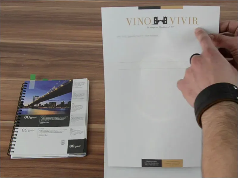
Now let's look at this in detail. We have the hole marks here. Nothing has been cut off at the bottom here, as we made sure it was correct when cutting.
And now the golden moment that I'm so excited about ... I'll turn the whole thing over.
This is the reverse side. And it looks simply superb, doesn't it? If you let it sink in, it has a very elegant look. These contrasts, this gold-brown tone that we have, or these earth tones actually.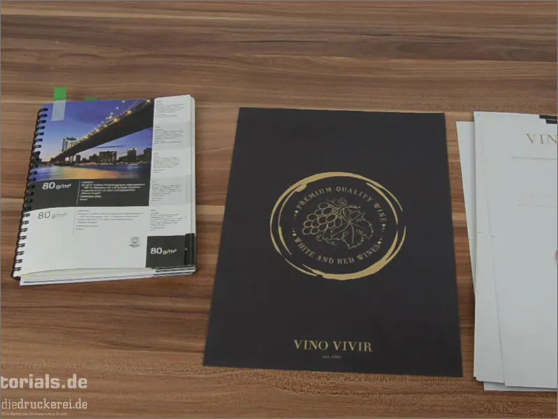
And now take a look at this side effect: We have a very low opacity here, in other words a translucency. And this almost creates a kind of watermark. Of course we didn't put that in, no, it's from the back. And that's a pretty great effect, because it shines through here quite unobtrusively. It's really cool, you can work well with it. Simply write the text here or throw these letterheads into the printer, fill them out on the computer, print, done. And this wonderful paper is ready to go on its journey. I would simply say that it has a look and feel that I really like. I am totally impressed. And I would really recommend that you incorporate what you've just seen and this unboxing into your design, into your layout, let it inspire you, because it's really great. I hope I've been able to help you develop a feeling for what happens when you actually move the printed product from the PC into the physical world, when it's actually created. I think you were able to take something away with you.
Your Stefan