In this tutorial, you will learn how to create an appealing gallery layout using Flexbox in CSS and HTML. The Flexbox model provides flexible ways to arrange elements on your website, especially for layouts like galleries, where an elegant and responsive display is crucial. We will discuss the structure of the HTML code as well as the corresponding CSS styles and build it step by step.
Key Takeaways
- In this tutorial, you will learn how to use Flexbox to create an image-based layout, including using container elements and applying CSS properties like display: flex, position: absolute, and justify-content: space-between.
Step-by-Step Guide
Step 1: Create the basic structure of the HTML code
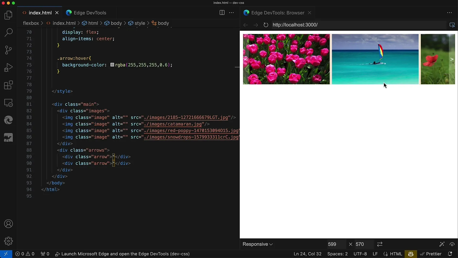
Start with the basic structure of your HTML document. Create a container div called main and add another div with the class images that contains all image tag elements (IMG). You can source these images from a website with Public Domain images. Note that the layout focuses on three images, so the fourth one will not be displayed.
Step 2: Define CSS for the main container
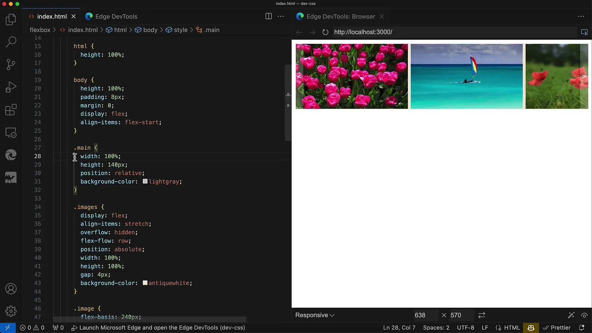
For styling the main container, set the width to 100% to adapt to the window width. Set the height to 140 pixels and ensure that the positioning is relative to ensure that the absolute positions we will use for the images and arrows align correctly.
Step 3: Style the images container
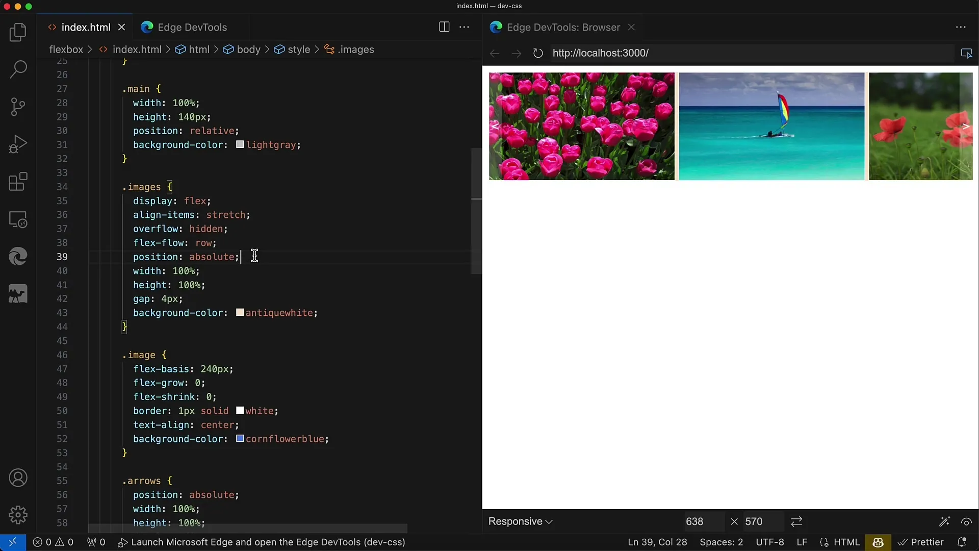
Set the images container (.images) to position: absolute so that it hovers over the container for the arrows. Set the width and height to 100% to place it fully within the main container. Also, use Flexbox properties.
Step 4: Apply Flexbox properties to the image layout
For the .images class, set display: flex and align the contents in a row with flex-direction: row. Adding a gap of 4 pixels between the images ensures more space between them, loosening up the layout.
Step 5: Define image styles
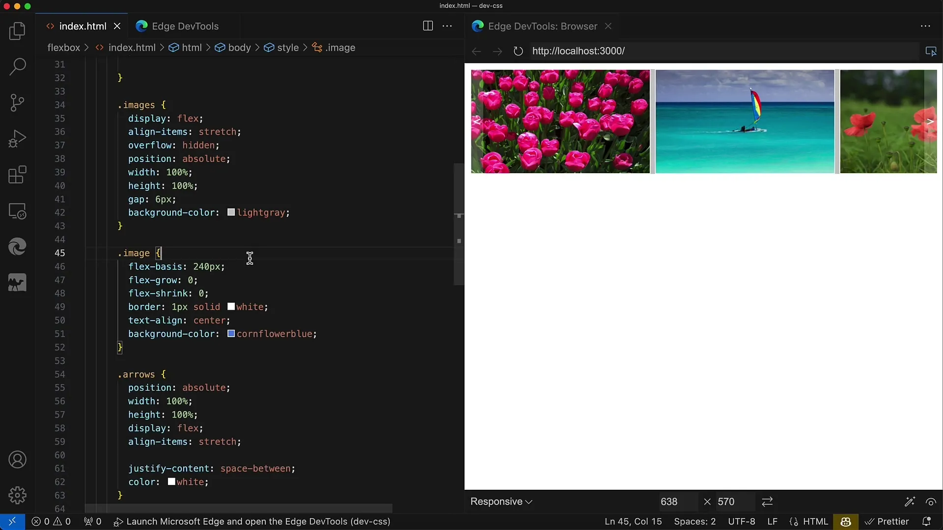
For the images (img) in the gallery, set the Flexbox property flex-basis to a width of 240 pixels and height of 140 pixels. Additionally, you can set flex-grow and flex-shrink to 0 so that the images do not change size and always maintain the selected dimensions.
Step 6: Create the arrow container
Now, create the container for the navigation arrows. This container must also be set to position: absolute and maintain a height and width of 100% to always overlay the images. Use display: flex to arrange the arrows horizontally.

Step 7: Style the arrows
Set the justify-content property to space-between so that one arrow is on the left and the other on the right. For the arrows, you can use Unicode characters to represent them. Set the text color to white and ensure the background of the arrows is transparent.

Step 8: Add hover effects
To add a hover effect, you can change the background color of the arrows when hovering over them. Set this to a slightly transparent white to make the background light up and provide an interactive feel.
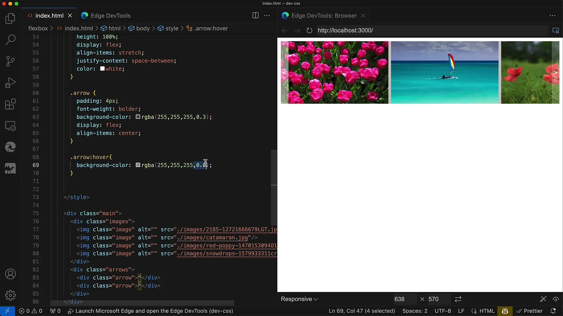
Step 9: Test and adjust the layout
Now it is important to test the entire layout and possibly make adjustments. The distance between the images, the size of the container, or the general color scheme can be easily modified according to the requirements of your website.
Summary
In this tutorial, you have learned how to create a responsive image gallery using Flexbox. You have gone through the steps from the basic structure to the visual effects. Flexbox allows for a flexible arrangement of elements, making your designs particularly appealing.
Frequently Asked Questions
How do I adjust the size of the images?You can adjust the values in flex-basis for the images.
What is the difference between flex-grow and flex-shrink?flex-grow determines whether an element can grow, while flex-shrink defines whether and how it can shrink.
How can I customize the hover effect?Change the background color and opacity in your CSS for the hover state.
