You want to give your texts that certain something, but you have little time? No problem! With Photoshop, you can create cool typo effects in just a few steps. In this tutorial, I'll show you five quick and easy techniques to creatively and modernly design your typography. From Neon Glow to metallic looks to distorted effects - these quickies bring variety and style to your designs. Let's get started and showcase your texts!
1. Retro contour effect for headings
For flyers and wallpapers, creative retro contours can be quickly created using the Outer Glow fill option.
Step 1: Place text
As a starting image, I use a sunbeam background with slightly rotated text. The text is in the Eight Track font at 300 pt.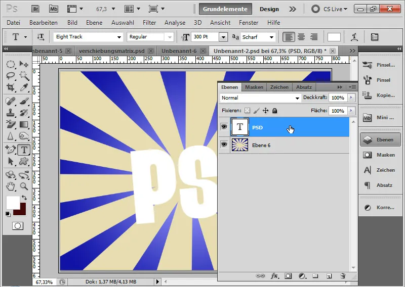
Step 2: 'Outer Glow' fill option as gradient
The Outer Glow as a fill option is usually used as a light or dark glow/shadow. However, Photoshop also offers the option to apply a gradient instead of a color as a glow.
For texts, precise adjustments can result in numerous contour effects, each of which can be varied with different fill methods. Thanks to the availability and easy creation of suitable gradients, there is an almost infinite variety of contour effects that can delicately outline or encase fonts in psychedelic colors.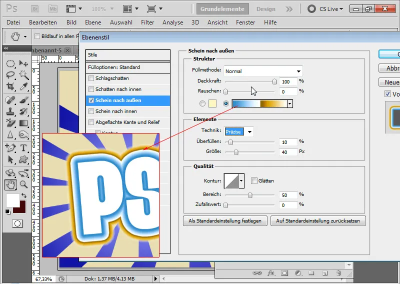
The Size in the Fill options dialog indicates how large the gradient should appear outward. Underfill indicates how strongly the effect should appear directly on the text. Precise technique is important.
Very nice: under the setting Special Effects, there is a broken gradient that can be used for a successful retro effect. The colors can also be easily adjusted. For those who like it, the outer contours can also fade out in transparency.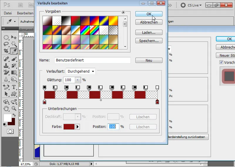
The retro contour effect is complete: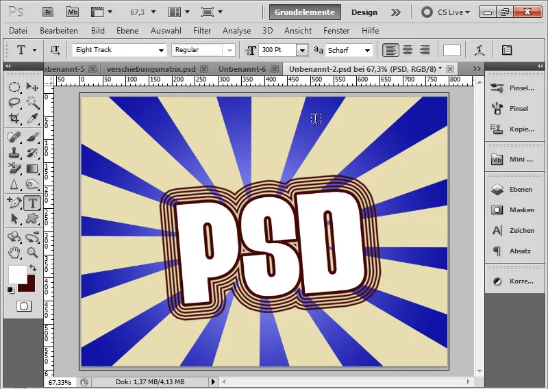
2. Frayed contour effect for headings
A frayed contour effect can be used wonderfully in grungy flyers or for headings. The effect itself is quickly done.
Step 1: Place text on a white background
The background is white. I write the letters PSD in a 600-point Army using the Text Tool.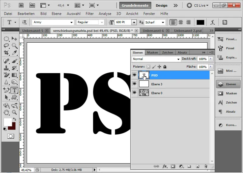
Step 2: Select letters I select the letters of the text layer by pressing Ctrl and clicking on the layer thumbnail of the text layer.
Step 3: Edit selection Using the shortcut Ctrl+Alt+R, I open the Refine Edge dialog and set a Feather Edge for my selection. The specific value may vary depending on the text size.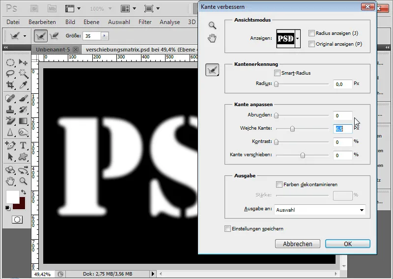
Step 4: Create a new layer and fill with color I create a new layer with the shortcut Ctrl+Shift+Alt+N and fill it with any color. Only the selected area is filled with color.
I can deactivate the text layer and release the selection with the shortcut Ctrl+D.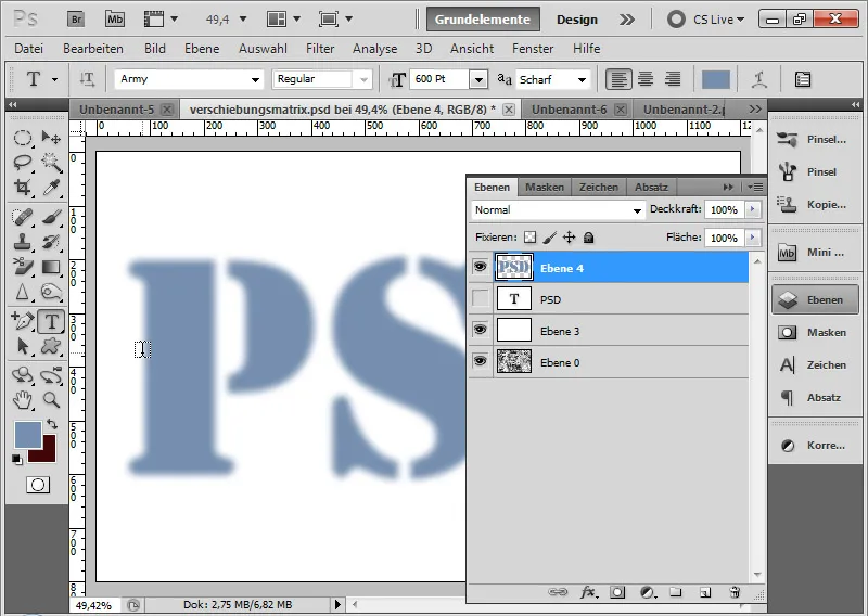
Step 5: Convert to Smart Object I select the letter layer with the Feather Edge and the white layer and convert both layers into a Smart Object.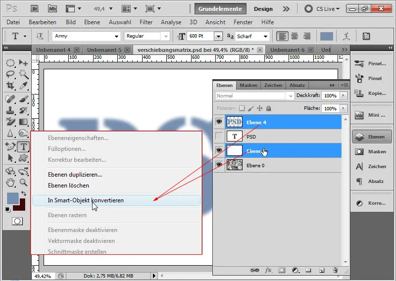
Step 6: Apply Aquarelle smart filter three times I apply the Aquarelle artistic filter three times to my Smart Object.
- Pass
| Brush Details: | 6 |
| Darkening range: | 0 |
| Structure: | 2 |
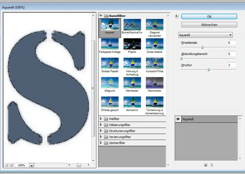
The inputs can also vary here depending on the chosen color, size of the feather edge, and text size.
- Pass
| Brush Details: | 14 |
| Darkening range: | 0 |
| Structure: | 2 |
- Pass
| Brush details: | 11 |
| Darkening area: | 0 |
| Structure: | 2 |
After two passes, an irregular, frayed edge effect becomes visible. With the third and, if necessary, a fourth pass, I can further fine-tune the effect if needed.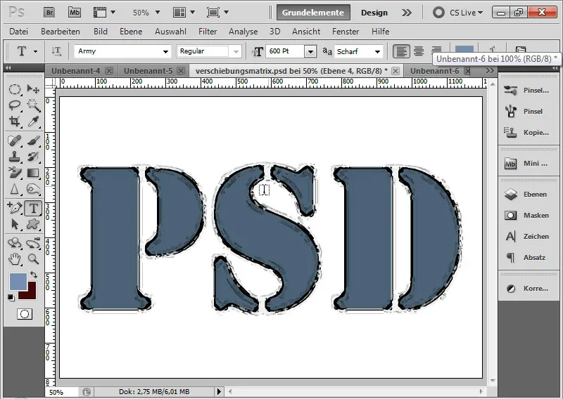
And so the effect can be well used as a text component for grungy backgrounds. The background shown here is attached to this tutorial as working material.
In this view in Darker Color mode with 85 percent Opacity, the background is in Normal mode also with 85 percent Opacity: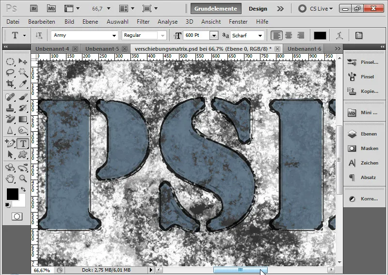
In the differentiated view in Difference mode with 100 percent Opacity, the background is in Normal mode with 50 percent Opacity:
3. Simple 3D Reflection Effect
A simple reflection effect for fonts, which works in a very simple way without much frills, is created in the following few steps.
Image source: Akhilesh Sharma – Fotolia.com.
Step 1: Set Mirror Image as Pattern
The first step for this effect is to set the image that should be mirrored within the text as a pattern. I do this with the image open via the menu Edit>Define Pattern.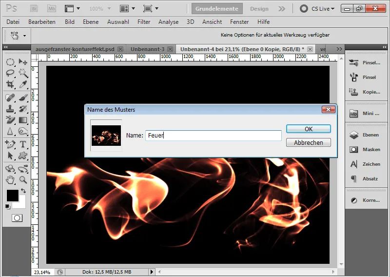
Step 2: Place Text I place my text with a 300-point Arial in my document. The document has a size of 800x600 pixels and a black background.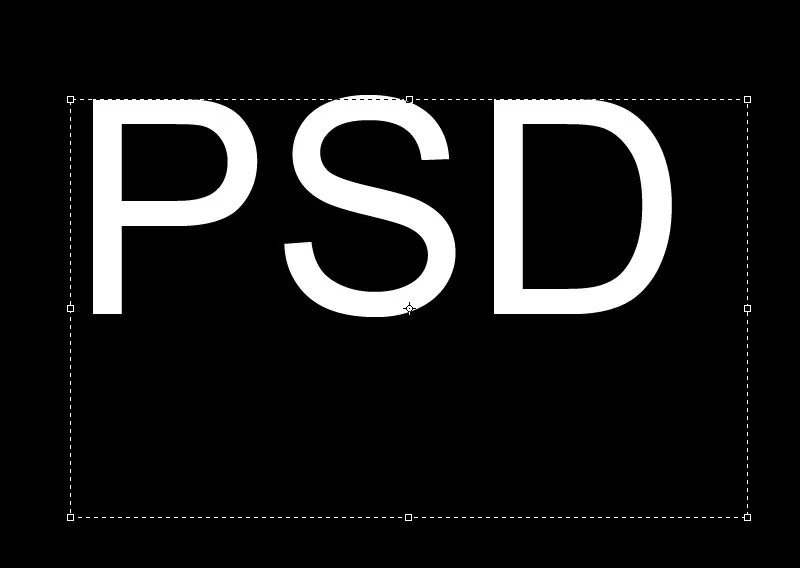
Step 3: Fill Option Contour I open the Fill Options of my text layer and select the Stroke tab. I choose Pattern as the fill type and click on the pattern previously set in the Pattern Preview.
Additional settings:
| Size: | 3 px |
| Position: | Middle |
| Scaling: | as needed, depending on how large the set pattern was; in this case 35% |
With the mouse, I can position the pattern very precisely in the image as I want it to be displayed within the text contour. I can confirm the settings with OK.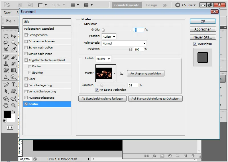
Step 4: Set Fill Option as Layer With a Right-click, I can create a layer from my Layer Style. The contour is now in a layer in the Layers panel. I place the layer below my text layer.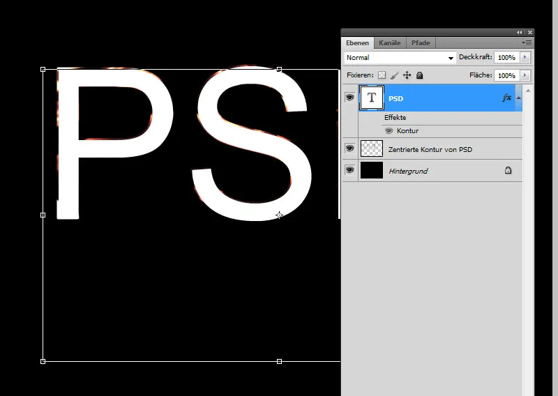
Step 5: Fill Option Pattern Overlay In the Fill Options for the text layer, I select the Pattern Overlay tab and call up the previously set pattern. Using the Scale slider, I resize my pattern until it fits the view. With the mouse, I can position the pattern in the image exactly as I want it to be displayed within the text.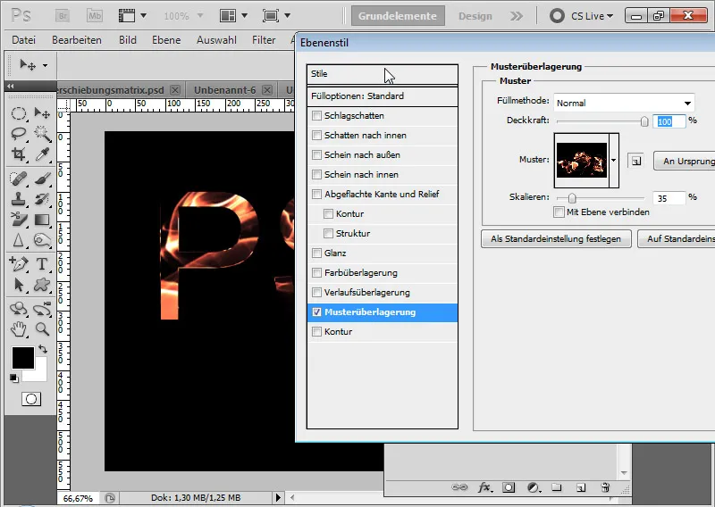
Step 6: Fine-tuning via the Contour To make the effect look realistic, I move the contour layer slightly down and left using the keyboard's Arrow keys, creating a subtle 3D effect.
Now, to add some shine to the reflection, I create a 1-pixel Outer Stroke with the Pattern Fill to the text layer. Since the Stroke with one pixel is really only minimal, it can also be displayed in the upper part of the text. If the effect is too strong, simply lower the Opacity a bit.
This results in a beautiful additional light reflection. A simple 3D reflection effect is complete.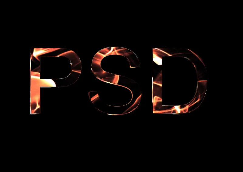
4. Reflection Gradient Effects in Texts and Shapes
First of all, I was inspired for this tutorial by Scott Kelby, who explained this effect in his book "Scott Kelby: Photoshop CS4 Down & Dirty Tricks".
Scott Kelby explained the creation of this effect in 12 steps for two letters. He proceeded as follows:
- Create text
- Rasterize text, select and draw initial gradient
- Duplicate layer and draw counter gradient
- Cut gradient using ellipse selection
- Transform selection
- Invert and remove selected gradient area
- Add contour
- Add flat edge and relief
- -Repeat steps 1-8 for the second letter
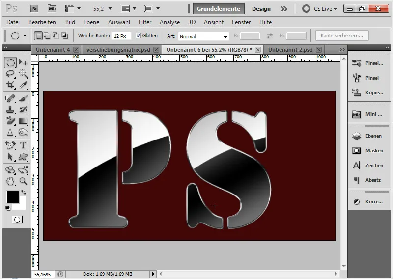
The effect is a small, nice eye-catcher. However, the process only allows for a static result. The text cannot be changed because it was rasterized at the beginning. For every additional letter, I have to repeat a large part of the steps.
In my tutorial, I want to show a way that allows for further editability of the text. With this effect, additional letters can also be added more quickly.
Step 1: Creating a Gradient
To create this effect in a more efficient way, I create a double gradient as a pattern. Therefore, I first open the Gradient menu in my document sized 1000x600 pixels by clicking on the Gradient preview in the menu bar with the Gradient tool (G) activated.
Now I create the gradient that is to be placed in the text as a reflection with a double gradient.
The gradient has the following arrangement:
Gray - White - Black - Gray
I add missing color interruptions by clicking next to an existing color break and place them using Drag&Drop to the desired position. I can change the color of the color interruption using the Color picker of the Gradient menu.
The transition from white to black is sharp. The color buckets should not overlap but be slightly offset. Otherwise, the transition will have slight stair-stepping effects later on. A Smoothness of 30% ensures that the gradient in the gray area is soft as well.
If needed, I can save the new gradient in the gradient preview by declaring it with any name as New. Then I confirm my gradient settings by selecting OK.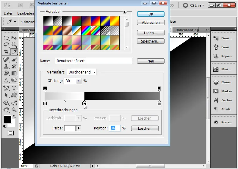
Step 2: Curving the Gradient
I drag the gradient with the Gradient tool from the lower middle of the document to the top left.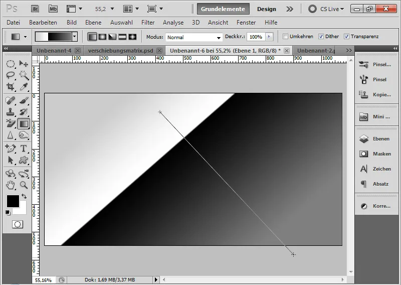
Due to the curve in the gradient, I can't do all the editing solely through a Gradient overlay. The solution is to apply the curved gradient as a pattern.
Using Ctrl+T>Warp, I now adjust a slight warp so that the black transition appears curved. For this, I slightly move my Warp grid upwards to the left.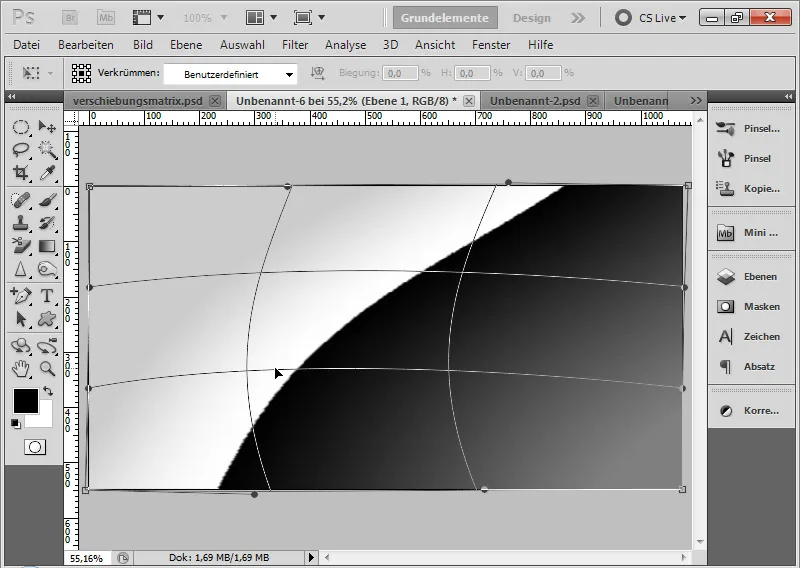
Step 3: Setting the Gradient as a PatternI can now set the curved double gradient as a pattern. I do this by selecting Edit>Define Pattern from the menu. The name is: Double Gradient with Reflection.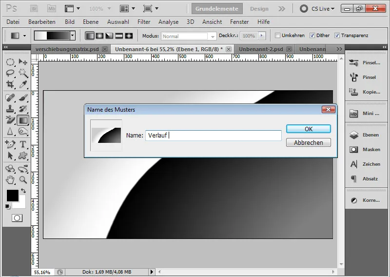
Step 4: Placing the TextFor the document, I choose a new dark red background. Now I can enter my text with a 530-point font. I type the letter P.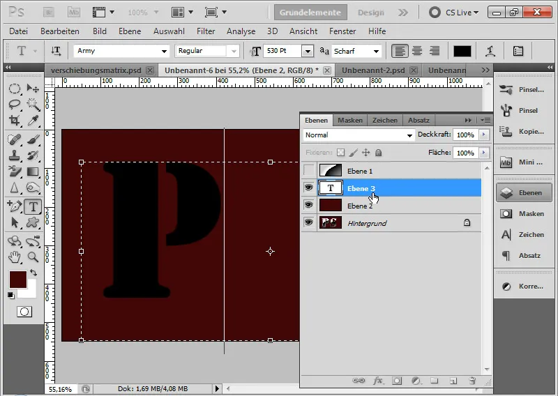
Step 5: Pattern OverlayI open the Fill options of my text layer. In the Pattern Overlay tab, I select my previously defined pattern from the dropdown list.
Now I can easily go into the document with the mouse and intuitively move my pattern to the desired location. If needed, I can also scale the pattern in case it is too big or too small for the letter.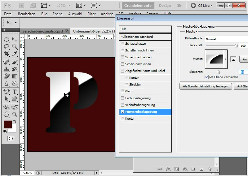
Step 6: StrokeIn the next Stroke tab, I set a 5-pixel thick stroke on the Outside position. The fill type is a Gradient.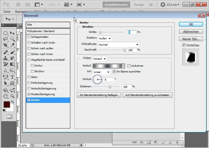
I click on the Gradient preview for the default Silver option from the Metal presets.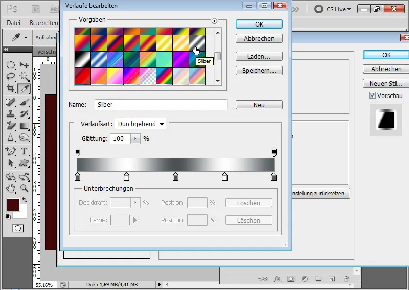
The stroke alone does not appear as desired. It's only with the Bevel and Emboss that it looks truly metallic.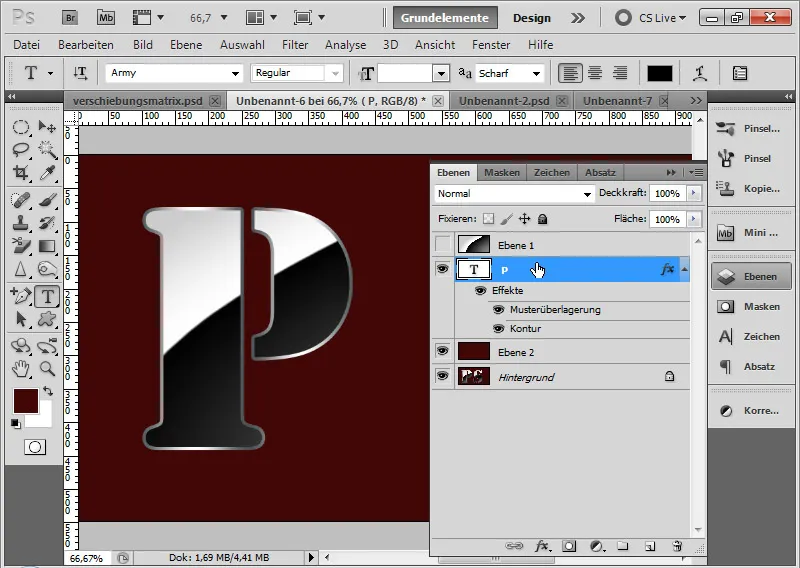
Step 7: Bevel and EmbossThe 3D metallic effect is achieved by the settings in the Bevel and Emboss tab. I choose the following settings:
• Style: Emboss
• Technique: Smooth
• Depth: 100%
• Size: 5 pixels
• Angle and Altitude: 120 and 30 degrees
• Gloss Contour: Double Ring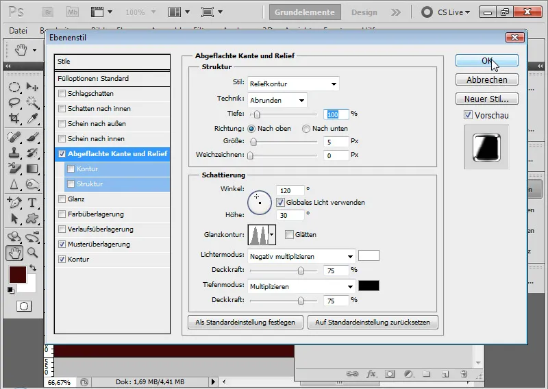
The effect is complete.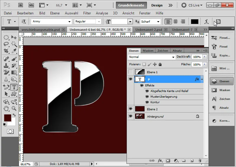
Step 8: Additional LettersFor additional letters, I simply duplicate the text layer, move it to the desired location, and use the Text tool to change the respective letter to the new one.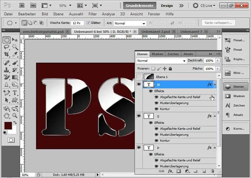
If necessary, I only need to adjust the double gradient in the Pattern Overlay tab to fit the shape of the new letter.
If I want to add some color accents to my gradient, I can also use a Color Overlay in the Blend Mode in the fill options.
That's it!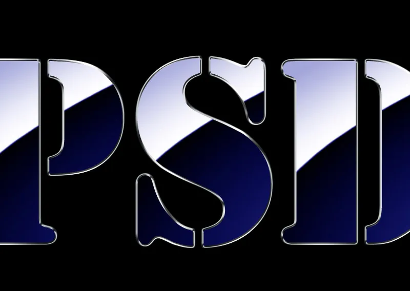
5. Inclined Text with Frame
A nice evolution of the previous gradient reflection effect could be to add a frame to my text and tilt the frame with text in the view.
In this example, not every single letter will have an individual reflection, but they will share a reflection with the rest; meaning, the letters are not in separate layers, but together in one layer.
Step 1: Adding a Frame
I create a rectangle with a thin border using the Custom Shape Tool (U) from the Default Settings as a frame around my text.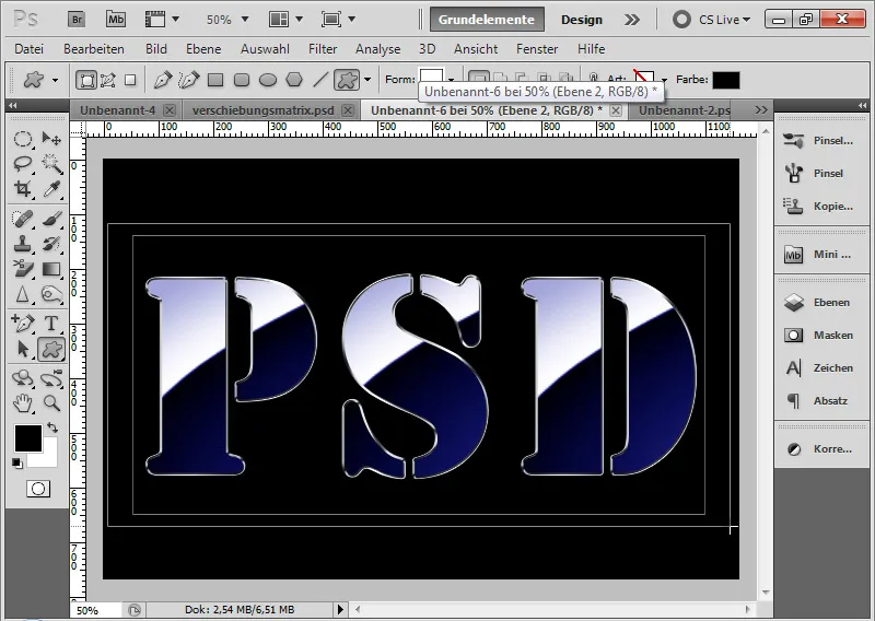
Step 2: Copy Layer Styles Holding Alt, I drag the existing layer styles of the text layer onto the frame layer. This way, I have copied the layer styles for the frame. If necessary, I adjust the specific position of the Pattern Overlay using the fill options again to make it look neat in the view.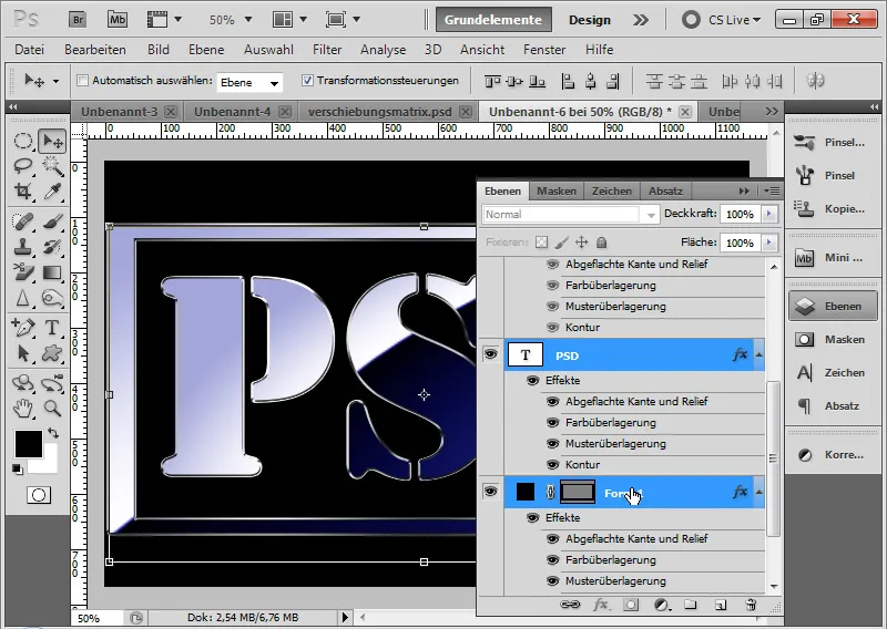
Step 3: Convert Both Layers to Smart Object I select the text and frame layers in the Layers panel and convert them into a Smart Object.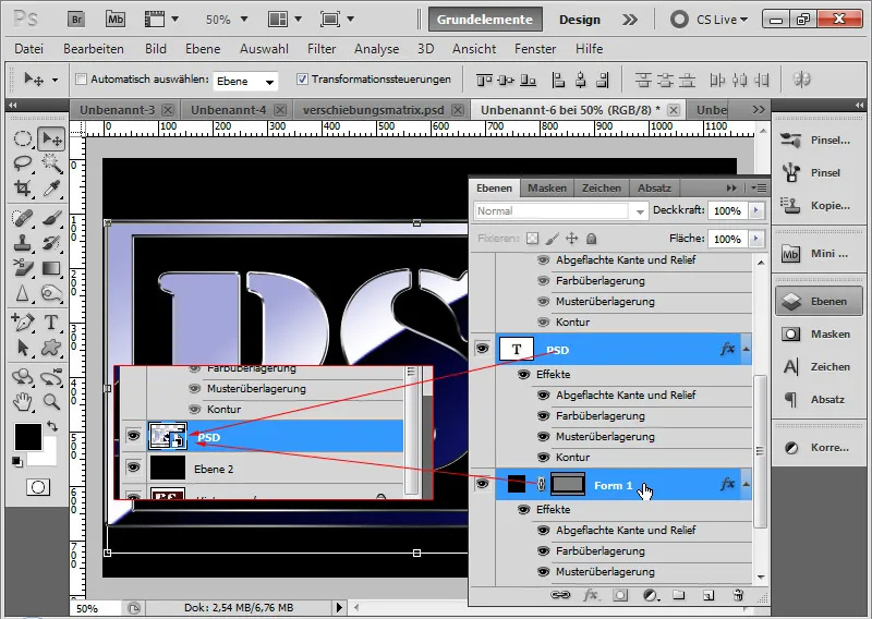
Step 4: Transform I press Ctrl+T on my Smart Object to transform it. Using Ctrl, I can move the top-left corner slightly towards the center. This tilts the frame and text. If needed, I can also individually move the bottom corners while holding Ctrl to enhance the tilting effect. I confirm my transformation by pressing Enter.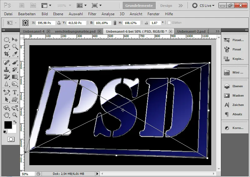
Step 5: Placement Tip It is important that the text has a frame to create a clear tilting impression. The text alone would only achieve this effect to a limited extent.
If I want to achieve a special effect with the placement, I position my text with a frame in a way that not the entire frame fits in the document. If necessary, I may have to crop the document for this look. This creates the impression of a special visual size. For example, the SPIEGEL magazine placed the Google name on the cover in a way that Google did not entirely fit on the cover. This visually and simply highlighted the special size and power of Google.