I would now like to introduce you to the Disney Rules. They come from Frank Thomas and Ollie Johnston's book "The illusion of life". This book collects all their experiences since the 1920s or 30s - the time when Disney was still in the starting blocks and experimenting with how to bring the drawn characters to life on the screen.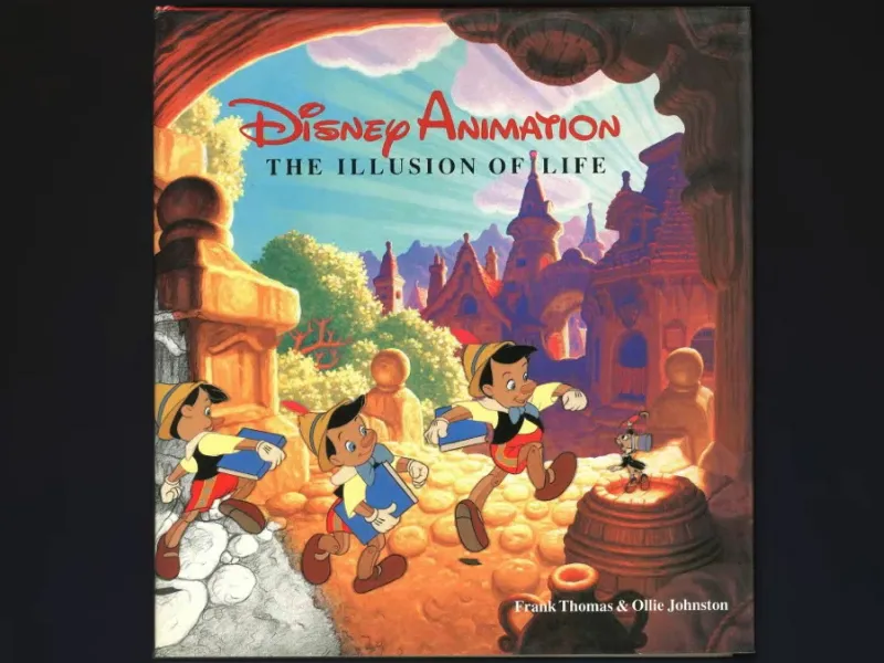
What makes it work? What creates the character that can express thoughts and feelings? And how can we tell that the movements are natural?
The rules in this book are of course designed for characters, because Disney makes characters and animates them. That's why the rules are naturally built around this construct. But I can also apply these rules to motion in general and graphic animations like we have in After Effects. They help me every day in my work and I think you will find them helpful too, so I would like to show them to you.
At Mainz University of Applied Sciences, where I teach, these rules form the basic set of rules that we spend the whole first semester with and on which all our lessons are based. uIn this part we start with rules 1-6 and in the second part we will cover rules 7-12.
1. squash & stretch
A body that is not completely solid reacts to external circumstances. The bouncing ball is the most classic of all animation exercises, which we will also do here. The aim is to squash and stretch the ball.
In this case,squash & stretch means that the ball is squashed a little when it flies and then hits the ground (1). And when it is at its fastest point, it is stretched a little (2). This makes the ball look much more flexible, dynamic and lively.
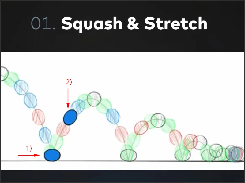
Squash & stretch is therefore the be-all and end-all of the bouncing ball. Of course, a good one can do without it, but we will look at that in this tutorial series.
There is one thing you should not forget, however, and that is volume. A body that deforms still retains its volume. If I want to flatten the ball we just had a little, I can only do this if it shifts its volume to the width and therefore becomes a little wider.
A human body, for example, remains as it is, it can't deform. But when I jump, I squat down first and sort of pull myself together. That's squash. And when I stretch and jump up, I stretch my whole body. That's the stretch.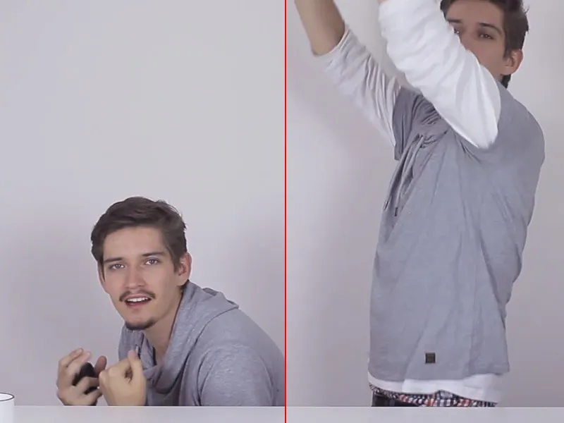
So this is also important when posing characters. So always keep an eye on the volume, it has to stay the same.
The principle is:
If I press things flatter, they get wider, and if I press them narrower, they get higher. The volume must remain the same.
2. anticipation
This rule is really incredibly important and one that I actually use every day in my animation work.
It's about every movement having a preparatory movement. If I'm sitting on a chair and want to stand up, I first go down a little, gather my strength and then stand up.
Or when I'm playing Hau-den-Lukas. I don't take the Hammes in my hand and hit it downwards straight away, but first I take a real swing and do the opposite of the movement, so to speak: I lift the Hammes over my shoulder behind me, gain a decent amount of momentum and then hit the Lukas. That is the core principle of anticipation.
We can see this quite clearly in these drawings: The little bear lays back before coming forward. The little man who picks up the ball has to bend over the ball before he picks it up. And when jumping, the squash & stretch is the anticipation.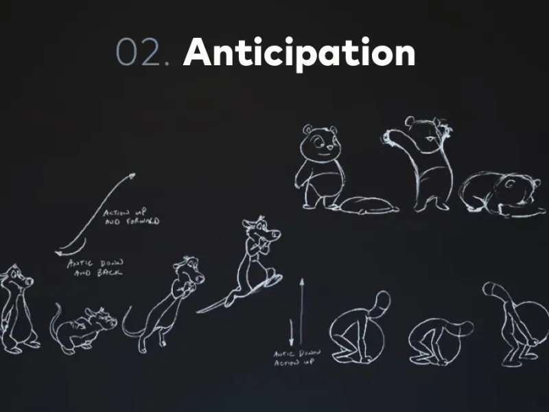
Every movement has a preparatory movement. Even when we move a logo from left to right, we first move it a little to the left, let it gather momentum, so to speak, and then bring it to the right.
You'll see how these little things take your animations to a whole new level.
3. staging
This third animation rule can also be found in the theater: no one will stand sideways or with their back to the audience while speaking. This is the simplest form of staging.
You can often say that staging is well defined when the silhouettes are also meaningful. Where the two people on the left are facing each other, you can't really tell how the one on the left is gesticulating or what he actually means.
It's different with the two on the right: you get the impression that the one on the left is totally stunned. There is emotion in this silhouette.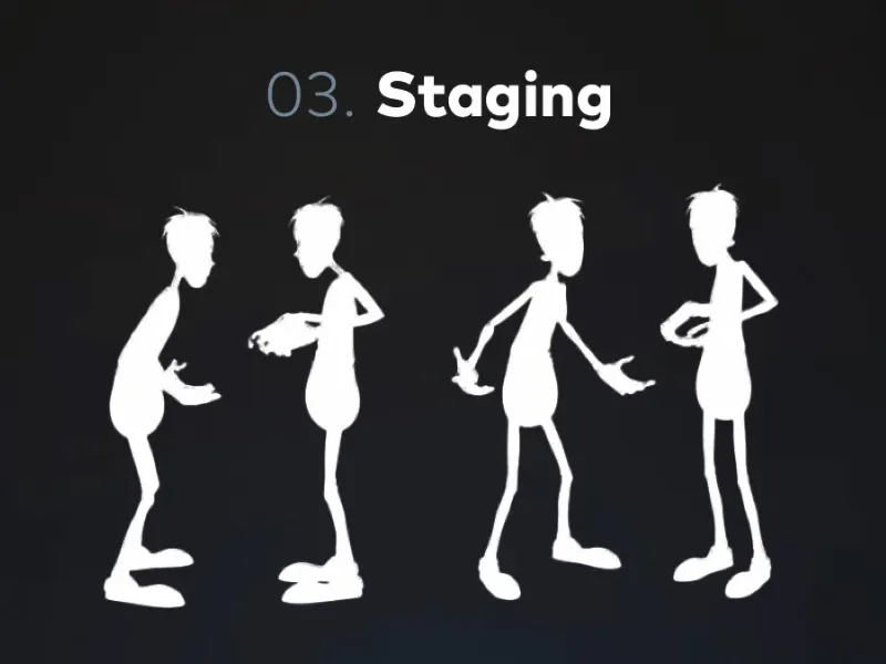
But staging also has to do with how I construct my image. It goes as far as the question of how I place my typography and how I structure the image. Rules such as the golden ratio or the fact that every typography needs a bit of space come into play. All these things are part of staging.
Make sure that every picture you take for the animation is ready to be hung on the wall. If every single picture is good, then the animation is good. Make sure you don't neglect the composition just because you think the camera needs to pan.
Remember: we need a good picture in every frame of the animation and then the whole thing will result in a good animation.
4 Follow through and overlapping action
You could say that this is the counterpart to anticipation.
The javelin thrower throws the javelin and can't help but let his hand or his entire weight, which he has at the moment of the throw, fall forward.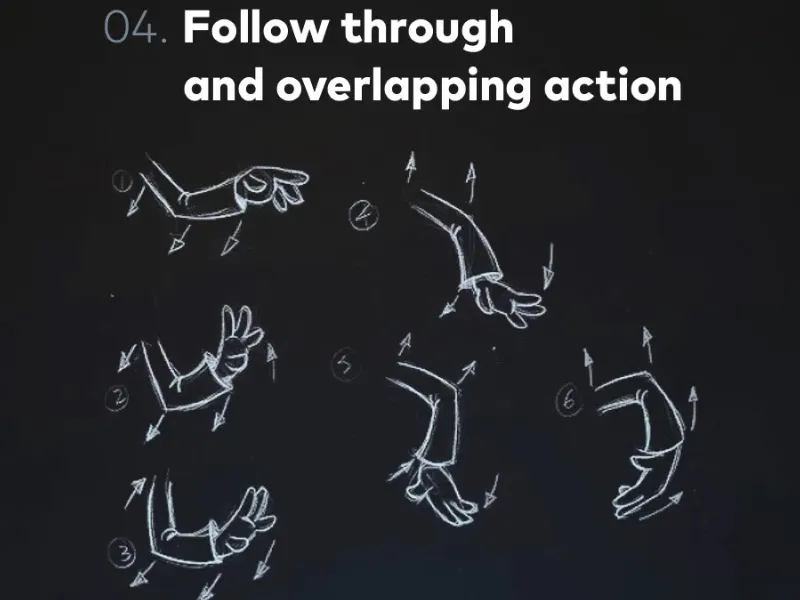
If I wanted to throw my mouse against the wall, for example, I would of course first lunge backwards with my arm over my shoulder and then I would throw - we've already been through that, that's anticipation. But I can't immediately stop and pause at the moment of the throw because my whole body has energy. I have an impulse that I give at that moment and it has to be reciprocated. In other words, I throw the mouse forwards, flick it with the palm of my hand and then lunge to intercept the movement.
So I have a movement that happens after the actual movement. And follow through means nothing more than that no movement stops from one second to the next.
This very, very important animation principle is also used 1:1 in graphic animation. For example, if you move an object somewhere, let it overshoot the target a little because it has this momentum. And only then does it return to its actual position, where it wanted to go. So follow through is definitely one of the most important rules.
Another rule that is always associated with this is overlapping action.
This drawing shows it quite well. We have an arm that is waving and moving. A lot is happening at the same time, but not quite at the same time. What do I mean by that?
I mean that if I stretch my arm out horizontally, then bend it upwards and pull my fist towards my shoulder, not everything happens at the same time. Even if I now throw my fist forward, the arm stretches first and only a little later does the hand unfold - while the arm is already moving upwards again.
So if we have several complex movement cycles that consist of several individual movements, then this is a bit of a shift. Such movement sequences can be a character that you move, for example, or a few icons hanging on a moving chain or similar.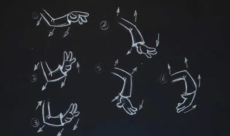
We always remember that this is also used in graphic animation. Overlapping action means that we avoid twinning. We avoid multiple things happening at the same time; even if they happen at the same time, they don't happen at the same time, they all have their own moment. In the real world, nothing ever happens at the same time, even if I bump two marbles, I don't bump them at exactly the same moment, they are also slightly offset.
So on the one hand, the rule describes that we have several simultaneous movements, on the other hand, that they are not simultaneous, but only simultaneous. Please understand the difference between the two terms, even if it's always a bit difficult with terminology because sometimes people talk out of their minds, but I think you've understood what I mean.
5. slow in and slow out
You've probably come across this rule when animating in After Effects - that Easy Ease keyframes look really cool. Why is that the case? What's it all about?
Slow in and slow out is one of the most basic rules that always applies to any form of movement and animation, because no movement starts from one moment to the next.
For example, the car is parked on the side of the highway, we get in, turn the ignition key in the lock and are immediately in the fast lane at 200 km/h the next moment. No. We have to step on the gas pedal, we have to accelerate, the engine has to get going, the wheels have to move and then the whole thing starts. That's a relatively complex example.
But it works the same way when I pick up this cup, I need a moment to grasp it and lift it up. This movement also has a slow moment at the beginning. It is over when it has reached where it is supposed to go - but even then I let the cup rest.
Every movement, when I do something, swing my hand or whatever, everything has a slow in and a slow out, everything accelerates and slows down.
Let's take the pendulum as an example.
Let's imagine a pendulum with a strictly linear movement, where linear means that a movement takes place at an absolutely constant speed, i.e. that the movement starts immediately at the maximum speed, and when the movement stops, the speed stops from one second to the next. Here we have a reflection, so to speak. We go from one side to the other and don't lose speed anywhere. That is very unnatural.
On the other hand, look at this pendulum. You can see here in individual images what the pendulum movement could look like. It swings much more naturally. Why?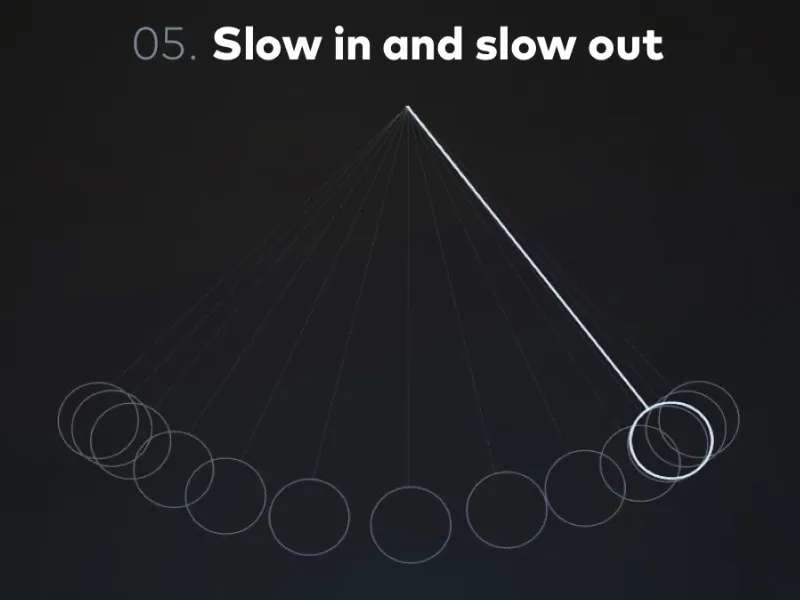
This pendulum obeys the physical laws of acceleration. In this case, we see that it is a mixture of different forces - the centripetal force, which pulls the pendulum towards the center, and at the same time the gravitational force, which causes the pendulum to point only towards the earth and swing out.
This pendulum obeys the laws of physics and thus slow in and slow out. It shows how essential this rule is in the real world, which is why we have to include it in our animations. We always try to simulate something and make people realize that even the typography we make appear is an object and not just pixels on the screen.
The object should jump in, move in and have a certain substance. And it only gets that when it accelerates and decelerates. A very important rule, slow in and slow out.
6. arcs
Arcs means "arc" in English and describes the state of every movement. We always move in arcs. There are hardly any linear distances, straight lines that we make with the body.
Let's take the body as an example. The body is like a marionette. It consists of individual parts and joints and these joints hold the body together. But they also ensure that we only ever move the body by turning it. I stretch my arm upwards and if I stretch my arm downwards and to the other side, my hand would draw a semicircle or a circle.
We can also see this in the illustration. There we have various semicircles that make up the movement of the swinging arm.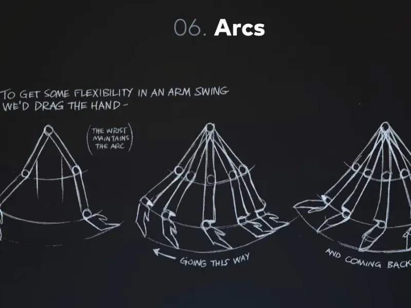
However, we not only have these arcs in the swinging arm, but also in our walk. Incidentally, this is also a classic animation exercise: the walk cycle. We animate something where we do a few frames, a few steps, one leg forward, then the step with the other leg, and when we have the animation, we can let things run.
And also there we find that the person has an up and down when walking and therefore also shows a wave or a curve again.
This rule is also super important in terms of graphic animation, because even in graphic animation, if we want an object to move from one place to another, we tend to do it in a linear motion. This is rarely the case in real movement, it usually swings in waves or a curve from one place to another. So don't make your movement sequences too linear, but draw arcs, draw waves, these are much more harmonious and dynamic movements than straight lines.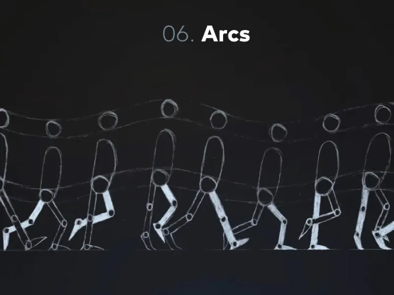
What have we learned?
- Squash & stretch - the body reacts to the environment and external circumstances, be it that the body first sits down and then jumps upwards or that it is the ball that falls to the floor and first compresses itself. Also think of Kickers, the show. When they shot at goal, the ball was an oval at the moment of flight. And all this just to make the speed significant again. The important thing is that the volume always remains the same.
- Anticipation - every movement has a preparatory movement. If I want to hit the table with force, I first move my hand upwards and then hit the table. Hau-den-Lukas is the best example.
- Follow through and overlapping action - every movement has a specific follow-up movement. If I throw something, I can't just stop as soon as I've let go because I still have energy and the objects on the screen don't have this energy. We have to give them that energy as animators.
- Staging - all the pictures we take are harmonious. That the silhouette is right, that I pose in an interesting way when I pose a character, that I don't stand with my shoulder to the audience and that every single one of your pictures looks good in the animation. That you could frame each of these pictures and hang them on the wall. That's the principle. Therefore, always pay attention to a good image composition, even within the movement.
- Slow in and slow out - every movement has an entry movement and an exit movement. We have a slow start to a movement, the acceleration, and a slow stop, a slowing down. Unless, of course, the movement is disturbed by external influences. For example, if I run into a wall, I accelerate at first, but since I can't see the wall, I don't slow down. Also, if things hit the ground, then we have a hard point and there is no slow out, but otherwise every movement slows down and accelerates. Very important.
- Arcs - stop with straight line movements, start thinking dynamically, in curves, swings, circles and arcs, this makes for much more dynamic, organic movements and therefore much nicer motion graphics and animations.
That was the first part of the Disney Rules and I'm looking forward to the second. And then we'll see where we can apply these rules when we go into the practical project.
