In this training, I would like to take a closer look with you at some of InDesign's visual support functions, because you know what it's like: like me, you're working on an article and you have various elements such as headings, introductory texts, quantity texts, placed images ... and somehow the whole thing always has to be aligned symmetrically.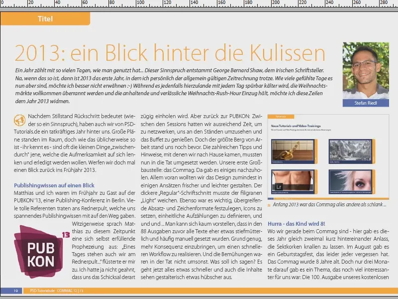
And this is where InDesign really helps us out. There are numerous little helpers that you can activate. These are not plug-ins or anything like that, but are included by default. I can only recommend that you take a closer look at them. Let me show you how you can benefit from them.
Automatic alignment to guidelines
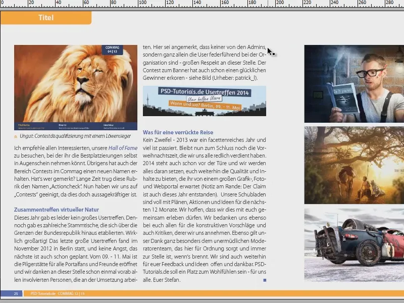
I'm going to take this example and move these three images, which are already nicely inserted (1), to the side (2).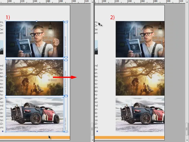
Now I want them to be aligned approximately on the previous axis next to the text. I'll change the display here (1). For example, I could now draw a guide line (2). I'll do that (3).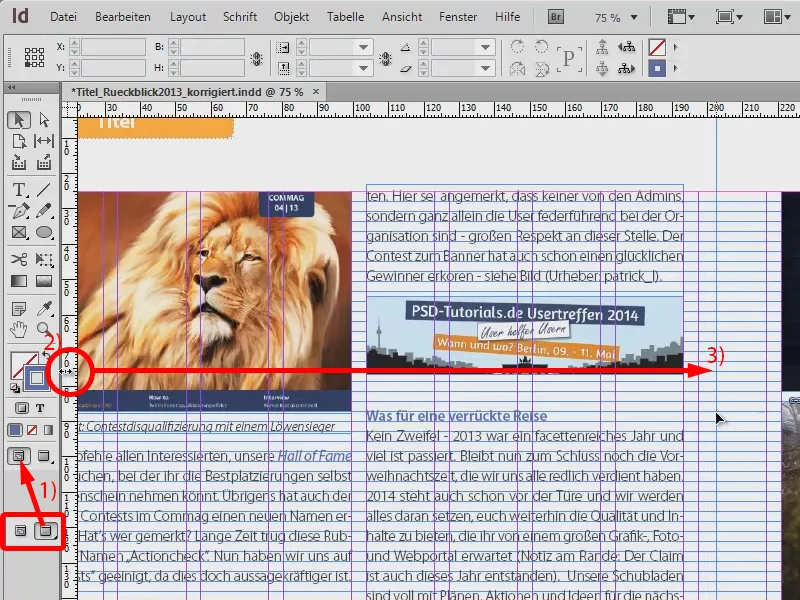
And now I'll select the three images again, zoom in and move them in the direction of the guideline. Of course, you need a very precise eye and a very steady hand to really get it right down to the millimeter. As you can see, I didn't succeed here - the dark blue line of the pictures doesn't fit perfectly on the light blue auxiliary line (1).
But that doesn't have to be the case, because there are little helpers. You can find one here: View>Grid and guides>Align to guides (2).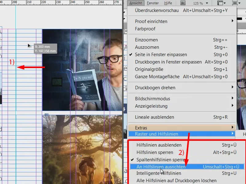
If you have activated this function and you have filled your document with lots of guides to which all elements should be aligned, then the following happens: If I now come close to the guideline (1) and fall below a certain minimum distance, these three images will automatically dock to the guideline (2). The last millimeter is therefore skipped and it places the images precisely on the guideline (3). This is very practical, as you usually work with guide lines, which are also used to create a certain grid. This function should therefore be activated in any case.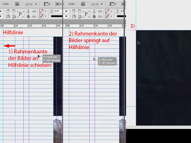
Intelligent guidelines
A second example: This is about the uniform, symmetrical alignment of individual objects. We have this beautiful image in the middle. I'm going to manipulate it a little by reducing its size so that it no longer fits. And I'm moving it a little. You know how it is: images are placed but not aligned at all (1).
Now I could try to move it to the right place by eye, but of course there's an easier way to do it: View>Grid and Guides>Intelligent Guides (2). One of my favorite tools. Let's see what happens ...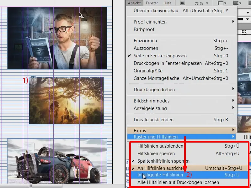
I still have the image selected and will just move it to the right edge. And we can already see a green line (1). This shows us that this image is aligned on the vertical axis in exactly the same way as the one above it. I can now confirm this.
Now I could change the size of the image, for example to full size. Then we get very practical hints again, which are shown to me in the form of green arrows (2).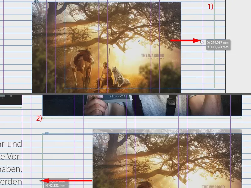
But I could also say, for example, that I don't want exactly the same size. Now I simply reduce the size further, down to this point, and the intelligent guideline now tells us: Wait a minute, at this point you would have arrived at exactly half of the top image (1). So that's super practical. Of course, it also works in the other direction (2).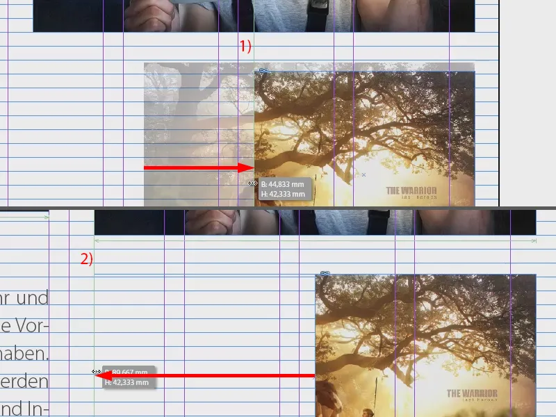
And also in height: Now we have reached exactly the same height as the image below (see green line at 1).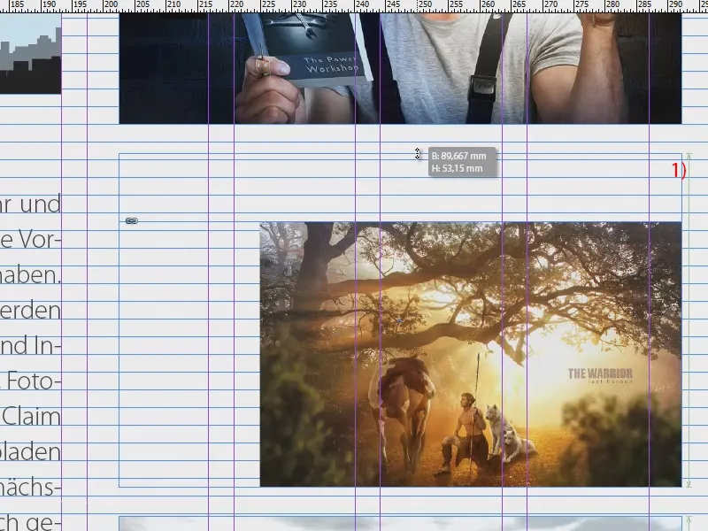
Now I right-click>Customize>Fill frame proportionally and the image has the same size as its neighbors.
The intelligent guides are a must in any case, there is no way around them.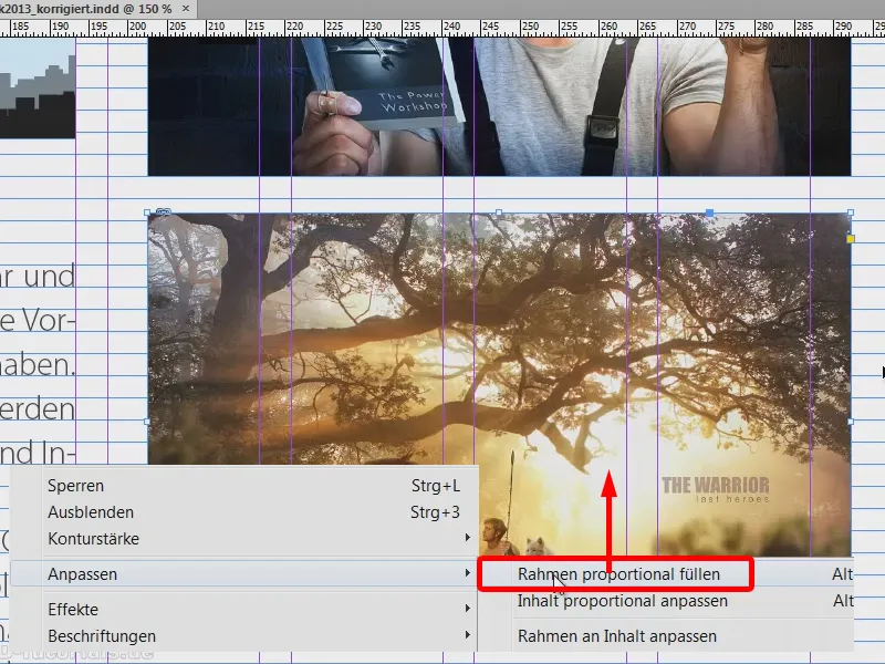
Show hidden characters
Let's leave the images to one side and look at the text again. If I take a closer look at the text, I can see that it is laid out quite nicely, but has a paragraph been inserted at this point by the mouse pointer, for example, or has a particularly large line spacing just been used? How can I find out? You can easily find out via Font>Show hidden characters (or shortcut: Alt + Ctrl + i).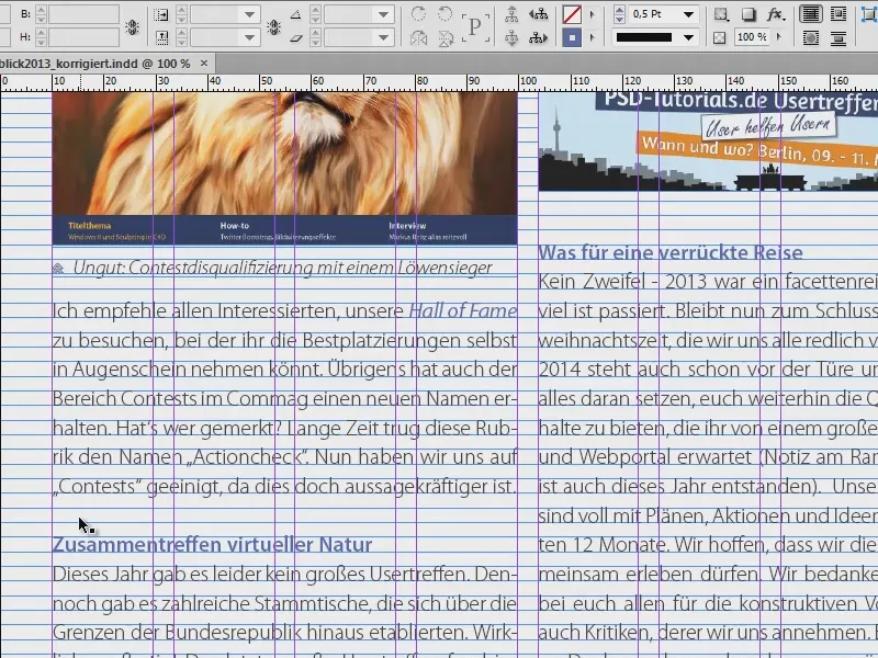
This will show you the hidden characters in the text fields. And for me personally, these are an absolute added value, as they make it much easier for me to assess the microtypography. Here, for example, I can see that a paragraph has been created manually (1). And the spaces (2) are now also highlighted with small blue dots. Hyphenations (3) are also clearly displayed.
So if you have no idea what formatting is behind such a text, switch on this function and you will certainly find informative answers that will help you to better assess the set text.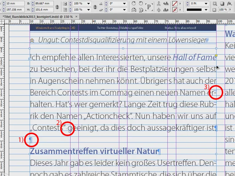
Text concatenation
Such texts are usually always in text fields. We now see a text here, but where does it actually go and where does it come from? We have these funny blue arrows (1). Most of you probably know that these are text chains, but where the text starts and where it ends and which bridges it jumps over, InDesign doesn't tell us at the moment.
Of course, you could assume that it is logical: if the text ends at the bottom (1), then it will continue at the top in the second column. And if the text starts here at the top left (2), then it must probably end somewhere on the front page. But we don't want to play a guessing game.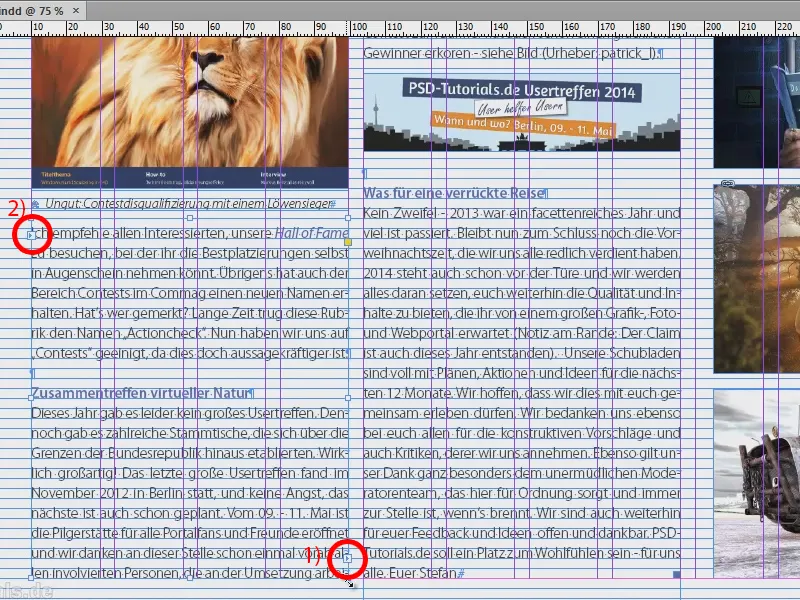
So simply use the following option: View>Extras>Show text links (or shortcut Alt + Ctrl + Y). Then you will see these rubber bands. And if I now move this text around, then you can see exactly from where to where the text moves. And these rubber bands are so variable that they always show you how the continuous text flow has been set. Great thing, I actually always have it activated.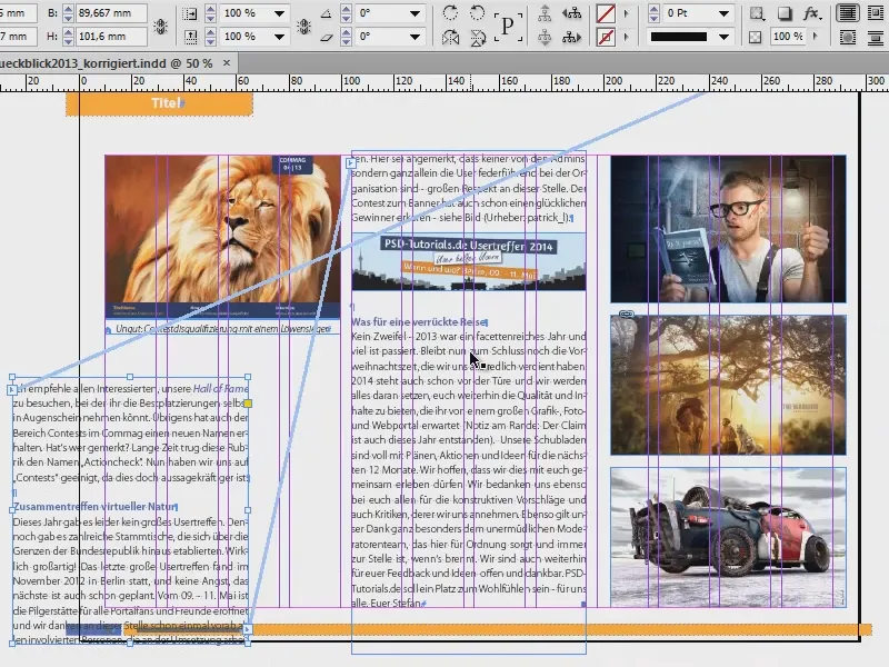
Baseline grid
If you work very frequently with texts that are aligned to the grid, as you can see here, then I recommend you: Blender the baseline grid as well. These are the horizontal lines that you see everywhere. In my case, all paragraph formats are laid out in such a way that each line sits on a single line of the baseline grid with a blank line in between.
You can hide and show the baseline grid via View>Grid and Guides>Hide or Show Baseline Gr id (shortcut: Alt + Ctrl + ß). This allows you to place text fields in such a way that they are really seamlessly aligned with the border of the grid.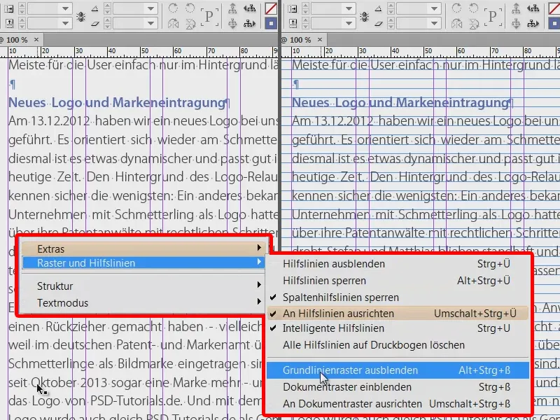
Content selection tool
The next tip, which I think is pretty great, because most of you have probably already been annoyed by this: Maybe it's happened to you before that you've placed an image, like I did this big lead image here. Then of course you know that there is a picture frame, which you can recognize on the outside, and a picture content.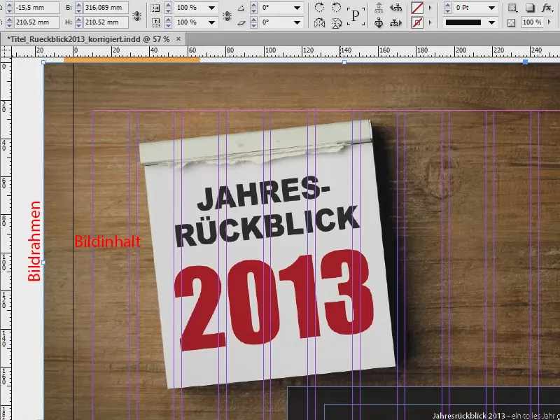
And if you're really quick and fast in InDesign, it happens from time to time that the image frame stays in place, but the image content is accidentally moved, like I am doing here. This means that the frame is still in the right place, but the image content flits from left to right and from top to bottom.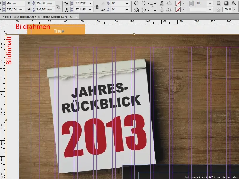
Why is that? It's because the content selection tool was introduced with CS5. This is responsible for the fact that you can actually see a small, round circle in the middle of an image, where I can now see the hand, which looks a bit like a donut. Unfortunately, this is not shown in the image. But this is basically nothing more than the content selection tool. And if you click on this donut, you move the content of the image, but not the image frame itself.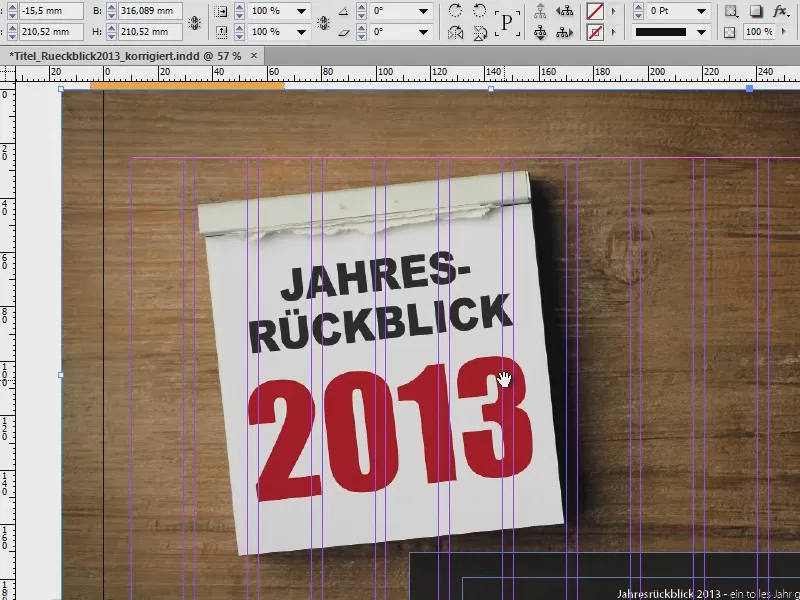
If you are already annoyed by this, then my tip is to deactivate this function via View>Extras>Hide content selection tool. Once you have confirmed this, the donut will never annoy you again until you reactivate it.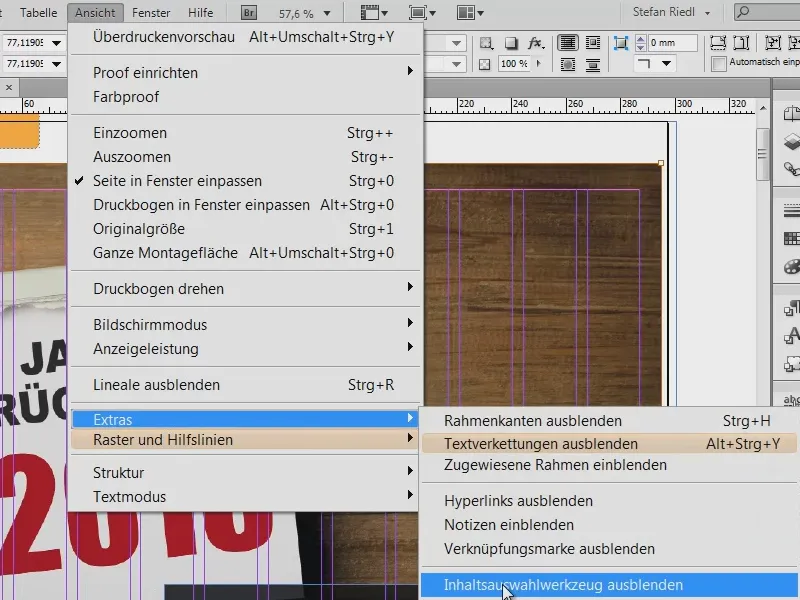
Lock
I'll fill the image proportionally again. And now take a look at this: We have a black text box with a slight transparency and a text field on top of it. If I now want to select and move the two, the following often happens: I move it, but of course the background is there again. Annoying thing.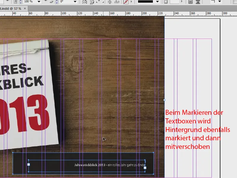
But you can also get around this by simply locking the image in its position with a right-click. Ctrl + L for "Lock".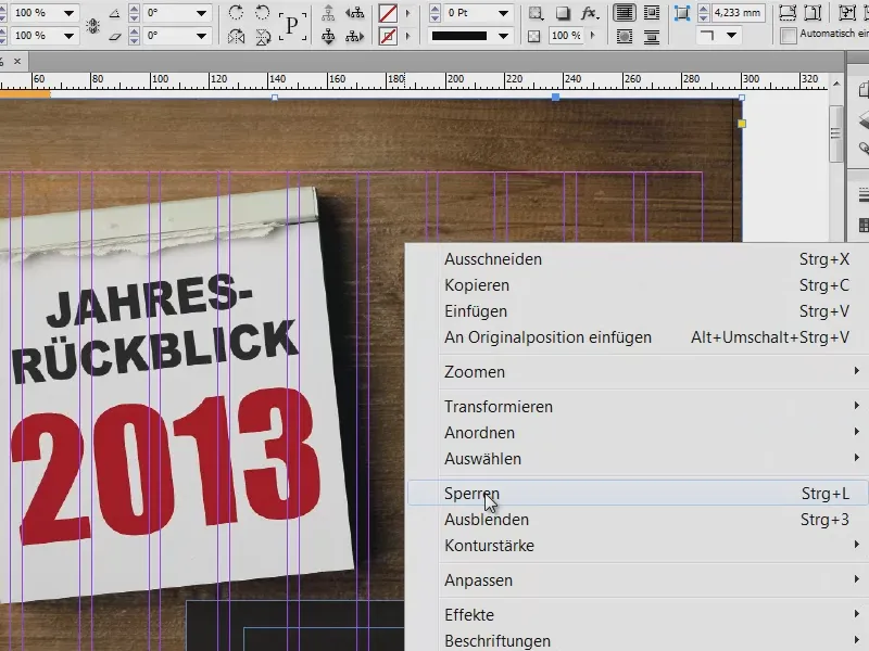
And if you now want to make a selection, the background image will of course be completely ignored and you can easily move the selection to the position where you like it better.
And so that the background image can also be moved again at some point, you can of course also remove the lock. In the layers, you can also see which layer is locked, indicated by a lock. If you make this symbol disappear by clicking on it, then this image is also free again from the chains we have placed on it and can be moved around our workspace again.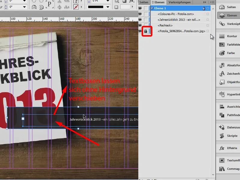
Using layers
By the way, one more tip: It is highly advisable to work on several layers.
Here we have layer 1 (1) and can now also make another layer (2), for example, set only images or only guides on the background layer, set only texts on the second layer, etc. The advantage is of course already known from Photoshop. And we can follow exactly the same principle here. So work with layers if it gets a bit too confusing or if you simply want to prepare your document in a more targeted and tidy way.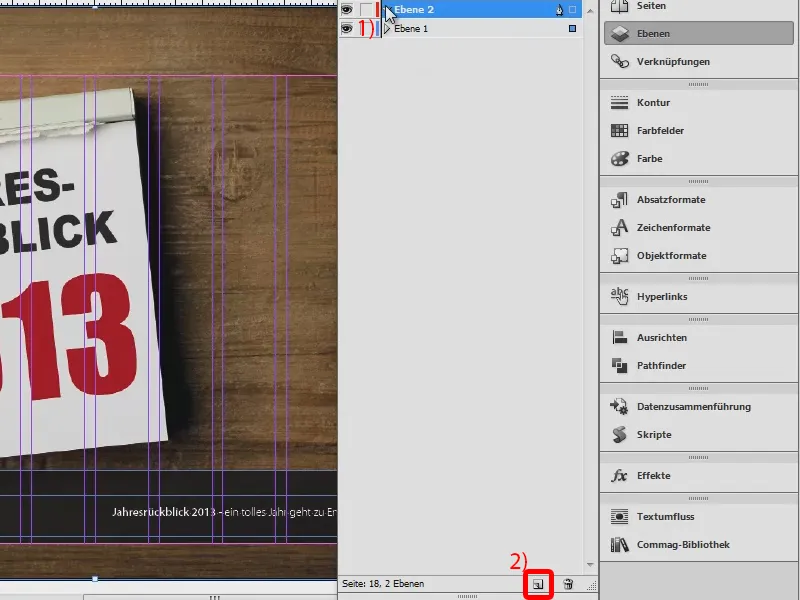
That was a small list of the visual aids that InDesign offers us. Just try them out for yourself to make layouting as easy and straightforward as possible.
Yours, Stefan


