The pre-settings in Adobe InDesign are essential to adapt your working environment to your needs. Whether it's units of measurement, grids, colors, or storage locations – with the right settings, you can work more efficiently and precisely. In this tutorial, I'll show you step by step how to configure the most important default settings to ensure a smooth workflow. Let's get started and optimize your InDesign experience!
1. Basics
Adobe InDesign doesn't have optimal default settings for everyone right out of the box. In fact, it can't because users tailor their default settings to their personal needs and work requirements. With default settings, you have a way to regulate the behavior of InDesign with its features, tools, panels, and appearance.
In this tutorial, I'll show you how to optimally adjust the default settings in InDesign to your personal needs and what you should know and consider while doing so.
Distinguishing between Program Defaults and Document Defaults
InDesign has the peculiarity that it distinguishes between absolute program defaults and document-specific defaults when setting up.
If a document is open and you change defaults via the Edit menu, the changes will only apply to that document! If you close the document and create a new one, you will again be working with the program's standard default settings. Your previous changes will not be taken into account in the new document.
This makes sense because document-specific settings such as the size of your baseline grid and document grid, language settings, or type of quotation marks may vary from document to document.
Therefore, remember: Always make absolute changes to defaults when no document is open! Adjust defaults when a document is open only for special requirements.
Resetting Defaults
When starting InDesign, press the shortcut Ctrl+Shift+Alt. A prompt will appear asking if you want to delete the default settings file. You can confirm this if you wish to reset the defaults to the state after installing InDesign.
Alternatively, you can also copy your default settings file to a different directory right at the beginning.
Under C:\Users\currentUser\AppData\Roaming\Adobe\InDesign\Version 8.0\de_DE\, all defaults are saved in the file "InDesign Defaults" (on Windows 7). You save this file in its original state on an external drive. Additionally, you back up all your custom default settings so that in case of a reinstallation, you simply need to copy these settings back to this directory. If InDesign fails to start correctly, replacing the original default settings file with the modified settings file can help.
Setting Default Font
Before diving into the default settings dialog, adjust your default font first. For example, if you want to work with Myriad Pro, it should be set as the default font when creating a new document. Select the Type tool and in the Control panel, choose Type attributes. Then simply enter the text format that belongs to the corporate design/publishing by default, such as a 12-pt Myriad Pro.
From now on, when creating new documents, Myriad Pro will be the default font when you use your Type tool.
Recommendations for Setting Up InDesign
If you have no document open and want to adjust the absolute, i.e., program-wide defaults, you can open these settings via the shortcut Ctrl+K or the menu Edit>Preferences. The following will explain all the options in InDesign's defaults and provide tips and advice for any deviations from the default settings.
2. General
In the General tab in the Preferences dialog of Adobe InDesign, you can control the rules for page numbering, loading and embedding fonts, as well as object editing.
Under Page numbering, you can choose between section numbering and absolute numbering. The difference between the two is that with absolute numbering, page numbers always start at 1 in the Pages panel, while with section numbering, page numbers always correspond to the actual print sheet page number.
Small example:
The Commag, an online magazine for image editing by PSD-Tutorials.de, is generally consolidated into a book file. Each editor works on their respective part in an INDD file of the final (book) file. It may be useful for the editor to choose an absolute page numbering. This way, they always have numbering starting from 1 in the Pages panel, which can be helpful when the article needs to have a specific page count. However, it is important that all layout files in the InDesign book document regain a consistent page numbering.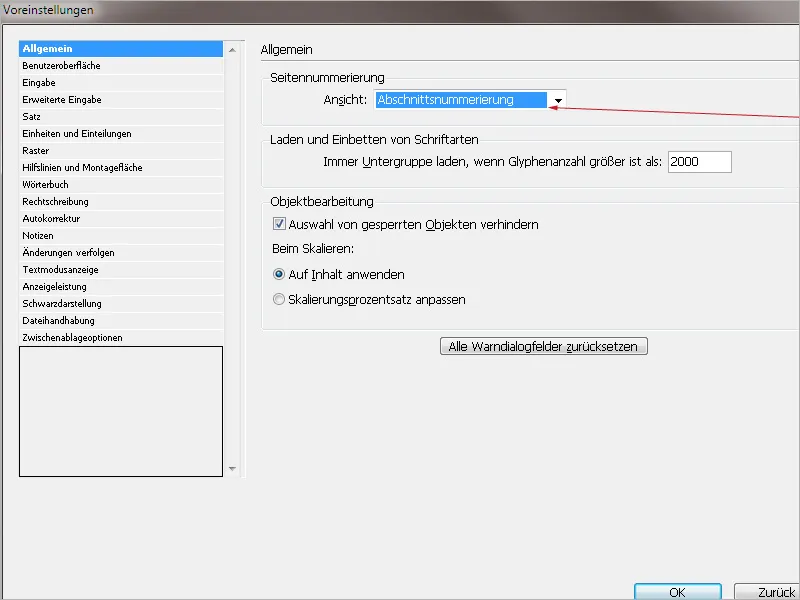
With section numbering, the numbering follows how it will be in the exported PDF document and how it will appear in the page numbering directly on the printed sheet. In this case, an InDesign file that is in the middle of the Commag may start at page 43 in the page panel numbering.
If you do not have specific layout tasks set to a predefined page count and need a quick check on the current page count, you should leave the default setting at section numbering.
When exporting to PDF, fonts are embedded to ensure that the PDF file displays correctly in terms of typography – even if the computer opening it does not have that font installed. OpenType and TrueType fonts can be very extensive and include numerous decorative and special characters due to country-specific apostrophes.
Example of glyphs for Myriad Pro. You can access the Glyphs panel using the shortcut: Alt+Shift+F11 or via the menu Window>Type and Tables>Glyphs.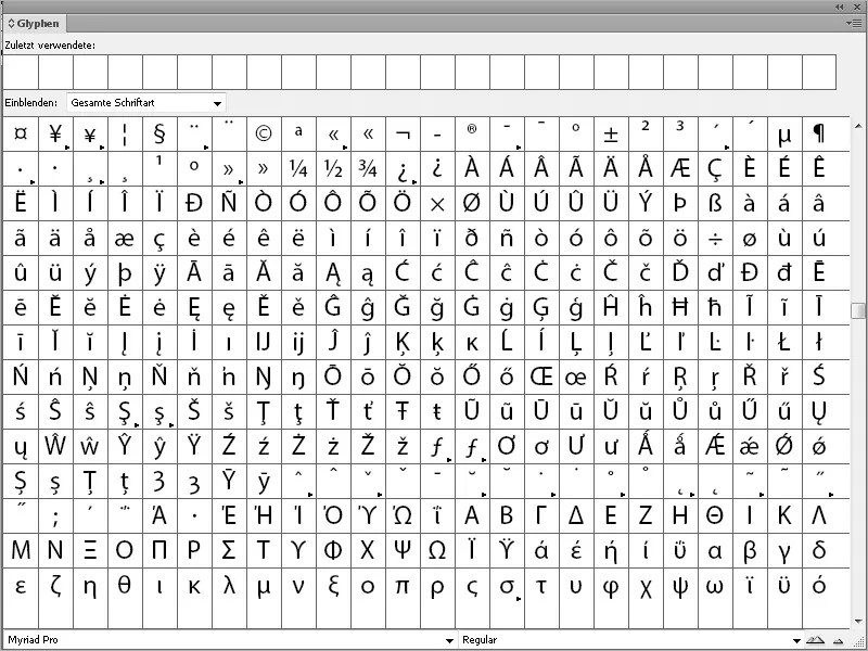
The number of glyphs can go well into the thousands. A glyph, as per Wikipedia's definition, is "the graphical representation of a character, such as a letter, a syllable symbol, a ligature, or a part of a letter. The glyph forms a graphic unit in itself." In other words, glyphs are different representations of the same character.
As embedding includes the whole range of glyphs in the file, it would unnecessarily bloat the file size.
For example, Times New Roman alone offers hundreds of glyphs for punctuation. Therefore, it makes sense to automatically create a subgroup when there are more than 2,000 glyphs, which outputs the glyphs actually used. This limits the file size to the actual size and does not unnecessarily increase it.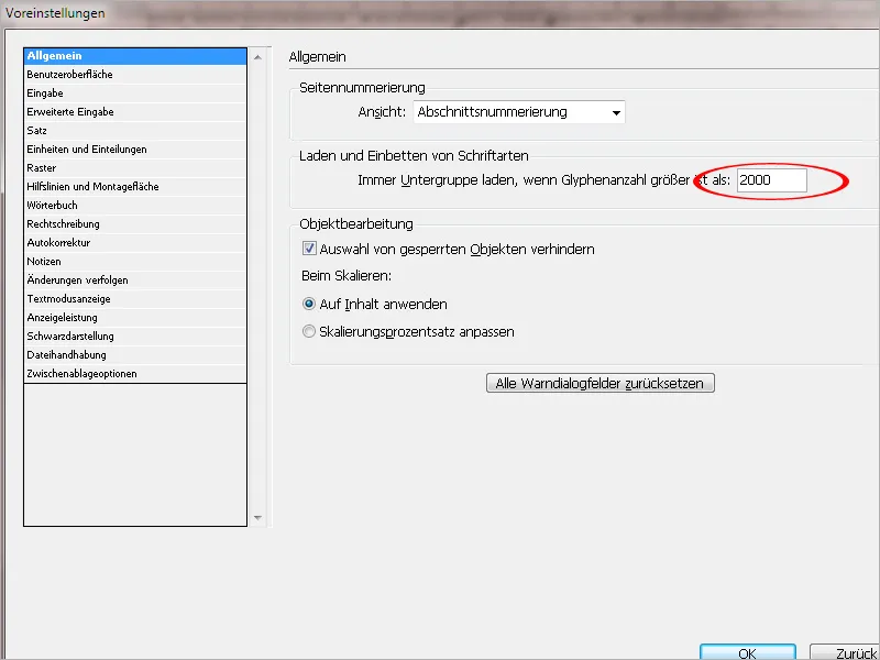
In the Object Editing field, there is a pre-activated checkbox that prevents the selection of locked objects. This makes sense because there are often graphics whose exact appearance in the document should be static. With the checkbox activated, you ensure that locked page elements are not accidentally modified during layout. If the checkbox is deactivated, locked objects cannot be moved in position, but changes in fill color, stroke color, transparency, and stroke weight are possible.
Using the shortcut Ctrl+L, from the Pages Panel (lock icon) or via right-click>Lock, you can lock objects. Now, thanks to the activated checkbox in the Preferences, these objects can no longer be selected. You can unlock them through the Layers Panel by simply clicking on the lock to unlock the page element.
Example: The educational program icon on the DVD cover for our educational DVDs must always be placed exactly in this position. It must not be moved, must not receive any stroke or other effects. Therefore, this element is locked, and thanks to the pre-activated checkbox for preventing selection of locked objects, it cannot even be selected at all.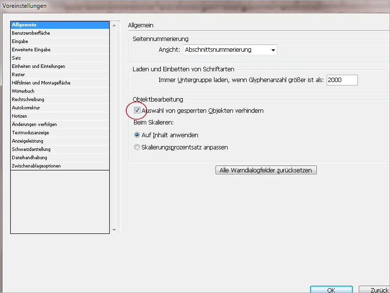
When scaling, the default setting Apply to Content can remain. It states that when scaling a frame – for example, a text frame via the Control Panel or the Object>Transform menu – the content of the frame also adjusts. Both values, both frame and content, are specified as 100 percent after scaling.
By activating the radio button Adjust Scaling Percentage, after scaling, the frame is displayed with the respective new scaling percentage. The text size receives two values: the original one and in parentheses the currently displayed new one. This way, the user always retains the original information about a page element.
In this example, the text frame was scaled. The once 24-point font is now only 22 points.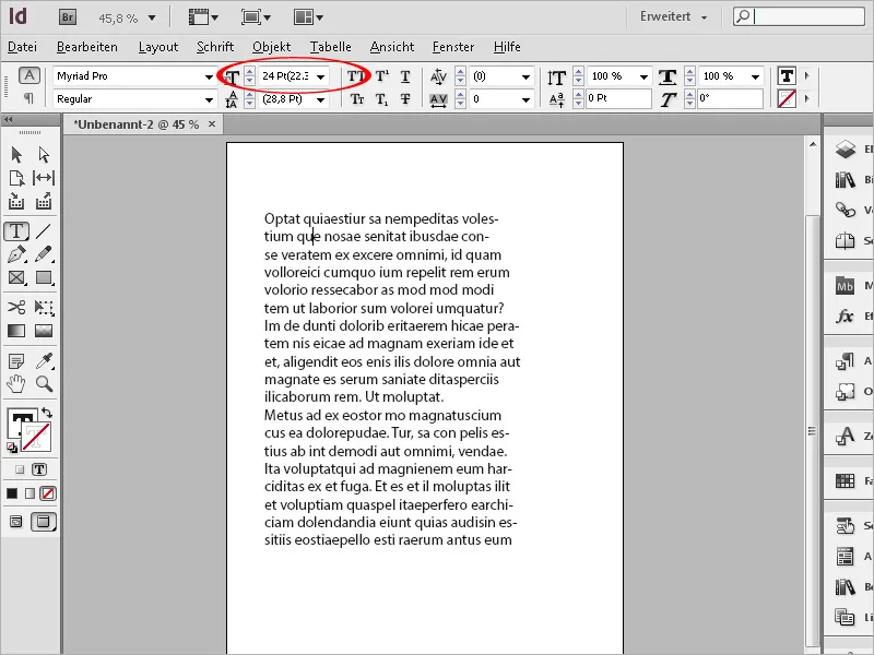
Sometimes InDesign gives the user warning messages that can be suppressed with the checkbox Do Not Show Again. With the button Reset All Warning Dialogs, you can make the warnings that are no longer displayed visible again, if InDesign detects issues in a file or with a setting that has been made.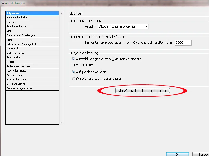
3. User Interface
In the User Interface section of Adobe InDesign's Preferences, you can adjust the handling of InDesign's interface.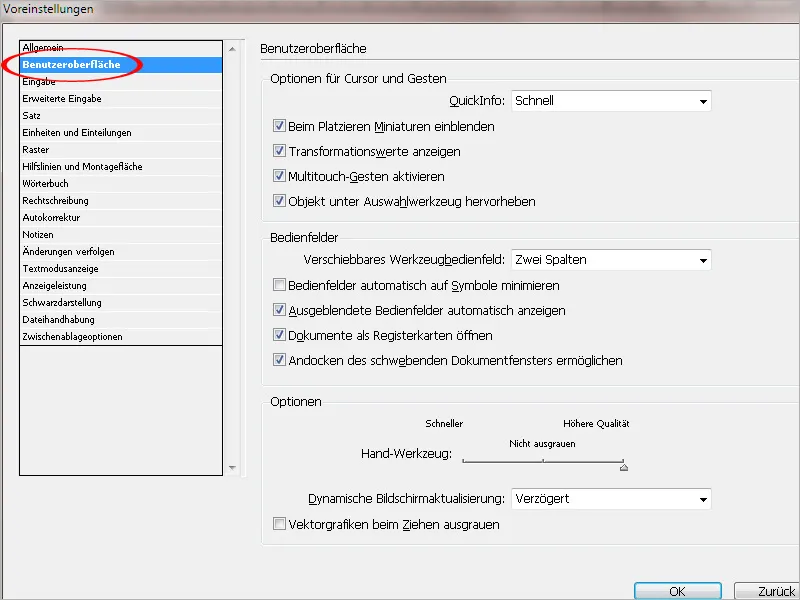
In the first block for Cursor and Gestures, there are four preset options: The field Tool Tips under the Cursor and Gestures Options indicates whether specific information about the current tool or panel where the mouse is located should be displayed on Mouseover. If you're already a pro at using InDesign, you can also work without Tool Tips. Others should consider Tool Tips as a nice gimmick to learn about tools and panels with the correct name and function, and – if available – the associated shortcut.
Even in the Preferences Dialog, you will find a Tool Tip in the checkbox Allow Floating Document Windows.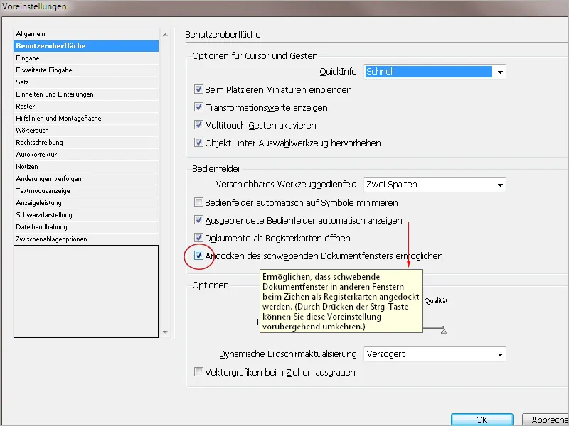
The checkbox Show Thumbnails When Placing should remain activated. When you use the File>Place (Ctrl+D) menu to insert texts or images into the document, a thumbnail of the image to be inserted or a preview of the text to be placed appears. This makes sense, especially if you want to insert multiple elements into your document at once. The thumbnail always shows you which image from the placement stack is currently being placed.
The activated checkbox Show Transformation Values ensures that you always see the current value when transforming frames. So, when scaling, you see the dimensions of the object, when rotating, the angle, etc.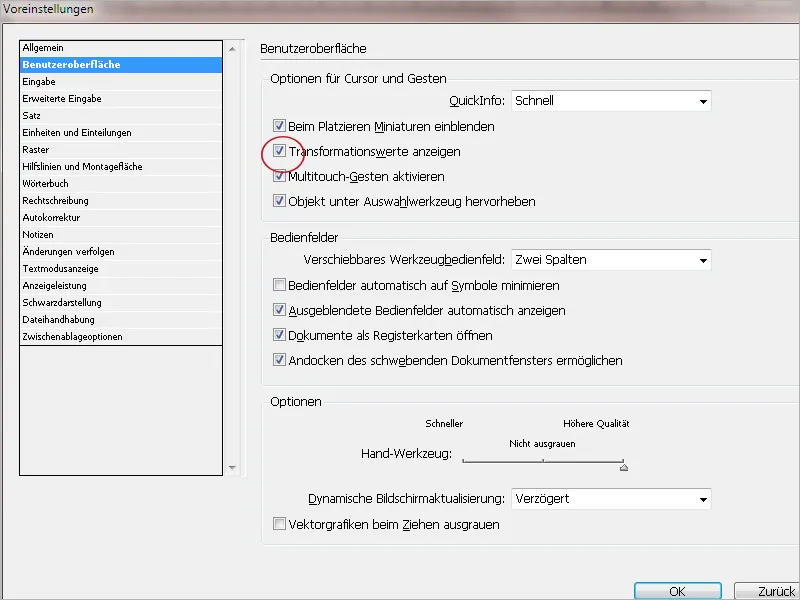
The checkbox for Multi-touch Gestures is specifically intended for users of multi-touch mice. The Magic Mouse for Apple exists, and Microsoft introduced a multi-touch mouse back in 2009, allowing navigation in documents via gestures and finger movements. Therefore, the checkbox is only relevant for users with a multi-touch mouse.
In the second block for Control Panels, there are five preset options:
The field Movable Tool Panel contains three preset options for the default view of the tool panel: One Line, One Column, or Two Columns.
The default view is always a matter of personal preference. I prefer two columns, so I activate this preset. You can also temporarily change this setting via the small double arrow in the Tool Panel.
The checkbox Automatically Minimize Panels to Icons is deactivated by default. And that makes sense. If you activate the checkbox, clicking in the document window will minimize the previously activated panel to icon size. This can become annoying after a short time!
The preset Show Hidden Panels Automatically is important if you hide the panels via the Tab key. When you then move the mouse to the document edge, the panels automatically reappear temporarily. If the mouse route plus the one second it takes for the panels to reappear is too long for you, pressing Tab again provides a quicker way. Therefore, the checkbox can be deactivated, but it does not have to.
Note: In version CS 5.5 on Windows, there seems to be a problem with this feature. Regardless of whether the checkbox is activated or not, you have to press the Tab key to make the panels reappear.
If you deactivate the checkbox Open Documents as Tabs, new documents will open as floating windows in InDesign. If necessary, you can then drag and drop this floating document into the tab bar. I find it useful when a document is immediately opened as a tab. Therefore, this preset can remain as it is.
The checkbox Allow Docking of Floating Document Windows regulates whether you can dock a floating document window in the tab bar or not. This preset option is completely pointless for PC users. For Mac users, it may be useful because they do not have the tab bar as PC users do. There, the document windows are docked as tabs to a "master document." This docking can be enabled or disabled with the checkbox Allow Docking of Floating Document Windows.
In the Options field, you can make settings for moving image elements. Depending on the hardware configuration, it may be useful to forego quality when using the hand tool (via Alt+spacebar) when moving the view. If you have a powerful computer, you should leave the higher quality when using the hand tool so that texts and images do not gray out. The slider position in the middle grays out images, the position on the left grays out text and images when moving with the hand tool.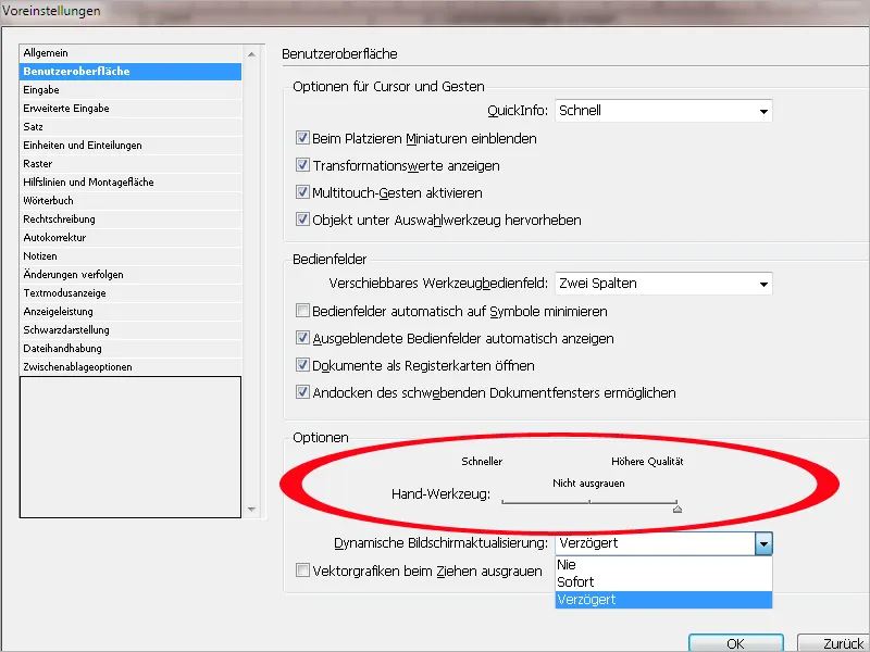
The dynamic screen update controls the view of the hidden image area in a frame when transforming the image within that frame using the direct selection tool. With the activated option Instant, the hidden image area is shown with slight transparency. With the option Delayed, it is displayed with a delay, and with Never, the hidden image area remains fully hidden and is only identifiable by the brown frame marking its boundaries.
4. Input
In this tab, you can influence the behavior of text during input, moving, and wrapping, i.e., writing beyond the end of the text section.
In the first block, you will find the Input Options:
• The checkbox Use typographic quotation marks performs the important function of regulating the coherence of quotation marks. In Germany, the double quotation marks are typographically correct with the graphical 99 placed at the bottom front and 66 placed at the top back. However, quotation marks are entered with the inch sign. If I deactivate the checkbox for Use typographic quotation marks, then exactly what is on the keyboard is typed, so the inch sign instead of the double quotation marks when pressing the inch key, the single quotation marks are placed at the top, etc. There is no automatic recognition that the keys for opening and closing quotation marks should be combined. Therefore, it is crucial that this checkbox is activated. Furthermore, depending on the selected dictionary, the feature also harmonizes regional differences and can accommodate typographic preferences, such as using French guillemets as double quotation marks even in German text. To do this, you simply set the guillemets as double quotation marks in the Preferences in the Dictionary tab and then, thanks to the activated checkbox Use typographic quotation marks, you will get the guillemets as quotation marks in your text when pressing the inch key.
• The feature Text tool converts frames to text frames allows you to immediately use a frame as a text frame by clicking on it. It does not matter if the frame is empty or contains a color. I recommend deactivating the checkbox to avoid activating the default font in the document each time. This becomes especially noticeable during PDF export/packaging, where this font, which is essentially not specified anywhere, is still taken into account.
The default setting came with CS3 with the intention that this behavior can be deactivated and the feature is not actually necessary. Placing text within an image frame is somewhat inflexible, and it is better to keep text and image frames separate in the document and maintain the easy placement of the text on a colored frame. If needed, both frames can be grouped using the shortcut Ctrl+G. However, if you do want to use an image frame as a text frame, you can alternatively open your object for text by selecting Object>Text from the menu.
• The checkbox Automatically adjust correct optical size is only essential for Multiple Master Fonts. There are fonts that have MM in their name. These are Multiple-Master fonts, which unlike conventional fonts, do not have styles (italic, regular, bold, etc.) but offer variations in width, stroke weight, optical size, etc. MM fonts are not suitable for layout work. They are mainly used in Adobe Reader and Acrobat, where they serve as substitute fonts for missing fonts. Multiple Master Fonts are no longer developed by Adobe as they never really caught on.
• The activated checkbox Select line by triple-clicking allows the following behavior when clicking in a text field:
Single click: Positions the cursor at the clicked location in the text. Double click: Selects the word. Triple click: Selects the line. Quadruple click: Selects the entire paragraph.
If you deactivate the checkbox Select line by triple-clicking, a triple click will select the entire paragraph, which is probably the better default setting. Therefore, this checkbox should remain activated.
• The checkbox Apply line spacing to whole paragraphs governs the behavior when changing the line spacing in text. By default, the checkbox is deactivated, meaning that you can change the line spacing between paragraphs very flexibly line by line. To change the line spacing, you just need to select the respective line each time.
If you rarely need such flexibility, you can activate the checkbox Apply line spacing to whole paragraphs. Now, clicking on a line allows you to change the line spacing for the entire paragraph. I personally find it more convenient because it saves a few mouse clicks. Therefore, I recommend deviating from the default setting and activating the checkbox. Good to know: You can safely set the checkmark in the checkbox for foreign documents. Existing breaks will not be changed by doing so!
• The checkbox Automatically adjust correct visual size adjusts the spacing in text when cutting and pasting words. If you select and delete a word within the line, theoretically two spaces should remain in the word space. InDesign automatically deletes one space so that everything is displayed correctly. Similarly, when pasting texts from Word or other documents, InDesign corrects any unnecessary spaces. If the checkbox Automatically adjust spacing when cutting and pasting words is disabled, however, two spaces will remain in the text because generally only the extracted text without spaces is selected. InDesign's function is very useful and should therefore always remain enabled in the Preferences.
• The Font Preview Size is a matter of taste. I prefer it large and therefore change the default setting from Medium to Large. This allows me to roughly see how a font looks in the preview menu in the Control panel or the Character panel, which is especially useful because a proper font management system has not yet been implemented in InDesign, where you can create and manage favorite fonts, fonts by style (serif/sans serif), or themes (headline fonts/flyer fonts/corporate design standards), etc.
For those who need to be resourceful, the Font Preview can also be disabled in the Preferences, saving a bit of processing power needed to display the preview menu.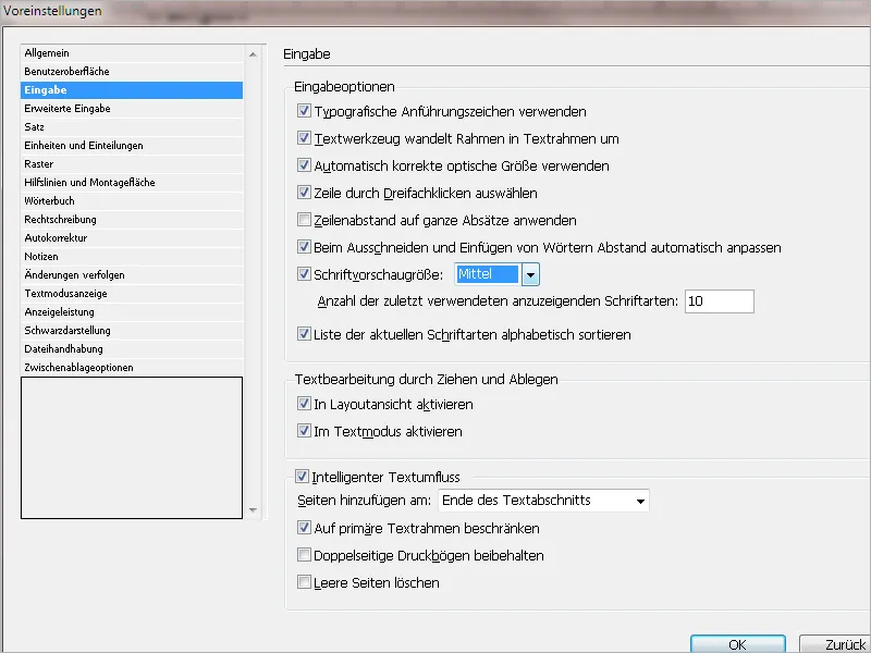
In the second block, there are settings for Text Editing via Drag and Drop.
• The checkbox Enable in Layout view is deactivated by default. By activating this checkbox, you can move selected text via Drag&Drop. You can recognize the feature when your mouse pointer turns into a T while over the selected text. This allows you to avoid the typical process of cutting (Ctrl+X) and pasting (Ctrl+V) text. I find this feature quite useful and have activated it because I write directly in InDesign files and have never quite adapted to the text mode. This way, I can easily rearrange paragraphs and text blocks within the layout file when working on long texts. Additionally, I can copy snippets of text simply by pressing the Alt key before releasing the mouse button during the move. Those who only need to layout finished text or write text into the document via the text mode should leave this feature disabled to avoid accidentally moving things around.
• The checkbox Enable in Text mode is enabled by default. In this way, you can also move text using Drag&Drop in the text mode. If both checkboxes are active, you can also move text from text mode to layout view and vice versa.
Side note: The text mode can be accessed with Ctrl+Y and allows texts to be displayed and written without formatting guides or distractions from the text frame length. The text is not affected by text formats or the text frame's length. Although a red line appears for overset text, you can continue typing without any issues. In the layout view, you would need to extend the text frame or chain it with a new text frame.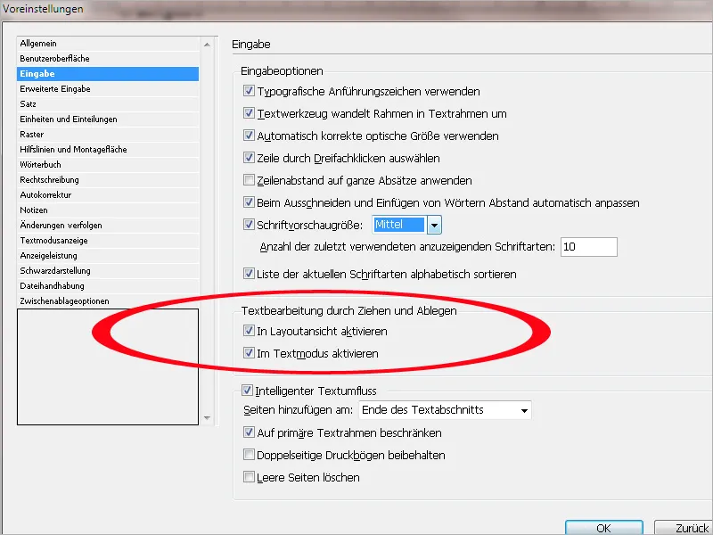
In the third block of the input register, there are options for intelligent text wrap.
• The intelligent text flow is set by default and causes the text input to be treated as in a word processing program. If the entered text exceeds the end of your text frame at the bottom of the page, InDesign automatically responds by creating a new page and continues the text in a new text frame with the same character- and paragraph formatting. Sounds good in theory, but in practice, it doesn't always work that smoothly. The intelligent text wrap was a new feature in the CS4 version. Initially, I found it quite cool and left this function activated. However, it has since been shown that the intelligent text wrap does not always work as easily as described. If you are not writing a novel in InDesign, where the layout is quite simple, you can no longer effectively apply this function in a comprehensive layout document nested with formats. Also, setting a large amount of text is easier with automatic text flow, by simply holding down the Shift key while chaining. Therefore, it is advisable to deactivate the intelligent text flow.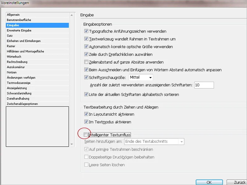
5. Advanced Input
In this register, you can control the superscript and subscript as well as the small caps in the generation.
The percentage figures in the character settings under Size indicate how much the font is reduced compared to the normal view. The percentage values in the position represent the baseline offset in relation to the font size.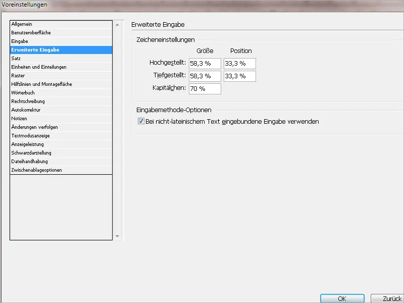
Why do we need this at all? Anyone who has to write a bachelor's/master's or other academic work will have to incorporate certain methods of academic form into the work. This includes footnotes, quotes, mentions of names, etc. And for such applications, small caps (for example for attributions of authors or original titles) as well as superscript and subscript characters (for example for mathematical formulas, cross-references, or footnotes) are suitable.
Quick digression: What are small caps exactly?
Small caps are capital letters where starting from the second letter of the word, the height of the letters matches the normal height of lowercase letters. At least here in Germany. In the Anglo-Saxon region, the letters are about 10 percent higher. There are a few other peculiarities. Because by "forcing" generic small caps in InDesign, there are often lower stroke weights and differences in widths.
Therefore: If your font has a small caps font, you should use small caps as a typographic tool. OpenType fonts are optimal for this purpose. An example of a font with a small caps font is Minion Pro.
The font can be seen in the glyphs window for each letter.
If your font does not have small caps as a font, and you would have to resort to incorrect small caps, you can also alternatively make italic emphasis in your text. This is still better than entering the minefield of incorrect small caps.
In the input method options, you will find the checkbox Use input embedded with non-Latin text. This ensures that language systems such as Cyrillic, Japanese, or Greek, which are not based on the Latin alphabet, can still be used in InDesign.
Note: Your computer's operating system must also support this language system. Otherwise, it will not work.
6. Set
In the Set register, you can control InDesign's behavior in text problems as well as text wrapping, the so-called contour guidance.
The first portion of the Set register deals with marking deviations from the norm that occur when arranging text. Everyone surely knows the pink highlighting that occurs when fonts are not found and therefore replaced by InDesign.
In addition to this note about a "problem case," there are other markers that InDesign can display.
• The paragraph break violations checkbox is deactivated by default. When activated, document deviations from a line break that you have set in the break options are displayed with a yellow color background. If informational boxes, quotes, or other related paragraphs are inserted into running text, it may be useful for these to be displayed as an optical unit, thereby keeping all lines of a paragraph together. You can call the break options via the paragraph control panel in the context menu - or even faster via the shortcut Alt+Ctrl+K - where you set the desired option. In this example, I activate the Do not break lines checkbox and the All lines in the paragraph radio button. If your paragraph is split up due to space constraints, a yellow line will indicate a paragraph break violation.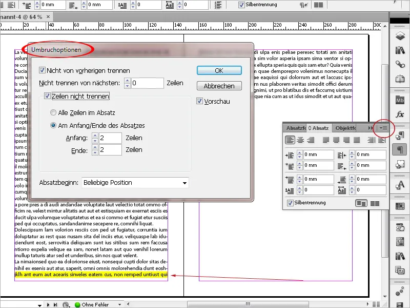
• The hyphenation and alignment violations checkbox is also deactivated by default. When activated, deviations from the (pre-)set standard for hyphenation and spacing in the document are shown in light and/or dark yellow color.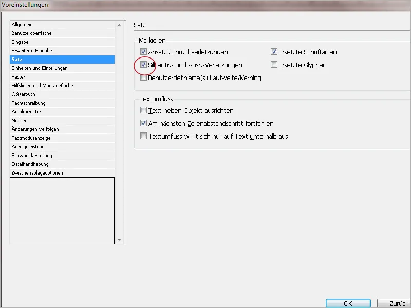
For example: If you set your text in justified alignment with an 8-letter/word hyphenation, then with smaller text frames, larger spaces between words will appear. The gaps are therefore larger than the default setting in the spacing dialog, which specifies a maximum word spacing of 133%. In this case, the relevant lines are marked in yellow. You can either increase the value for the word spacing in the spacing dialog, enlarge the text frame, reduce the font size, or open hyphenation for words with fewer letters.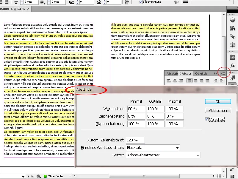
• The checkbox Custom Tracking/Kerning is also deactivated by default. When activated, a turquoise highlight is displayed in the document where the tracking or kerning has been manually adjusted.
For example, in the headline, the tracking, i.e., the space between the characters, has been increased. This is displayed here.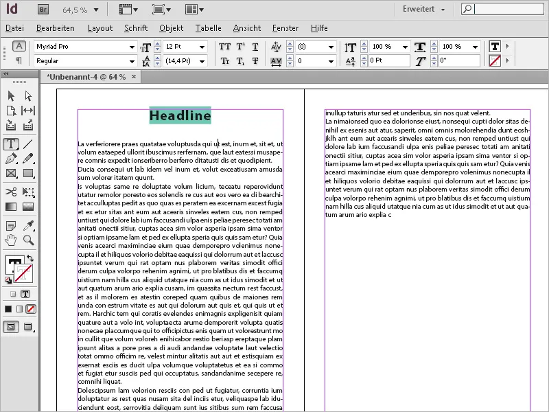
The kerning means underscoring and is always done automatically in InDesign mode Metric. There are letter pairs that leave gaps in the word. For example, in the word VANDALS in the character combination "VA", this is the case. Many fonts have so-called underscoring tables where the spacing of certain letter pairs is already taken into account as a preset. InDesign defaults to these presets in Metric mode. However, if you manually change the kerning, it will also be displayed in turquoise in the document.
• The checkbox Substituted Fonts is activated by default. Pink highlights indicate where a font that is no longer available was used in the document. This can happen more often when working in a team or when older documents are reloaded on a new system.
• The checkbox Substituted Glyphs is deactivated by default. When activated, substituted glyphs are displayed with a dark yellow background. The substitution may have been done automatically. For example, if you choose small capitals for a text, InDesign will choose the small caps style if available and replace the written characters with the small caps characters. Or you have assigned alternative representations of characters in the text for a better view using the Glyph panel. Both will then be displayed in dark yellow.
Example: With Minion Pro (this font has a small caps style):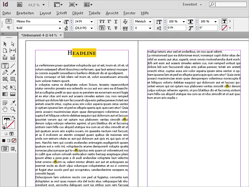
The second block of the Sentence Composition tab deals with Clipping Path, which means the displacing behavior of graphics to texts in the document.
• The first checkbox Align Text Beside Object is deactivated by default. When activated, text to the left of an object is aligned to the object in full justification. This can have visual advantages, especially when, for example, a slanted or irregular object appears in a text. The space between the object and the text appears clean because the left text is aligned to the edge and not flush left with gaps to the object's contour. However, if the width of the left line is not very large, large gaps in the text may occur. Therefore, you must weigh whether you want to activate the checkbox or not. For rare cases where this is needed, you do not need to check the box separately. However, it is useful to know that you can quickly activate it in the Preferences at any time.
Example: Rectangle one time normal in the text and then tilted about 30 degrees.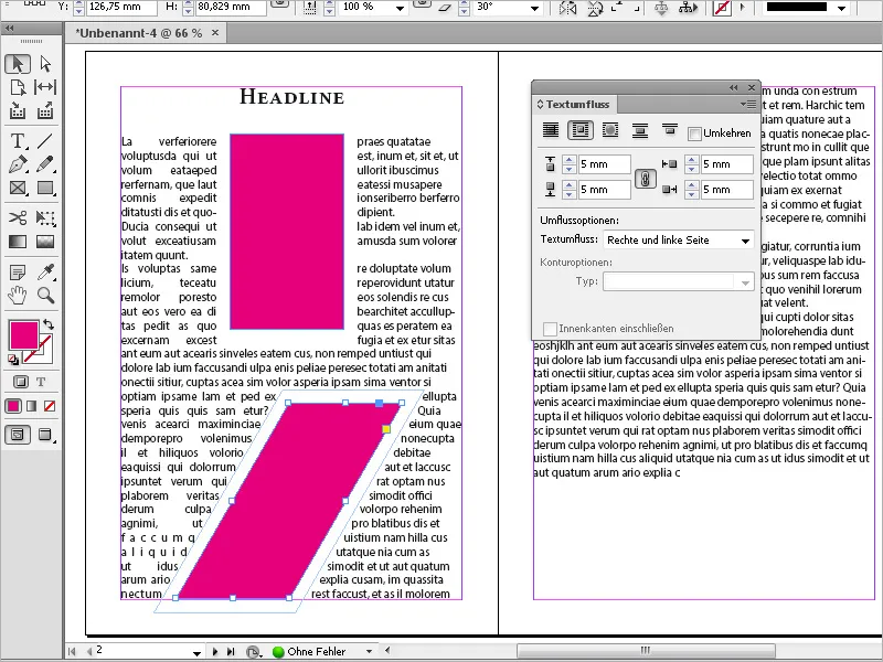
• The second checkbox Continue to the Next Line Spacing Increment is the only one of the three checkboxes that is activated by default. According to Adobe's InDesign Help, with this option, "the text affected by the clipping path is moved to the next text line below a clipping path object. If this option is not activated, text lines may jump so far under an object that the text is not aligned with text in adjacent columns or text frames. This option is particularly useful when you want to ensure that the text is aligned to the baseline grid."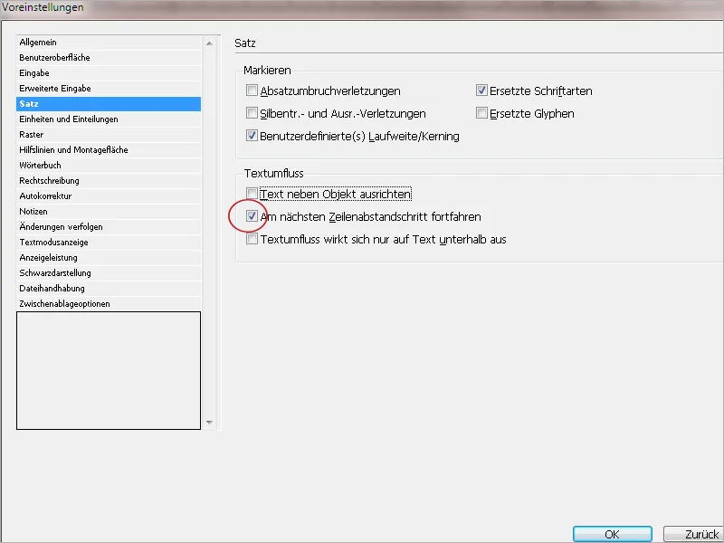
Disabling this option is sensible in one situation: For example, when a multi-column text (without a baseline grid!) places an image across columns, this measure ensures that the text continues at the same distance in all columns below the image. This ensures that an imaginary baseline grid also works below the image. Otherwise, lines across columns may lose uniformity.
• The third checkbox Clipping Path Only Affects Text Below is deactivated by default. When the checkbox is activated, the clipping path of the object also takes into account the hierarchy in which it is placed. In InDesign, you can arrange objects and texts both through the context menu front and back and through the Layers panel top and bottom. When the checkbox is activated, text is only displaced by an object if it is placed in a lower layer or stands behind the object in the same layer. I recommend leaving the checkbox deactivated. On one hand, you can counteract the effect by activating the ignore clipping path option in the Text Frame Options dialog. On the other hand, it is generally advisable to place text frames at the top of the layer hierarchy. Transparent objects are computed with the background during output. Transparent objects already include drop shadows of texts or objects.
These would be converted to pixels as unnecessary text elements. Therefore, it is advisable to place text layers at the top and graphics at the bottom. And this basic rule would be rendered meaningless if the checkbox Clipping Path Only Affects Text Below were activated.
7. Units and Divisions
In this tab, you can set the unit of measurement in which InDesign should calculate through the drop-down menu in the Horizontal and Vertical fields. Apart from millimeters, you can also use points, inches, pixels, etc.
In the Keyboard Increments section, you can set the increment for the arrow keys (when moving an object, for example), the default for the relationship between font size and line spacing, kerning and tracking, as well as the baseline shift.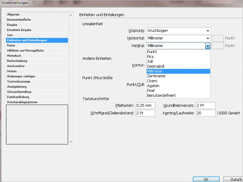
8. Grid
On this tab, you can set a different color for the baseline grid if needed. Additionally, you can define a value for where the grid should start in relation to the format or text edge, and one for the division. If you are working with a fixed layout and master pages with uniform text frames, it is advisable to set the start at value 0 relative to the top text edge. This way, the text gets a fixed reference to the surrounding frame.
In the Document Grid section, you can define a grid suitable for your layout with the desired subsections, on which you can then align the layout elements uniformly.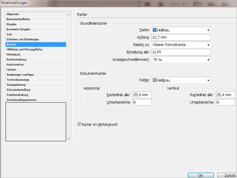
9. Guides and Mounting Area
Here you can set the color for displaying margins, columns, bleed, info area, preview background (it doesn't always have to be gray), and smart guides.
Under Guide Options, you can set a value in pixels to determine how close an object must be to a guide or grid line to align with it.
Using the options for smart guides, you can determine where objects should be aligned to. Finally, in the Mounting Area Options, you can set the size of the mounting and therefore storage area.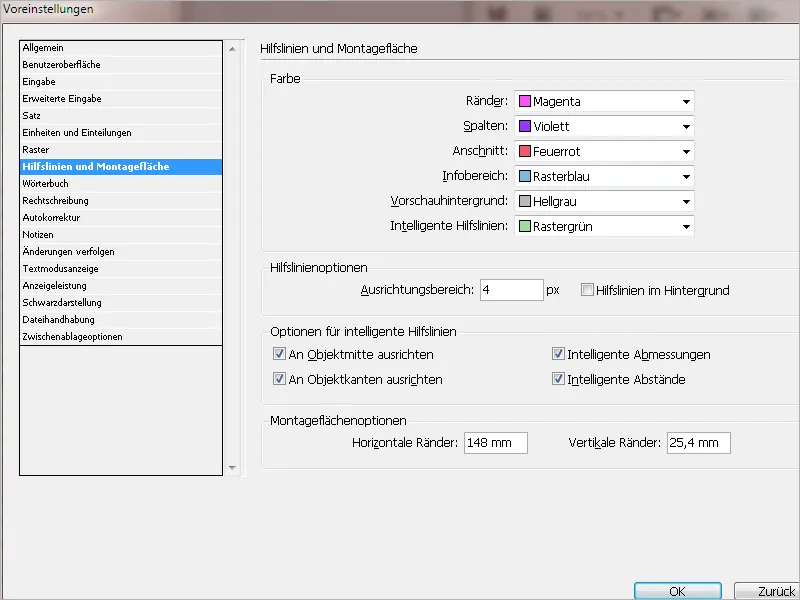
10. Dictionary
On this tab, you can first set the language and the desired spelling (for German alone, there are three different orthography modes, with Switzerland there are even five).
Using the small plus symbol below, you can also add another dictionary (which is a *.udc file), additionally to an already existing one. InDesign then consults both dictionaries consecutively during text input. You can remove dictionaries from the list using the minus symbol.
Further down, you can set the display of simple and double quotation marks via a drop-down menu.
To add the exception list saved in an external user dictionary to the list saved in the document, check the checkbox Read User Dictionary into Document.
By selecting the option Reframe All Stories on Change, stories are reframed when you change the settings for Build With or add or remove words with the Dictionary command.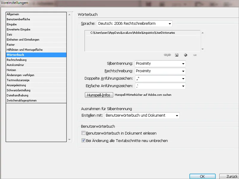
11. Spelling
Here you can set how InDesign should search for errors according to the previously set dictionary. By activating Dynamic Spelling Check, InDesign underlines misspelled words during input.
You can choose a different color for highlighting different errors.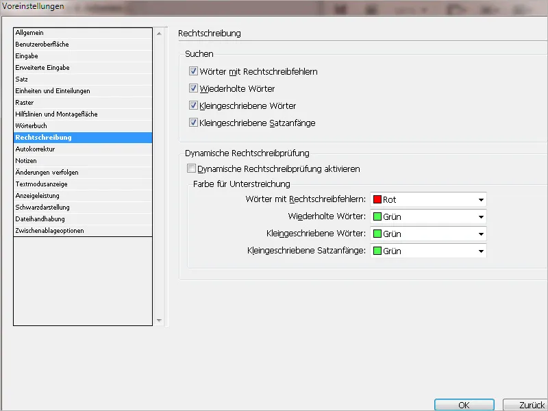
12. Auto Correction
Here you can enter terms that are commonly misspelled (e.g. due to typos), by adding them (via Add) and providing the correct spelling underneath. For longer terms, you can also enter an abbreviation and the fully spelled out word below. InDesign then automatically corrects these terms while typing.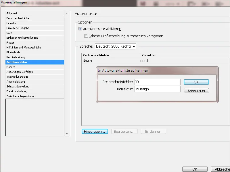
13. Notes
Here you can set the color used to mark a note in the text and decide whether a tooltip should be displayed on mouseover.
You can also activate Spelling Check or Search/Replace for Notes.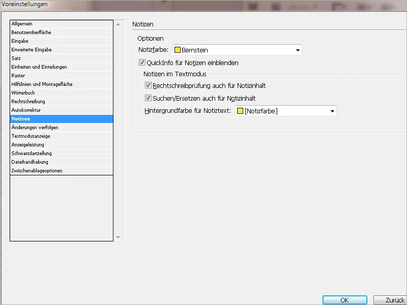
14. Track Changes
On this tab, you can set the text and background colors for items added, deleted, and moved in track changes mode (Menu Window>Editorial Tasks>Track Changes) while editing the document by different users.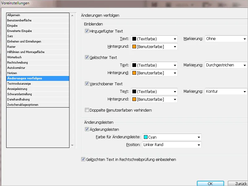
15. Text Mode Display
Here you can set the display font, size, line spacing, text color, and background for text mode. You also have the option to set a different theme, e.g. Classic System for yellow text on a black background or Terminal (green on black). These settings affect the text display in the text mode window, but not in the layout view.
You can also choose a display option for the cursor.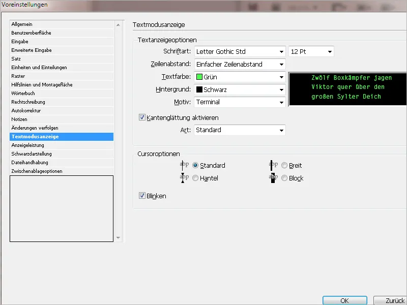
16. Display Performance
Here you can set the default display options to be used when opening all documents. Additionally, you can customize the settings that define these options. Each display option has its own settings for displaying raster images, vector graphics, and transparencies.
• Fast: Draws a raster image or vector graphic as a gray box. This option is suitable for quickly flipping through print sheets with many images or transparency effects.
• Draws a low-resolution screen preview image that is sufficient for identifying and positioning an image. This is the standard and fastest way to display an image.
• Draws a high-resolution raster image or vector graphic. This setting achieves the highest quality, but the display speed is slower (depending on the computer configuration and image resolution) than the other options.
If needed, you can adjust the default settings by changing the sliders for Raster and Vector Graphics as well as for Transparencies separately.
You can temporarily adjust the settings in the document later via the menu View>Display Performance. These settings only affect the display – not the output quality.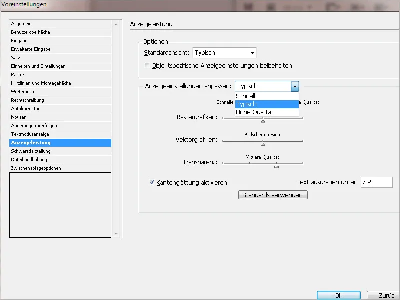
17. Black Representation
Here you can set how the color black should be displayed on the screen and exported. Pure black consists of 100% black and appears rather dull compared to a rich black, which has a color coverage of 400% (in CMYK mode) (namely 100% Cyan, Magenta, Yellow, and Black each). A rich black is not practical for print output; however, for screen output (e.g. as an interactive PDF file), such a black appears much more convincing. In this case, you can also choose the setting Output all black tones as rich black, which would be incorrect for print output.
The checkbox Overprint black should only be disabled in exceptional cases, as it would result in colored backgrounds being omitted where black text runs, which could lead to registration problems in printing due to paper distortion.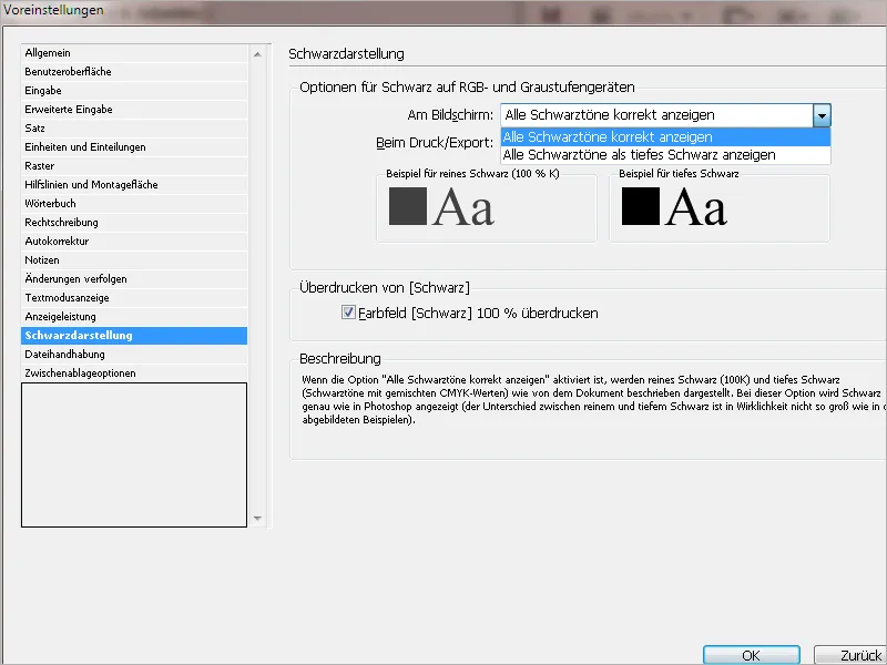
18. File Handling
In the event of a program or system crash, the current state of the open document is saved in a system folder by InDesign. If needed, you can choose a different storage folder for this via the Browse button.
In the Save InDesign files section, you can adjust the number of recently used documents that will be listed in both the start screen and the menu File > Show Recently Used File.
For Snippet Import, you can set whether these should be placed at the original or the current cursor position.
In the Links section, you can set how InDesign should handle opening a document with linked images or graphics.
By default, these will be checked, and missing links will be searched for. In exceptional cases, it may be useful to deactivate these options.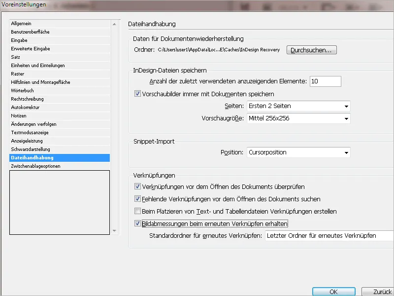
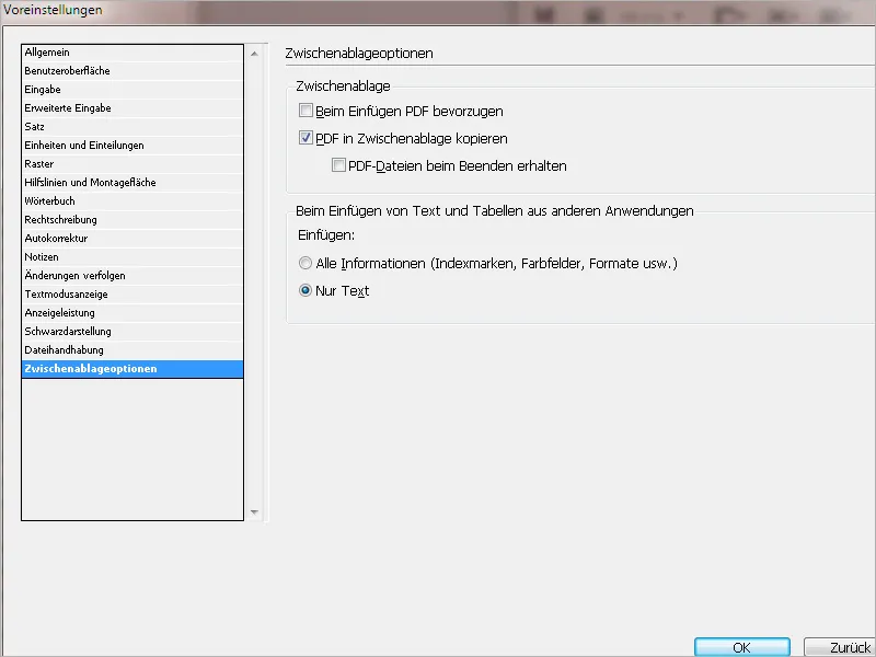
19. Clipboard Options
If the setting Prefer PDF on Insert is selected, an Illustrator graphic that InDesign treats as a group of smaller objects cannot be edited in InDesign. Therefore, this option should be disabled.
For pasting text via the clipboard, you can further specify below whether the formatting, etc. of the source text should be retained or only the plain text should be inserted.