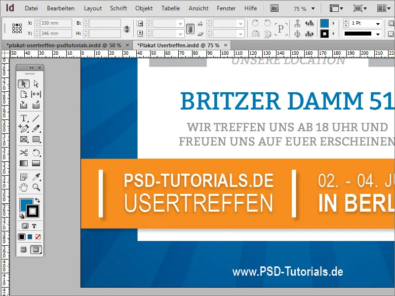
The title alone is not meaningful enough. That's why you need more detailed information in text form. This text should also be decorated with some graphic elements. For the decorative elements, use the rectangle tool and draw a narrow rectangular frame.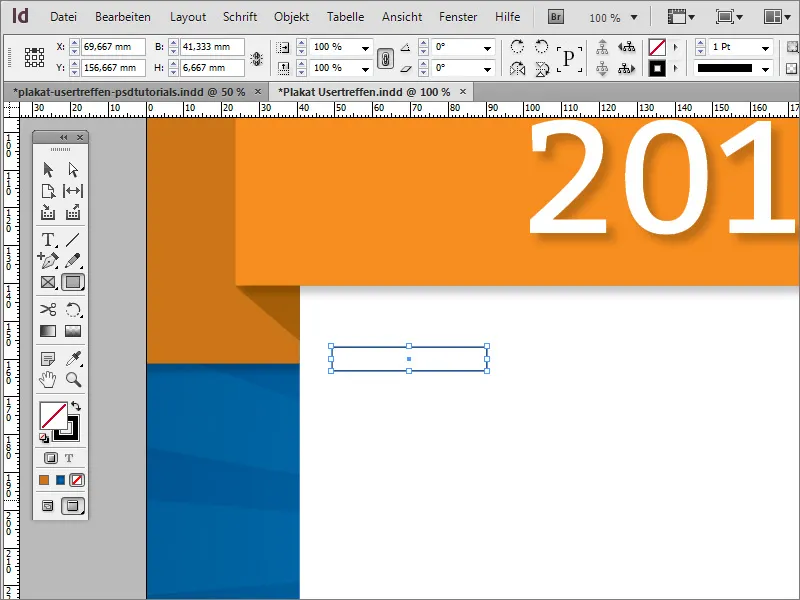
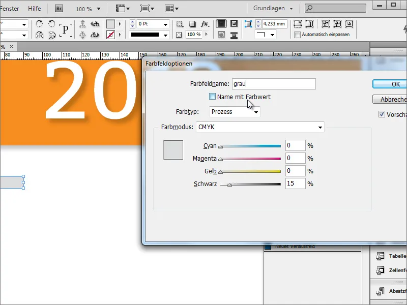
Create a new color in the color fields palette. To do this, create a simple shade of grey with approx. 15 -30 % black in CMYK color mode.
Hold down the Shift+Alt key and copy the rectangle object to the right-hand side. The exact position will only be determined after the text has been created. However, you can also use an auxiliary object to adjust the margin distance on both sides.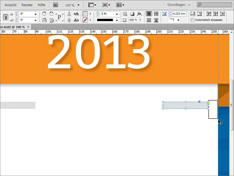
The text information can then be entered between these two rectangles. To do this, you need a text box and enter the corresponding data there.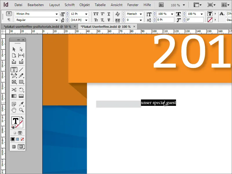
Once again, the Bitter font was used in the Regular font style with a font size of 25 points. The text was also centered with a 10 degree inclination and in capital letters. All formatting options can be found in the properties bar with the text tool active and the text selected.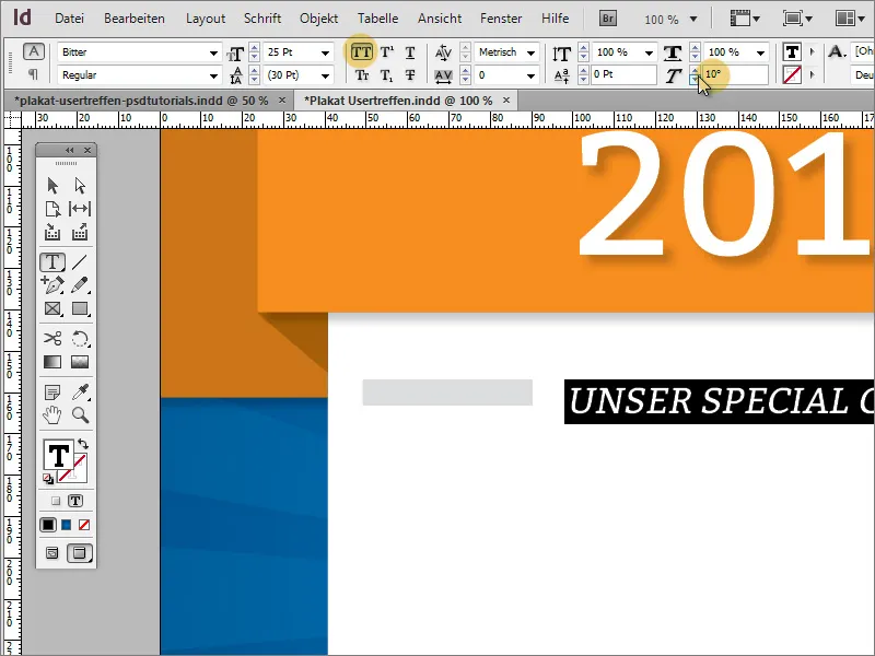
The height of the two rectangular graphics is now adjusted to the text. To do this, select both elements using the Shift key and scale them using the selection tool. The intelligent guide lines show you when you have reached the bottom edge of the text frame.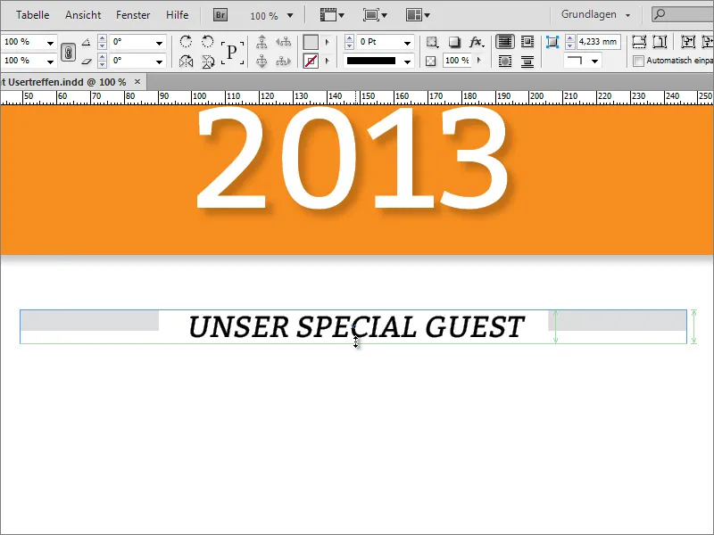
To ensure that the text and rectangular graphics also form a visual unit, you should assign the same grey color to the text.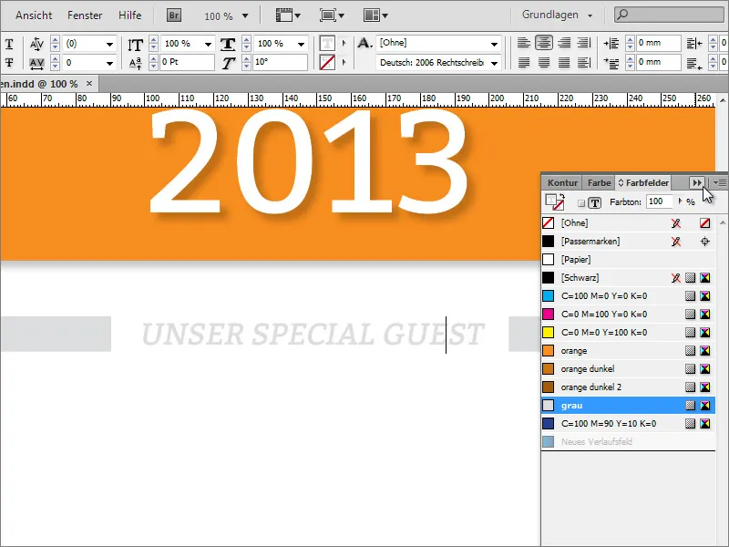
Now add further text additions, such as the name of the main guest. This main guest is centered, announced with 76 points and in the font Bitter, Regular.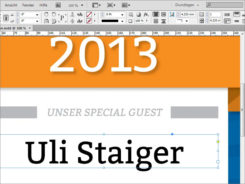
To make the text stand out from the other information, a special color is assigned to it. To do this, I call up an existing blue in the color fields palette or create a new color and use it to color the object.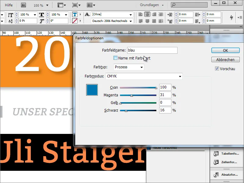
The text is now formatted so that it only consists of capital letters. Therefore, select this text and set the capital letters in the options bar.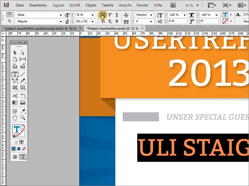
You can either place the topics of the guest post in a separate text box or directly in the same text area. The same font is used again in capital letters at 24 points and in centered alignment.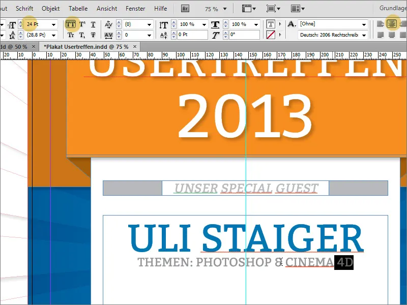
The line spacing between the two lines of text should now be changed. A value of around 45 points provides good spacing.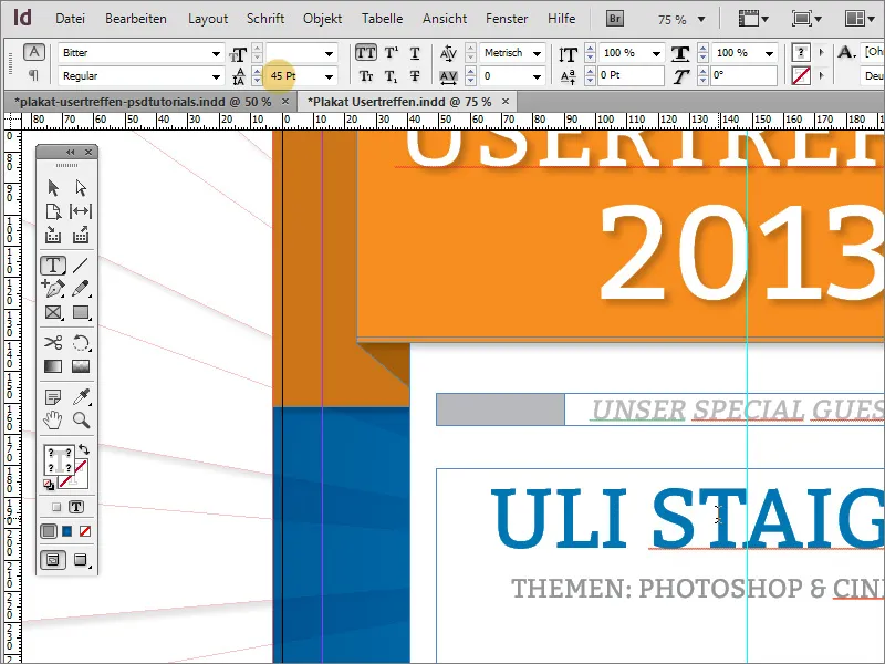
This is followed by a narrow, horizontal line as a visual separation. Draw this below the text using the line drawer. Set the outline color to grey and deactivate the area fill. The line width remains at 1 point.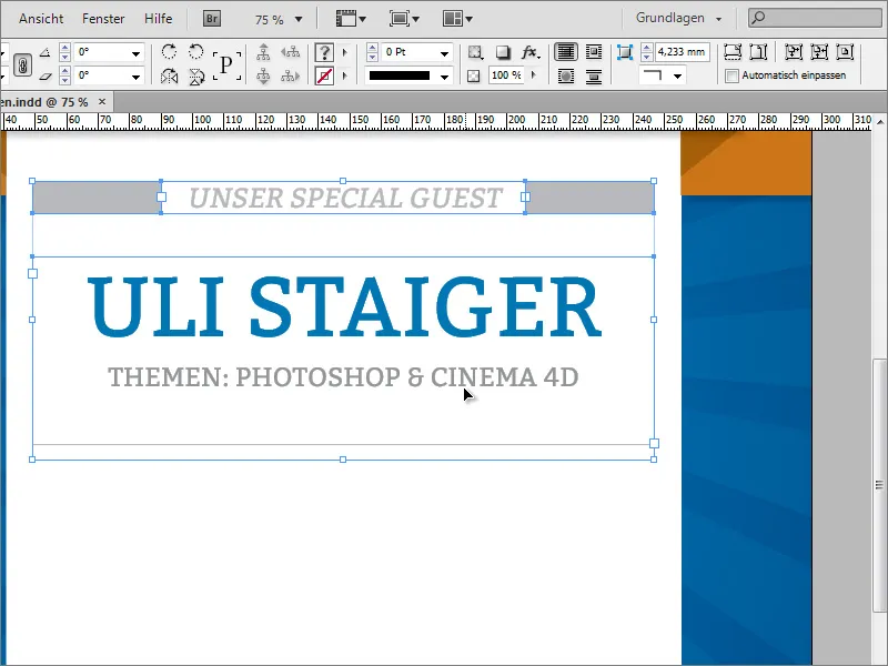
Now select this text block and copy it by holding down the Alt key and using the arrow keys on the keyboard to move this block downwards. Of course, you can also create such a copy with the mouse using the Alt+Shift key and drag it straight down.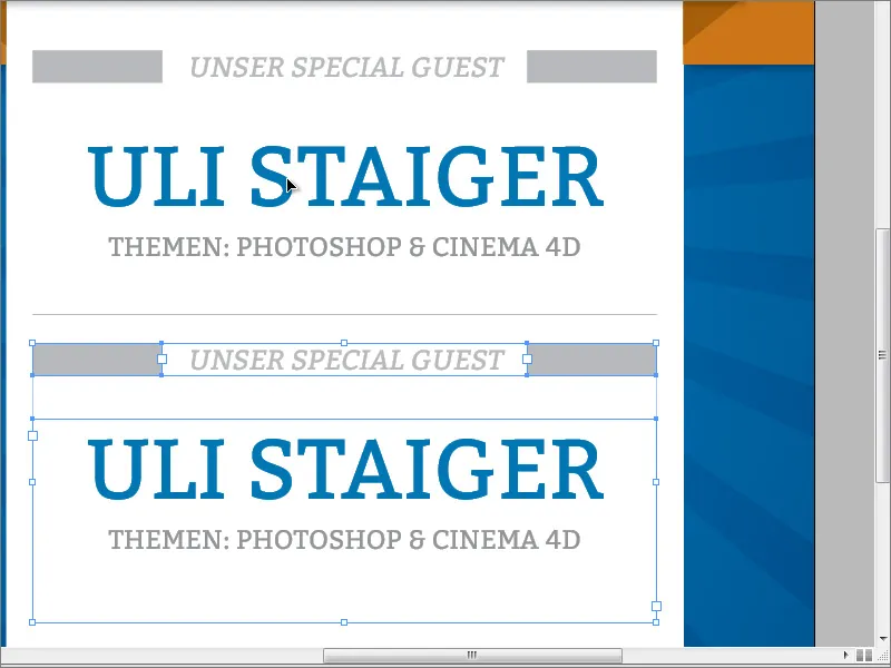
Then simply rename the existing text areas. You may need to adjust the font size for the address. It has been reduced to 50 points. In addition, the line spacing for the bottom double line has been automatically changed back to the value.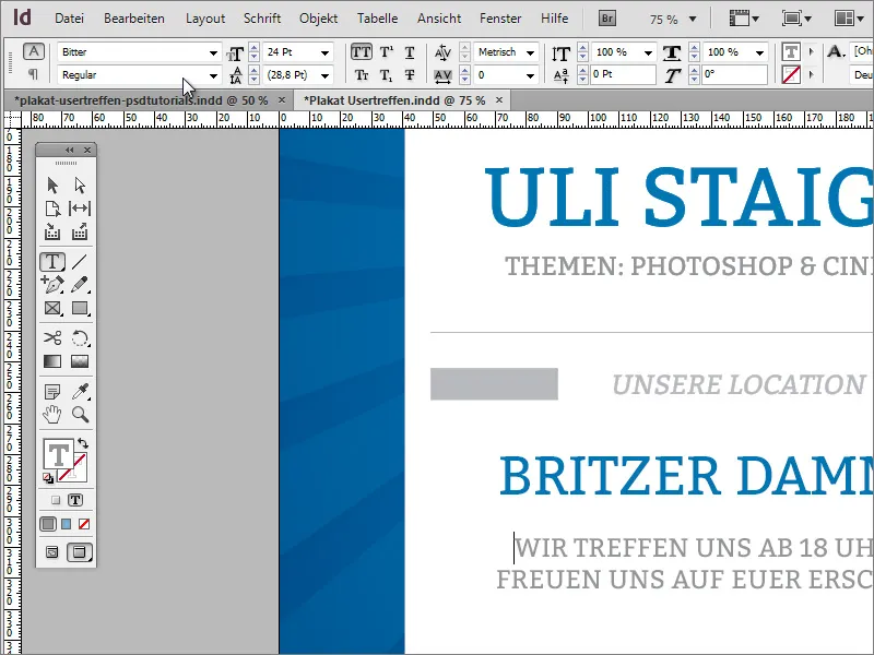
A rectangular area should be inserted again below the text. As it has the same color as the upper graphic construct, you can simply adapt the rectangle object from there and move it down as a copy. Then scale it in width so that it reaches the bleed of the document. It can also be compressed slightly in height, as you now need a narrow line.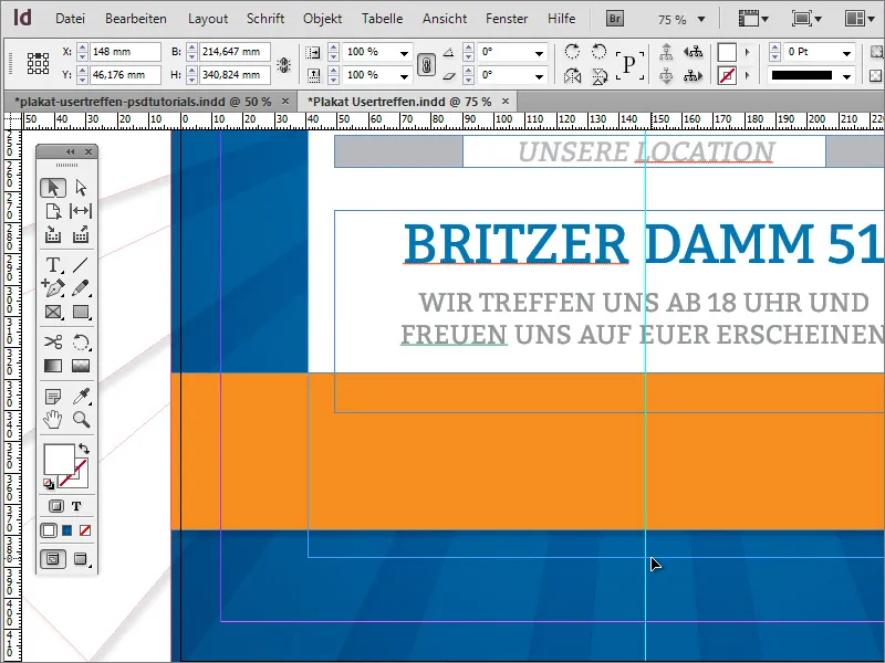
Extend the white background area until it appears below the rectangular area.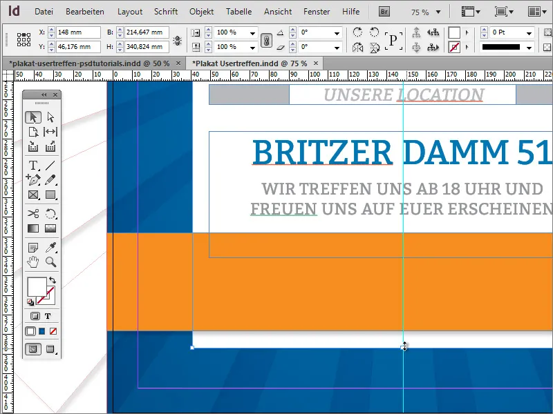
The website name can appear again on the poster. Therefore, simply copy it from above and paste the copy below. As you have a group of logo and text object at the top, you must first double-click on the required area to select it.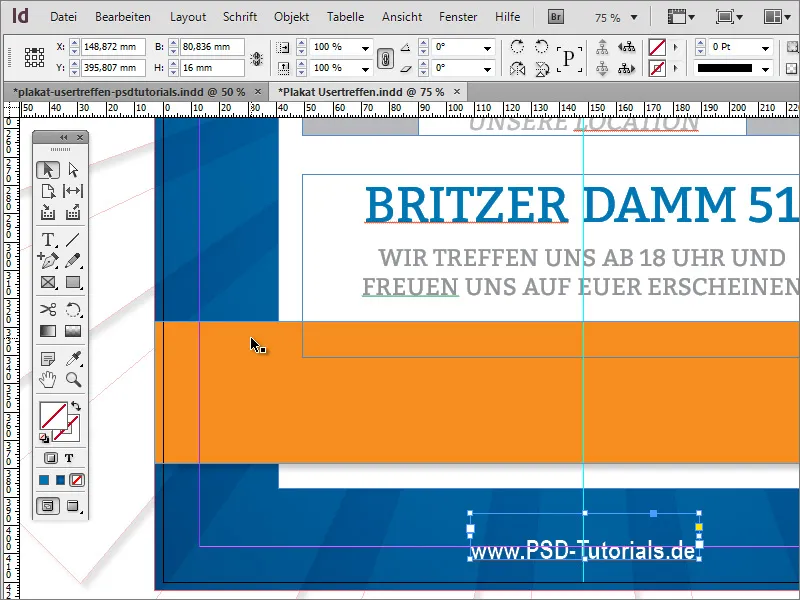
The orange color area will also receive some more information. You should create another graphic object beforehand. Use the rectangle tool and create a narrow, upright rectangle with a white color and without an outline at the same height as the orange rectangle.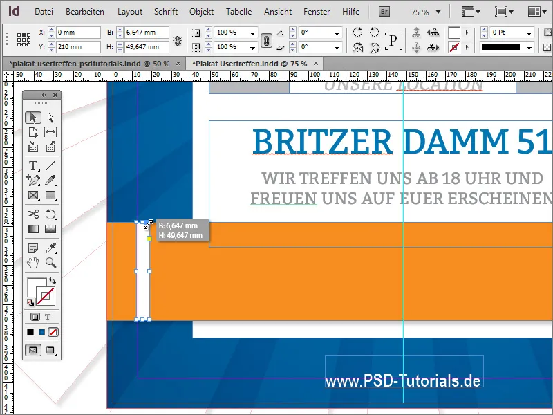
If necessary, move the object to the edge distance line and scale it by holding down the Alt key, which will reduce the size of the object from the outside to the center. If you are satisfied with the first object, you can also create another copy of it and position it further to the right at the same height.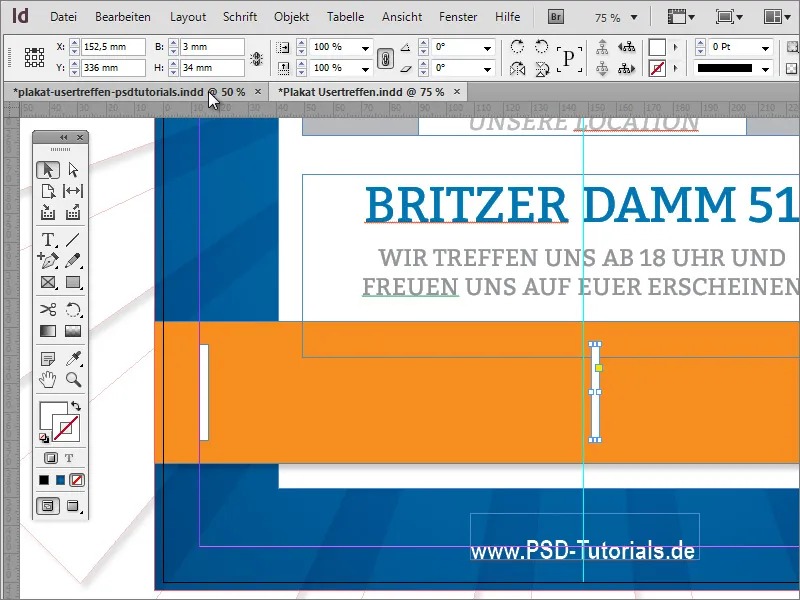
Now you can add additional information in the usual way. The font and the two graphic elements are given a light drop shadow. Here you can again select all objects and assign them the drop shadow object format.