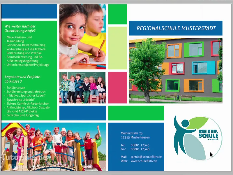
Question for you: Who has fond memories of their school days? Yes, please raise your hands. Oh, I see, two, three, four, five hands go up. No, fun, there's actually no one here but me, but I'd like to welcome you to a new training session. And a new training session also means a new print product for us, this time a school flyer in A5 portrait format, shown here in a very plain and simple design with clear shapes. We have rectangles here.
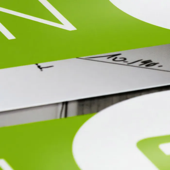
There are a few tricks on how to get everything so clean and symmetrical, which we will look at in detail. Here we work with a calm and equally colorful display. Something that is quite cool here, which is not so noticeable during the layout process, but is very noticeable in the final print, is the break mark in the middle. So it's not the break mark that's pretty cool, it's actually pretty normal, to be honest, but what's really cool are the elements that go over the edge. That means we're not going to let it finish at the fold, we're going to move it to the back as well. And when you actually see the design in the printed format, it has a pretty impressive effect, because as a designer it sharpens your eye to think outside the box and beyond existing lines and boundaries. It will be quite exciting when we do that.
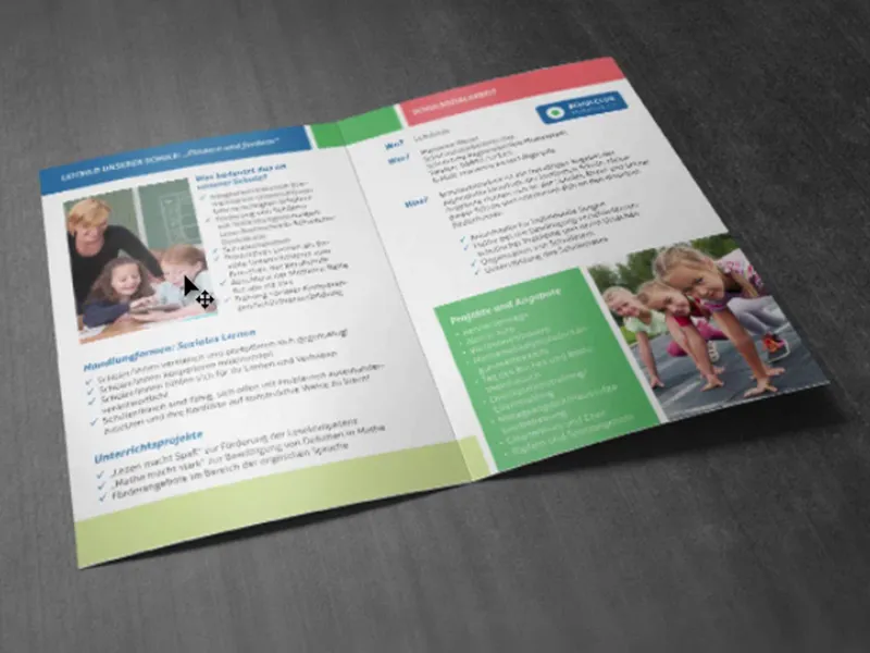
Let's switch to the inside right away. It will look like this: Here we have that tile design again with various bulleted lists and placed images. And as you have no doubt already recognized, it is of course colourful. Of course, the target group is pupils, children and their parents. But before it gets too colorful, I would suggest we just get started. And I say: On your marks, go and get set.
Printing conditions for the school flyer
Our journey begins, of course, on the website of our print shop (1). There we can take a look at the portfolio and pick out the right product. We are going to make a folded flyer. To do this, we naturally choose the right product, first the standard folded flyer, then the format (2). We have a final DIN A5 format. And here we get more details and data information (3). Compared to other trainings, we will use a different paper, picture printing paper, which is called "coated" in English. This means that it is coated paper on whose surface the pores of the paper have been sealed with a kind of glue. What does this achieve? - A relatively bright and rich color brilliance. This is actually a big difference to uncoated paper, which tends to be dull, matt and absorbent. Picture printing paper simply has the effect that it has a really great color appearance. And if we don't know exactly what it looks like, of course: Our paper sample book will help us. What we need to know is the format. We have again shown the final format here, 297 by 210, which is actually a DIN A4 format with 2 mm bleed (4). And under the data notes (5) we see it again: "important information with at least 4 mm distance to the final format". Here we can also see the color mode again: coated paper, ISO Coated v2. Good, now that we have found this out, we can actually switch to InDesign.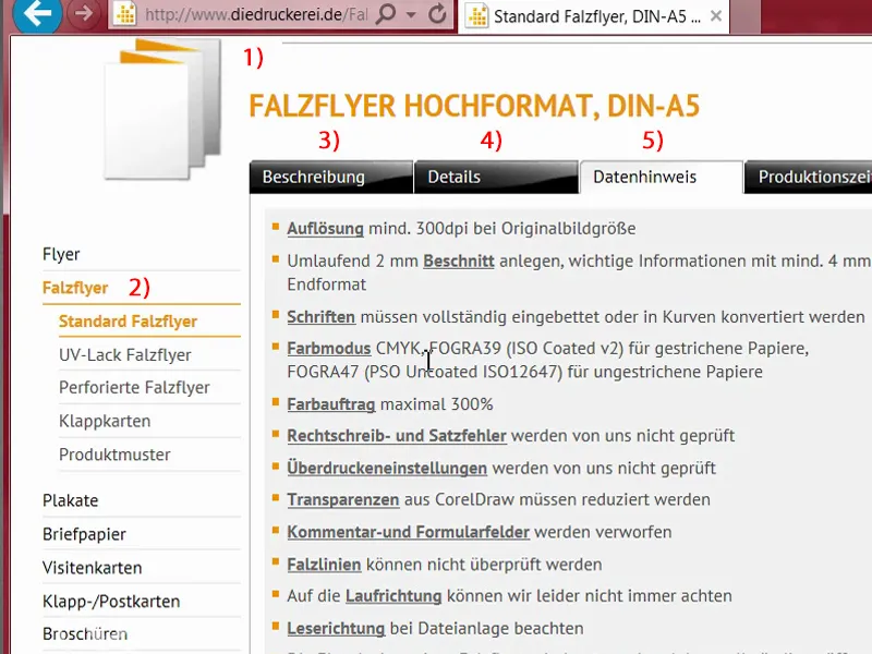
Setting up the document in InDesign
We open a new document (1). Once again, we don't need the double page (2) in this case. I would like the landscape format instead (3). Margins: 4 mm (4). Bleed: 2 mm (5). Then we can confirm the document.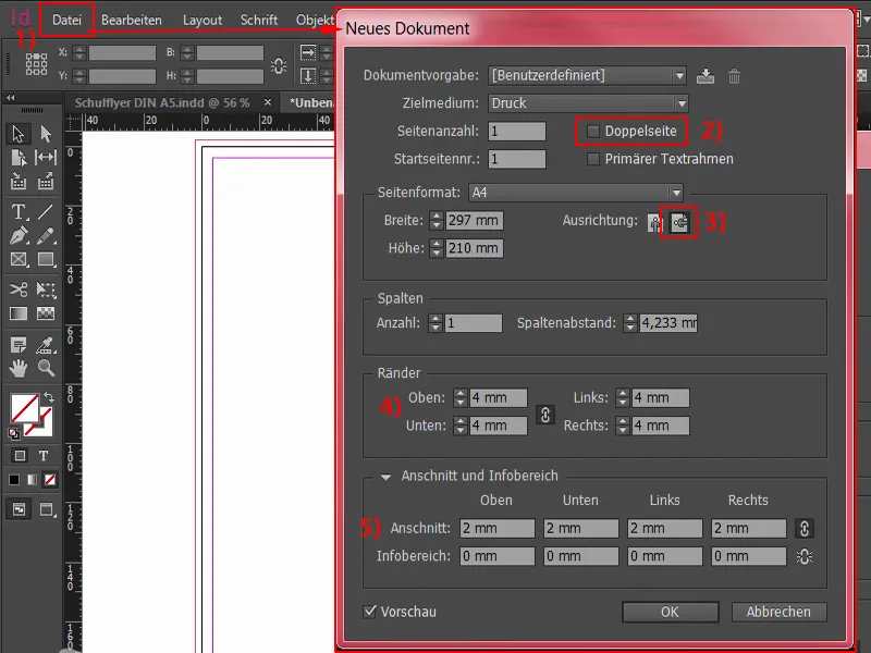
Here at the top left, the red line, you can see this very clearly if I zoom in, this is the so-called bleed. We also need this at this point in order to place elements beyond the normal final format and to avoid white color flashes that could occur during cutting. As you can see, speed cameras are not only unwelcome guests on the road, but it is also important to avoid them here in print.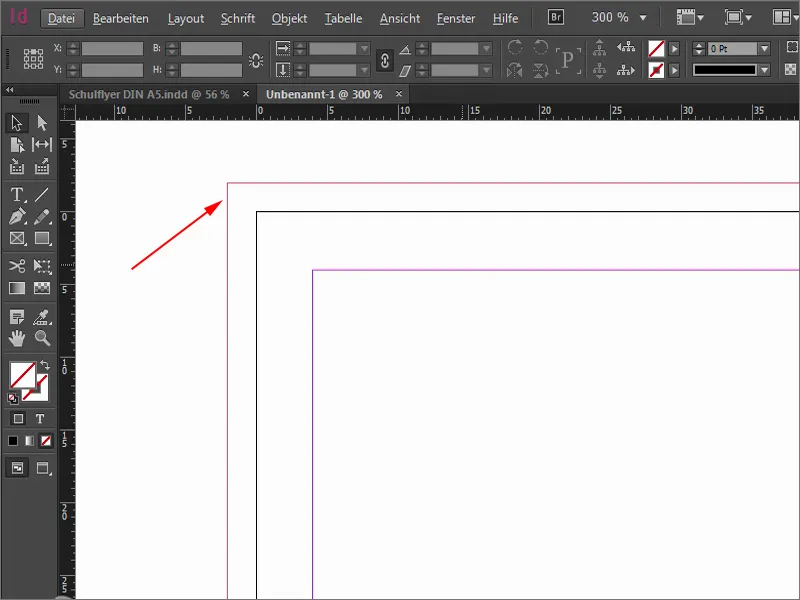
Ctrl+0 for the overview - and now let's get started by working with a design grid. If you go to the trouble of creating a design grid, you'll reap huge benefits afterwards. You can do this via Layout>Create guidelines... And you'll recognize the significant advantage once the grid is in place.
I will now define how many rows and how many columns we have. I want exactly 10 rows. I'll set the column spacing to 3 mm, which is the distance between them. And then I'll take 20 columns and also 3 mm. This gives us a grid that looks like this. We can confirm that.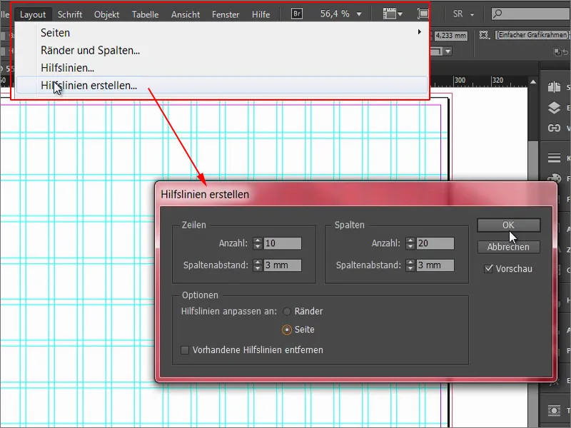
If you, as a designer, use your mouse like a star chef wielding a cooking spoon, then you may have noticed that you sometimes move this grid, i.e. these guide lines, by mistake.
To avoid this, the very first thing I'm going to do is lock the guides. I can do this via View>Grid and Guides>Lock Gu ides. Now nothing can happen, I can manipulate it however I want, nothing happens to the guides. This is bombproof and we are of course doing well if we stick to it.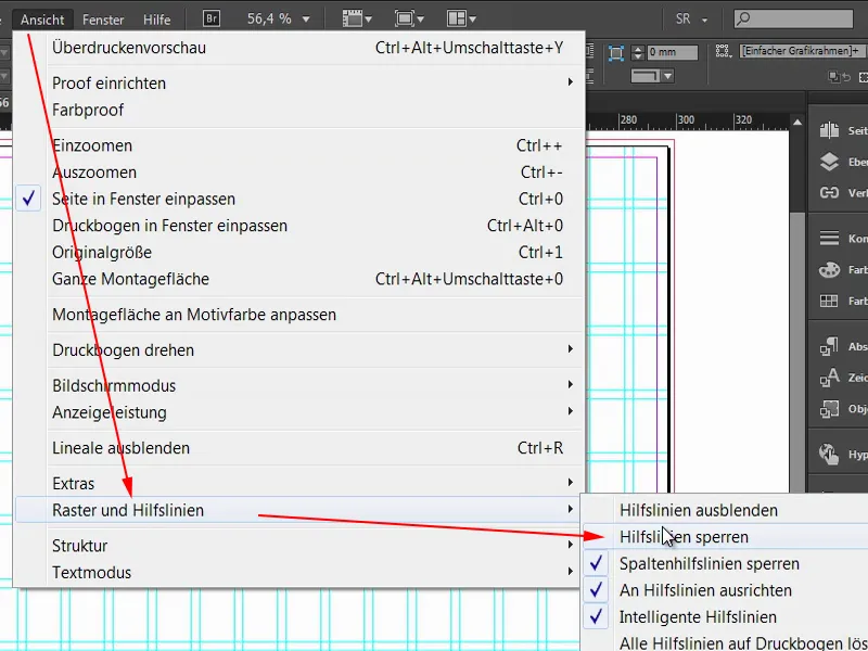
Create a structure for the flyer
In order to bring some structure into this rectangular maze and maintain an overview, I start by quickly defining a new color field. Nothing special, just add 20 % to black here.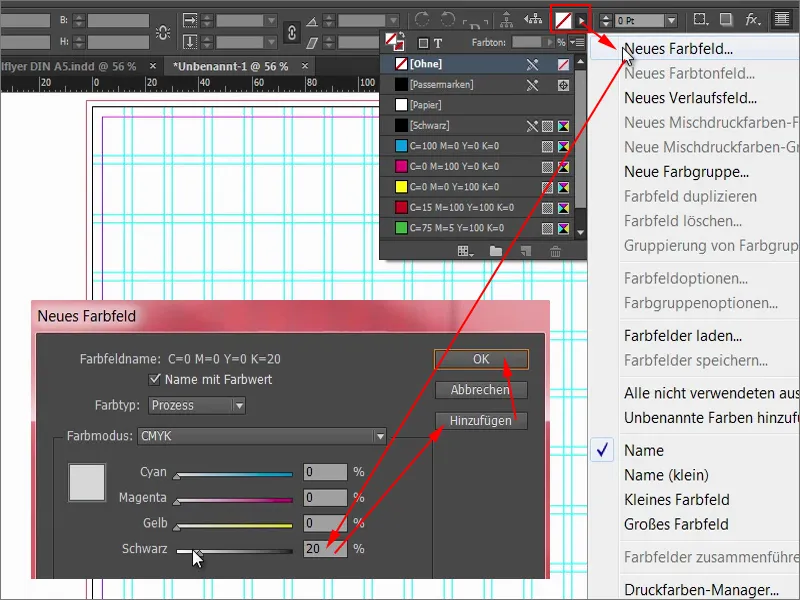
And then I start to draw the tiles in principle. We start at the top left and drag the rectangle from the bleed further across the grid, four boxes in fact, and assign this color directly to it.
We now repeat this in several places. Next, we'll move over here. I'll move it over there by holding down the Alt and Shift keys. I'll add a photo later. But it doesn't need to be that big, it only goes as far as that, and then I can drag it down ... (see image for result)
Let's move on. Here we need something similar, I'll just drag it further down. Then we'll make a copy of this and move it to two fields together. And another one on one field. Here's another photo below ... (see picture for result)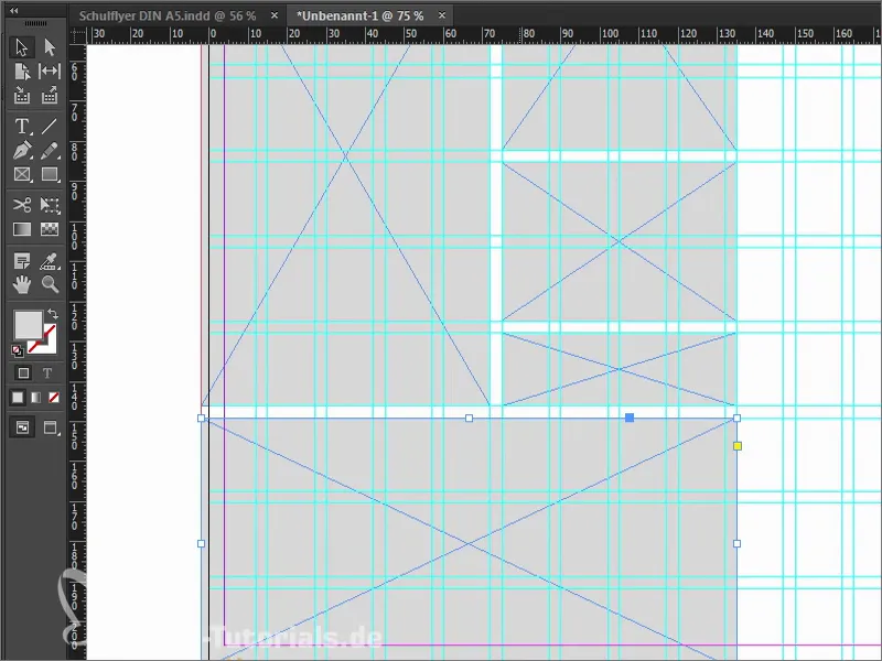
Now we go to the place where the front and back will separate from each other. If you do all this, you can also pay attention to the green arrows. For this, InDesign needs the reference point in the visible area (left arrow). And if I move the rectangle here, it shows me that this is now exactly 3 mm (right arrow).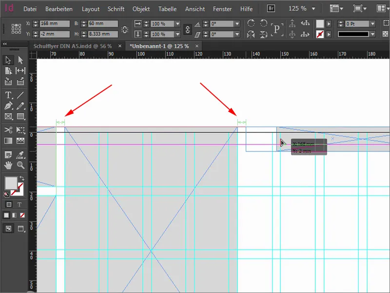
So that fits. I make the field even smaller (reduce the width of the top left rectangle in the image). The break is then between the two auxiliary lines that run vertically through the rectangle. Now we can pull the rectangle down a little, I do this with the eye, approximately up to this point (see size of the rectangle), so that it is not completely symmetrical at this point. I would like to have a little dynamism in it.
Make another copy of it and move it down (bottom left rectangle). Now we have to make sure that we have 3 mm. We can use the gap tool (1), for example. Once in here, it tells us that this is now 3.725 mm (2). If I were to move it now, it would only move the position, but I don't want that. I want to make the gap smaller. If I now hold down the Ctrl key, it sets this to 3 mm (3), i.e. exactly the distance I need.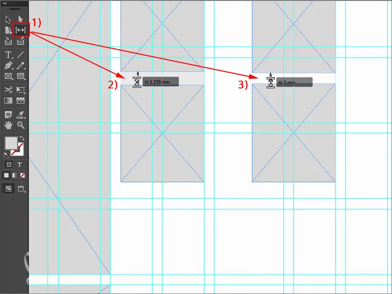
Then we drag this rectangle (1) to that point. I'll make another copy (2) of it, the same size as the photo to the left. Another copy (3) with Alt and Shift. The whole thing goes a few fields to the right, four in fact. Another copy (4) of it, down and out to the bleed (5). Please always make sure that this is guaranteed.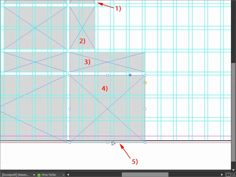
Then I grab copies (1) and place them there - always using the guide lines as a guide, because that's what the grid is there for. Now you can see the notable advantage that the grid gives us. This really is a unique feature, I find it really practical. You can see how quickly we can move forward here, it's really quick and easy.
Ctrl+0 again for the overview - this is what the layout will look like at the end. Now it's actually a matter of placing images and filling the individual rectangles with colors, i.e. with life, so to speak. We are now breathing life into the whole document. That was just the basic structure.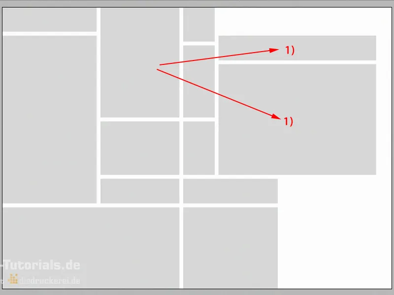
Placing and aligning images in the layout
The shortcut of our choice: Ctrl+D. This takes us to the Place dialog. Here I look for the right images, four for the first outer pages, which I can all select with the Ctrl key...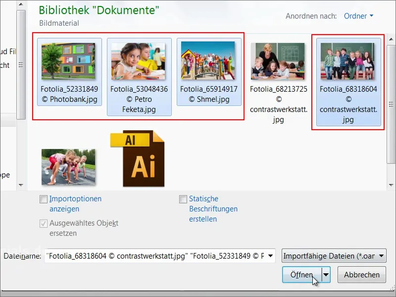
Now we have a loaded mouse pointer. You can see a small "(4)" next to the icon. This means that there are four images in the loaded mouse pointer. If I don't want this to be the first image, you can easily switch between the loaded images using the arrow keys.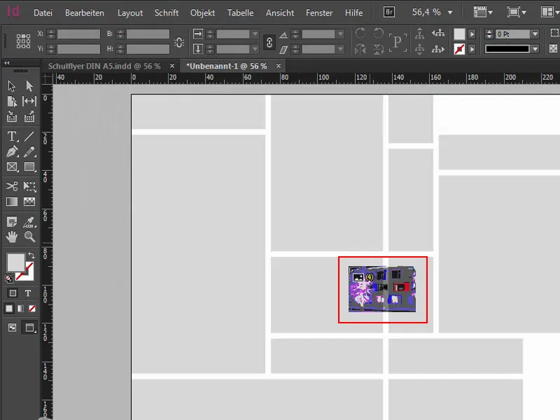
I position the individual images ...
Now, of course, everything is not proportionally adjusted, so I select all these areas. Right-click on them, then click on Customize>Fill frame proportionally.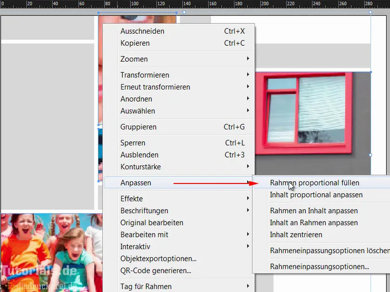
Then we need to do a bit of fine-tuning. So this pretty girl here with the big googly eyes, she looks quite likeable. That's simply because the childlike scheme comes into play here. Faces are of course always more interesting than pencils or hole punches or chalk or colored paper or glue, or whatever else children are busy with at school. No. Big eyes like these are exactly what we need.
I double-click on the image and then we have the image content. And I move it by holding down the Shift keyand pressing the arrow key to the right in the frame so that the pencil is still on it.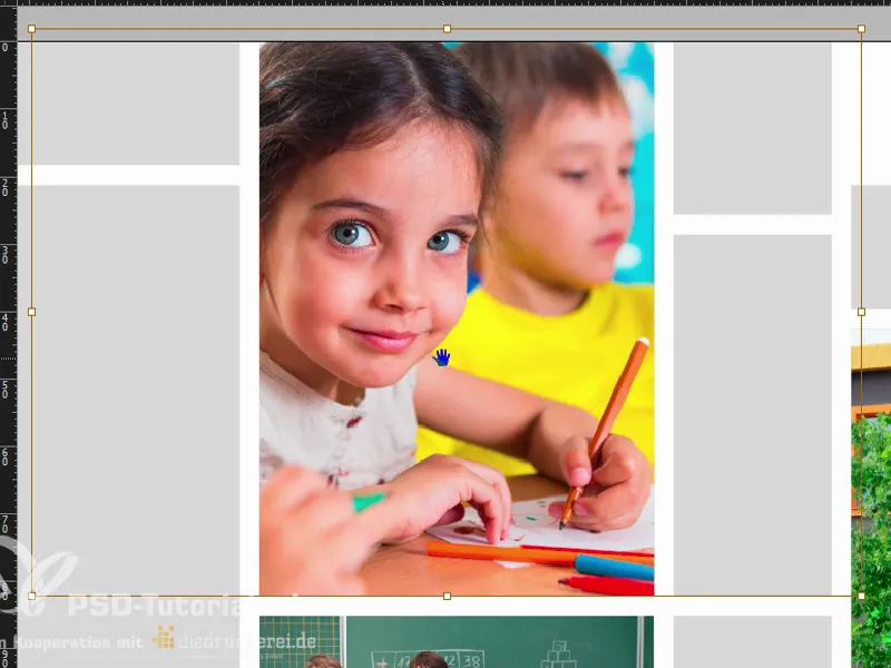
Let's continue with this picture. We can drag it a little larger by holding down the Shiftkey to enlarge it proportionally.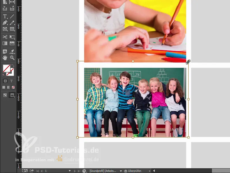
Then this one below. Let's make it a little higher so that the kids can all fit on it.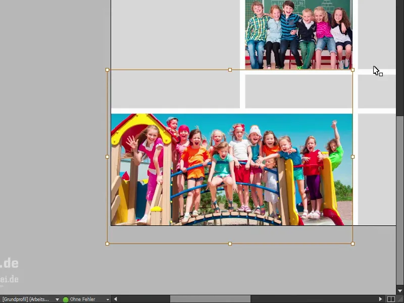
And our regional school - it actually fits quite well.
Let's take a look at the whole thing. Wonderful.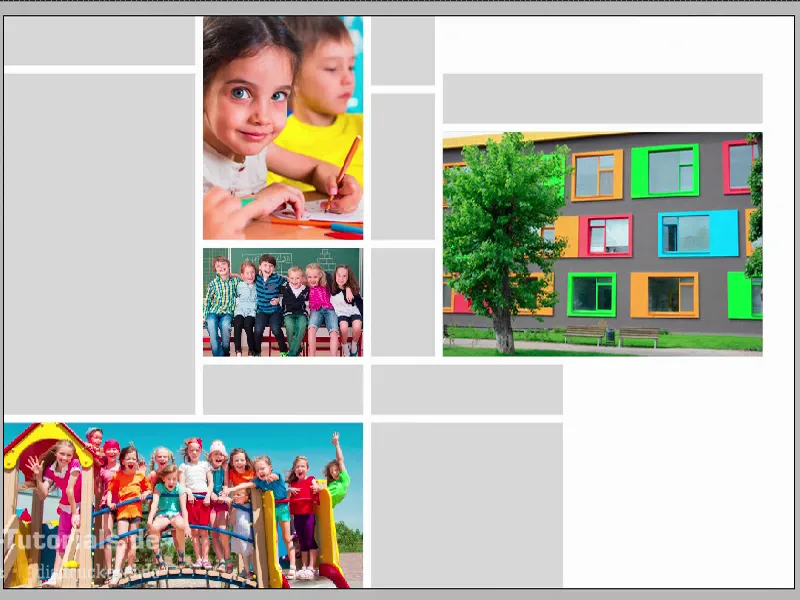
Define color fields
Let's move on to the next step: color swatches. Since InDesign CC, which is constantly improving and optimizing, there is now a pretty cool tool called Color Settings (1). It's a bit like the eyedropper, only in "large", i.e. the big brother of the eyedropper. If you click on it, you'll see this pipette with three small cubes at the bottom (2). This is to suggest that it is about color fields: I'll click on this image here (3) - and InDesign will recognize which colors (4) are used within this image. These colors can then be extracted and added as color swatches. Just click on it ... (5) And now take a look at the color fields (6), the whole thing is now called "Bunt_Design" (7). In there we have five color fields that come from this image. It's a pretty cool feature, because you always want to have color harmonies.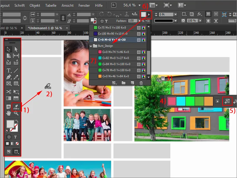
What I don't quite like now, though: Take a look, it didn't really work properly because we have two color values (1) here that are pretty much identical. I adjust them a little.
I remove one of them by double-clicking on it. It gets a new color mixing ratio. You may also have noticed that when the colors are extracted, they are converted from an RGB image into CMYK values (2) - pretty cool.
I now change the color to a pastel tone (cyan: 23 %, magenta: 0 %, yellow: 55 %, black: 0 %).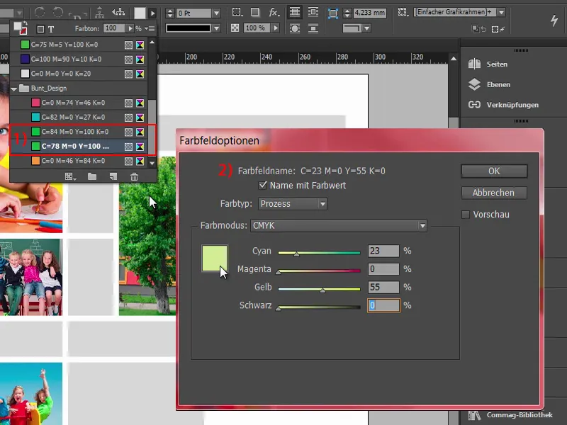
It doesn't work quite so perfectly with the pipette, so you don't always get exactly the color harmonies you want. This is actually already the cyan tone of this window (1), but that's not what I had in mind for my design. I want these values here (2). But we can keep the rest as it is.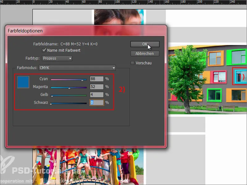
Inserting colors and logo
And here we go: the rectangle gets the blue. So do the three, so I select them with Shift and set them to blue. This is how I color the rectangles now ...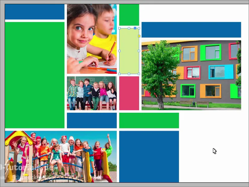
What's still missing is a logo at the bottom. I also took this from Fotolia and edited it in Illustrator. I can't show you that here, but this isn't an Illustrator workshop, it's an InDesign workshop. I drag it in, switch the grid back on with the W key, and then you could actually position it a little further down.
Adding text
Now let's fill the whole thing with text. I'll start at the top here. I draw a text field. For the flyer, I've chosen Aller in Italic, large, 20 pt, color snow white like innocence, and then we write in: "Regionalschule Musterstadt". I adjust the text field and center it.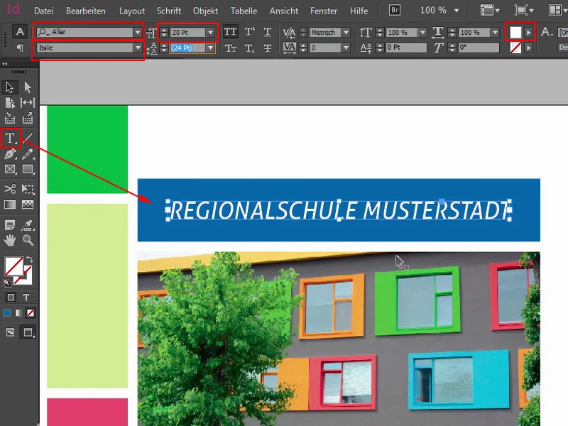
Continue on the left-hand side: I copy the text field and move it over. You have to be careful. As you know, we have to keep this four millimeter safety margin (1) to the edge, so we drag the text box over here. Now write the text: "What happens after the orientation stage?" at 13 pt (2), without capital letters (3), and add a paragraph.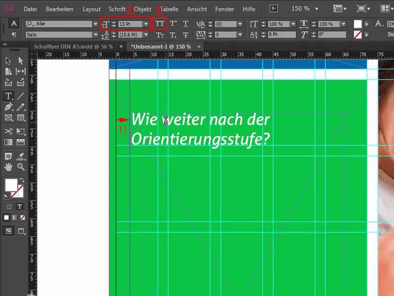
The whole thing can now also be marked and defined as a paragraph format. This means that we first define manually how we want the font, how we want the format. So select and define a new paragraph format.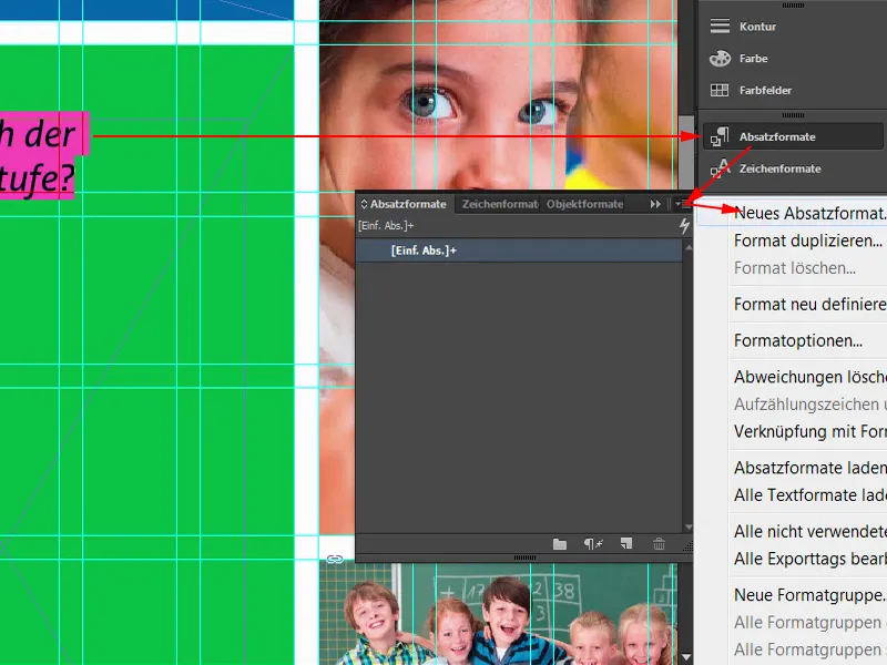
We call this "2nd order heading". We will need this more often, so it's a good idea to define it as a paragraph format.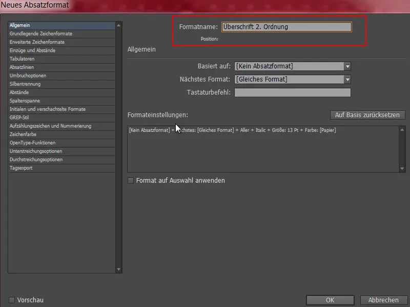
So what is a question without a suitable answer? Exactly - nothing more than a question without an answer. And we're changing that now. But I would also like to give you a little tip: We have placed a paragraph here that you can't even see. If you want to see something like this, go to Font>Show hidden characters (1) - and you will see that there is a paragraph. I now select the simple paragraph (2) and copy the text I need from the clipboard.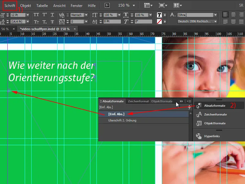
I'll now give it a new paragraph format, which I'll call "Bulleted list" (1). We will now adjust the format further.
If you have activated the preview option(2) below, you can see exactly what I'm changing on the left.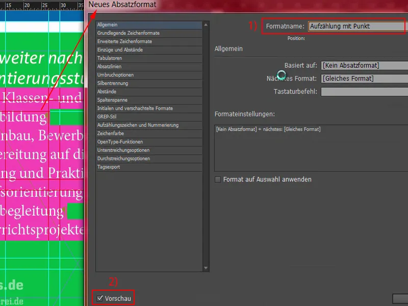
First: Basic character formats (1). Here we select Aller Light with a font size of 11 pt and a line spacing of 14 pt. Strangely enough, nothing changes on the left. Why not? - Because the paragraph format is not applied. So - select everything (2), apply "Enumeration with point" to it. Now something has changed and we can continue editing.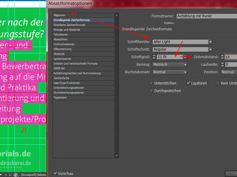
So the character color is of course white. This was previously set to black, so you really have to be careful that the contrast effect is sufficient. Black on green is not really easy to read, and the same applies to black on red, for example. These are very unfavorable combinations. We'd rather use white.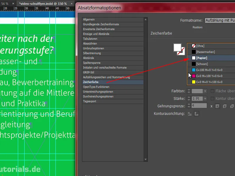
What else do we need? Of course we need a bulleted list - so we go to the Bullets and numbering tab (1). Under List type (2), we select the bullet points and this bullet point (3). The tabs aren't really right yet either, they make huge airports as spacing aids, which looks really bad. So: indent left 3 mm, and here in the next field -3 mm (4). Now the whole thing is in place as we need it. Then we can also confirm it.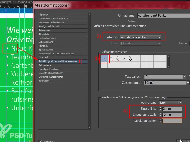
What would certainly be very practical at this point (1) is if we define a certain distance at the top here. It's a bit too close together. We can easily change this by opening the "Heading 2nd order" (2) and defining, for example, 3 mm in the Indents and spacing area under Spacing after (3).
What has changed? We now have 3 mm spacing here, but strangely enough we also have (4) here. This is due to this paragraph (5), which we have set manually. I'll confirm the whole thing first.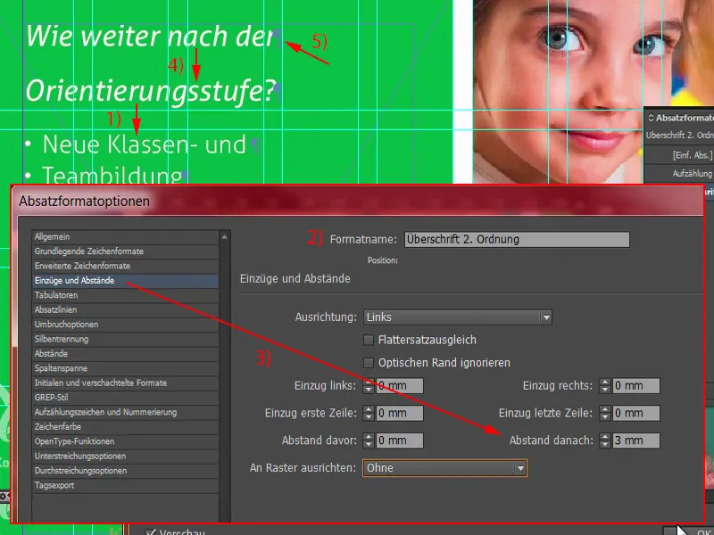
To solve this problem now, I'll simply delete this paragraph (1) once with Remove. But now we have a break that we don't like. We can work around this by holding down the Shift keyand pressing the Enter key (2). Shift and Enter - this prevents the 3 mm spacing from being added here as well. Good, then we can confirm the whole thing.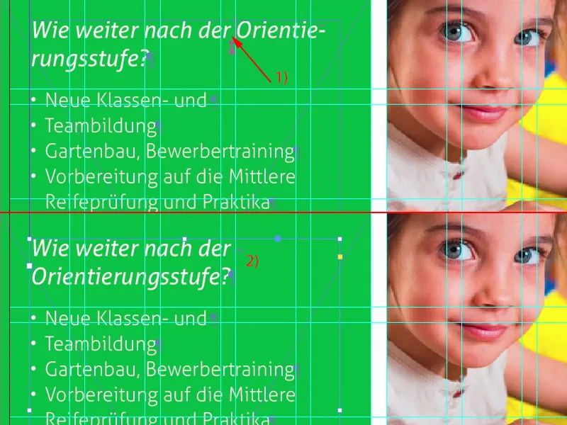
I will now make the text field as large as necessary: double-click on this handle (1). Make a copy (2) of this whole structure. I'll move it all the way down to here. And now I'll move it up again twice with Shift and the up arrow key, the same distance as here (3).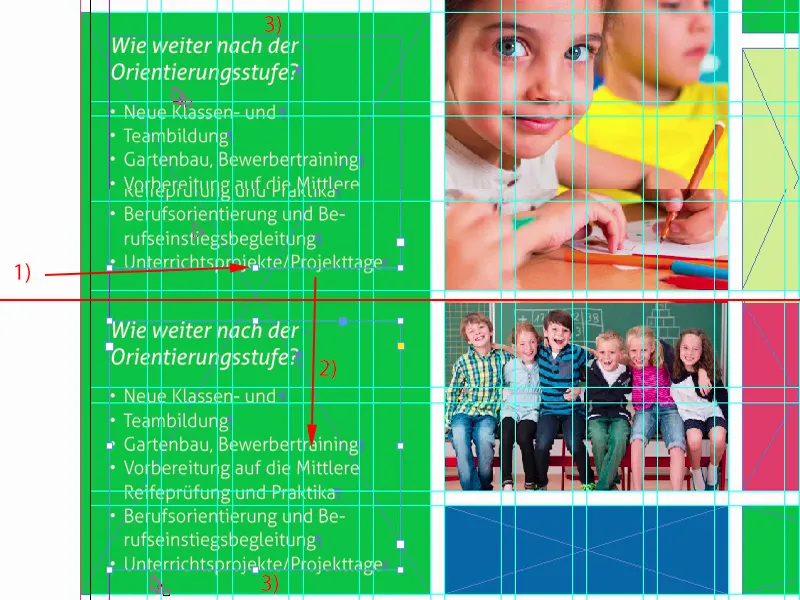
Then I'll rewrite the text with predefined content that I copy from the clipboard.
What has happened now? We have this effect again with the paragraph (1). We throw it out. With Shift and Enter, this is also correct again (2).
And another enumeration.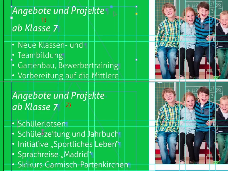
Let's continue with our address, which we'll find below, because mommy and daddy have to enter an address into the navigation device when the first day of school is approaching, and that's why there's help here. Simply draw a text field (1) and always pay attention to which format is used. Our heading format is now in here, which is wrong at this point. I'll just take the enumeration (2), drag the address and paste it here. Now I'll duplicate the whole format (3), which I'll call "Address" (4). Under Bullets and Numbering we can simply delete the enumeration (5). Confirm, apply once. Wonderful.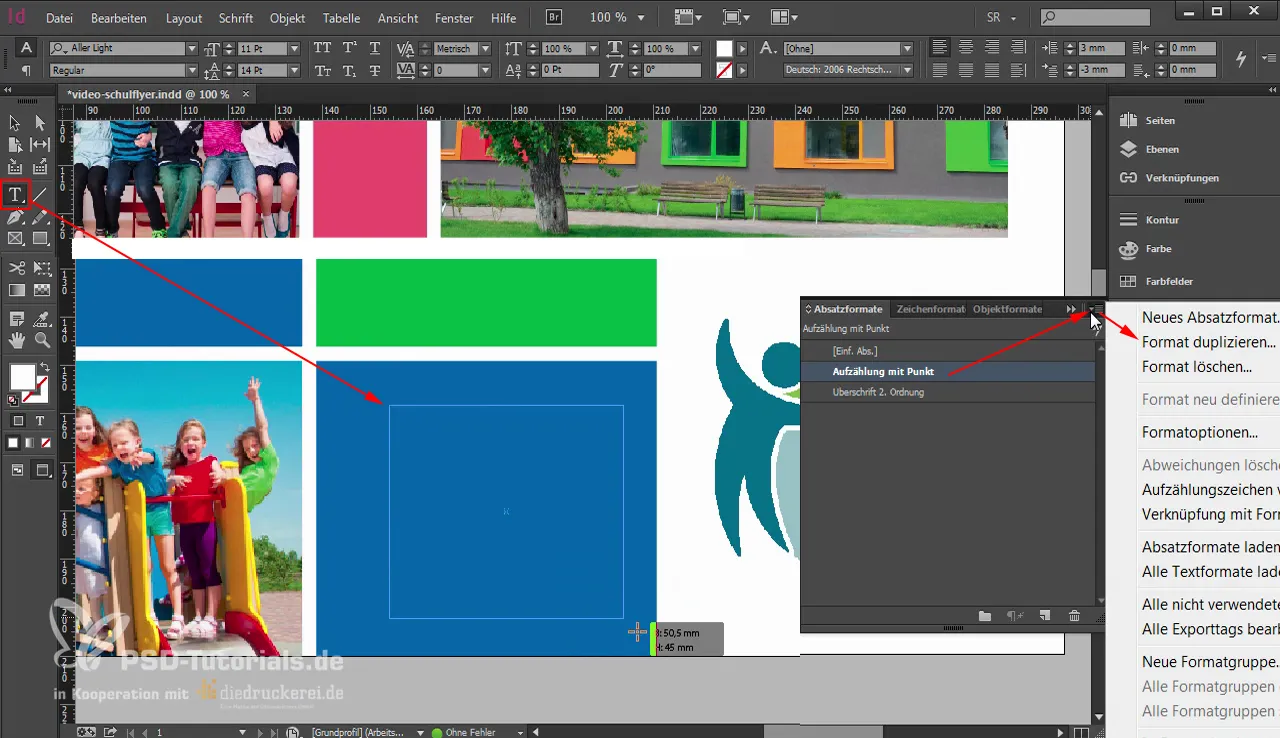
Now we need to delete a few superfluous paragraphs. Remove the one at the top. And what's wrong here? The width (1) of the text field doesn't fit.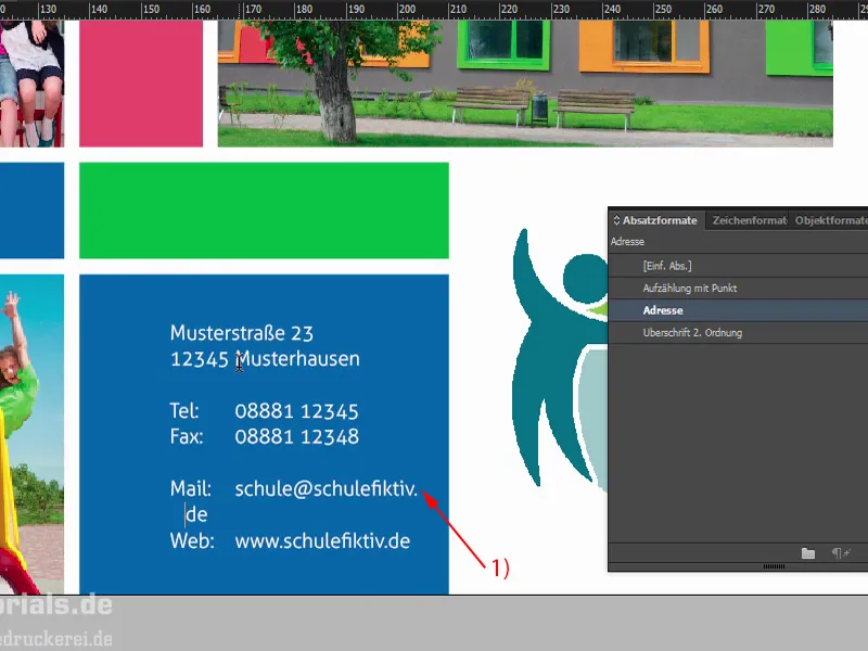
Something special comes into play here: I explained to you at the beginning how great this effect of cross-page tiles is. You could almost make a mistake with the layout, because at first glance: There's a break in the white space. No - that's not the case. The break is at this point at 148.5 mm (1). So if you were to align this text field here, for example, four millimeters from the left (2), then you wouldn't make it easy for mommy and daddy to decipher the address, because they would have to constantly switch back and forth between the front and back. That would be an absolute no-go.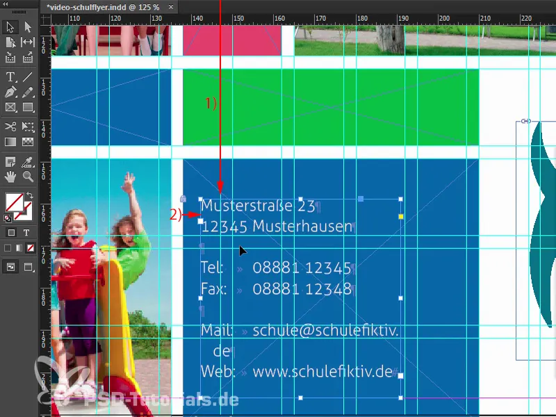
So the first thing I do is expand the text field so that we remove the wrap at the bottom (1). Adjust the height and then move the entire text field to the right (2). Then I'll take out the bleed at the bottom here (3), select the top text field, select the back field and then select the exact center in the Align panel(4). Now we have centered it. Then we need to check again: So that's about 4 mm now (5), here's the break (6). This means we have enough distance.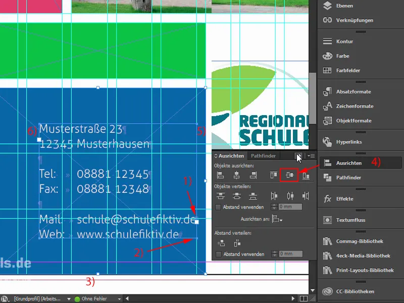
Let's take a look at that. That fits, I think. Let me zoom out. That's right.
We'll continue with the back in the next part of the training.