We have already learned about the first six Disney Rules in the first part of this tutorial series. Now there are six more, not all of which, admittedly, relate to graphic animation, but I would still like to discuss them with you in full because they all have a core that we as animators should bear in mind.
7 Secondary Action
The seventh rule states that every movement we make has a consequence. Be it external circumstances or the pom-poms on my sweater - for example, if I jump up, the pom-poms are thrown up with me and then fall down again. You could also take a skirt that swings when you turn or a dangling ponytail as an example of how something always moves when things animate.
Another good example is the Pixar short "For the birds". A very large bird sits on the power line with a number of smaller birds and the whole thing sinks down. The small birds naturally slide towards him in the middle and gather there because he pulls the whole line down.
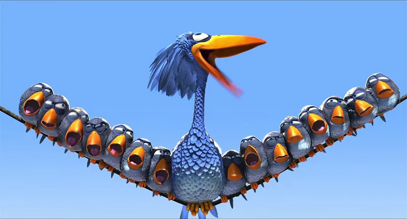
For the birds, © Pixar.com
This is a classic example of secondary action. Or one jumps into the water and we have bubbles rising all around him.
Or the squirrel jumps and its tail always follows because it's not attached in any way, it's flexible. As long as it is not completely alone in space, every movement entails other movements. This is also very important in graphic animation, for example, when something is smashed onto the screen, the whole image is shaken for a brief moment.
8. exaggeration
Exaggeration simply means "to exaggerate". Animation was started in very early times, even before the movie actually existed. Eadweard Muybridge proved with a series of photos that a galloping horse has all its legs in the air for a brief moment. He set up lots of cameras and had them all triggered in quick succession. In this series of photos, you can see in the third picture that all of the horse's legs are actually in the air and it is actually floating.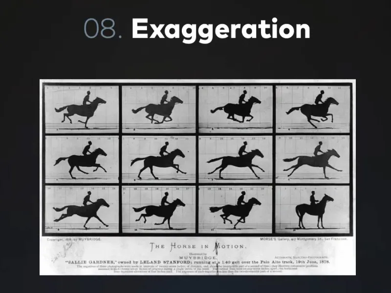
Disney then went on to experiment and research these things. It realized that if you took a video, a film recording, and traced the images bit by bit exactly as they would look in the real world, it wouldn't look alive and natural, but rather a bit stiff and not dynamic.
So you have to exaggerate in any form of animation. In terms of character animation and posing, we can see the example of this little panda.
At the beginning, the illustrator was quite unsure. The pose on the far left is already clear, but not yet extreme enough. You could say that the Disney factor of this figure is gradually increasing. She is becoming more and more stylized and exaggerated and thus more and more endearing.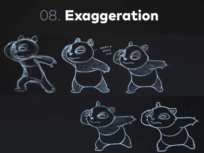
Exaggeration is a very important means of animation to make certain elements look the way you really want them to look.
Here's another example of this pirate in two poses. Where the poses are simply exaggerated again, where he leans much further over the plank or opens his mouth even wider and the sabre is even more blatant, the whole thing suddenly becomes much more dynamic.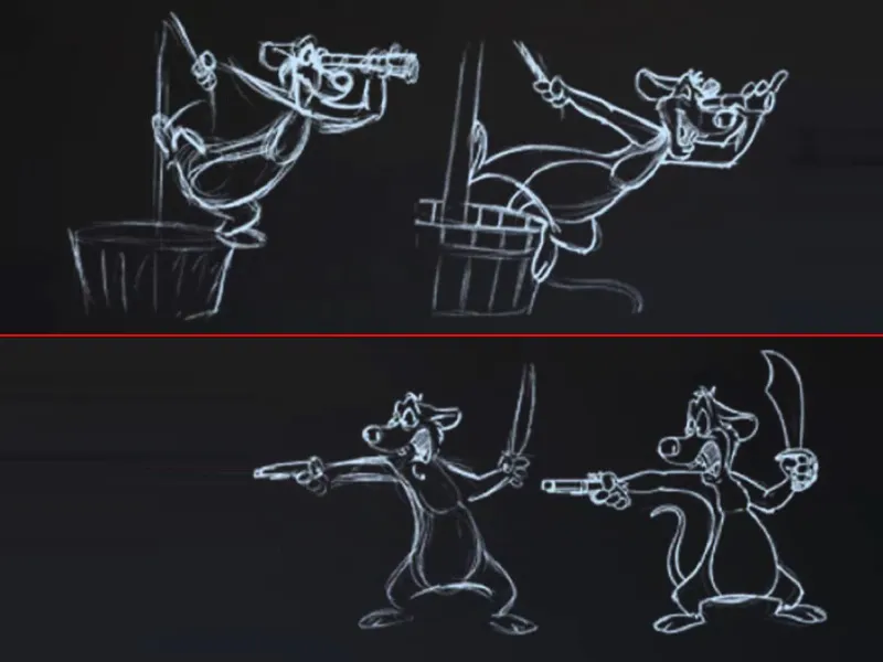
Exaggeration gives an action much more energy and that's where principles like the action line come into play. We always make sure within a character and especially with their posing that they never just stand there straight. If he wants to punch, for example, then he shouldn't stand so straight and just extend his fist forwards. If I want to show that there's a lot of energy behind the punch, then I have to let him swing out and bend his whole body. Only then can I get this action line in the opposite direction to the punch, i.e. in anticipation, and make it believable.
That is also a form of exaggeration. That we don't make the movements small and careful, but that we exaggerate the anticipation and the follow through quite a bit, in a way that would perhaps never happen in the real world, but which looks much more dynamic, fluid and lively in the animation.
9 Straight Ahead vs. Pose To Pose
This is not a rule that we have to follow every day, but two animation principles. They originally come from cartoons and are still used in digital animation today.
It's about the principle of how I approach an animation. Do I approach it in such a way that I animate it from start to finish or do I first block a few poses in the animation and use the poses to go into the intermediate frames and look at the intermediate movements.
Here we see an example of someone who goes to the blackboard and wants to write. The whole thing here is animated à la Pose To Pose, which means we have 3 key poses. And every computer animation is basically Pose To Pose. In this case, because we set keyframes. We say that an object should be in this place at second zero, in this place at second one and in that place at second two - and the computer then does the intermediate keyframes automatically in most cases.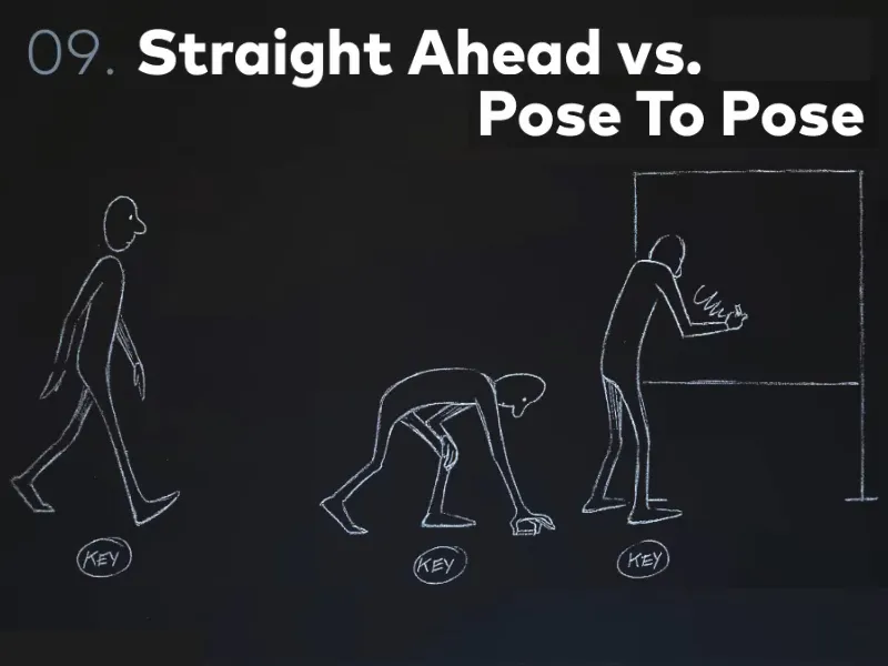
But this pose-to-pose thingis still important in the digital age, because we can approach keyframes in different ways. Let's take a fight scene between two characters, you can hardly animate it pose to pose, because every single movement counts, every reaction to a punch, a kick, a blow. Whatever happens in a fight animation, you really have to do it straight ahead, i.e. play it through from start to finish. I start with the first pose and then move on bit by bit by bit. Straight Ahead simply means: animated from front to back.
You can also do this in animations to block things. I always block the bouncing ball in this way. But when it comes to adjusting tracking data in After Effects, for example, I always proceed like this: I adjust my track at the beginning and adjust it at the very end. Then I break the whole thing in the middle and look in the middle to see if it still fits and adjust it there if necessary. Then I take the middle from the middle and adjust and then the middle from the middle on the other side and then the middle from the middle from the middle. I break it down further and further. First in quarters, then in eighths and so on. I do it this way to save myself as much animation as possible, because most of the intermediate poses are done automatically by the computer. If I set one pose at the beginning and one at the end, then the middle is already the middle of the two poses assumed by the computer and this may already fit.
So Pose To Pose is still a very important thing in contrast to Straight Ahead. So either we animate completely from start to finish or we set our poses and thus Tim.
With Pose To Pose, for example, it's much easier to time movements to music or something similar, if it means we don't go in with the attitude that we're going to animate somehow and get away from this place where we are. Instead, we definitely want to go somewhere at a very specific time.
Let's go back to our little man on the blackboard. Here we see another small example of how elaborate cartoon animation really is. We had the three key poses and there is no one here, so there is no After Effects that generates the in-between poses, but there are the so-called in-betweeners. These are cartoonists who have a separate job from the animators.
So we have the key animators, who actually only draw the key positions, and the inbetweeners, who draw all the in-between positions.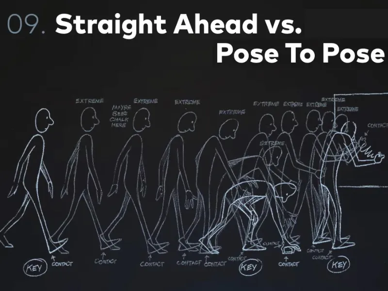
The Simpsons, for example, is still drawn by hand in New York, but only the key poses. All the inbetweens are done somewhere in Korea for very little money.
The in-between poses that we see here are still not all the poses that are actually needed to animate it. These are the further extremes, the further extreme poses related to the step sequence, to the contact position of the walk that he does, to all the things he does with his hands, and so on.
And this is where we see the breakdown, i.e. all the intermediate poses of the intermediate poses. And that's where we get to all the individual images.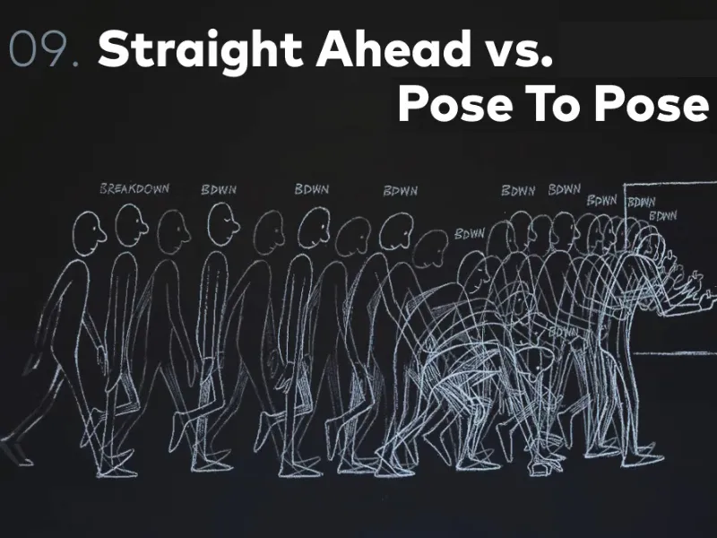
I'm really glad that today we animate digitally, that the computer does the keyframe interpolation and we only control how we want the whole thing to look.
10 Timing & Spacing
Timing & spacing, I would say, is the basic principle of animation. Timing & Spacing is where people who work with After Effects differ from people who animate with After Effects.
It's a bigger difference than you might imagine. A sense of timing and spacing is what makes good animation.
Timing is this: I say at second zero the point is here, at second two the point is there. Spacing is what happens in between.
Let's take the example of a coin moving from A to B. We have one second both times. So 25 frames. Within these 25 frames, we have three poses that we set, and these are the three positions of the coins. Exactly the same at the top and bottom. Once on the far left and once on the far right at the edge of the picture and once in between. But that still doesn't completely define our animation.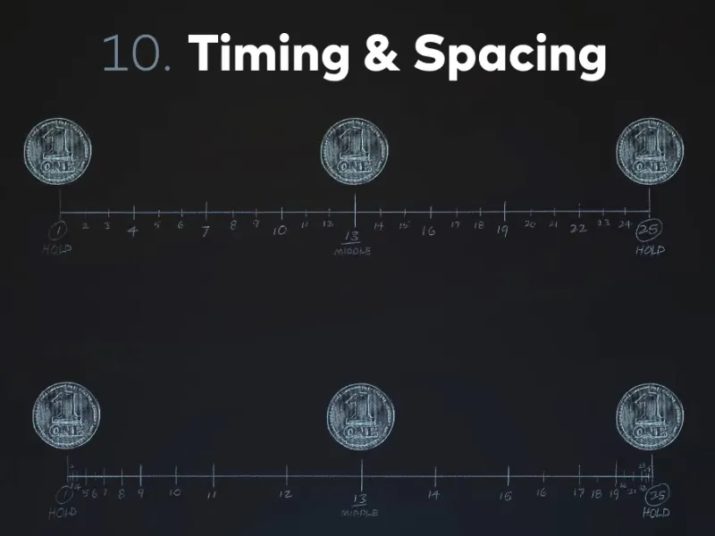
And that is precisely the crux of the matter that we need to be aware of:
Animation is not just about timing things and moving things to the right places. A lot of people who work with After Effects stop at exactly this point. They say, "Okay, I want my text at the beginning there and at the end there and in the middle there". And then it's done. You press F9 Easy Ease and that's it. No, no, no, that's not how it works, because the spacing has been completely left out.
And spacing is exactly what makes the difference between simple A-to-B animation and good animation.
Here, for example, is a linear distribution of the intermediate frames and a distribution with slow in & slow out.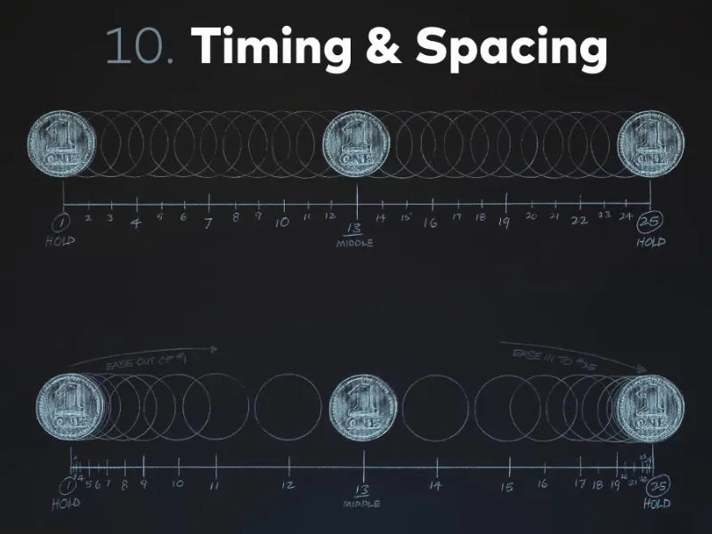
Spacing is not actually a rule of its own, but the basic principle of animation, in which we can apply all the other rules in turn. This means, for example, that Slow In & Slow Out is a nice application of good spacing. Good spacing in this case because the movement starts slowly and slows down again at the end. We have deceleration and acceleration and that is exactly what is expressed by the spacing.
It doesn't matter whether the car is there at the beginning and there at the end in the same amount of time, it doesn't always travel at the same speed, but it brakes and accelerates. And that's the difference between good and bad animation, but unfortunately you can't learn that.
You can't generally learn how to time poses and how to do the spacing, i.e. the intermediate frames. You can't learn that, you have to develop a feeling for it. That's why animation is such a big exercise.
There are also many animation exercises, including the bouncing ball, which we will also look at in this tutorial. But without ever having done these exercises, you can hardly learn anything from them.
You can understand the principles, but unless you develop an eye for whether it's good or bad spacing, these exercises won't help you at all.
In other words, I recommend that you try out everything we do in this tutorial straight away: Move objects from A to B and play around with the curves. Because the curves in After Effects determine the spacing.
We don't let After Effects do the intermediate animations of the poses with Easy Ease, but we go into the curves and edit them. In this way, we adapt the spacing to what we want the animation to look like.
11. solid drawing
Solid drawing has relatively little to do with new graphic or digital animation. The following can be neglected in digital animation: We no longer draw every image ourselves, we let After Effects draw the image and only describe the objects that After Effects should draw. And After Effects doesn't allow itself any mistakes, but errors can occur when drawing.
For example, if a person is walking and you draw a walk, and as you draw it frame by frame, the person gets smaller and smaller. However, the figure must always remain the same size in the animation. This would be a contradiction of solid drawing.
Here is a small example: Homer Simpson from two perspectives. He simply looks like a body. You really get a feeling for volume and for his stature here. Simply because he is well drawn from two different perspectives.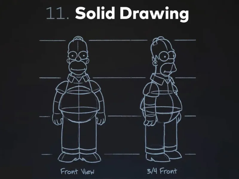
This solid drawing, the consistent, good drawing, is something we don't have in After Effects, but we should still look into this rule in case we do something in the direction of animation at some point.
12th Appeal
This has a lot to do with how the character feels, whether they're believable, whether they have ulterior motives, whether you can empathize with them, and so on. And all this gives the whole thing more life than if it was just a character moving around.
In our graphic animation, Appeal has a lot to do with music, with feeling, with composition, with animation concept, that we simply feel somehow addressed or touched by an animation. We don't necessarily draw characters or deal with seemingly living objects, but our animation still has to be appealing.
It simply has to do with empathy. When we draw a character, even if it's a small illustration of someone smiling at the beginning and then looking sad - you feel empathy if it's done well. You immediately think "Oh dear, the poor thing". And that's exactly the point. If that's achieved, then the appeal has worked.
Here we see Homer Simpson again; everyone loves him and everyone laughs at him, simply because he's such a klutz. He has appeal, he has exactly this point that you can't dislike him, you can't hate him. And that's exactly why: Homer Simpson has a very good appeal.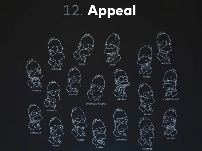
In complete contrast, the villain Scar from Disney's classic "The Lion King". He doesn't look friendly at all. And of course he shouldn't, because he has exactly the opposite appeal. He has the appeal of a villain. That comes across in the character design and even more so in the animation.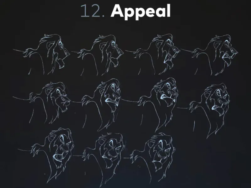
If you're really interested in animation and maybe not averse to doing some animation, which I recommend to anyone (anyone who works with After Effects in any way): Try your hand at animation. It can be just the bouncing ball, it can be a tiny little animation that's only four or five seconds long, but just try animating by drawing every single frame.
And I especially recommend "The Animators' Survival Kit" by Richard Williams. He has taken these Disney rules and worked them out really well.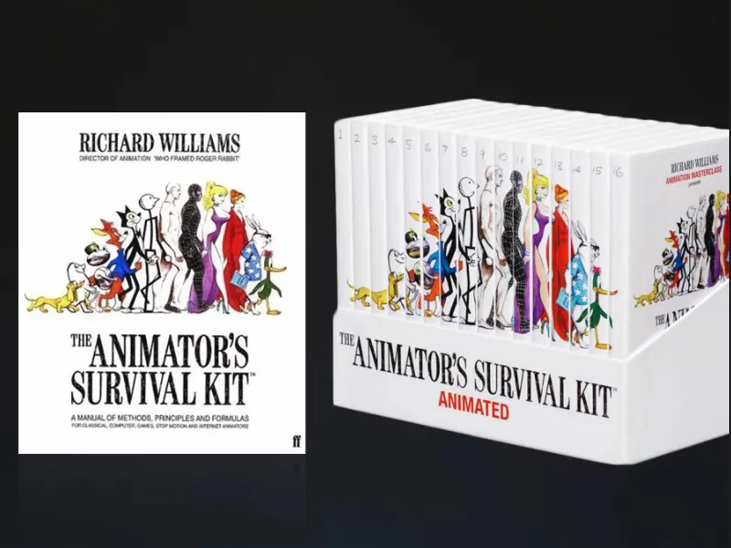
It's about walk cycles, bouncing balls, appeal, animation in general and a whole lot more. He is a former Disney animator and has a lot to say about it. He's also a super funny guy who isn't afraid to make a fool of himself in front of the camera. So there's both a book and a huge DVD section, that's 16 DVDs, where he explains the whole Animator Survival Kit in a live show in front of a few students. Plus lots of animated examples and his presentations.
A really recommendable work that I can only recommend to every animator and everyone who deals with moving images.
There is now even an iPad version of this Animator Survival Kit, which makes much more sense than the book because we have the normal book content, but still with moving examples.
That's it so far with the Disney Rules. You can see all the sources I've used here for all the beautiful drawings you've seen in the first two tutorials in this series.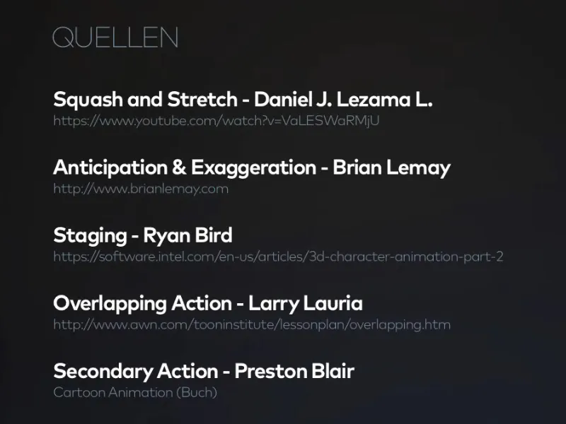
Here are some more sources: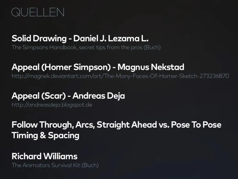
There are quite a few things in these rules that don't necessarily fit our digital animation in a contemporary way, but which we should nevertheless pay attention to. Because the rules somehow give us a little tool that we can always use as a guide.
I hope that when you're working on your next animation, you'll always think back to the Disney Rules, for example the anticipation, so that when you make a movement, you first go back a bit, so to speak, and only then move in the right direction. Or if you make something pop up and appear, it first becomes very small, then a little too big and then a little smaller again. And then it literally pops up.
I would like to go through all these small examples with you in the practical project. We'll take another look at how letters bounce up, how the bouncing ball works, etc.
But I would still like to encourage you once again: Try to recreate the whole thing. Animated. Practice. Because only then will you really become an animator.
With this in mind, thank you for reading and we'll see you in the next part, where we get to the real practical project "Animation made easy".
Bye.
