The right font can make the difference between a boring lecture and an engaging presentation. Often, slides are equipped with standard fonts, which not only appears unprofessional but can also diminish the attention of your audience. Let's explore together how you can effectively use fonts to optimize your presentation and inspire your audience.
Key insights
- Font elements are crucial for the perception of your slides.
- Use a minimum font size of 30 points.
- Combine different fonts to create tension fields.
- Avoid standard fonts, especially Comic Sans.
- Utilize special resources to find free and appealing fonts.
Step-by-Step Guide
1. Choose the optimal font size
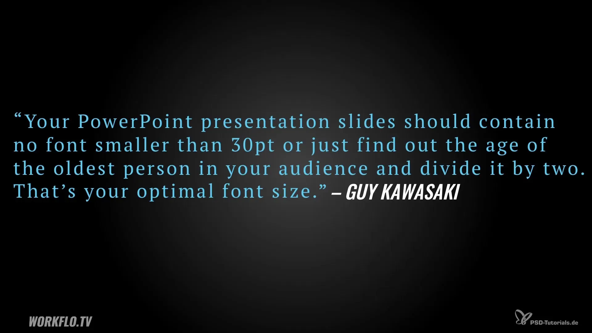
A central aspect is the font size of your presentation. Guy Kawasaki, a renowned figure in the field of presentations, recommends that the font size should never be smaller than 30 points. If you are speaking in front of an audience with older age groups, it may be useful to take the age of the oldest person in the room to determine the right size. For example, if the oldest person is 90 years old, you can comfortably use a size of 45 points.

2. Understand the importance of font choice
The font communicates emotions and moods in a subtle manner. The use of certain fonts can support the character of your topic. A font like “Papyrus” conveys a specific look, while futuristic movies like “Terminator” often harmonize with modern fonts. Therefore, you should never underestimate the impact of the font on your overall image.

3. Avoid standard fonts
Standard fonts like Arial, Times New Roman or Calibri are widespread; however, they are not very appealing and can negatively affect the overall impression of your slides. Instead, opt for fresh, newer design options such as “Oswald,” “Sunita,” or “Geomanist.” These fonts are often available for free and give your slides a more attractive and professional look.
4. Identify fonts
If you have seen a specific font that you like, you can easily identify it. A practical option is the “WhatTheFont” maturing tool, which allows you to upload an image to recognize the font used. This feature is particularly helpful if you found a graphic on Pinterest or another source and want to know what font it is.

5. Combine fonts
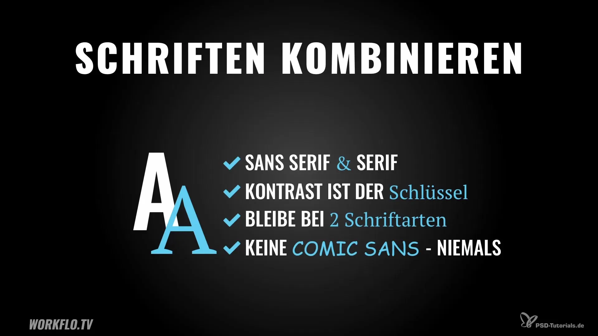
The combination of different fonts can bring excitement to your slides. However, be careful not to use more than two fonts. An effective method is to combine a sans-serif font with a serif font. The contrast between these two fonts draws your audience's attention to important information.
6. Choose fonts thoughtfully
One of the absolute rules in the font area: Never use the “Comic Sans” font. This font is often perceived as unprofessional and inappropriate. It can ruin the impression of your entire presentation. Stick to serious fonts to radiate respect and professionalism.

7. Find free fonts
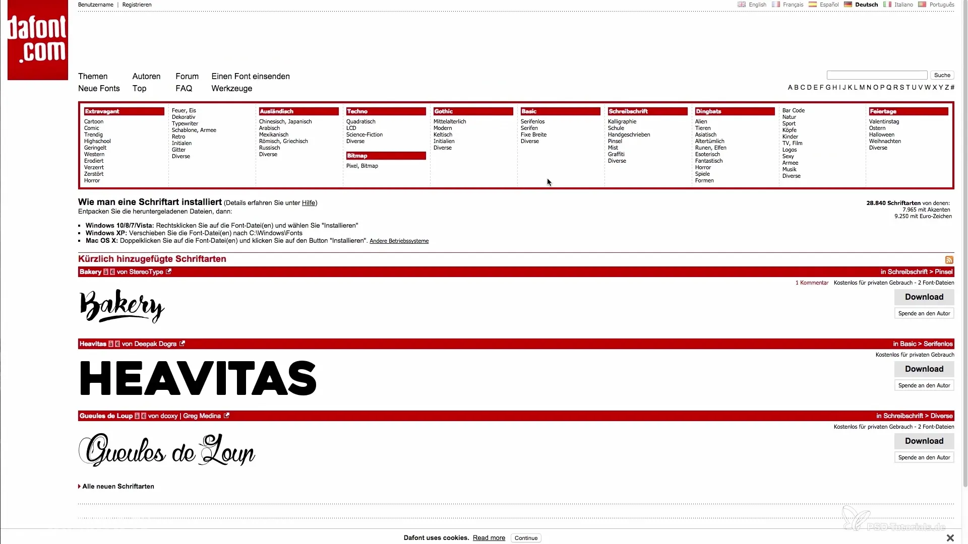
There are various websites that offer a wide range of free fonts. A recommended site is “dafont.com,” which categorizes all fonts. Additionally, you can use the fonts from Google, which can be used commercially, ensuring you are legally safe in your presentation. Another option is the site “Squirrl,” where you can filter for different fonts by categories.

Summary – Presenting Persuasively: Font Design Tips for Your Slides
To truly shine with your presentation, you should not underestimate the importance of font. Additionally, it is crucial to choose the optimal font size, avoid standard fonts, and creatively combine different fonts. Use the presented resources to make your slides appealing and unique.
Frequently Asked Questions
What is the optimal font size for presentations?The recommended minimum font size is 30 points.
Can I use more than two fonts on one slide?It is advisable to limit yourself to a maximum of two fonts.
Why should I avoid “Comic Sans”?It appears unprofessional and can negatively affect the impression of your presentation.
Where can I find free fonts?Websites like “dafont.com,” Google Fonts, and “Squirrl” offer numerous options.
How do I effectively combine fonts?Combine a sans-serif font with a serif font for optimal contrast.


