If you are working with Photoshop and want to create a color look for your images, it is crucial that the individual elements of the composing harmonize well together. Often, you see works that appear perfect at first glance, but upon closer inspection, inconsistencies in color and lighting mood emerge. Jurek shows you in this tutorial what steps are necessary to create an appealing color look and what you should pay attention to in your composing.
Main insights
- A coherent composing is essential for a successful color look.
- Make sure that the color of the individual elements fits well together.
- Use techniques like Color Lookups and adjustment layers to optimize the colors.
- Make adjustments step by step to achieve a harmonious overall image.
Step-by-step guide
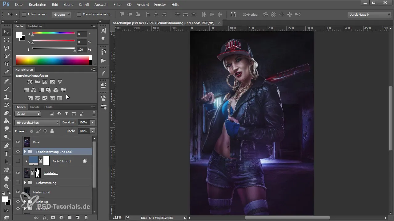
You start with composing your image. At this point, it’s important to examine the individual elements closely. When looking at the entire image, you might already notice that the model is not optimally integrated into the background. Here, the color and lighting mood are significant.
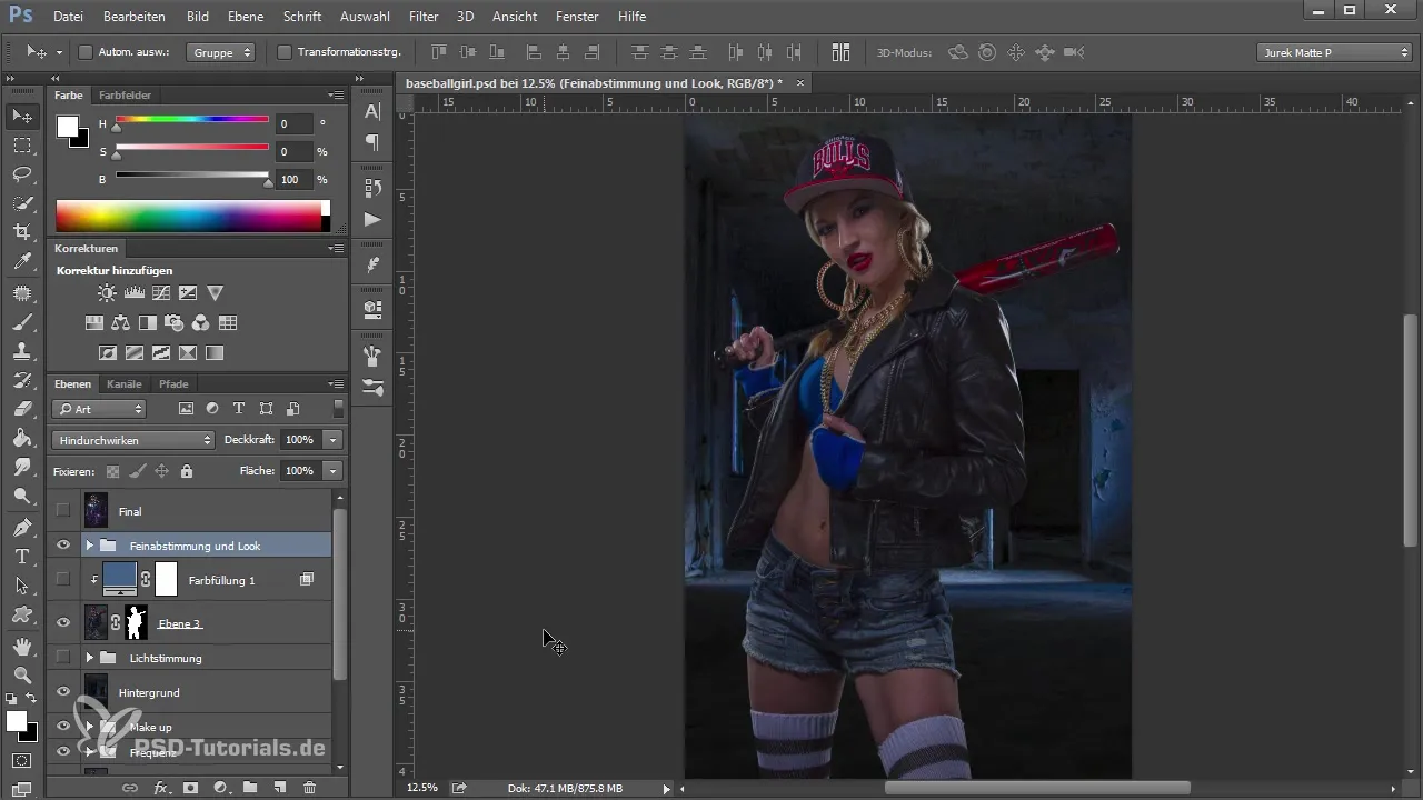
In the next step, you will hide the final image to consciously see how the disharmonious elements work in the composing. Often, you can see that the model's colors do not harmonize with the background. It’s important to compare the brightness and hues of the model with those of the background.
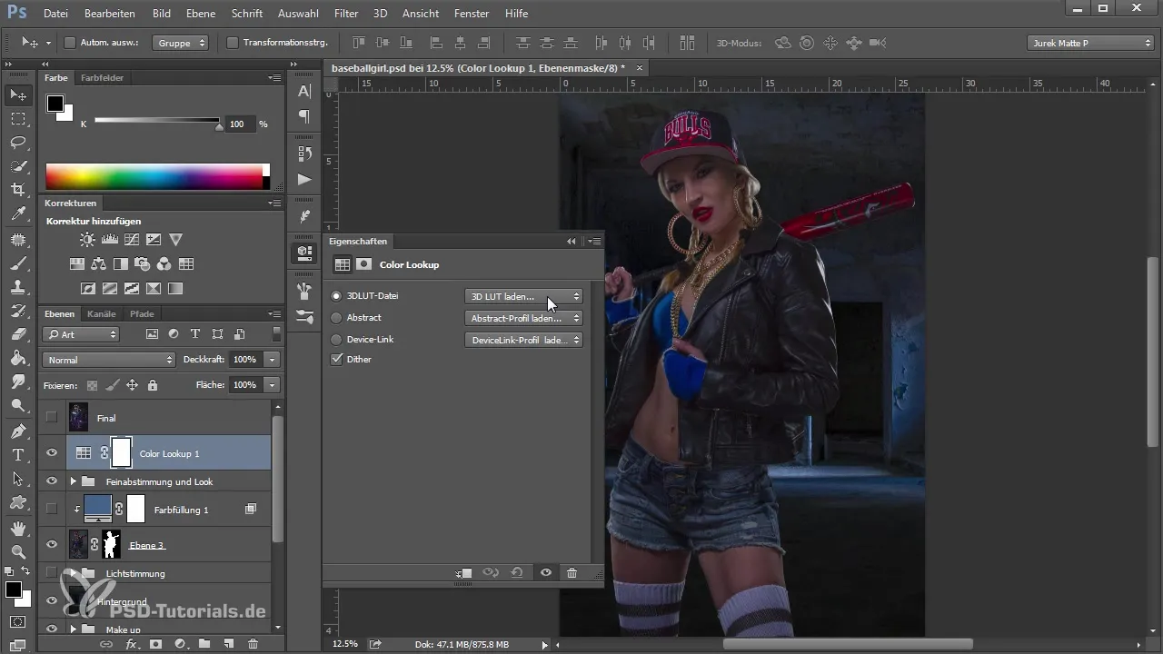
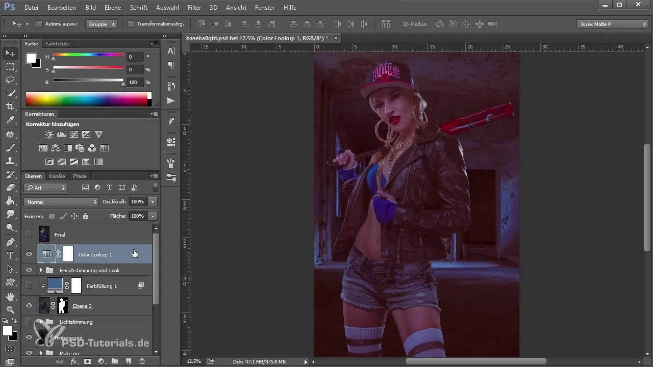
To give the image an initial color look, you can, for example, set a Color Lookup. It is not crucial to find the perfect look right away; what’s important is that you experiment with the color tone to find out what suits your image best.
However, it is important to understand that a color tone without the correct adjustments cannot lead to success. So, also be cautious with the color look adjustment and be aware of what has already happened in the composing.
Now you move on and take a look at the layers of your composing. You might rename some layers to improve clarity and properly name the cutout. This way, you get a better idea of what you’ve already edited and what is still missing.
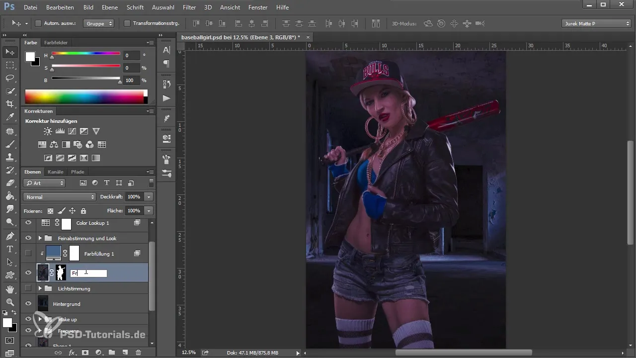
Step by step, you work on the lighting mood. By mixing soft light modes and adjustments, you can add interesting effects and further refine the image. Use vignetting to direct focus to the center of the image and ensure that the light flows harmoniously into the image composition.
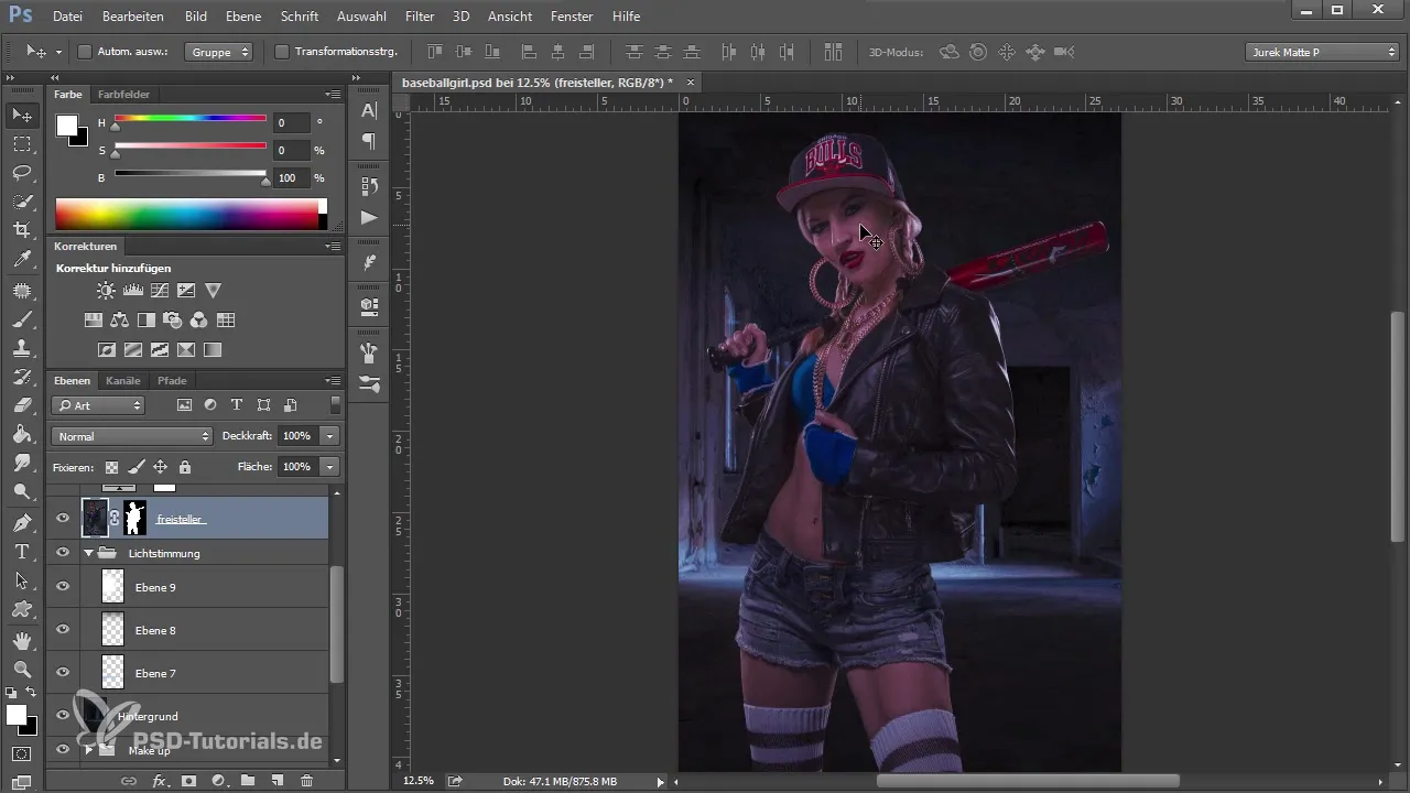
Additionally, you can work with color fills that specifically affect the cutout. A color fill in “soft light” mode can help you match the midtones of the model to the background conditions. This creates a nice transition and makes the image appear more cohesive.
Another important step is to use selective color correction to adjust certain hues of the model. This allows you to make the colors more vivid and adjust the overall mood of the image.
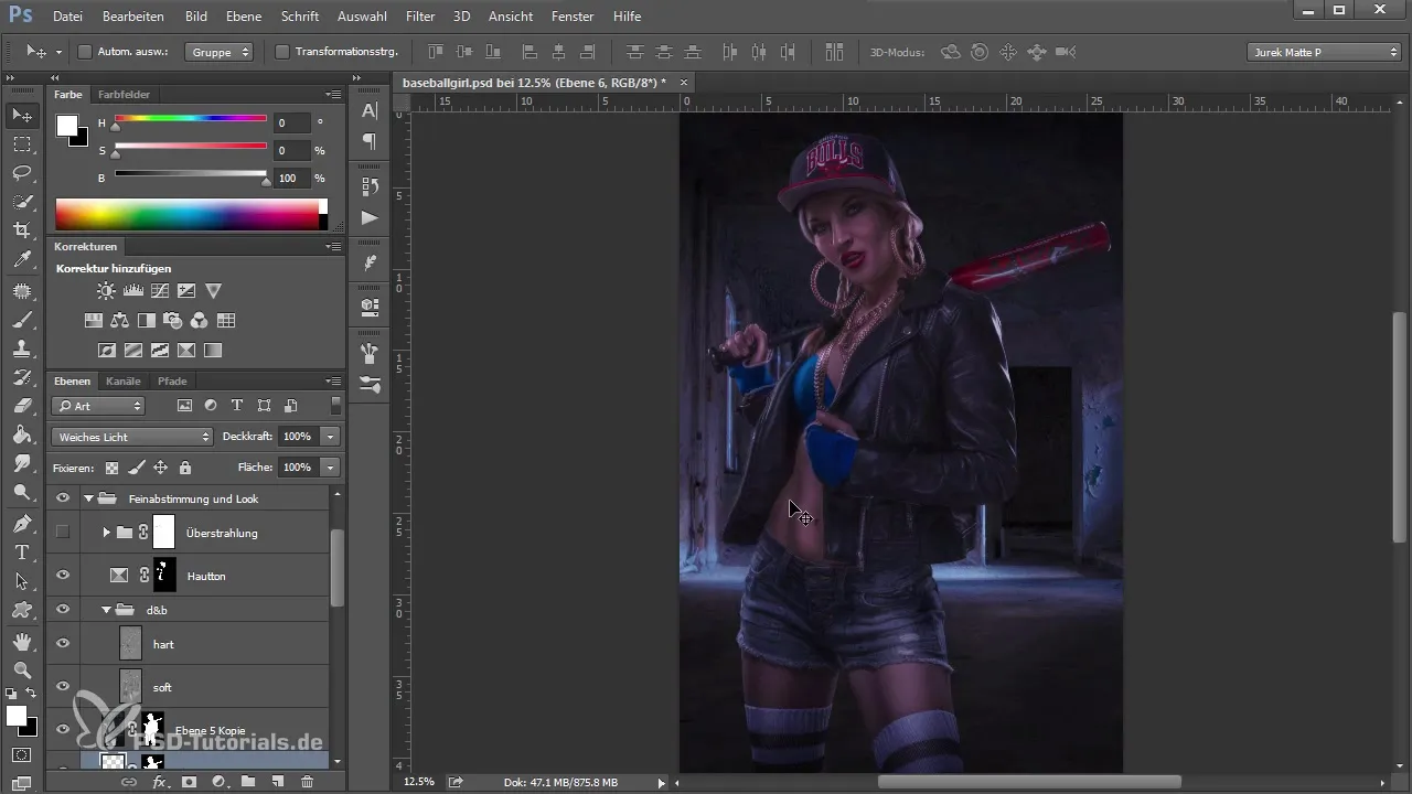
When you have nearly finished your image, you can work with highlights to give the image additional depth and dimension. This is done by adding different layers that enhance the highlights in specific areas of the image.
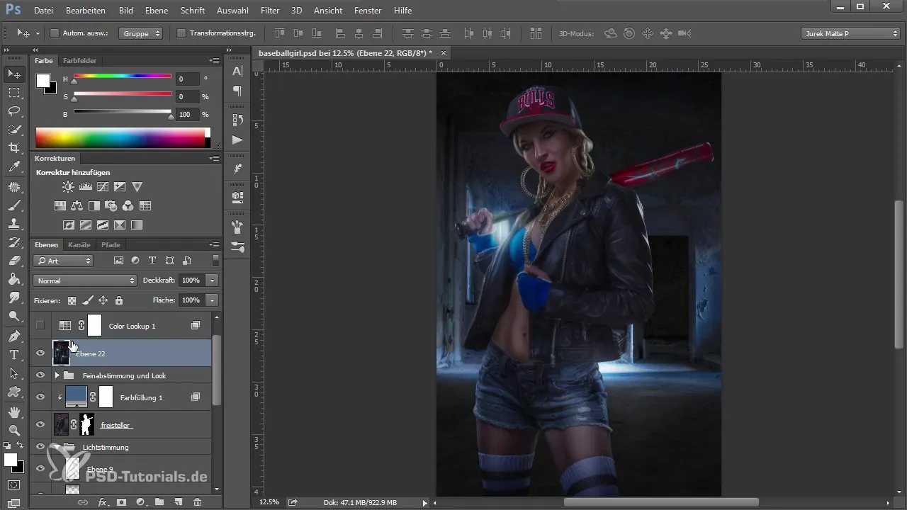
Finally, you merge all layers to create your final image. This is done using the shortcut “Shift + Ctrl + Alt + E”. Now it’s time to focus on the details and make the final color adjustments to give the image the desired color look.
Summary
In summary, an effective color look in Photoshop depends on a harmonious composing. Make sure that the various elements fit well together, and use targeted layer adjustments. This ensures that your final image looks impressive and cohesive.
Frequently asked questions
How can I ensure that my model is well integrated into the background?Make sure that the colors and lighting conditions of the model and background harmonize.
Which tool can I use to optimize the color look?Color Lookups and adjustment layers are excellent tools for color optimization.
How can I adjust the brightness of my layers?Use adjustment layers like “Brightness/Contrast” or “Curves” to control the brightness.
How can I effectively use vignettes?Use vignettes purposefully to draw attention to the center of the image and round off the lighting mood.


