The color management settings in Adobe InDesign are essential to ensure that your colors are consistently displayed on various output devices such as printers, monitors, and digital media. With the right settings, you can minimize color deviations and achieve professional results. In this guide, I will show you step by step how to configure the color management settings optimally to ensure consistent colors and reliable color reproduction in your projects. Let's get started and master the basics of color management!
In the Creative Suite, color management ensures a color-binding screen view of the expected print result. However, a calibrated monitor is a prerequisite for this. Additionally, the stored settings for converting RGB image data into the planned printing process (e.g. newspaper printing or sheet-fed offset printing) as well as to the desired material (coated or uncoated paper) are crucial. Therefore, some basic settings must be made initially. Since some color profiles are more suitable for later output than the ones included by default, you first download them from the European Color Initiative (ECI) website www.eci.org.
Under the section Downloads, you will find the package for Offset profiles "eci_offset_2009.zip" (which includes profiles for both sheet-fed and web offset printing on different types of paper) as well as "ecirgbv20.zip" for monitor display.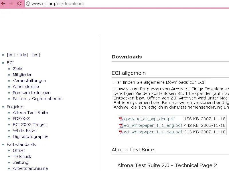
After unpacking, you can install the profiles "ISOcoated_v2_eci.icc" for coated, "PSO_Uncoated_ISO12647_eci.icc" for uncoated, and "ISOuncoatedyellowish.icc" for uncoated paper with a yellowish tint on Windows via a right-click.
The default setting for the color management in the Creative Suite is first carried out in Photoshop since the settings dialog offers more options than InDesign.
To do this, open the program without opening a document and go to Edit>Color Settings (or faster with Shift+Ctrl+K) to access the relevant dialog.
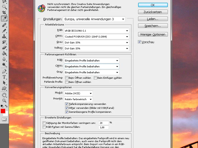
The initial setting here is Europe, Prepress 3. Here, you select Working Spaces as eciRGB v2 for monitor display and below that ISO Coated v2 (ECI) for future output in sheet-fed offset on coated art paper.
If later printing is to be done on uncoated paper or in a newspaper, you select the corresponding profiles (e.g. PSO_Uncoated_ISO12647_eci.icc for uncoated paper or ISOnewspaper_v4_26_bas.ICC.
In the Color Management Policies, you set Preserve Embedded Profiles in all three working spaces. This ensures that image data already embedded with a profile are not automatically converted to the color space set above.
In this section, checkboxes are ticked for the three sections, which means you will be prompted to retain or convert images with different profiles when opening or placing them. For Conversion Options, you keep the settings as Adobe (ACE) and Relative Colorimetric, which are suitable for most images.
Later, you can adjust any color casts in color-intensive images after conversion by right-clicking on the image in InDesign and editing the Rendering Intent to, for example, Perceptual if needed. Now save the settings with a meaningful name for you, such as "Sheet-Fed Offset Printing on Coated Paper".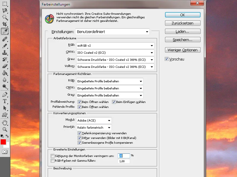
To work with consistent color management within the Creative Suite, it is recommended to synchronize these settings with all programs.
To do this, switch to Adobe Bridge and go to Edit>Creative Suite Color Settings (or with the same shortcut Shift+Ctrl+K as in Photoshop) to access the relevant dialog. 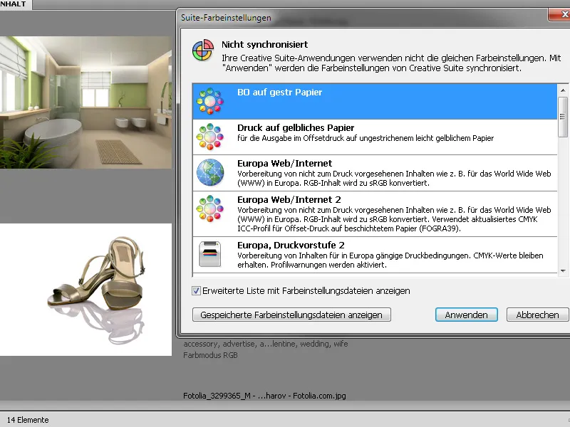
At the top, you can see that the CS applications are not yet using the same settings. Now select the settings file you just created, mark it, and then click on the Apply button.
Now you are working with the same profile in both Photoshop and Illustrator as well as in InDesign. If you open the color settings for InDesign or Photoshop for verification, you will find this CMM setting there.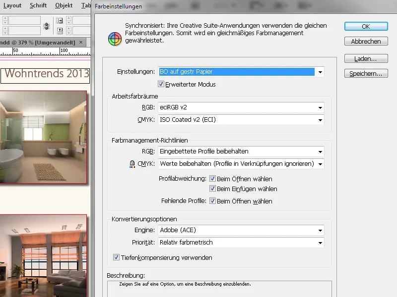
When opening an InDesign document, it retains its original color profiles; only during output (PDF-export) will it be converted to the color space of the applied color management profile.
Hardware Calibration
Setting the correct profiles for the RGB and CMYK working spaces for the corresponding material is of little use if the monitor itself is not properly calibrated. If calibration, if it has been carried out at all, is often done subjectively, a difference compared to the later printout is no wonder.
For those who value precise and objective calibration of their monitor, it is necessary to invest in hardware specifically developed for this purpose.
One product with a balanced price-performance ratio and relatively high popularity among the abundance of available products is the SpyderElite Colorimeter, available for around 180 EUR, usable for both PC and Mac platforms. This color sensor, connected to the computer via USB, along with its software, offers the most possibilities among Datacolor's three different products.
Begin by resetting the monitor to factory settings, install the software, and connect the Spyder to the computer. The program creates a space for the Spyder on which the connected measuring device is placed.
The sensor measures a range of colors on your screen and creates a profile, which is then used as a reference for later comparison. At the end, you can compare how the image looks before and after calibration.
All these efforts already create a very good condition for the most accurate representation of the expected print result on the monitor. However, this is only possible within the limits of the quality of the hardware used - namely the monitor. It is no coincidence that there are devices for which more than 3,000 EUR must be spent.
In order to make an accurate comparison between a print produced in the offset printing process according to the Process Standard and the display on your monitor, you can order their highly informative Prepress Manual in print version on the website www.cleverprinting.de. This includes a printed test form that can also be downloaded as a PDF file.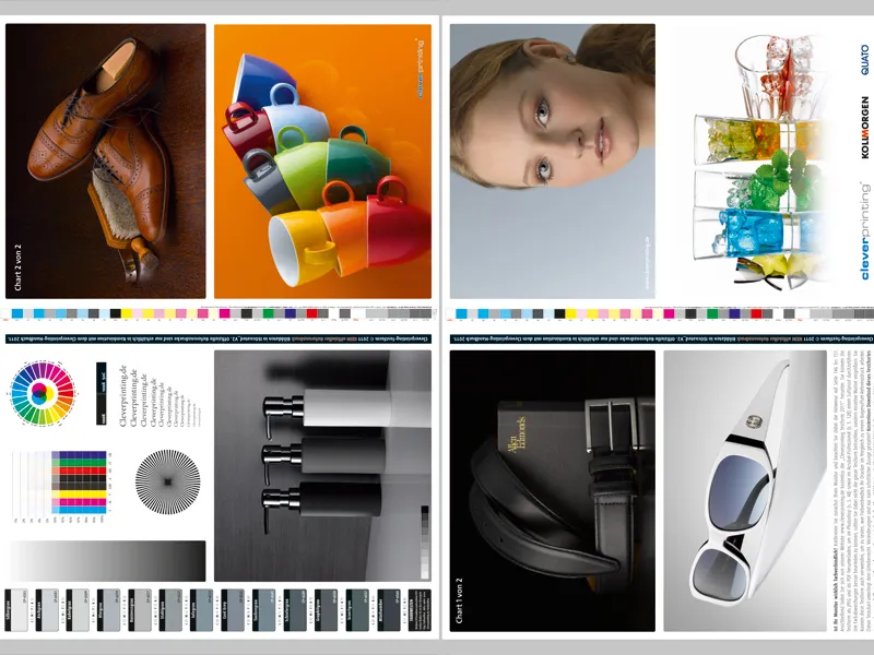
The visual comparison between the printed test form and the representation of the print file on your monitor will show whether the calibration is perfect or possibly still needs a few adjustments.
After these preparations, a fairly realistic representation of the final print should be ensured on the monitor.


