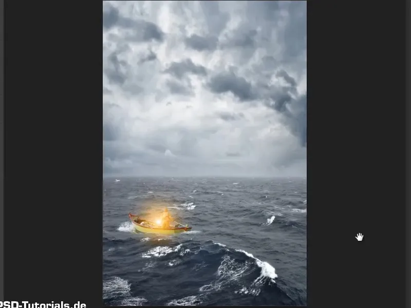
Note: The tutorial "Cut out the lamp and make it shine" is a text version of the accompanying video training by Marco Kolditz. The texts may therefore also have a colloquial style.
Step 1
The light contours have now been removed from the image using the copy stamp tool and the lamp can now be used.
Now remove the "Background" layer by dragging it onto the garbage can symbol (1). Then select the two remaining layers and press Ctrl+E (2). This will combine both layers into one. This new layer can be renamed to "Lamp" (3)..webp?tutkfid=55233)
Step 2
Use the Move tool to drag the lamp onto the sea image.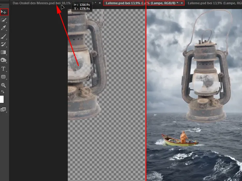
Step 3
You should always convert an image that you have placed on another image into a Smart Object first, without exception. To do this, right-click on a free area of the layer and select Convert to Smart Object (1).
This ensures the highest image quality when the object is subsequently scaled. Now you can make the lantern smaller and place it where it belongs (2).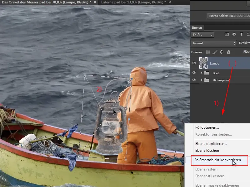
Actually, the bright contours should not have been removed with so much effort because the lantern is very small compared to the overall image anyway and the bright lines would not have been noticeable at all. But who knows, maybe you'll need a lantern later on and then you'll have everything nicely cropped.
Step 4
Press Ctrl+T to turn the mouse pointer at the corners of the lamp into a double arrow, which you can then use to rotate the object. This not only adjusts the size, but also the position of the lantern.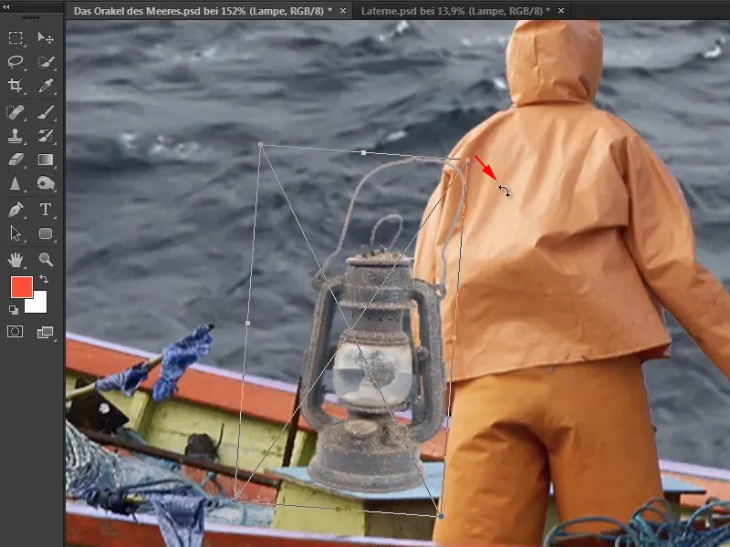
However, the lamp should stand behind the boatswain and be partially covered by his arm ...
Step 5
To make the lamp appear to be behind the boatman, you could cut out the man's entire arm and place it over the lamp.
In the video training, however, Marco recommends creating a mask and simply masking out the corresponding area of the lamp. To do this, click on the mask icon (1) and create a mask. Then select the brush (2).
Black is required as the foreground color. If white is set, the shortcut X is sufficient to switch between foreground and background color. (3)
Make sure that the mask is activated and then paint with the brush over the areas of the lamp that you want to disappear (4).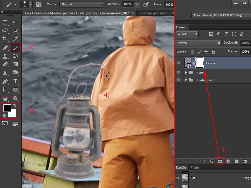
Step 6
Here you may not know exactly how far the sleeve goes. You can simply paint generously over it and then change the foreground color to white with X. This allows you to undo the areas of the mask that have been removed too much.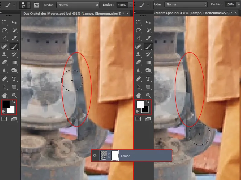
Step 7
Now it looks as if the lantern is behind the boatman. However, if you now want to move it a little to the left, for example, it may no longer fit because some parts are no longer visible due to the edited mask. There is a trick for this:
If you click on this chain symbol, ...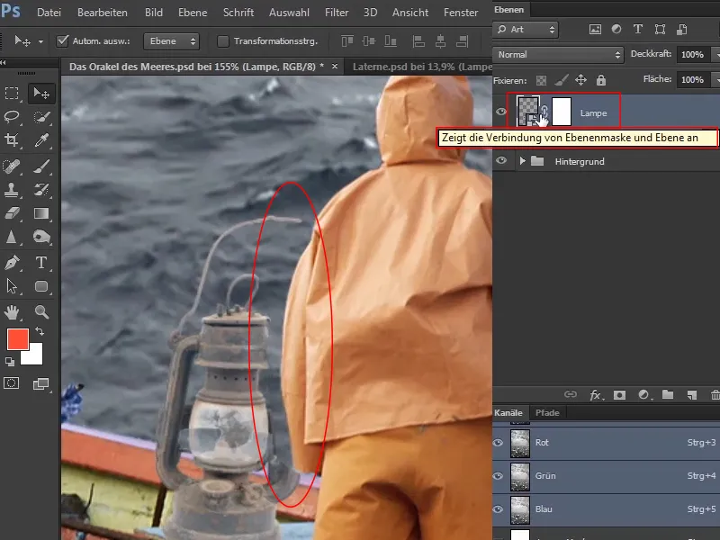
... it disappears and you can move the lantern while the mask remains. The image has been decoupled from the mask so that the two can now be moved independently of each other.
Depending on how you then want to move the object, the mask would of course have to be adjusted accordingly, but in this case this is perfectly sufficient.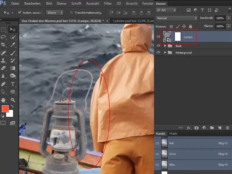
Theoretically, you could also click on the mask and move it, which makes little sense in this case, but it would be possible.
Step 8
The contrast of the lantern is quite low compared to the surroundings.
To change this, click on the "Lamp" layer and then on the symbol for the adjustment layers. In the selection, select Gradation curves .... The Gradation cur ves dialog box then opens with the diagonal and the histogram in the background. This can be read as follows:
On the left side are all the dark pixels or image information, on the right are the white areas, in the middle are the grayish areas, i.e. the average values.
As you can see from the distribution in the histogram, there are very few completely black pixels and very few completely white pixels. But there are a lot of grayish pixels.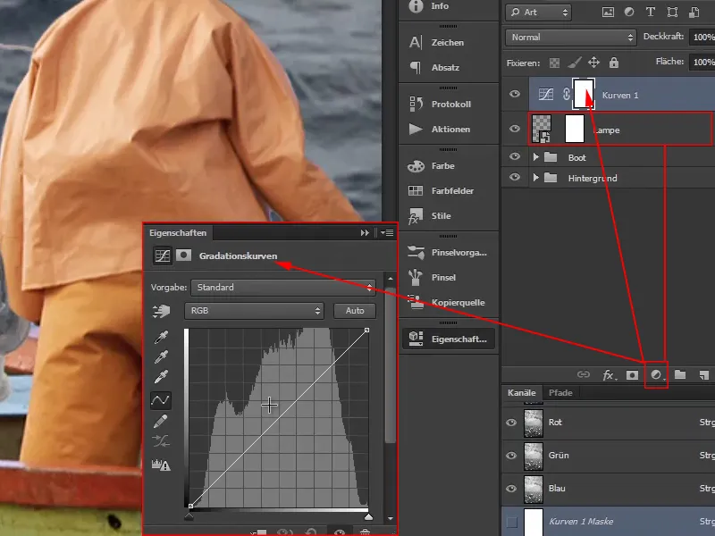
Step 9
Now first define the mean values by clicking once on the diagonal in the middle and thus virtually hammering a nail in. Nothing else happens unless you deliberately move the point.
To make areas in the image brighter, click approximately in the middle of the upper half, hold down the mouse button and drag the diagonal upwards a little. This causes the diagonal to move a bit like an S-curve.
Proceed in a similar way with the lower half: click approximately in the middle and pull the curve down a little while holding down the mouse button. This will make the dark areas darker.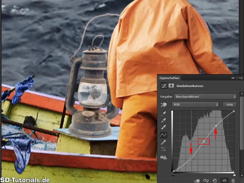
If you hold down the eye symbol, you can compare the before and after.
And as you can see, the changes affect the entire image.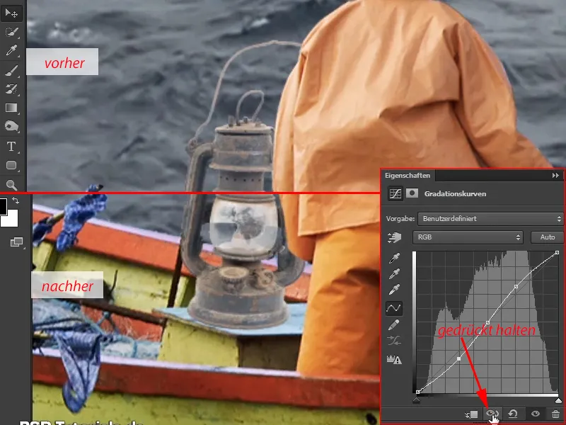
Of course, the change to the gradation curve should not affect the entire image, but only the lamp.
That's why you create another clipping mask so that all changes only affect the lamp.
Earlier you did this by holding down the Alt keyand clicking between the layers. In this dialog box, however, an icon for the clipping mask is also offered and you only need to click on it once. And then all changes really only affect the lamp.
You can see from the small arrow on the layer that a clipping mask has been created. If you want to remove it again, simply click on the symbol in the dialog box again.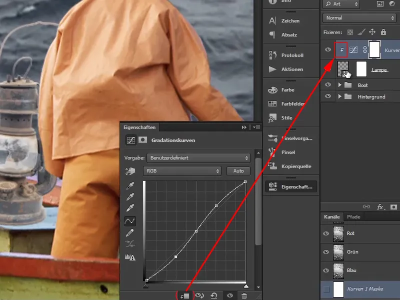
Step 10
Changing the gradation curve also affects the color saturation. For example, if you pull the lower part of the curve even further down, the brown of the lamp will become really rusty. But this should not happen.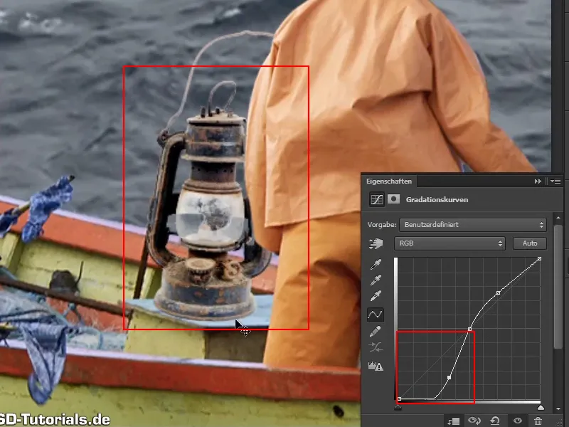
Therefore, click on the "Curves 1" layer again and select Luminance in the layer modes.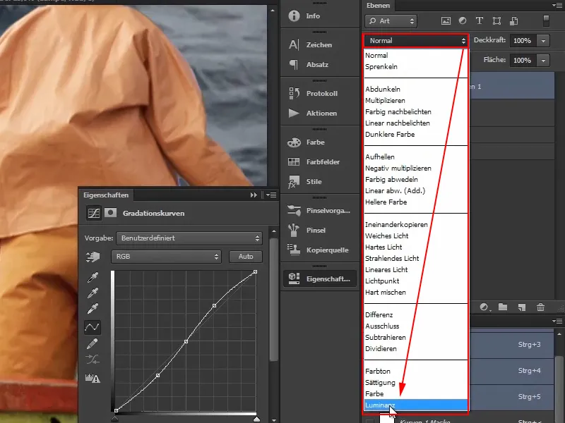
The changes will only affect the brightness information of the image or the lamp. Not on the colors.
This means that if you pull down the gradation curve, it will become darker, but not stronger. It also makes sense with many other images that you can increase the contrast without automatically increasing the colors at the same time.
Now you can adjust the curves until the lamp fits well into the picture and you like it. Just don't overdo it. If you adjust the color mood of the picture later, the lamp will blend in much better with the rest of the picture.
It looks good like this: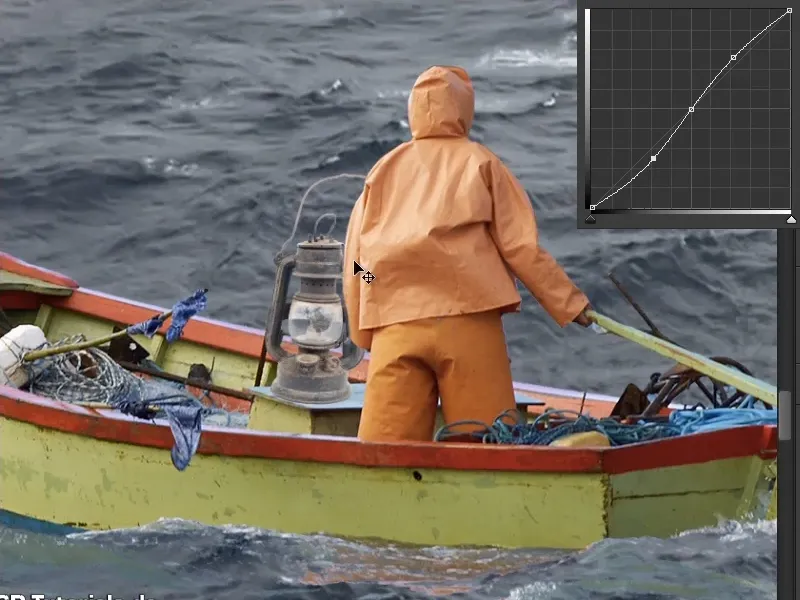
Step 11
Let there be light. Now let the lantern light up and create a nice contrast to the cool, bluish look of the rest of the picture. After all, the large mask will be added to the top right-hand side of the picture, which will also be dominated by blue. As orange is the complementary color to blue, the orange man and the bright lamp will create a nice contrast.
So how do you make the lantern light up? Combine all the layers that belong to the lamp in a group and rename them "Lamp".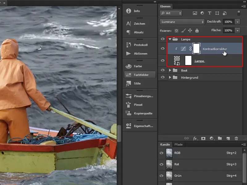
Then click on the top layer ("Contrast correction"). You want to create a color area layer right away and therefore select the top layer, as the new layer will be created above it.
Step 12
Then click on the Create new fill or adjustment layer icon and select the Color area... option (1).
The preset color is not so important in this case; simply confirm with OK (2).
Now the mask should be inverted. Select it and press Ctrl+I (3)..webp?tutkfid=55249)
Step 13
Now everything looks better again.
Then you create a yellow shimmer by double-clicking on the red field in the layer and selecting an orange color. Confirm the color with OK. Rename the layer to "Glow color".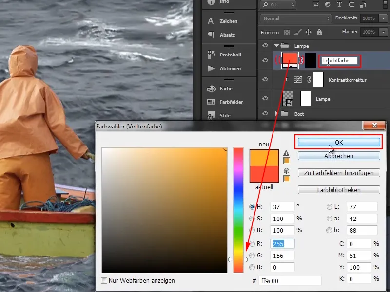
Step 14
Now create another color layer in the same way.
After clicking on the icon for creating adjustment layers, select Color area ... again, select white as the color and confirm with OK. Then click on the mask and invert with Ctrl+I.
Rename this layer to "Point of light".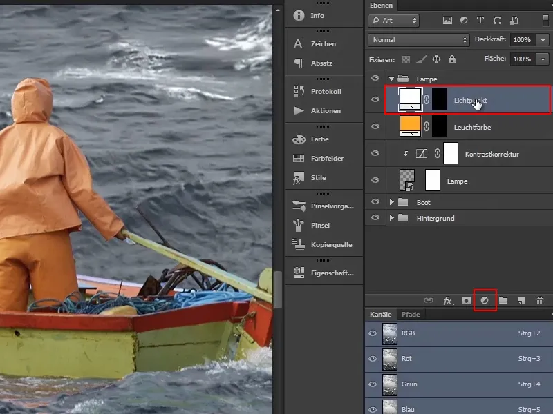
Step 15
First, make sure that the lamp lights up. Select the mask of the "Glow color" layer. Now use a large, soft brush and white as the foreground color.
By holding down the Alt keyand right mouse button, you can change the brush size directly by moving the mouse to the right (enlarge) or left (reduce).
Now place the small cross in the center of the brush exactly where the lamp is located and click once.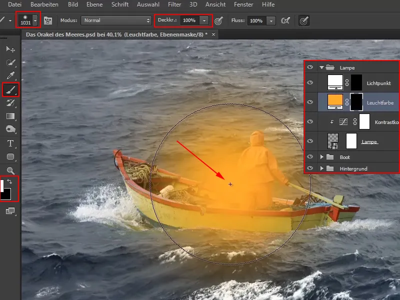
This defines the light color.
Step 16
To integrate this even better, select the " Multiply negatively " layer mode when the "Glow color" layer is active, as this will make it stand out.
For anyone who is not yet familiar with the layer modes, Marco briefly explains how the areas are arranged in the video training:
The options in the first group darken, the options in the second group lighten, the third group combines both and provides contrast, the fourth contains relatively complex layer modes that Marco personally almost never uses, and the last group concerns the colors.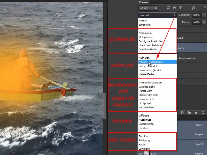
As soon as Multiply Negative is selected, it starts to glow: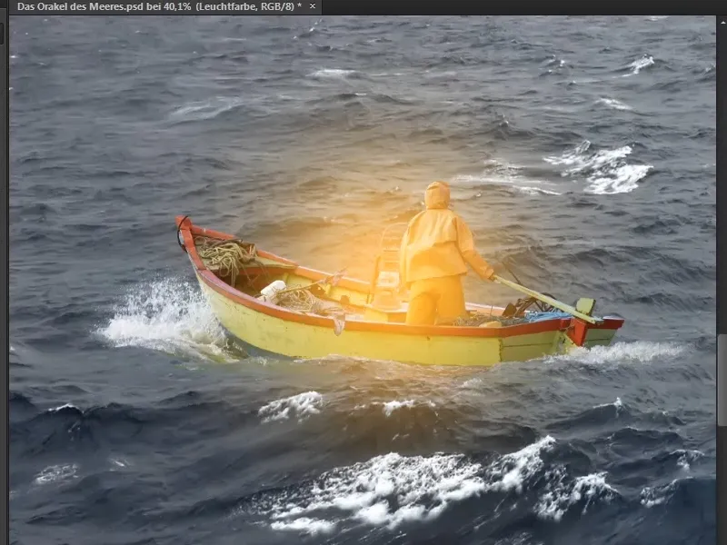
Step 17
However, there should be a little more light in the center of the lamp, because that's where the light source is. Therefore, switch to the "Light point" layer.
Select a brush again, but make it smaller this time. Move it to the center of the lamp and click again.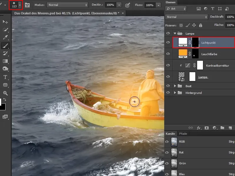
Step 18
You can do this several times. Next time, for example, make the brush slightly larger again and reduce the opacity to about half. And click again in the center of the lamp.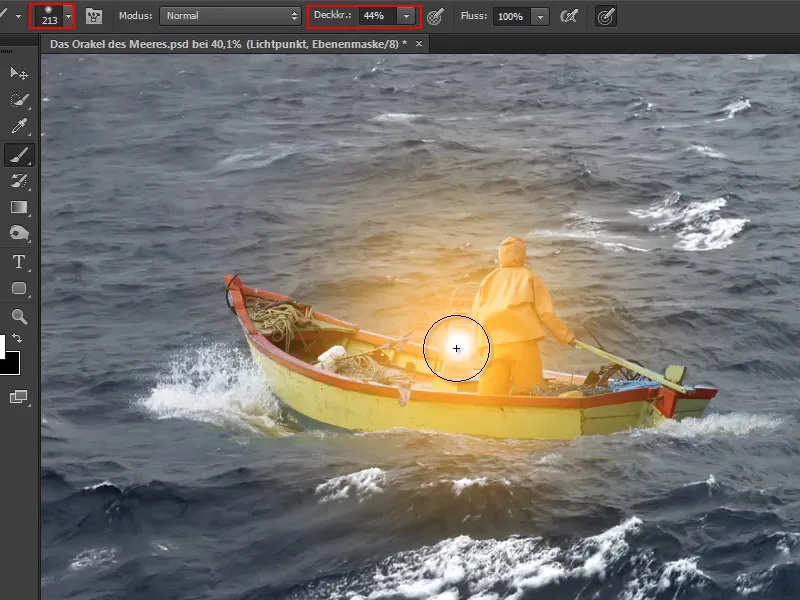
You can keep optimizing this until you think it looks realistic.
Now you have made the lamp glow.
Finally, Marco points out that you could of course also reduce the opacity of the layer, but he doesn't recommend this as it looks a bit grayish and doesn't fit at all with the white light spot.
Marco is satisfied with the current status and says goodbye until the next part of the tutorial series.