Memento Mori - Remember death (Dark Art Style)
Welcome to my making-of for the creative project "Memento Mori".
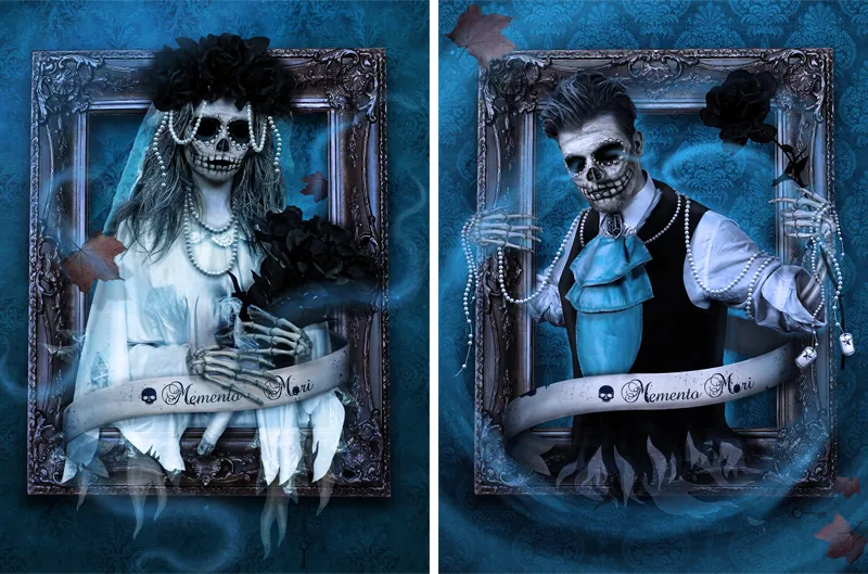
The picture series is about the transience of life. I want to emphasize the melancholy of the idea of Memento Mori and create something dark.
I chose a bride and groom as the protagonists for my little project.
They represent eternal love and at the same time question the famous "... till death do you part".
The main part of the picture consists of vanitas symbols, all of which stand for transience: the falling brown leaves, the extinguished candle and the skeleton or skull.
The pictures were taken in October 2014 - which perhaps explains my motivation for the project.
My original idea was the picture of the bride "floating" out of an old picture frame and coming towards the viewer.
Fortunately, Elisa H. contacted me as a model so that I could realize this idea. (Thanks again to the model).
I took over the complete project management:
The entire costume and accessories were made and sewn by me, I did the model's make-up and the photography and subsequent editing was also done by me. As I have a lot of creative hobbies, this was a great opportunity to put them all to the test.
The make-up process was even recorded especially for you: Click to watch the video.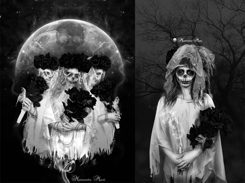
As there were some see-through areas in the costume, we had to take the photos in front of a black background.
This also has the great advantage of making it easier for us to crop the protagonists later on.
The main focus was on the planned poses in the sketches - followed by a few shots with spontaneous ideas from the model and myself.
The model was illuminated by two softboxes on the left and right. The photos were then opened and edited in Photoshop.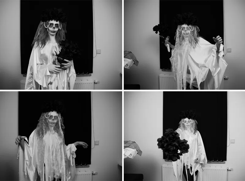
The background
I really wanted an old wallpaper pattern for the background to give the impression that the picture was hanging in an abandoned villa. I found what I was looking for on the internet - and discovered this beautiful texture (1). It was then simply converted into a black and white image for my project and the contrast was adjusted using a tonal value correction. The textures were tiled over the entire image and the transitions were improved using the copy stamp tool (S).
Finally, everything was packed into a folder and the mode was set to Multiply with 60% opacity. We can color the background layer with the fill tool (G) and our desired color - in this example I used a medium/dark blue.
To make the wallpaper look a bit old and dirty, I place another texture of watercolors on a sheet of paper (2) over the background. This texture is then duplicated, mirrored and reduced to 50% opacity. This makes the texture symmetrical.
The layer mode is set to Color Burn with 100% opacity. Then I take the symmetrical texture again (2) and can invert the colors with Ctrl+I (3). We now put this into a folder and increase the light parts of the texture with a tone value correction. Finally, the layer mode of the folder is set to Multiply with 50% opacity. Finally, I put all the elements from (2) and (3) into a large folder and set the opacity to approx. 60% so that the effect is not too strong. With several gradients from black to transparent, we can give the wall realistic shadow effects in further layers.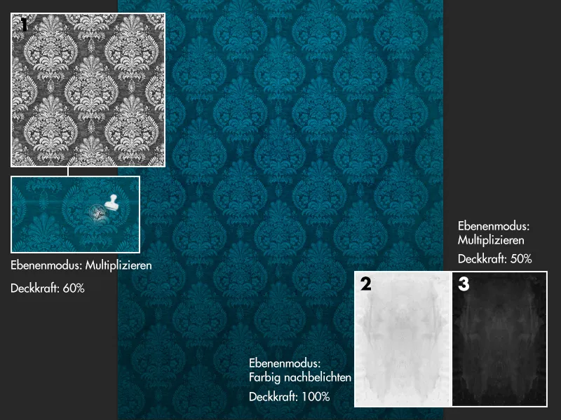
The clipping
The protagonists were first detailed using the pencil tool (P ) on the clothing and the hair and veil were roughly cropped. The layer with the protagonist was then duplicated and the dark parts of the image in the lower layer were further darkened to black using a tone correction. If we now set the mode of this layer to multiply negative, we can easily create a mask on the upper layer and delete the veil. By multiplying the lower layer negatively, the light parts of the veil are retained and the dark areas become transparent.
This is why a dark background makes it easier for us to cut out transparent fabrics.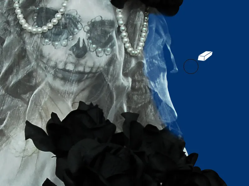
Creating the beads
The pearls are important picture elements! They can be found both on the costume and in the picture montages.
The challenge here is to make the pearls look exactly like the ones in the photo.
But you can achieve this quickly with a brush and your own layer style!
First, I take a hard brush in the desired size of the pearls. Then I place the "pearls" on the picture according to my ideas. The whole thing is connected with a "string" by using a smaller brush tip to connect the "pearls" on a separate layer (under the pearls). I use a very light gray as the color so that it is easier to show the highlights and shadows.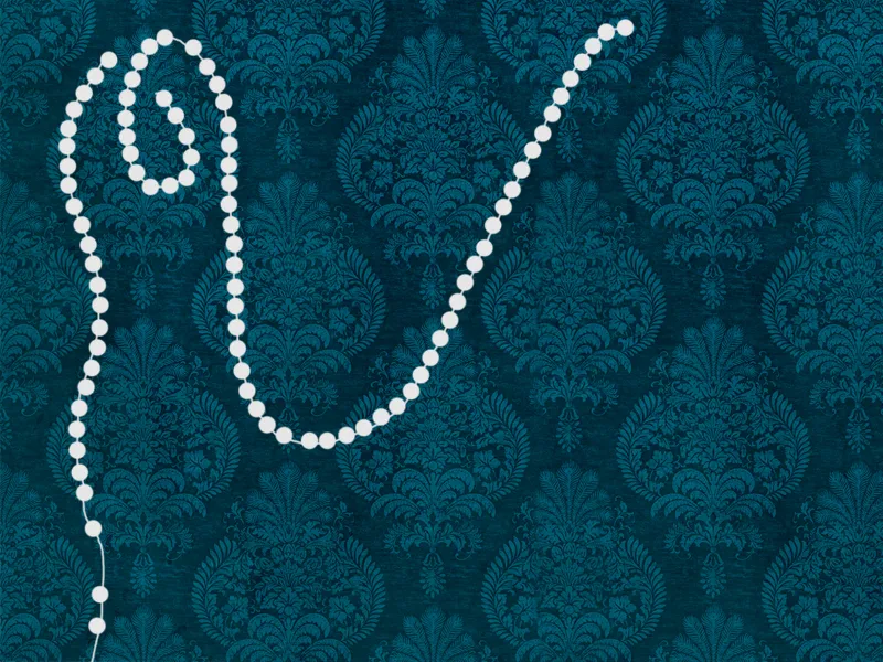
We now duplicate the pearl layer twice and hide the copies.
We start with the main pearl layer at the bottom and can open the layer styles window by double-clicking on it.
- Flattened edges and relief
Specifications may vary depending on the size - it is best to use the screenshot as a guide for the depth and size.
- Shine inwards
Filling method: Negative multiply
Opacity: 75%
Color: White
Underfill: 0%
Size: Here in the example 9px
- Gloss
Filling method: Multiply
Opacity: 15%
Color: Black
Angle: 19°
Spacing+Size: 4px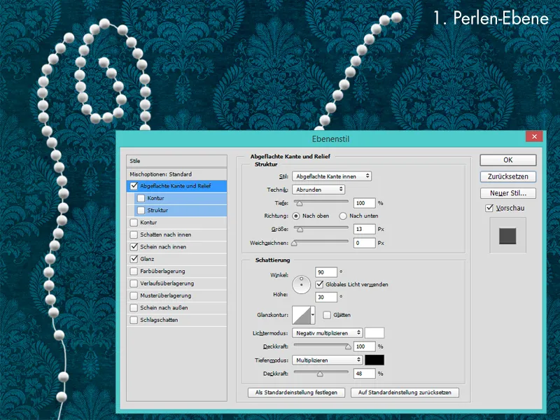
The pearls now look very three-dimensional, but the color and details are still very unrealistic. To make the pearls look really photorealistic later, we should constantly compare them with the pearls in the photo. We show the layer above the main pearl layer and reduce the area value to 0%.
In the layer styles, check the following points again:
- Flattened edge and Relief
Information can be read from the screenshot
- Shine inwards
Filling method: Multiply negative
Opacity: 100%
Color: Light blue
Underfill: 0%
Size: 1px
- Gloss
Blending mode: Normal
Opacity: 15%
Angle: 19°
Spacing+Size: 4px
- Color overlay
Blending mode: Color
Color: Light blue
Opacity: 40%.webp?tutkfid=55295)
Finally, we give the pearls a suitable drop shadow.
To do this, we simply show the last copy of the pearl layer, set the value of the area to 0% and go to Drop Shadow in the layer style window.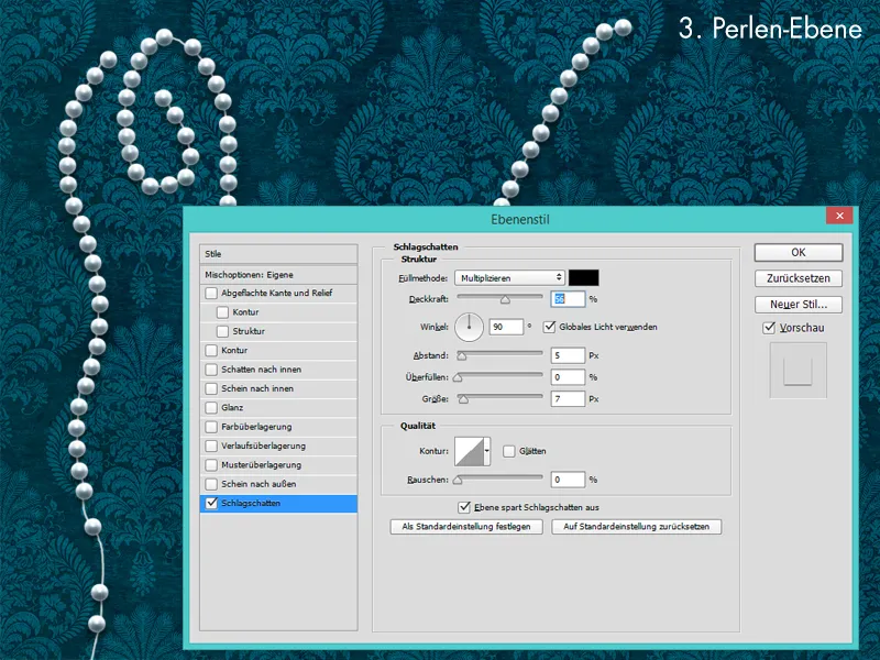
Creating the paper banner
The basic shape of the banner was created in Illustrator and loaded into Photoshop. The "paper" was then given a brownish color with color and soft light layers. To make the paper look nice and old, I applied a blotchy paper texture to the banner using the Multiply layer mode.
In the other points, light and shadow were painted on the paper banner with a soft brush and low opacity.
For the light situation, I use layers with the Soft light or Multiply negative mode. For the shadows, I always use layers with the Multiply mode and sometimes also Soft Light.
For the lettering, I add "Memento Mori" with a skull. I use the font Precious Regular and color it in a very dark blue to make it look like ink. To make the ink effect look better, I add some ink stains and splashes.
Finally, I create a 3D effect by duplicating the paper banner shape, reducing the area value to 0% and giving the banner a flattened edge and relief in the layer style menu.
Then the banner is only adjusted in terms of the colors.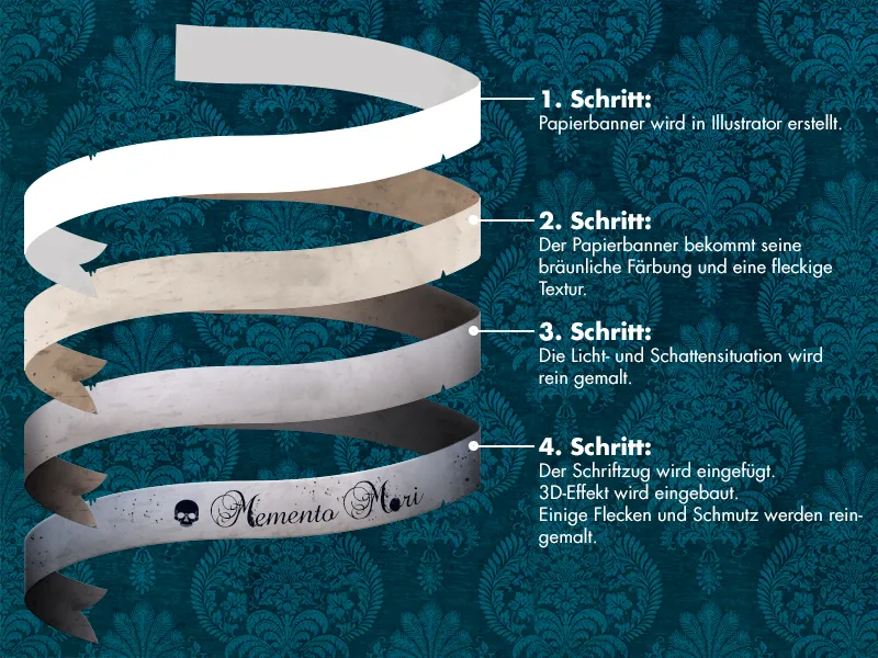
The final look
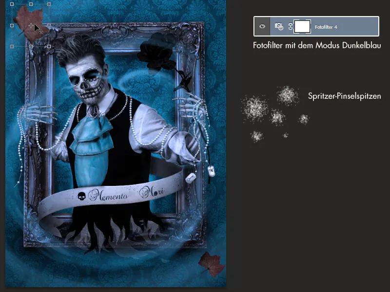
When I had the image in my head, it was clear from the start that the image would be very blue and that the viewer would be met with a kind of supernatural vortex. This cool blue can be achieved thanks to the photo filters in Photoshop and the color dark blue. If you want it to be cooler, you can simply apply the effect several times. The swirl was painted with a splatter brush using the color light blue with low opacity.
I recommend using a graphics tablet for this step, as it allows you to adjust the size intuitively with pen pressure. It also gives you the opportunity to paint more dynamic lines.
The swirl should be painted large and roughly at the beginning and then you can draw in the details of the storm in further layers by taking a smaller brush tip and painting along the swirl. To make the blue of the storm come out better, you can duplicate the swirl and change the layer mode to soft light or copy into each other. As this is a series of images, you should compare the image with the existing one at the end. You should be able to hold both images next to each other without major color differences. Ideally, both should look like one "big picture".