Modern posters very often contain a QR code, i.e. an image code that can be photographed with a smartphone. A software program on the smartphone can then extract the internet address from this code and direct you to the organizer's website. But how do you create such a code?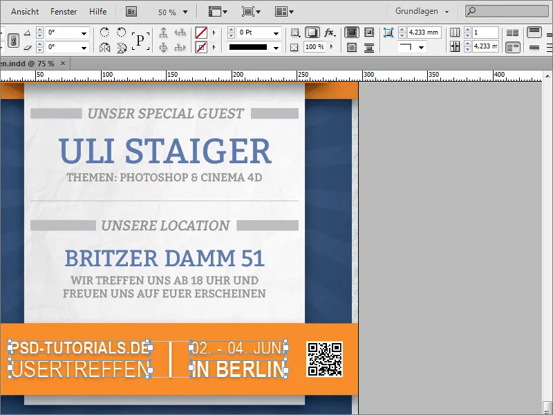
Simply enter the keywords QR code generator and EPS in the search engine of your choice. Then you will certainly get some relevant search suggestions like the page of www.keremerkan.net.

Further down on this page, you can specify what type of code you need and where it should lead.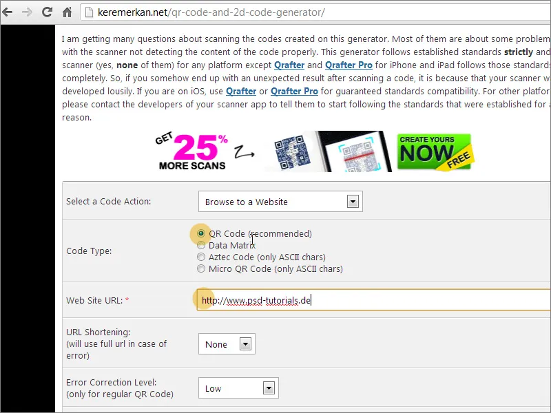
You can select the action to be triggered by the code from a drop-down list.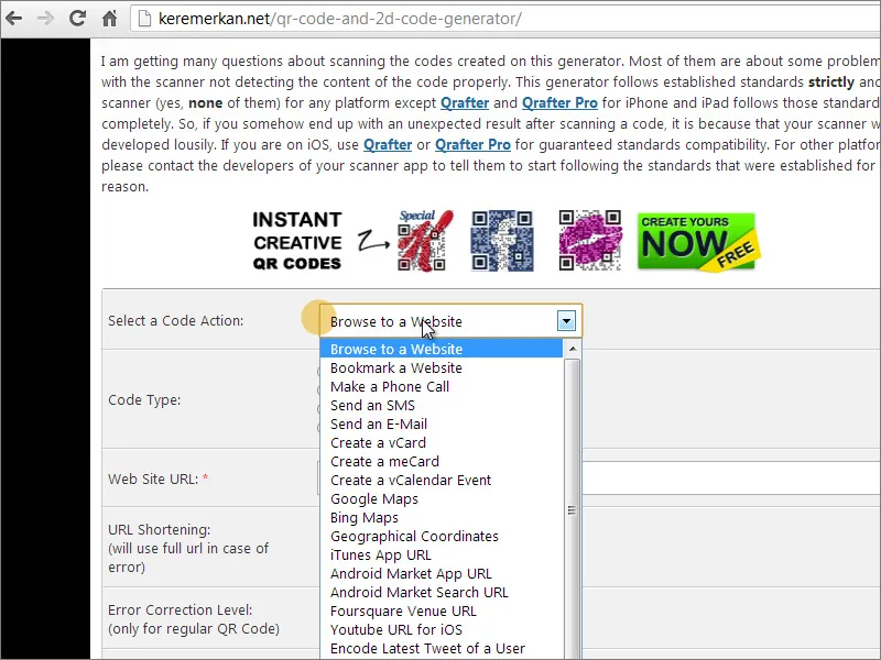
Further down, you can select the output format for this code, specify the background color and then generate the code.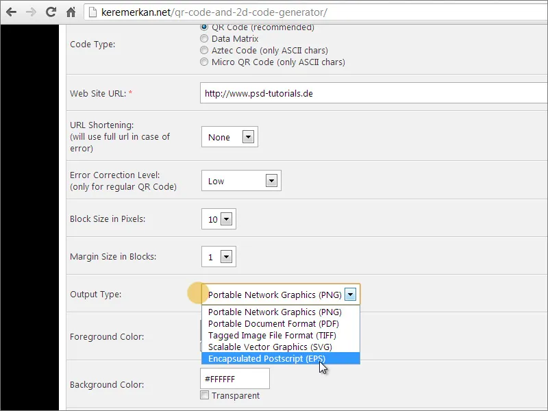
The generated file is then made available as a download. Open it by simply dragging it from the download folder into the InDesign document. The mouse pointer briefly changes the display and indicates that a graphic is attached there. Simply drag an area of the required size to the appropriate place in the document and the graphic will be placed there immediately.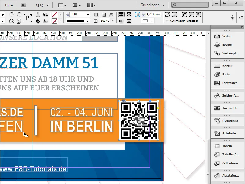
If it is a little too large, you can make it a little smaller. It would be nice if this graphic were exactly the same height as the text area. You can draw corresponding guidelines in the document and then reduce the graphic proportionally with Shift+Ctrl.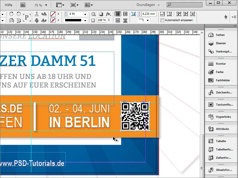
Now the poster is basically finished. Apart from a few small adjustments to the text or graphics, there is only one more major change to make - the integration of a texture for the white background area. This can be your own texture or, for example, a photorealistic texture from the texture DVD. Copy this graphic to the clipboard.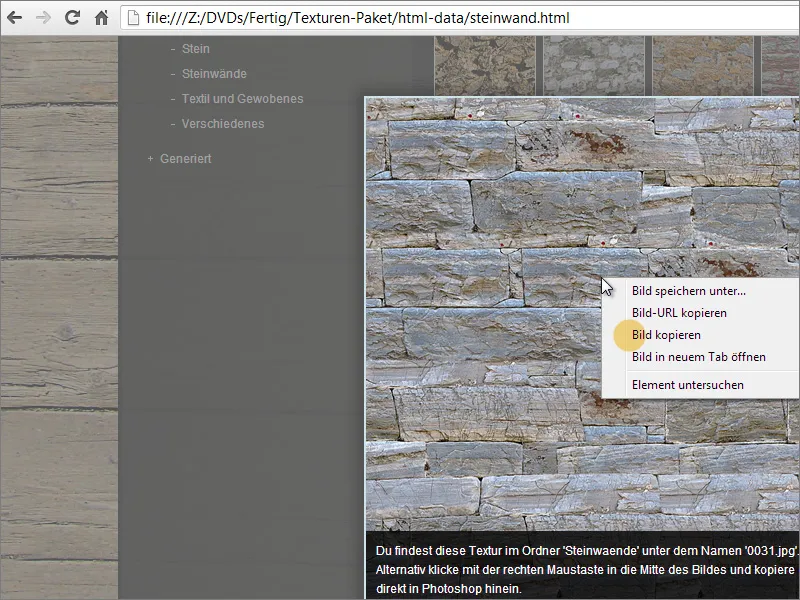
Now you need a graphics program such as Adobe Photoshop to further refine the texture. If you create a new document there, Photoshop already takes the information from the clipboard and offers the appropriate format.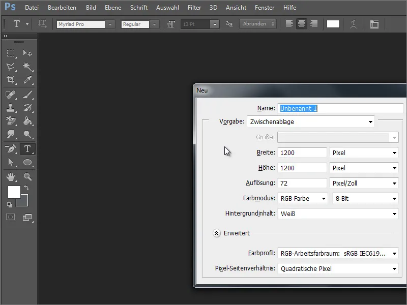
However, you have a tileable graphic in the clipboard and need a document in DIN format in A3 size. Therefore, change the document dimensions.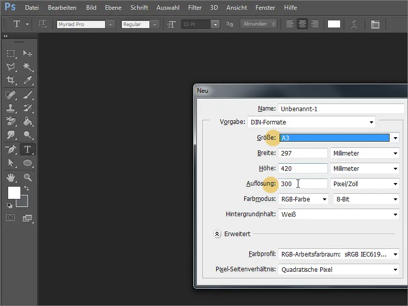
You can then simply insert the graphic into the newly created document by pressing Ctrl+V. Adobe Photoshop will then create a new layer.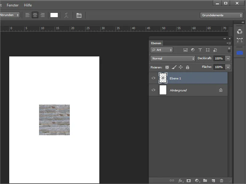
Hold down the Ctrl key and click on the layer thumbnail of layer 1 in the layer palette to create a selection of the object. Then navigate to the menu item Edit>Set pattern to save the selection as a pattern. In the subsequent dialog, you can also assign a name if desired.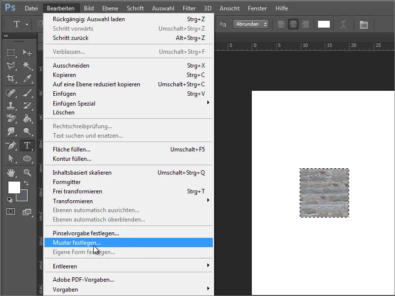
Layer 1 can then be deleted by dragging it onto the trash can icon and the selection can be canceled with Ctrl+D. The background layer must be converted beforehand for editing. Double-click on the background layer and confirm the dialog box to turn this layer into a normal, editable layer.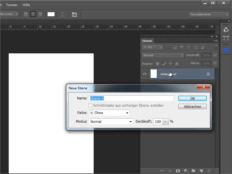
Call up the fill options via the context menu on the converted layer.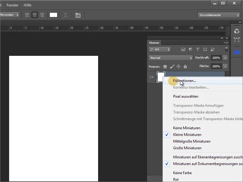
Activate the pattern overlay in the settings dialog. The pattern you have just created can be found at the bottom of the drop-down selection field in the current gallery. Select this pattern to assign it to the area.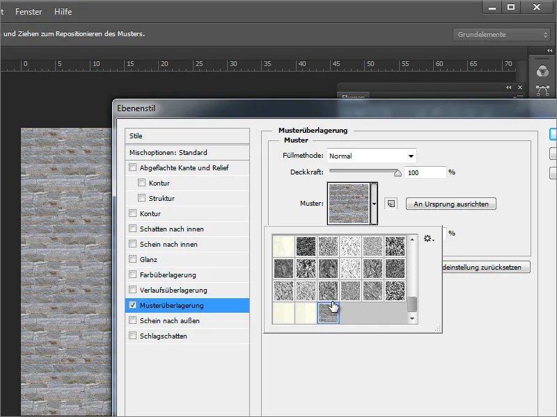
This is where the wheat is separated from the chaff. The advantage of a seamless tileable texture is that there are no unsightly transitions and the background looks like a single piece.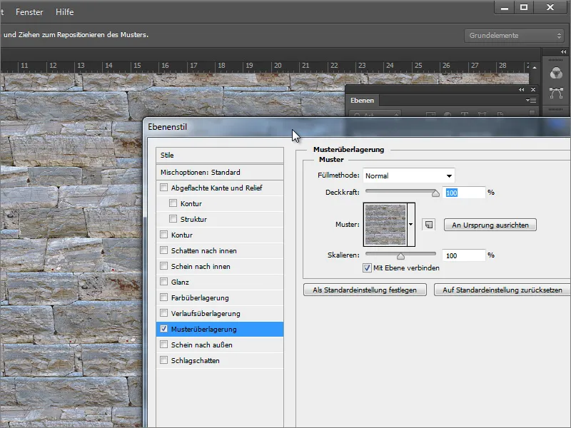
The Photoshop file can then be saved. It can be placed in InDesign. Please make sure that the area to be filled with this pattern has been selected beforehand.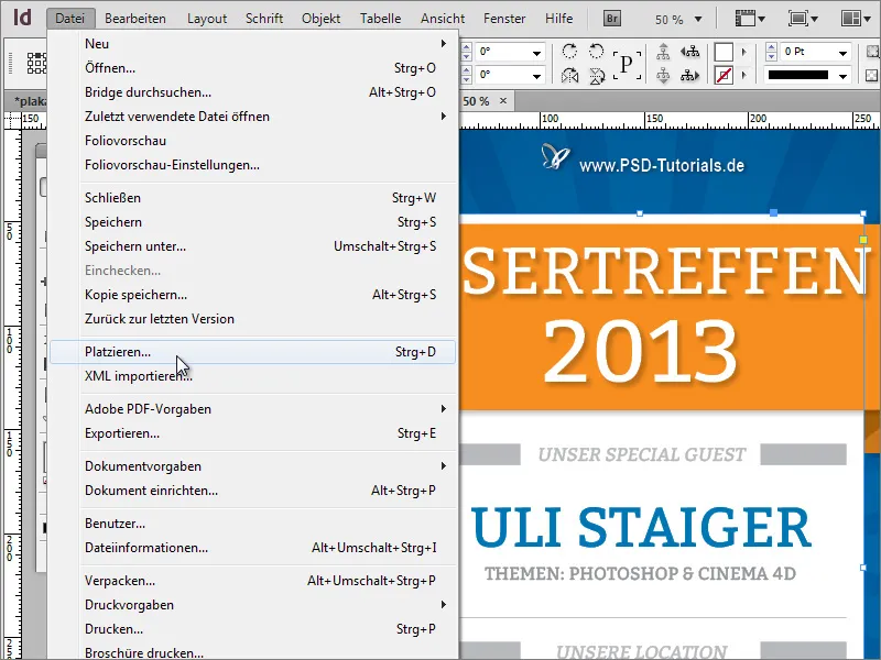
Once the texture has been selected, it will appear on the surface. However, this is not exactly to the advantage of legibility.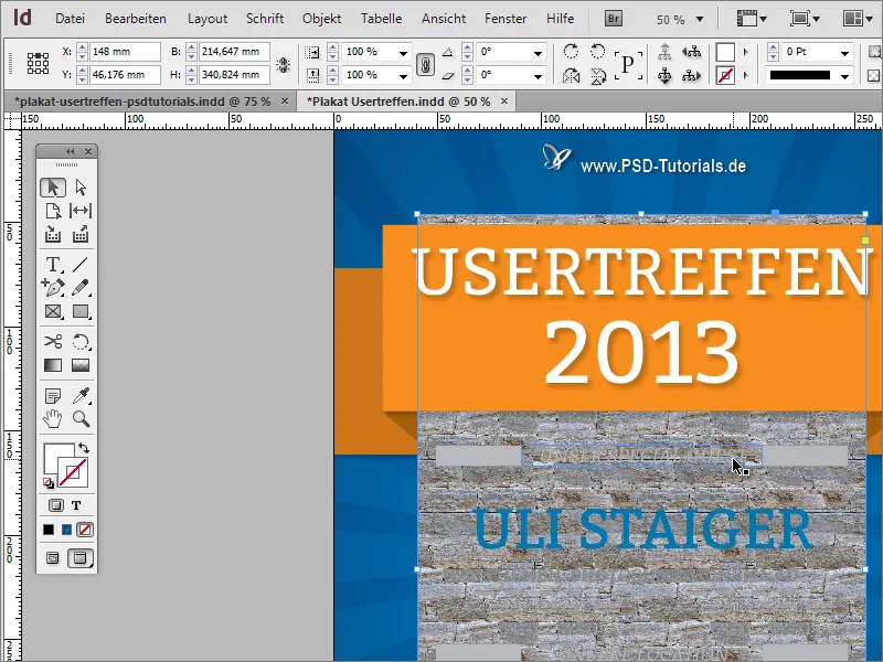
There are several ways to counteract this. One of them is to specify a lower opacity value for the pattern overlay in Adobe Photoshop. The PSD file can be edited and saved again at any time.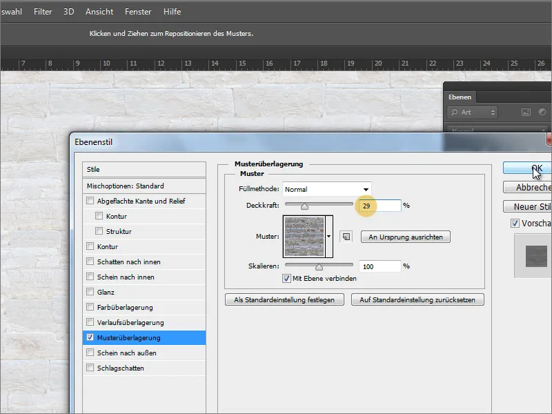
All you have to do is update the link to the graphic in the Links panel. To do this, select the entry with the exclamation mark and click on the Refresh button.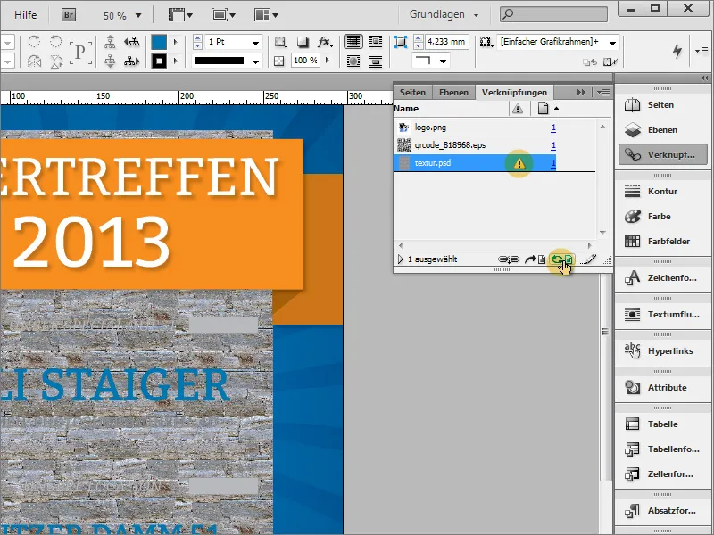
The graphic will then be reloaded and will now appear in its updated form.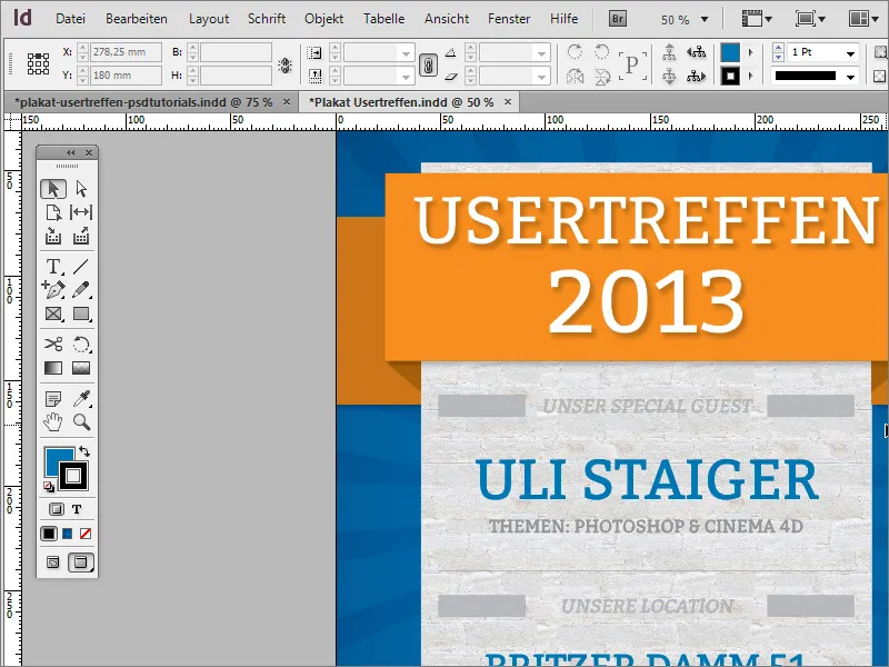
In Adobe Photoshop, you can of course access numerous presets from the texture library. If you click on the small cogwheel in the selection field, you can also call up other texture collections, which in turn come up with other structures.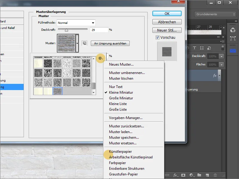
These can be appended - i.e. added to the existing texture selection or loaded as a separate collection. Now you can also select a different texture for the pattern overlay.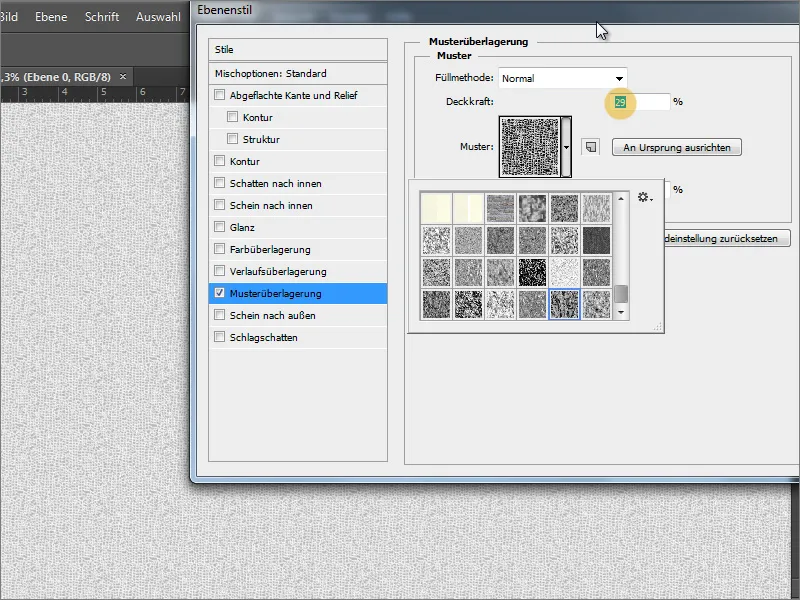
You can also try adjusting the opacity or changing the scaling. Both sliders change the effect. However, be careful not to set the scaling too large, otherwise the texture will become very coarse and blurred.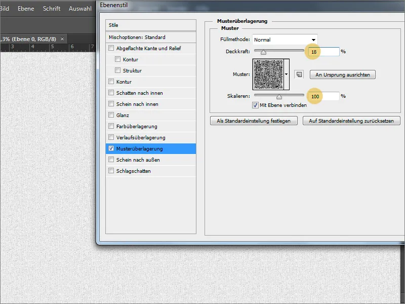
After the PSD file has been saved again, you can update the link in InDesign again. The result will then be displayed directly. If you still don't like it, the PSD file is still available for adjustments.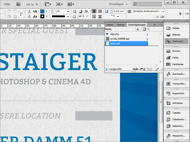
You can also soften a restless or wild pattern by blurring it. However, this does not work in Photoshop if only an effect has been applied to a layer. To do this, you must first convert the layer into a smart object.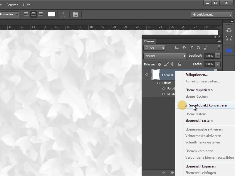
You can then apply any blur filter to this layer. These can be found under Filter>Blur filter. The Gaussian blur filter is very suitable for blurring and ultimately helps to soften wild areas.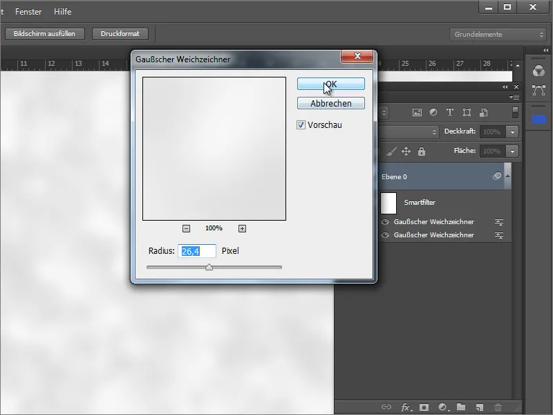
After saving in Photoshop and updating in InDesign, the texture no longer looks so wild and blends in well with the overall image.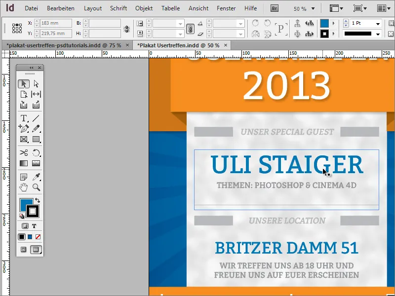
In the poster template, a small texture was also added to the outer edge.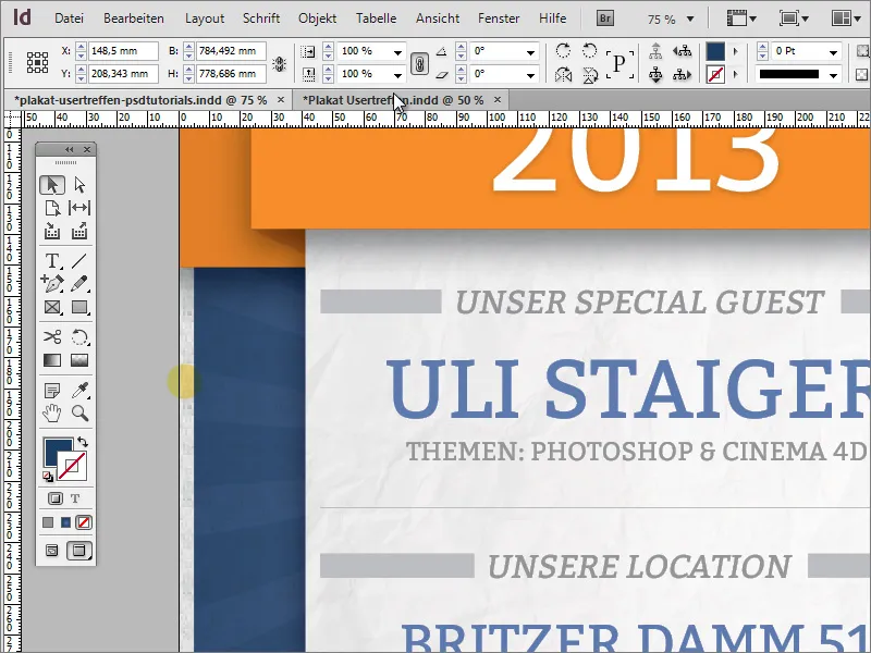
You can use the existing texture area for this framing and simply duplicate it. The duplicate is enlarged so that it extends to the bleed on all sides.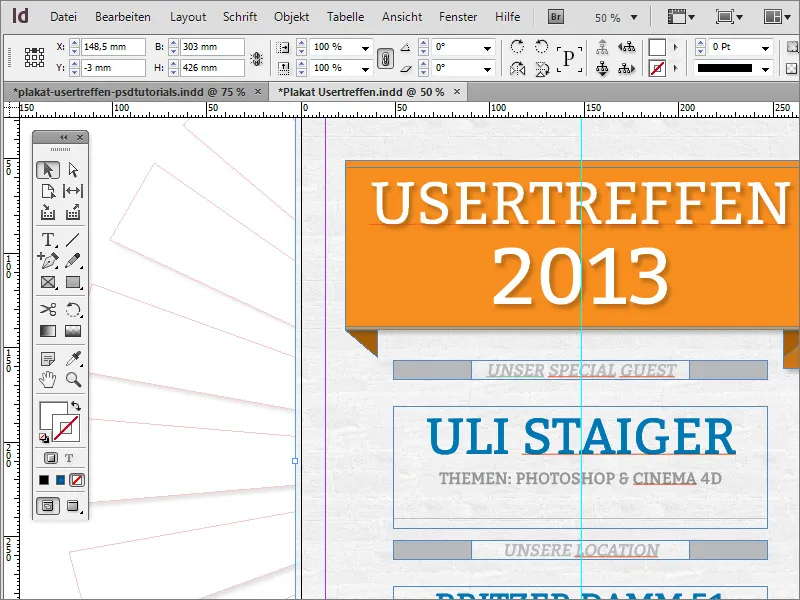
For further editing and a better overview, you should temporarily move the object out of the active workspace.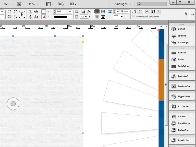
Then simply draw another frame in the form of a rectangle completely over this object. Make sure that it is exactly the same size and that no contour has been set.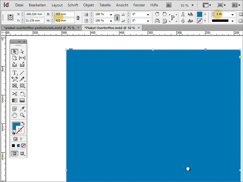
In the properties bar, you can reduce the size of the object by a percentage. First change the reference point on the far left to the center and then enter the new object size as a percentage for the height and width of the object. This can be either 90 or 98 % of the original size. It depends on how thick this frame should be later.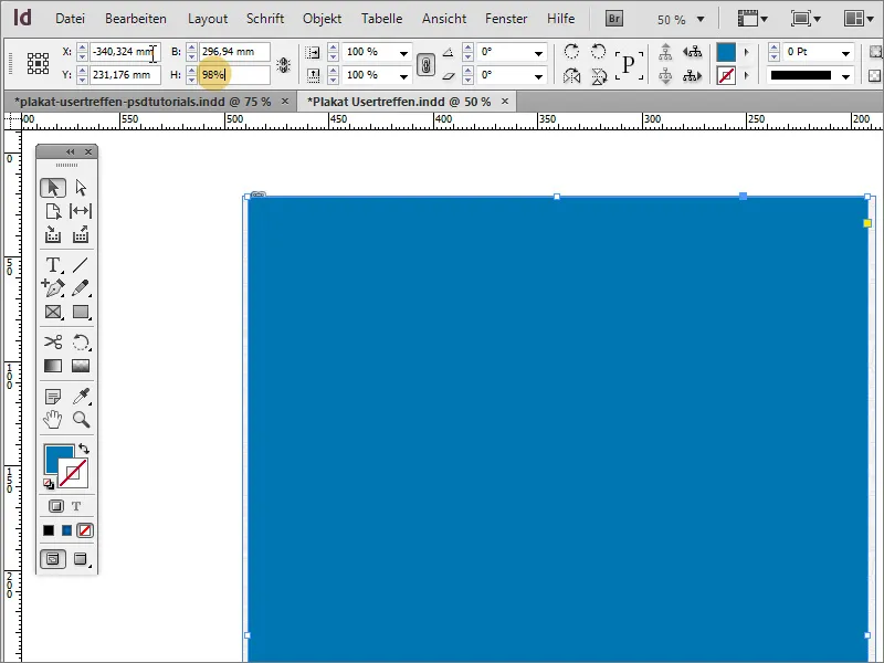
Select both objects and call up the Pathfinder. You can find this under Window>Objects and Layout>Pathfinder. Select subtraction in this dialog box. This subtracts the front object from the back object, leaving only the overlapping areas.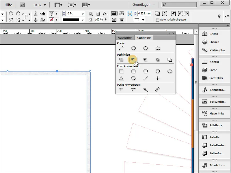
You can now move the object onto the document. Adjust it according to the document boundary.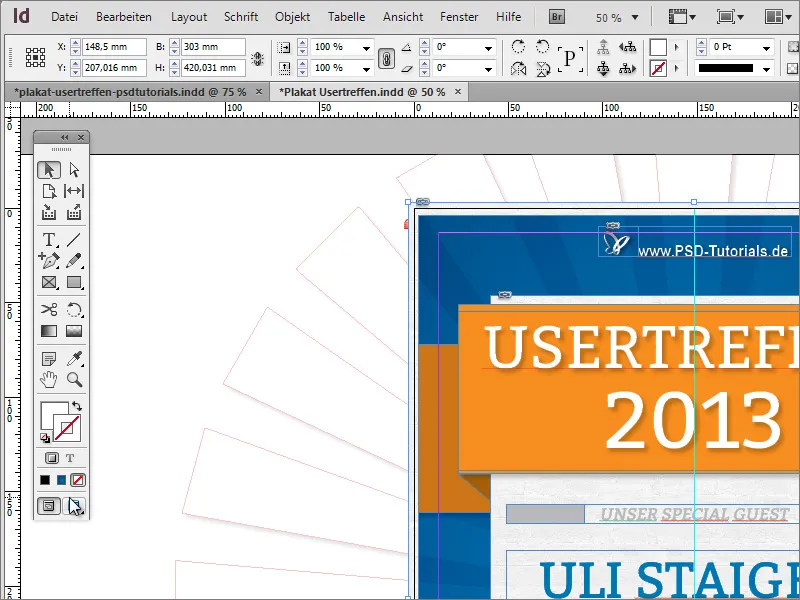
Check the positioning of the object using the crop edges and scale it if necessary. Use Ctrl+Ö to move the frame a little further back in the document structure so that the orange areas of the title graphic are above the frame.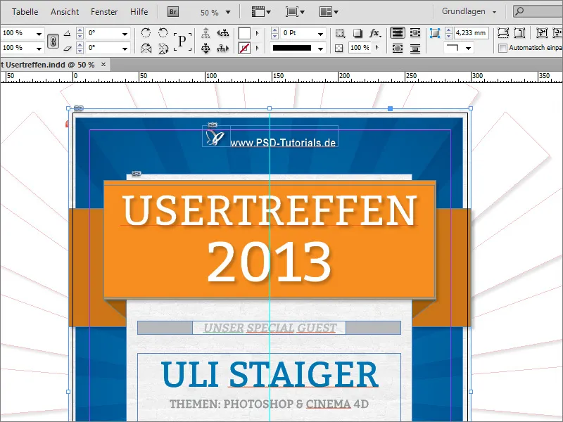
Using the direct selection tool and holding down the Shift key, you can first activate individual nodes of the object and readjust them if necessary.
Guide lines help you to maintain full control over equal spacing.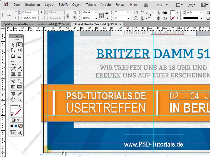
You can make final adjustments to individual elements at any time. For example, you can use Ctrl+Shift+Alt to scale the logo and lettering proportionally from the center point.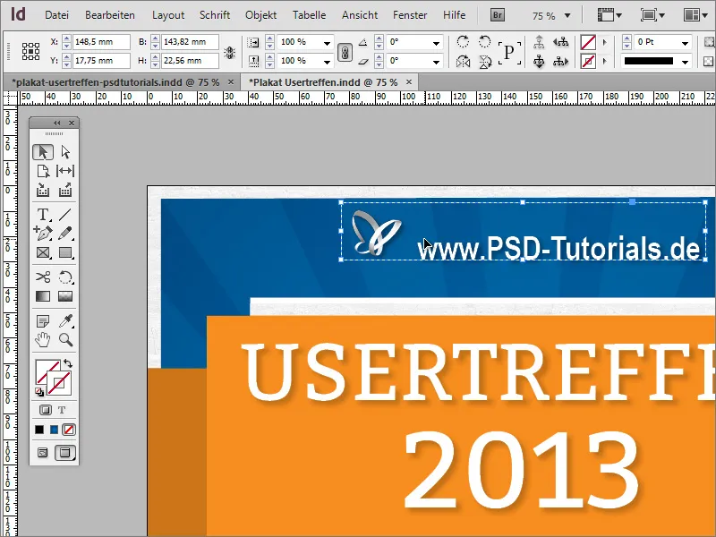
During a final check, you may notice that the gray graphics in the middle of the poster still leave too much space for the text. You can delete one of the objects, adjust the length of the other and position a copy of it on the opposite side.