You are faced with the task of creating a template in Google Data Studio to present your data clearly and effectively? This guide will take you step-by-step through the process, allowing you to design appealing and functional templates. Whether you are working for Google Ads, Google Analytics, or other data reporting, this approach will help you structure your information clearly.
Key insights
- Google Data Studio is a powerful tool for data visualization.
- Designing a template involves inserting and formatting elements.
- Choosing colors and fonts contributes to readability and branding.
- Using links and interactive elements enhances the user experience.
- A clear layout and careful layer management are essential for an appealing template.
Step-by-step guide
To create an effective template in Google Data Studio, follow these steps.
First, you need to delete the timeline that is initially visible in your workspace to create more space for your design. Simply click on the timeline and press the delete key. This will give you a blank workspace that is more suitable for creating your template.
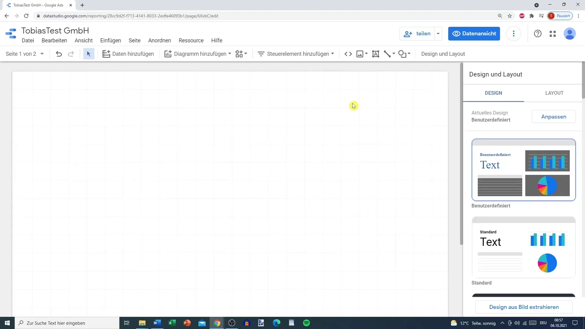
Now, start with the basic layout of your template. An important first step is to insert a shape, for example, a rectangle. To do this, go to “Insert” and select “Shape” to display the desired shapes. In this case, choose a rectangle and place it where you want in your layout. Position the rectangle to occupy about one-sixteenth of the screen height. This element will serve as a header or general title.
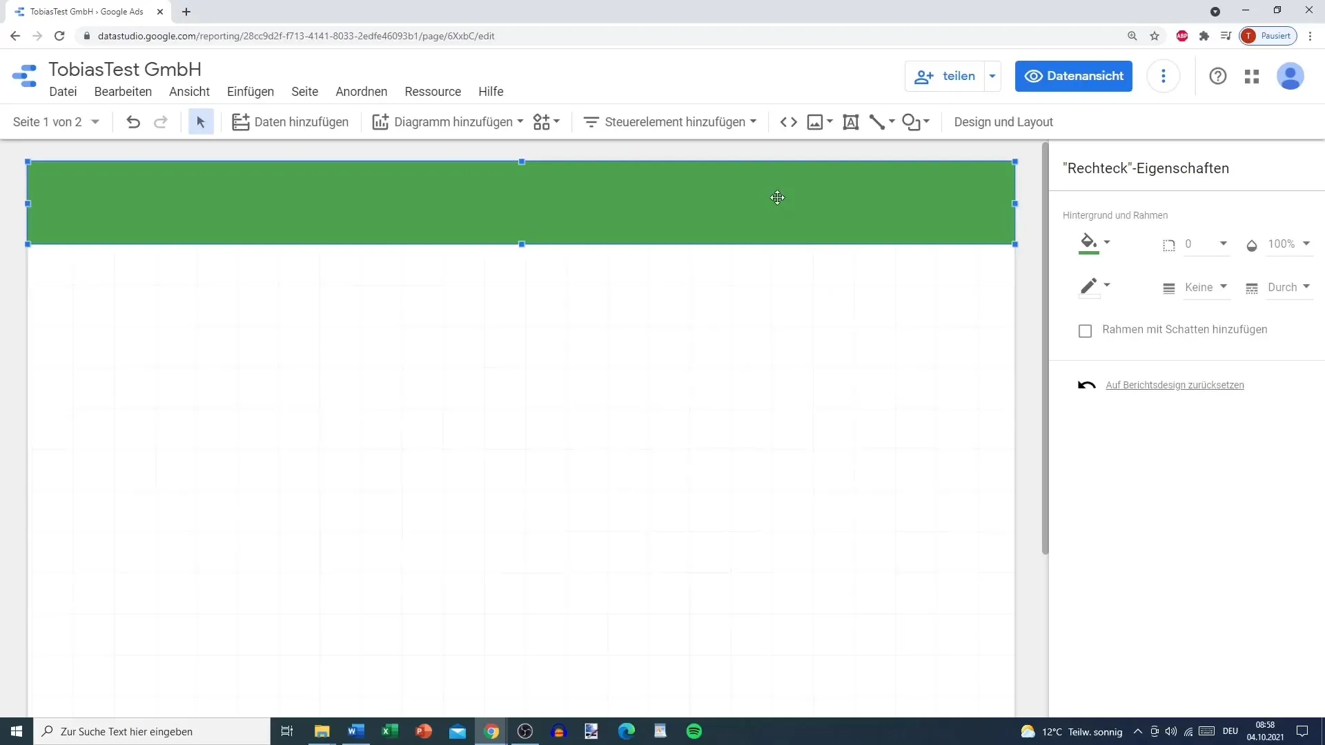
To make your template visually appealing, you should adjust the colors. Since you want to differentiate between various themes such as Google Ads or Google Analytics, you can use different colors for different sections or pages. For example, you might choose green for Google Ads and orange for Google Analytics. This helps you keep track and increases clarity.
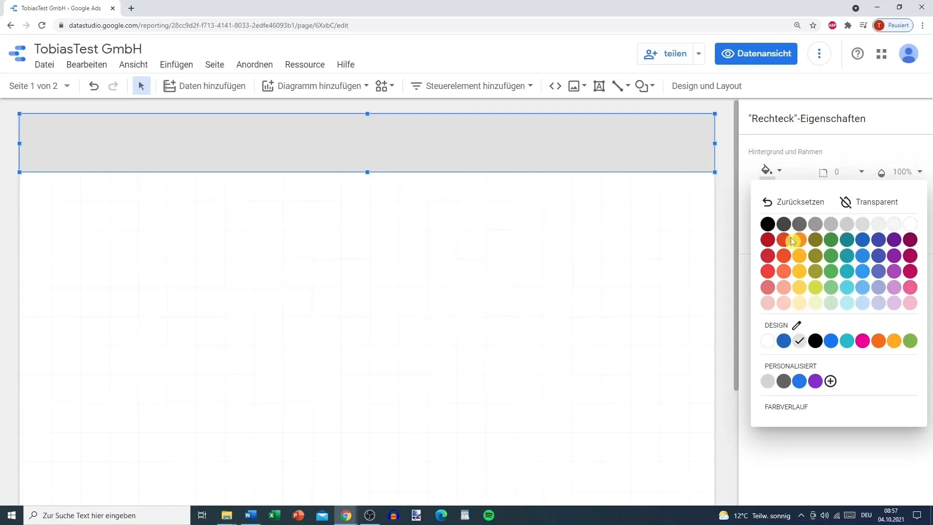
A helpful trick is to use the report level. Right-click on the object and select the option "Move to report level". This allows the inserted object to remain visible on all pages of the template. However, if you want to work with specific colors for each page, stay at the page level and copy the newly designed element to the other pages accordingly.
Before you begin inserting a logo, it is advisable to first select the colors and background of the object. Here, you can either choose a transparency or another color to highlight the logo. A well-designed logo gives your template a professional appearance. Make sure that the logo is well placed and visible.
Now insert the title of your template. Go back to the toolbar and select the text function. Insert a text box into your template and write a concise title that summarizes the theme of your template. Use an appropriate font and size, so that the title is easily readable and fits the other design elements.
To further customize the title, you can try different text formatting options, such as bold, italic, or underlining. Remember that you can also insert a link to your website so that viewers can find more information if needed.
In the next step, you should insert the time control tool to filter the data over a specific period. This is especially useful for creating dynamic data views. You can choose settings for automatic or custom time periods, depending on the data you wish to analyze.
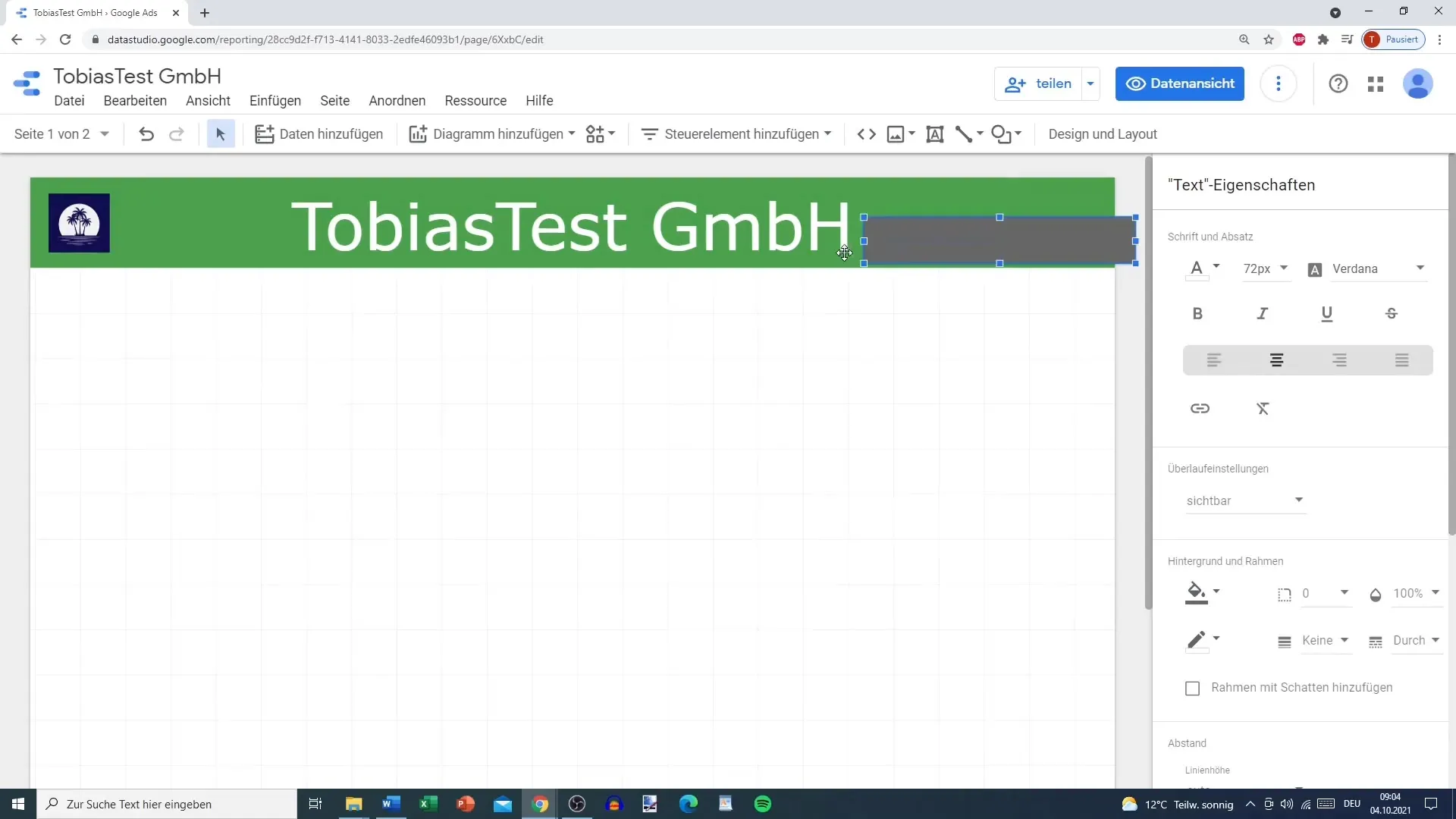
Once you have added the time control tool, make sure to also optimize its design. An appealing color scheme and border shadows can help the tool stand out better. Also, consider whether you want to switch this element to the report level.
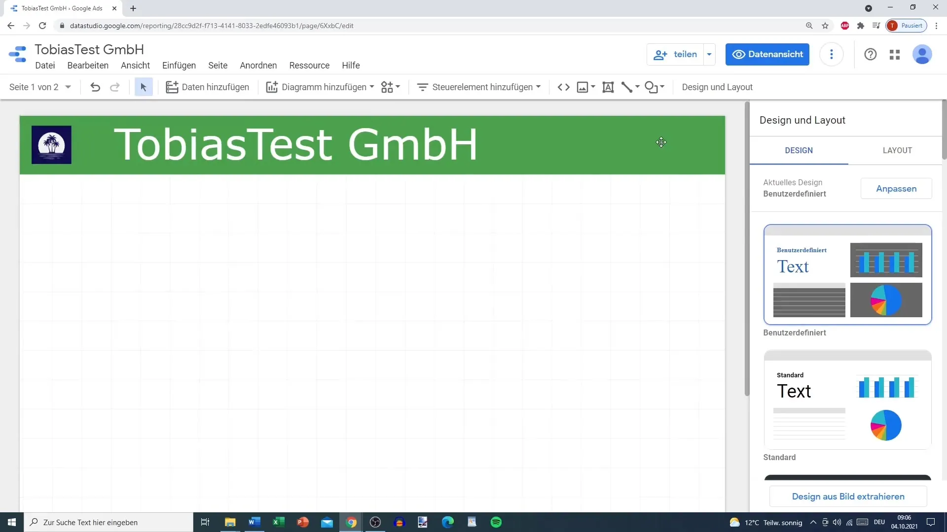
Since layers can sometimes become disorganized, it is advisable to check the order of objects to ensure everything is sorted to your liking. Sometimes, it may be necessary to duplicate the image or area to make sure it looks good on all pages. Ensure you select the right layer to achieve the desired designs.
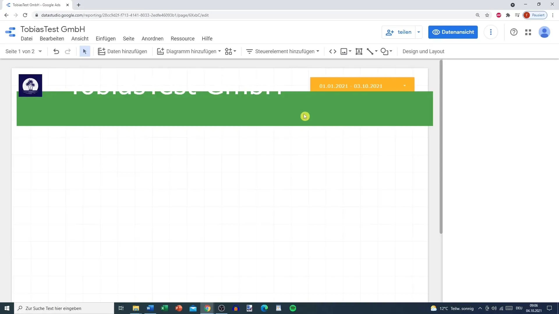
After following these steps, your template should be well-structured. You have now created the basic layout that you can use for future reports.
Summary
This guide has shown you how to create an effectively designed template in Google Data Studio. You have learned how to use colors, fonts, and interactive elements to visualize your data and enhance the user interface. Use these skills for your future data reports!
Frequently asked questions
How do I save my template in Google Data Studio?You can easily save your template by clicking the “Save” button in the upper right corner.
Can I share my template with others?Yes, you can share your template with other users via the share button in Google Data Studio.
How do I insert graphics into my template?Go to “Insert” and select “Chart” to add different graphical representations.
Are the templates in Google Data Studio free?Yes, Google Data Studio offers free usage.
Can I customize templates I found online?Yes, you can customize templates you found online and save them for your own use.
