Hello back to the second part. It's about creating a school flyer. This is the front page again.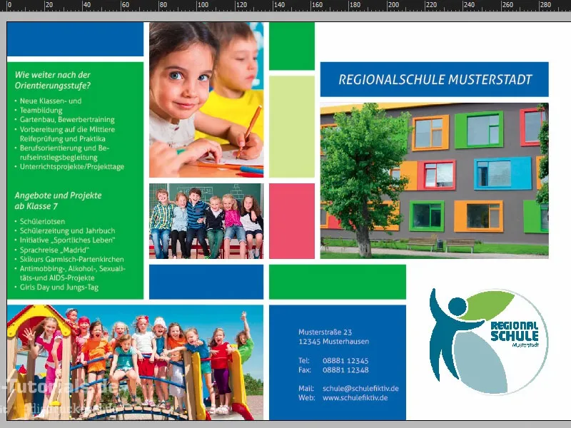
Create new page, add design grid
We'll now move on to the inside pages. We open the page paneland add a new page.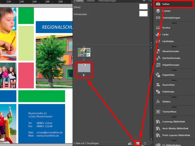
Of course, our design grid is missing here. You can simply create this again, but if you are working with several pages, then it is worth creating such a design grid on the master page, because then you have it on every page. In this case, I simply create guide lines again (Layout>Create guide lines...). Here it was 10 mm, 3 mm, 20 mm and also 3 mm. The grid is now identical to the one on the front.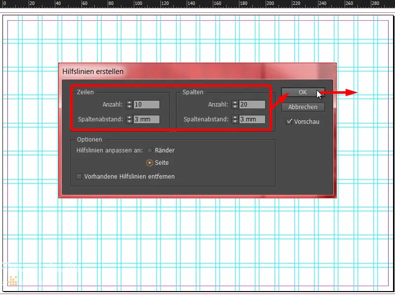
Designing the flyer: graphic elements and images
Now we can start drawing rectangles at the top again. I'll make the first one in the color blue (1 and 2) and drag it up here from the bleed (3). Make a copy of this and in this case reduce it to three boxes (4). Then create another rectangle here on the right in our apricot color (5). Good, the header area is in place (6) ...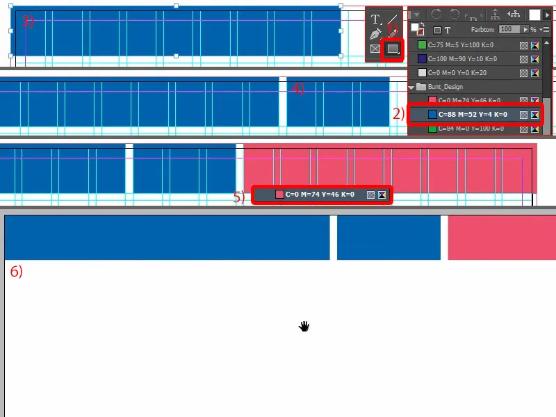
Let's continue with the placement of the first image. I select the rectangle and simply drag it up here (1). Of course, you always have to be a little careful how big you want it to be below the line.
I press Ctrl+D and select the appropriate image (2). This is also promptly inserted there (3). Adjust>Fill frame proportionally... (4) Now of course we need the good teacher, she has to be on the picture so that mom and dad can see how friendly they are there (5).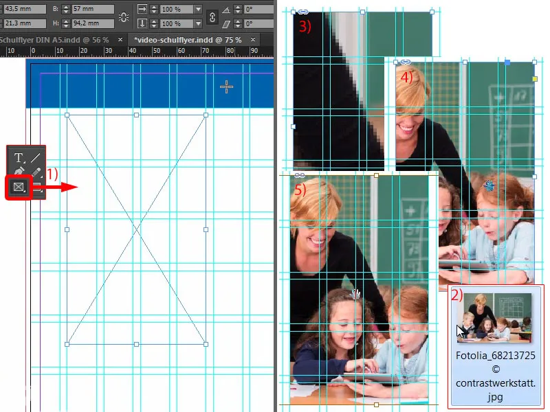
Then we could make the whole thing a little deeper (1). We're breaking the grid here, but that's perfectly fine, because in the end it's also about aesthetics.
At the bottom, we also place a rectangle like the one above. So make a copy of it and drag it all the way down (2). And now it might be quite helpful if we set this auxiliary line exactly at the halfway point where the break is (3). 148.5 - that's where the fold is.
And we simply move this field a little bit beyond it, like this (4). I like that ... Quickly change the color (5) and off we go.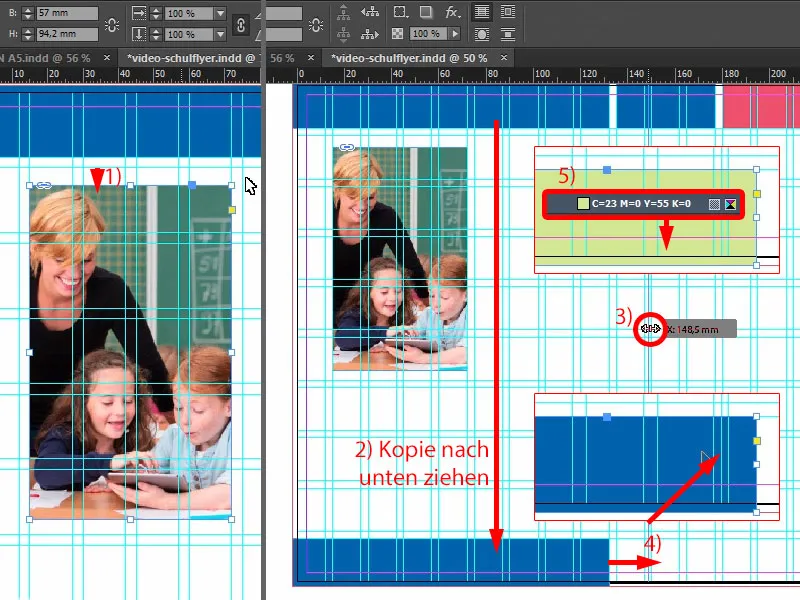
We'll make another copy of this (1).
Now we need our 3 mm. Because InDesign doesn't show me the distance when I move the rectangle, we simply have to solve it with the gap tool (2). To do this: Hold down the Ctrl keyand set it to 3 mm, and the problem is solved (3). Of course, this is still a little too big, so: move it smaller, until then (4) ...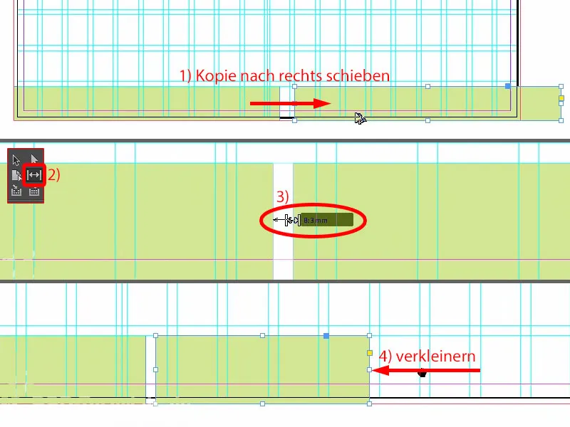
... and four fields up (1).
There is also an image, which I move to the edge here (2). Ctrl+D once , open the image (3), ...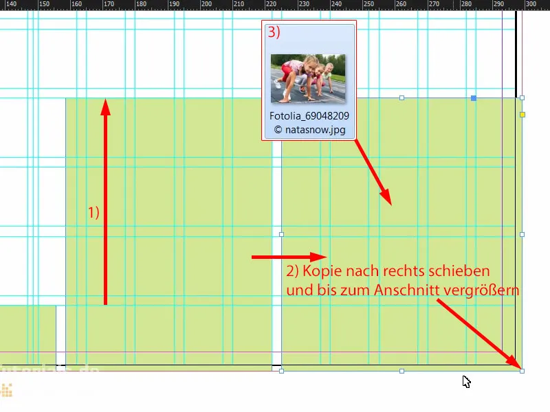
... again Customize>Fill frame proportionally (1). Now we have something special, the typical case: We place a photo and these nice girls not only look out of the layout, no, they even want to run out, and that's not possible. So we take the image, Object>Transform>Mirror Horizontal (2). This ensures that the girls look into the layout and also run in when the start flap goes off. However, it is important that you simply take care of where people look when you place them in the layout - so rather into the layout, because outside there is only our white mounting area and then nothing after printing. So please be careful with that. Here we change the color to green (3).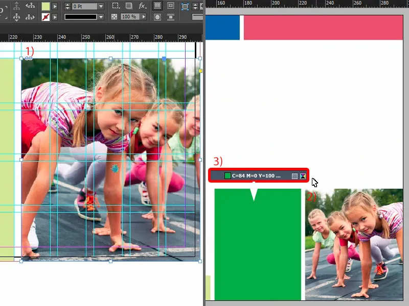
Let's take another look at the whole thing ... The only thing missing is the text.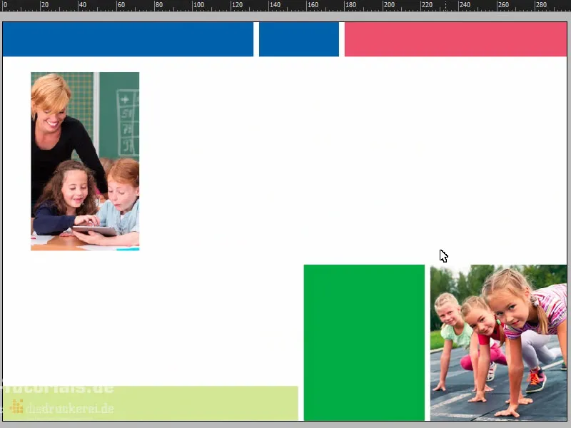
Contents of the flyer: Text and formatting
I scroll in here at the top, grab the text tool, open a text field and paste the appropriate text from the clipboard (1). That actually looks pretty good. However, I still want the first three words in capitals (2).
And we can now align this to the optimum size (double-click on the text field handle at 3).
Of course, this is where our alignment panelcomes into play again. I select the text box and the object behind it, this blue rectangle (4), and can then easily align it to the vertical center axis (5).
Why isn't it right now (6)? Clearly - we have included the bleed.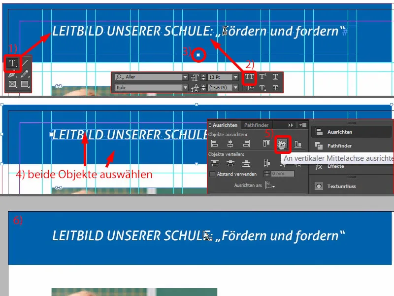
So let's remove it for a moment (1) and do the whole thing again (select the rectangle and text field, then align to the vertical center axis in the Align panel(2) ). Then I drag the rectangle back to the bleed (3). Now, of course, it looks much cleaner and is really centered (4).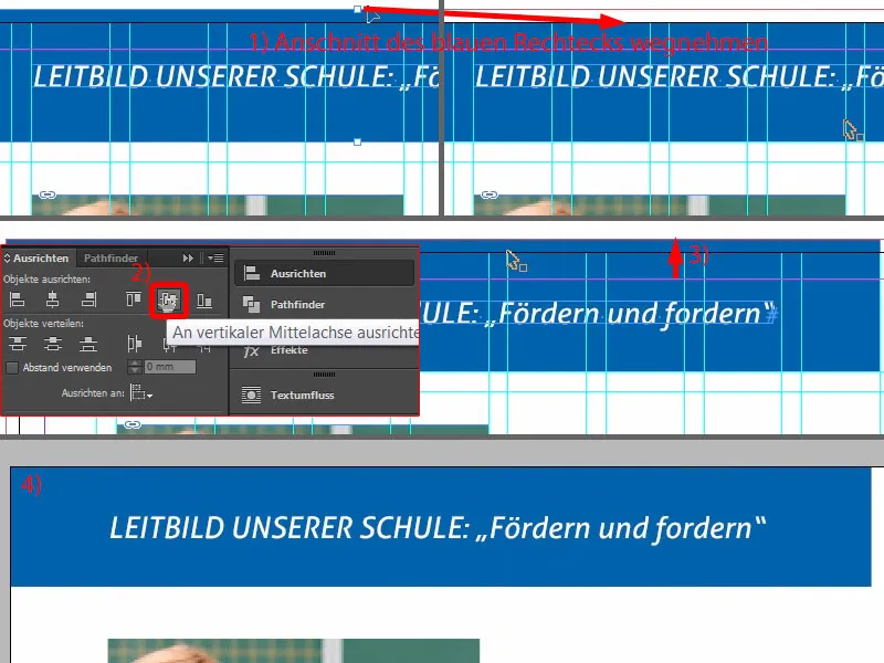
In the next step, we draw a text field as large as the image (red frame at 1).
Then, of course, we have to pay attention to which format is currently applied. The "2nd order heading" (2) was the one above (3), but it is in white. We can't do anything with white, so I'll make a copy of it. Duplicate format... (4).
I call this "Heading 2nd order blue" (5). I then change the character color (6) to blue (7). Now we have the right format (8) ...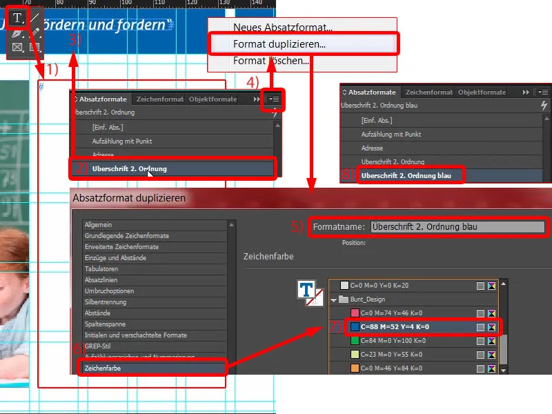
... and I can simply copy and paste the text again (1). The color fits, but again, the hyphenation is not nice (2). No problem: place the cursor in front of "our", then Shift and Enter - problem solved (3).
Now I grab the next text, copy & paste (4). Of course, this is all far too big, so I'll format the whole thing with "Bulleted list" (5). We also duplicate this format (6). We give the child a new name: "Enumeration with tick" (7), and then we confirm this once. And I'll apply it to this text - click on it once (8).
Now we can start to customize the format. What do we want first? You may have already noticed that white text on a white background results in snow white. That's why we need a little more contrast, because you can't read anything here yet. Let's go into the character color (double-click on 8, then on 9). There we already find various color fields, including a black tone (10). If I select this, the whole thing changes color. It's a bit too harsh for my taste. It could be a bit softer.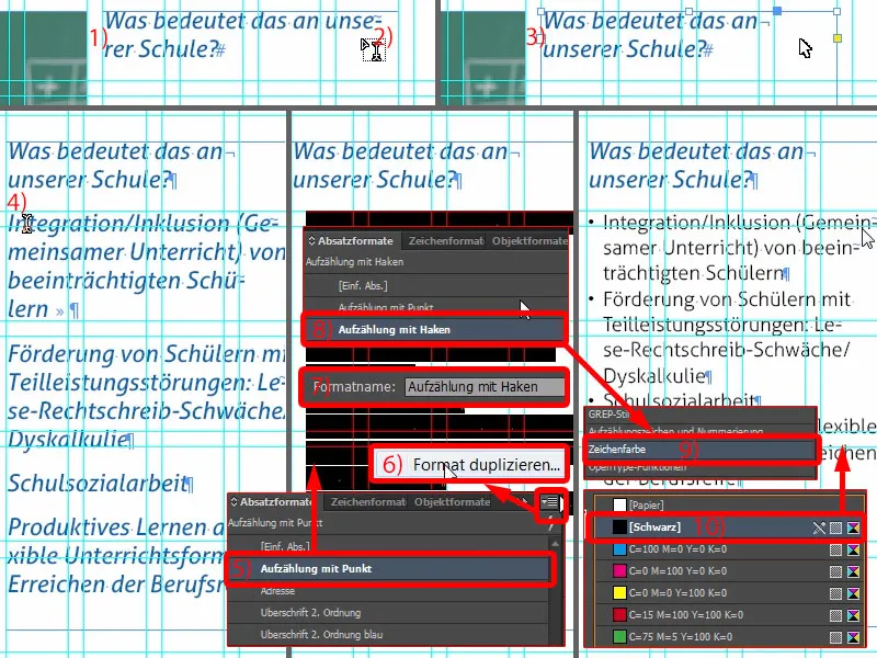
So I create a new color field. Unfortunately, you can't do this from the current dialog, so let's go out briefly via OK. For the new color field (1) I select: three times the 0 and once the 90 percent (2). Add and Done (3).
Now we have a very soft black. I go back to the paragraph format and can now select the 90 percent black (4). That's just a bit more pleasant.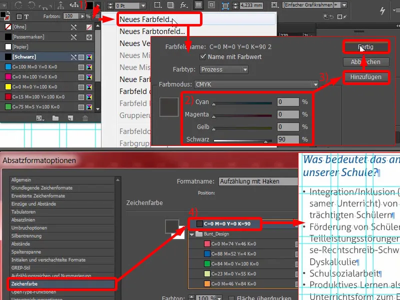
Then we need a bulleted list (1). We currently have these black bullet points (2), which you will get tired of at some point. I'll change them. We can see: The tick is missing... (at 2) Let's go to Add... (3) I've already searched through the Aller Light completely, but there's no checkbox in the glyphs like the one I want, or a tick like that. So I enter the Wingdings (4). There we also find the checkmark (5) ... OK (6). And then I select it (7). As you can see, this will be adjusted right away (8).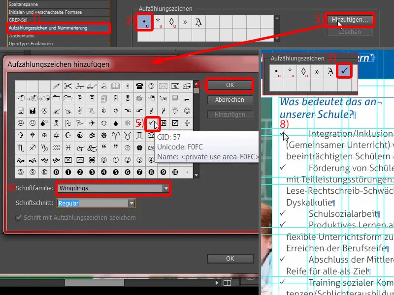
We still need to structure the indents a little here. I set the indent on the left to 4 mm and the indent of the first line to -4 mm (1). Then it fits (2). What I want to change now, however, is the color of the hook.
You can easily create a suitable character format from the dialog. I select New character format... (3) This opens another dialog (4). And there I simply define the character color (5) as blue (6). Another new name, "Blue" (7), and confirm (8). Now let's take a look at these checkboxes - and you can see that they are now also in blue - zoom in once - voila (9). I love paragraph formats because they are just so incredibly practical. Of course, they take a long time to create, but when something needs to be changed, it's done in no time at all.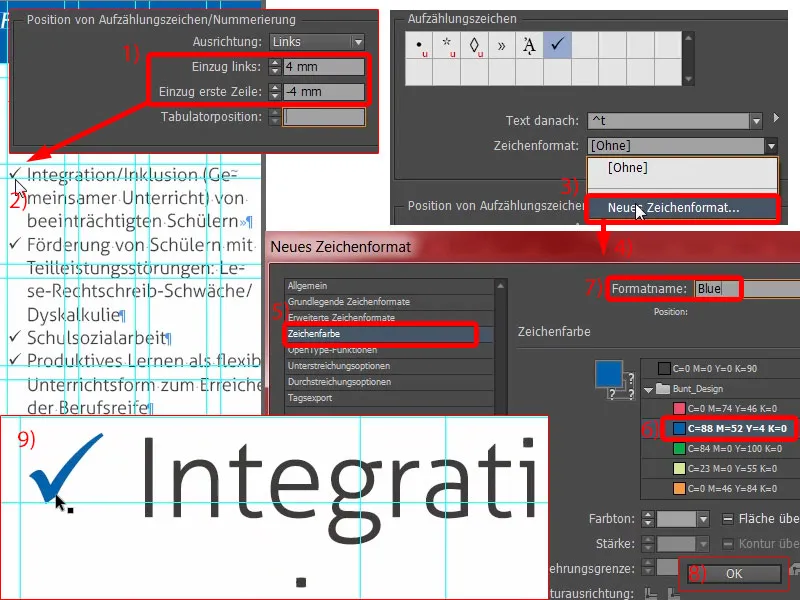
What else do we see here? This is not symmetrical (1). Now some of you will be thinking: "Yes, oh God, something again." Yes! I'm telling you, that's what design is all about: precise work. And that's why I open the "Enumeration with checkmark" (2) again and set the line spacing to 15 pt (4) under Basic character formats (3).
Now we have a slight overset text (5, double-click on the bottom handle of the text field). And then I can simply make the image slightly larger again (6, drag to text field height). This ensures a better reading and writing image again. This is really important - the reader will not consciously notice what exactly has been changed. They will only recognize one thing: that they somehow can't read it. And that's something designers need to avoid at all costs.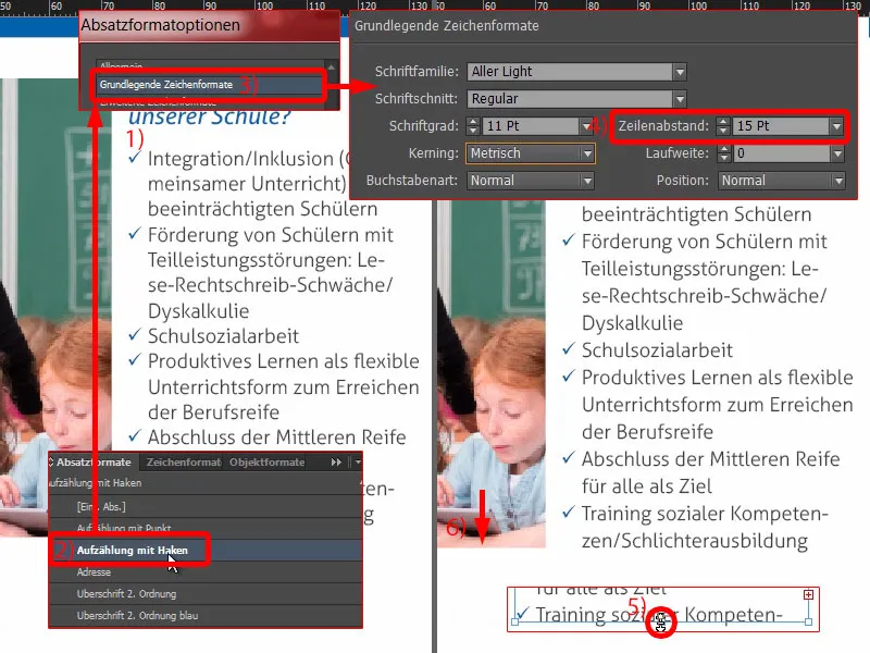
Now let's not make it any more difficult than it is. I make a copy of this field (1), draw it up nice and large, all the way over there and all the way down there (2 and 3).
I copy the texts from the clipboard again ... Then you can copy this construct once and add a paragraph here. The text is also adjusted. Done (4).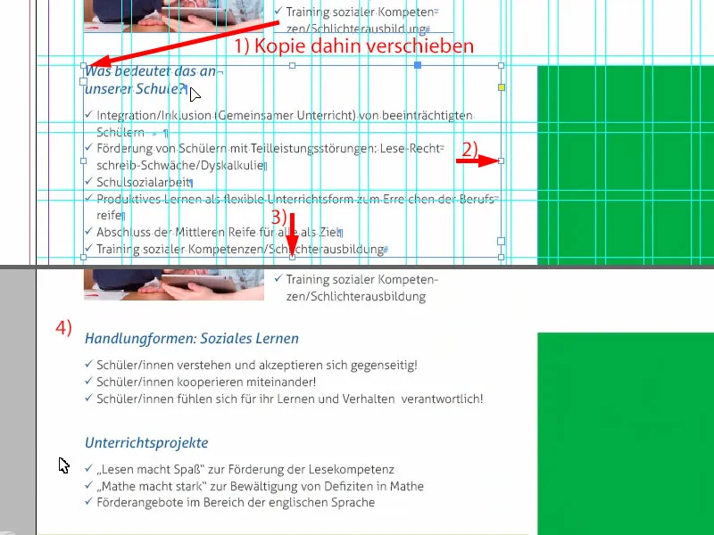
On the right-hand side, we make a copy of the heading on the left-hand side and write "Social work" there.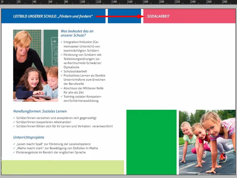
Now I'll add a text field (1). The size doesn't matter for now (red frame at 1). I insert the text again (2).
Now the whole thing is defined without a paragraph format, but the character format has got lost in it (3). We throw that out (4). Please also check once, so that we don't still have blue text here because this format has gone astray.
We don't have a suitable format for the text yet, but we do have one called "Address" (5). I'll format that now. So create another duplicate (right-click and 6). I'll call this "set text" (7). Now, of course, the whole font is white. So I simply change the character color (8) to 90 percent black (9). Problem solved. I confirm the whole thing and apply it to the text field (10).
Take a look here to see what's gone astray (11). We still have a problem somewhere in the paragraph, otherwise we wouldn't have the indent.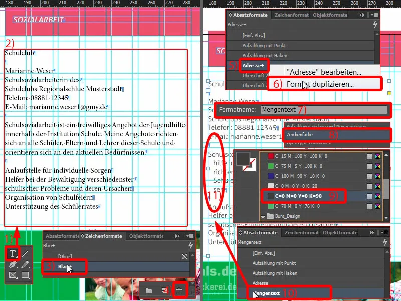
So check again in the paragraph format "Quantity text": Under Indents and spacing (1) we see the 3 mm. We can throw them out. So set everything to 0 (2). Then the problem is solved (3).
At the bottom we can simply use the "Enumeration with checkmark" (4). And we've solved the whole thing.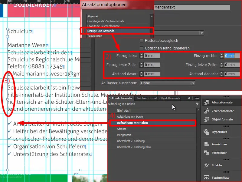
This is about social work in the school club, with a contact person. We can add a new text field (1) and write in it: "Where?" Format with the correct format, namely "Heading 2nd order blue" (2). We do this right-aligned (3). Double-click on the handle (4). And please check that this is symmetrical (5). Then make a copy of it. Now we write in it: "Who?" (6) And again: "What?" (7) We've solved that too.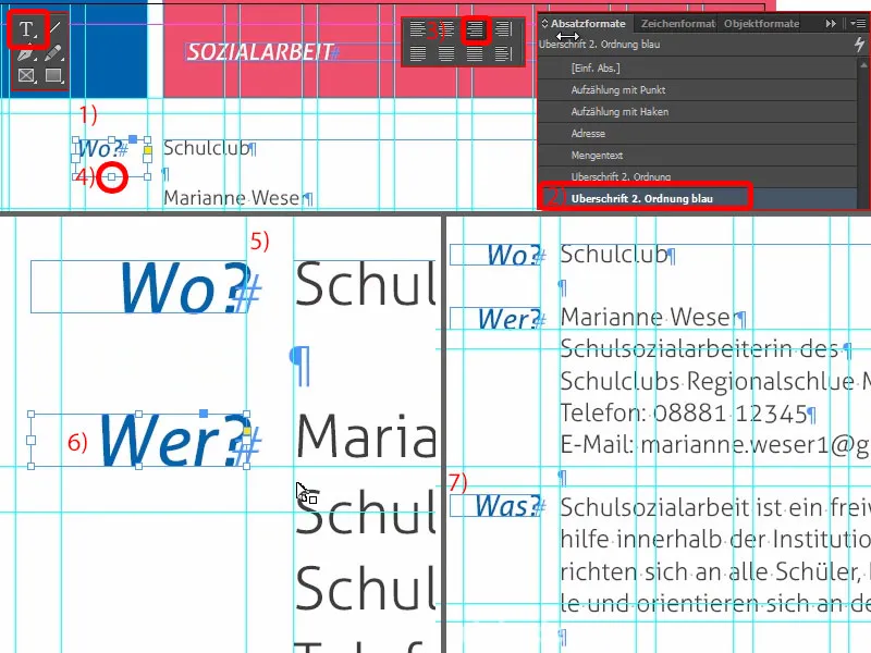
Here you can clearly see the symmetry across shapes. We have 3 mm up here (1), which we continue down here (2). These are really crucial criteria that will give your layout at home a tidy character.
Over here we can add a logo (3). This is for the school club, I just created it manually ... it's completely fictitious and made up. That would add a certain branding to the whole picture.
Let's take a look at the whole thing. We're making really good progress. What's still missing down here is a bit of text in this green box.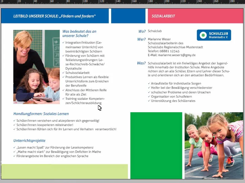
But no problem: we simply drag a copy from the first page using Ctrl+C and paste it down here (1). Then I place it in the top left-hand corner (2) and, holding down the Shift key, press the right arrow key twice and the down arrow key twice (3). I adjust the size of the text field slightly (4). Now rewrite the text ... Voila.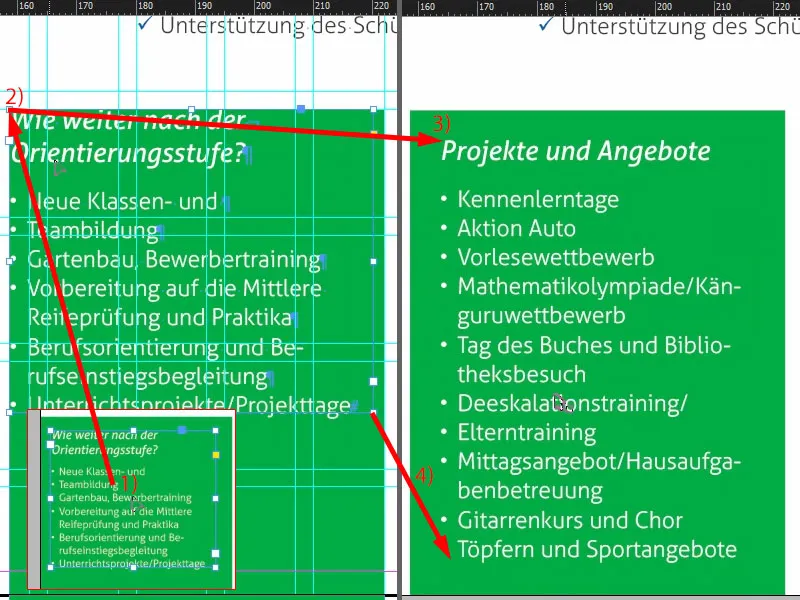
These are the finished pages.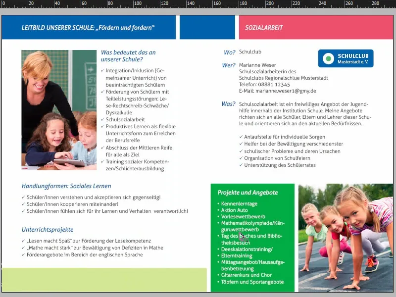
Exporting the flyer from InDesign
Now we'll export the whole thing and then send it to print. Open the export dialog with Ctrl+E and save. Now I'll select diedruckerei.de ISO coated from my Adobe PDF template (1), check once again that everything fits: Pages, yes (2).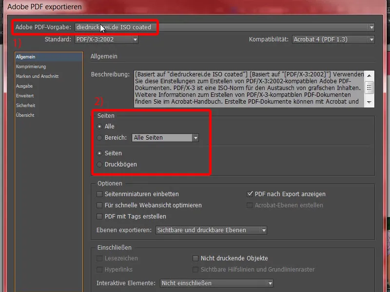
The compression is OK.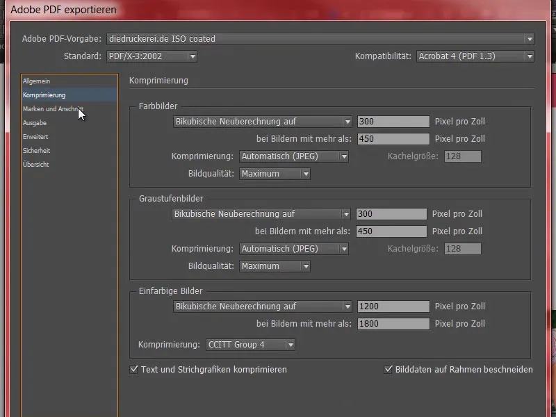
Marks and bleed - exactly - use the document's bleed settings.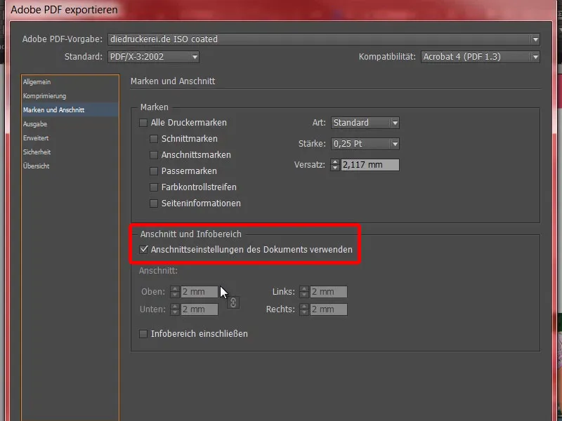
Output: Convert to target profile, document CMYK ISO Coated v2 (1). And here we also have Document-CMYK ISO Coated v2 (2). That fits. Now just click on Export (3) and the PDF is promptly created.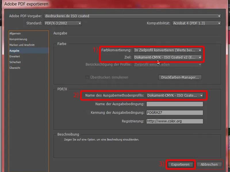
These are now the outer pages, ...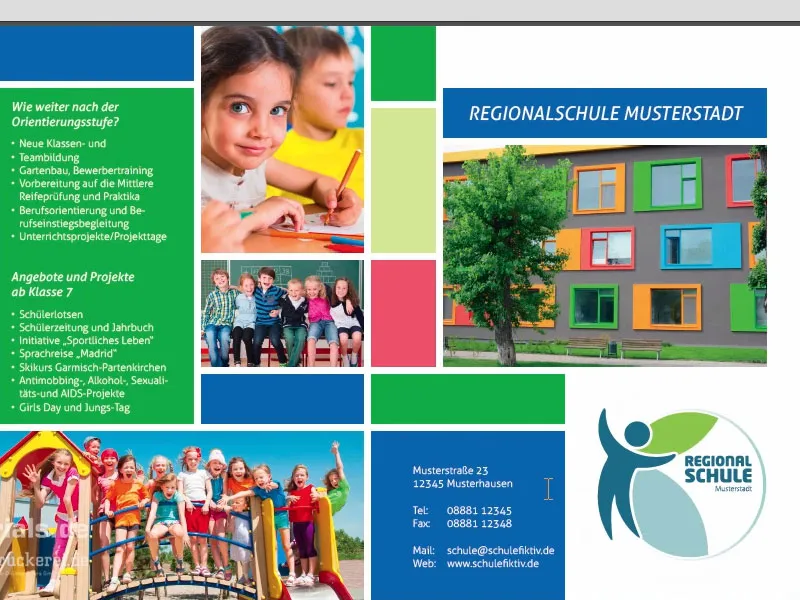
... these are the inside pages, exactly as we created them in InDesign. And now off to print.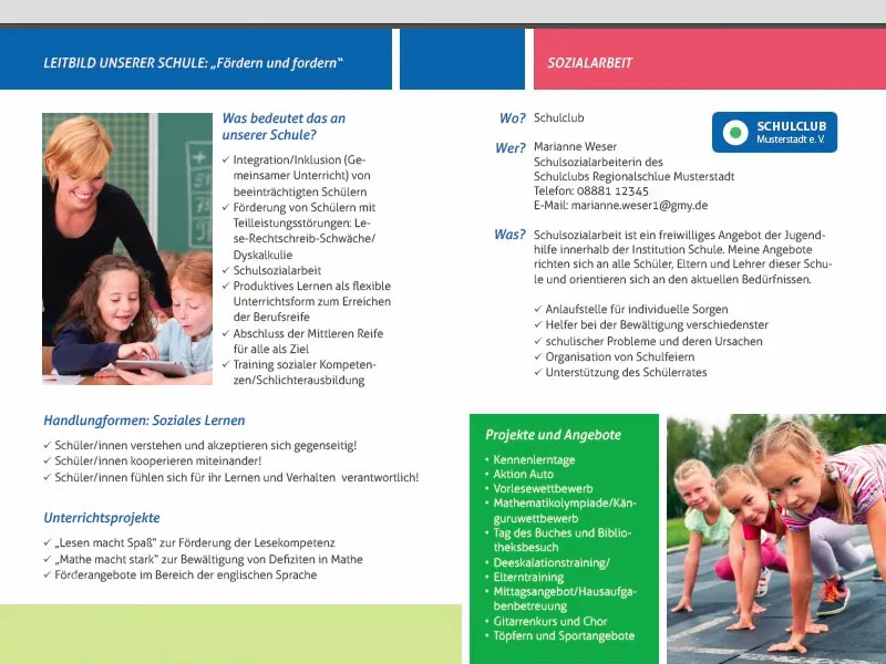
Handing over the flyer to the print shop
Now it's time to place the order. So once again we go to the folded fly er (1) and select the standard folded flyer (2). We had the DIN A5 format(3). Perhaps a practical tip here below (4): Here you can also find folded flyers with perforation. What is that? These are tear-offs that are used for vouchers, receipts or reply coupons. This is perhaps less suitable for DIN A5 flyers, but if you have a flyer with a 2-break fold or something like that, then you can easily incorporate it, which is a really exciting topic, especially for vouchers.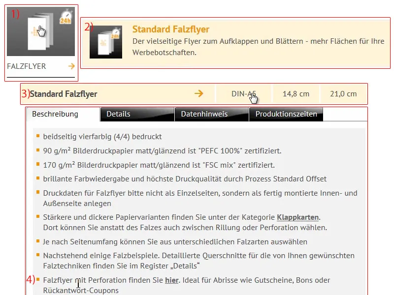
Next up: product configuration. We have this wonderfully beautiful picture printing paper (1). A look at the paper sample book revealed to me that I would prefer to work with 170 g/m². The number of pages is 4-sided (2). Let's increase the print run to 1000 (3).
Folding: Sure, we have a fold (5), there is only one fold to choose from. Finishing (6): Here we have the option of choosing a complete finishing technique from the print shop. What does that mean now, "glossy coated", "matt coated"? Of course, you can take a look at the paper sample book. I choose glossy coated because it simply has a very aesthetic, high-quality appearance. We don't need the data check (7). The production time, 4 to 5 working days (8), is perfectly fine ... To the order.
Now let's go through the ordering process ... Below is our shopping cart, as we know it. If you have a voucher code, you can enter it here. I'll go to Next. Then the whole thing is confirmed again, Next. Prepayment ... Next. I accept the terms and conditions. Scroll all the way down. "Would you like to stay up to date?" - Yes, we want to. And now it's time to buy.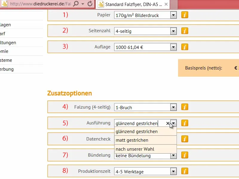
Sometimes it happens that the upload is delayed. That's why I'm going back to the homepage now. And then you might be wondering where you can upload the document now if you didn't do it during the ordering process. You can do this via Print data>Data upload (1).
Here (2) you can use your order number, which was displayed earlier or which you received by e-mail, to go to the upload dialog (3). This means that if you ever get lost somewhere or if you need to submit the order first and then upload the print data, for example because you have received it externally, you can simply use your order number to complete the process. I'll drag and drop the school flyer in (4).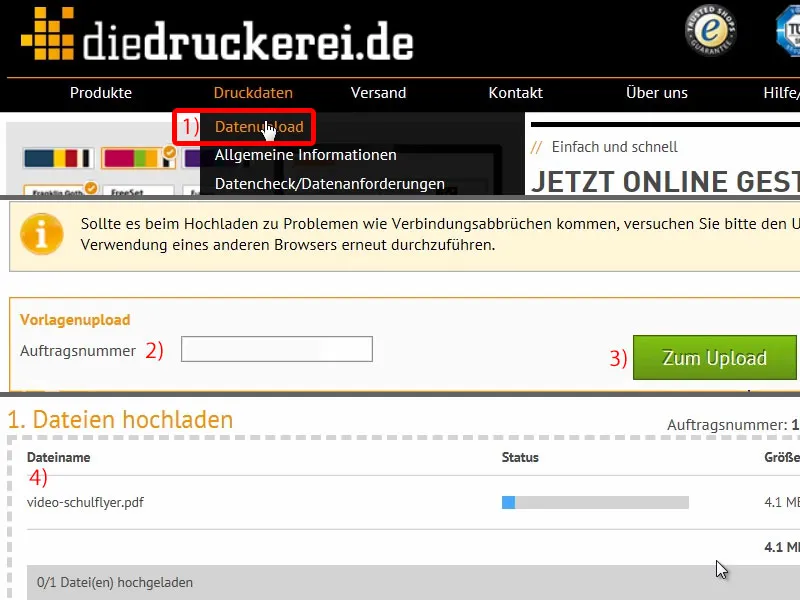
Then let's scroll down a bit. That's all in one document (1). "The print data is ready for production" (2). Wonderful. I've uploaded everything, finalized it (3), and the job is ready to go.
We have completed the project, are now waiting for these flyers to arrive at our home and will then take a look at an unboxing to see how the whole thing looks and how the haptics feel on the bottom line.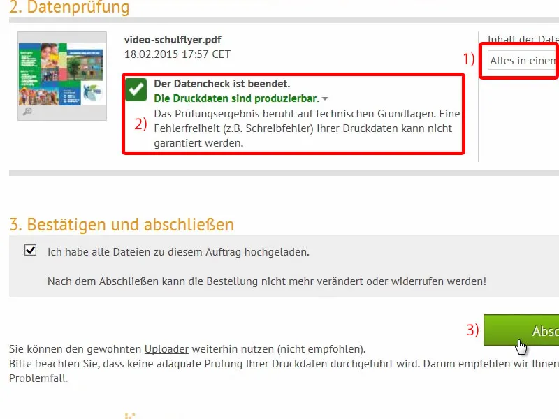
Unboxing of the school flyer
Here is our package. Our flyers are currently sleeping in there, which we'll shake up and unpack. Let's take a look at it ...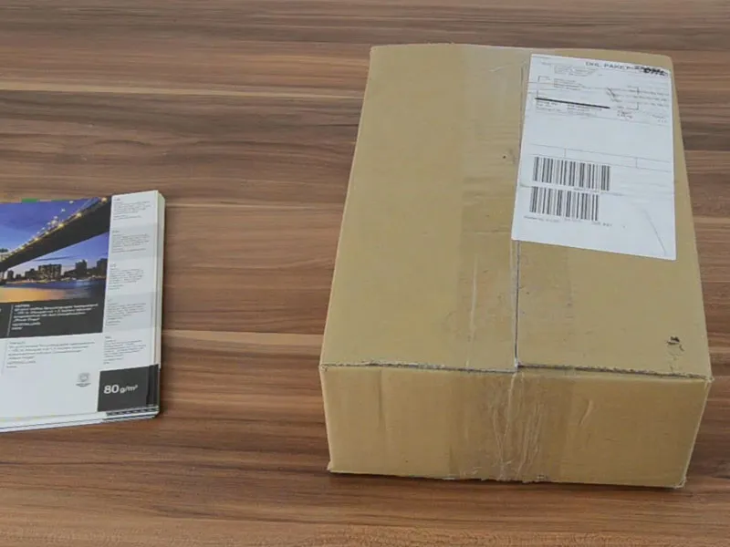
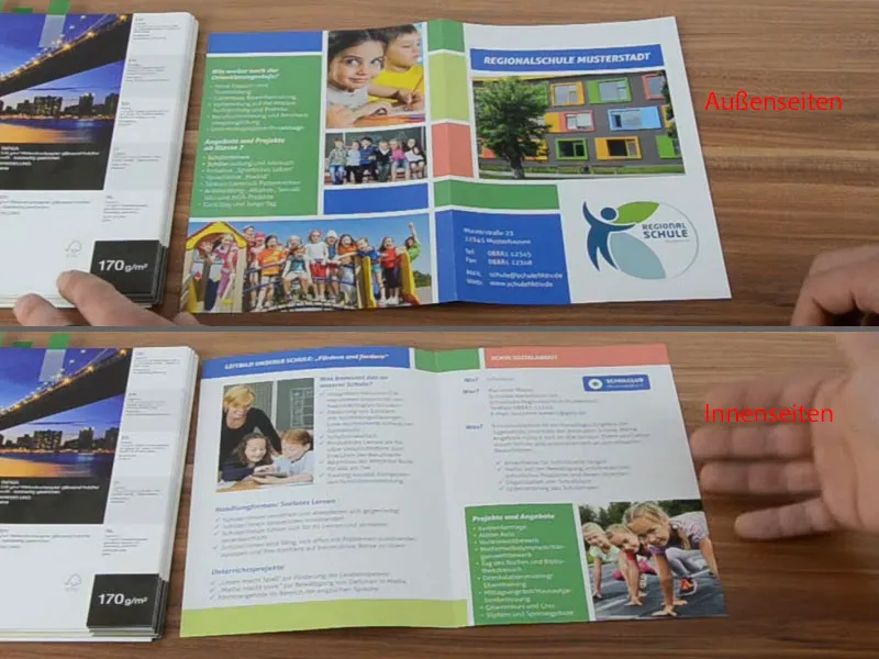
Our regional school Musterstadt as we have laid it out: the front, the back ...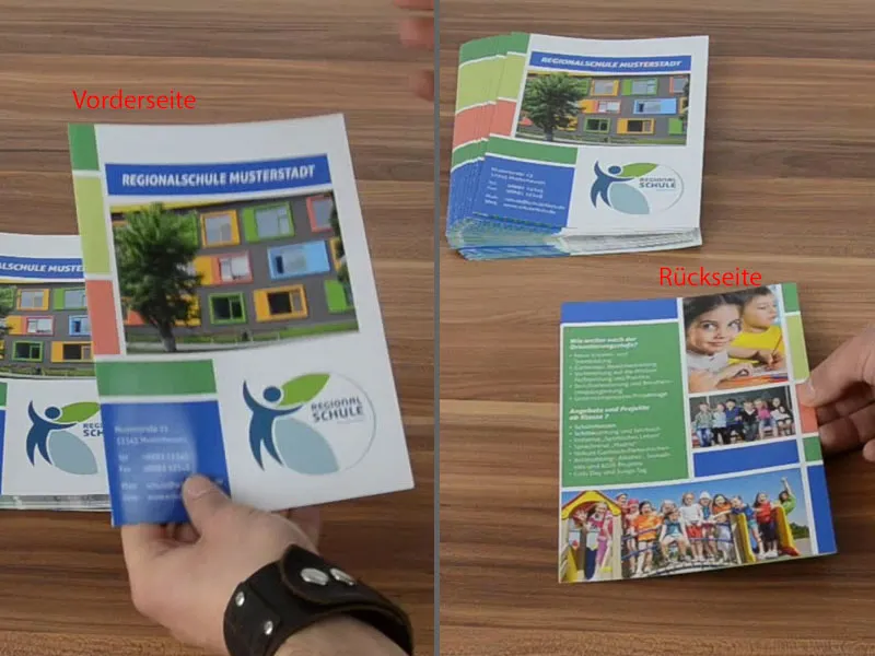
... and then the outer pages unfolded. Wonderful. Let's also take a look at the corresponding grammage, which was 170 g/m². The coated paper makes the pictures stand out much better.
With uncoated paper, the color brilliance simply suffers, but this one is really great. So if you work with photos, be sure to use coated paper.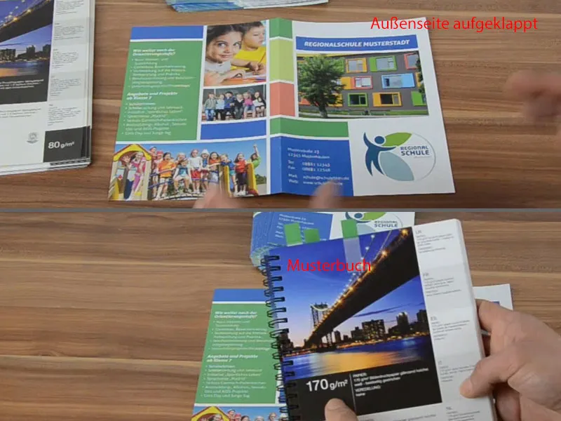
And now let's take a look at the inside: Everything is wonderful here too. It's definitely something to be proud of. I hope this helps you when you're working on your design. Work with paper sample books like this. It helps immensely. I'm happy ... I hope you are too. Bye, Stefan