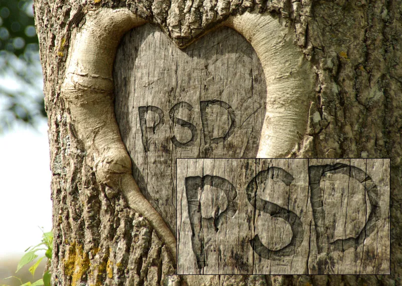
A gravure effect in wood gives your typographies and layouts a rustic and natural look, perfect for creative projects. With Photoshop, you can realistically create this effect by combining wood textures, layer effects, and shadows. In this tutorial, I'll show you step by step how to create the impression of an authentic engraving in wood - ideal for logos, posters, or decorations. Let's get started and give your design a warm, handcrafted touch!
I cropped my original file to the image size of 2500x2000 pixels.
Note: The settings in the filters and fill options in this tutorial are for an image with the corresponding pixel dimensions and text size. For other image and text sizes, the settings must be adjusted accordingly.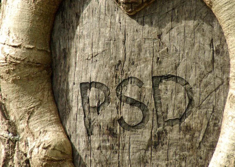
Step 1: Placing text
In my open document, I first create a text layer. The font is placed with an 84-point Futura LT Medium.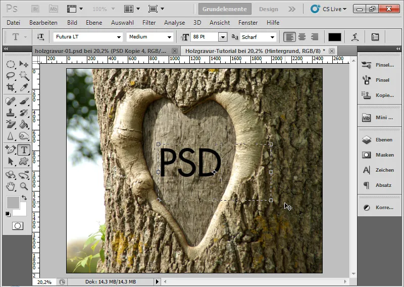
Step 2: Rotating text
I rotate the text layer by about 6.5 degrees. To do this, I select the Transform frame with Ctrl+T and can grab my text layer at the corner points with the mouse and rotate it as desired.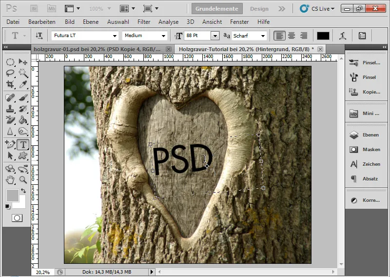
The rotation ensures that the effect on the wood looks more authentic.
Step 3: Convert text layer to Smart Object
When text layers are converted into Smart Objects, I retain the ability to make text changes later, even though filters have been applied. With a normal text layer, I have to rasterize the layer before applying filters. This is not the case when the text layer is embedded in the Smart Object Original.
By right-clicking on the text layer, I choose the Convert to Smart Object command.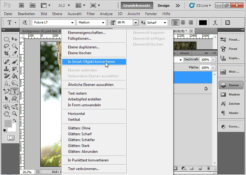
Step 4: Reduce opacity to 30 percent
I reduce the Opacity slider to 30 percent. Briefly about the background: While the Opacity slider can vary the layer contents as well as layer styles in transparency, the Opacity slider can exclusively affect the layer content. The chosen Layer styles (via the Fill options) remain visible. Since the gravure effect is based to a large extent on layer styles, the 30 percent Opacity only affects the black color of the layer content, but not the Fill options to be made later.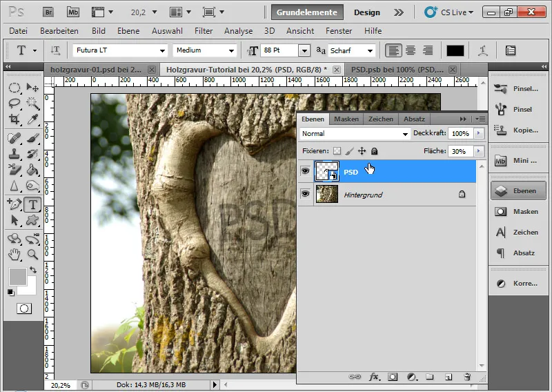
Step 5: Layer Styles
Now comes an essential step to achieve the gravure effect: the Fill options.
Inner Shadow:
The Inner Shadow creates an imitation of light coming from the top left by setting an inner shadow. This creates spatiality, making the effect three-dimensional. The following options are to be selected:
• Opacity: 80 percent
• Angle: 135 degrees
• Distance: 10 pixels
• Choke: 2 percent
• Size: 12 pixels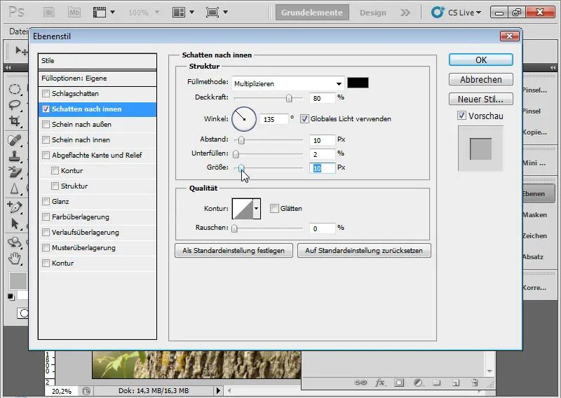
Intermediate result:
Bevel and Emboss:
The Bevel and Emboss option helps to ensure that the engraving actually receives an impression effect. The following options are to be selected:
• Style: Emboss
• Technique: Soft Chisel
• Depth: 100 percent
• Size: 1 pixel
• Soften: 0 pixels
• Angle: 120 degrees
• Highlights mode: with 50 percent Opacity
• Shadows mode: with 75 percent Opacity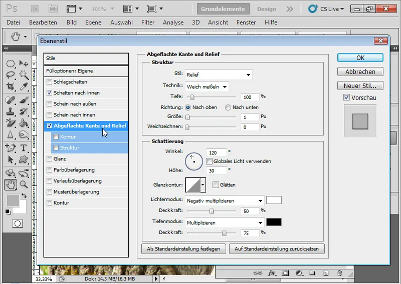
Intermediate result:
Color Overlay:
With Color Overlay, I control the brightness of the wood in the recess. To do this, I choose a dark brown tone in Multiply mode at 20 percent Opacity.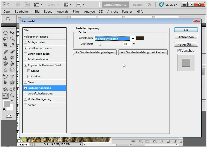
Intermediate result: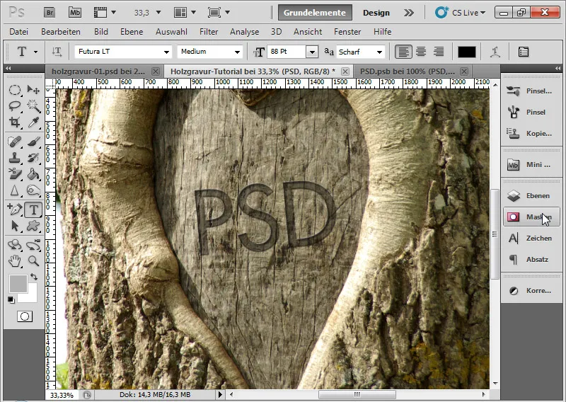
Gradient Overlay:
To simulate different heights and depths in the recess, I can easily create a gradient. The applied gradient is called Silver and is a preset from the Metal preset set.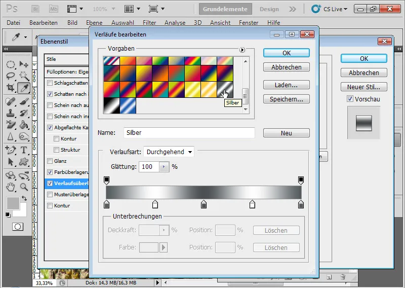
By clicking on the gradient bar, I access the Edit dialog. I call up the presets via the menu arrow and select Metal as a preset to append to the existing gradients. Now I click on the Silver gradient. Alternatively, I can also simply create the desired gradient myself by interrupting the color and opacity.
The following additional options are to be selected:
• Blend mode: Multiply
• Opacity: 35 percent
• Style: Linear
• Angle: 135 degrees
• Scale: 135 percent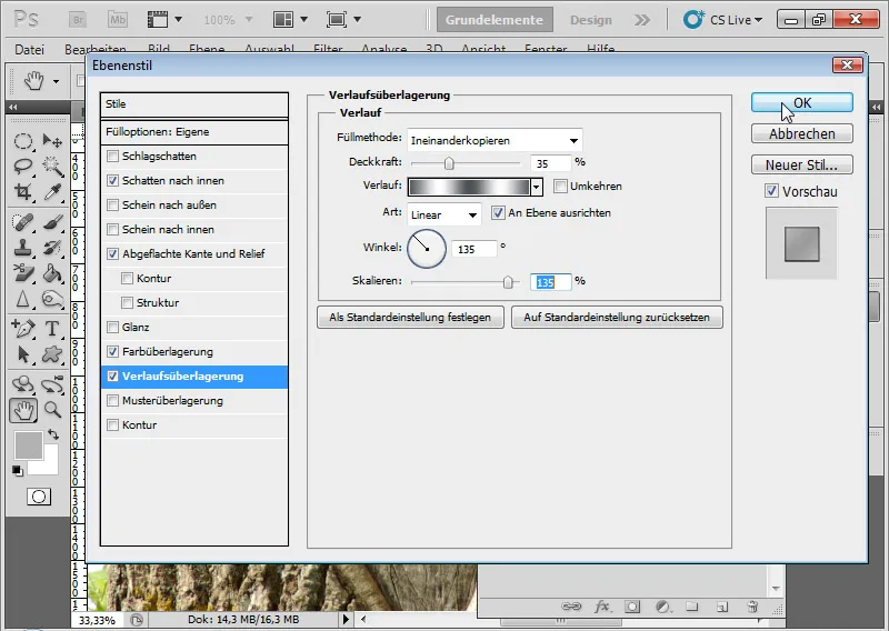
Result after the settings in the layer styles:
Step 6: Adding irregularities using the Smart Filter Ruffle - the easy way
The text engraving is installed. But to look realistic, the text is still too smooth, too uniform. Therefore, the letters at the edge must be made slightly more disorderly.
The quickest option is to simply insert a ruffle effect as a smart filter via the menu Filter>Distort>Ripple.
• Intensity: 150 percent
• Size: Medium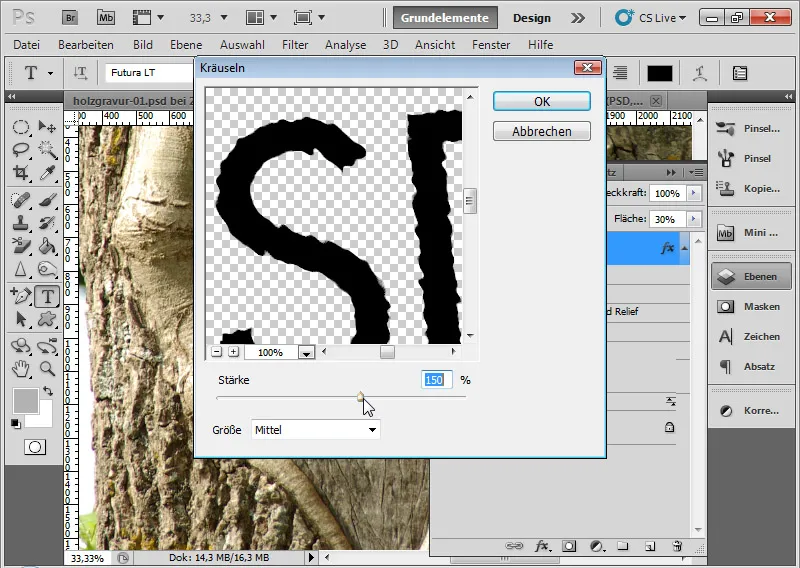
Now I have ruffled my edges slightly. The letters have a slightly frayed effect on the wood.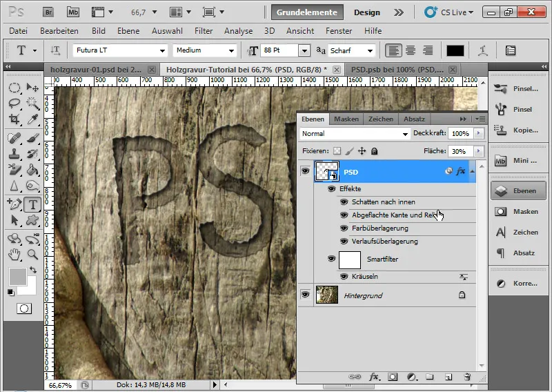
The effect is already ok, but almost identical on all edges. It would be better if the irregularity had a bit more play at the edges. Therefore, I will deactivate my ruffle layer and show a second way to create irregularities using a displacement matrix.
Step 7: Adding irregularities using the Smart Filter Shift - the advanced way
Unfortunately, the Shift Filter is not as intuitive to use as you might be used to from other Photoshop filters. Nevertheless, I can create great effects by applying a displacement matrix, especially useful for surface textures with elevations and depressions.
With a so-called displacement matrix, I distort the main image - in this case my three letters - by shifting parts of the image based on brightness differences. So first I create the displacement matrix and adjust it according to the brightness for the shift effect.
I duplicate my background layer into a new document by choosing: Right-click>Duplicate layer. The goal is a new document named: wood-engraving-matrix-tutorial.psd.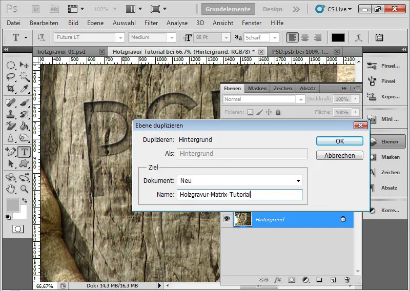
I convert the background layer in the new document to a smart object. Then I call the Gaussian Blur through the menu Filter>Blur>Gaussian Blur.
With a Radius of 5 pixels, I blur the image.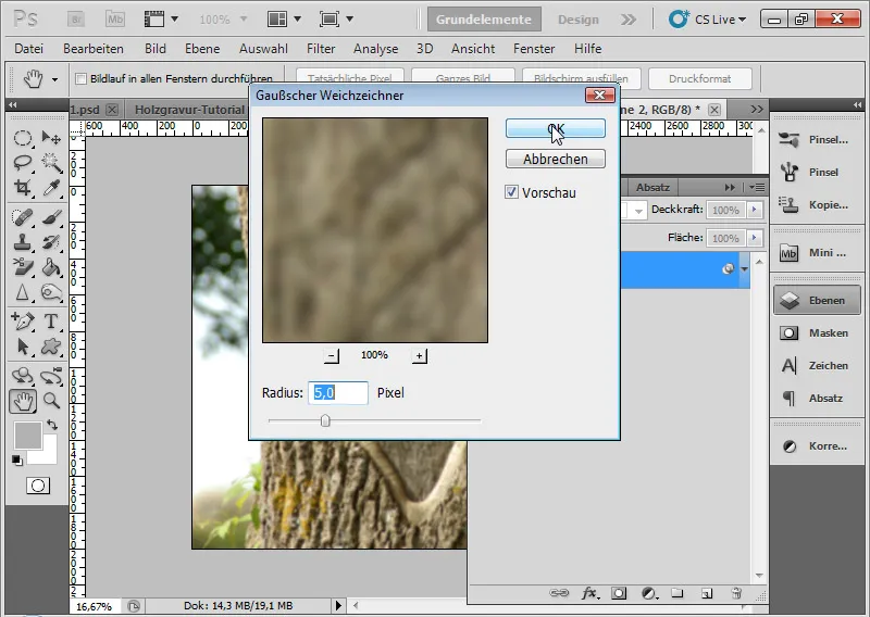
I create an adjustment layer for Brightness/Contrast and adjust the sliders to the following values:
• Brightness: 40
• Contrast: 32
This will brighten the image while increasing the contrast.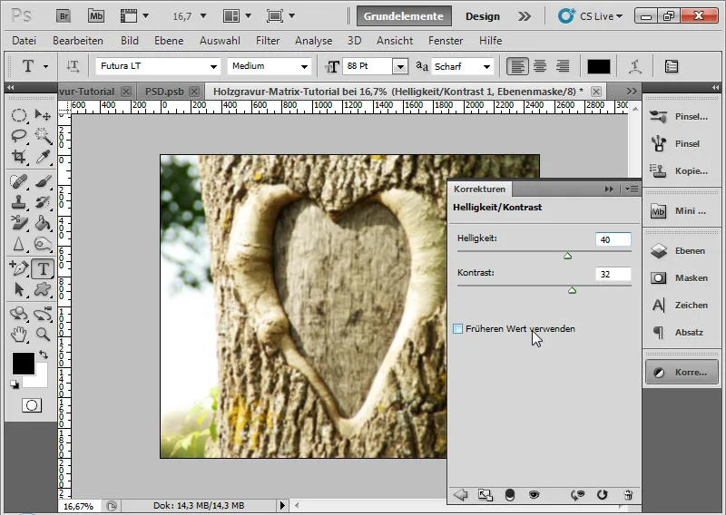
In another adjustment layer for Hue/Saturation, I adjust the Saturation down to -100. This desaturates the image.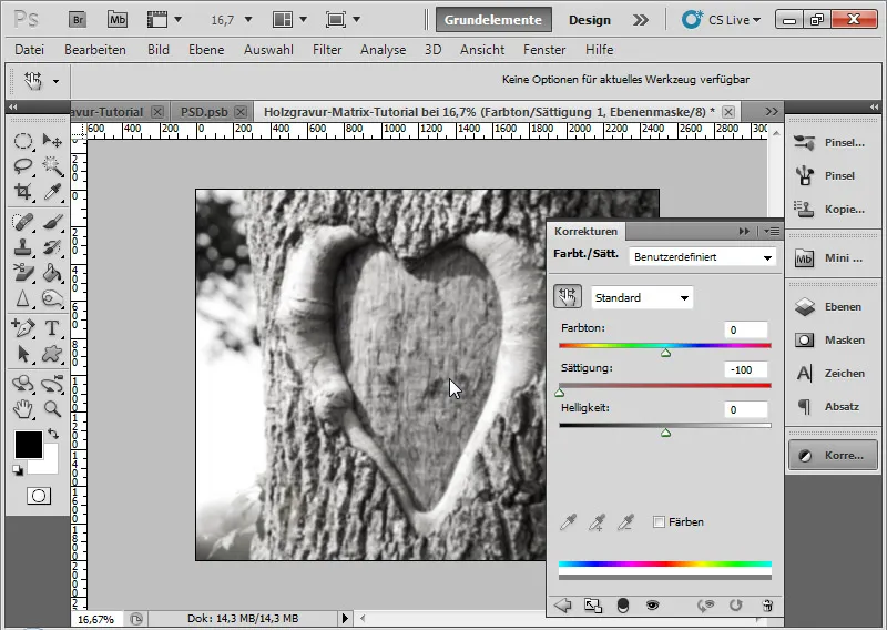
Now I can save my displacement matrix as PSD or BMP. First, I need to mark all layers and reduce them to one by pressing Ctrl+E. Then I convert it to a background layer by going to the menu Layer>New>Background from Layer. This is important for the effect to work.
It may be wise at this point to save the layers in another PSD document before reducing them, in case I want to make changes to the settings for the displacement matrix later.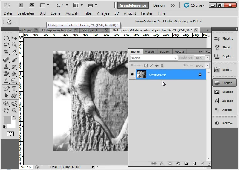
Back in the main document, with the letter layer selected, I open the Shift Filter dialog via the menu Filter>Distort>Shift.
I set a shift of 12 horizontally and vertically each. The input can go up to 100 percent. 100 has the effect of a shift of 128 pixels. For more information on how the Shift Filter works, I recommend checking the Photoshop Help.
The following radio buttons are enabled:
• Scale to selection size
• Repeat edge pixels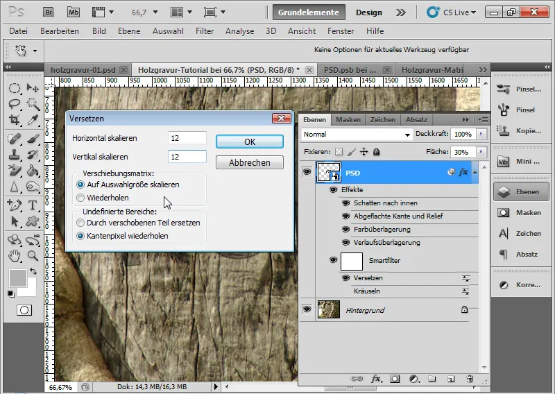
I confirm with OK. In the file browser that opens, I now assign my previously created displacement matrix to the Shift Filter.
The effect is a shift in the text, giving the letters a natural, irregular look. The Ruffle Filter can be hidden in the Layer panel or used in addition to the Shift effect.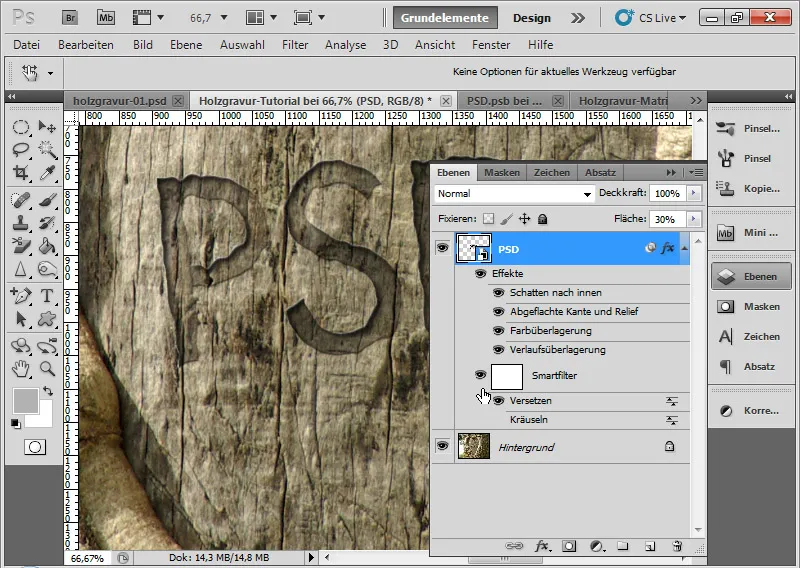
Step 8: Bringing sharpness to the engraving
Now it's time to make the engraving a bit sharper, more structured, and ultimately more realistic.
First, I duplicate my background layer with Ctrl+J. I immediately convert the duplicate into a smart object, because smart filters are also used in this case.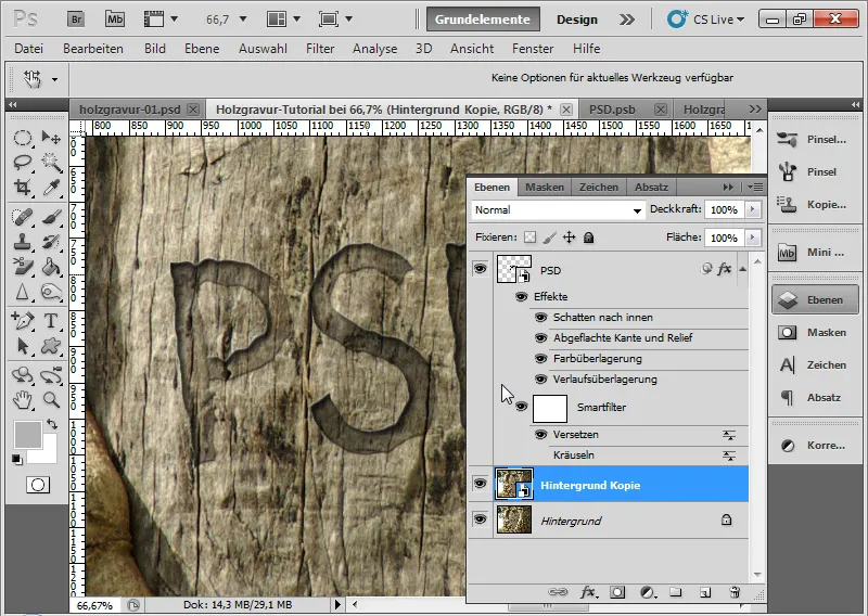
Next, I call the High Pass Filter through the menu Filter>Other Filter>High Pass.
The High Pass Filter tries to detect edges in the image and make them sharp. When the High Pass Filter is applied with a high Radius, it can lead to artifacts besides sharpening. I take advantage of this effect by applying the High Pass Filter with a Radius of 50-100 pixels.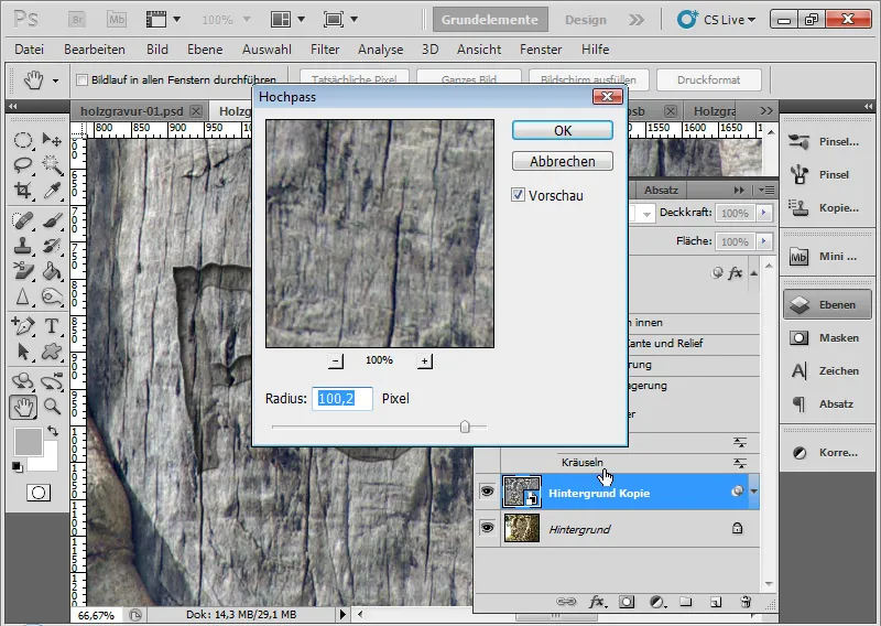
The image still appears gray. I go into the Fill options of the Smart Filter High Pass by double-clicking on the double triangle symbol in the Layers panel. There, I set the fill method to Blend and reduce the Opacity to 50 percent.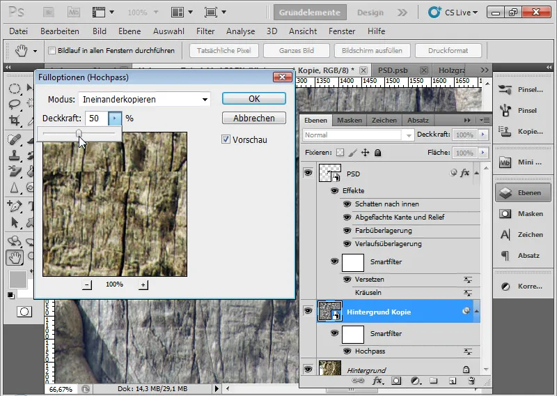
So that the effect only works in the engraving area, I click with Ctrl on the Layer thumbnail of the letter layer. This selects the visible layer content of this layer. I then add the selection as a Layer mask to my duplicated background layer by clicking on the Add layer mask icon in the Layers panel.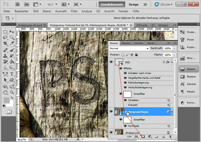
Now the Smart Filter High Pass only affects the recessed area, where it should.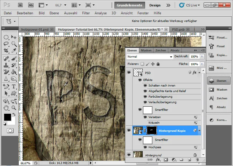
Step 9: Depth Displacement
The effect becomes authentic when the notches in the wood are adjusted accordingly in the recess.
For this, I first release the link between the Layer thumbnail and the Layer mask of the duplicated background.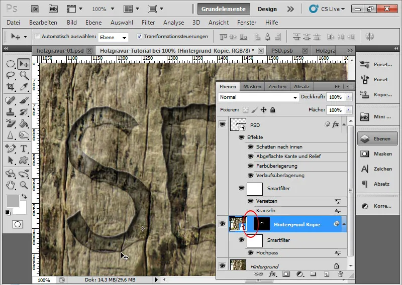
Now I can move the layer content without the Layer mask "moving" with it. I activate the layer thumbnail and simply move the duplicated layer content slightly to the right using the Arrow keys on the keyboard.
The effect becomes slowly authentic. It creates the appearance that the notches are actually slightly offset in the recess.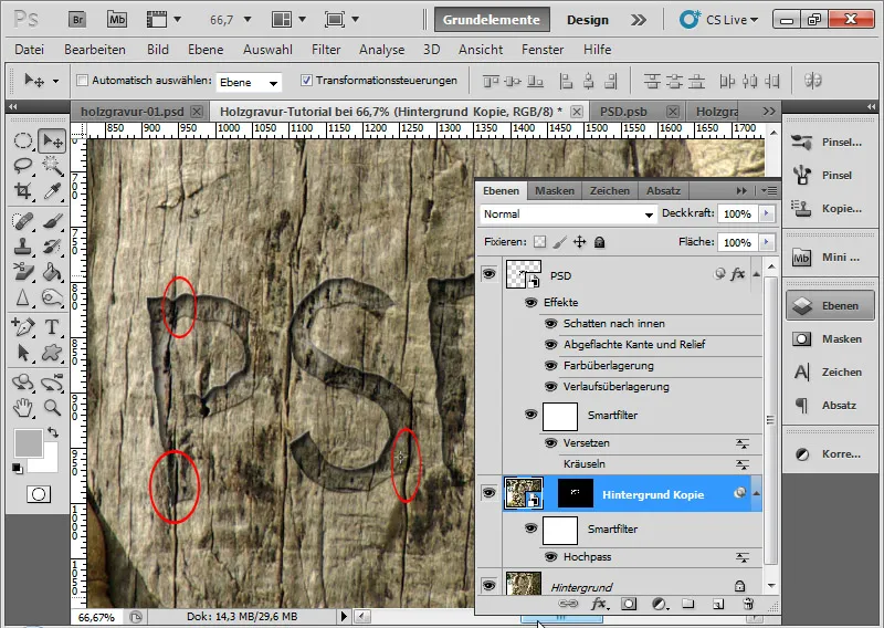
Step 10: Applying Glass Filter - Optional
If I want to intensify this effect of the shifted notches a little more, without simply moving the placement, I call the Glass filter via the menu Filter>Distort filter>Glass.
• Distortion: 8
• Smoothness: 15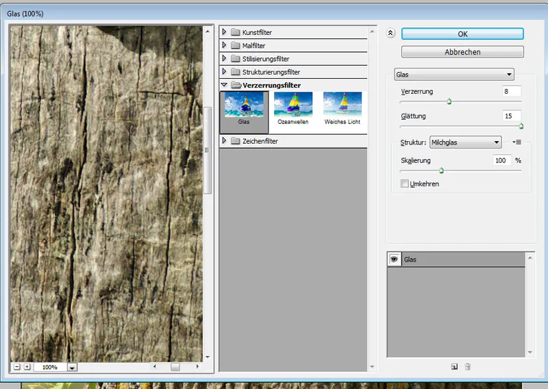
This additionally creates a deepening effect in the engraving, where the notches no longer run completely straight in the recess.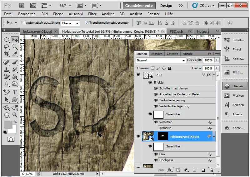
Step 11: Applying Texture - Optional
Although the effect would already be fine after step 9, it can still be intensified with a cutting effect in the recess. This creates the impression that the recess in the wood was carved with a knife.
For this, I need a suitable texture. I take a stone texture provided with this tutorial as working material. By the way: This and many other textures are available on our Textures DVD - available in the PSD-Tutorials.de shop. I must save the texture, originally a JPG, as a PSD file beforehand.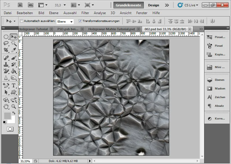
I choose Filter > Texture filter > Apply texture through the menu.
In the filter menu of the Texture filter, I load my stone texture. The hard edges in the texture will simulate my knife cuts.
I make the following settings.
• Scale: 80 percent
• Relief height: 40
• Light: From top left.
Variations in settings have a significant impact on the effect. Therefore, some trial and error is necessary to achieve the best look, creating notches as cut effects.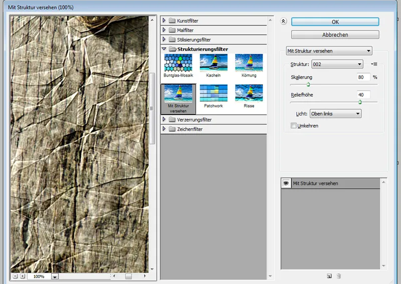
Depending on the desired intensity, I can vary the cutting effect in the Fill options of the Smart Filter in the Opacity. I choose 60 percent.
My effect is complete.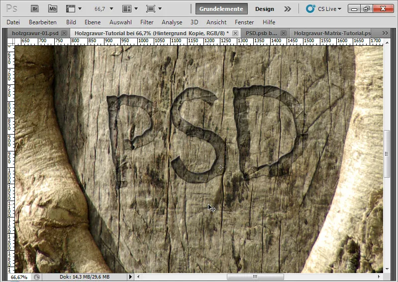
Step 12: Changing Text - No Problem
If I now go into the original Smart Object of my letter layer by double-clicking on the Smart Object thumbnail, I can still change the text afterwards. Don't forget to save the PSB file!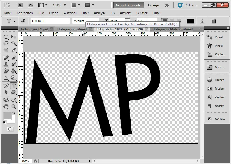
In the second step, I just need to adjust the Layer mask of my duplicated background by generating a new selection by Ctrl and Click on the letter layer and using this as a Layer mask on the background duplicate layer.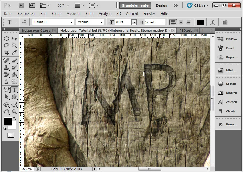
Step 13: Variations and Visual Adjustments
If during editing I notice that a setting in the Fill options may no longer be quite right or I want to intensify or soften the shadow, I can adjust this at any time accordingly. The effect is created in such a way that I preserve all possibilities for variation in the Smart Filters and Layer Styles.
Thus, I can optimize the shading of the flattened edge and relief by changing the Angle and Height.
• New Angle: -59 degrees
• New Height: 26 degrees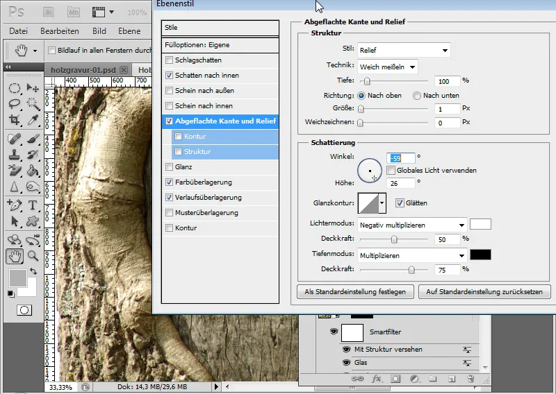
Now the light is falling properly from the top left and also giving my letter edge on the bottom right a more suitable minimal shine.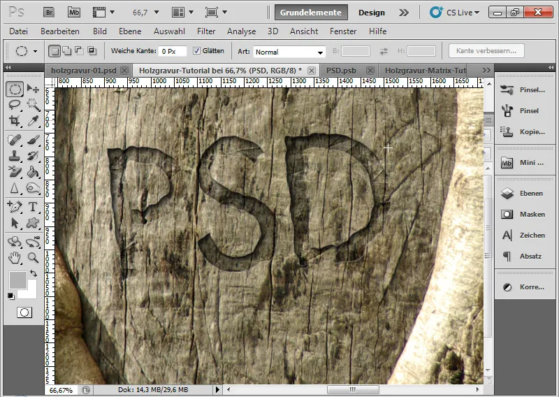
The final image with a slightly scaled cutting effect in the recess.