In this guide, you will learn how to easily create, edit, and format charts in Canva. Charts are an excellent tool for presenting information clearly and attractively. Whether you need them for social media posts, videos, or presentations, Canva offers you a variety of options to visually represent your data. Let's dive right into the exciting world of Canva charts!
Key Takeaways
- Canva offers various types of charts such as bar charts, pie charts, and infographics.
- You can enter data directly and customize the appearance of your charts.
- Colors, fonts, and other design elements are easy to change to customize your charts.
Step-by-Step Guide
Creating a Chart
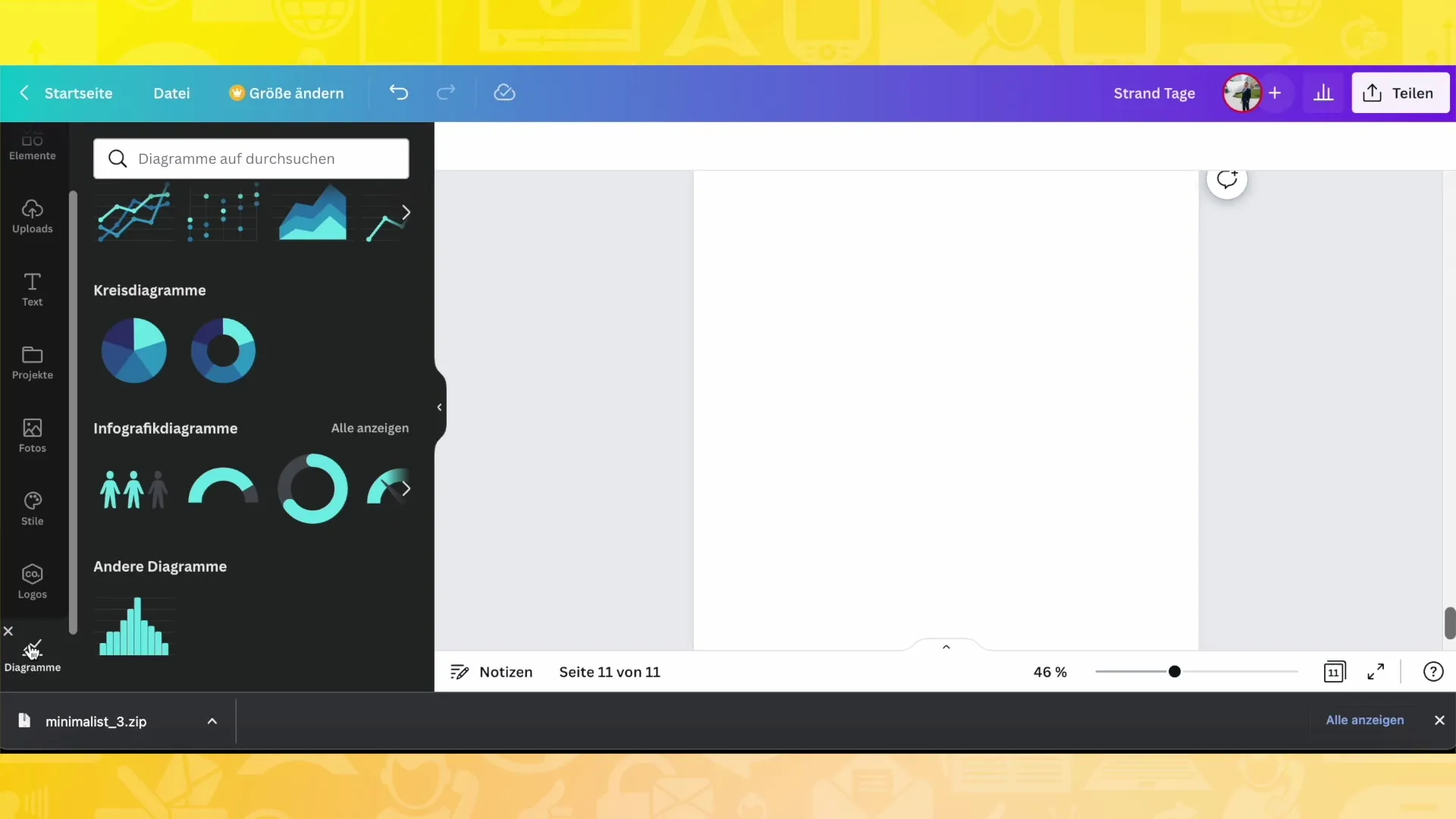
To create a chart, open Canva first and go to the "Apps" tab. There, select "Charts".
Choosing the Chart Type
You will see a variety of chart types, including bar charts, scatter plots, and pie charts. Choose the chart type that best suits your data.
Entering Data
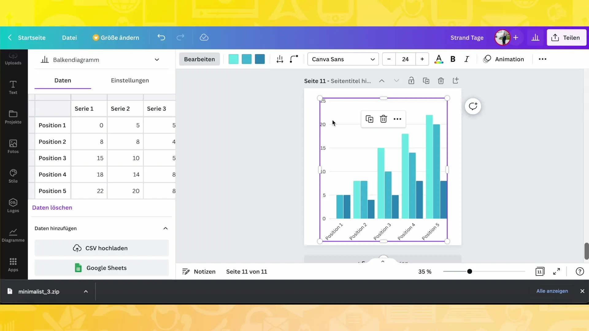
After selecting the chart, you will see various data fields on the left side. Here you can enter or modify your data. For example, you can add the theme "Sports" and create different categories like "Nutrition" or "Fitness Studio".
Adjusting Values
You can change the values in your chart by adjusting the corresponding numbers. For example, if you have a series of values you want to represent, you can update them by entering your desired values in the fields.
Changing Colors
An important step is adjusting the colors of your chart. Click on the color options at the top of the screen to change the colors of the different series. You can give your chart a unified look that matches your brand or the occasion.
Adjusting Spacing and Corners
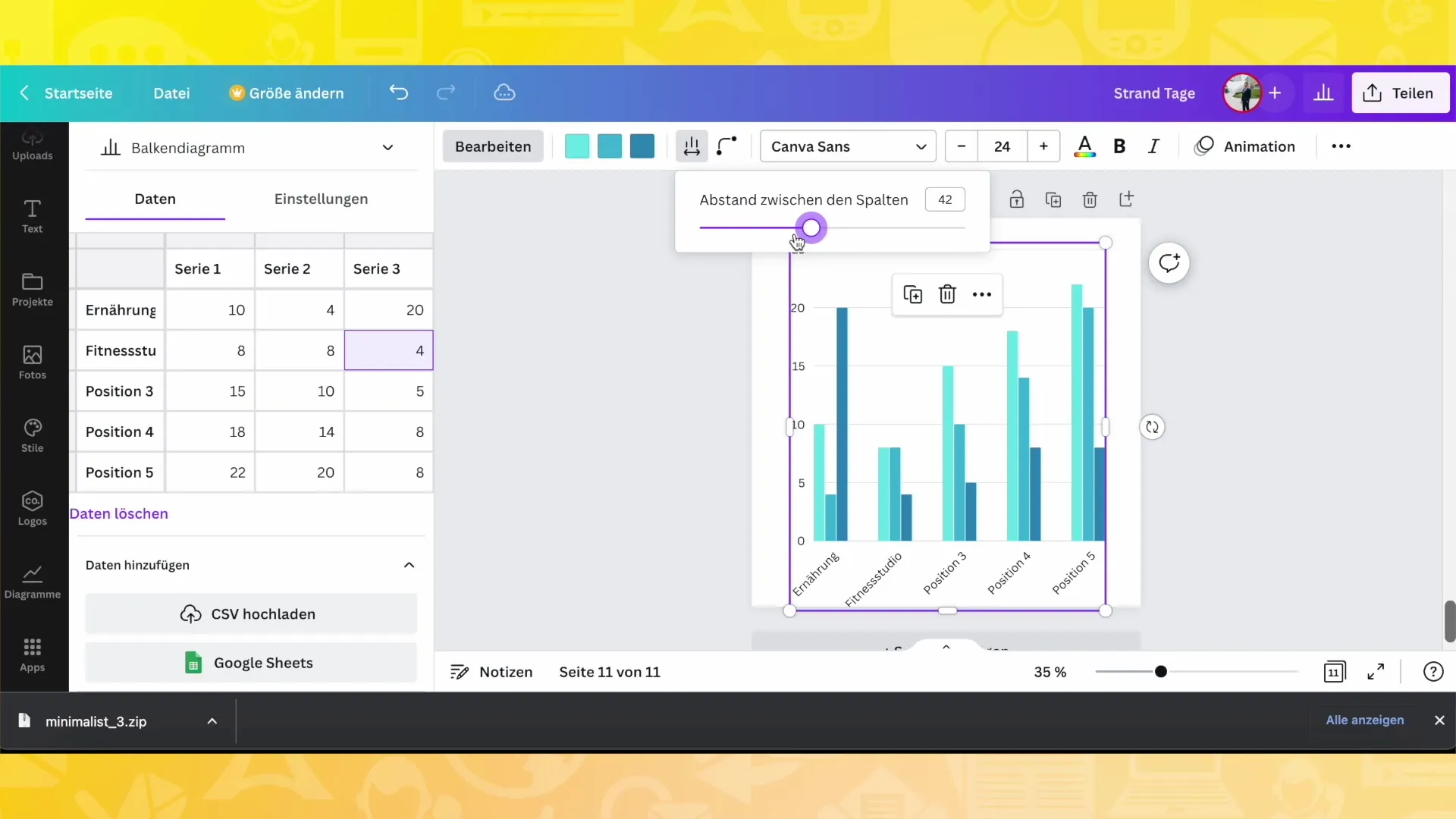
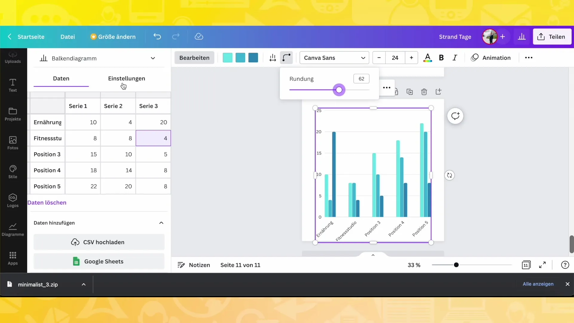
You can adjust the spacing between the bars or representations to make the chart appear more airy or compact. Additionally, you have the option to round the corners of the bars or leave them square, depending on your design preference.
Adding Legends and Labels
A good practice is to add legends to your chart. Click on the settings and enable the legend to see which colors correspond to which data series. You can also customize the labels to clarify what each series represents.
Using Infographics
If you want to make it more interesting, you can also use infographics. For example, you can use people as symbols to illustrate percentage data. You have the freedom to choose between different symbols and representations.
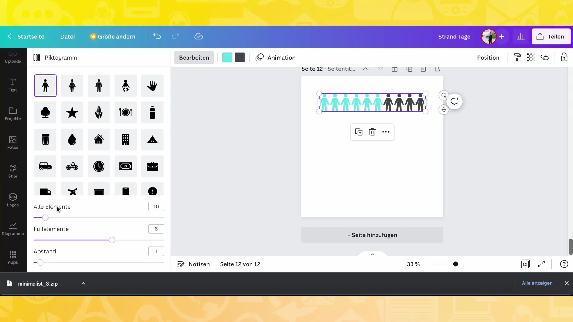
Symbol Customization
Choose symbols that emphasize your message and customize them. For example, you can use people as icons for different age groups or choose specific symbols for certain professions. This gives your chart a personal touch.
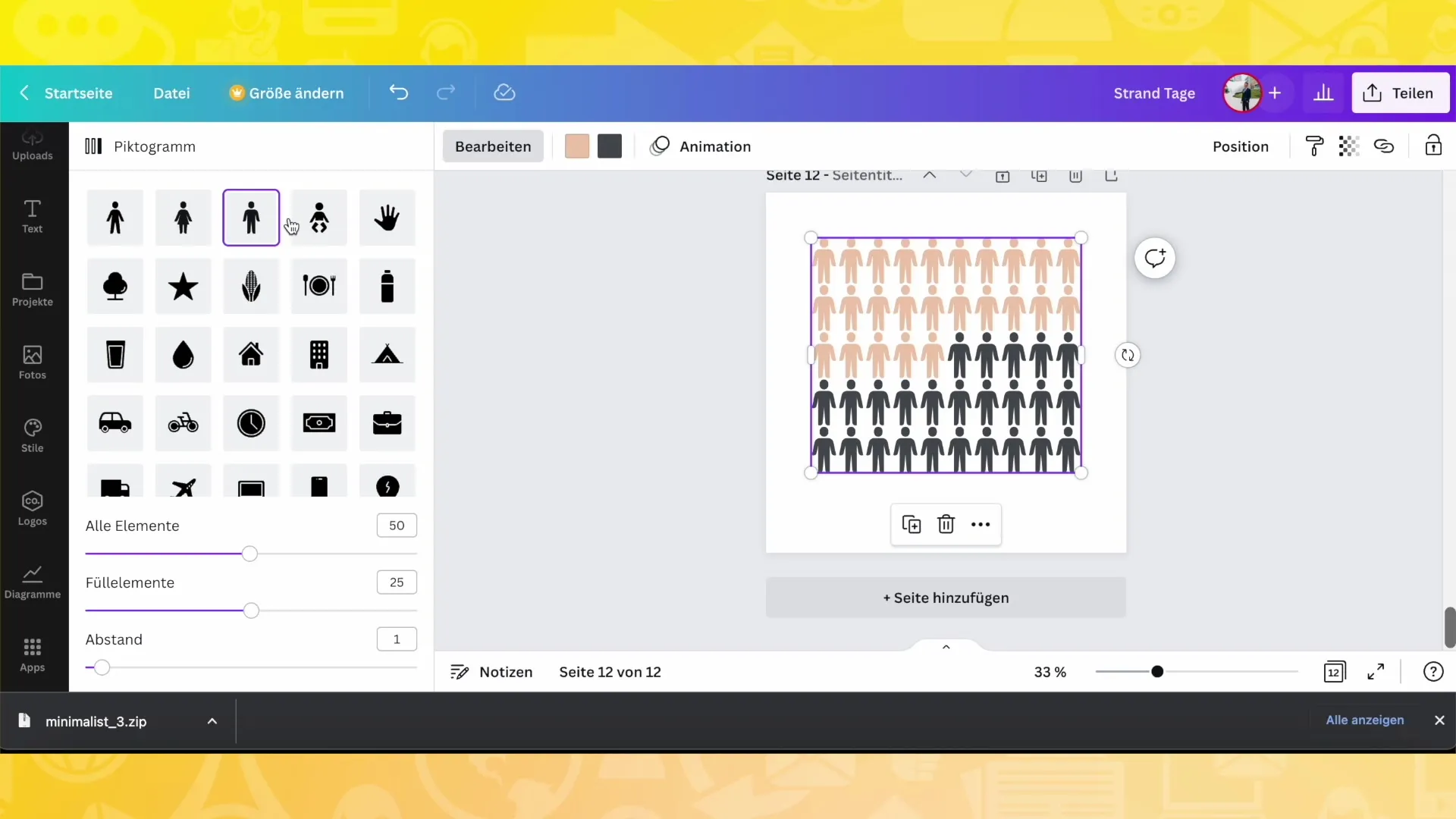
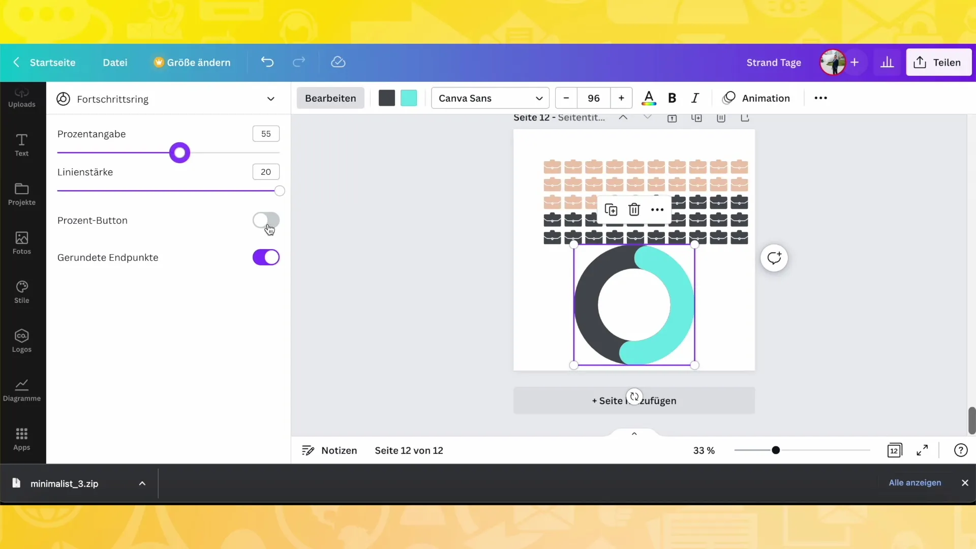
Proportional Representation in Pie Charts
If you prefer a pie chart, you can represent the proportions in percentages and ensure that the actual percentages are displayed. Edit the line thickness or switch between rounded and angular representations.
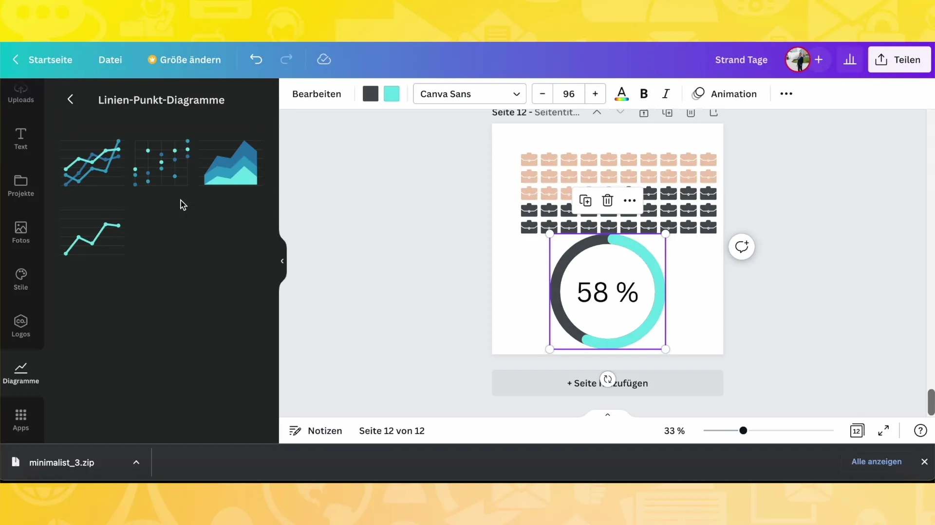
Final Adjustments
Now that you have assembled your diagram, double-check everything. Make sure that the colors, formats, and data are exactly as you want them. You can go back at any time and make adjustments until you are satisfied with the result.
Summary
In this guide, you have learned how to create and customize different types of charts in Canva. From entering data to changing colors, to legends and symbols - the possibilities are almost endless. Experiment with different options to find the best solutions for your projects.
Frequently Asked Questions
What can I do with diagrams in Canva?You can create diagrams for posts, videos, presentations, and much more.
Which types of diagrams are available in Canva?You have access to bar charts, pie charts, dot plots, and infographics.
How can I customize the colors of my diagram?You can change and adjust the colors in the design settings.
Can I change the size or shape of my diagram?Yes, you can adjust the spacing and the corners of the bars or segments as you wish.
Are there additional customization and options available in Canva?Yes, Canva offers numerous ways to customize your diagrams.


