Welcome to the training "Animation in After Effects" from PSD-Tutorials.de. I am Philipp Sniechota and I will guide you through the training..webp?tutkfid=56215)
I would like to dive into the world of animation with you using a practical project and look at what is important for good animation.
We will use After Effects as a toolkit, as a tool and not deal with the basics. We won't be learning how to create compositions, use color areas or apply effects, but we will be looking at what makes a good animation. The knowledge you gain here can then be transferred to many other areas. You don't even have to think about 2D After Effects work. It goes all the way to 3D and even character animation.
This training is interesting for anyone who is interested in motion design and has to do with animation in their work.
We do a project together that I have called "Animation made easy". We will make a short trailer that deals with animation itself. We're going to establish, piece by piece, what beautiful movements are, what's important and what rules you can follow and implement in After Effects. It will be about how this implementation works, what tips and tricks I have in store and what needs to be considered.
The practice project is stylistically very reduced. I only worked with two colors, didn't create any large illustrations and generally kept everything very simple. In terms of style, I also went back to the time when the pictures were learning to walk.
The animation skills I'm teaching you have been around for almost 100 years and have been used by Walt Disney, Pixar and the other big animation studios ever since.
I want to explore this world with you in a way that is broken down as much as possible so that you understand the essence of good animation by the end. With practice, because that's also part of it, you can ultimately enrich your moving image projects.
With this in mind, I hope you enjoy this training, have an instructive time, and I'll see you again soon when it comes to the basics of animation, namely the basic work by Walt Disney, the "Disney Rules - Part 1" and then we'll continue with the color concept.
Before we start and dive into After Effects, I would like to say a few sentences about the concept, i.e. a few sentences about what you do before you start.
You should think about the direction you want to take stylistically and the look or mood you want to convey.
In this case, I thought we'd get away from the high glossy motion graphics and shiny spheres that we're familiar with today from Sky and American television. Let's take a step back to the time when animation started, to the time of cartoons and Disney Rules, and give our video a little cartoon-like look.
Of course, we don't want to create a cartoon because that would be far too complex and we also want to work with After Effects. So we use the style of the cartoon and then implement it in After Effects. What helps us with this?
Step 1
In this case, I have already decided to use a handwritten font. This font is not hand-drawn by me, but is a font that you can find under the name Amatic at fontsquirrel.com. Many thanks to the creator Vernon Adams.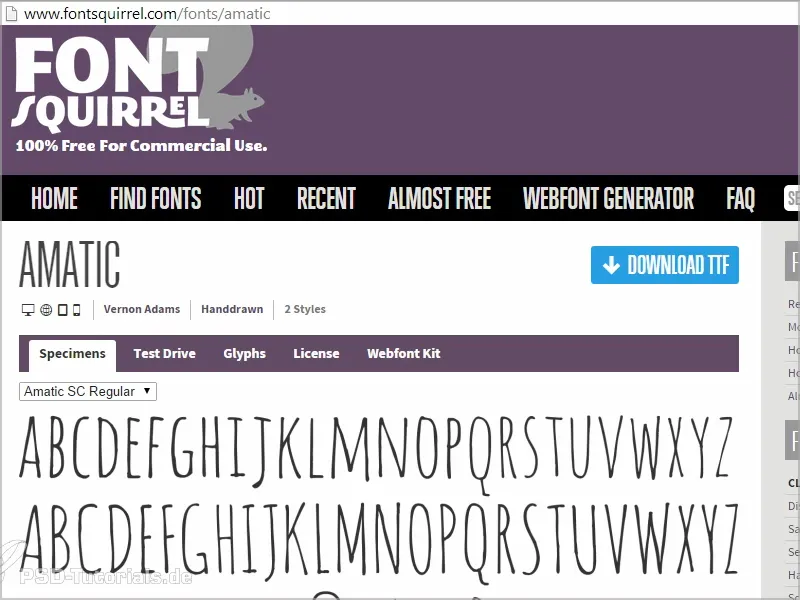
We have uppercase and lowercase letters, which are all written in capitals, but this gives us two font variants. The lowercase letters are redrawn versions of the uppercase letters.
A beautiful font that works very well animated.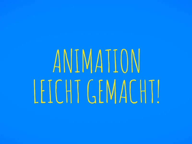
I will show you in one of the following tutorials how to make it look as if every frame has been redrawn.
To do this, I first download this font and install it.
Step 2
In order to capture even more of the feeling where the pictures learned to walk and the movie began, around 1900, I decided to go in that direction musically as well. Ragtime is reminiscent of Charly Chaplin, Dick & Doof and all those early attempts at television films and, of course, the animation industry.
I found the right piece at Incompetech.com by Kevin MacLleod. He's a great guy, has been around since March 2006 and covers quite a few songs and styles on his site. Especially the latest stuff is great and he also recorded the "Fig Leaf Rag", a Scott Joplin classic for silent movies.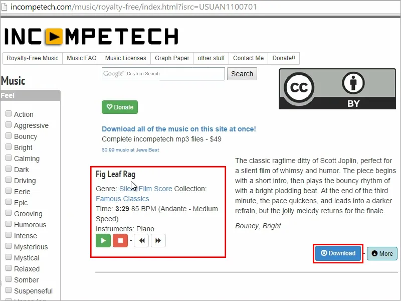
That's exactly the style I was looking for. The piece also has beautiful accents, which is always good for animation. So we have certain parts that go with the music. In these parts we can animate fantastically and almost build up chapters.
I download the piece of music.
Step 3
In terms of color, I decided to leave it relatively reduced in blue in combination with yellow, so we only use two colors that are complementary to each other and therefore stand out from each other very well.
In this case, it also works very well in the other direction, i.e. yellow lettering on a blue background or blue lettering on a yellow background. I can play with this, divide the video and create chapters by changing the two colors in the middle of the animation, for example to create a visual divider between the explanatory and questioning positions. This works very well for such cases.
Step 4
We want to create a setup for this and first create the project file so that we can animate nicely and concentrate on it.
We open After Effects and get the "Fig Leaf Rag" directly from the sound folder and import it into After Effects..webp?tutkfid=56220)
The duration is still displayed here as 3:29, but the video won't take that long of course. We will end the piece after about half a minute.
Step 5
To start, we drag "Fig Leaf Rag" onto the composition icon and generate a composition.
I check the composition settings by right-clicking or Ctrl+K. Everything is fine here: we use the default setting: 720 25, i.e. half HD with 25 frames per second (frame rate), because we are in Europe.
Let's leave the length as it is, then we have room at the back. We don't need to worry about that yet. We confirm this with OK.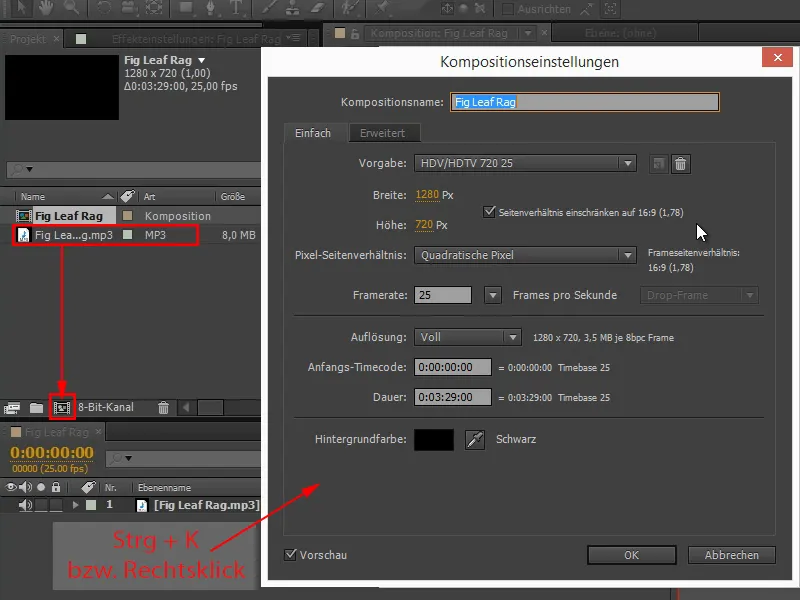
Step 6
The font is installed and set: Amatic SC.
I write "Animation made easy" and set the font size slightly larger.
A little tip at this point: I would always try to set the font size in the control panel. I keep seeing people writing text and then grabbing it using the handles and holding down the Shift keyto make it bigger. I don't recommend this, because all you've actually done is change the scaling of the layer. This is not a problem in terms of quality, because texts are vector-based in After Effects, but it is a bit difficult if you want to design different texts uniformly - because you should never have too many font sizes. And then it becomes difficult to get them to the same size.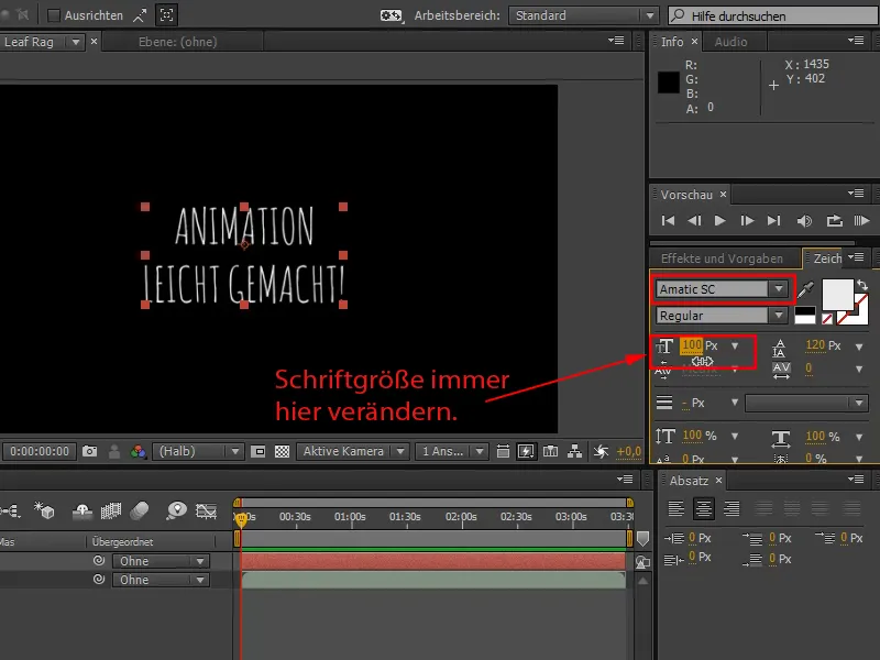
I would reserve scaling for scaling up and zooming in. For creative and basic layout, I recommend the character palette and the font size.
I have another tip for you when working with text:
If you move the cursor into the text, you can adjust the spacing between the individual letters, i.e. the spacing (also known as spacing or kerning), in great detail.
I always see people using the slider in the control panel - if I select everything, I have the complete spacing here - and trying to kern the text. That's a masochistic way of doing it. With Alt+arrow keys left or right, I can do the whole thing really conveniently and stay in the middle of the text. I can spationalize the text until I like it.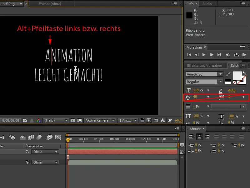
In our case, a slightly awry spacing makes no difference, because we're in the handwriting look anyway and perfect spacing isn't as necessary here as it would be with a sans Serif.
Step 7
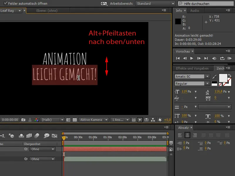
Now I would like to change the line spacing. Again, there is a slider, or you can triple-click on the second line to select the whole line.
And then you can easily position the line as you like it by holding down the Alt keyand using the up and down arrow keys.
The automatic size is also applied directly and gradually decreases, which is much more convenient for me personally.