Even though Photoshop is getting smarter and smarter, producing better and better tools for cropping and the algorithms of these tools are constantly being refined, we still fall back on tried and tested techniques from time to time. For example, in this picture here, where we want to add a new background.
The tried-and-tested technique of clipping using channels is ideal here. Why? Because I want to draw in a new background in this picture and also have to cut out all these sky-blue spaces between the wooden beams. Other tools would be confused by the blue parts of the clothing. So I have almost no choice but to do a channel clipping.
Clipping via channels is about the following: You simply assume that there is already one in Photoshop's channels that is already relatively close to the mask that will later be used. If we take this image here, it doesn't seem too far-fetched to think that the blue channel - blue sky - or the red channel - the opposite of blue sky - might work quite well.
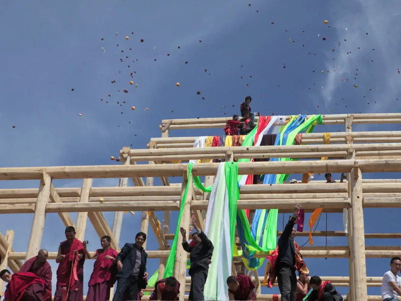
Well, the red channel probably won't work because the red guys are too present and too often in the picture. But we could just see if there is another channel that works well.
1. RGB color
So the decision has been made as to which way to release and we are now at the channel release.
To do this, I switch to the channels and first click on the red channel. We can already see that the blue sky appears quite dark and the beams are nicely highlighted. But the boys are quite dark, darker even than the sky, while the beams are lighter than the sky. This means that the sky is in between and the red channel is a clipping channel.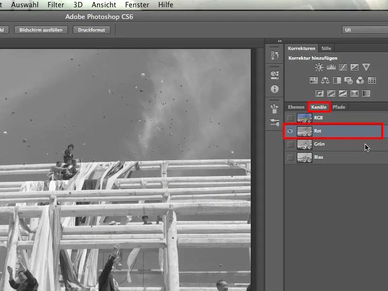
We now take a look at the green channel and see that it is unfortunately the same here: the boys are darker than the sky, while the bars are significantly lighter than the sky.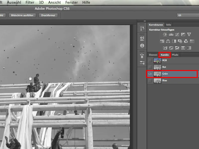
That leaves us with the blue channel. It doesn't really offer what we want either. The contrast between the bars and the sky is simply too low: at the top, the bar stands out brightly against a slightly darker sky. At the bottom, the bar is rather dark against a lighter sky.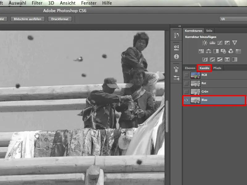
Both the red and green and blue channels do not work at this point, and with this realization many people give up. They say to themselves: None of the three channels work, so I have to think of something else. Perhaps they then try the color range selection.
I'm not saying that wouldn't work, but you'd have to do a lot of repairing and touching up afterwards, because there are a lot of color tones that are not only represented in the sky, but also in the rest of the picture - think of the jeans, for example. And that's why we keep looking.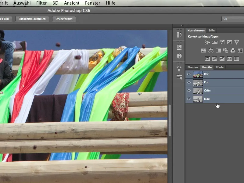
I now claim that each image has not just three, but 10 channels.
2 CMYK color
So let's look at the next four channels. All I have to do is convert the image and click on Image>Mode>CMYK Color. Now the three RGB channels are converted into four channels. This is relatively quick: Photoshop tells me that I'm doing this and I confirm it.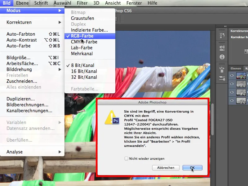
We first look at the cyan channel and see the difference immediately: this is a completely different number than before. Even from a distance, you can now see very nice, very bright bars against this rather dark sky. And this applies to both the top and bottom of the bars. The bars are significantly brighter everywhere than their background. The cyan channel works best - at least for the moment.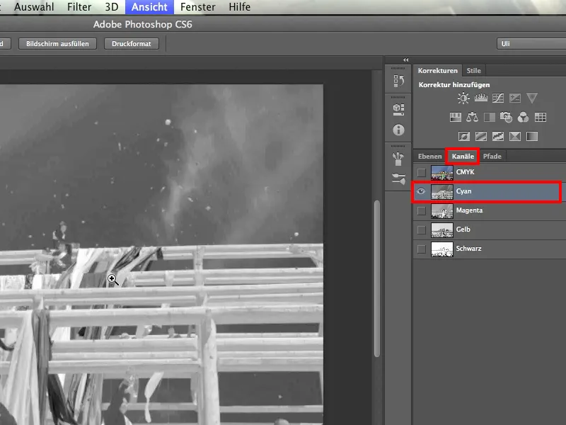
What is unfavorable, however, is that we have a few figures standing in front of a similarly dark sky with a dark jacket, for example. We will probably have problems. So the result with the cyan channel isn't really wonderful yet.
But by the way: it's worth taking a second look at the subject of this photo. At first glance, it looks like a medieval topping-out ceremony, but the monks are equipped with state-of-the-art camera and telephone technology. They really know their stuff.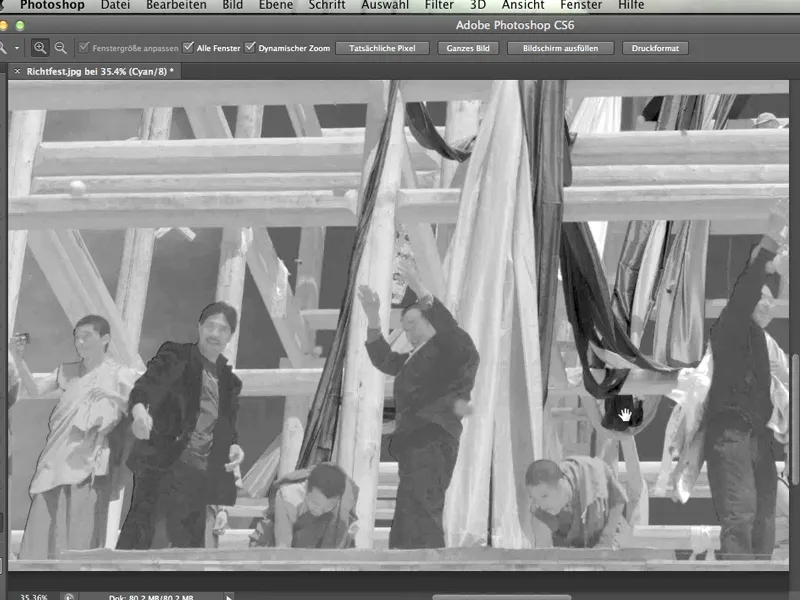
Now let's take a look at the magenta channel. We can see at first glance that this can't work because there is a huge difference between the beams and the monks.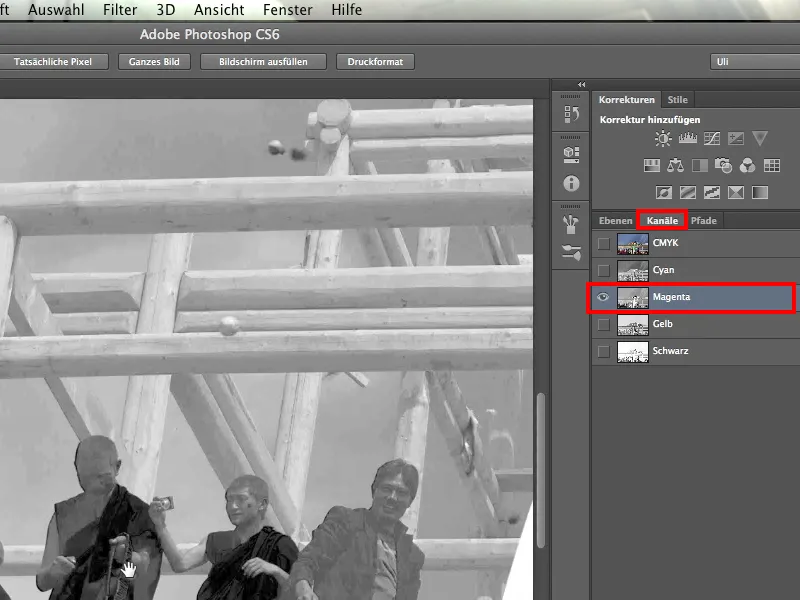
Let's take a look at the next channel, the yellow channel. As expected, the beams are a little darker and the sky is very bright.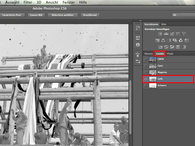
That leaves the black channel as the last one - and it doesn't work at all.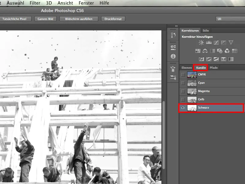
3rd Lab color
And now we can take a look at the last three channels: those of the Lab color model. To do this, I click on Image>Mode>Lab Color. This is often a really great way to crop, but only if it works.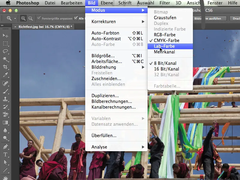
Let's take a look at how the Lab channels are structured. For those who have no idea, a brief explanation:
There are two directions. Direction a is everything from yellow to blue; on one side is yellow, on the other side is blue. And direction b. That's magenta and green, don't hold me to that - maybe it's the other way around. Think of it as two meters, one on top of the other. Now you can put a circle around these two axes at any point and pick up exactly the colors you are looking for. It has either a higher or lower proportion of blue, a higher or lower proportion of green, magenta or red.
And that's why I can select any color in this way. Multiplied by the brightness - that's the third channel - I can even choose any hue.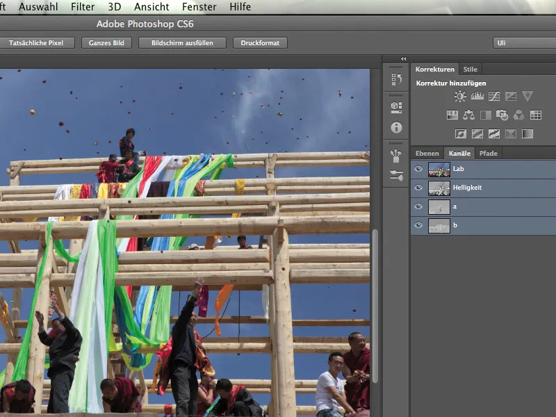
Now to our 8th channel: This is the brightness. It works in a similar way to black, except that it is not quite as intense because it really contains the entire luminance of the image and is therefore very finely graduated.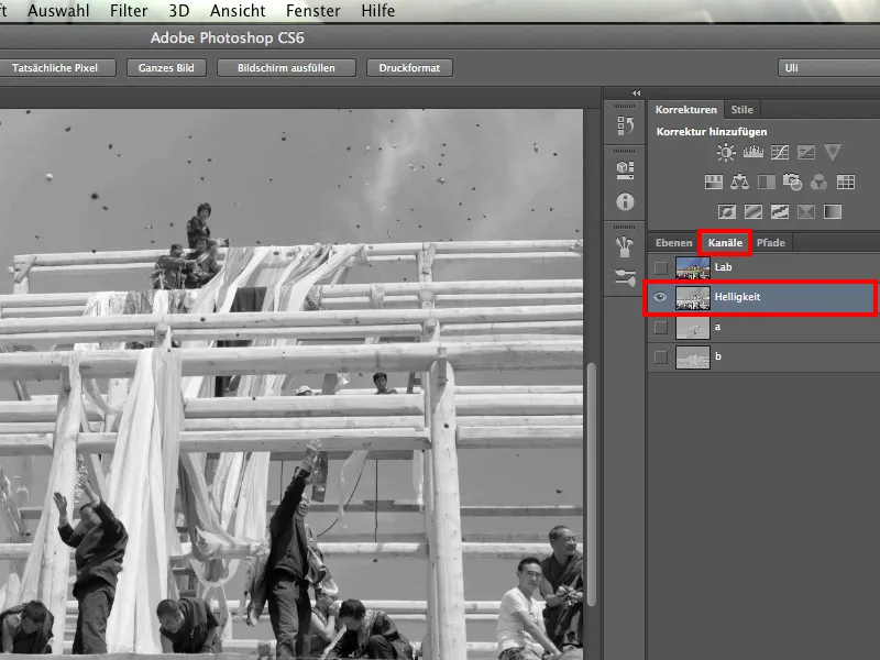
We have the a channel, which looks like this and is really the least effective.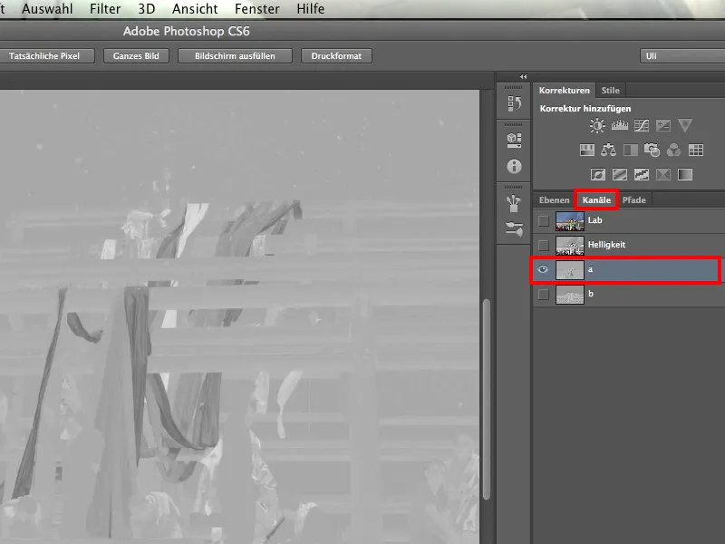
And whenever the night is at its darkest, the light is close, which in this case is the b-channel.
Take a look at this. You might have doubts at first because we don't have a particularly high contrast here, but contrast is not a problem. After all, we can work out contrasts ourselves. It would be a problem if we had a lot of different brightness values on one side and none on the other.
But the sky is almost uniformly gray everywhere. The beams are significantly brighter everywhere, regardless of whether it is the light or shadow side of the beams. Even the rather dark robes of the monks are clearly lighter than the sky.
So this is our channel for cropping.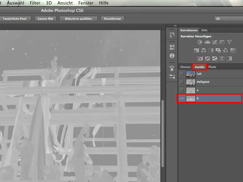
Of course, we also have a few blue tones in these fabric panels, but all colors are represented there anyway. It's almost clear that we have to do a bit of reworking by hand.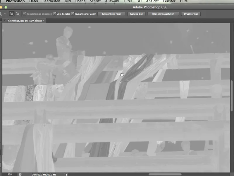
Even the hair color of the monks, which was very dark, stands out more brightly against the dark sky. We have definitely found the right channel for our purposes.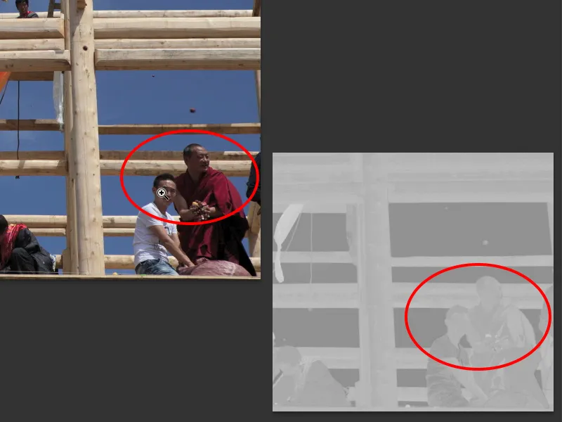
And it's not so much a question of going straight on now. What I want to show here in this tutorial is that we first have to check the image for its suitability or the suitability of the channels. You should not be tempted to give up after RGB, but should definitely also look at CMYK and Lab.
What do we do now with this knowledge? Of course: We memorize it. And then we go back to Lab and look further.
4. layer mask
Now that we've figured out which of these 10 channels works best, namely the b channel, let's pick a tool to continue working with. Many people don't like the tool we choose afterwards. I, on the other hand, think it's great, and once you've seen how great it works, you'll probably agree with me.
But first, let's go back to the layers, because now we need to create a layer mask from the channel we've chosen so that we can actually hide the background. The tool I mentioned above will help us with this.
I click on Image>Channel Calculations.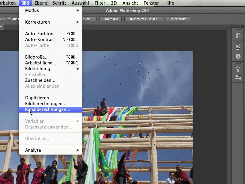
And there you can see that we have several sources. Source 1 and Source 2. You might be surprised, because we only have one image file open. But you can see immediately that our image Richtfest.jpg is in both Source 1 and Source 2. This is because we only have this one image open.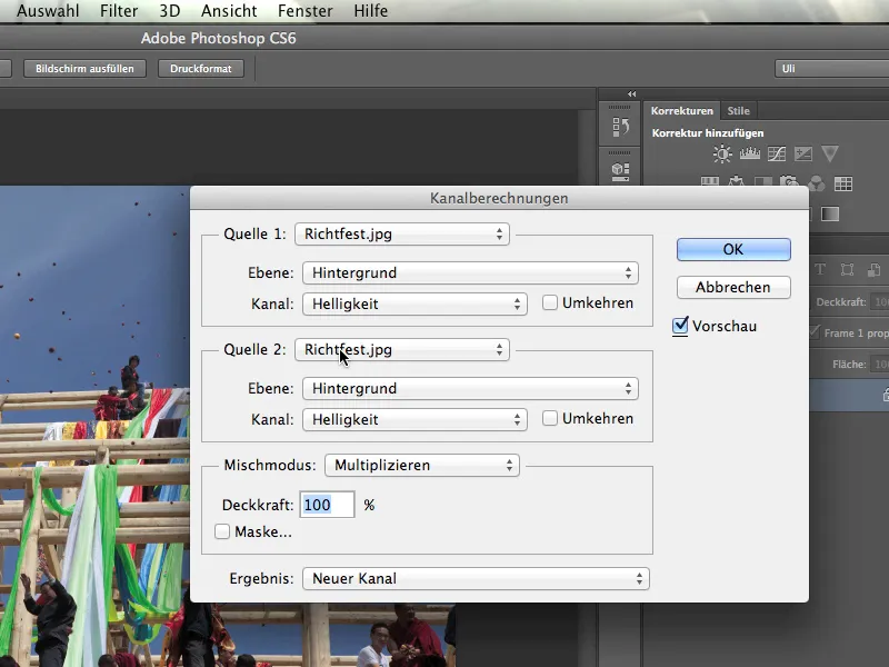
It looks similar with the layer. We only have a single background layer, nothing else. That's why we can't select anything here.
But now we're starting to use our knowledge that it's not the brightness channel, but the b channel, and I'm going to click on it.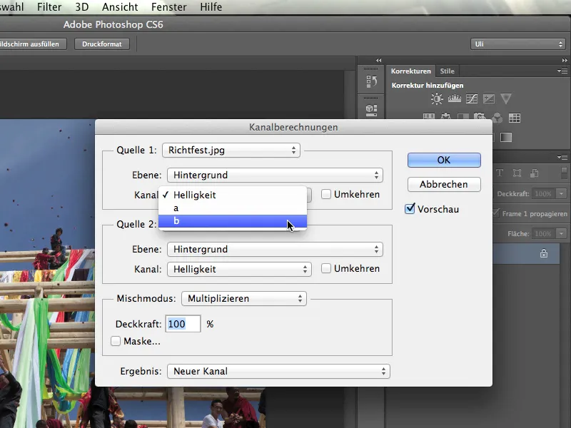
I now want to offset this b channel against itself. So I also change the channel for source 2 from brightness to b-channel. And now you can see how this thing works and how channels are simply offset against each other here.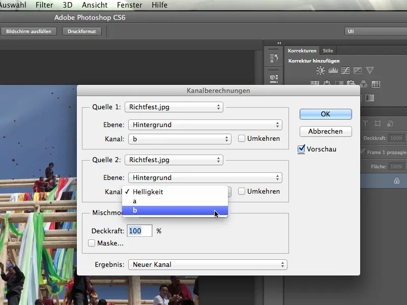
We now set the mixing mode to Hard light, because I don't want to use the Multiply preset here.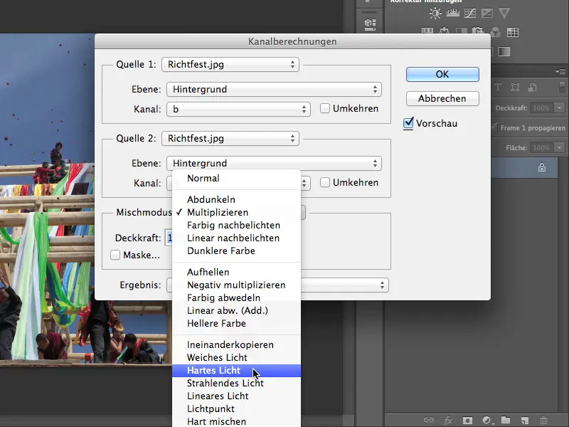
You'll have to try out which mode is best. This is Hard light, relatively often it is the Multiply mode. And even though it says "blend mode" here, that's not actually what it means. Rather, it is a "filling method". This tool offsets channels against each other according to the blending methods that we also know from the layers.
Everyone knows that and how layers can be offset against each other. But not everyone knows that you can also offset channels with a special tool. We know that now.
Let's go a little further and see what else we can find here. The result can now be a new channel and we'll select that at this point. In any case, a new channel has already been saved. Of course, you could also simply create a new document or a selection from which you can then create a layer mask. I'll just stick with the new channel here.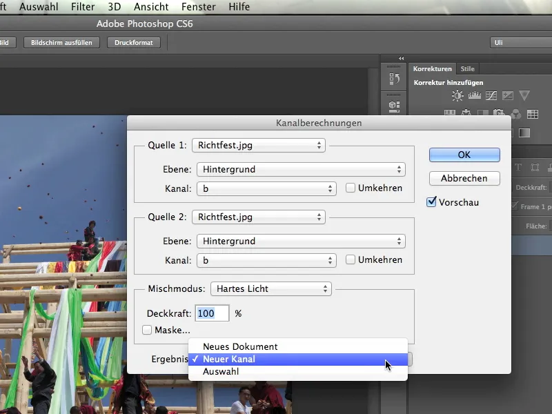
What I get now looks wonderful - it's exactly what I want. We can still see that the whole structure here is lighter, and we can still see that the sky is darker. But the contrast has really increased.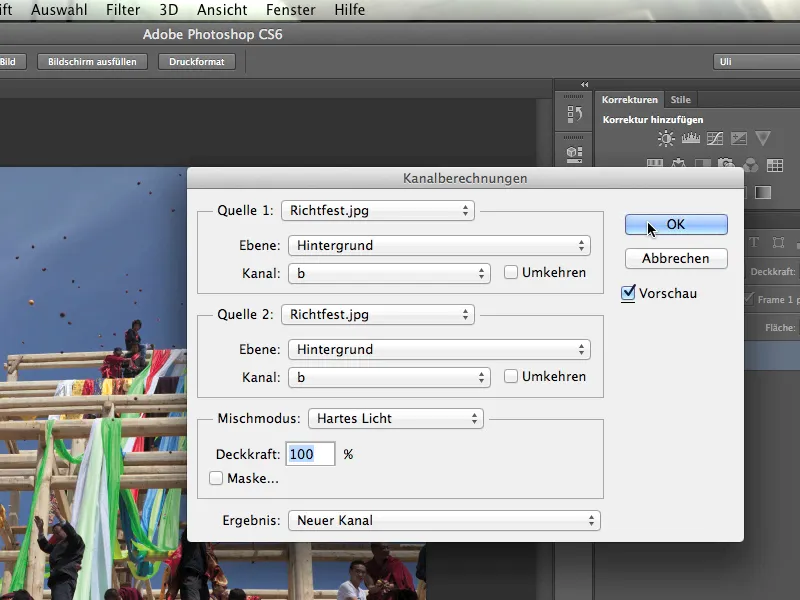
If we look at the channels now, we see the b-channel and the alpha 1 channel that this tool has just calculated for us. And you can already do a lot with that.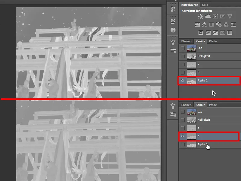
So once again: To convert the channel we have found out into a clipping channel, it is calculated with itself via Image>Channel calculations. And it is also best to create a new clipping channel, which is now called the Alpha 1 channel.
Just a few words about these channels in particular: An alpha channel is basically nothing more than a saved selection. The fact that this is stored in the control panel of the color and brightness channels is purely arbitrary. Photoshop could theoretically have created a fourth tab "saved selections" for the alpha channels. This would probably have been less irritating and many people would be more comfortable with alpha channels. So just look past this strange filing and remember: Alpha channels are saved selections.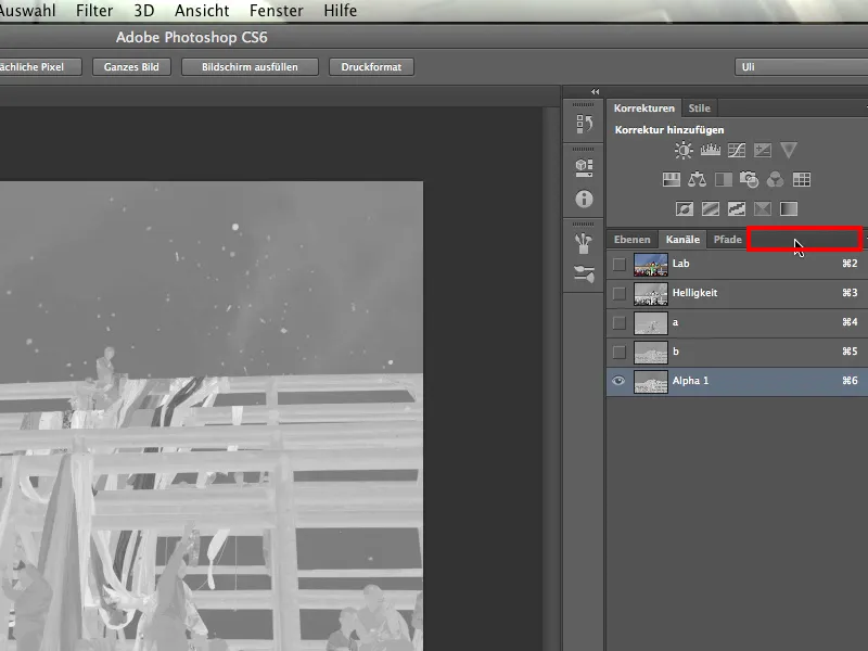
Now, however, we have to build a proper layer mask from this channel, our selection. To do this, I go back to Lab and the three channels and make sure that the alpha 1 channel is now unchecked .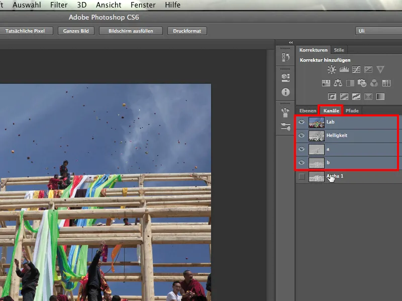
Then I go back to the layers and load my saved selection: Selection>Load Selection. Photoshop asks what I want to load and I select Alpha 1. After all, it is the only saved selection. I confirm the whole thing by clicking on OK.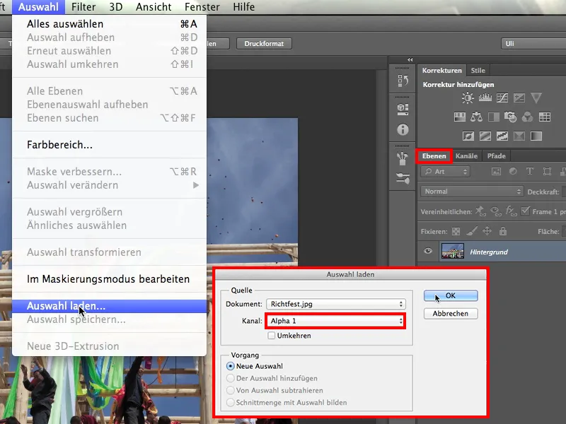
What I get now looks promising, because you can see that the ants are also dancing around all these celestial objects.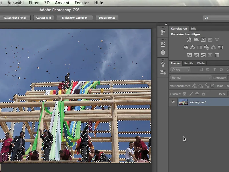
Now I can create a new layer mask by clicking on the layer mask symbol.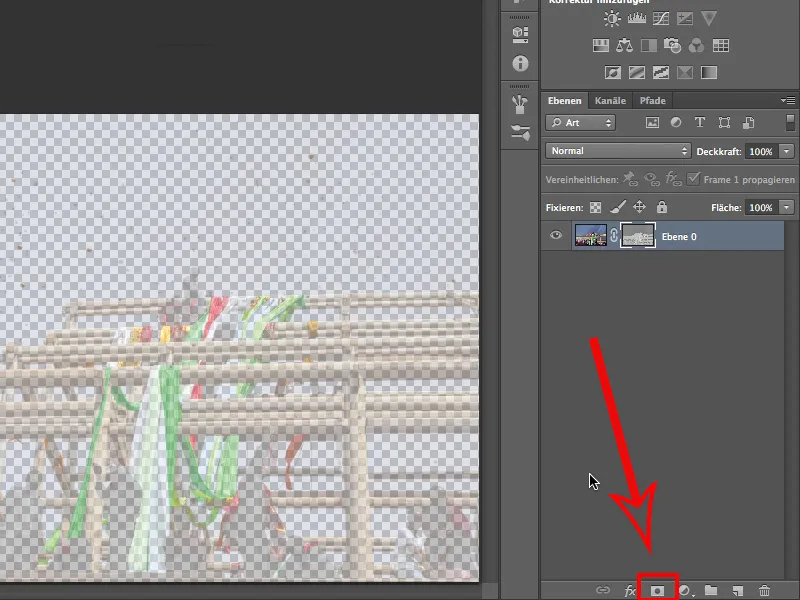
But what we see here is still not really good. We still don't know exactly whether this is what we want or whether we should reverse it? I try it by activating the layer mask icon and then clicking Ctrl+I.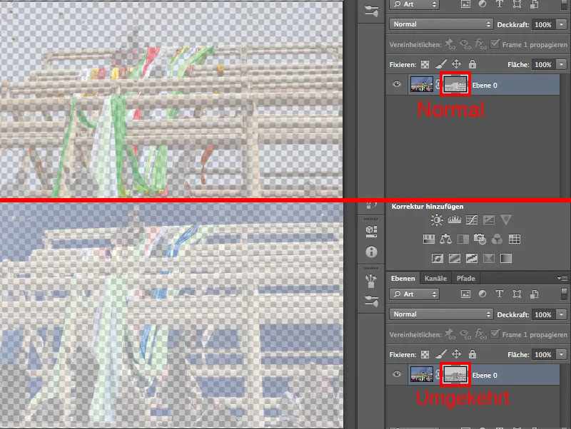
No, undo. That was what we wanted. The foreground is still relatively transparent, but the sky has been masked out quite well.
We mustn't forget that we were working with a mask here. I take another look at it by holding down the Alt key and clicking on the layer symbol and see that it will work really well as soon as we have managed to make it sharp enough.
5. work out the layer mask
Our mask is still too blurred at the moment, i.e. not sharp enough. This is because it does not have black and white tonal values, but mainly dark and light gray. That may look quite nice, but it doesn't work for us because it has to be black everywhere we don't want to see the sky. Everything else has to be white.
So I hold down the Alt key and click on the layer mask.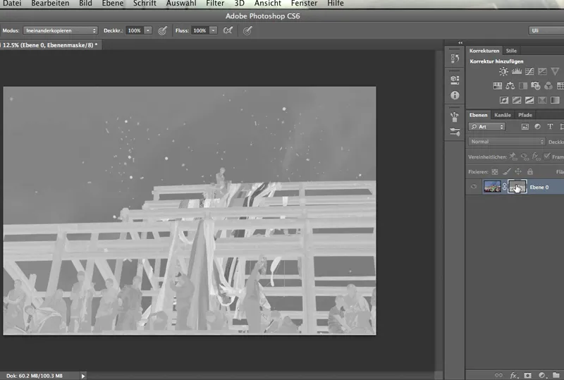
The sky is dark gray, the blue of the sky is not yet sufficiently faded out. And the beams and the monks in the foreground are not yet light enough. We still need to do something about that. We need to increase the contrast of this layer mask. We normally do this with a correction layer.
However, if it is a layer mask, as in our case, this will not work. We need to access the tool directly.
We access either the gradation curves or the tone value correction via Image>Corrections. You could also use Brightness/Contrast, but this gives you very little control. This function works linearly or only in one direction at a time, without being able to bend the curve in any way.
We now do this with the tone value correction because we simply have more options there.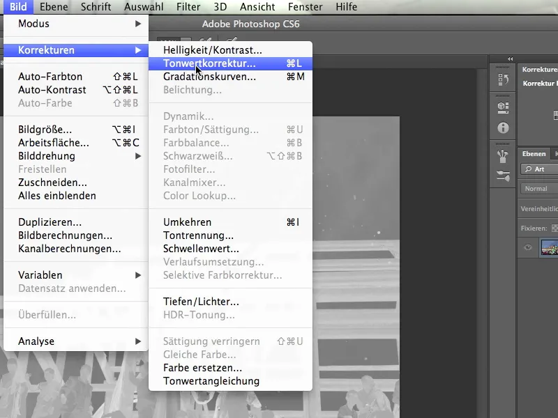
So I click on Tone correction,...
... and if you can read a bit in a histogram, you'll immediately understand what's going on: You can see this tower, this high rock on the left-hand side of the histogram - these are the darkest tonal values. Because there are relatively many of them, you can even imagine that this must be the sky. I say "relatively many" to mean: We have a high deflection, which speaks for the number of tonal values in this area. And they are close together, just like in the sky, which is quite monochrome.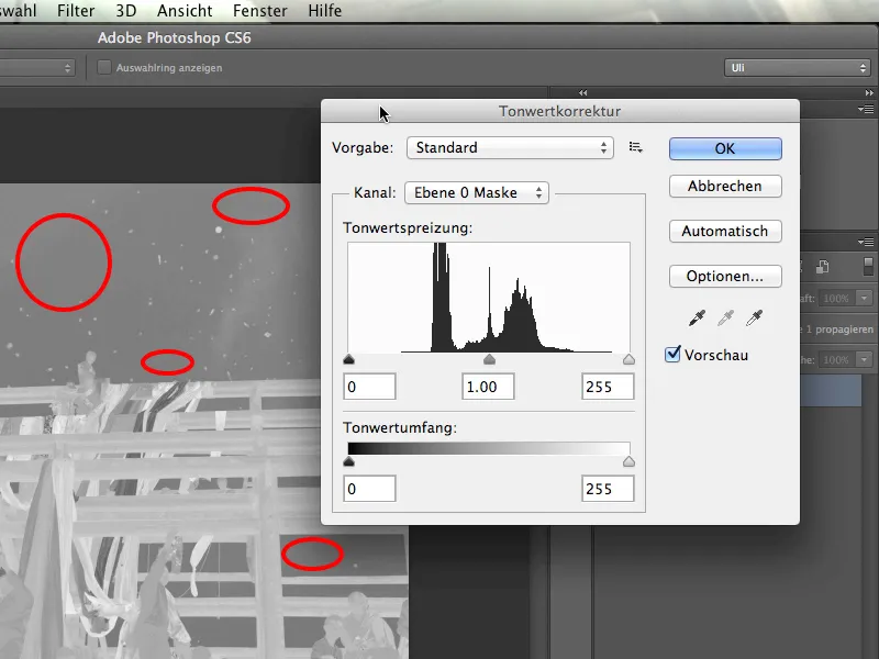
So we have identified the area of the sky in the histogram and now we want to make it really black. To do this, I grab the left slider and drag it a little to the right. This has already made the sky really black.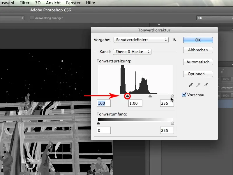
Now we continue on the right-hand side of the histogram. We need to make sure that the brightest tonal values are also significantly brighter. So I grab the slider on the far right and pull it gently to the left. This makes everything that is bright a lot brighter.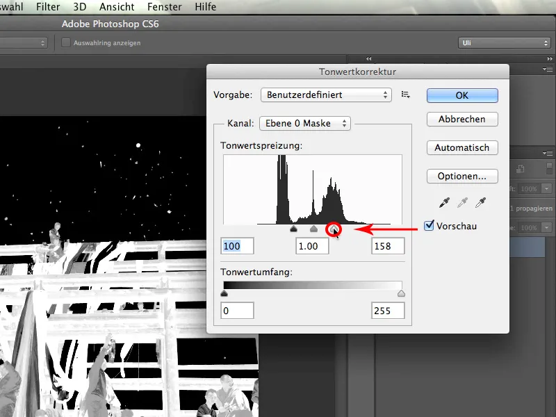
This has already increased the contrast considerably, but there's still room for improvement ...
I can also make the areas that are already quite bright a little brighter. To do this, I move the middle of the three sliders further to the left. The selectivity of the mask has increased enormously compared to before and works quite well. I confirm this dialog and you can see ...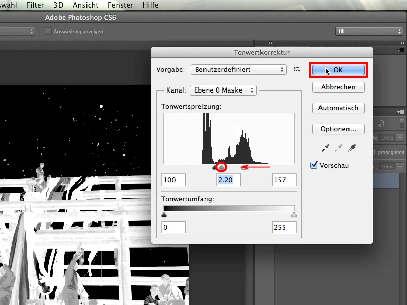
... that everything has become much brighter. Even the darker tones of the people are much brighter than the sky.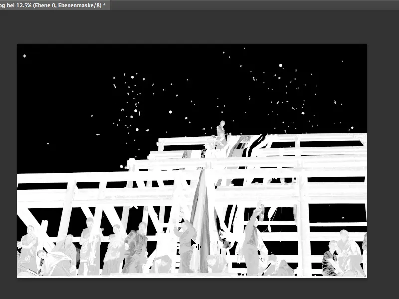
6 Touch up manually
The only thing left to do now is to make the already bright tonal values even brighter. As you can easily paint in any mask however you like, we can of course do the same here. I set the color to white and get a brush in Normal mode.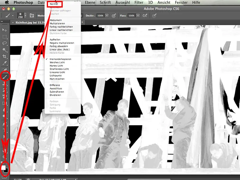
I then simply paint into the picture in the places where I want my mask to be white. It's relatively easy and looks like this: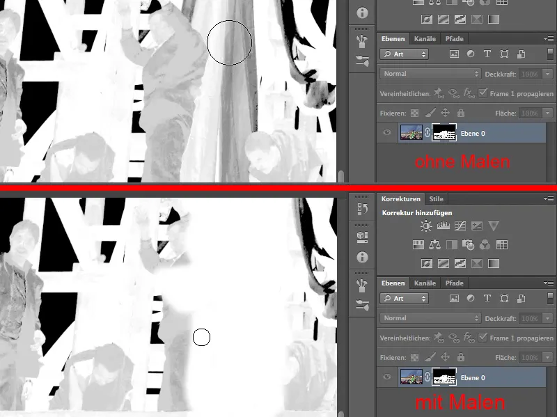
The story only becomes problematic at the points where I must not slip into the black background under any circumstances: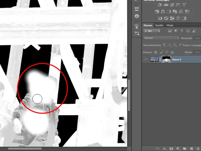
That's why I switch to Mode>Copy one into the other.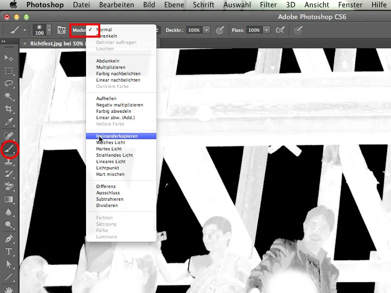
The brush now paints just as white as before in Normal mode. However, in the Interleave mode, it can no longer damage the black background.
I always find it great to paint over it like this and make my mask so beautiful.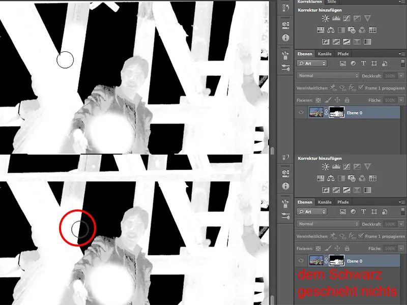
Of course, a few areas remain, such as on the clothes, which have to be touched up by hand later. But on the whole, the tool is a real joy to use in interlocking mode, isn't it?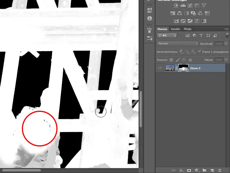
I now paint over everything in white that should be white. In some places I have to paint over it a few times, but that's normal.
This gives us a much clearer and better mask.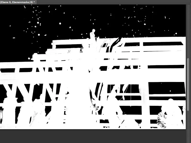
One of the incontrovertible truths in Photoshop is that masks where you don't have to do anything by hand, where everything is done by the Photoshop tool, only exist in training videos. Admittedly, that's a bit mean. I would say there is a certain discrepancy, but I think this mask is really representative: it works beautifully via the channel release, but still requires a little bit of manual work.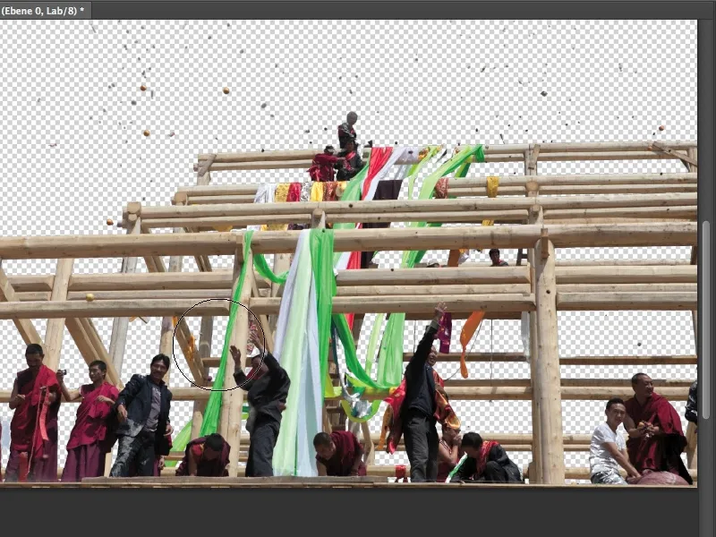
To show you where the manual work still needs to be done, what else we could perhaps do with our mask and how good it is in general, I'm now dragging it onto these mountains. Then I can see exactly what the edges look like.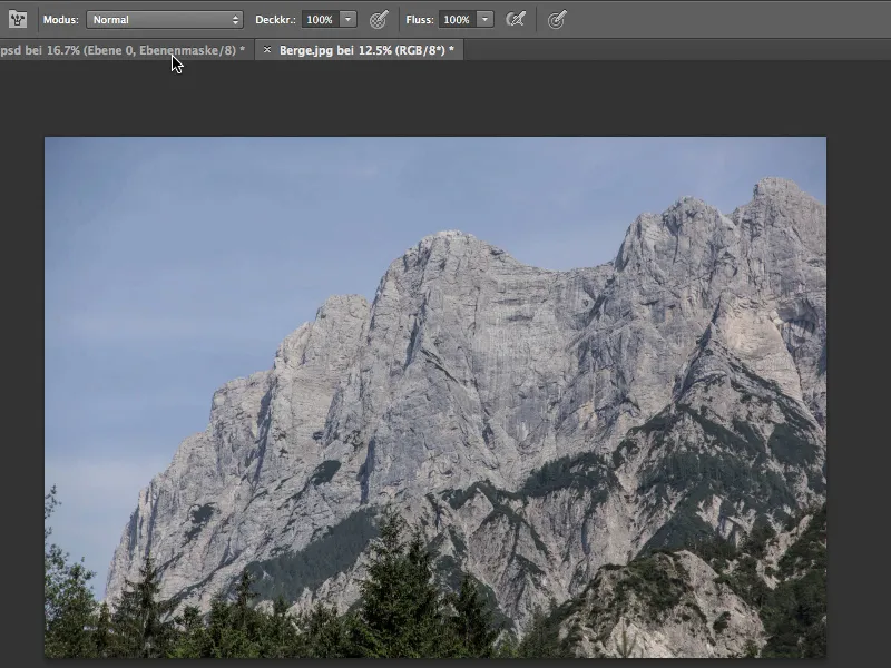
To pull the mask onto the mountains ...
... I use the Move tool and drag the entire topping-out ceremony onto the image with the mountains.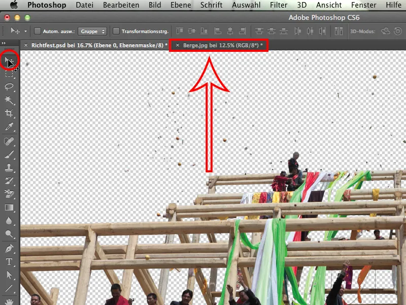
The perspective fits quite well and the light is, well, almost quite good.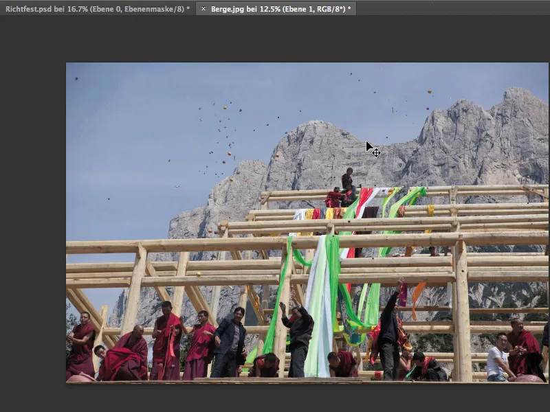
Not bad at all, but it's not really perfect. And now let's take a look at how it all looks zoomed in. The cropping of the objects flying through the sky looks great. There's really nothing I would change about it. You can use them in exactly the same way.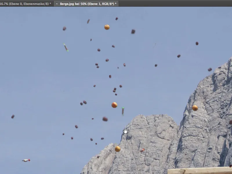
Let's get a little closer and take a closer look at the wood. This also works really well.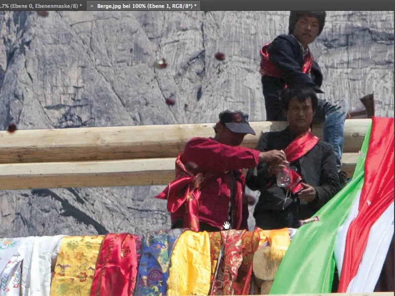
The underside of the wooden frame is perhaps a little too light, so you could reduce the mask by half a pixel. Let's try that.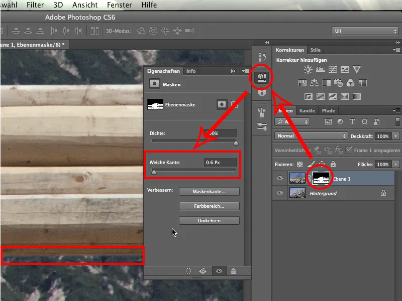
I click on the layer mask and then go straight to the properties. I think it's enough to assign a soft edge of about 0.6px. That should be enough to adjust the edge here. And indeed: it already looks better. The foreground and background now nestle together more beautifully, so to speak.
Let's take a look at the person. There are still a few pixels left in the neck area. They should be darkened a little.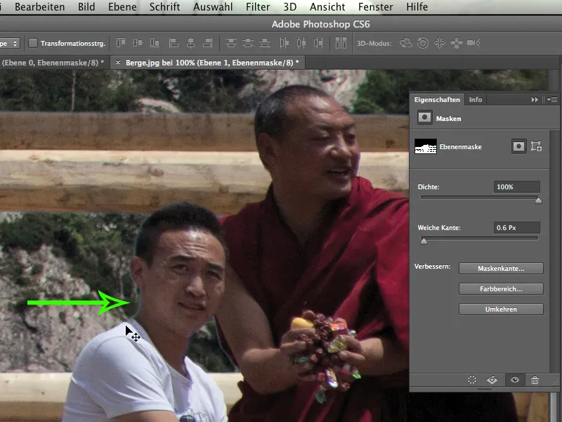
To darken them, I activate the image layer again, use the post-exposure tool and make it nice and small.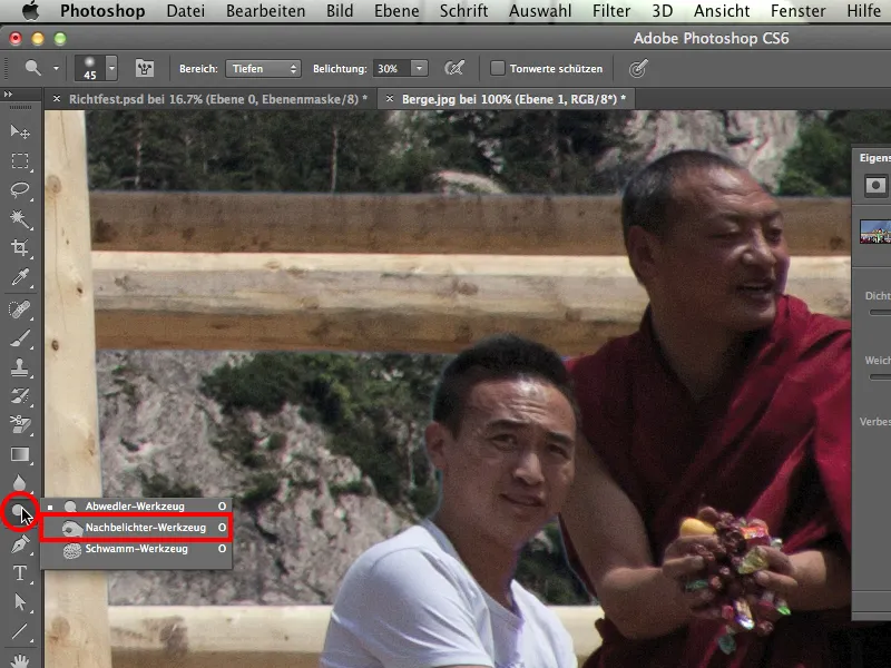
I also set a Midtones>Exposure 20% and darken the young man's neck a little to minimize the reflection. I also do the same with the hair, which means that this area is processed in no time at all. It doesn't matter on the white shirt, but of course it does on the neck and hair.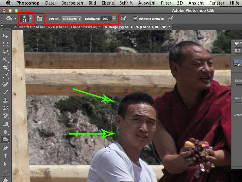
What else do we have? Of course, the story with the fabric panels, and you definitely have to continue by hand. It helps to hold down the Shift key and switch off the mask. Then you can see exactly what is sky and what is cloth.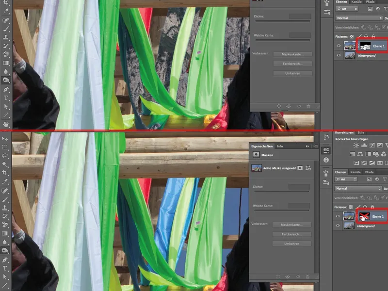
In any case, we have to bring back the blue cloth with the Brush>Mode: Normal>White Color>Opaque 100%. Because of its color, this cloth flew out with the sky in no time at all during the channel release. This is a nasty thing that happens with a channel release, there's nothing we can do about it.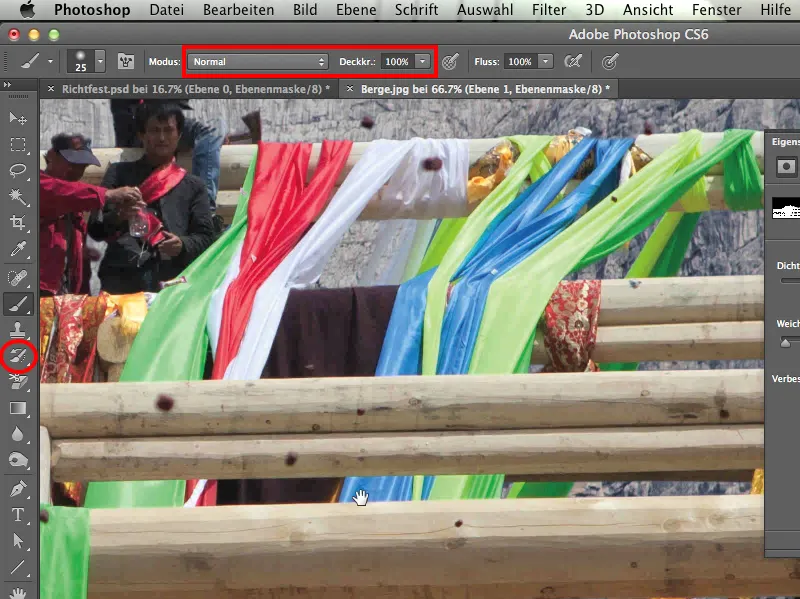
That's why you should always be sensitive and pay special attention to the color that you have mainly excluded or to the channel in which the color is represented.
To be on the safe side, I'm now going to hold down the Shift key and check the layer mask to see if I've captured this cloth completely.
What else do we have? There's a problem with the monks at the bottom left. We have to work on the outline again. The monks look great on one side. Only on the right-hand side, as seen from our point of view, are there light-colored outlines.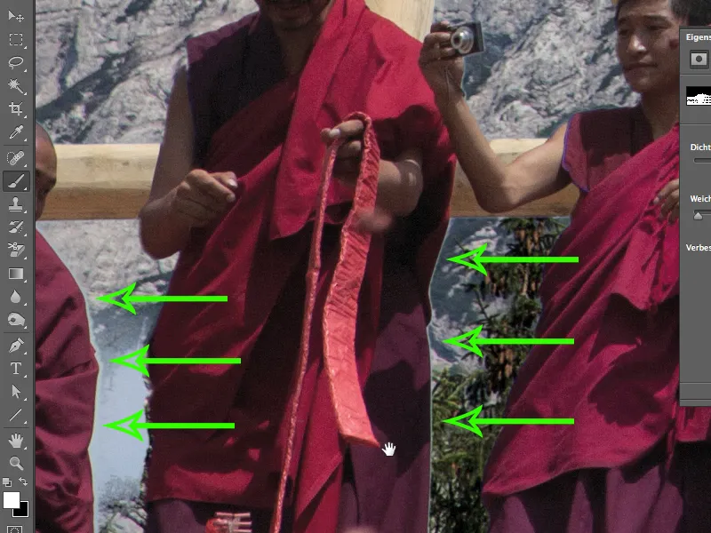
There are two reasons for this:
- the corner areas of the lens: the further in the corner, the worse these so-called chromatic aberrations occur. This means that the three colors of light hit different areas of the chip and produce these edges.
- The fact that there are relatively dark cowls against a relatively bright sky, which of course favors this error.
What do we have to do? We have to bite the bullet and paint in these areas with black color in the layer mask. However, this is not really dramatic, because the problem is solved with just one pass over it. You may also have to iron a few creases out of the monk's robe, but that's not so bad. I also go over the whole gap here again, but only because a piece of light blue sky has taken up residence here. The area is small, so I'm done quickly even with a small brush tip.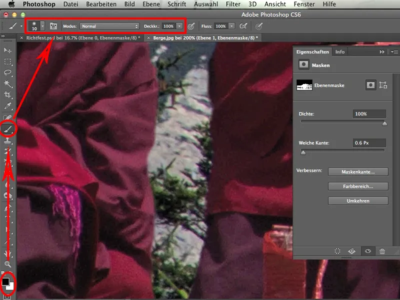
In the same way, we iron out the light edge of the next man a little. If you're working with a tablet now, you have an advantage because it's much quicker.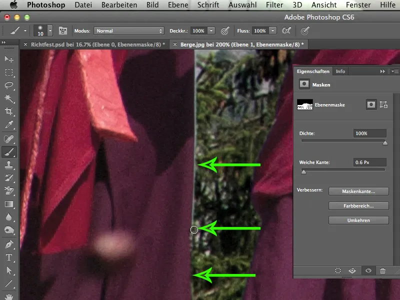
When I look at this corner again, I would say: you can leave it exactly as it is.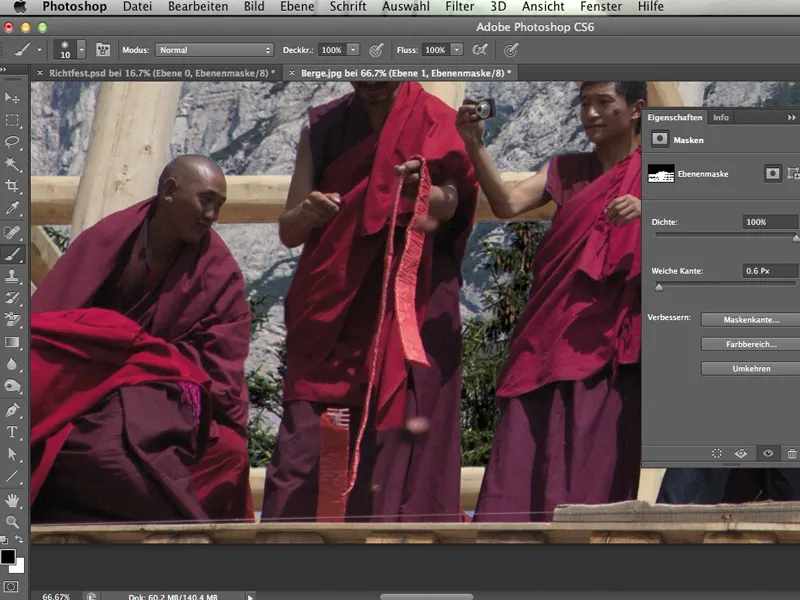
And that's all the manual work. That's all it is. We reached our goal relatively quickly using the channel release. This tool is simply excellent for some pictures.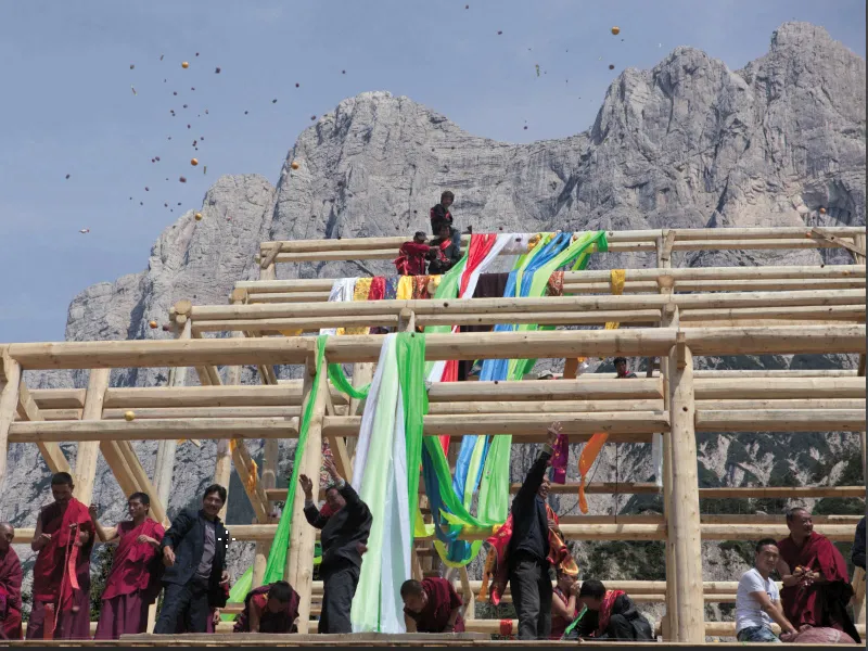
I hope you had some fun with this tutorial. And especially with channel cropping, because it's something that's particularly close to my heart. I hope you can now apply this technique to one or two pictures yourself.
Have fun!
