Note: This tutorial is a text version of the accompanying video training by Marco Kolditz. The texts may therefore have a colloquial style.
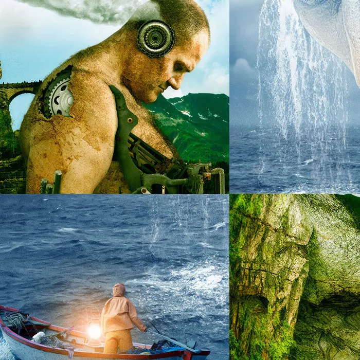
Now that the cloudy sky, the stormy sea and the small boat have been placed and even the lamp has been made to glow, it's time for the mysterious mask.
Steps 1-10
Step 1
Select the image "Man 1" via File>Open.
Then drag the second image directly into the image via the file folder or via File>Place and confirm with Enter.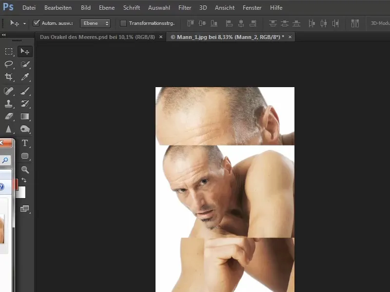
Step 2
The "Man 2" image dragged in is a Smart Object, the "Man 1" image opened first is the "Background" layer.
First turn this "Background" layer into a floating layer that can be moved: Double-click on the layer to open the New layer window , change the name to "Man 1" and confirm with OK.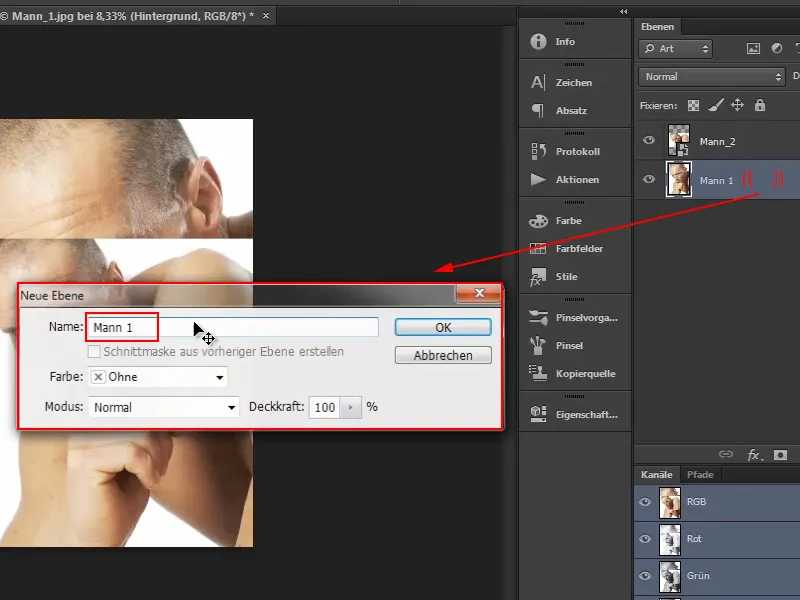
Step 3
The face of "Man 1" is the basis for the mask in the composing. However, the forehead is cut off at the top left and the chin is covered by the hand. The forehead and chin should therefore be reconstructed.
This works with the picture "Man 2", even if the perspectives are not completely identical. This can be seen in the nose and cheek:
In the large image, the nose meets the cheek line pretty much exactly in perspective; in the small image, the distance is greater. However, as you only need parts of the forehead and chin, you can use this image for this purpose.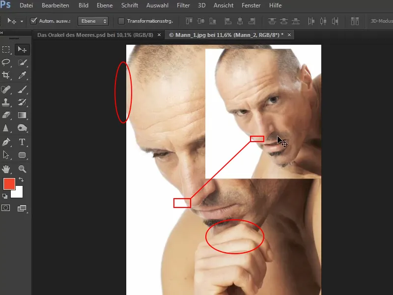
Step 4
To reconstruct the forehead, you need space. You can enlarge the format via Image>Workspace....
Enter a generous 1000 px, which can then be adjusted accordingly.
Then you have to set the anchor and define on which side the new workspace should be placed. Unfortunately, this is a little complicated and you always have to think a little differently:
If you need new space on the left-hand side, you have to press the arrow to the right and vice versa. A little awkward, but you get used to it.
In this case, you click on the arrow pointing to the right so that Photoshop expands the workspace on the left by 1000 pixels..webp?tutkfid=57426)
Step 5
A transparent area has now been created on the left. This should now be temporarily filled with a white colored area.
To do this, click on the symbol for adjustment layers and select Color area.... Then set the color to white.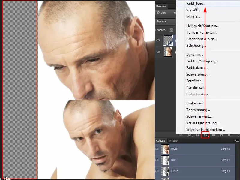
Step 6
Rename the new layer to "Color fill 1" and drag it to the bottom, i.e. to the background.
Then activate the "Man_2" layer and press Ctrl + T. Now you can enlarge the head by dragging the corner points until it is roughly congruent with "Man 1".
If it fits approximately, confirm with Enter.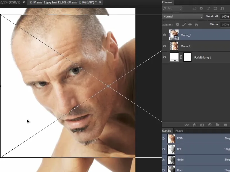
Step 7
Then reduce the opacity of the layer to make it easier to place the head. You can either set this using your mouse and hand or simply use the number pad on your keyboard. For example, if you press 5, the opacity will be set to 50%.
With an opacity of 60%, you can move the head so that it lies exactly on top of the other.
It is somewhat difficult to position the images congruently as the perspective is not completely correct. In addition, one is a portrait format and the other is a landscape format, which means that the upper image is smaller than the lower one when imported into Photoshop.
It is best to choose a fixed point first, for example the top of the ear, and move the two heads to fit on top of each other..webp?tutkfid=57429)
If the image you want to move keeps snapping to certain points, you can prevent this by holding down the Ctrl keywhile moving it.
Step 8
If you now press Ctrl+T to transform the active image, you will see a crosshair in the middle. You can grab it and move it. Place it on the upper edge of the ear.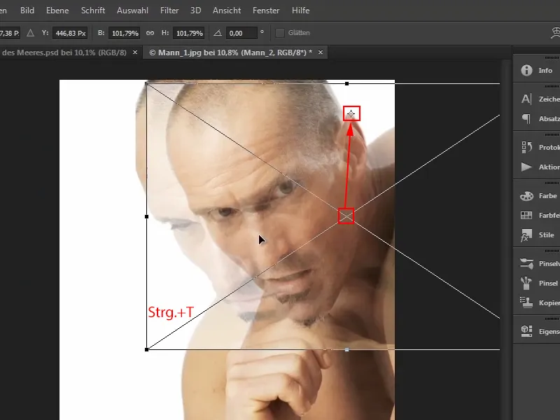
Step 9
If you now press the Shift and Altkeys at the same time and drag the lower left corner point, the image will be scaled from the ear point. This is very practical.
Drag it so that the two heads are as close together as possible and check this by zooming in and taking a closer look. If it fits, confirm with Enter.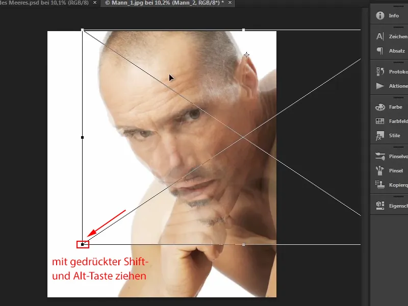
Step 10
Now increase the opacity back to 100%.
Then create a mask by holding down the Alt keyand clicking on the Add layer mask icon. The image is now gone again.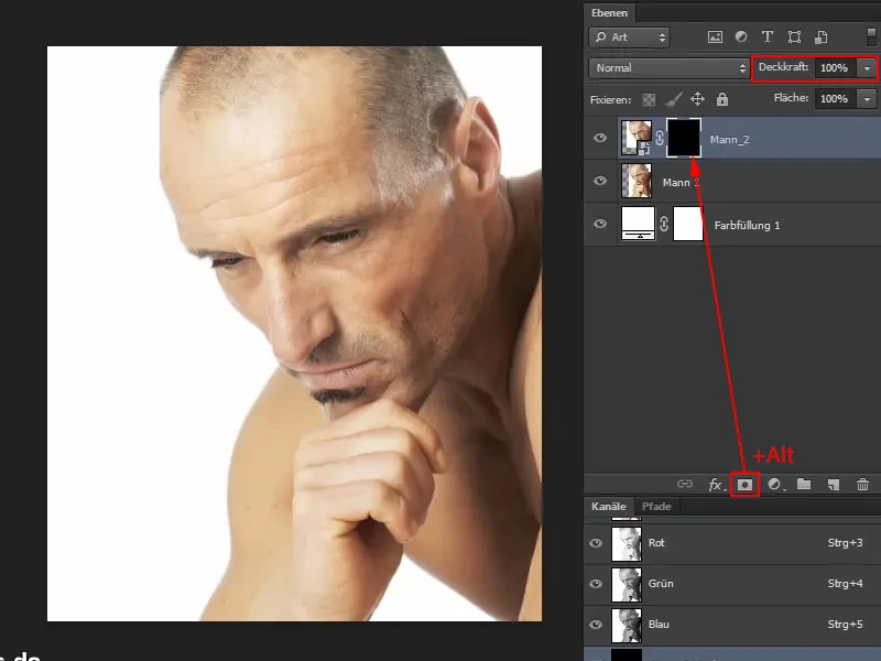
Now continue: Steps 11-20
Step 11
Use a brush and the foreground color white to bring out the missing piece of forehead.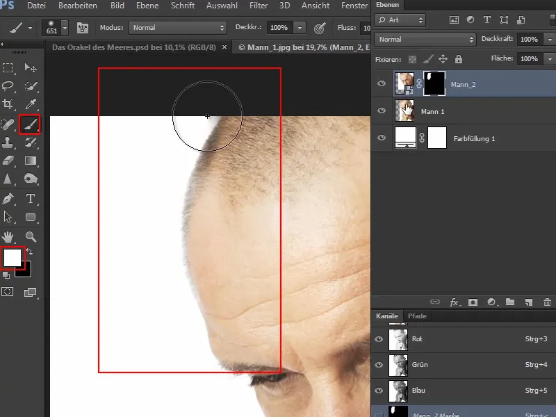
Step 12
If you fade the eye symbol in and out and look at the picture in the before and after comparison, you will notice that the forehead has become slightly narrower.
Basically, this is not a bad thing, because in this case the upper area will not be used later.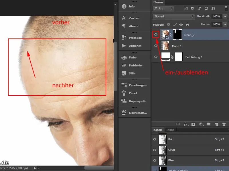
Step 13
Nevertheless, Marco shows how such an error can be corrected, even if it is not absolutely necessary here:
Remove the lock symbol between the image and the mask by clicking on it once and then activate the image. Now simply move it a little to the left until the transition is exactly right.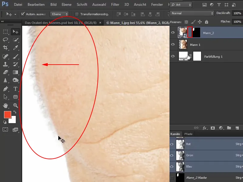
Check the result by hiding and showing the eye symbol and comparing the position before and after.
Step 14
With the brush, black foreground color and reduced opacity, you can bring back a few more hairs so that the transition works even better at this point.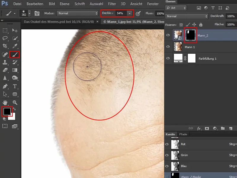
This reconstructs the forehead very well: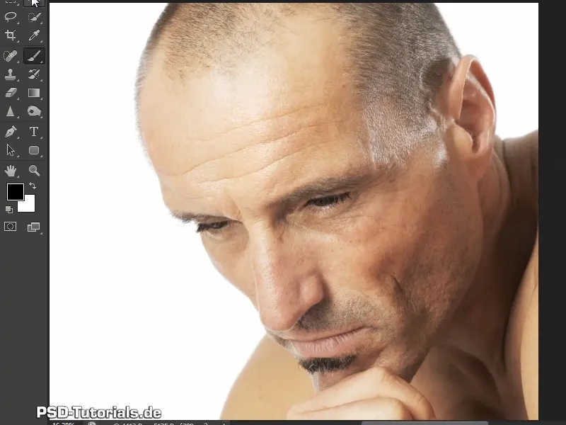
Step 15
The chin is then reconstructed in a similar way. First, duplicate the "Man 2" layer by grabbing the layer and dragging it upwards while holding down the Alt key(1).
Rename the new layer to "Chin" by double-clicking on it so that you don't confuse the two layers later (2).
Then grab the layer mask of the "Chin" layer and delete it by dragging it into the trash can (3).
To make it easier to position the chin, reduce the opacity to 60% (3).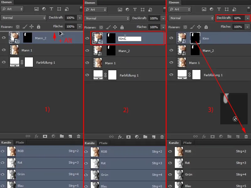
Step 16
Now the face needs to be scaled or rotated. It is basically already scaled. However, the image is slightly rotated at the point of the chin and differs from the image below due to the slightly different perspective.
Press Ctrl+T and then move the image so that the start of the beard matches the image below as closely as possible. Use the first hairs as a guide and position them roughly congruently.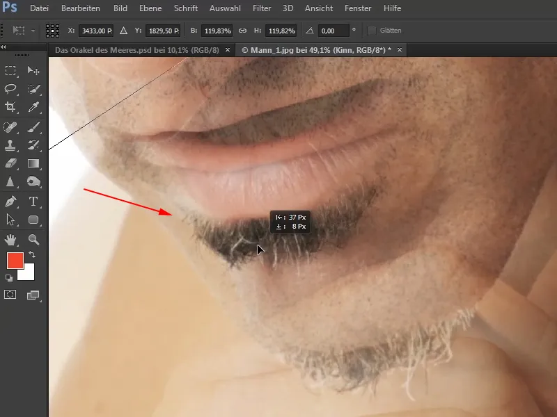
Then compress the image a little and pull the middle handles of the transformation frame inwards a little. This is because the fact that the man is turning towards you naturally makes it look a little narrower.
Correct the position and place the beards even closer together. If it snaps here and there when you move the image, hold down the Ctrl keyso that there is no more jerking.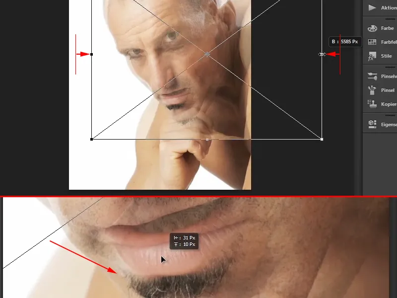
Now rotate the image a little from the perspective ...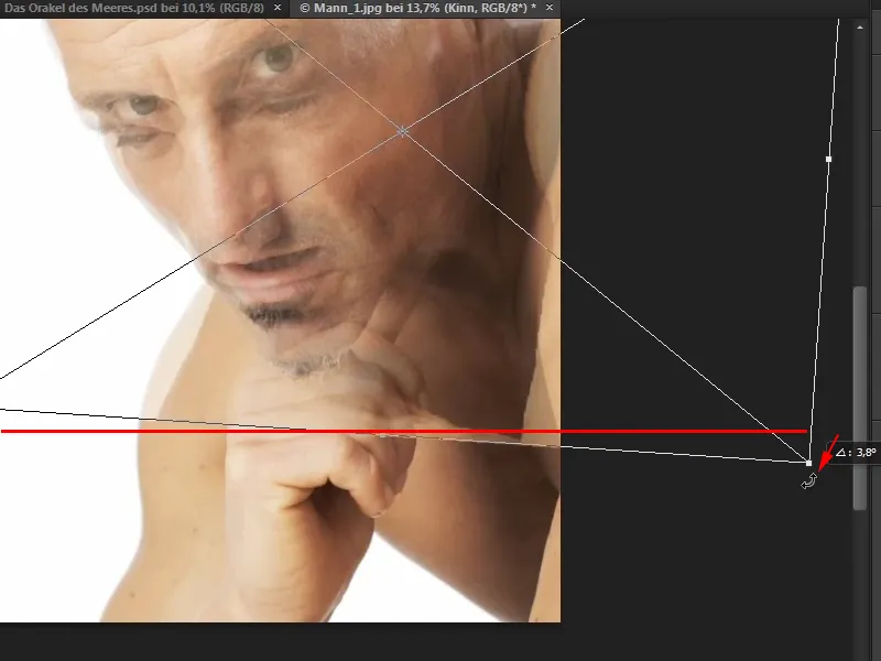
... and move it a little more precisely again so that the edges match as closely as possible.
Marco also adjusts the height and width of the image slightly and points out that the whole thing is a bit tricky and that you have to work your way up to the right shape bit by bit.
Above all, you should take your time with this step so that it looks really good in the end (1).
When the positioning is right, confirm with Enter and increase the opacity back to 100% (2).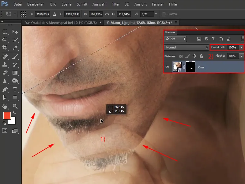
Step 17
You can view the before and after comparison by showing and hiding the eye symbol. It should fit: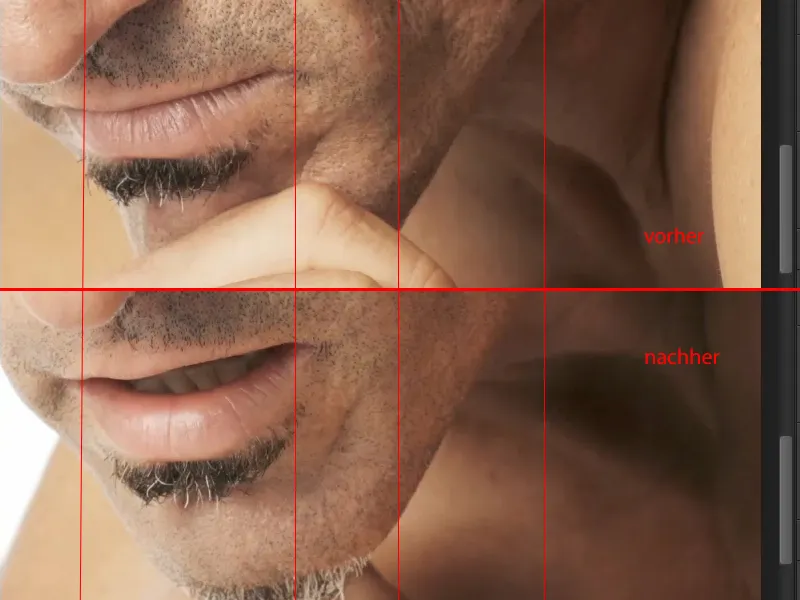
Step 18
Now create another mask by holding down the Alt keyand clicking on the mask symbol (1).
Then take a brush at full opacity and set the foreground color to white. Use this to paint the hand away.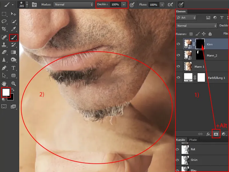
Step 19
Then set the foreground color to black and reduce the opacity to about half or even less, depending on the area. This removes the areas from the picture that are still distracting. It doesn't have to be perfect, because in the end nobody who doesn't know the original image will notice. And it won't be so clearly visible afterwards anyway.
Keep checking whether details are still disturbing by fading the eye symbol in and out and, if necessary, switch back and forth between the foreground and background color with X until the chin blends in harmoniously with the face.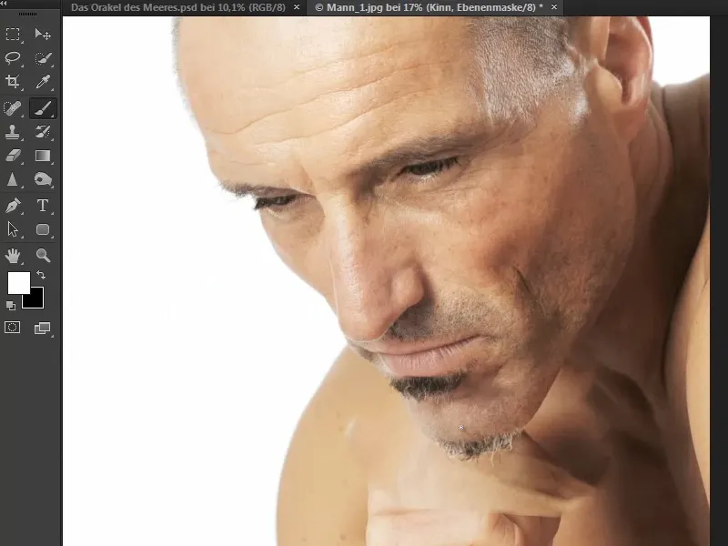
Next, you can merge all the layers.
Step 20
Marco makes a time jump at this point in the video training so as not to repeat himself. In the meantime, he has removed the background from the face and used the channel calculations for this. This has already been described in detail. Here he only briefly touches on the most important steps:
He chose the blue channel, as this has the highest contrast, and then offset it against itself.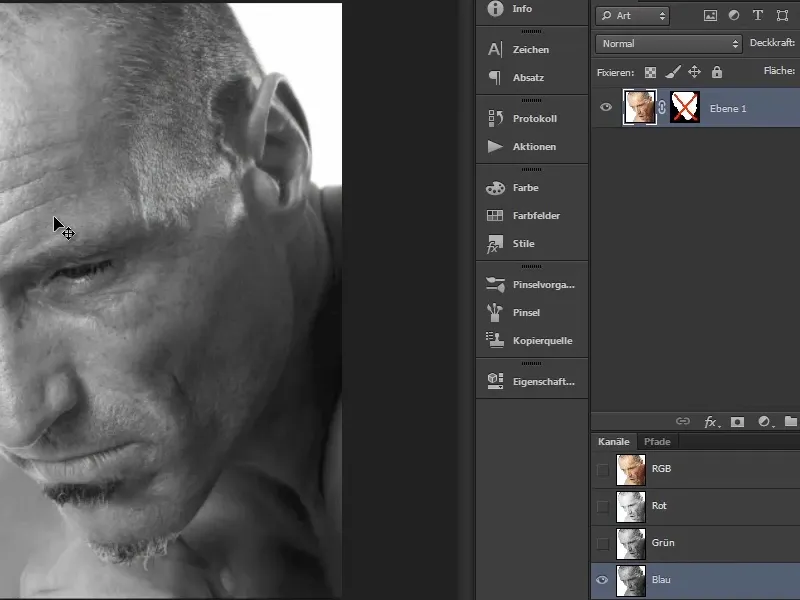
This enabled him to create this mask...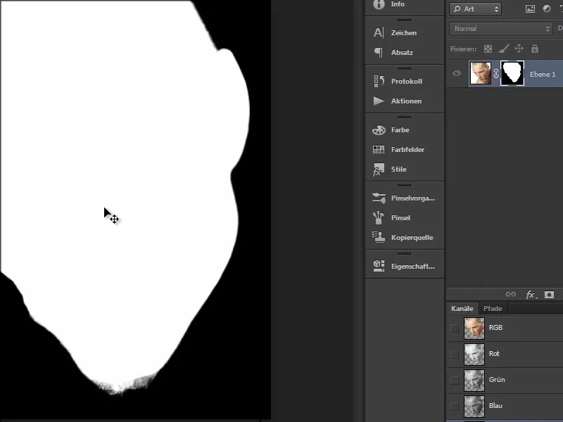
... and then worked on it with the brush on the edges and with small brush tips on the whiskers.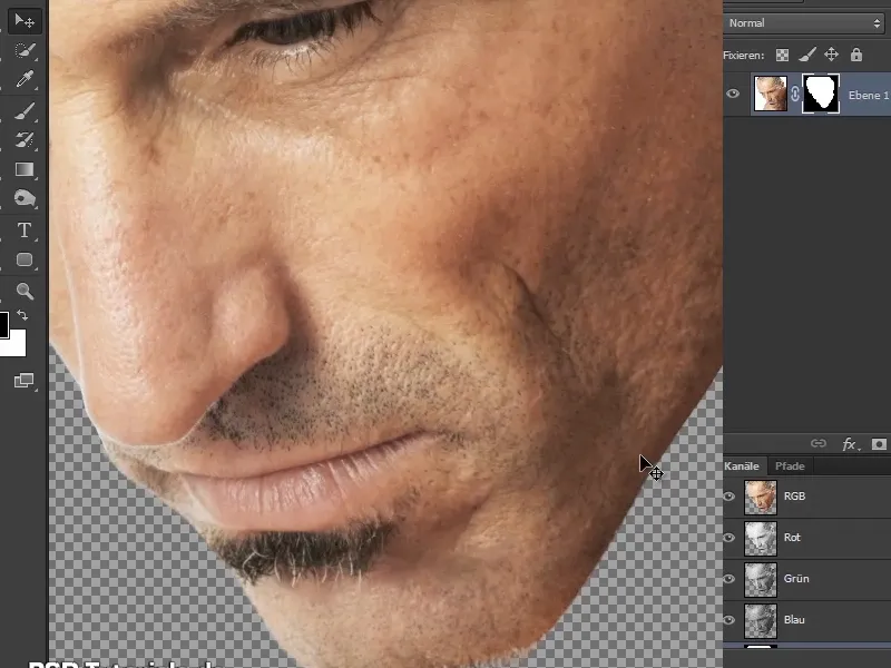
The result looks like this and we will continue working with it below: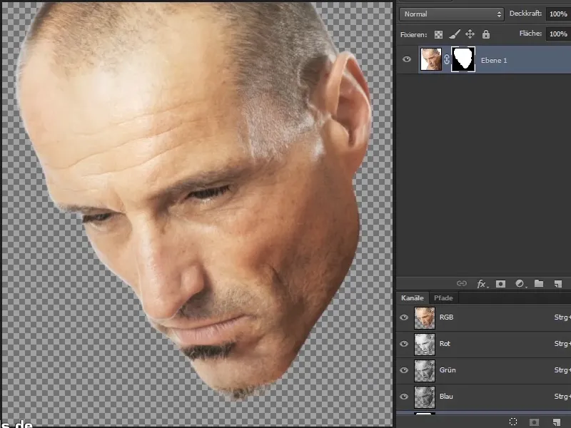
Keep at it: Steps 21-27
Step 21
It is now important to make a few corrections to the beard hairs, as some are still transparent or milky white.
To do this, create a colored area... and choose a shade of blue, for example.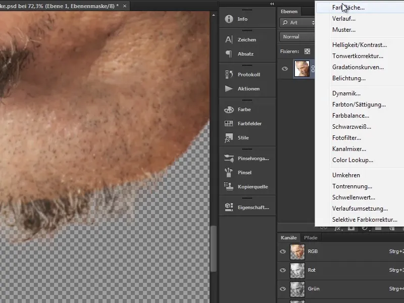
Step 22
Turn this colored area into a background by dragging it under "Layer 1" (1).
You can rename "Layer 1" to "Mask" (2).
Then create an additional new layer above the "Mask" layer. Click between the two layers while holding down the Alt keyto create a clipping mask (2).
As the hair is now to be corrected on this new layer, rename it "Hair correction" (3).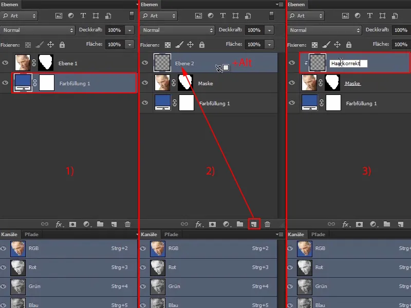
Step 23
To remove the milky areas between the stubble ("before"), select the copy stamp and check the box underneath.
Now gradually pick up areas in the hair area and stamp them onto the milky areas. This won't be noticeable later because it can be combined very well with the sea.
However, make sure that the areas are not too obviously repeated, as this is often done incorrectly. In the end, everything should look realistic ("after").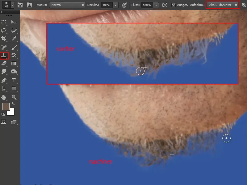
Step 24
When zooming out, Marco discovers another flaw in the mask: at the edge of the face ("before").
He now paints along it with a hard brush and black foreground color. He then brings back some of the skin with white foreground color.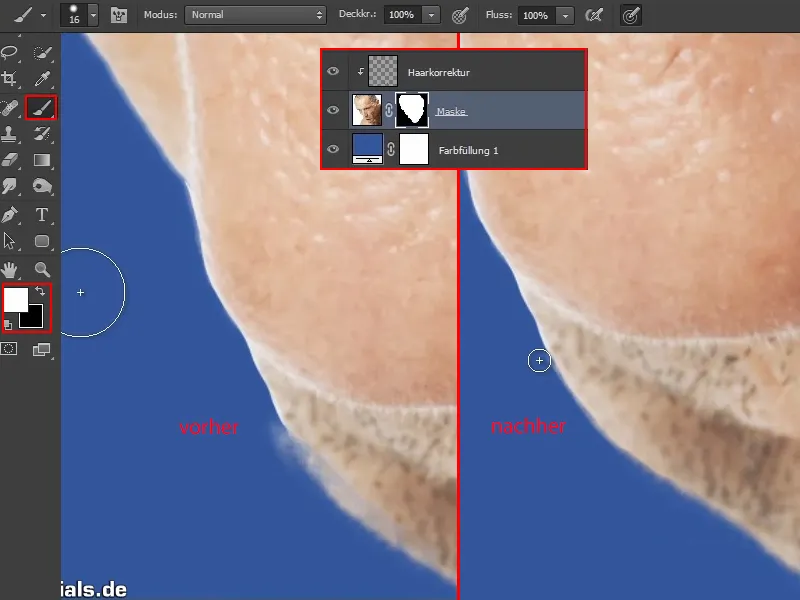
Step 25
You can now delete the background layer ("Color fill 1") by dragging it onto the trash can icon (1).
Then select the "Mask" and "Hair correction" layers (2) and merge them into one layer (3).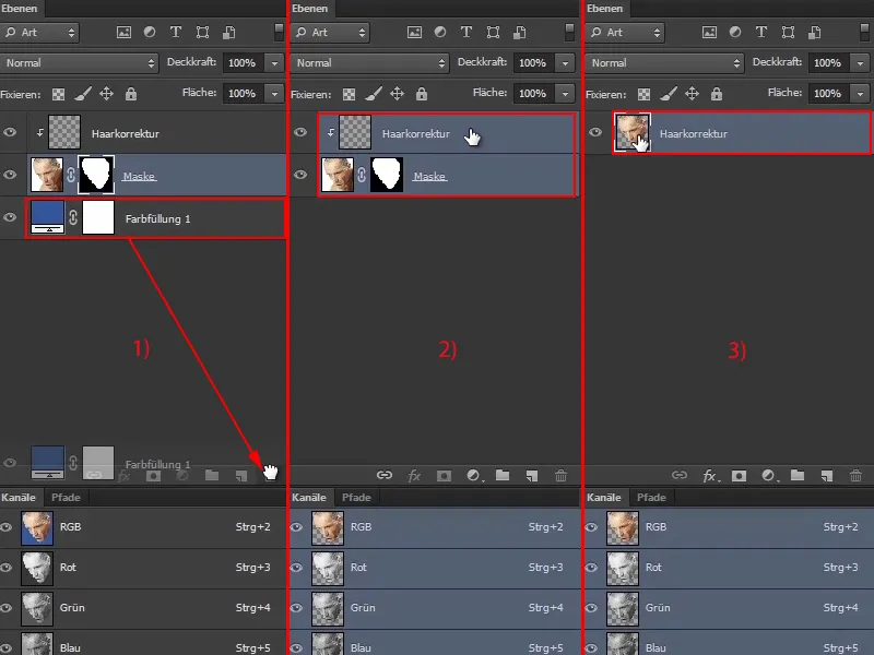
Step 26
Then grab the head and simply drag it onto the image with the sea.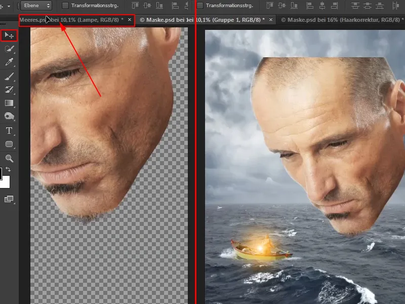
This large, flying head above the sea looks quite good.
Step 27
As the layer is no longer used for "hair correction", rename it "Mask".
Use Ctrl+G to put the layer into a group, which you then also name "Mask".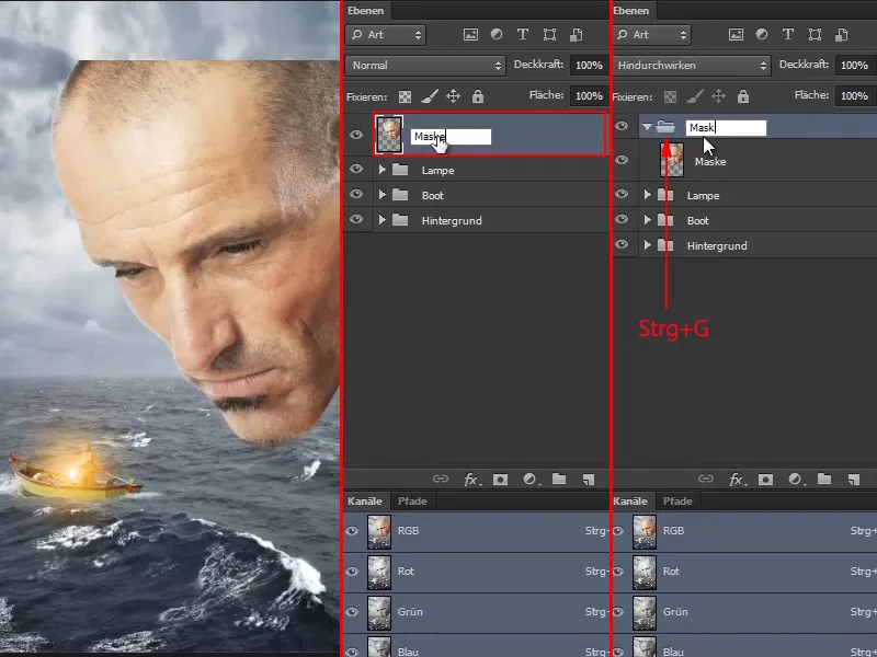
This is what the image looks like at the end of this part of the tutorial series: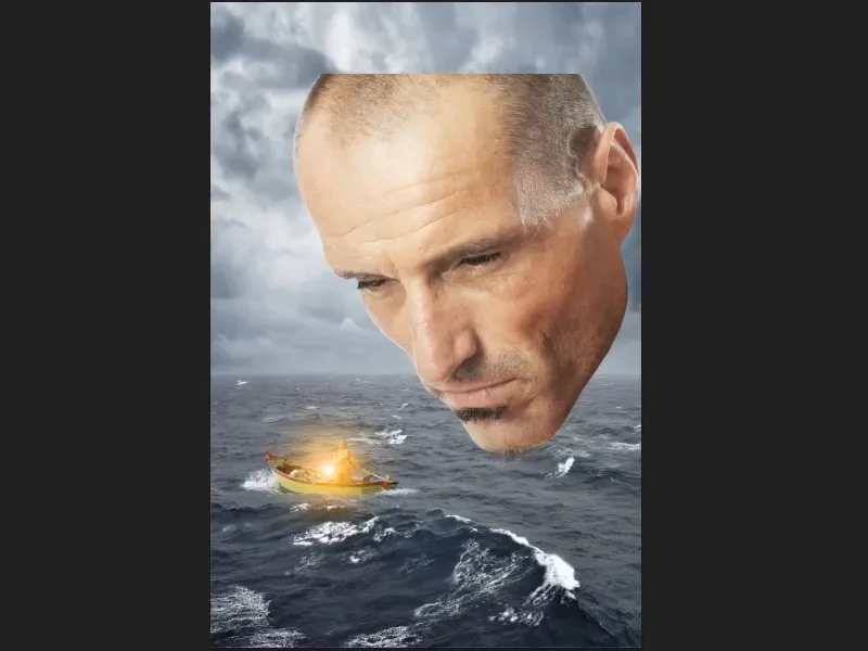
The next part will be about creating a path mask to really get the look of a mask.
