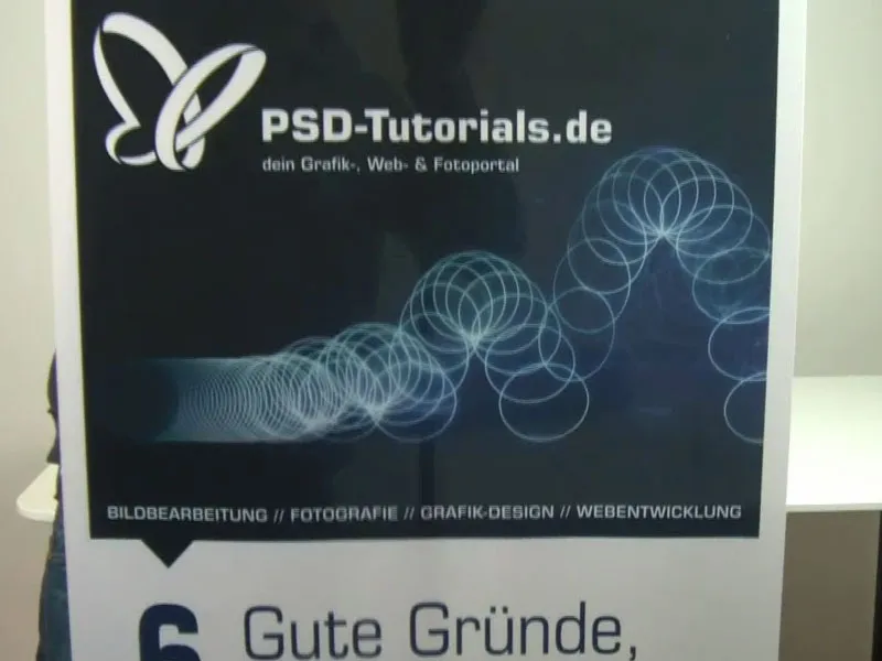
We're all back together again and the next print product we're going to design is waiting for us. You can already see it here - it's a roll-up. And this roll-up system is branded with "PSD-Tutorials.de, your graphics, web and photo portal".
What's so cool about roll-ups like this? It's definitely cheaper than entire exhibition stands or exhibition systems. But if you still want to take part in a trade fair, then it's definitely worth stocking up on these things, because they can be set up in no time at all, can be used in a variety of ways and cut an excellent figure both indoors and outdoors. Our system will have a grammage of 260 g/m² and is made of polyester fabric. This not only ensures durability, but is also antistatic. This means that you can rub your head up and down on it and there shouldn't be any static electricity, maybe a few critical looks from others at most. And the whole thing is also non-flammable, which means it complies with fire protection class B1. That brings us back to our abbreviations. Yes, but it's actually quite practical if you can't set fire to the stuff. So if you want to reduce the premium rate of your fire protection insurance, simply wallpaper the walls with it and submit the proposal to your insurance company ... So you've seen what we'll be designing in this workshop. And as usual, we'll next look at the parameters for the design in InDesign.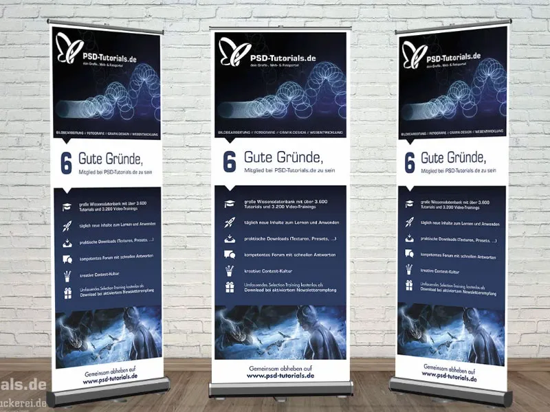
Observe the print shop's print specifications
Once we've arrived at our print shop's website, diedruckerei.de, we'll get an overview of their portfolio. I scroll down and there are the advertising systems (1). Here at the top left we already have our rollup (2). We can then choose whether we want a roll-up system including print or just the print. This means that if the branding ever changes, you don't always have to throw away the cassette in which the roll-up is stored, so you could also order it as a print only. But of course we need the system (3).
Here we choose the exclusive system, which is a bit bigger and has a great pitch-black appearance like the night (4). It looks very high quality and classy.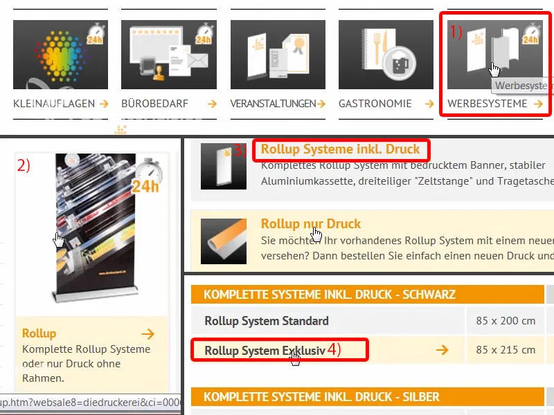
There is a description here. So once again four-color printing, the different grammages. And here is the note that the system is made of aluminum with a printed banner, three-part tent pole and padded carrying bag. You can be particularly grateful for this, because with a weight of five kilograms, padding is very easy on the shoulders, after all you don't want to have a lot of bruises on your shoulder - or you can simply let the trainee carry it.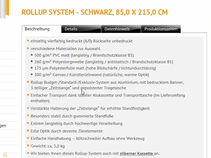
Let's take another look: What else is important? Details: The data format, that's what we're most interested in. For this, I'll simply pull the data sheet from the server ...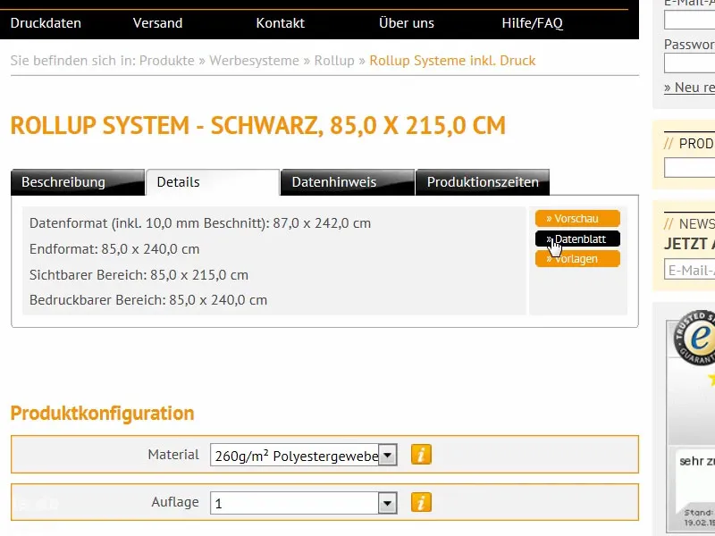
There we can see the format. The thing is 85 cm wide and 215 cm high (1). However, there is something very important to note here, because we are deviating from our classic 2 mm bleed.
We have a 10 mm bleed here (2). And, very importantly, the final format is 85 x 240 cm (3), although the visible area is only 215 cm. Where does this difference between 240 and 215 come from? There are 25 missing, they are lost somewhere - we'll see that further down ...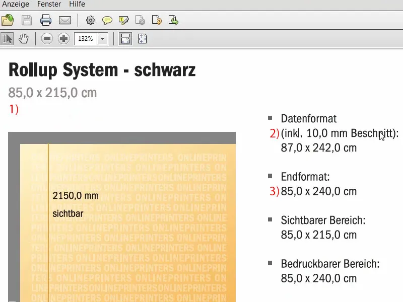
This is the area that is not visible. This is the piece that is anchored in the cassette at the bottom, so it can't be pulled out.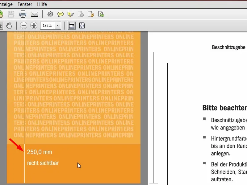
Let's go back into the system. Data note: It may be interesting to note that we need a resolution of at least 120 dpi for the original image size, i.e. not 300 dpi as we are used to from printing. 120 is enough. This is because you are not looking at the thing with a magnifying glass from a distance of 20 cm, but rather from a distance of a few meters. Color mode: CMYK according to FOGRA39 (ISO Coated c2).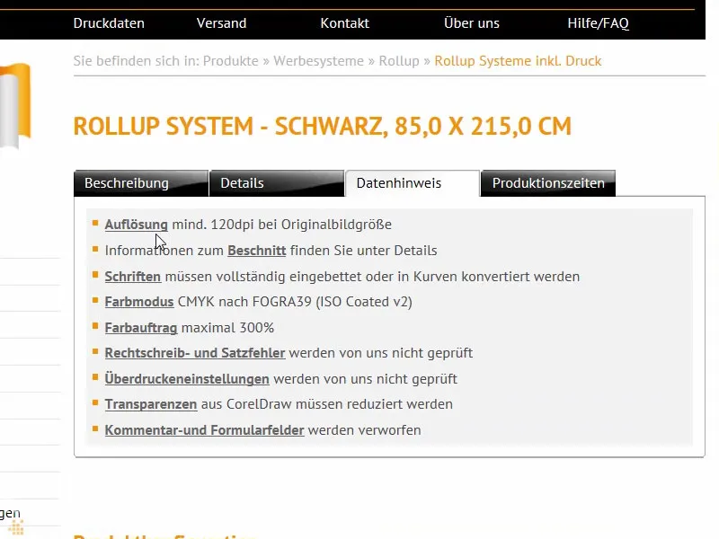
Overview of the final roll-up design
Okay, now that we have all these parameters in place, we can create the file in InDesign. I open InDesign CC. Here you can see our old roll-up. This was the design for our first draft, which we also printed. This is what it looks like, you can take a look at it for inspiration.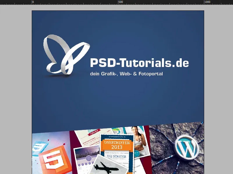
If I keep scrolling here, you'll see the branding at the bottom.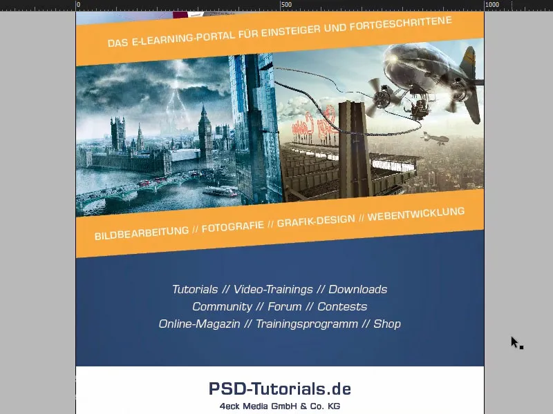
In the second tab you'll find the roll-up that we're going to build. A nice lead image at the top. Of course, there's an idea hidden here: we have this bouncing ball that's starting to bounce, with our PSD-Tutorials.de logo. That's the first thing you'll notice. Then this bouncing ball, that you just want to take off creatively. We're here to help, and we have six good reasons to join us in the areas of image editing, photography, graphic design and web development.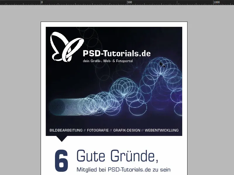
They are listed below. We can also see a wonderfully beautiful gradient here, which we are going to incorporate. This is exactly the color transition from the top image to the bottom image and then in a gradient in our house color, namely this wonderfully beautiful deep blue, which you can also see here above in the "6", for example. We also work with small symbols to suggest this path from top to bottom. They are intended to emphasize and mark the direction of view.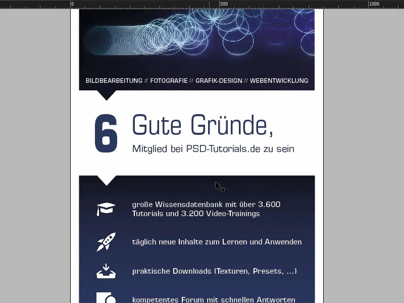
Then there are six reasons, with icons, so that you can visualize everything a little. And then there's a premium image at the bottom. Of course, everyone knows this one, it's Batman, created in a composing by Jurek Gralak for one of our training courses. And this is what you can get when you start at the top at PSD-Tutorials.de, so to speak, become a professional on your journey and then finally create such great composings. "Take off together at www.psd-tutorials.de". The web address here below and then our large free space.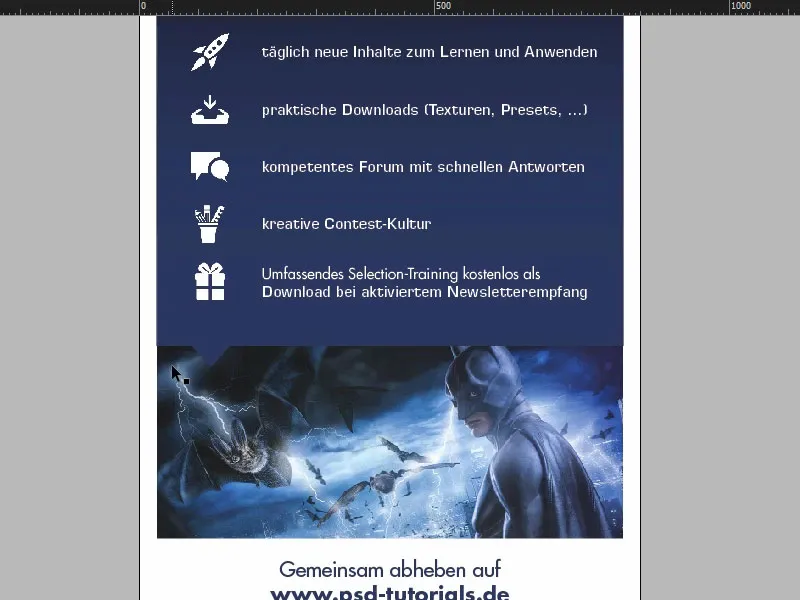
Preparing the basic layout
Right, let's get to work on the new file. We select File>New>Document... and then deactivate the double page (1). Enter 850 mm for the width and 2400 mm for the height (2). Then I'll draw in margins and set them to 30 mm (3). This will be a white border that will simply enclose our final design, i.e. a visual boundary. And the bleed at 10 mm (4). Good, then we can confirm that (5).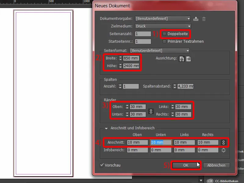
Here we now have our final work surface on which we will work. Bleed, white border and here we start with the design.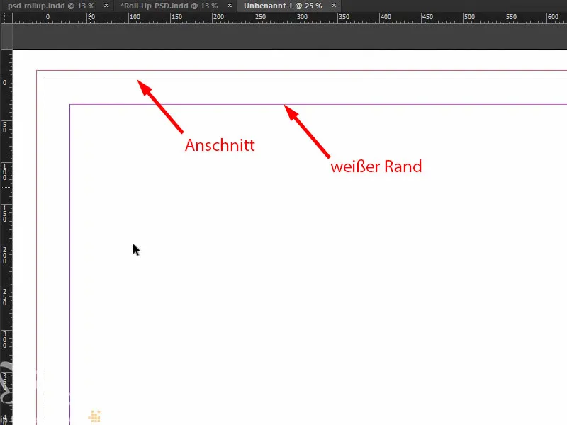
Of course, the very first thing to do before we do anything is to set the guide line for the lower area that disappears into the cassette. We simply pull out a ruler. We set the guide line to 2150 mm (1), just as we saw in the template. This means that this area should not be printed (2), nor should this area be designed, perhaps with one color at most. If you work with colors here, please draw them all the way down. But the thing will then disappear somewhere in the roll-up cassette system.
So far, so good. Now let's draw a few more guide lines. Let's take another look at the original file. I'm now going to draw guides, once at this exact point (3), once at this point (4) and once at the bottom here (5). And then I'll also draw guidelines on this axis for the icons and the "6" (6).
Just go back to the ruler. By the way, if you don't see the ruler, you can show or hide it via View>Rulers or show and hide it with Ctrl+R. So I pull out the auxiliary lines and set them to 665 mm, 950 mm and 1670 mm. On the X-axis, the auxiliary lines are set to 90 mm and 154 mm.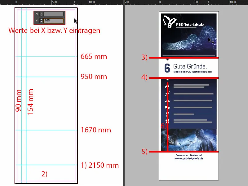
Placing images in the upper part of the roll-up
Okay, the preparation is now complete. Now it's time to place the images. Our favorite shortcut: Ctrl+D - and select the image (1). I start here at the top, drag the field to (2) ...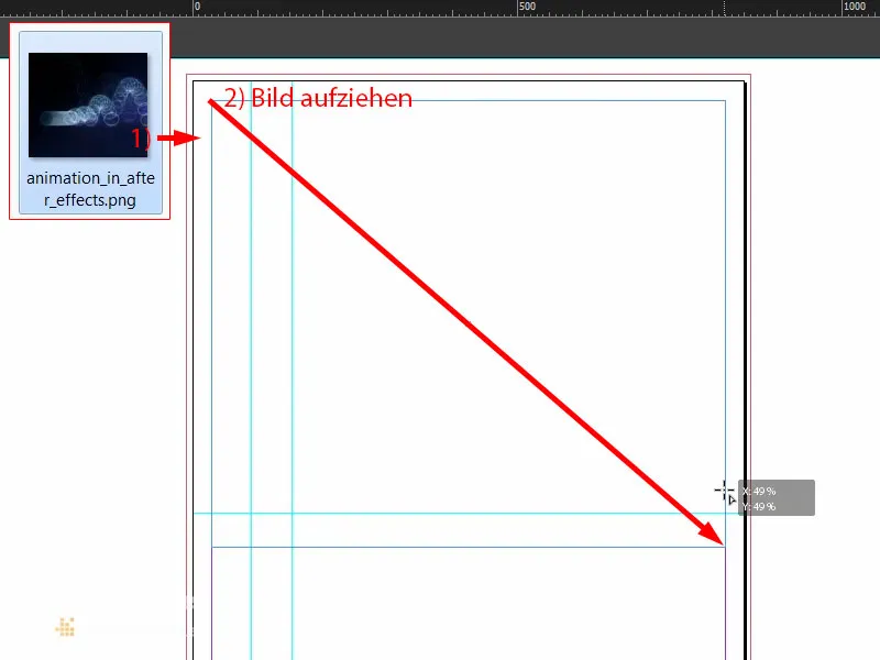
... and reduce it in size down to our guideline (1). Now comes the logo. I have the vector file of our butterfly in my library. I'll position it right in the corner (2). Then, of course, I work with symmetrical spacing. Holding down the Shift key, I press the right arrow key ten times and the down arrow key ten times. Let's take a look at this ... There's more to it. So another ten to the right and ten down ... Something like this (3). Exactly.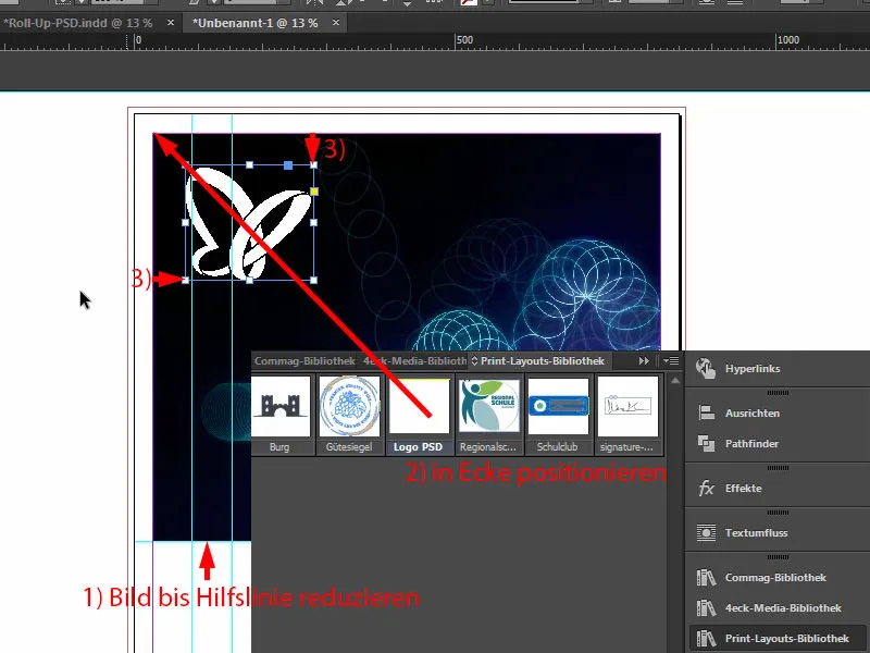
Placing, formatting and aligning text
Next, I draw a text field (1) in the Eurostyle LT Std, font style Bold at 136 pt, color white (settings at 2). Write "PSD-Tutorials.de" in it (3), reduce the text field to the required size by double-clicking on the handle (at 4).
I'll make a quick copy of this (5) and change the font style to Demi. This is a little slimmer. The font size is set to 55 pt (settings at 6). And then I add the text (7). Double-click to resize the text field again (8) ...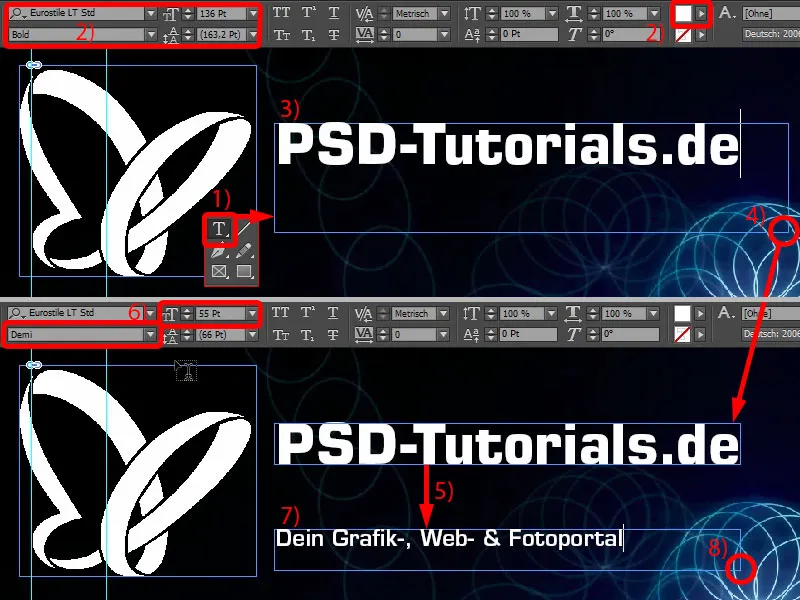
Now it's time for the alignment. I leave the two text fields docked there (1). I move the heading up ten steps using Shift and the up arrow key (2).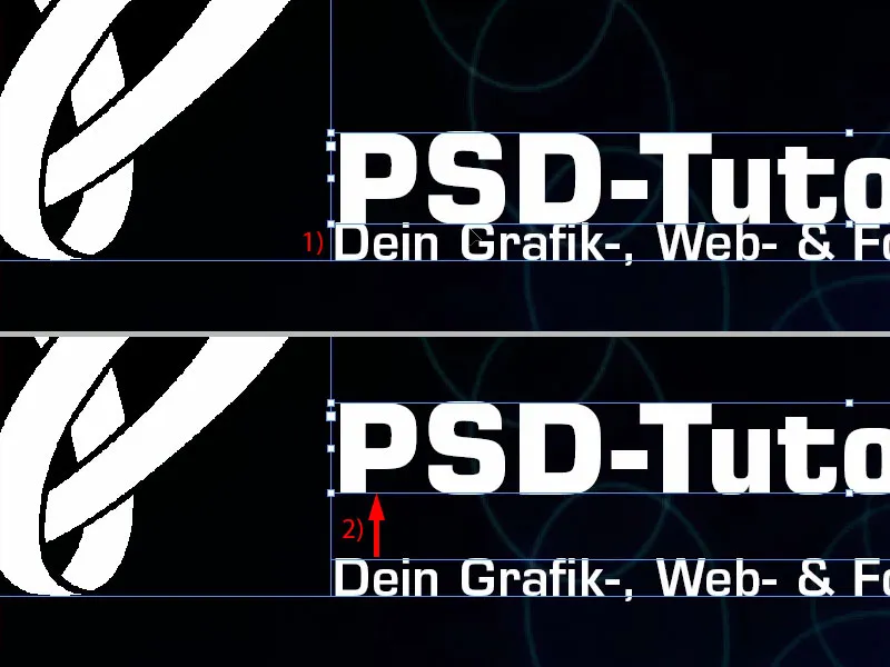
In most cases, of course, you will be working with logos where everything is already stored in a vector file, so to speak, or where the spacing has been specifically written down in a design manual. In my case, this is not the case, which is why I adjust it manually.
You can see the boundary of the logo here. I select both text fields by holding down the Shift keyand simply want to have it right here at the edge of the butterfly for visual reasons (1). This means that I simply move it a little further to the left.
Here, too, we now have an uneven ratio (2), so I move the claim a little to the right. We can also work with an auxiliary line (3) - the "P" is in place, as is the "D" (4) ... For some it's totally annoying, for others it's great fun.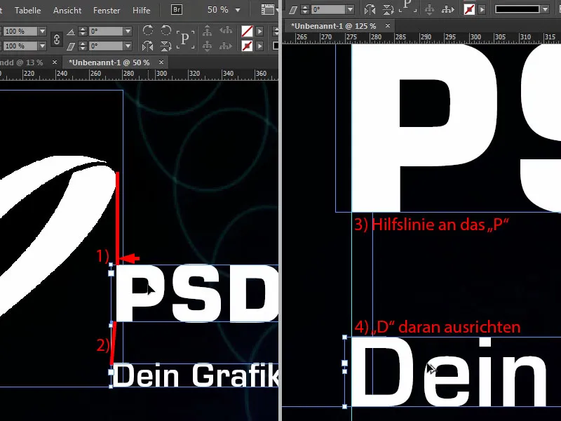
What bothers me a little is that this is exactly in the line of the bouncing ball (1). So mark everything again and use Shift and the arrow keys to move up five times and to the left five times (2).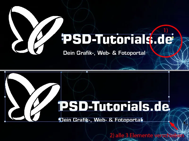
Then we go to the end of the image. Here I'll draw a text box exactly to the width of our image (1). Here too: Eurostile LT Std, font style Demi with 55 pt. But align the whole thing in capitals, in white and centered, then we are exactly in the middle (settings at 2). And here I simply copy in the text that I have already prepared. Move the whole thing down to the edge once and then move it up fifteen steps with Shift and the arrow key (3). We have the fifteen everywhere here, so it's always easy to keep to the spacing.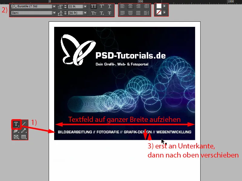
Connect direction arrow with image - Pathfinder
In our final layout, we had small triangles here in which the image is still included. We will now recreate this next. So use the polygon tool, which is this hexagonal stop sign (1). Click once in the workspace. Set the number of sides to 3 and the star shape to 0% (2).
And then we give it a color (3). Then we need to rotate it 180° (4). Now it's upside down.
Now I'll change the view (5), then we have our guide lines for the width of the triangle (6). And we'll increase the height to 45 mm (7). That should fit quite well.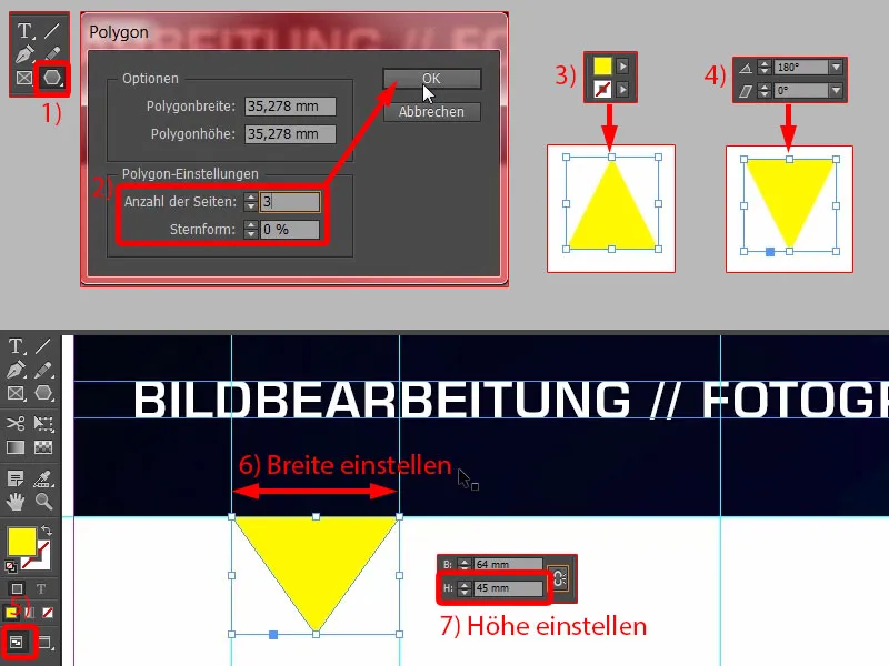
Now we're going to do something very cool: we're going to combine the top shape and the bottom shape, because we want this image, this bouncing ball, to be included in this triangle. The easiest way to do this is to merge the two into one shape. That's why we're going to use a pretty cool tool for this, the so-called Pathfinder. I have it here in my sidebar. If you don't have it, you can display it via Window>Object and Layout>Pathfinder. You can use it to add shapes together or subtract them from each other.
Before we merge them together, I make a copy of it: hold down the Alt keyand drag it out once (1). This way we can use it again later.
Now I select both objects (2), call up the Pathfinder and merge them together (3). This sends the image into the afterlife, so somehow it has now disappeared. We might have known this beforehand, but it was a good thing that we placed it first, as we wanted to align the logo at the top of the bouncing ball. So that fits.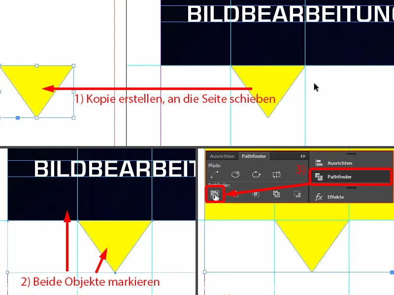
But now we can call up the shortcut Ctrl+D and insert the image again (1). Now it somehow turns the whole thing upside down. So whenever you use the Pathfinder with images, it looks as if the whole thing has been put through the blender once. So now we have to adjust it.
To do this, select the image, i.e. the image content - you can see this when the brown frame is highlighted (2), right-click, Customize>Fill frame proportionally. And now it's time to transform the object:Object>Transform>Flip horizontally (3) and then flip vertically again (4). What has happened now? The image is hanging up here because the reference point is selected at the bottom edge (5).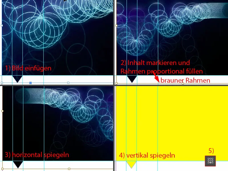
Ctrl+Z, undo. Set the reference point once in the middle (1), if this is what happened to you, and flip vertically again (result as in 2).
And now take a look at what has happened here (3): The image has now become part of this triangle. This means that we have created a new element, a polygon, from the actual picture frame. We will use this effect more often later.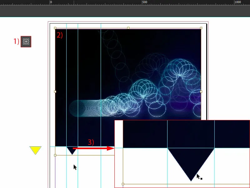
OK, let's move it in the layer sequence all the way to the background (1). This is what it looks like (2). And now I'm happy with it.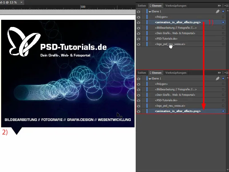
Creating a background with a color gradient
We now want to insert the other backgrounds. So first I define a new color field (1), namely the one with our PSD blue: 95 % cyan, we mix 78 % magenta on top, then add 34 % yellow and 26 % black (2). I add the color field (3). This is the PSD blue. I delete the other one here (4) so that there is no confusion. Now I draw a rectangle (5). Now I could fill it with this blue, for example (6), ...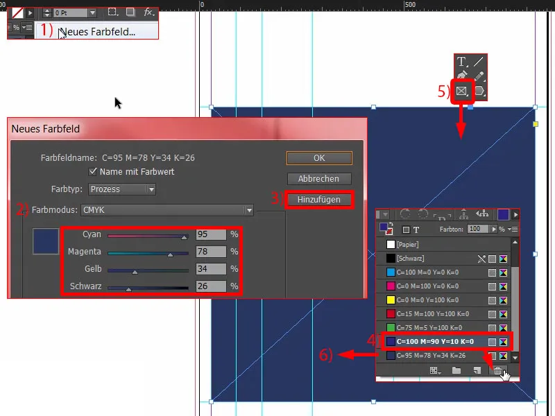
... but you can see that we have quite a strong contrast here. We actually have this shade of black (1) and then it flows into this blue (2) without a subtle transition. What helps with soft transitions? Of course: gradients. That's why we're now going to create a gradient field so that it looks like this - when this image is viewed at the top and gets darker and darker - that it starts here in the dark again and then flows into blue.
To create a gradient field like this, we naturally need two colors. We already have one, which is this one here (2). And I'm going to get a second one now with the pipette. I'll zoom in here below and take this color value (3) ... Define as a new color field, but not in RGB mode, but in CMYK mode(4). Add it. Done.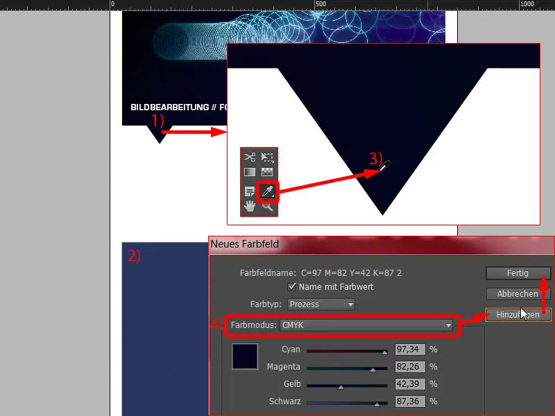
Now we have two colors that we need. Now we move on to a new grad ient field (1). We will call this "New gradient field" (2). Now we'll simply click once here on the left (3), where we can define the first color. Now I would have to enter this manually, but I don't want to because I already have the colors in my palette. That's why I select the color fields in the slider color area (4). Then I take this color (5). And on the right I take this color (6).
Now I can click on this funny little diamond in the middle (7). What does that mean? It sets the mixing ratio, more blue or more black. And my position is somewhere around 80 %. Now we go to Add (8). Done (9).
Okay, now if I click on this and I select this gradient box (10) ... what happens? Something is wrong. The problem is, this black area should actually be up here (11).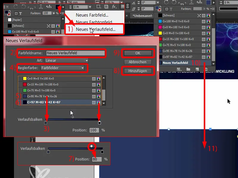
But if I go back into the gradient field (1), we don't have a slider like in Photoshop that shows us so nicely in a circle from which direction the gradient field is coming. That simply doesn't exist here in InDesign. You have to think about it: What else can I do here? You can choose radial, but that's not the solution to the problem.
I'll tell you where the solution can be found, namely in our toolbar on the left, if we go to the gradient color field tool (2), shortcut G, here. Then I can select this field. And now I'll just hold down the Shift keyand drag it upwards (3). And now it fits.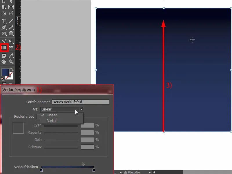
In the next step, I'll get a copy of it again (1) and drag it to this position (2). Arrange>Into the foreground. Now we have this at the top. And I subtract this triangle from the shape behind it. So once again the Pathfinder, this time Subtract (3). And voila, there's the triangle. Cool thing, isn't it? Let's take a look at the whole thing. Perfect.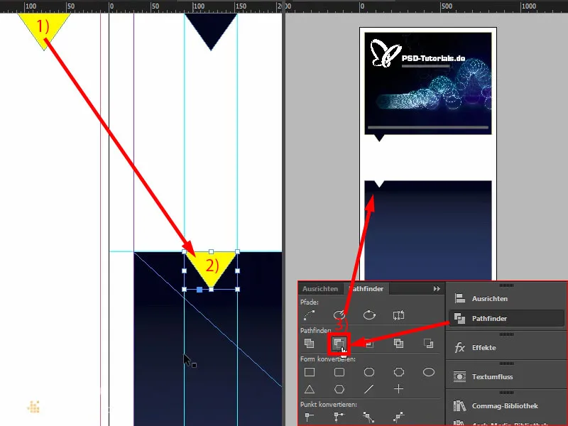
Prepare text for "good reasons"
Tell me, how many good reasons do you need to register with PSD-Tutorials.de? Actually only one, namely really cool tutorials from really good tutors, but I'll give you six right here.
Simply draw up a text field (1). Change the view quickly. Then it's time for a new font: Eurostile LT Std in Bold. 490 pt large, that will be really bold. Then our corporate color (settings at 2). And then we can type in a "6" here. Reduce the text field to the required size by double-clicking on the handle (3).
And then another text field, also in Eurostile LT Std, but this time not Bold, but Condensed, size 260 (4). A condensed style is always characterized by the fact that it is very, very, very slim. That doesn't mean it was on Weight Watchers, but it's still incredibly slim in appearance. Take a look at this: "Good Reasons".
And in Medium, font size 90 pt, I write below it: "Being a member of PSD-Tutorials.de" (5).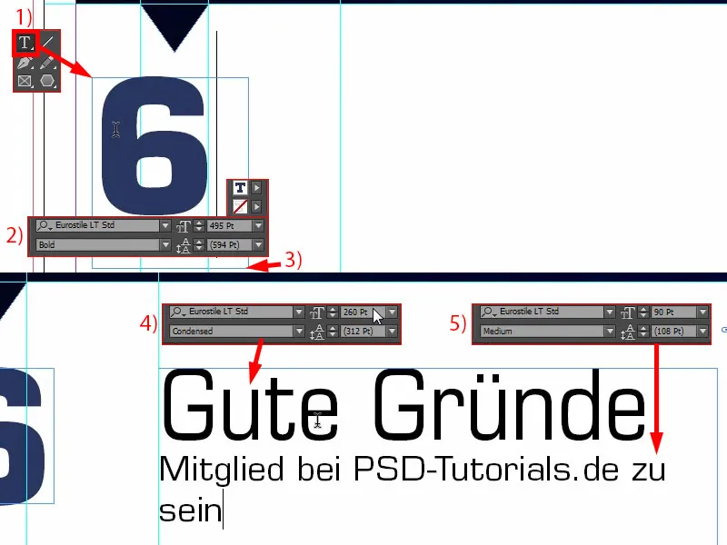
That doesn't fit here now, so we have to move it a little to the left and make various adjustments anyway. First, let's make the text field a little bigger so that everything fits in (1). And now let's align it briefly with the top edge of the "6" (2).
The line spacing also doesn't fit. That's why I select the entire text - and enter 136 pt in the line spacing (3). Then we can also change the color to blue (4).
This is how it looks now. Actually quite good, but what doesn't fit is this gap, which is very unpleasant to the eye here (5), because the larger your font size, the more width you have before the first letter. Of course, we want to avoid this, and there are a few tricks to do so.
I'll show you one of them now: We simply add a space before the "G". Zack. Now I'll mark this space (6) and we'll undercut it. I'll enter -310 here (7). And now you can see what we've done here: Both are almost on the same edge (8). So that's a simple trick, how you can align something like this symmetrically.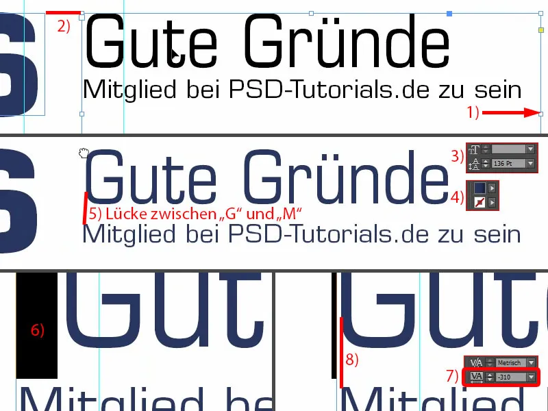
Next, I would like to adjust this text field to the "6". The spacing doesn't quite fit yet, so we can go a little higher until it jumps out. So at 169 pt, that's where it stops for me (1).
And then we just have to align everything, the "6" and the good reasons, in the middle between the upper and lower block. So I'll move it up (2), and then we'll hope for our spacing aids when we move it down (3) ... We have one here, but it's not quite right (4).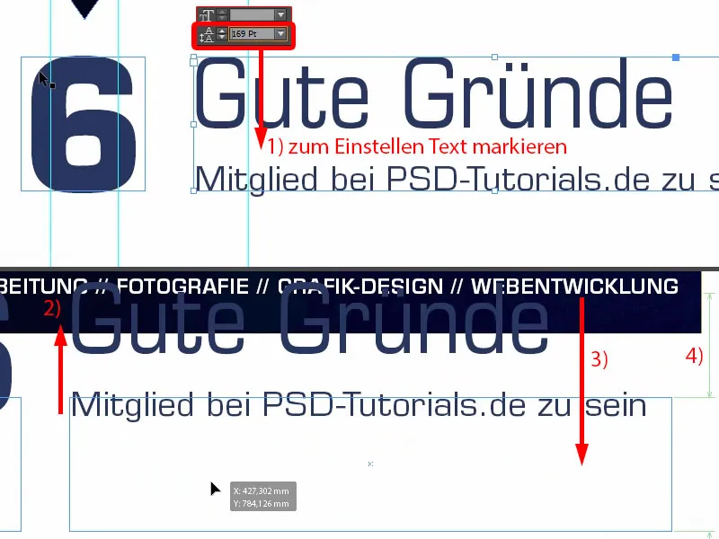
Unfortunately, there are no other spacing aids. Then we have to do it manually: First, we'll draw a rectangle here and give it a color (1). I drag it to this position (2). I align the good reasons with this (3).
Then I can draw a color field in the background and place it in the background using Arrange (4). Now I mark both the "6" and the good reasons, because now we definitely have a reference. You can see this from the green line that appears in the middle (5). Now we have the center and can delete the placeholders again.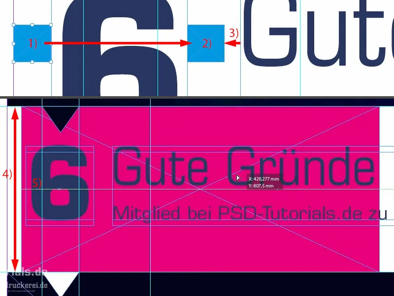
This is also the way I often work with placeholders in several places so that I always have the same spacing. This is the intermediate result.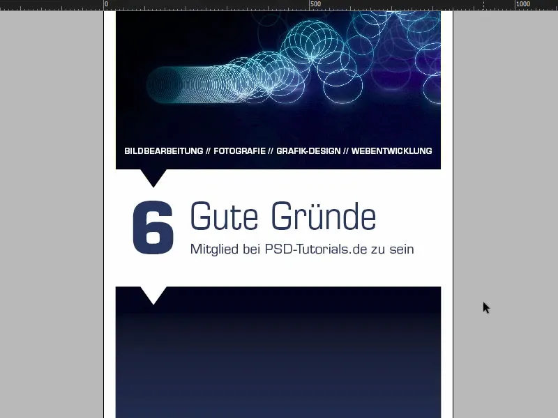
Inserting icons and editing texts
Now the icons follow. They are placed here between the two guidelines (1). Ctrl+D, select the hat and drag it exactly between the two guides (2). There is the hat, these are very simple PNG files.
Next, I draw a text box in the same size as the icon. Then I also align this to the top edge (3). And then I add the description text. Here, too, we use the Eurostile LT Std, font style Demi, 72 pt and the whole thing in white (settings at 4). I get the text from my clipboard, just copy it in.
So that I can also use the whole thing for the other five icons, I have to prepare it a little, because not every description text goes over two lines. With just one line of text, the whole thing would always hang on the top edge (at 3).
To avoid this, you can simply open the text frame options for a one-liner, Ctrl+B (5). And there, under Vertical alignment, I click on Center (6). If I now make a copy of the whole thing, using Alt and Shift, and change the text with a one-liner, it looks like this (7). InDesign positions the text in the middle.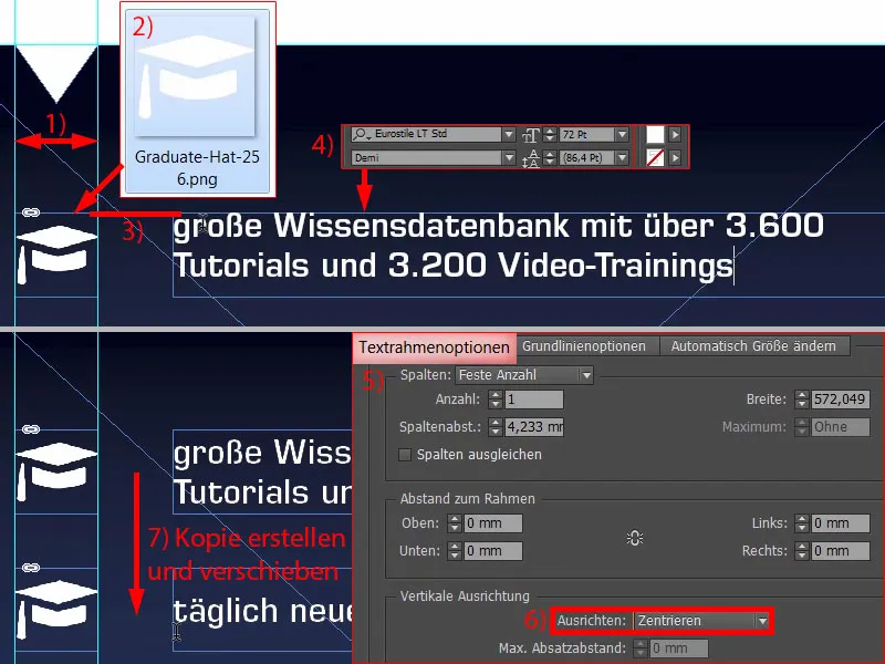
Here too, of course, we need uniform spacing. So simply create another rectangle, 50 x 50 mm (1), give it a color (2) so that we can differentiate. I'll move it to this position (3).
Here we'll swap the icon, Ctrl+D, and then I'll grab the spaceship here (4). And then we continue. Select everything once (the spaceship and the "New daily ..." text field), move it down (5). Next content (6) ...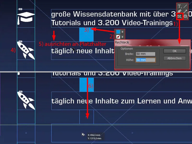
... and so on until all six good reasons are present. Now the space is getting tight (1).
We need to make sure that we align the top better. Let's take a look at the whole thing. I'll lock this in the background (2).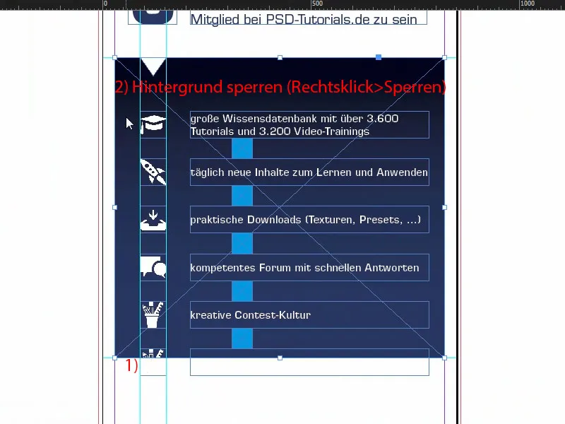
Now I can select everything without taking the background with me. Holding down the Shift key, I move it to the top (1). Then I move the content to the last good reason (2).
Then I can delete all these placeholders again.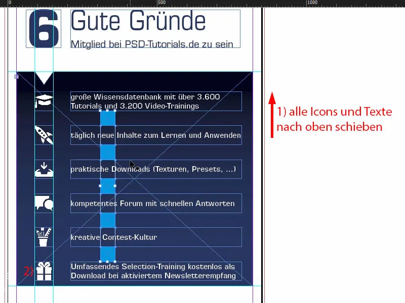
Now we need to center the whole thing. To do this, I can select and move them all until I hit the center. I think it looks quite good this way.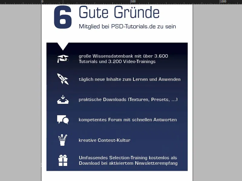
Editing the lower part of the roll-up
Our Batman is missing at the bottom. I grab him and drag him to (1). I drag the field to the right (2). Right-click, Customize>Fill frame proportionally (3). Okay.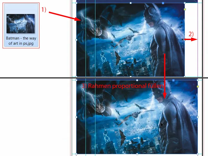
Our triangle is still missing here. I'll get that from above. Ctrl+X, insert (1). In this case, I simply set the color to blue, because we have identical colors here (2). It's not so easy with images, but in this case it's allowed.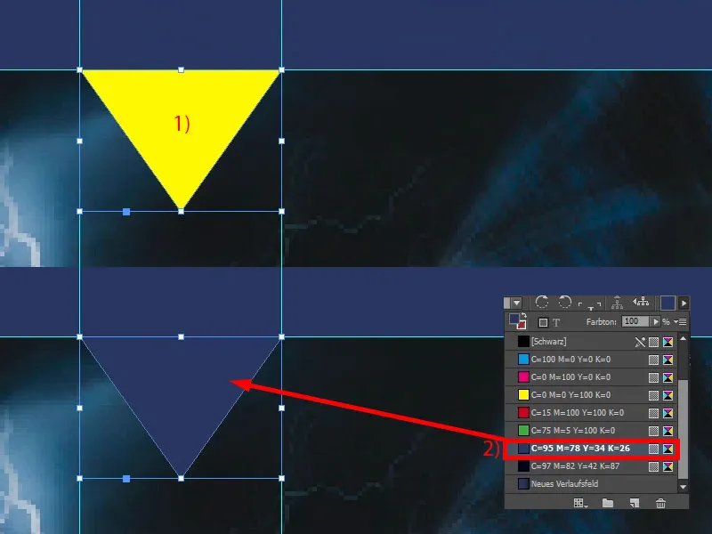
I take another quick look at the template, there's the Internet address at the bottom, which I can actually copy as it is. I can also see that we've made Batman a bit too big.
Yes, I know, superheroes need space, but this superhero has to make do with a little less (1). Then I draw a text box from one edge to the other. Now I copy in what I have in the clipboard (2). And then we have to make sure that the whole thing is above the line that marks the non-printable area. Yes, dear Batman, maybe we'll have to cut off a bit of your nice washboard stomach after all. Or we'll cut off your ears ... Push them up a bit more, take a bit off the bottom. All right.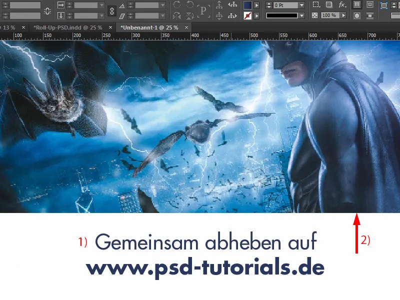
Overview of the roll-up design
Ctrl+0. Let's take a look at it from a bird's eye view and scroll through it once. Okay, the logo fits at the top. Below that, we have our four areas of expertise and 6 good reasons to be a member.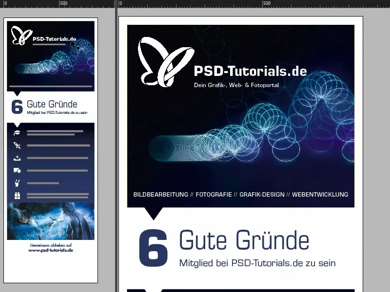
Then there are also the six reasons ...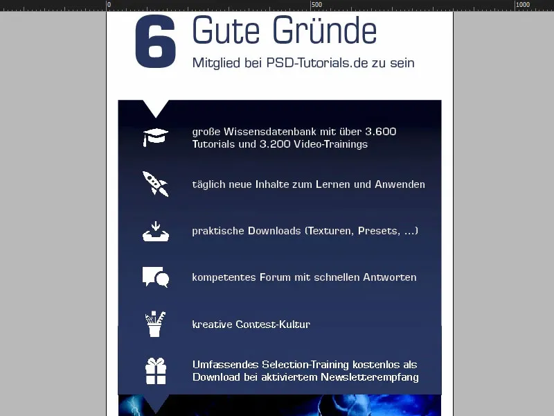
... and then the Batman and the web address at the bottom.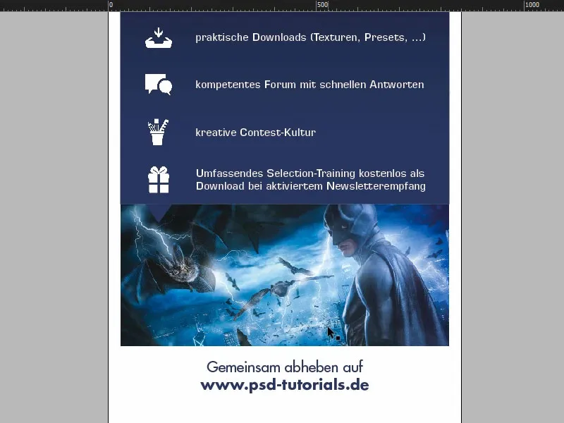
Although I don't like that ... I'll have to improve that again. The pointed ears have to be indicated, otherwise this picture looks wrong to me.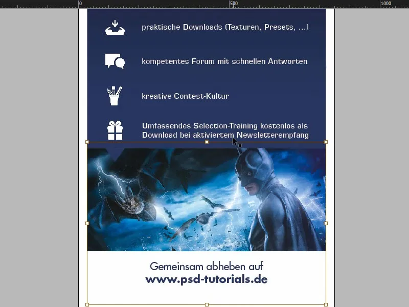
Basically, you always have to bear something in mind when working with roll-ups: Just ask yourself from what position does the viewer perceive this roll-up? Mostly when passing by, mostly somehow at trade fairs, when their gaze just happens to cross this roll-up or because it is very attention-grabbing. But they will never have too much time to read through everything or take the time to stand in front of it and read through everything. This means that you generally always have to work with large, large fonts, with minimal information. It's better to work with visual communication tools such as icons or images. Of course, the logo has to be there. But you shouldn't overload it, because I promise you: Nobody will read it.
Maybe some of you will now say that even this is already borderline (1). Could be. For my taste, I think it's still perfectly fine. But as I said, please always keep this in mind and ask yourself from which situation the interested party is viewing this communication medium.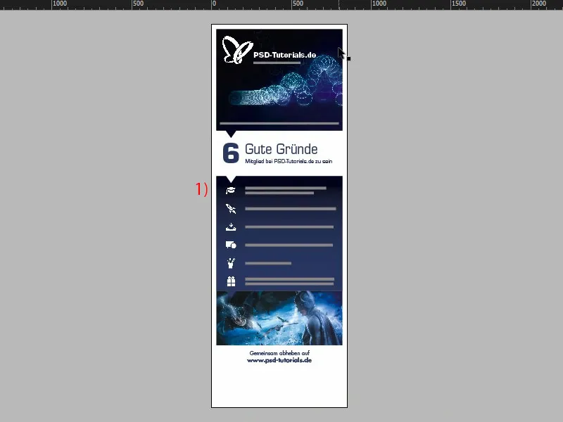
Check resolution and export
We've done the job so far. We'll now export it and then it's time to upload it. Before we do the final export, it's worth taking one last look at the images. As you remember, we read on the printer's website that the images should have 120 dpi. If you now simply open an image in the link panel(1), like this one here, which is the cover of "Animation in After Effects" (2), you will actually see that the ppi is 145 (3). 120 was the default, which means we are within a range that is perfectly acceptable. So that fits. Okay.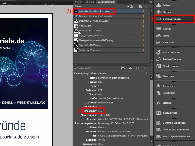
Then Ctrl+E. Save. Here we select ISO coated, the default, which we have already saved.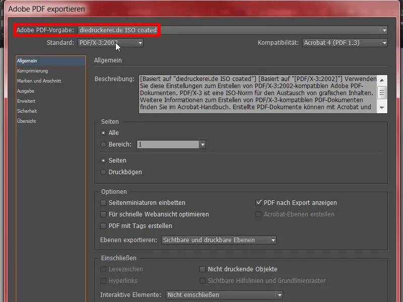
Otherwise, check the marks and bleed again, and be sure to use the document's bleed settings, i.e. 10 mm.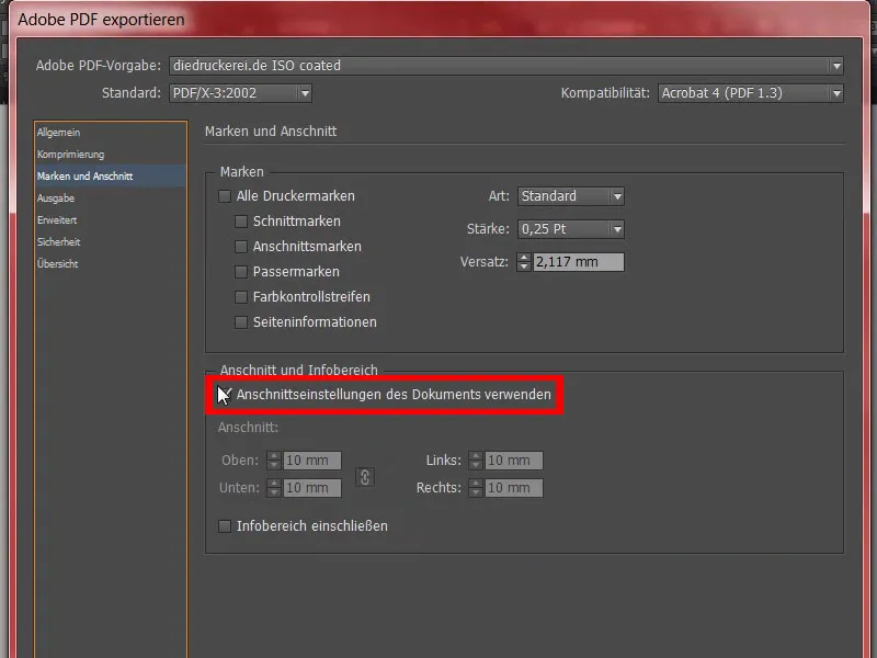
Then check the values in the output. That's correct so far. We go to Export.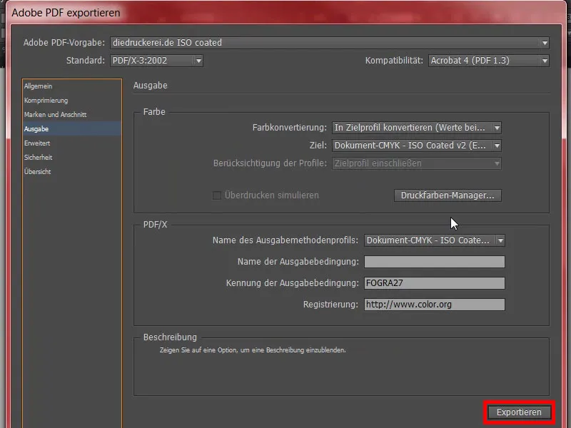
This will now be a really large document, I think. There's the PDF. Looks clean.
Excellent, but now I'm a bit curious. Now let's take a look at how big the file has become ... "video-rollup", right-click and then open the properties. There we see: Yes, well, the file is seven and a half megabytes. We can now upload it.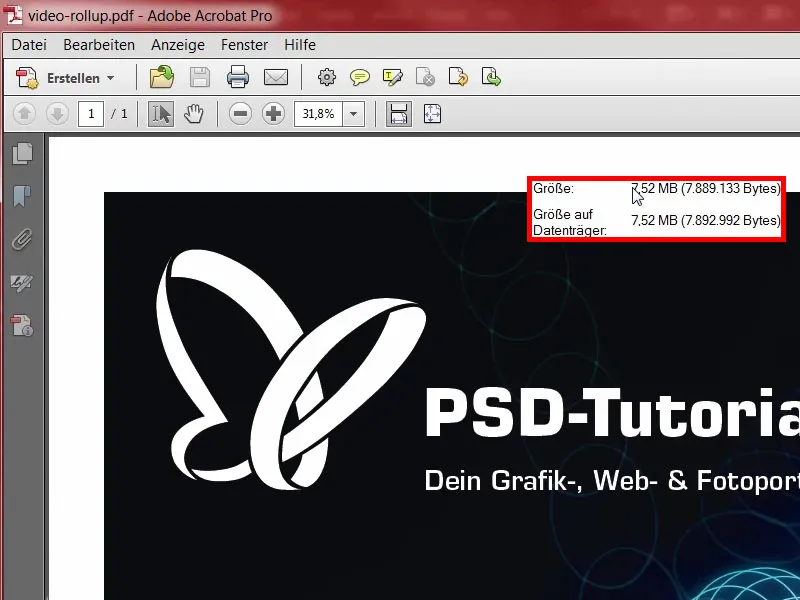
Transferring the roll-up to the print shop
Quickly go to the advertising system (1), select the rollup (2), Rollup System Exclusive (3). That's what we selected. That fits so far. We had announced 260 gram polyester fabric, we'll keep it that way (4). Edition 1 (5). That's all we need at the moment. We can also do a data check (6) in case something goes wrong. And then it's on to the order. That's all okay, so click Next. Here is the data with the address. Next. Payment method, also click Next. We accept the terms and conditions and privacy policy. And then we would like to subscribe to the newsletter. And buy. "Thank you for your order" - here you go (order process follows). To upload, and then simply drag and drop the file in here (7) ...
Now it's uploaded. We select the front side (8). "Resolution below 120 dpi"?! (9) Oh well, we'll have to take another look to see what's happened, whether some image might not quite reach the limit. It could be that it's the Batman. We've already checked the first one. I'm going to check it again in detail to see where the problem lies. But it's handy to know if something is really wrong, that you get the clue at this point. All that remains for me now is to wish you lots of fun with your next training session. For my part, I'll have to do some touching up and check which of these pictures has spit in my soup, but I'll definitely get it right.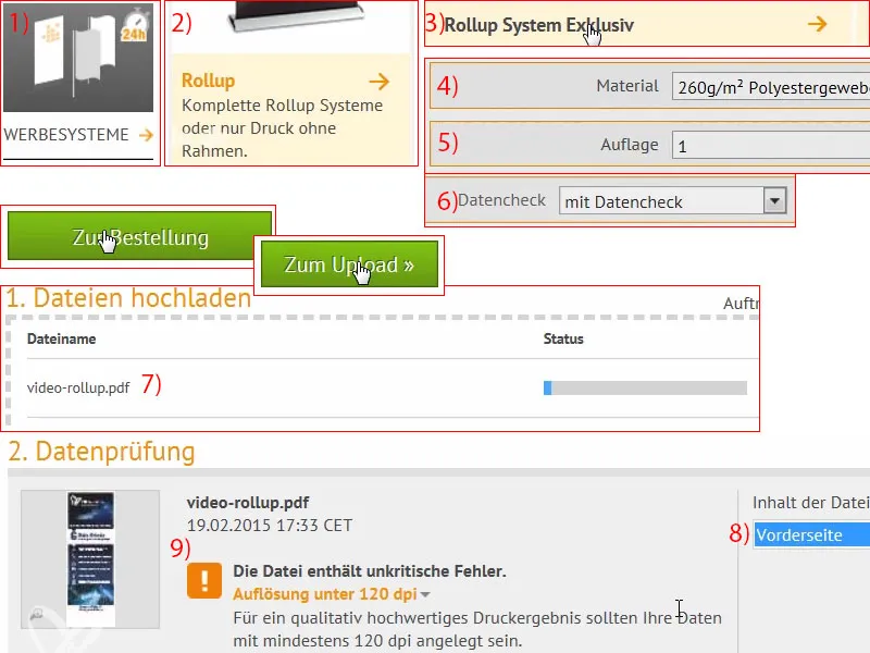
Unboxing of the printed roll-up
It's neatly packaged ... And the roll-up is also packed in a separate bag, which is wonderful. It looks really high quality.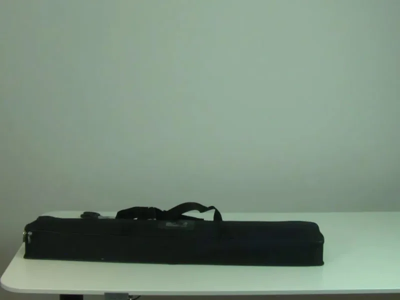
Here we have the carrier system for the back.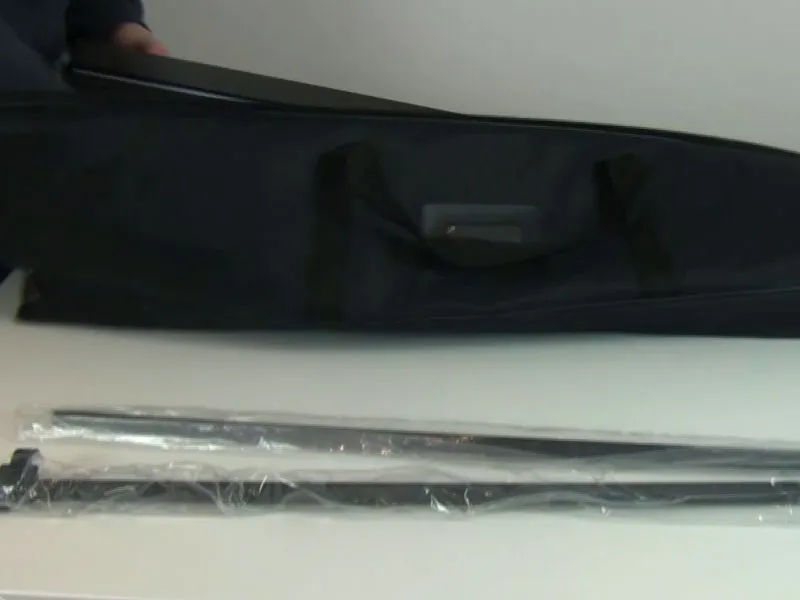
And here is the good piece. This was the exclusive version, it looks very high quality. And when you place it on the floor, you simply screw the support system into the screw thread provided. With a few rotations to the right, it fits perfectly.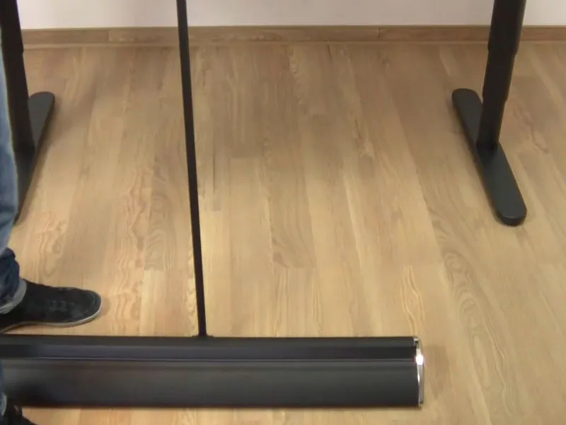
Then it really does go up with one pull. As you can see, you can really set up this roll-up on your own. You don't need two men or a whole soccer team, you can really do it on your own. A little higher ...
In terms of appearance, it looks really great, so I have to say that it really impresses straight away. You can see a slight translucency, but of course it's not available light, which is what we have here in this room, but there really are permanent lights, eight bulbs with 70 watts each, which illuminate the whole thing, and accordingly the bar shines through a little at the back. But of course that won't happen at a normal trade fair, where it won't be illuminated like this. Above we can see the bouncing ball again, which by the way is an artwork by Philipp Sniechota, who recorded an After Effects training session for us. Then the six good reasons. Makes a really solid impression.
The Batman ... By the way, that was our problem child, I had embedded the wrong image. I then increased the resolution again. And here everything is really razor-sharp, makes a really solid impression.