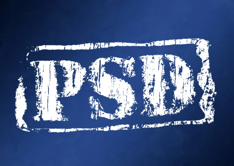
A grunge effect gives typography and layouts a rough, unconventional look that is perfect for modern and creative designs. With Photoshop, you can easily achieve this style by using textures, masks, and brushes. In this tutorial, I'll show you how to step by step give typography and layouts an authentic grunge look – from subtly worn to intense and chaotic. Let your creativity flow and add an extra dose of character to your designs!
1. The Classic: Grunge Text with an Urban, Dirty Look
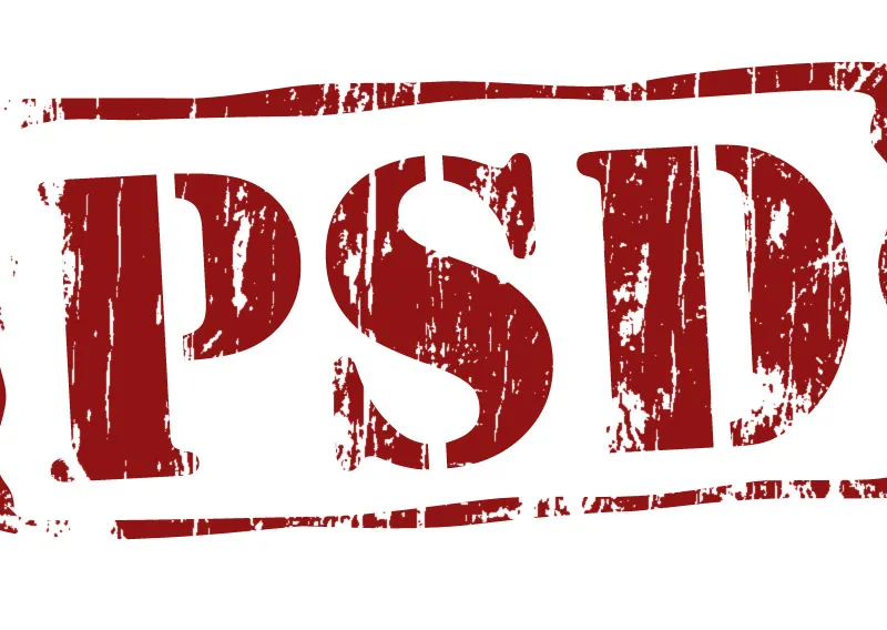
The classic grunge effect is text interspersed with dirty elements that give the text its typical torn, dirty appearance. To create this effect, an image containing "dirty textures" for the text is needed.
Step 1: Create a New Document
First, I open a new document through the shortcut Ctrl+N in the size of 1200 x 800 pixels. The background is white.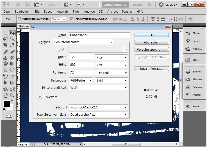
Step 2: Place Text
Using the Text tool, I draw a text frame and write the letters PSD in black color with a 400-point font size.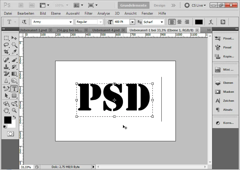
Step 3: Rotate Text
Text always gains a bit more dynamism when slightly rotated. So, I hover over the corners with the mouse pointer until it changes to a double arrow. Now I can rotate the text. I choose an angle between 3 and 7 percent.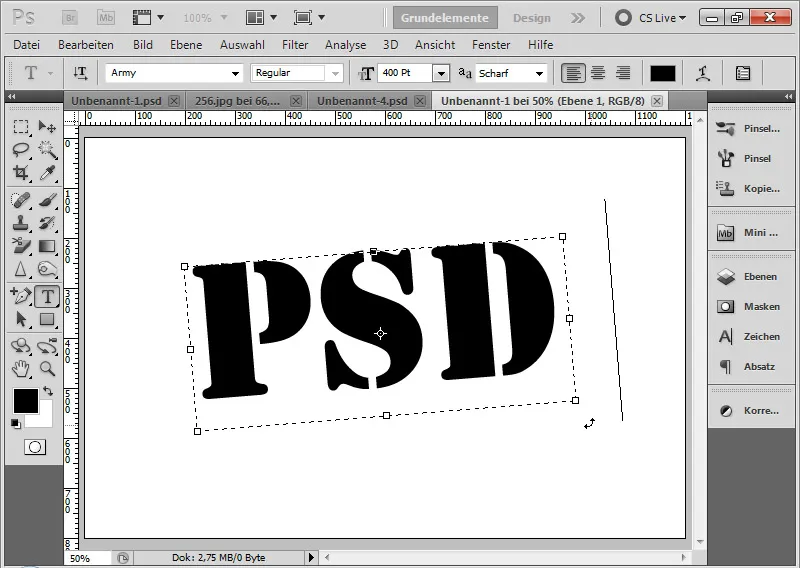
Step 4: Open Image with Textured Background
I open an image that has hard, linear structures that I can incorporate as grunge particles into my text. The initial conditions in this image will determine the particle structure the dirt effect will have in the text.
My choice falls on a tree image. In this image, I have two different structures: on one hand, linear indentations in the heart bark of the tree for a hard-edged effect, and on the other hand, splattering features on the "normal" tree bark.
Image source: azaliya – Fotolia.com.
If the image was placed as a Smart Object in the already opened document, I can convert it to a normal layer by right-clicking on the Smart Object in the Layers panel>Rasterize Layer. This is important because otherwise my subsequent image correction will not work.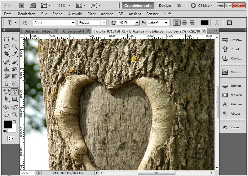
Step 5: Apply Threshold Image Correction
Through the menu Image>Adjustments>Threshold, I can filter out my desired dirt particles for the grunge effect.
The Threshold Image Correction converts all pixels in the layer to black and white. With the Threshold slider, I can control the sensitivity at which the separation into black and white occurs. I move the Threshold slider from 128 to the left towards 1. In the preview, I can already see when the effect might fit. I leave the slider at 96 and confirm with OK.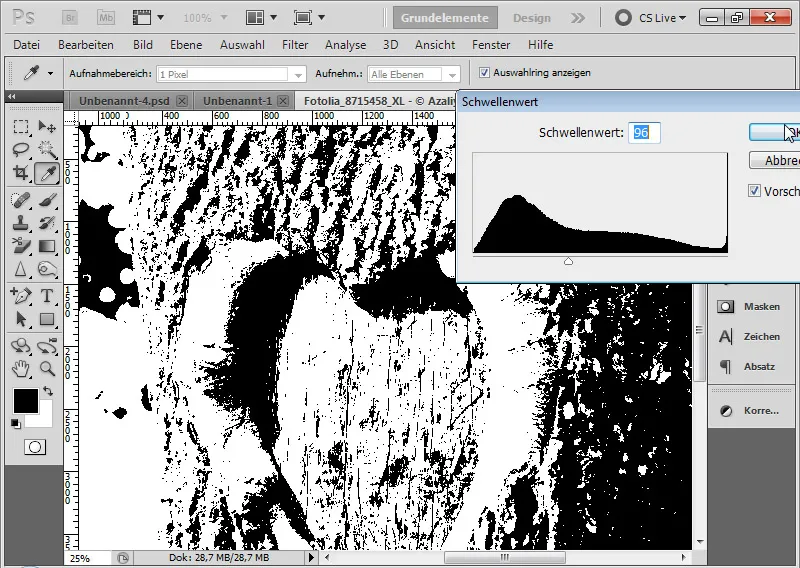
Note: Not all images reveal suitable dirt particles for grunge effects after applying the Threshold Correction. In these cases, the Threshold Correction must simply be tried with different images until one produces the desired results.
Step 6: Select Color Range
Through the menu Select>Color Range, I can select my black pixels in the image. For this, I choose a high Tolerance and click with the Eyedropper tool on a black area in the image. Then I confirm with OK.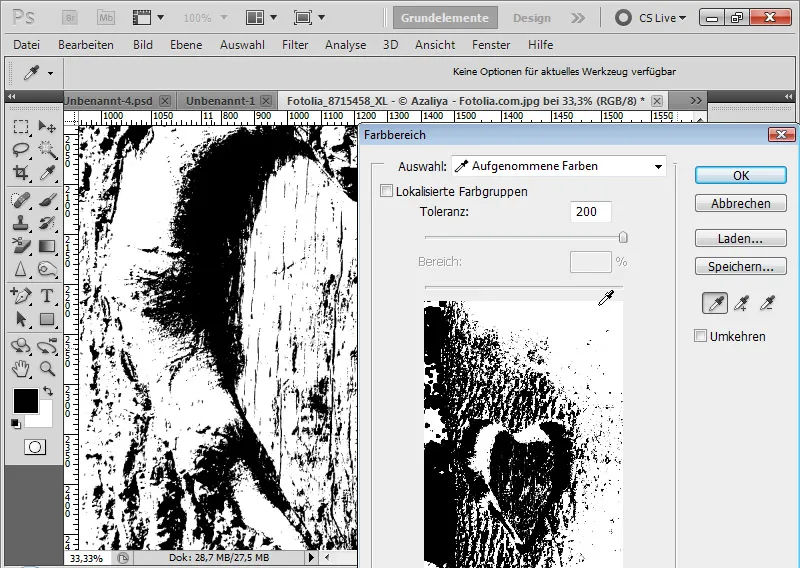
Step 7: Separate Dirt Particles into a New Layer
Using Ctrl+C and Ctrl+V, I copy the selected black pixels and paste them into a new layer.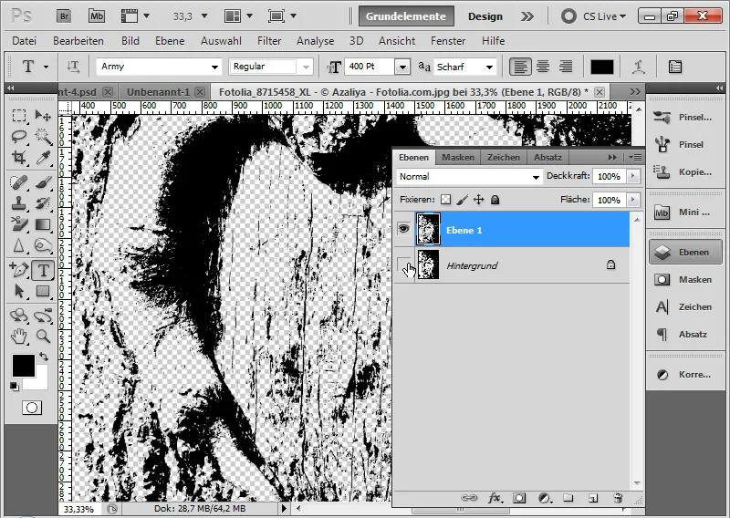
If the separation of dirt particles was done in a separate document, I can duplicate this layer and paste it into my main layer. If the separation of dirt particles was already done in the main layer, I can delete all other layers of the image.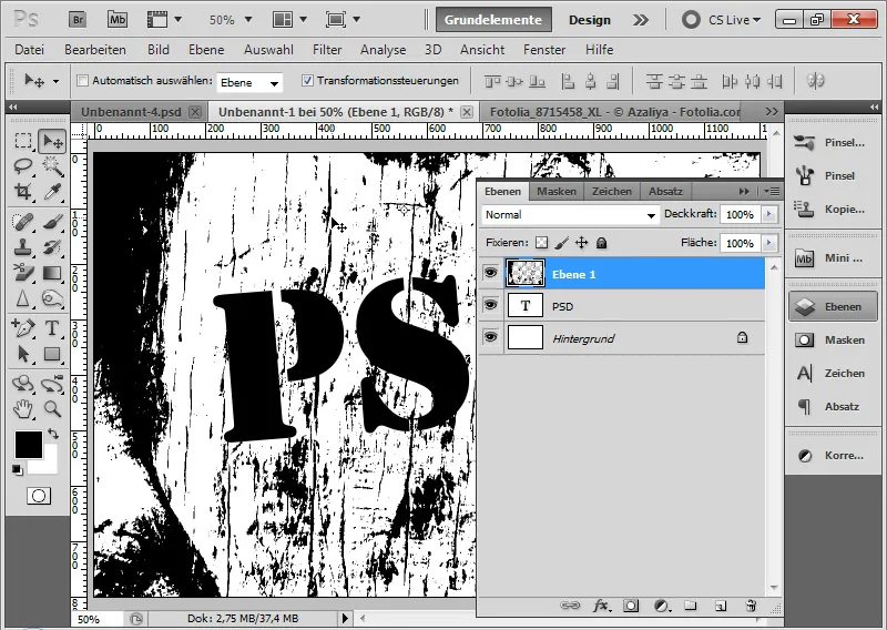
Step 8: Adjust Color Overlay
In the Layer Styles for the dirt particle layer, I can adjust a Color Overlay in the background color hue.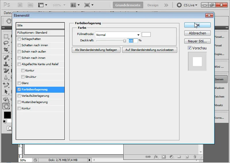
This gives the best effect. With that, the classic grunge effect is complete. In the following steps, I would like to give a few tips for further editing.
Step 9: Clipping mask to text
Since the color overlay of the dirt particle layer is based on the background, I cannot easily choose a different background. Therefore, it is optimal to apply a clipping mask to my dirt particle layer with the text layer. I do this using the shortcut Ctrl+Alt+G or with Alt and Click between both layers.
This way, the effect only affects the text area.
Step 10: Gaussian Blur
If the effect still appears a bit harsh, I can soften it by applying a Gaussian Blur with a minimal Radius of 0.3 pixels on the dirt particle layer. This makes the dirt particles more pleasing to the eye.
Step 11: Create a frame around text and layer mask
Using the Custom Shape Tool, I choose frame 7 from the default settings and draw it around the text. The layer is placed above the text layer and given the same color tone as the text.
The grunge effect should also work in the frame. On one hand, I can simply duplicate the dirt particle layer with Ctrl+J and assign it as a clipping mask to the frame layer.
Alternatively, I can also simply add all text and frame elements as a layer mask.
To do this, I lift the clipping mask with the shortcut Ctrl+Alt+G again and delete the previously duplicated dirt particle layer.
I select the text by Ctrl and Click on the layer thumbnail of the text layer and add the selection as a layer mask to the activated dirt particle layer by Clicking on the Add Layer Mask symbol.
For the frame layer, I select the layer content by Ctrl and Click on the vector mask. Then, I click into the layer mask of the dirt particle layer and fill the selection with white color.
The advantage of using a layer mask is that I don't have to create a new clipping mask with a dirt particle layer every time I add new text or shape elements. This way, I can keep the dirt particles centrally in one layer and simply consider new layer contents in the layer mask.
Another advantage: When the Fill Options are activated, it may happen that in the hierarchy the specific layer style is above the clipping mask and therefore fully displayed. Therefore, if in doubt, a calculation must always be made by changing the Fill Method.
Step 12: Optimize layer mask
With pixel selections via Ctrl and Click in the thumbnails in the Layers panel, it can happen that small contours remain after the selection.
Therefore, I select the mask content by Ctrl and Click in the layer mask and open the Refine Edge dialog with the shortcut Ctrl+Alt+R. There, I move the Edge to +100 percent. The selection is slightly expanded.
Alternatively, I can also simply go through the menu Select>Modify Selection>Expand with a value of 1 pixel.
I fill the expanded selection with white color within the layer mask. The small contour is thus removed.
Step 13: Optionally adjust dirt particles
I release the connection between layer mask and layer. This way, the layer mask remains in this position, while I can move the layer content.
This allows me to see which dirt particles I like best in the respective position and adjust the view if needed.
My classic grunge effect is complete - in this image with a red color overlay on a black background.
2. Applying the grunge effect using predefined brushes
Since the effect using a dirt particle layer is more static, as the particles always depend on a suitable, structured image, it is recommended to achieve the grunge effect using predefined brushes.
Anyone can quickly create a grunge brush from a photo or texture template. It is essential that the template from which the brush is created has enough structured content.
Step 14: Using Thresholded Image as Brush Preset
Since the tree image could already be used for the classic grunge effect with its base structures, I can now also create a brush tip from it.
Using the Lasso tool, I select a suitable area in the image.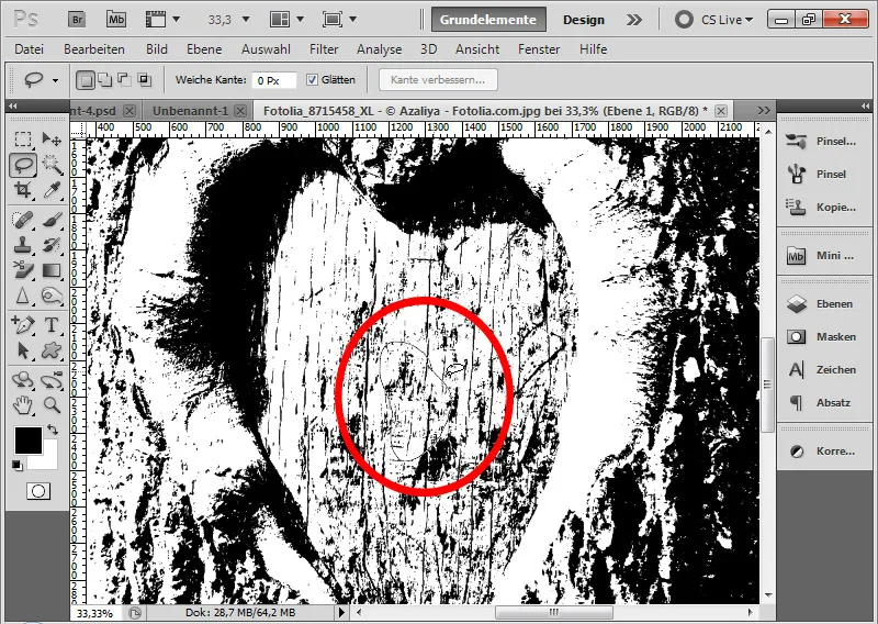
I copy this area with Ctrl+C and paste it into a new layer with Ctrl+V.
By holding Ctrl and clicking on the layer thumbnail, I select the pixels of the previously inserted dirt particles.
In the Edit menu, I can define the brush preset.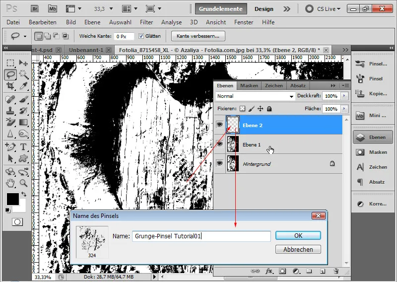
Step 15: Placing Text
In a new document with a textured background, draw a text frame and write the word "Grunge" using an Army Expanded font size of 160 points.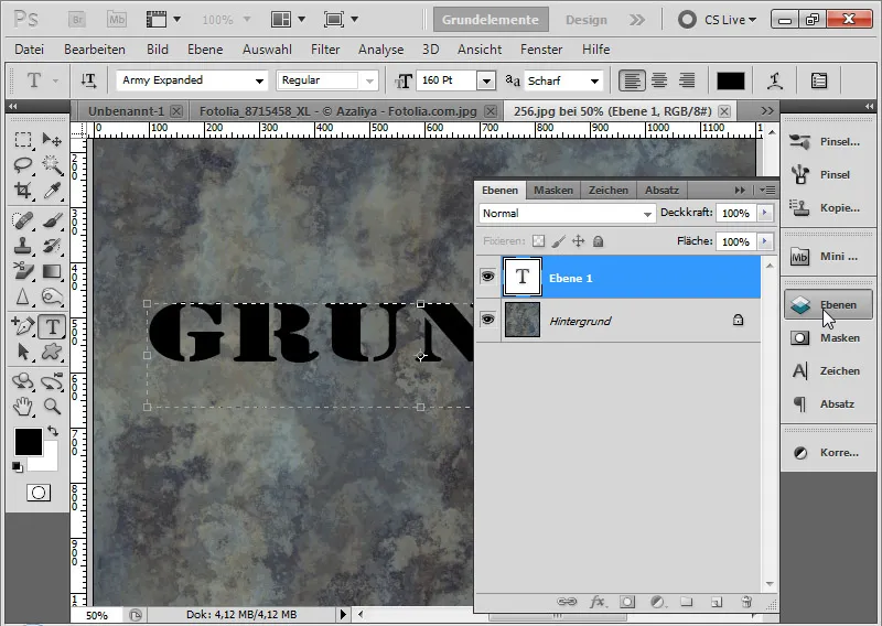
Step 16: Create New Layer and Set as Clipping Mask
I create a new layer with Ctrl+Shift+Alt+N and set it as a clipping mask over the text layer using the shortcut Ctrl+Alt+G. The clipping mask ensures that the brushed dirt particles are only displayed on the text.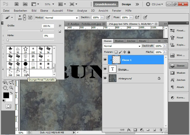
Step 17: Brush in the Brush Preview
In the brush preview, the brush has been added at the bottom.
Now I can apply this brush in size, color, and transparency as desired. It is recommended to set a moderate angle jitter in the brush shape dynamics for grunge brushes. I have set the setting to 33 percent. This ensures that the tool tip is rotated with each new click, preventing identical brush tips from being used at first glance.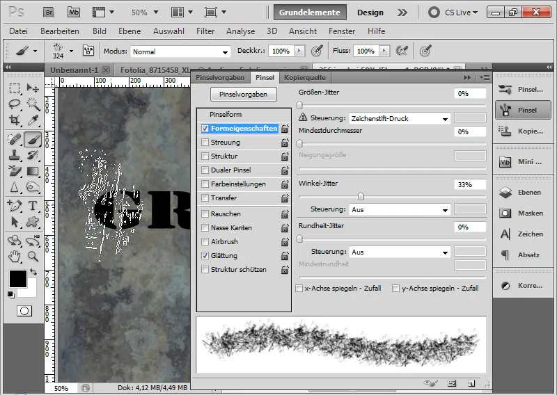
Step 18: Brushing
With my new brush preset, I can now brush dirt particles on the new layer in white, light gray, and dark gray.
The grunge effect is applied to the text.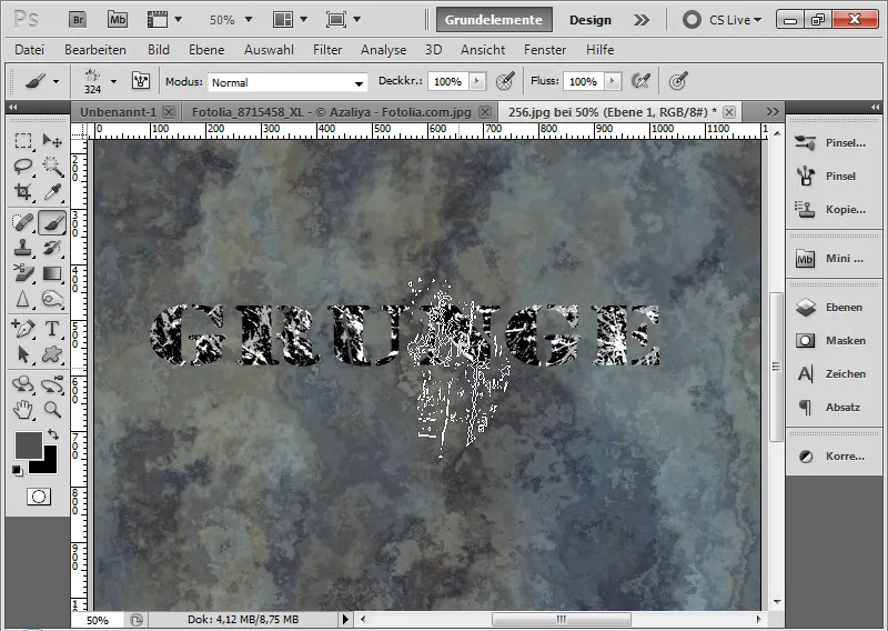
Step 19: Accentuating Grunge Text
For better visibility, I draw a white area below the text layer using the Rectangle Tool (U) in white with 40 percent opacity. In the fill options, I also set a 10-pixel thick black stroke with 25 percent opacity.
Subsequently, I add a drop shadow to the text via the fill options with 75 percent opacity.
The applied grunge effect over a previously defined brush tip is now complete.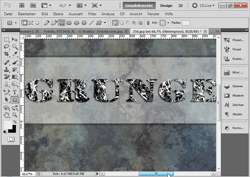
Step 20: Creating Brush Presets from Textures
In the first variation, the grunge brush was created from the structures of a photo. Creating a grunge brush is just as quick with a texture. It just needs to be sufficiently textured for it to work. In this texture, some minor adjustments are still needed to obtain grungy elements for a brush tip. The previous layers with the applied grunge text have been hidden.
By the way, the texture is from our Textures Double DVD, available in the PSD-Tutorials.de shop. The texture is also included as a working file in this tutorial.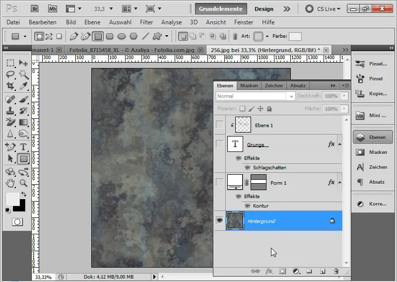
Step 21: Desaturate Texture
First, I desaturate the texture via an adjustment layer Hue/Saturation, by reducing the saturation slider to -100.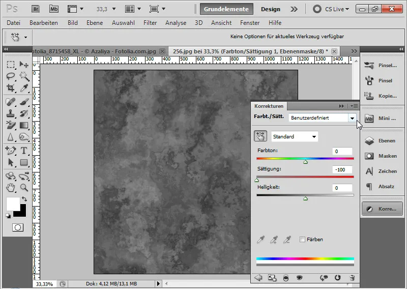
Step 22: Increase Contrast
In the next step, I select the adjustment layer Levels and move the two outer sliders towards the center to enhance the contrasts of the texture. In this example, the outer sliders are set at 46 and 135.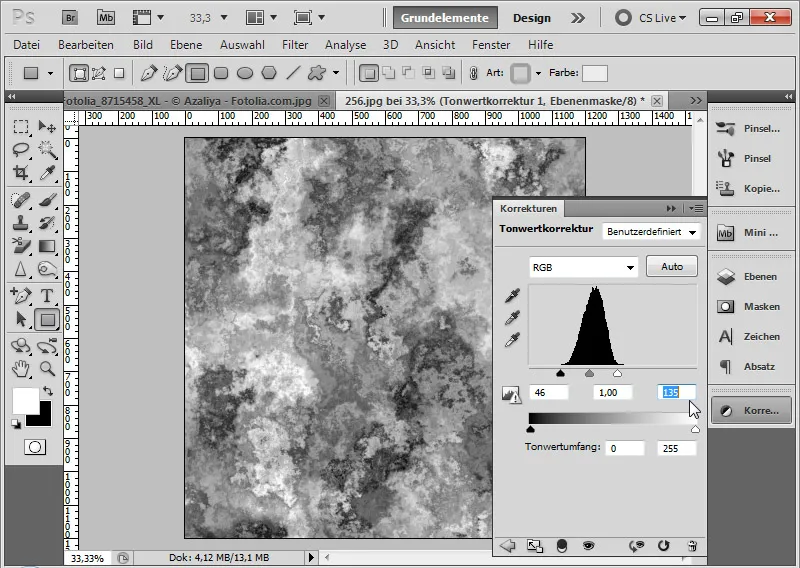
Step 23: Duplicate to Merged Layer
If the texture shows a good foundation for a grunge brush, I can duplicate all visible layers to a merged layer. I do this with the shortcut Ctrl+Shift+Alt+E.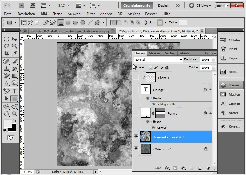
Step 24: Select Dirt Particles
Using the Magic Wand Tool (W), I click on a dark spot in the resulting layer that should represent the color content of my brush. The Antialias option in the menu is enabled, with a tolerance set to 32.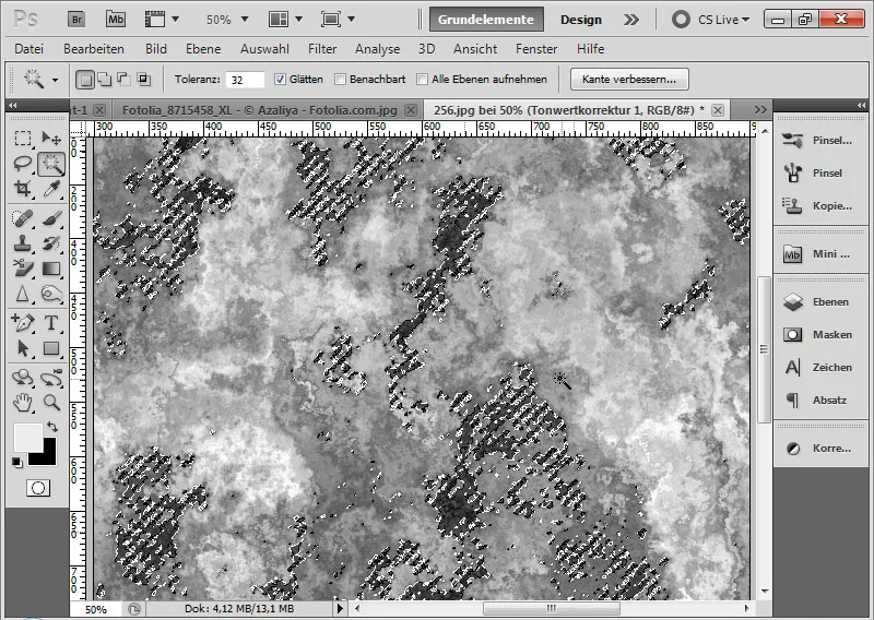
Step 25: Insert selected area into a new layer The areas in the brush with the selected color content are selected. I copy the selection and paste it into a new layer. I can delete the previous layer with the adjusted texture.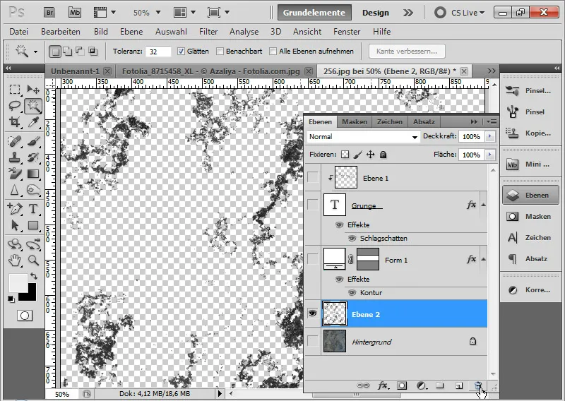
Step 26: Select specific grunge brush
With the Lasso tool (L) I can now conveniently select the desired grunge brush.
I copy the selected area with Ctrl+C and paste it into a new layer with Ctrl+V. I can delete the previous layer with the previously selected grunge elements. By using Ctrl and Left-click on the specific grunge selection layer thumbnail, I select the pixels of that layer. Through Menu>Edit I can set the selected area as a brush preset.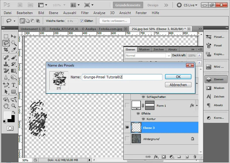
By the way: You can find numerous grunge brushes for download on PSD-Tutorials.de:
Download Grunge Brushes
Step 27: Applying grunge brush
Now I can apply the second brush preset to apply grunge elements, just like with the first brush preset.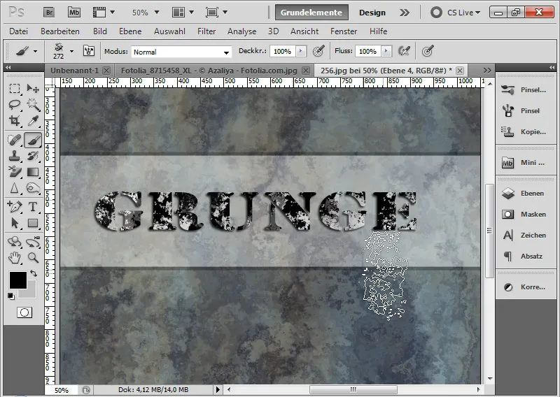
3. Creating frayed grunge letters
The previous two techniques describe grunge effects where more or less dirt particles were applied to the letters.
It gets really grungy when the letters themselves also get a frayed look. The basis of this technique is the calculation with a displacement matrix.
Step 28: Create displacement matrix
I take the existing texture and my previously created grunge brush and brush once completely over the document. (For those without a texture at hand, you can easily create a cloud texture using the cloud filter with standard colors activated. That works too!)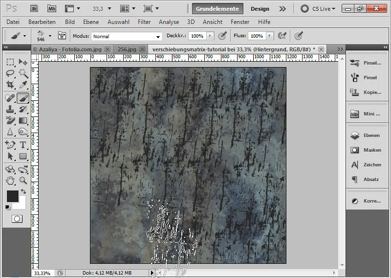
If the layer is not a background layer, I can convert it to one via the menu Layer>New>Background from Layer.
I save the file under the name displacementmatrix.psd. My displacement matrix is complete.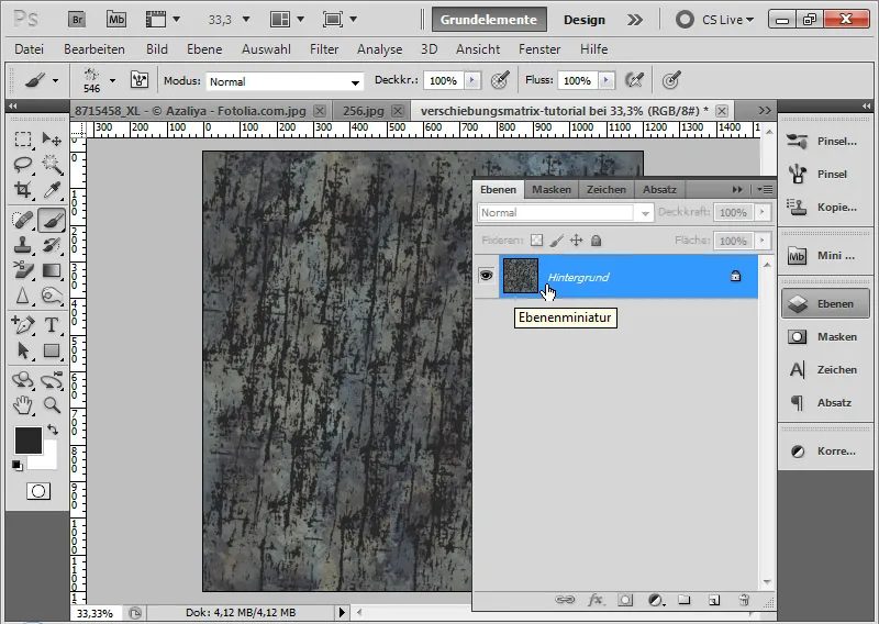
Step 29: Place text
In a new document sized 1200x1200 pixels, I write the word "Grunge" in 160-point Army Expanded font.
I convert the text layer into a Smart Object by right-clicking on the layer in the Layers panel>Convert to Smart Object.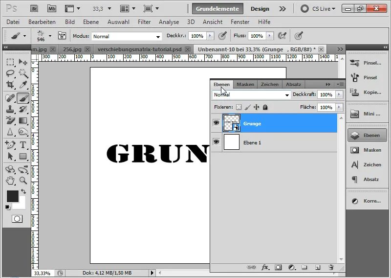
Step 30: Apply Displace filter
Now the Displace filter comes into play. The Displace filter is unfortunately not as intuitive to use as other Photoshop filters. Nevertheless, by applying a displacement matrix, I can create great effects that work well on surfaces with elevations and depressions.
The main image is distorted by the displacement matrix - in this case, my text - as image parts are shifted based on brightness differences. Therefore, I first created the displacement matrix and adjusted it for the displacement effect accordingly in brightness.
I apply the Displace filter with the following settings:
• Horizontal Shift: 15
• Vertical Shift: 3
• Radio buttons:
- Scale to fit
- Repeat edge pixels
The input for the shift can go up to 100 percent. 100 has the effect of a displacement of 128 pixels. Since the effect should mainly be lateral, the horizontal value is higher than the vertical one.
I confirm with OK.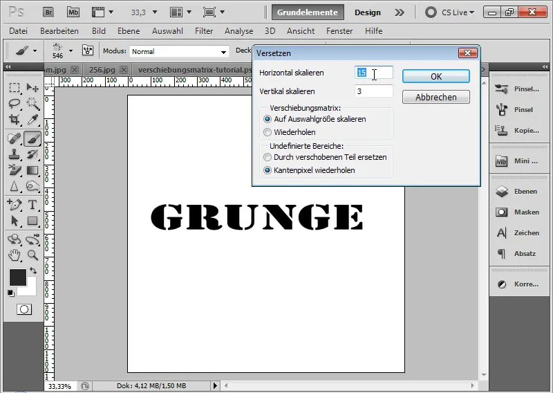
In the file browser that opens, I assign my previously created displacement matrix to the Displace filter. It is important that the displacement matrix is saved as a PSD or BMP document.
The Displace effect frays the text edges completely.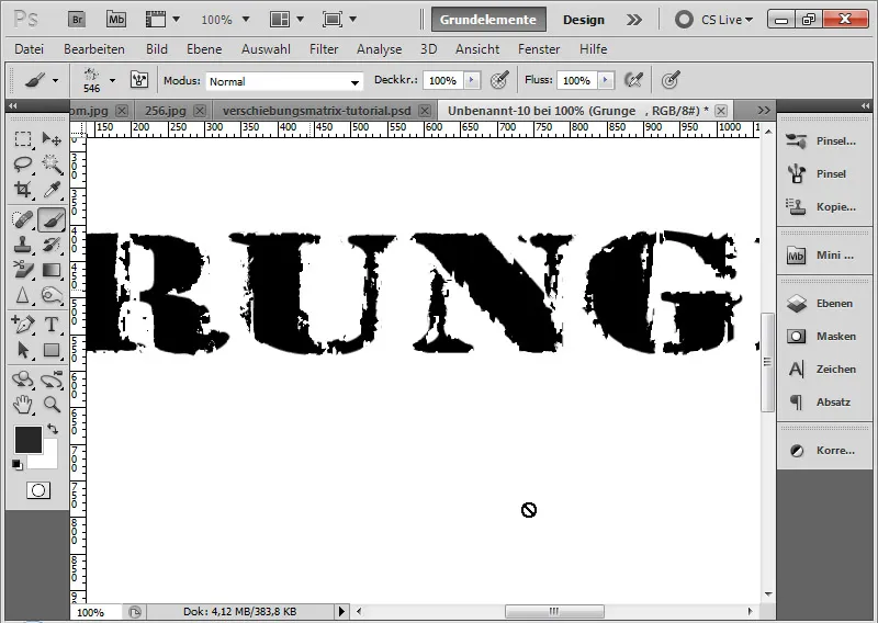
Step 31: Softening the frays
If the frays look too speckled, I can apply the Gaussian Blur with a minimal Radius of 0.2-0.4 pixels.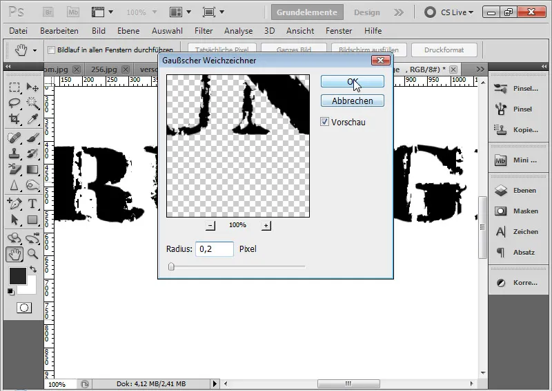
Step 32: Edge grunge effects
Now I can also simply duplicate my grunge dirt textures from the first effect into the new document. This way, I get another nice grunge frame for the frayed grunge text. Additionally, I set a red Color Overlay in the Blending Options of the text layer.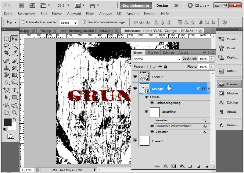
Step 33: White Outline
To further highlight the text, I create a white outline with a size of 100 pixels in the text layer.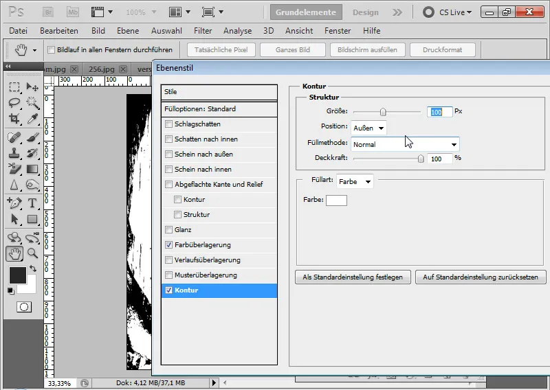
Step 34: Dirt Particles in the Text
If I want to put the crown on the grunge text, I duplicate the dirt particle layer, give it a white color, and limit the visible effect to the text area. To do this, I select the text and add the selection of the duplicated dirt particle layer as a layer mask.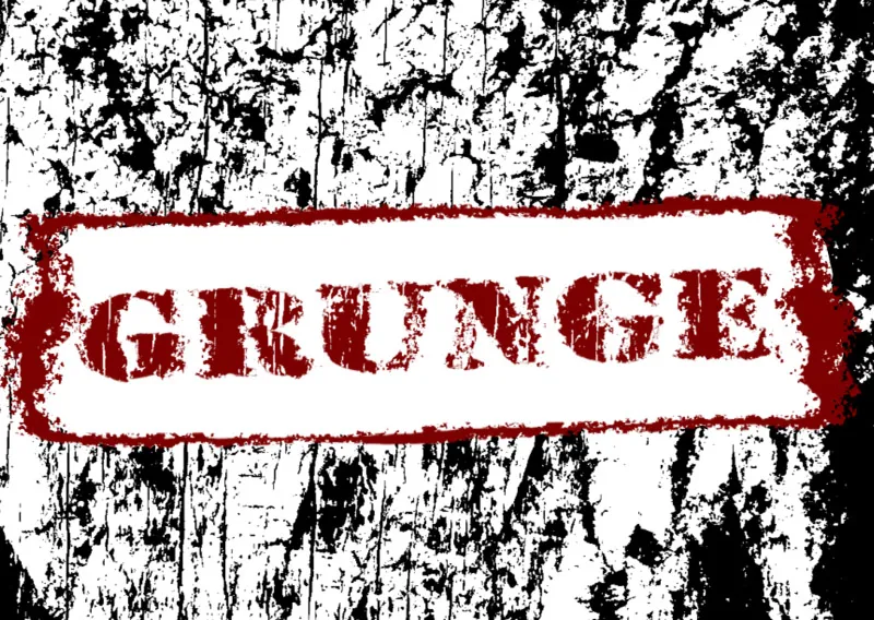
Step 35: Text Variations Still Possible
If I want to use a different text now, I simply click on the Smart Object Thumbnail of the text layer and change my text in the Smart Object Original. When saved, all effects are calculated with the new text. Cool!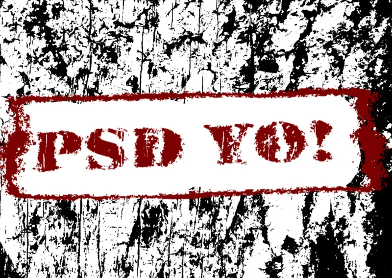
Step 36: Transferring Effect to First Grunge Effect
By simply applying the Offset Filter to the first effect as well, I can quickly transfer this frayed effect. The displacement matrix remains the same.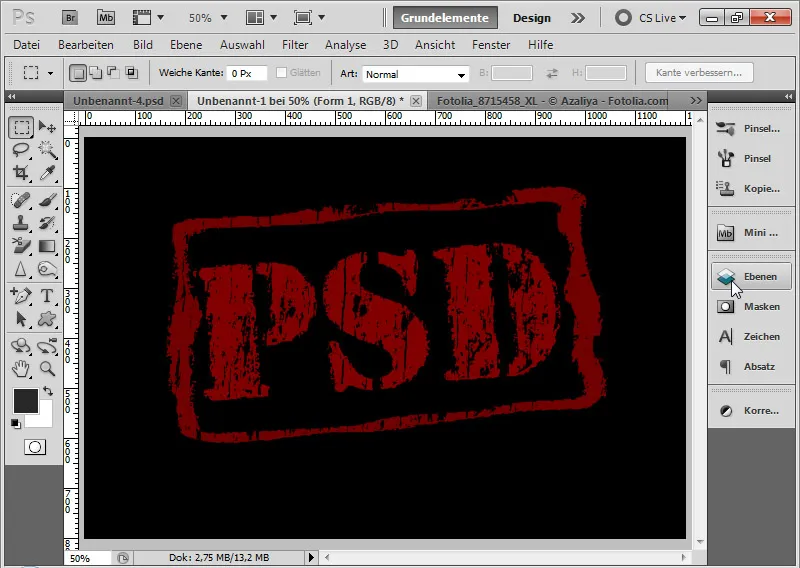
Step 37: Solution for Non-Solid Color Backgrounds
In this case, the grunge effect is based on a black background and can be adjusted repeatedly thanks to the color overlay in the background color. But what if the background is not a solid color?
The best solution is to simply shoot through my grunge effect all the way to the background. I activate the top layer with the grunge effect. The shooting-through transparency, the so-called knockout, is created very easily by setting a strong knockout at 0 percent area in the Advanced Fill Options. Then it doesn't matter what background is present.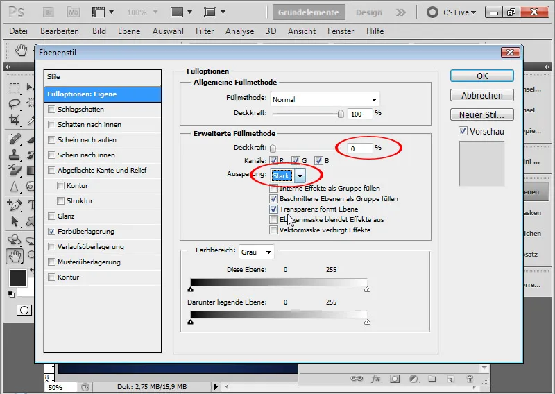
In the grunge effect, the respective background always seems to show through, in this case a gradient in shades of blue. It is important that the background is also placed as a background layer. (If this is not the case, as usual: select background, then click on Layer>New>Background from Layer in the menu).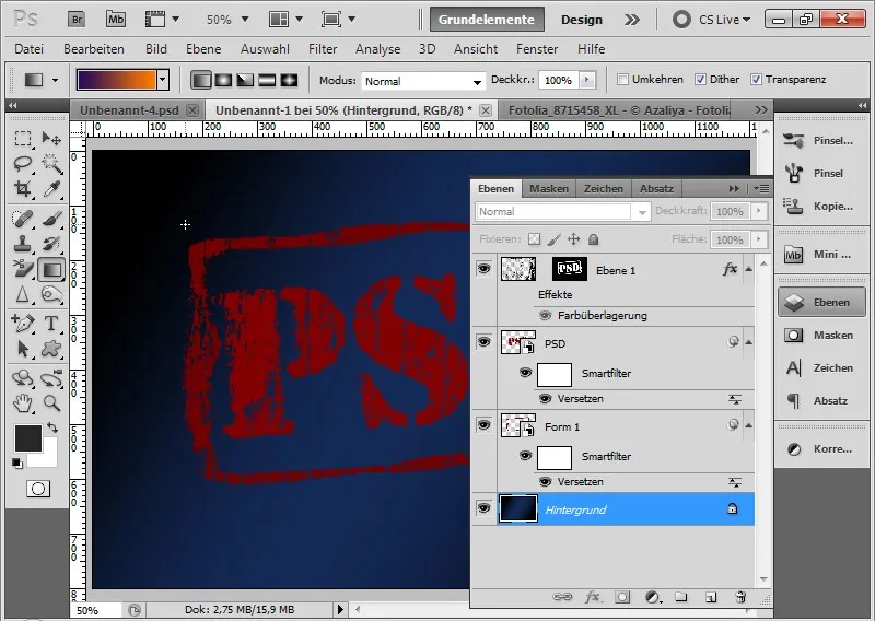
What exactly happened? The knockout causes a kind of pushing out of all transparency-supporting layers in the document. Now all transparencies in the document starting from the layer with the setting of the strong knockout up to the layer above the background layer are exactly knocked out. It's like a kind of punching out in the document, no matter how many layers are visible in the document.
The transparency layers are hidden exactly at this point in the text. Since the background layer doesn't have any transparencies, the applied filter of the background layer is always visible at this point. And thus, the background layer can exhibit all possible colors and brightness levels. They become visible.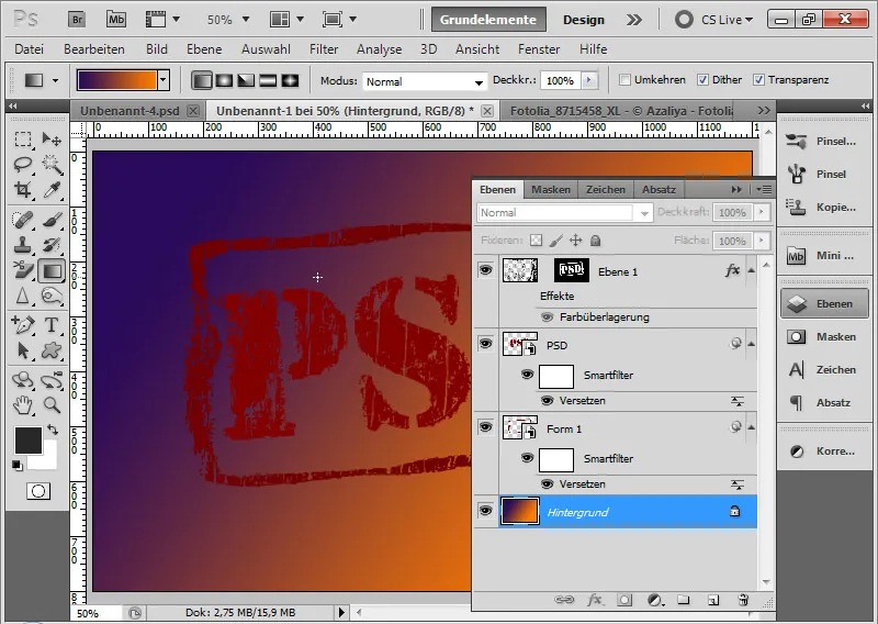
By the way: There are also a lot of fonts that are perfectly suitable for grunge effects. Here is a small list:
- Trashed
- Sidewalk
- Dirty Ames
- Turbo Ripped
- Neoprint M319.
- Hawaii Lover and Hawaii Killer
- King and Queen
- Marcelle
- Bleeding Cowboys
- Birth of a hero
- Alpaca 54
- A bite
- Acid label
- Doctor Atomic
- Tom violence
For those who want to save the work, simply use pre-made fonts.
But the coolest effect is still when you create it yourself and preserve all possibilities for variations.