This tutorial is about clipping with a very specific tool, the so-called background eraser tool. This is a great tool that has been on board Photoshop for a long time and that many people have lost sight of. This is mainly due to the fact that people often rush into the new tools, which are admittedly also great, but sometimes an old tool like this is just the right thing. Not because it's old, but because it's as good then as it is now, like the background eraser tool.
I've called it up before (1):
If you don't have this view, then it probably looks like this (2): Here is the Eraser tool and below it you will also find its two colleagues, the Background Eraser tool and the Magic Eraser tool.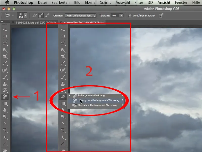
I would like to have this background eraser (see above). Now I'll show you what it's all about: It's about placing the sky from the file Sky.jpg in the place of the sky from the file P1050262.jpg.
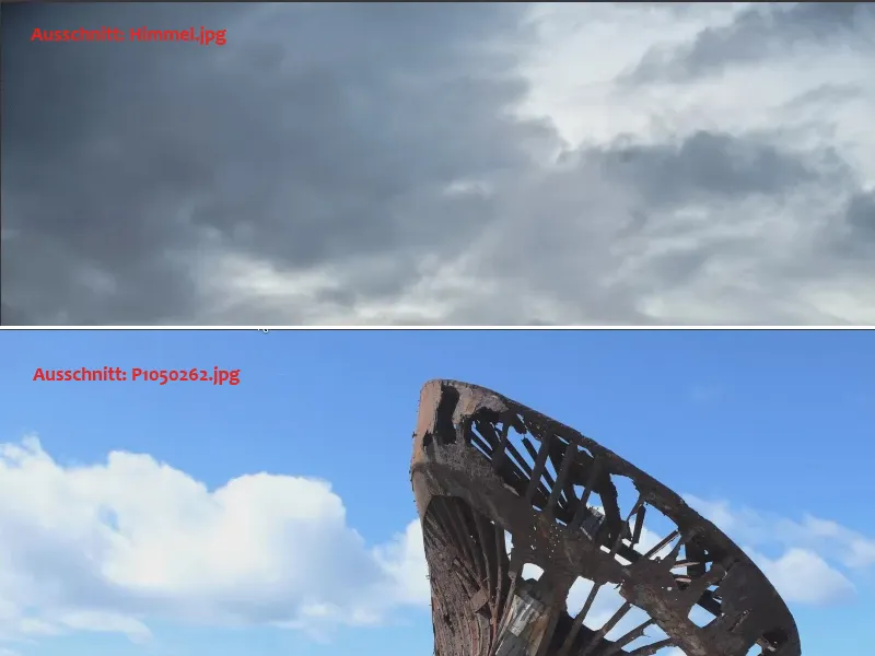
Of course, you could go to great lengths to crop this barge here and then place the cropped barge in front of the new sky, but I would like to show you how you can do this in a much shorter time using a whole range of different options and creative possibilities.
First, we click with the Move tool in the image with the wreck and drag it to the tab of the file with the sky. When this is in the foreground, we first press the Shift key and then release the mouse button. This places the file on top of the other one.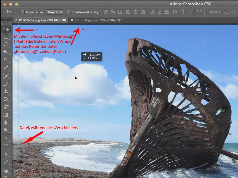
In my case, I get a note that the target and source color spaces don't quite match. But that doesn't matter, that's not necessarily the point at this moment, it's about getting things to match in the first place, so I simply confirm this.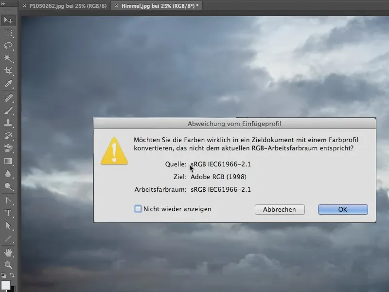
Now the two images are on top of each other in separate layers and we can work with the background eraser.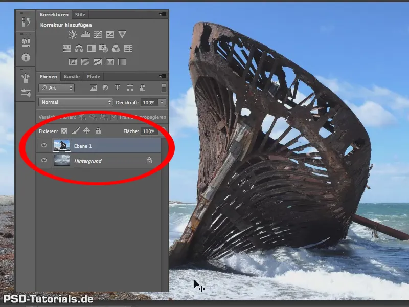
The most important thing with the background eraser is to give it the right tolerance.
Tolerance? That's a big word! I would simply put my money where my mouth is and say: "Friends, always try 40% (1) first.
It is precisely this tolerance around 40% that you need relatively often. Sometimes 70 / 80 / 90%, even 100% is better, for others you can get by with 30 or 25%. It's rarely much lower than that, so I would say as a rule of thumb: start with this 40%.
We don't want to protect the foreground color yet, so we'll remove the checkmark here (1) if there is one.
Let's see what happens and what this tool does.
The background eraser does the following: It grabs the color that is visible under the cross at the moment you click into the image. We do this in such a way that this color is only picked up once via the middle function of the control panel elements for recording (2). Not continuously as you drag, but just this one time.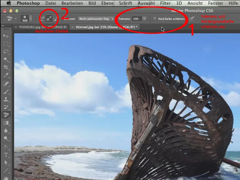
To do this, zoom in a little closer to the top left corner so that you can see exactly what is happening here. We place our background eraser at the top here and move over it and you can see that the entire sky blue is removed here (1).
Unfortunately, this leaves a rather blotchy background, which is a sign that our tolerance was clearly too low here. The 40% doesn't work here, but I told you it's usually 40%. In this case, I would go quite a bit higher; let's go to 70%. But first we'll reverse the whole thing.
We repeat the step we just took at 70% and you can see that the whole thing looks much better now (2).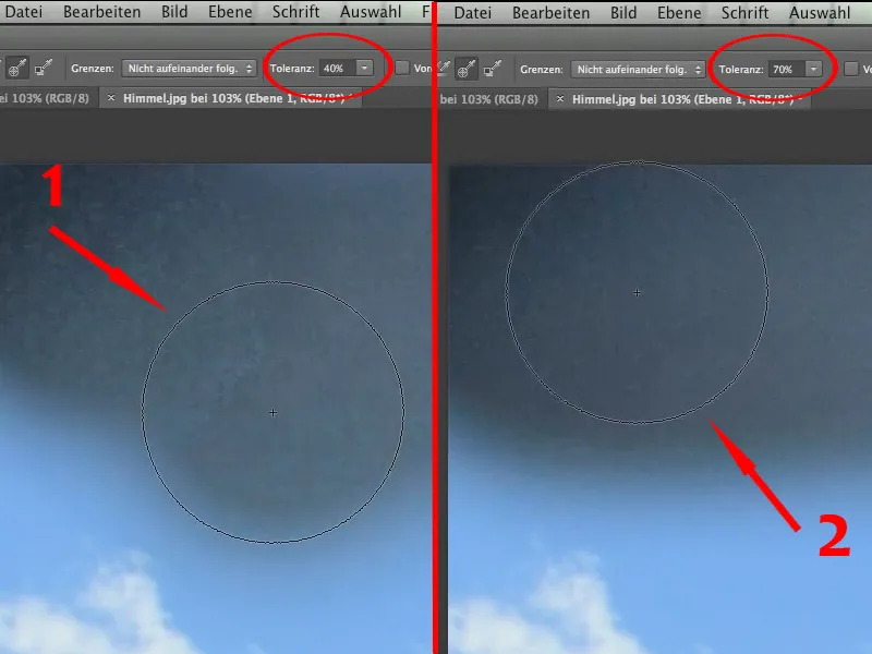
It's still not completely free of any spots, but we mustn't forget that the background also has a certain structure.
So, now we can move on, we zoom out again and can nicely remove the blue sky.
Now the only question is, if we want to keep this white cloud here ....webp?tutkfid=58865)
... then this 70% is definitely too high.
If we don't want to keep it, then it's okay, we could just carry on like this, but I'd like to keep the white clouds here just for the fun of it. To do this, we have to undo the last step where we erased the clouds.
We need to protect the color of the clouds. To do this, we zoom in closer again and now we need to hold down the Alt key to pick up the cloud color, preferably from the light gray (1), and protect the foreground color by checking the box next to Protect foreground color (2).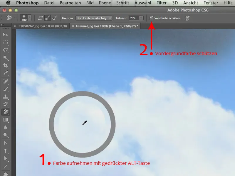
Now we can continue with 70%. It doesn't matter any more, the white clouds are beautifully preserved, and exactly this fluffiness that these clouds have, also the beautiful cloud edge, all this is preserved (1).
Now we can finish pretty quickly, because the great thing is that we don't have to pay much attention to anything inside this ship either. Because even here inside the ship, all these blue splashes are gone in no time at all. You just have to click on blue at the beginning (2) and continue through the other areas.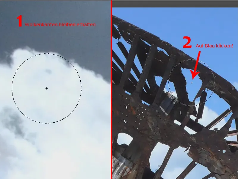
It's always a great, almost wonderful tool for me when I see how it works, how cleanly it works and how beautifully you can crop edges with it that you otherwise wouldn't be able to crop easily.
We continue and go over all the blue areas, including those inside the ship. But here, as you can see, we should pick up the color again on the right outside the ship, otherwise we'll have the problem of leaving the magenta or green-yellow color cast here.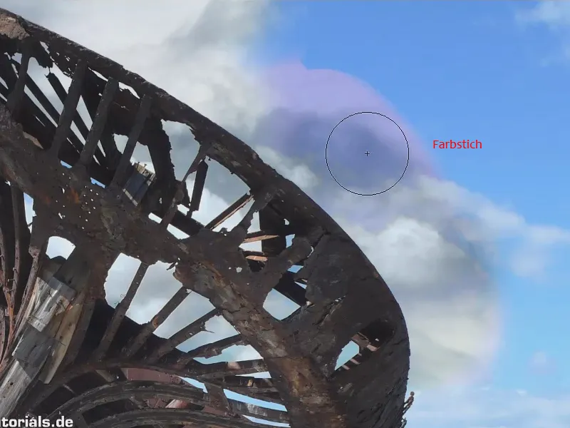
This is one of the most important things to bear in mind with this tool. Imagine you want to get rid of the blue up here (1). Then under no circumstances should we start here (2) in the white. If I apply my brush at this point, it will pick up the color that is underneath here. Because it no longer "sees" anything there, because we've already erased it, it can't recognize the blue either. So if we want to eliminate the blue at (1), we have to click exactly into this blue (3), and then it works perfectly and we can remove the blue..webp?tutkfid=58869)
Now we eliminate the blue in the other places. Where it is a little lighter, we pick up the color again and can thus let our two backgrounds merge gently into one another.
The whole thing is cut out in no time at all using a great tool, namely the background eraser.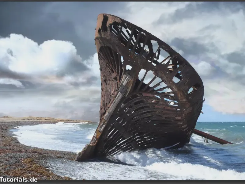
The background eraser can also do a lot for transparency, because that's what it's made for - or so I think. In any case, I've often used it exactly where transparency is required, such as in the following story. The thing is simply mercilessly good for that.
So, what do we want to do? We would like to place a jar of pasta in this almost Tuscan landscape. I admit, it's not really Tuscan, I think it's somewhere in the Saarland. It's quite far south in Germany from Berlin - that's why ...
So, we take this landscape (Landschaft.jpg) and this glass (Pastaglas.jpg) should go in there. That means I have to crop it here first..webp?tutkfid=58871)
Now I've just said "transparency"! Of course it works too. But - we don't just have transparency here, we also have the white reflections on the glass and a setup where the glass was photographed here, so it certainly makes the most sense to start by cropping the glass itself.
And although I keep hearing that it's no longer the tool of the day, we use the drawing pencil. They also call it a path. And there are still people today who hate this thing. They just don't like it, and when they do use it, they use it in such a way that they draw dot by dot (1).
We don't do that, we create curves (2). I admit that the thing is really hard to recognize. It would be a really Christian thing to do if Adobe would come up with a way to show the path in the complementary color of the background again. That should actually be feasible. But well: we now have to use the thing as it is, and we simply draw curves along the silhouette of the glass. We're not going to do it super precisely, just fairly precisely, but in such a way that you can definitely recognize the object.
We'll get through this relatively quickly. As I said, we are drawing a single curve here, which is applied to the glass. And finally, we draw the corner curve (3) again, then we get to the bottom.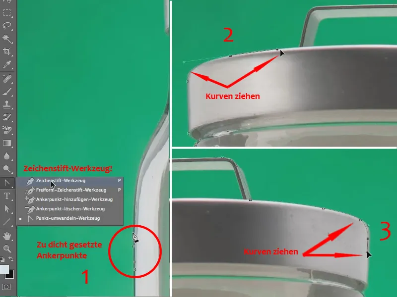
I'm not going to check everything again in detail, just to show that you can work super fast with this tool without having to mess around.
After the upper part comes the lower part - always get close ...
Tip:
If you put a point somewhere else, it's no problem to correct it. Simply press the Ctrl or Command key, grab the point and drag it to the correct position. Then continue drawing as usual.
So, now comes the bottom of the bottle ... Let's carry on ... and then we've cut out the outline of this glass in just a few seconds.
Now I'll get a selection for this path here ...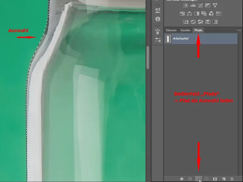
And now I can use a layer mask to ensure that the entire background is cut away. It will look like this: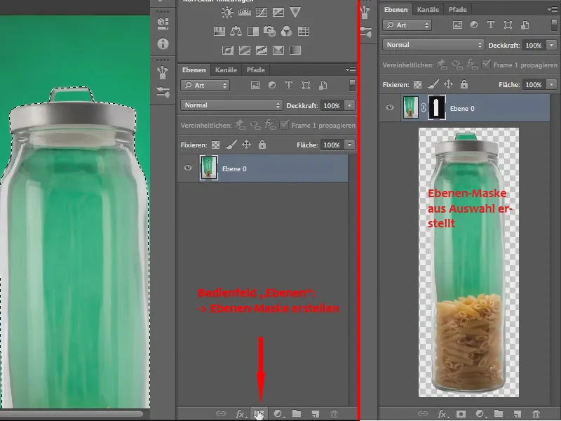
This is just the beginning. Now we could actually drag this glass over to the "Landscape.jpg" file. That's what we do: We grab the file "Pastaglas.jpg" with the cropped object on the tab and drag it down.
When we let go of it, the file lies on the window of the "Landscape.jpg" file, as only these two files are currently open.
As the file "Pastaglas.jpg" is currently active, you can see the Layers panel of the file.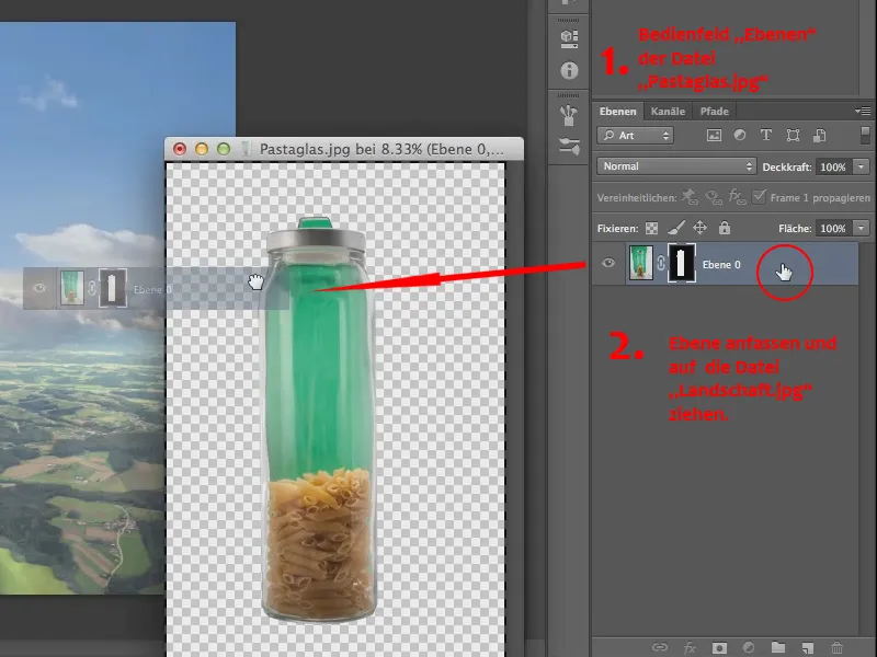
And now let's drag the layer with the mask directly over to the "Landscape.jpg" file.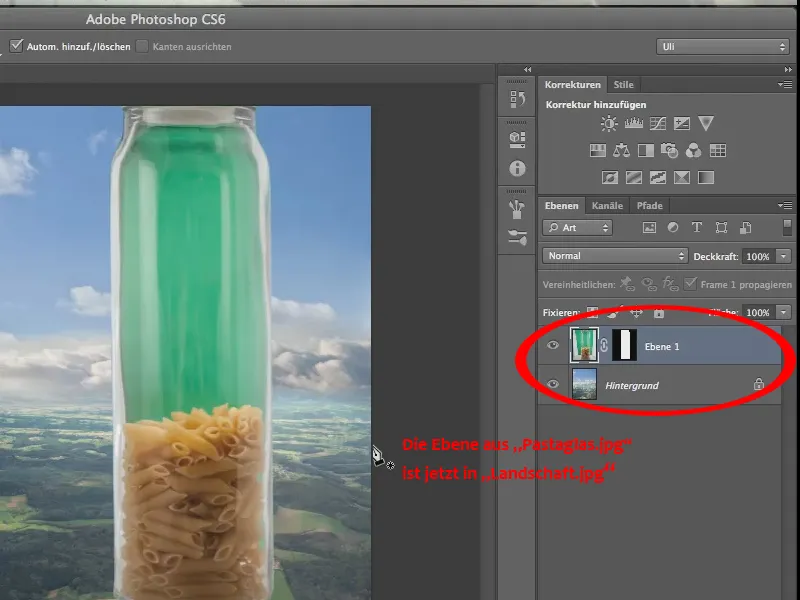
It's a little too big, so we should scale it, using Edit>Transform>Scale to make the glass a little smaller so that it fits into the landscape.
I admit it, in terms of perspective it is, well, questionable, but above all it only makes limited sense what we are doing here, at least as far as the glass in the landscape is concerned.
But sometimes you need something like that, don't you, for some composings, for some titles/magazine covers, that's why we do it. We straighten the glass a little using the rotate command.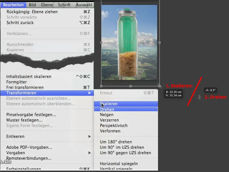
It looks a little straighter now, although not by much. And here we are. The background eraser does the rest again.
We'll now copy this layer and hide one of them, because don't forget: The eraser is a destructive technique, unlike blending out with the layer mask. So, it's not absolutely necessary, but you might want to consider making a copy..webp?tutkfid=58878)
So, now let's get the background eraser. I have a tolerance of 70%, which is a bit heavy. I can give it a try, but I think 70% will flatten everything here. But I realize that it actually works - it's not even that bad (2).
But let's reverse it again and take a little less, just a tolerance of 60%, to get all these subtleties, these fine reflexes (1) here in any case
So, 60% is probably enough and we'll now start exactly at the point where the green is greenest (3).
We'll go over here and have a look: This is what the whole thing looks like. With 60% clipping, I think this transparency is quite impressive (4)..webp?tutkfid=58879)
We continue painting over the glass and it's just great to see how great the tool works.
Now we're getting a magenta tint in here, well, of course we can do something about that later.
We'll crop the rest first - I still have a bit left over at the top of the lid, and after that we've basically cropped most of it.
The removal itself is one thing, but the correction that has to be carried out after such a removal is another. We'll take a look at that in a moment, but for now we've got to the point where transparency is complete.
As beautiful as our transparency is, it naturally has two ugly flaws. One is the magenta tint in the glass and the other is the magenta tint in the lid. Yes, and of course we have to get both under control again somehow, because there's no way we can leave it like this.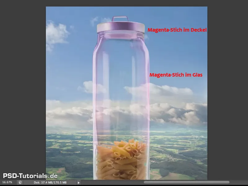
We only have a single magenta cast, but I still made the difference between the glass and the lid.
The fact that the magenta cast is there at all is almost inevitable, it has to do with the fact that this background eraser of course mainly accesses the green color and thus above all the green channel, which is why the magenta channel, i.e. everything that is not green, the red and blue channels, can come through relatively strongly. But it's not dramatic, you can get it under control again and that's exactly what I want to do now.
Let's go a little way up and take a look, it's particularly noticeable at the lid, it's very strong here (1).
... and here I would like to work with an old tool again, or rather with a tried and tested tool, one that has been around for a relatively long time, and you can find this tool here (2) - the so-called protocol brush.
You can't do anything with it alone. As the name suggests, you need the protocol - which is here (3)
And now you see, aha, you have used the backgrounderaser so and so often (4). That's why I have to put my protocol brush here (5).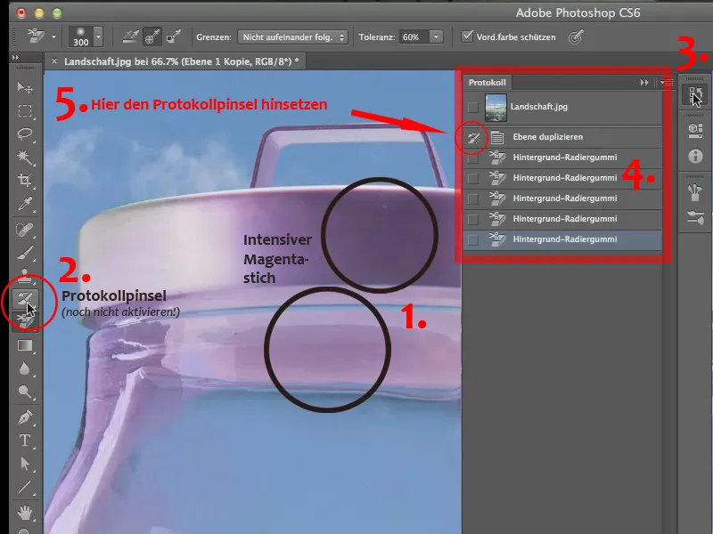
I practiced this earlier to see if it works. That's why you can already see the brush symbol here. Before, the box was empty. If it is empty, simply click in this field. Then, if you now pick up this brush by clicking on the protocol brush tool (2), you can simply paint over your image and restore the status of the protocol at this point, namely before the background eraser was inserted.
So, you can simply paint over it as comfortably as possible here, with a nice soft tool tip - maybe also bring back a bit of this transition to the glass, the plastic that's in here, and so we not only remove the magenta cast, but restore exactly the state of the image that we had before.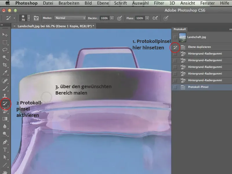
Now, of course, you could continue here at the top of the handle, with a slightly smaller tip - it will probably turn a bit green again.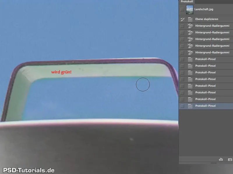
Yes, of course, because we have the reflection of the background here, but so be it, you can certainly remove it in other ways - we'll just leave it as it is.
So, it's not perfect, but it's definitely almost wonderful for the three minutes we've been working on it.
Unfortunately, we can't use the protocol brush on the other magenta stain, the one in the glass, because as soon as we do that, it will naturally turn green again.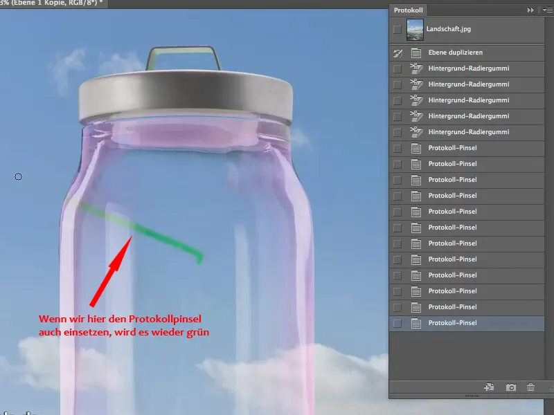
And that's why we can't do anything here with the protocol brush, we have to come up with something else. We undo the last step.
The simplest and probably most effective method is to remove only the magenta cast. The easiest way to do this is via hue/saturation - so we call up an adjustment layer here (1)
We set it as a clipping mask using the icon in the Hue/Saturation panel (2) so that we only affect the copy of this pasta glass here.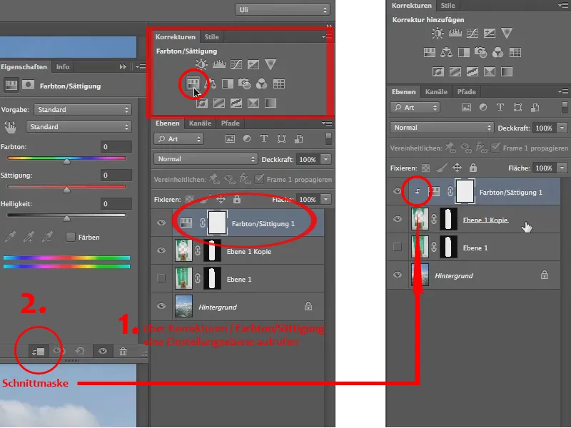
Now I can lower the saturation. But! Not the saturation of the entire jar, of course. That would mean that we would lose all the noodles here too, so we only want to lower the saturation where the magenta is. So we do not go to the properties of the Hue/Saturation control panel in the presets, but in the field below from the standard, directly to the magenta tones (1)
We can still expand these a little with the "Settings slider", because it is only a matter of bringing out the magenta and elsewhere we only have the yellow of the noodles. So we should stay far enough away from that, but we can "desaturate" everything here to cover the magenta area as completely as possible (2).
Yes, and the rest is easy: we just need to turn down the saturation (3)..webp?tutkfid=58886)
And that gives us the perfect transparency, just the way we want it..webp?tutkfid=58887)
Now there's actually only one aspect that isn't really nice yet. You can see this very clearly in the clouds. Some of the clouds also run behind the glass and seem to be completely unaffected by it..webp?tutkfid=58888)
So although they are there, they are not distorted by the glass, and as everyone knows, glass has a certain refractive index. So glass is only almost invisible under water, depending on the type of glass, but the light rays refract in the air because it is an optically denser medium. We have to take this into account and of course distort the background a little at the back.
We only want this distortion from the background. So we duplicate it by dragging the background layer onto the New layer icon (1) and add a mask. To do this, hold down the Alt key and drag the layer mask from layer 1 to the "Background copy" layer (2). This copies it (3), otherwise it would be moved and would no longer be available to layer 1..webp?tutkfid=58889)
Let's hide the (original) background (1). And in the "Background copy" layer, I'll go to the Liquify filter (2) in the Filter menu.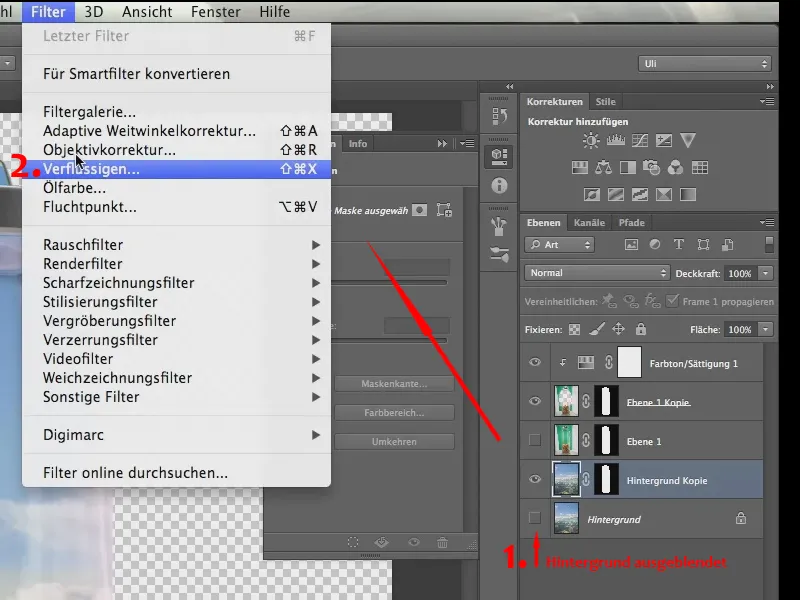
And as you can see, the glass is also visible here.
If you can't see it, it's because you haven't activated Show background in the control panel on the right-hand side - of course you should - and the opacity should be at 50% so that you can see both: firstly, what you're doing and secondly, the glass..webp?tutkfid=58891)
Because if you know where the glass is, then you also know what the distortion should look like. Here it's a little stronger at the edge and weaker in the middle (1).
Let me take this tool (2) ...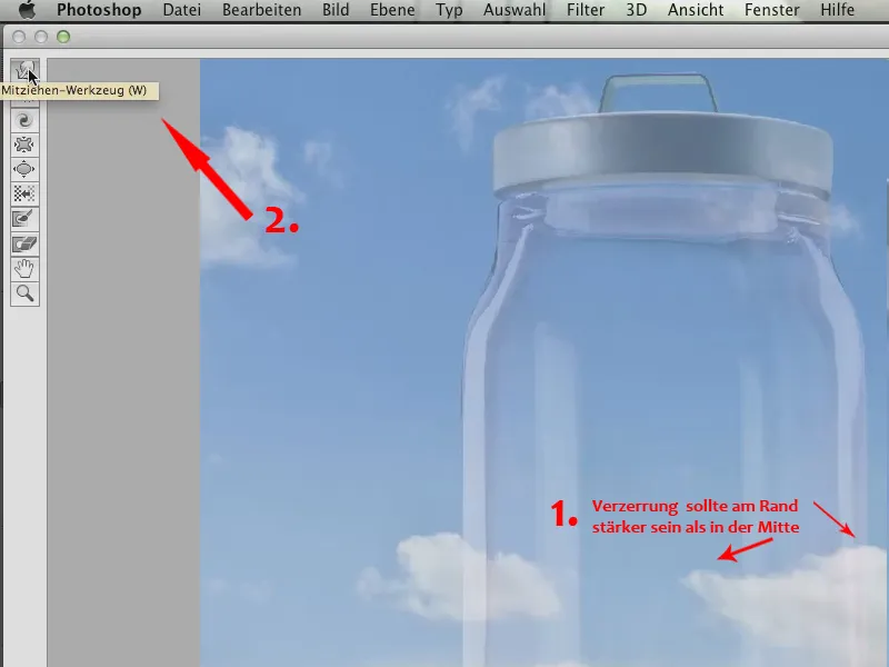
... it's called the Drag tool, a few versions before it was called the Forward Warp tool and it's one of my favorite tools here in the Liquify filter. Now watch what you do with it.
You just distort the clouds, that's really all there is to it. So it's a small thing..webp?tutkfid=58893)
If you distort a little at the edge, that's not dramatic, it'll be hidden again later by the mask, but we can definitely break up the outline of the clouds a little and make it look as if it's real glass.
So, we simply start in this filter, in our image, and we "knead" the polygons, so to speak - well, not the polygons, but the pixels a bit, so that it looks a bit "blurred".
It's not a bad thing if you go over it several times and it slowly becomes a bit blurred. It doesn't matter, because that's exactly what we want. We actually want it to become a little less clear through the glass. The most important thing is that the lines that go straight through here are changed so that you can see that the glass actually has a refraction.
Let's take a look at this and close the Liquify filter with OK. Now let's show the background layer again in the layer palette.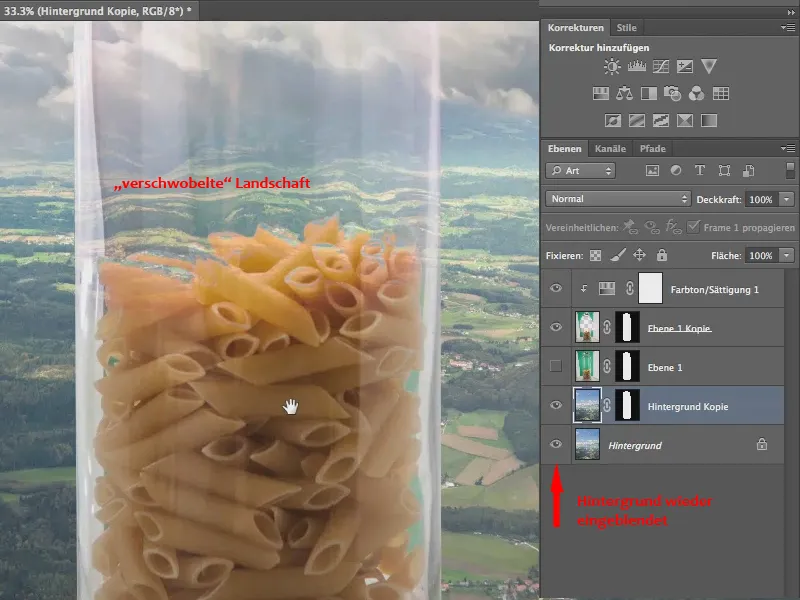
Now you can also see that this no longer just goes through, but we have this offset here, which we actually expect because it is glass after all. With the noodles, we have too little glass - but here you can definitely see that we have a distortion caused by the glass..webp?tutkfid=58895)
To summarize once again: We can crop quite wonderfully with the background eraser, but then we also have to make sure that what we see through the transparency is distorted, and of course we also have to make sure - especially with this tool - that any color casts are filtered out.
This is what the whole thing looks like:.webp?tutkfid=58896)
Screenshot: Photomontage


