Step 1 - Cut out
I use the pencil tool to place the anchor points on the inside of the figure and thus cut them out. I go around the outside of the hair generously and will rework it later in the mask.
As soon as I have closed my path, I select Create selection with the right mouse button and enter a radius of 0.3. The selection is now activated ...
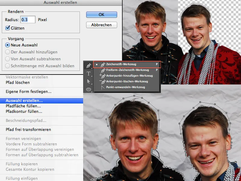
... and I can create my mask by clicking on the Add vector mask icon and the two are cropped in no time.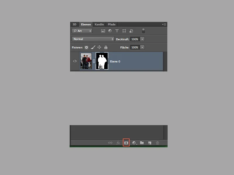
Step 2 - Touching up the hair
It's child's play to crop the hair. I go to the menu under Selection>Color range and select this. In the window with the color range, I select a low tolerance (in my case 12), select my gray colors with the eyedropper tool and the Shift keypressed and confirm with OK.
As soon as my selection has been created, I click on the mask and fill my selection with black.
If you now have a slightly hard edge or haven't got everything, you can repeat this step again with a higher tolerance. If the tolerance is increased, there is a risk that you will also select other gray values from the image. However, this is not a problem, as we can bring them back with a white brush in the mask.
I was already happy with the results, but I wanted more. So I simply drew in a few more hairs. If you select a soft brush and keep selecting the hair color with the Alt key, you can repaint or add the hair on a new layer.
To do this, activate the opacity and size controls and vary with different sizes and color tones.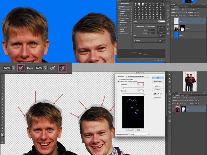
If you want, you can also do a little beauty retouching and remove some imperfections with the area repair brush. I now reduce my hair layer and the layer with the admins to a Smart Object to continue.
Step 3 - Placing and enlarging parts
Using the lasso tool, I select the heads (including the collar) individually and generously, copy and paste them into a new layer using Ctrl+V. Now I transform the individual heads and make sure that they fit into the original collar. It can be very helpful to reduce the opacity a little so that I can see where the collar runs from the original image.
I create a mask for each layer and use a black brush to paint away any parts that are distracting. The same principle as with the heads is now applied to the hands and nose!
Once you've done this, your result should look pretty funny!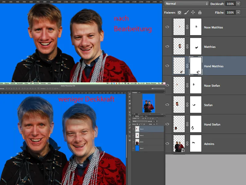
Step 4 - Get to liquefying
Since our two admins are naturally two funny guys, it doesn't take much liquefying (I had to make that joke - sorry, guys!!!).
To do this, I select a head and go to Filter>Liquefy in the menu. You can go wild with the drag tool and the move-left tool (just don't overdo it). Pay attention to the different settings for the brushes (density etc.).
Once you have achieved the desired result, you can move on to the other layer with the head.
Last but not least, we also want to liquefy our original layer. With comic-style images, it is common for the lines to be straight or rounded. This means that everything that sticks out on the pants, for example, is "pressed in", i.e. straightened. You can see the result in a moment.
Once all this is done, it's time for the finishing touches. I have put all the layers in a group that has to do with the admins.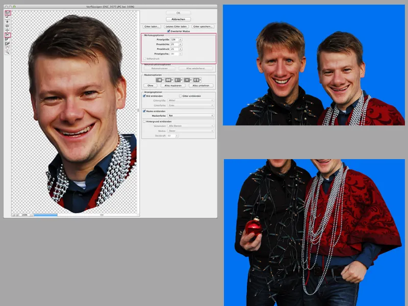
Step 5 - Dodge & Burn
I duplicate my group and create a layer from it. I use this layer to sharpen the admins because the image is not exactly razor sharp.
In the menu under Filters>Other filters you will find the high-pass filter. Select a radius between 0.8 and 1.5 and then place the layer in the group and change the blending mode to Hard light.
Now you can really get started and patience is required. The more carefully and intensively you follow this next step(s), the better your end result will be. So let's get started with Dodge & Burn!
I create a new layer above the group , fill this layer with 50% gray and create a clipping mask.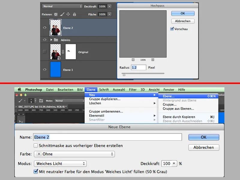
In the tool palette, I select the dodge tool, set the exposure to approx. 10% and stick to the mid tones; I can always switch between post-exposure and dodge with the Alt key.
Use a soft brush, which you always change in size (sometimes smaller, sometimes larger). You can repeat the process with the 50% gray layer several times and, for example, divide your Dodge & Burn into three steps: 1st step - lighten and darken the rough areas, 2nd step - lighten and darken the middle areas and in the 3rd step lighten and darken the very fine areas (this is how I often do it).
The aim of D&B is that I emphasize light areas and darken dark areas ... this has a kind of plasticity effect.
When I'm happy with my result, I select all the layers and groups (without the background) and create a snapshot from them. Shift+Alt+Ctrl+E.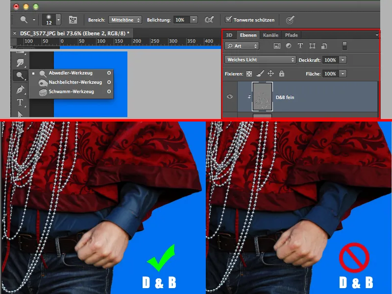
Step 6 - Oil filter & accessories
Under Menu>Filter>Oil Color I give the boys the actual painting style, if you can call it that. You can adjust the settings to your own taste ... experiment a little!
Now I'll get to work on the "Candy". After I have cropped the pole, I add light and shadow using exposure. I use the mask to darken areas so that the whole thing looks a bit 3D and no longer appears so flat.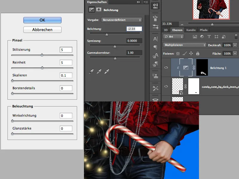
I now create some light for the fairy lights and my Christmas bauble on a new layer. I do this with a soft brush, 100% opacity and with a light yellow color for the fairy lights and a red color for the ball.
For this, I place a small dot of approx. 70px on some of the light bulbs. I repeat the whole thing again, but with a smaller size and the color white. I deliberately don't choose all the light bulbs, just a few ... the rest of the light bulbs remain off ;-).
Logically, I use a slightly larger brush tip for the sphere. If you don't want to paint on just one layer, you can spread this process over 2 layers. Then play with the opacity of the layers so that it's not so bright.
Now it's time for the background. I create a gradient and create a layer at the bottom of the hierarchy and fill it with a blue to red gradient. I create a new empty layer, select white color and a soft, very large brush and click in the middle of the image 1-2 times. This will be my glow from behind. I set the layer mode of this layer to soft light.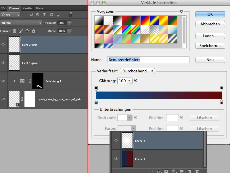
It will look something like this in the intermediate state: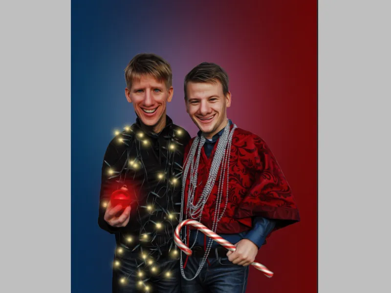
Step 7 - Finishing touches
I now select the Custom Shape tool in the tool palette and select the Fiducial 2 ornament. I use it to draw a circle until the rounding of the circle has disappeared and set the layer to approx. 30% opacity. This layer should be above our light.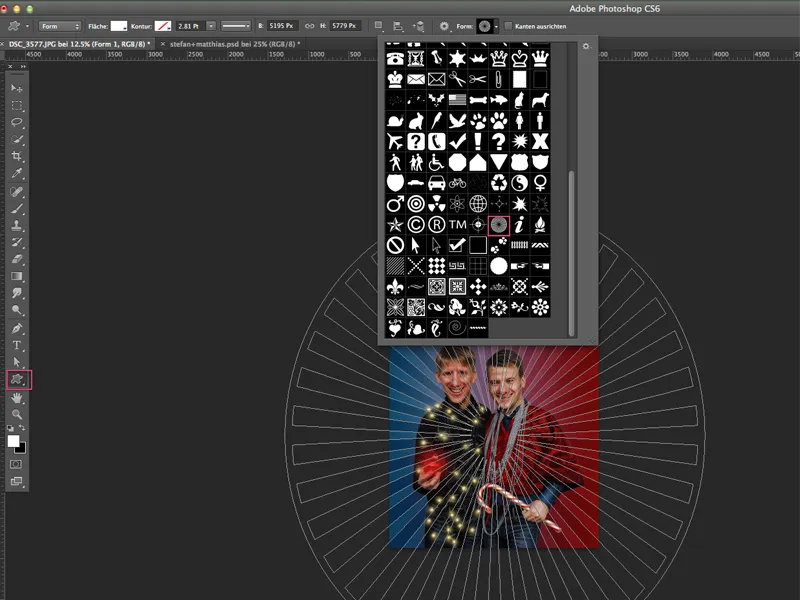
Now I switch back to the top layer and create some adjustment layers:
- Selective color correction
- Black and white (opacity 20%)
- Dynamics
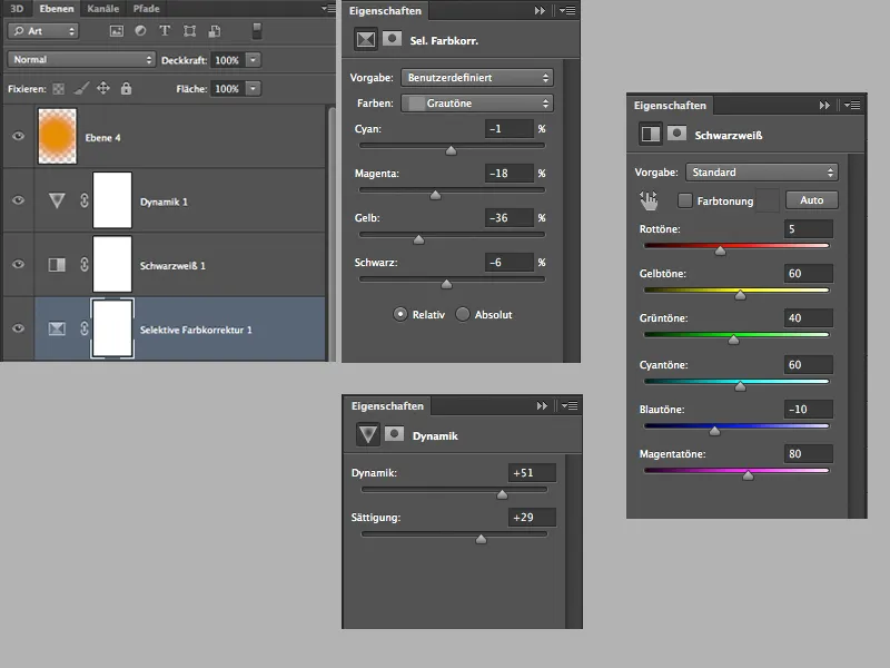
This isn't quite enough for the final touches, so I create an empty layer with the Soft Light mode and 60% opacity, grab a large soft brush and the color orange and dab a few times at the height of the heads with the brush. This gives the faces a subtle warm tone.
You can crop the space at the top and add text as you wish and as far as your ideas take you.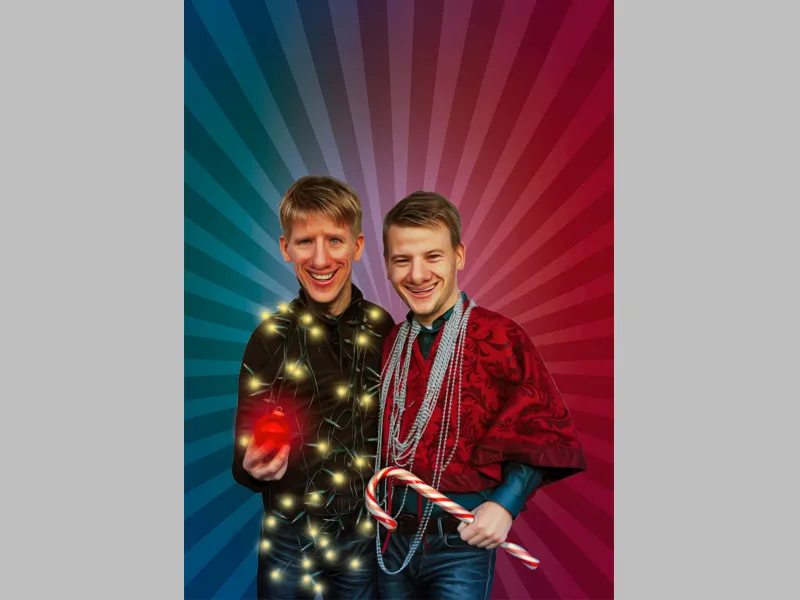
Finally, I would like to mention that when I was finishing the picture, I realized that the heads were a little too small. They could be even bigger. I'll just post the original picture from the Advent calendar in December 2013.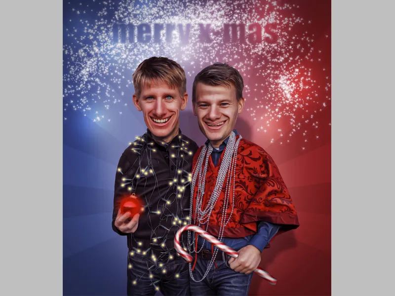
Thanks for reading and best regards, Dobi78.
