Here is an overview of the individual chapters:
Part 1 - Photographing "models
Part 2 - The sensible (!) equipment
Part 3 - Finding suitable models
Part 4 - Finding a location
Part 5 - Developing image ideas
Part 6 - Image composition tips
Part 7 - Styling tips
Part 8 - Skillfully lighting models
Part 9 - Efficient teamwork
Part 10 - Posing tips
If, for example, the hair is not in the right position, the photographer should have noticed and criticized it. If the background is too dark in the picture, the photographer should have brightened it up accordingly. If the model looks unmotivated, the photographer should have motivated her. If the clothes don't match the location in terms of color or style, the photographer should have chosen a different location or provided different clothing. And so on ...
Working with focus/blur
The smaller the amateur cameras are (the sensor), the more typical it is for the focus to extend from the front to the background. The fact that everything appears sharp depends not only on the initial aperture but also on the size of the sensor: the larger the sensor, the more likely it is that the background will blur when a model in the foreground is in focus. This explains why the photos of small compact cameras are always sharp from front to back (if by sharpness we mean depth of field). However, the distance from the foreground to the background also plays a significant role, as the further away the background is from the person being photographed, the more blurred it can appear.
The bokeh is also particularly beautiful when working with lenses that have as many aperture blades as possible (and therefore an almost circular aperture).
Figure 6.1: The comparison of two identical photos, one taken with aperture 22 and the other with aperture 2.8, shows how strong the difference in the image effect of different aperture settings can be. Nikon D4 with 2.8/70-200mm Nikkor at a focal length of 190mm. 1/100 second, aperture 22 , ISO 100.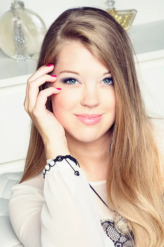
(Photo © 2013: Jens Brüggemann - www.jensbrueggemann.de)
Figure 6.2: The fact that the hair at the back looks darker in the first photo is due to the fact that the (percentage) proportion of available daylight was significantly greater in the second photo than in the first. Both photos were only flashed from the front. The first photo shown here therefore has a light fall-off. In the second photo, the available daylight in my studio provides the natural brightening of the hair areas at the back. In other words: Only in the second photo, taken with Blender 2.8, does the available continuous light play a role in the image result. In the first photo, on the other hand, taken with Blender 22, the proportion of daylight is almost zero. Nikon D4 with 2.8/70-200mm Nikkor at a focal length of 190mm. 1/100 second, aperture 2.8 , ISO 100. (Photo © 2013: Jens Brüggemann - www.jensbrueggemann.de)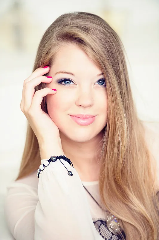
In model photography, playing with the out-of-focus effect is often used to make the person being photographed stand out from the (often distracting) background. If the background is unattractive, it can be made unrecognizable by using a shallow depth of field (often just a few centimetres or even millimetres). If the background is too sharp and distracts from the model, the background can be "softened" in the same way. The aim is always to draw the viewer's attention to the elements in the picture that the photographer considers important. In model photography, this will usually be the eyes, as long as the model's face is recognizably depicted.
Figure 6.3: It is interesting to note that in portraits it is important to focus on the eyes. The whole image can be out of focus - as long as the eyes (or at least one of them, then the one closest to the camera) are in focus, the image is considered sharp by the viewer. If, on the other hand, the whole image is sharp and only the model's eyes are out of focus, everyone will say the image is blurred. Nikon D4 with 2.8/105mm Micro Nikkor. 1/160 second, Blender 3.0, ISO 200.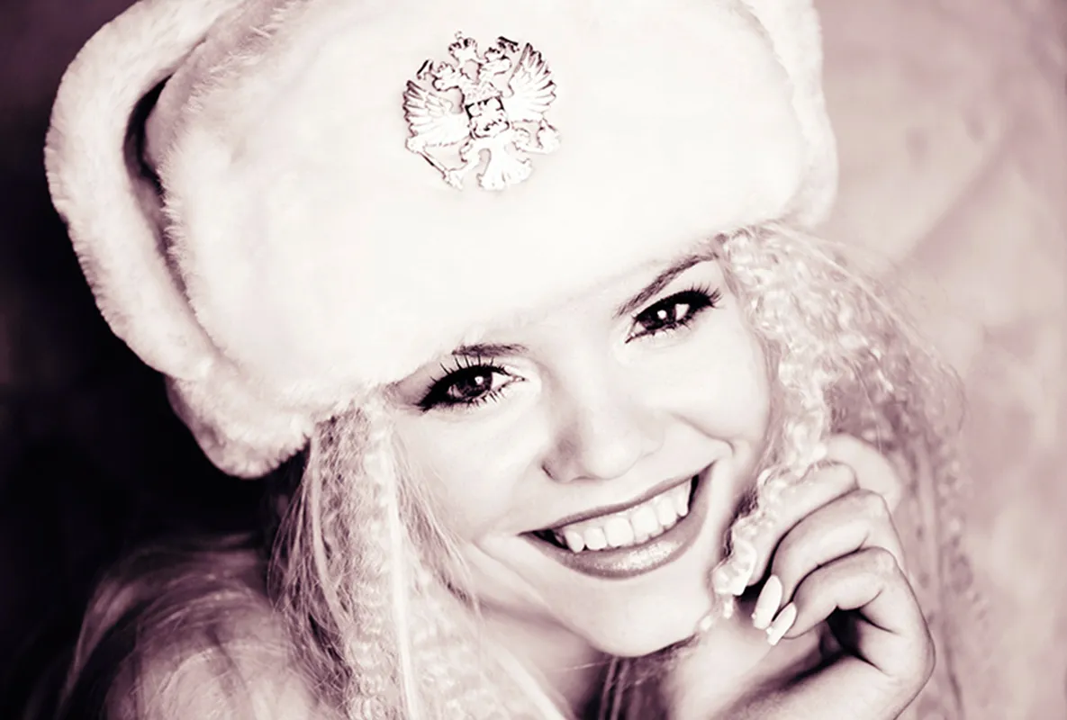
(Photo © 2013: Jens Brüggemann - www.jensbrueggemann.de)
Color or black and white?
Photos in black and white are still popular. They are apparently timeless. The absence of color does not necessarily mean a restriction; rather, it can often enhance the image statement. Other design elements such as light, shapes and structures become more important when colors are omitted.
Figure 6.4: Which version do you like better? For the title of my new book "Model Photography", I opted for the right-hand version in black and white (or brown and white). ("Modelfotografie - Profiwissen Beauty-, Fashion- und Erotikfotografie", mitp-Verlag, 2013, 256 pages, with DVD with over 8 gigabytes of film material: commented making-of videos from my photo shoots).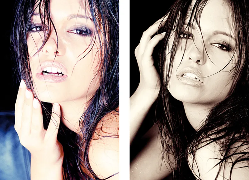
(Photo © 2009: Jens Brüggemann - www.jensbrueggemann.de)
I recommend setting the camera mode to black and white when taking photos. This makes it easier to assess the effect when checking the monitor. Black and white photography is not just about omitting color. Rather, it is about seeing motifs in black and white; the photographer who has mastered this will also distinguish between motifs that are suitable for black and white and others that do not benefit from it, where the color is merely missing.
Figure 6.5: A photo that also looked quite acceptable in color. Nevertheless, I opted for the black and white version here. Nikon D3 with 2.8/105mm Micro Nikkor. 1/80 second, Blender 10, ISO 1600.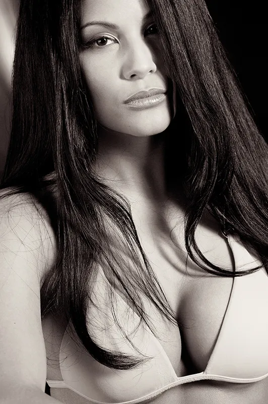
(Photo © 2011: Jens Brüggemann - www.jensbrueggemann.de)
Hint
- Some motifs literally "cry out" to be photographed in black and white.
- Others, however, are equally effective in black and white and in color.
- However, there are also subjects that are better not to be photographed in black and white because they lose something. It is up to the photographer to find out which category the subject to be photographed belongs to.
The best way to learn to "see in black and white" is to photograph exclusively in black and white over a longer period of time (e.g. half a year).
Figure 6.6: This photo of Thoma is already 16 years old! I photographed it back then on T-Max 100, a black-and-white film material from Kodak. Even today I would photograph this timeless motif exclusively in black and white.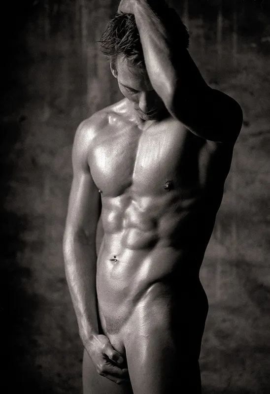
(Photo © 1998: Jens Brüggemann - www.jensbrueggemann.de)
Using props sensibly
I love props! Their use actually only has advantages (apart from the obvious disadvantage that props usually cost money). A few tips:
- Props often keep the model's hands busy. This takes away their insecurity (if they are still inexperienced), as many beginners often don't know what to do with their hands.
- Props help the model to understand and realize the picture idea.
- Props are fun. Making the photo shoot playful is a guarantee for a good mood, which in turn is a prerequisite for good photos.
- To some extent, props already provide the idea for the picture. The photographer often doesn't need to think about the picture idea if he uses meaningful props. For example, handcuffs in erotic photography will automatically evoke a story in the viewer. The same applies to the cowboy hat and pistol used by a child model. Here too, the "Wild West" theme is immediately clear to the viewer.
- Props are often like the icing on the cake. Or like the salt in the soup: a small ingredient with a big effect!
Figure 6.7: This propeller not only matched the motif in terms of color. And it's much more pleasant for the models if they can keep their hands busy. Nikon D2X with 1.4/50mm Nikkor. 1/60 second, Blender 5.6, ISO 200..webp?tutkfid=59593)
(Photo © 2007: Jens Brüggemann - www.jensbrueggemann.de)
Whenever you see great props: go for it! There's bound to be a shoot where you can use them! If you only buy the props just before your shootings, you will leave the best pieces lying around and cause yourself unnecessary stress when you are desperately looking for suitable accessories just before an important shooting. So: grab it if you see something unusual!
Figure 6.8: Not only children, but also adult models like to dress up! It's a good thing that there are stores that sell carnival items all year round. And it's good that there are Internet platforms like ebay where even those who don't live in Düsseldorf, Cologne or Mainz can buy carnival items. Nikon D3S with 2.8/105mm micro Nikkor. 1/160 second, Blender 4, ISO 500.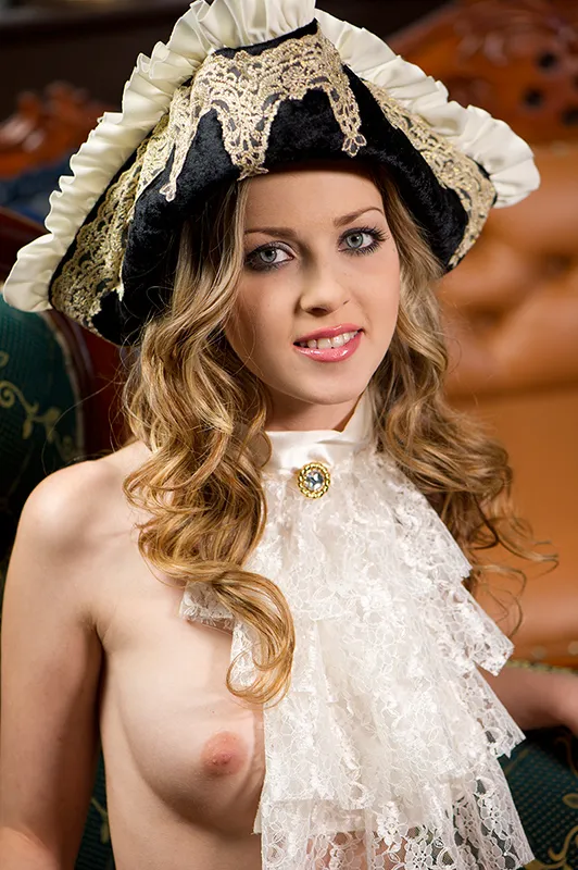
(Photo © 2010: Jens Brüggemann - www.jensbrueggemann.de)
There is another advantage to using props: The photographer is already mentally preoccupied with the photo shoot in advance. In my opinion, this virtually guarantees that the photos will turn out (better).
Figure 6.9: On Ibiza, at one of my photo workshops a few years ago, we were in Ibiza Town with the whole group in the evening when we discovered this bow and arrows in a souvenir store. It was supposed to cost just 12.90 euros; a bargain for a prop. But none of the participants bought it, even though they all loved it. Instead, they bought T-shirts, had a beer or an ice cream. But no one bought the bow.
After the workshop was over, I happened to pass the store again. This time I grabbed one because I had a model with me that I wanted to take photos with (because I don't get to do that during the workshops). Mean as I am, I emailed this photo to all the participants after the shoot. The participants will never again fail to buy a suitable prop ;-)
Since that workshop, the topic of "props" has become one of the daily tasks I set my participants. And with success: the results are always much better with this topic than with unprepared shootings.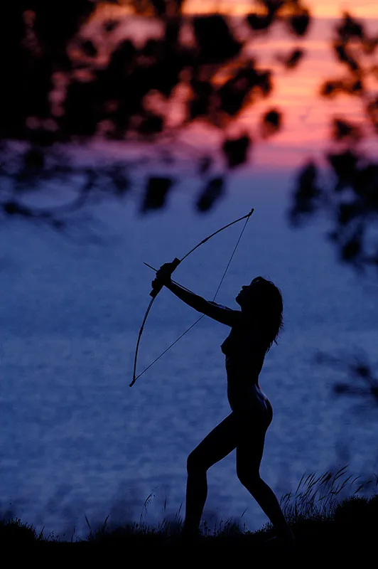
(Photo © 2009: Jens Brüggemann - www.jensbrueggemann.de)
Using wide-angle lenses skillfully
Wide-angle lenses are not only suitable for landscape photography. They can also be used to great effect in model photography. Used correctly, they can even lengthen the model's legs. (Used incorrectly, they distort the face unattractively).
The angle at which the camera is held is crucial. If you shoot in portrait format from bottom to top from a low perspective, you distort the legs of the standing model. This distortion looks like an elongation; and which model wouldn't like to have longer legs? The photographer is therefore particularly popular with models who have mastered stretching their legs.
However, you have to be careful that the stretching is not too extreme. The more inconspicuous, the better! Wide-angle lenses are needed to achieve this effect. The shorter the focal length of the lens, the more extreme the distortion. So please use with care! Particular attention should be paid to the model's feet!
This is because they are naturally closer to the lens with a standing model, which means that the distortion is particularly noticeable here. The crux of the matter: every model wants to have long, slender legs - but not huge-looking feet. So a compromise has to be found.
Figure 6.10: Only knowledgeable photographers will recognize the distortion of the model's legs due to the wide-angle effect. Only at second glance do you realize that the feet also look larger than usual ... Nikon D4 with 2.8/24-70mm Nikkor. 1/200 second, Blender 22, ISO 100. The Elinchrom Ranger Quadra RX Hybrid with a flash head was used here for the dramatic lighting mood.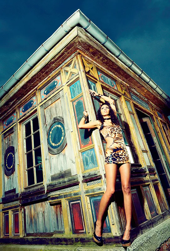
(Photo © 2011: Jens Brüggemann - www.jensbrueggemann.de)
Figure 6.11: In landscape format, with models lying down, the distortion is achieved by pointing the legs at an angle into one of the two lower corners of the camera format. If the camera is then tilted slightly upwards again (if the model is lying at a slight angle, as here), the effect is intensified. Nikon D3X with 2.8/14-24mm Nikkor. 1/250 second, Blender 22, ISO 100.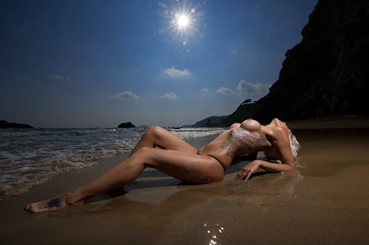
(Photo © 2011: Jens Brüggemann - www.jensbrueggemann.de)
Crops
I don't think much of photo regulations and image composition rules. I prefer to compose and photograph "from the gut", by feeling. I once read in a photography textbook that portraits should not be photographed in a crop. Why not?
Figure 6.12: What counts is the result! I don't care what other people say about my photos. The main thing is that I like the photo (and in the case of commissioned photo shoots, my clients do too). Photography is only fun if you can be artistically free. Only then can you be creative. So do your own thing! Don't worry so much about what others say or write about your photos. Nikon D3S with 2.8/105mm Micro Nikkor. 1/125 second, Blender 3.5, ISO 200.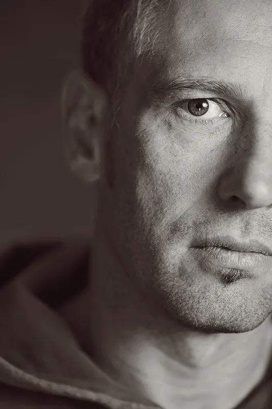
(Photo © 2011: Jens Brüggemann - www.jensbrueggemann.de)
Include the foreground
Photos gain depth, for example, by including the foreground. In my model photos, I like to use branches in the forest or wall projections or even furniture to place them out of focus in the foreground (on the sides of the photo). This directs the viewer's gaze to the subject of the photo as if through a tunnel. This makes the photos appear much more three-dimensional.
Figure 6.13: Here I have used furniture to create the three-dimensional impression of spatial depth. Nikon D3S with 2.8/24-70mm Nikkor. 1/80 second, Blender 4, ISO 400 (right photo). 1/125 second, Blender 4, ISO 2500 (left photo)..webp?tutkfid=59599)
(Photo © 2010: Jens Brüggemann - www.jensbrueggemann.de)
Shooting at an angle
Some photos look more dynamic if they are photographed at a slight angle. However, you have to be careful not to hold the camera at too much of an angle, as this will make the photo look as if it is tilting. In my opinion, the ideal angle is between approx. 10 and 20 degrees.
Figure 6.14: There are motifs that almost demand to be photographed straight on. Others, on the other hand, benefit from being photographed at a slight angle. They then appear more dynamic. Whether I tilt the camera and how much depends on my gut feeling. Just try it out! Nikon D3S with 2.8/24-70mm Nikkor. 1/250 second, Blender 4.5, ISO 1250.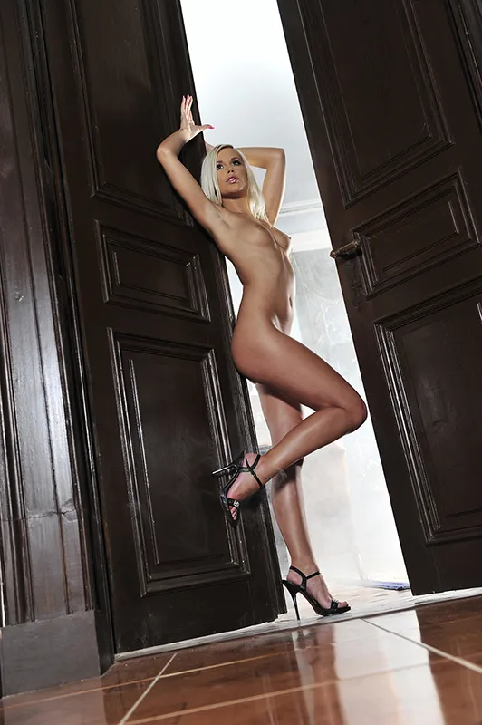
(Photo © 2010: Jens Brüggemann - www.jensbrueggemann.de)
