In the last tutorial, we learned about the zigzag fold and the wrap fold. We also set up our flyer and cut out the woman for the foreground.
In this tutorial we will design the title page.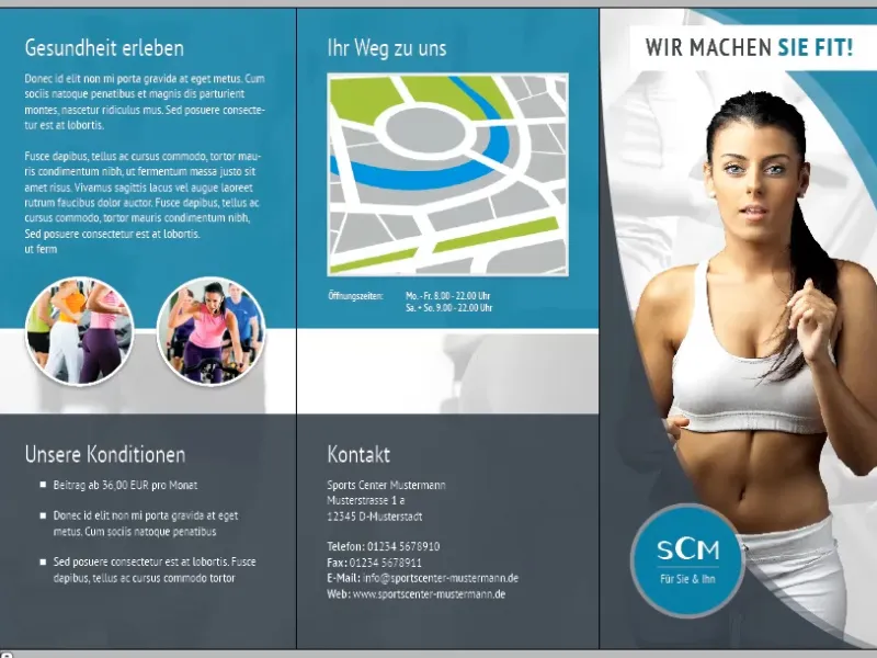
Steps 1-11
Step 1
First, we want to create the shapes. To do this, we double-click on the polygon tool and enter 3 for the number of sides.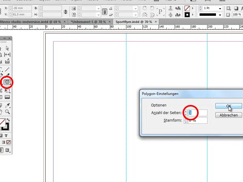
Step 2
Now we create our triangle ...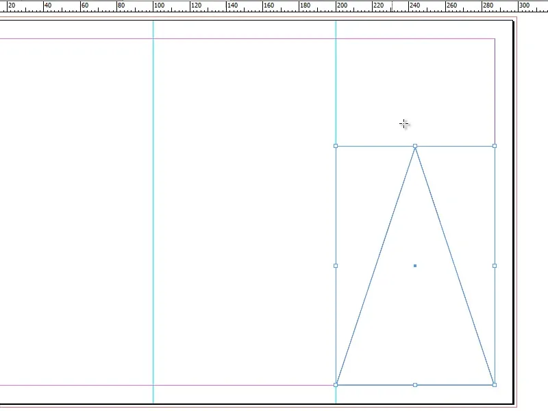
... and then enlarge it with the selection tool.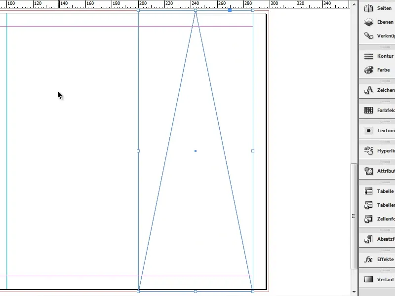
Step 3
Then select the direct selection tool and, holding down the Shift key, drag the top point to the left and the bottom right point further to the right.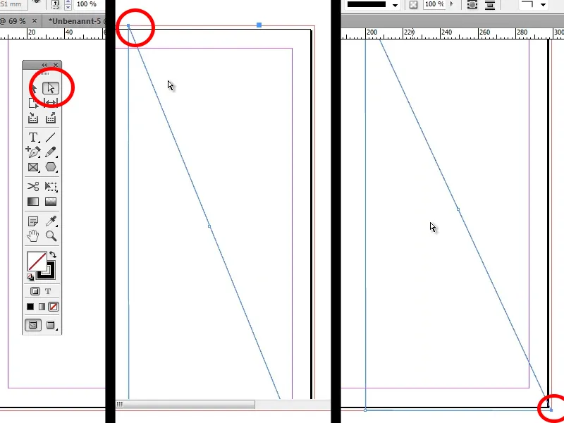
Step 4
Now we want an arc in our triangle. To do this, we click and hold on the pen tool and select Convert direction point (Shift+C). Hold down the Shift key and drag the top point upwards until we like the arc. We can do the same with the right-hand point at the bottom (hold down the Shift key and drag to the left).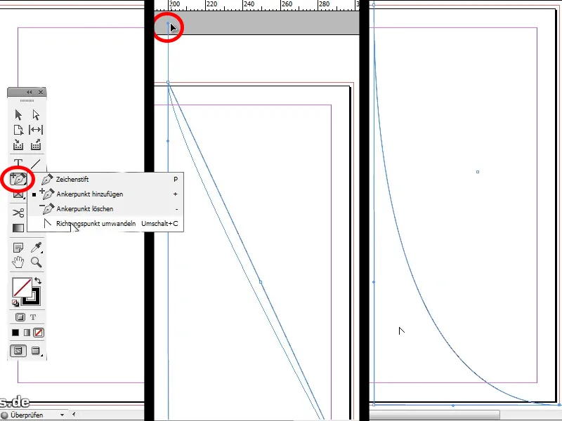
Step 5
Now we want to fill our shape with a color, and to achieve a harmonious overall picture in the flyer, we choose a dark gray (#37414a).
Tip: If you already have a finished flyer, you can also import the existing colors. To do this, click on the swatches panel on the right , select Load swatches, select the finished flyer and then select the desired color.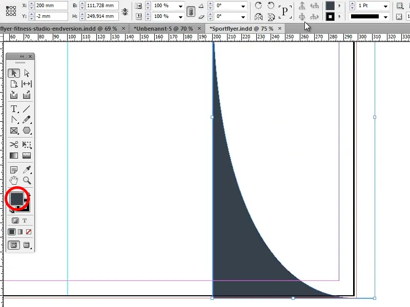
Step 6
In the next step, we set the opacity to 90% to achieve a slight transparency.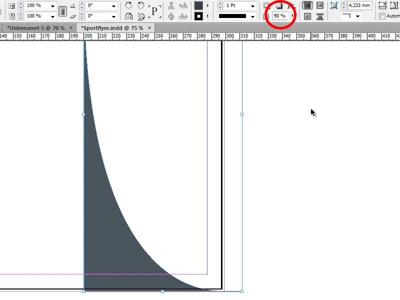
Step 7
Now we copy our shape with Alt+Arrow to the right and pull it apart a little so that a second shape is visible.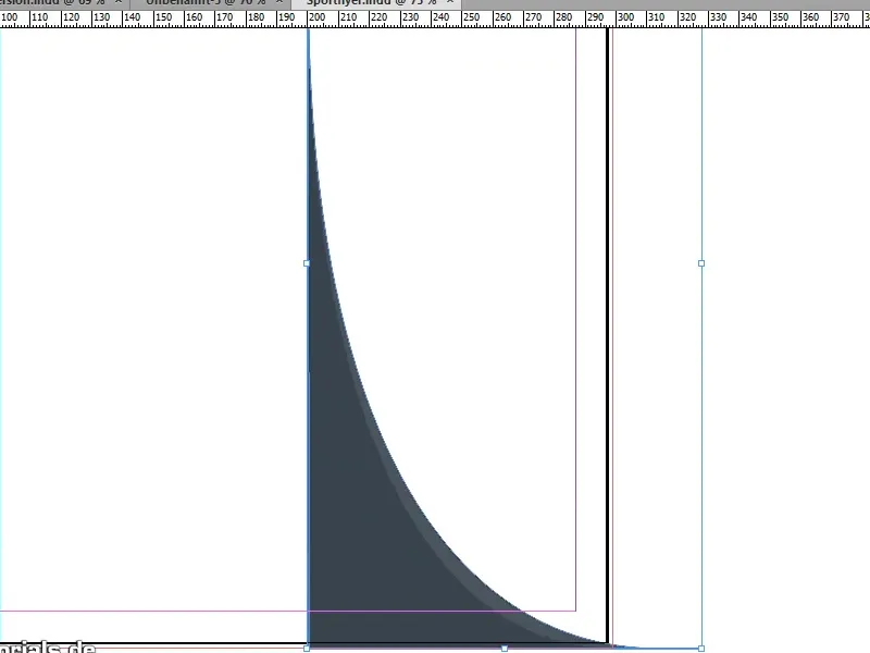
Step 8
Then set the opacity of the copied shape to 35%.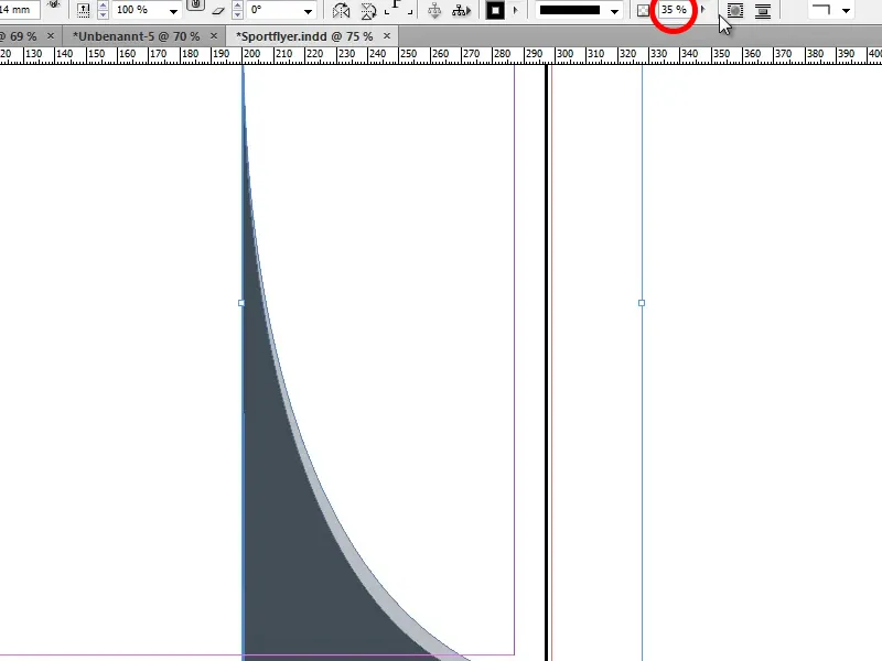
Step 9
Now we use the image we cropped in the last tutorial again (Ctrl+D, select cropped woman). We paste it in and adjust the size. Important: Always keep Ctrl+Shift pressed when zooming in/out so that the proportions of the woman do not change!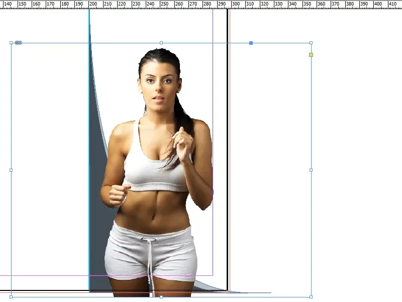
Step 10
Once we have done this and are happy with the size of the woman, we want to place her behind our two shapes. To do this, right-click on the woman and select Arrange>Backward Step by Step or use the shortcut Ctrl+O twice.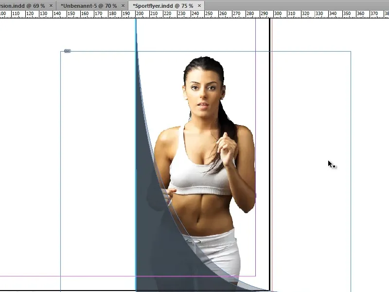
Step 11
Before we insert a new background, we need to duplicate the shapes for the top right-hand corner.
To do this, we select everything, click on the woman while holding down the Shift key to deselect her again, then group the two shapes (right mouse button>Group), duplicate our shape while holding down the Alt key, drag it out a little and rotate it to the correct position while holding down the Shift key.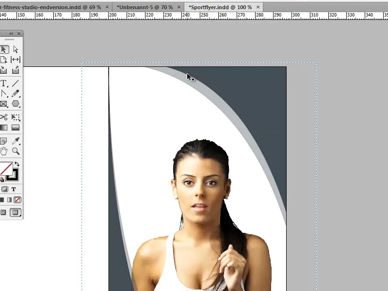
Steps 12-21
Step 12
In the next step, we double-click on the light gray strip and move it a little so that it is slightly thicker on one side and slightly thinner on the other.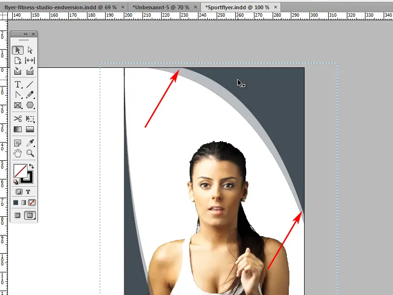
Step 13
Now we need to change the color of our upper shape. I chose a nice turquoise to match the gray. I selected this using the color picker and then clicked on the Add CMYK color field button in the color picker window. The CMYK values are C=Cyan 81, M=Magenta 28, Y=Yellow 25, K=Black 7.
Please make sure that 0Pt is selected for the outline, as we do not need an outline. The same applies to our gray shape.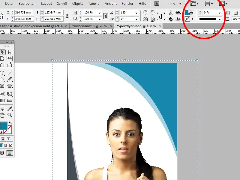
Step 14
Now we need our slogan "We make you fit!" To do this, we select the rectangle tool (M), set the color to white without an outline and draw a rectangle as shown in the picture.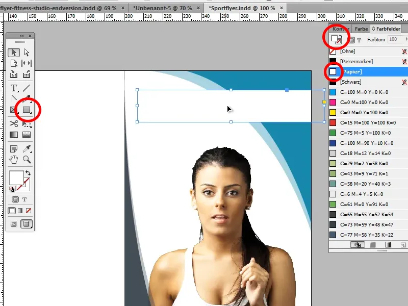
Step 15
Now write "WE MAKE YOU FIT!" in the box we have just created, set the font to PT Sans Narrow and the text size to 22 pt.
Tip: If you don't have the font yet, you can download it with all the required weights from www.fontsquirrel.com.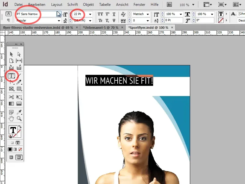
We also center our text. To ensure that the font is also centered in the text box, we go to our text box with the selection tool and the right mouse button and select the option Center in the text frame options (Ctrl+B) under Align.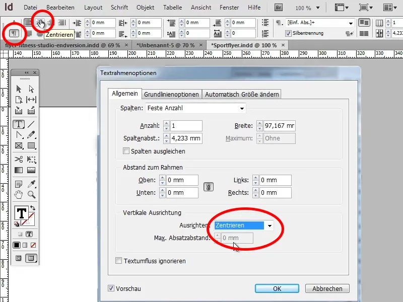
Step 16
So far this looks very good, but still a little unspectacular. To change this, we open our background image in Photoshop, place a Hue/Saturation adjustment layer over it and reduce the saturation to -100. The image should now be black and white.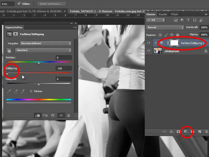
Step 17
Then select the image we have just saved by pressing Ctrl+D and drag it across the page.
Tip: While you are dragging it across the page, you can press the space bar to move the selection.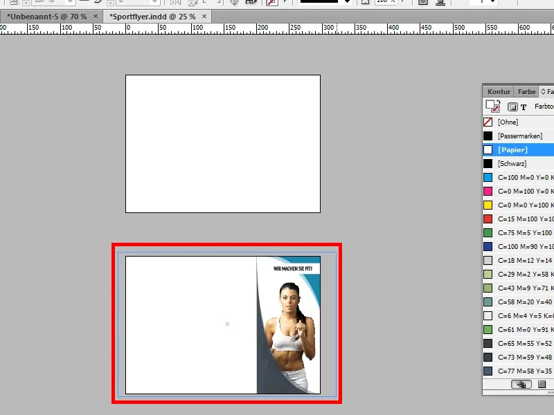
Again, we move the image step by step into the background with Ctrl+Ö and set the opacity to 25%.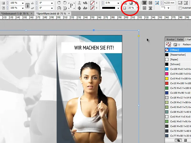
Step 18
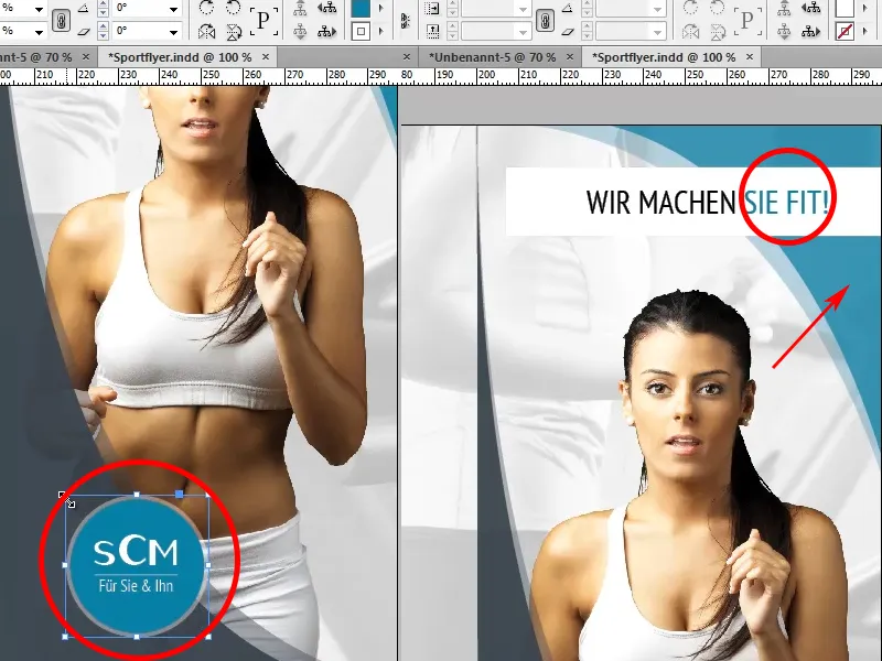
In the next step, we create the company logo. To do this, we select the ellipse tool, create a circle by holding down the Shift key (if you want to change the size afterwards, press Ctrl+Shift ) and fill it with our turquoise.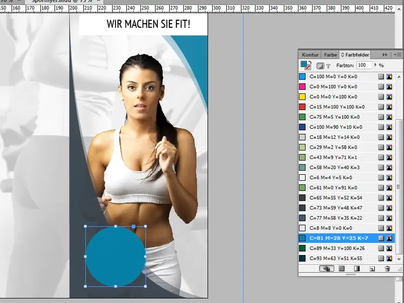
Step 19
Now we would like to have a white outline around the blue circle - there are two options for this.
Variant 1 (for users of older versions):
We copy our circle with Ctrl+C and then paste it again at the same position with Ctrl+Shift+Alt+V. Now we enlarge our copy to 48mm x 48mm, color it white using the color fields (paper), for example, and set the opacity to 25%. Finally, we just need to move our circle so that it is really centered.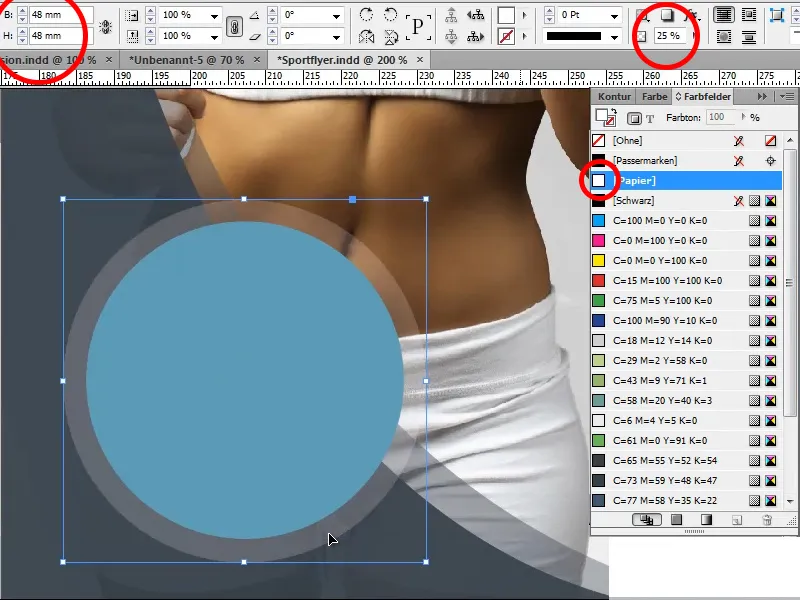
Variant 2:
We simply select in the swatches panel that our circle should have an outline, assign it the color white and change the outline thickness to 3Pt.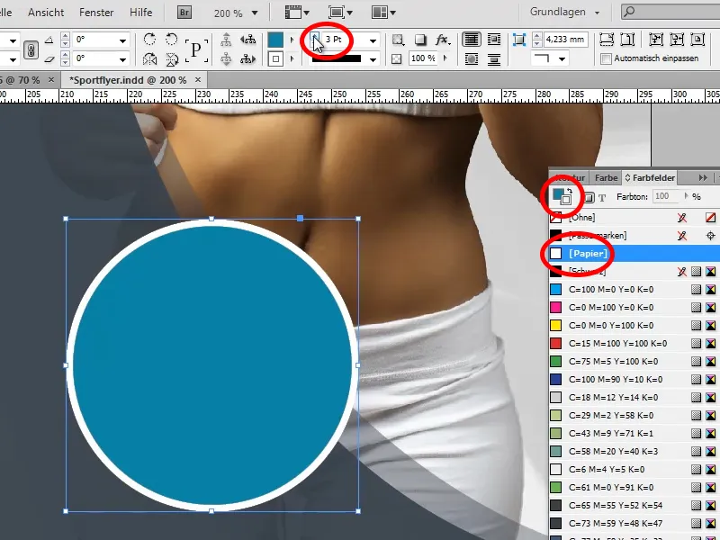
Now this outline should also be transparent. We do this via the Effects menu, in which we select the Object submenu. A new operating window opens again. Here we change the opacity to 50% in the Contour settings.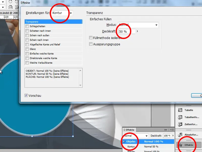
If you don't want a double contour for your white contour, check the box next to Recess group (in the object settings) and the entire contour will be transparent.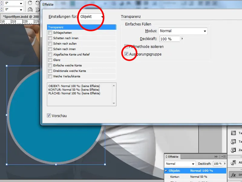
Step 20
Now we just need to add the logo font. To do this, we select our text tool and draw a text box inside our circle.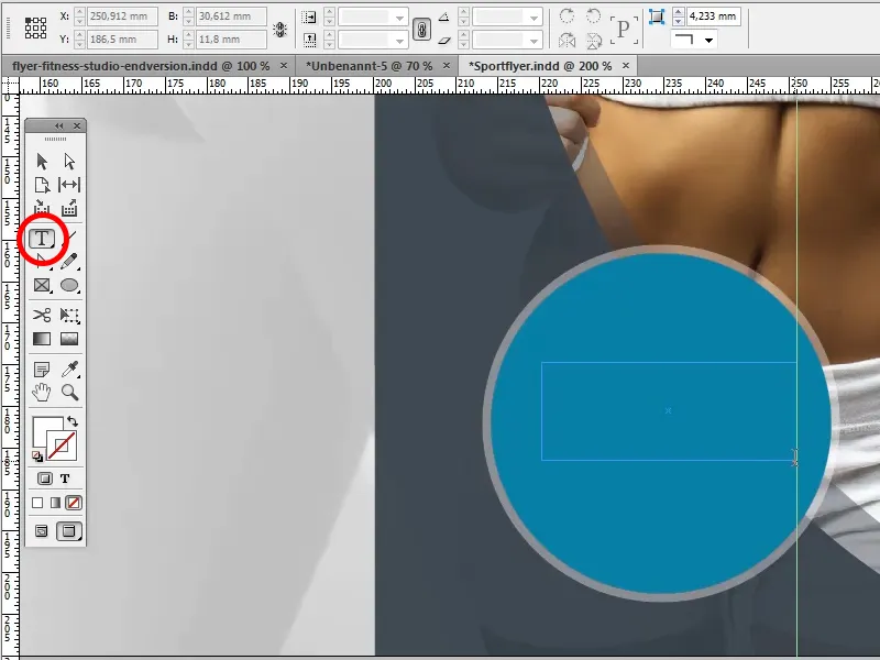
Now we write our company name in the Oil Can font (which we can also find on the Internet) in the text box. We then drag the two upper corners of the text box up to the white outline. This ensures that the text is really centered.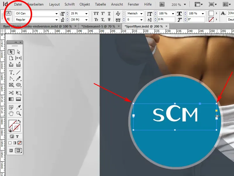
Hold down the Shift key and draw a line under the font we have just created. It should have a thickness of 0.5 pt and we select a light grey as the color. By holding down the space bar, we can move it to the correct position as we draw it.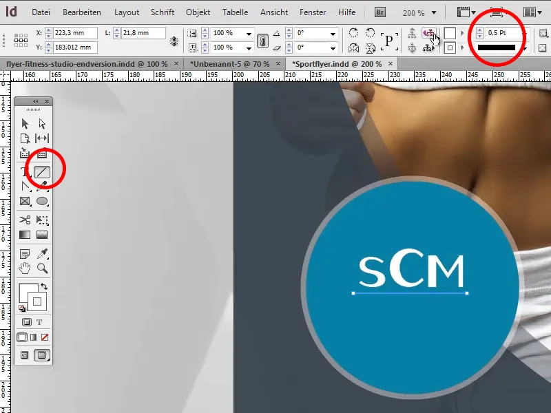
Immediately afterwards, we add "For him & her". To do this, we select our existing text box, press Enter and write our text. We'll use the PT Sans Narrow font again. We then change the font size to 11pt and the spacing to 18pt.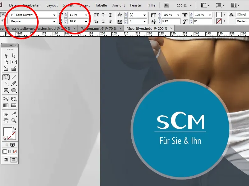
We then position the line centered between the font and adjust it to the S and the M using two guides. Now we can delete the guides by clicking on them and pressing the Delete key.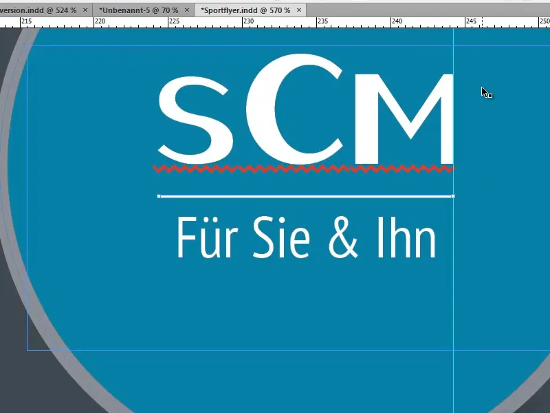
Step 21
Finally, there are three small things to correct or change: For example, we can reduce the size of the circle a little more by holding down the Shift+Alt key from the center; our darker shape in the top right-hand corner still needs an opacity of 90% so that the background shines through a little there too, and we recolor the two words "YOU FIT!" to our turquoise. Done!