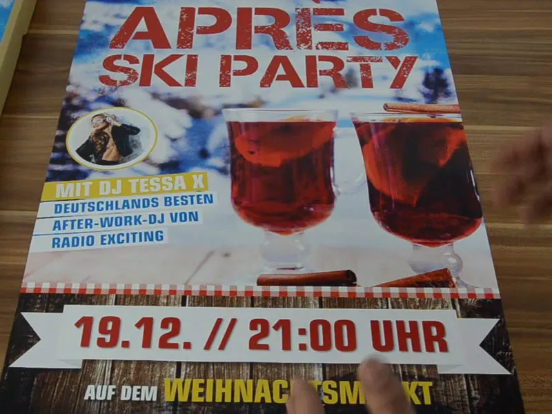
Hello my dear friends, my dear girlfriends, welcome back to a new round of "Fresh Print Layouts in InDesign". My name is Stefan Riedl from PSD-Tutorials.de. I would like to create this fantastic poster in DIN A2 format together with you. I have prepared a mockup of the poster so that you can imagine it a little more vividly.
This is exactly how it will look, and I suggest we go through the key, essential stages of this poster together. What did I have in mind? Why did I design it like this? - And maybe you can take one or two tips with you when you design your own DIN A2 or DIN A1 poster, depending on which format you choose. There are actually three relevant steps before creating any design ...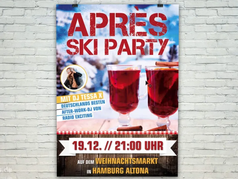
The very first thing is probably to define your target group: Who is looking at my design? Are there different characteristics, for example in terms of age? Does profession perhaps play a role, does gender play a role, is the message only aimed at men or is it also aimed at women or vice versa? Perhaps you can identify differences in the level of education. It is simply important that you know: Who exactly is your design aimed at? Who is looking at it? If there are several target groups - if you really realize, okay, we're dealing with several target groups here - then the best option is to simply form an intersection between two groups and draw out the greatest possible similarities.
No less important than the question of who views your layout is certainly the question of where your layout is viewed. For example, is there enough time to read, recognize and grasp something? What place? And what are the circumstances under which people view your design? It would be extremely pointless to start with the small print here, to add expansive texts and descriptions or perhaps even to add tear-off coupons. Of course that doesn't make sense. The point here is to be bold. Because that's how it usually is: You walk through the pedestrian zone, you walk through the city, stand at the bus station, wait for a cab or something else, and then you see this poster for a moment as you walk past or wait. That means you have to use really striking, large elements, you have to design it in such a way that you can see what it's all about even from many meters away. You also often have to take into account the lighting conditions under which you are viewing something like this. For example, if you are designing a drinks menu that is displayed somewhere in the nightclub, then it is of course a good idea to make sure that the drinks menu can be deciphered without having to put on a night vision device. You have to watch out for contrasts.
Or imagine the following scenario: You're standing somewhere at the checkout. You might ask yourself: "Is the printed product I'm designing now pocketable, for example? Can you take it with you, just put it in your jacket pocket like business cards or flyers?" You can put a little more information on it, because the prospective customer can simply put this little information leaflet in their jacket pocket and look at it again at home at the kitchen table. Of course, this comes into play in this case. You can't just take a poster home with you. Yeah, okay, maybe that's a good thing, otherwise you'll end up walking through the city as a designer and you'll constantly come across some guys running off with the posters we've designed and trying to get away. Well, maybe that doesn't have to be the case. And that's exactly why we have to work with elements that can be captured really quickly, note the date, dot, off, done. You have to be able to remember that.
So if we know who the message is aimed at, like in this example, partygoers who want to relax and unwind from the frenzy of the snow flurries and have a great time at an après-ski party, then it's all about generating attention.
Let me show you something: Let me Blender in a layer, this one with the letter "Z". What does this have to do with the poster? Well, the human viewing pattern resembles a Z. So you usually start at the top left, move over to the right and look at yourself: "What's this about? Aha! Après-ski party. Captured. Okay." Then your gaze automatically wanders to the bottom left at a 45-degree angle.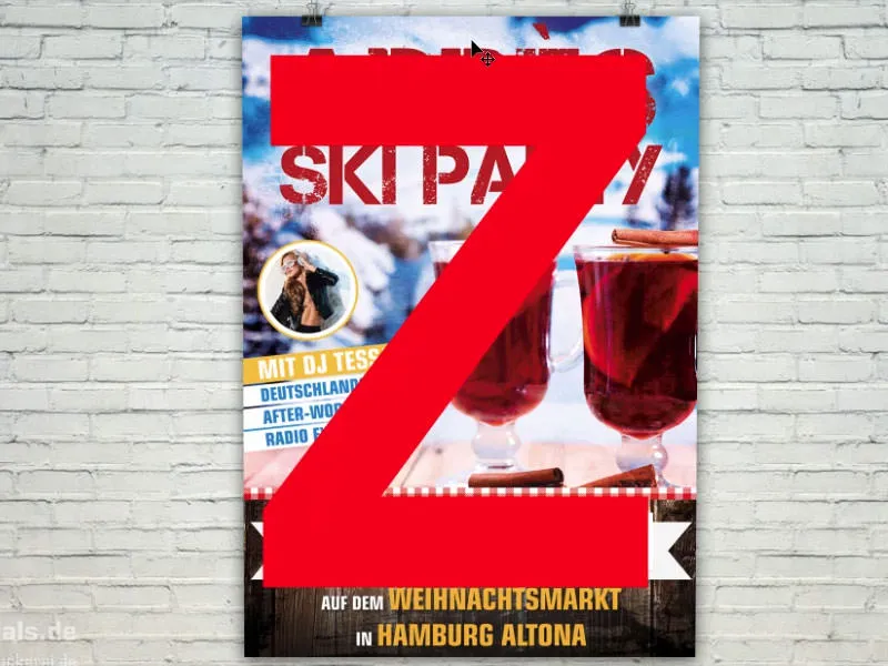
I've placed a message there about which guest of honor will be at this party. Then the gaze moves from the left to the right again. This is where the information about the date and time is located - i.e. when the whole thing is taking place. You would do well to follow this path and work with eye-catchers. This can be a great picture, for example, as shown here. But it can also be graphics, slogans or a line of text. You simply have to create key stimuli that trigger emotions and feelings. Even I feel like taking a sip here ... If you work with such eye-catchers, then please always relate them to the content. There's a motto that says: sex sells. It's kind of true, but the bitter aftertaste is simply that it's not very original. Of course, we don't want that to happen to us, which is why we always work with the content in mind.
Last but not least, we then work on the design. And once the medium is clear, you can start to split up the whole area. In this example, I've divided it into quarters, with a quarter at the top for the headline, around 50 percent in the middle and another 25 percent at the bottom with the date. Half-half divisions are not so exciting, you don't like them, somehow they don't appeal.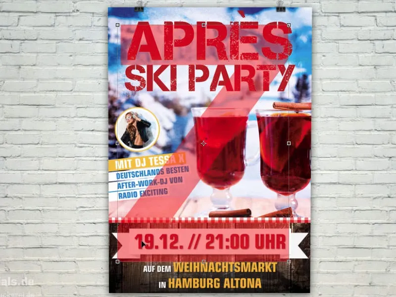
I advise you to either make a one-third/two-thirds division, as shown in the sketch here, or perhaps even a quarter division, as I have now done in our example.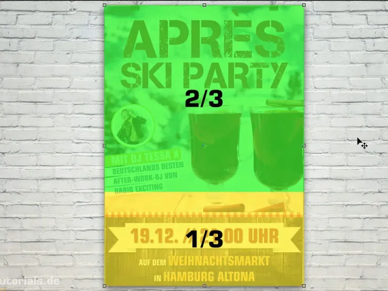
Print specifications for the poster
Now we're ready. Let's take a look at what the printing specifications are: diedruckerei.de (1) will tell us. Let's scroll down to outdoor advertising (2). Of course, a poster like this usually hangs outside. Click on Posters (3). Again, there are different variants. Posters, printed on one side (4) ... Then we are asked for the format, I choose DIN A2 (5). And then let's take a look at what the details tell us: The data format including 2 mm bleed: 42.4 x 59.8 cm (6). But we need the final format - 42.0 and 59.4 cm (7).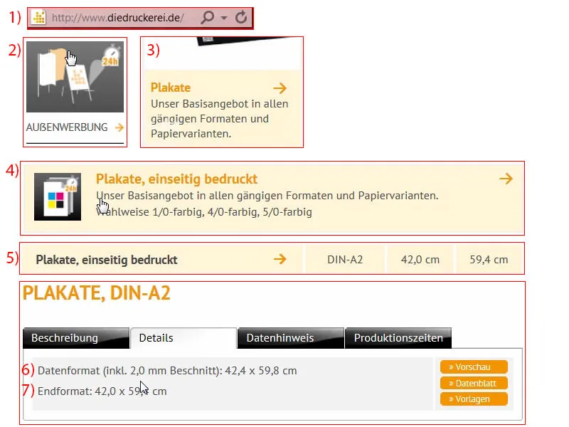
Setting up the document
So I switch to InDesign and create a new document. In the dialog for the new document, I deactivate the double page (1). There are 420 mm in width and 594 mm in height (2). We use 4 mm space to the edges (3) and make a bleed of 2 mm (4). And then it starts (5).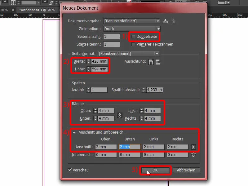
Then I divide my layout by selecting Layout>Create Guides.... Here I enter four lines for Number, column spacing 0 mm (1). Confirm this (2).
This is the layout (3) that I will use in this example.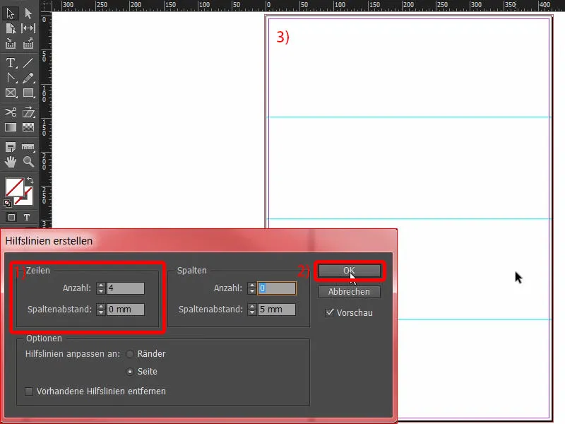
Designing the bottom edge of the poster
Let's start with Ctrl+D for the Place dialog. I'll select this wood texture for the background (1). Zoom in once to the lower area and drag (2). Always check that we are at the bleed here (arrow at 3), also on the other side (arrow at 4) ... Fits.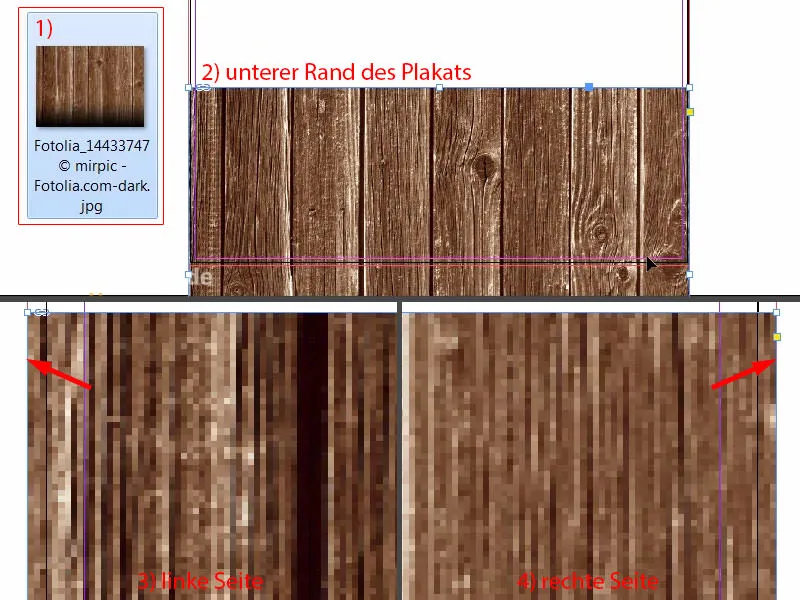
Then we adjust the image content a little (1). I use the Shift keyand the up arrow key to move the entire content upwards. This image is from Fotolia and I've added a black gradient at the bottom. That should be enough for now (2). Then we can also reduce the spacing, which doesn't have to be that big - but up to the bleed (see 3 and red box).
In general, the placement of the images is always a bit of fine-tuning afterwards. You have to do a bit of fine-tuning afterwards to make sure everything is really well coordinated. That's why I'm going to place the images provisionally for now, and later we can start counting the peas.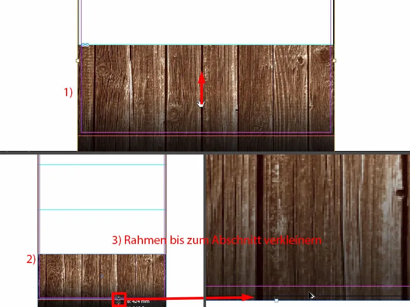
Place image
Ctrl+D again. Next, I'll draw this great picture (1) with the winter landscape (2) and drag the frame up to the guide line (3).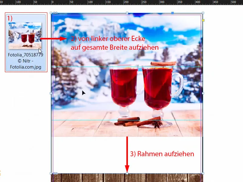
Right-click once, Customize>Fill Frame Proportionally.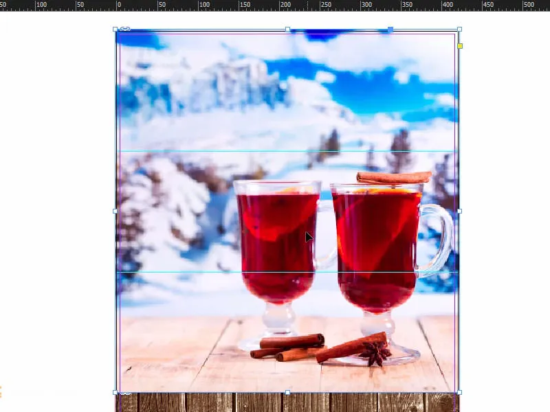
I already have a certain idea, so I'll make the picture bigger and move it. That should be enough for now. And on we go.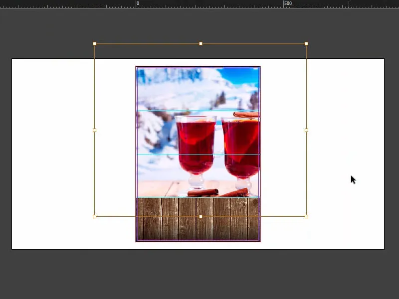
Adding the tablecloth pattern
In the existing design, we now have this Bavarian-style tablecloth pattern. I'll place that here too.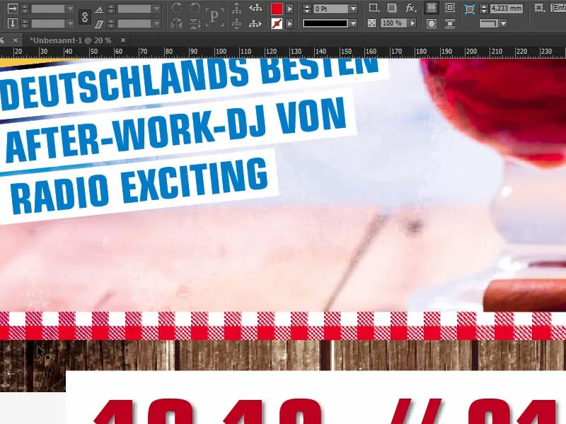
So Ctrl+D (1) one last time. I can drag the image (2) and adjust it: I pull the whole thing up to halfway (3), whereby the center is also displayed immediately. You can see this purple line - this is the auxiliary line (at 3).
By the way, if it doesn't appear for you, this is because you have deactivated the intelligent guides under View>Grid and Guides. The shortcut for this is: Ctrl+U.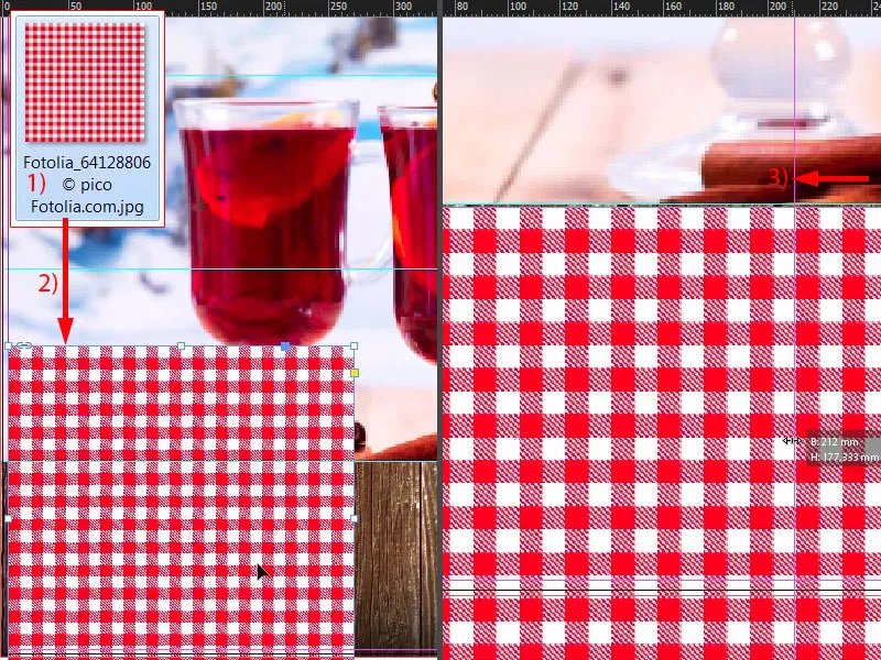
First reduce the size so that we complete exactly one row (1), also from below (2), and then place the pattern above the wood (on the edge of the arrow at 2). Then we have that too. And then I create a copy of it by holding down the Alt and Shift keysand move it to the right (3). Of course, I could have done all this directly with one image, but then these patterned tiles would just be too big for me. So we have a nice small, slim look. I just like it better this way.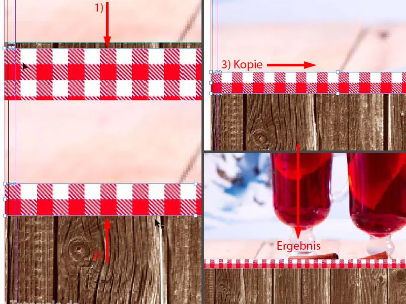
That's the interim status.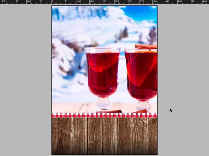
Inserting text into the poster
Now that the background elements are all in place, it's time for the next step, which will deal with the first major typographic element: We are adding the headline. Draw a text field (1). The settings for the font (2): Capture it, 320 Pt.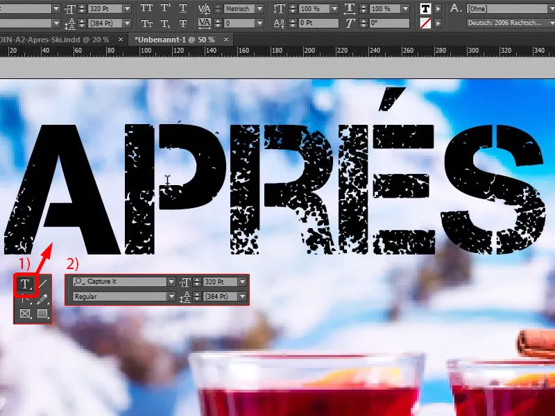
If you're wondering where to get the font, here's a quick tip: you can have a look at dafont.com (1). You can find free fonts there. Let's search for Capture it, and then you can see that it's available for download right here. Or you can also find fonts on fontsquirrel.com (2) ... That's quite a feat if you can pronounce it without tongue twisters. We are also looking for the font here, and it is also available here. In any case, you can find 100 percent commercially usable fonts among these two, and that's exactly what I used in our layout.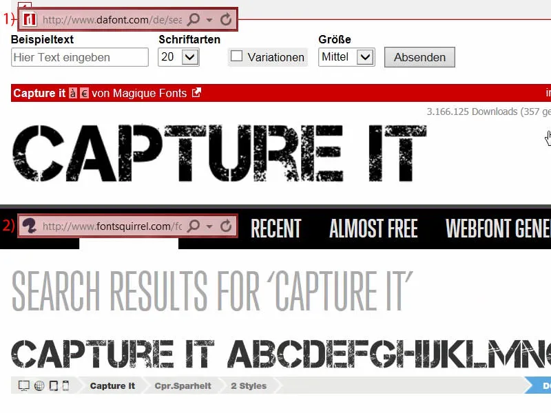
Now, of course, the word still needs a suitable color. And I simply take it out of this glass with the pipette (1). I'm thinking a deep shade of red here (2) ... That was too deep, so once again: this one, approximately (3).
Then I go to New color field... (4). I set the color mode to CMYK (5), then Add (6) and OK (7).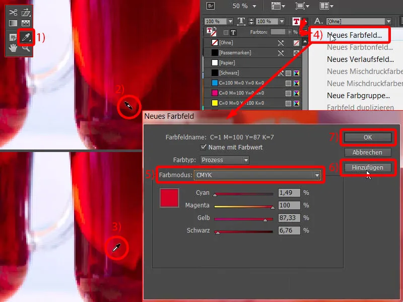
Then the whole thing looks like this (1). You'll have to try a bit to get the right tone, I mean, this glass has different color gradations. I also have a predefined color that we can take a look at: In the already prepared poster I used C=22, M=100, Y=100, K=4. We can simply change that here, double-click on it (2) and enter the values (3). It was close. And now I assign this color field again ...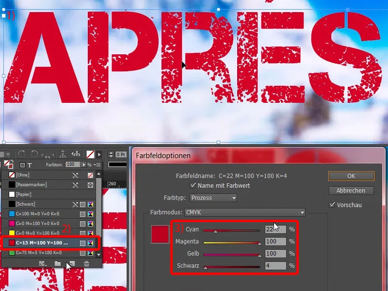
Now I see that I used the wrong color, which is the one from the default setting. In such a case, it is always a good idea to take all unused color fields (1) and delete them (2). Then this does not happen.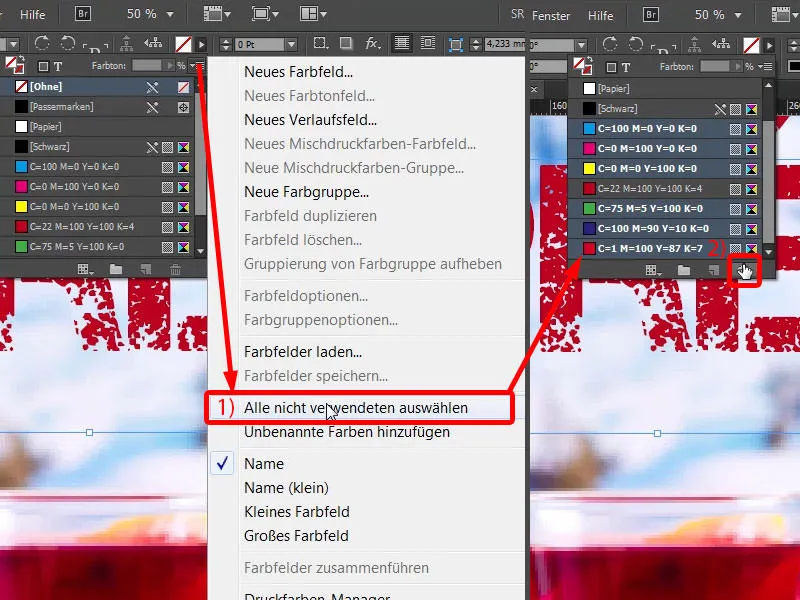
Adjust the size of the text field by double-clicking on the handle (1). And now I'm going to align it in the middle, the intelligent guideline will help again (2).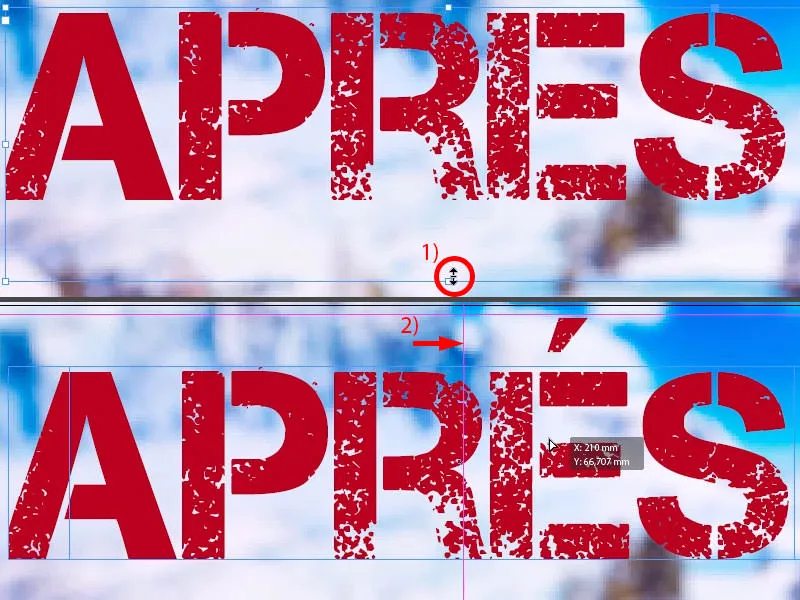
Make a copy of this and drag it down (1). Then we change the font size to 220 pt (2) and write in here: "Ski Party" (3). Now we have a slight overset, which you can recognize by this symbol here (4).
By the way - a little quick tip: If you don't know exactly how much of the overset there is, you can simply press Ctrl+Y and you'll get this great dialog (5) that tells you exactly where the overset occurs.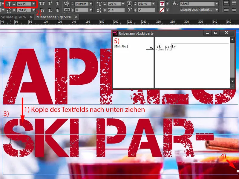
Then I simply make the text field a little larger (1), center it (2) and adjust the spacing (3).
And then we can clearly see an asymmetry here (4). This is due to the spacing of this word ("Après"), which still needs to be adjusted a little. This is what you do here: widen by 25 (5).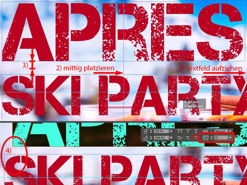
Double-click here to adjust the size of the text field (1) and center it again (2).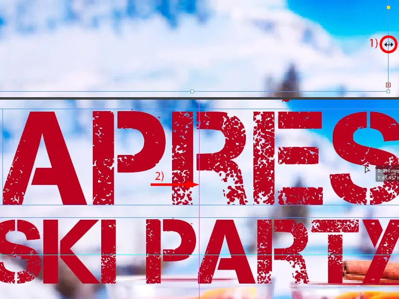
Now the whole thing looks better. You can get really fussy about the details at the end, but I think that's fine.
Let's take a look at the whole thing from a bird's eye view. This reveals the self-fulfilling prophecy with the images, which I described earlier: They have to be adjusted, of course, because it's totally in the way now.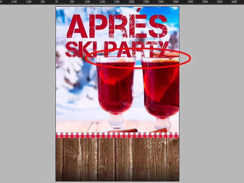
That bothers me so much that I have to make it a little smaller. For now ...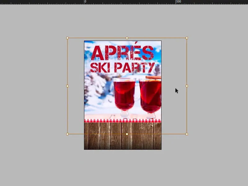
Add image with double contour
Now it's time to get musical and sexy, because we're going to place a picture of our guest of honor here. Let's take another look at the template: This is what it looks like - DJ Tessa X with extremely hip sunglasses, as you can see here ...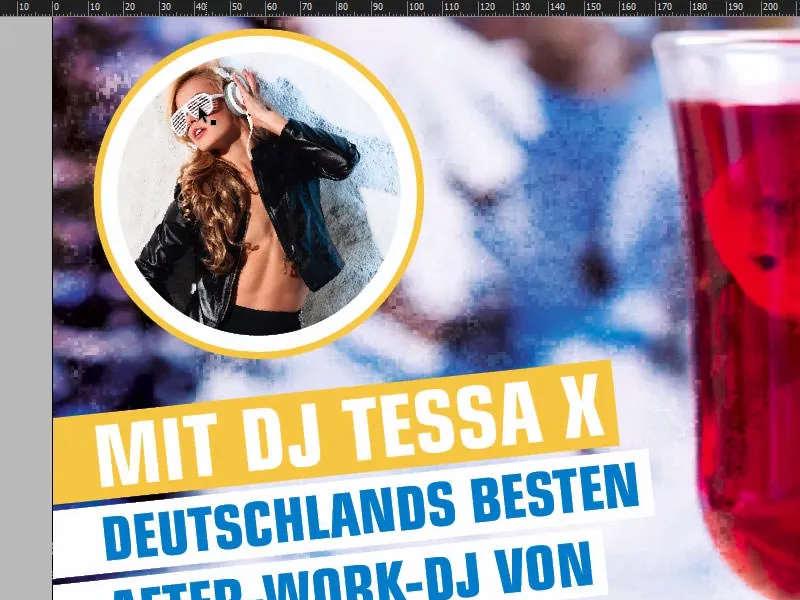
Let's switch back. First we have to draw a circle. You can find it here in the sidebar (1). Click on it once, set 94 to 94 millimeters and confirm (2). We're still missing the right color, which I'll create without further ado: C=3, M=25, Y=100 and K=8. Add, OK (3).
Now I make a copy of the circle, i.e. Edit>Copy. Then: Edit>Paste to original position (4).
Now we see in the Layers panel: We have two circles on top of each other (5). At the moment, the top one is selected and I'll fill it with white (6). I'll reduce its dimensions proportionally from 94 to 89 mm (7). That's okay. Now we have two circles in a row (8).
Now you might think that this would be much easier to solve with an outline. Right, but I want to have a double contour, because I want a yellow one and then a white one.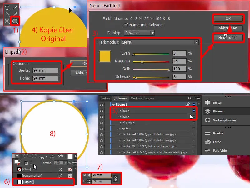
Now I select the upper circle, Ctrl+D for the image (1), and insert. Right-click, Customize>Fill Frame Proportionally - and there it is (2).
And now we can simply select an outline at the top here with white and enlarge it step by step - 10 pt fits (3). However, I still don't like the narrow yellow stripe ... So I'll change the size here again (4) - that's better (5).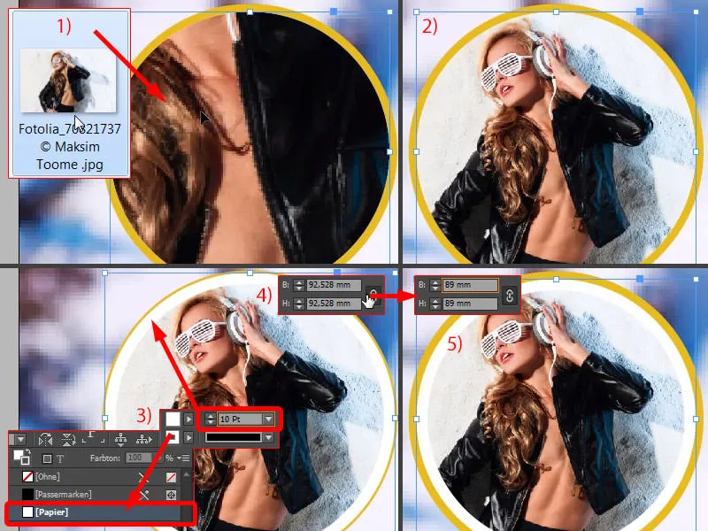
Incorporate slanted text
I think we can leave it like this. And now I'll select the back and front circles and press both into a group with Ctrl+G. Now you can move the whole thing together without anything slipping. For now, it's over the line at the top here (1).
Of course, Tessa's promo by name is still missing, it goes at the bottom. So let's draw up another text field. Font: Eurstile LT Std, in a fairly slim style, Bold Condensed, 68 pt size and in capitals (settings at 2).
Then we write the whole thing in (3). Next, we add a color frame in yellow (4) and set the font color to white (5).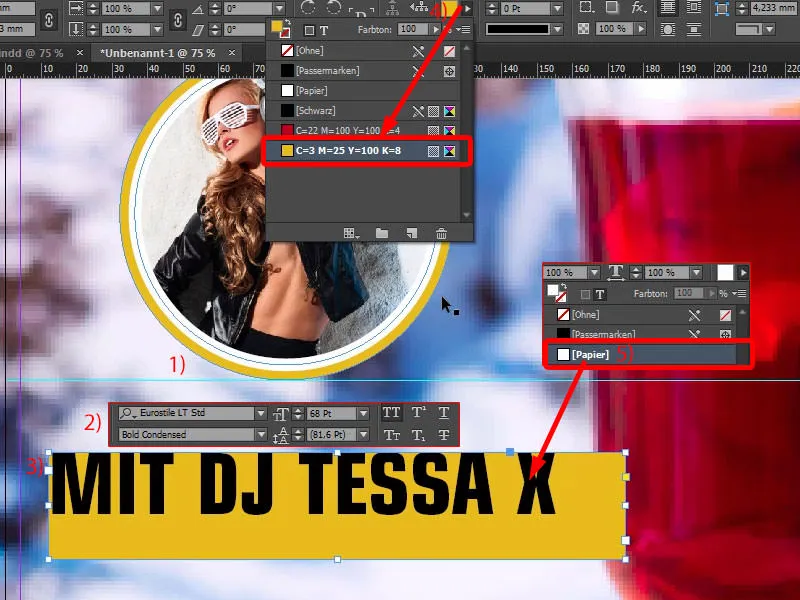
Now we open the text frame options with Ctrl+B. This means that we now have a text field with corresponding parameters for customizing. We will modify the spacing slightly: 3.5 mm at the top and 3.5 mm at the bottom. We set 20 mm on the left. We need this in order to be able to draw it outside the bleed. On the right, 3.5 mm (settings at 1). Please center the text alignment (2).
Then double-click on it (3). Okay. And now we have uniform spacing. We just have to adjust the text field to the size, i.e. double-click on it (4). Done.
Of course, there's a reason why we're doing this so elaborately with the spacing, because if we now copy the text field and then write a different text in it, which is perhaps a little longer or shorter, we can adjust the frame to the same dimensions with just a single click. I'll show you that now.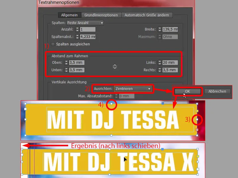
I'll make a copy of it with Alt and Shift (1). Now make it slightly larger (2), reduce the font size to 48 pt (3) and simply write in: "Germany's best" ... Adjust here by double-clicking (4) ... and - you see, that's exactly the effect: we now have uniform spacing here (5), and with just a single click. I do the same here on this handle. Double-click on it (6), the spacing of 3.5 mm always remains (7). Very nice.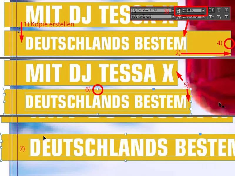
I deactivate the element by clicking on the mounting surface. Now the third color comes into play: C=100, M=28 and the other to 0 (1). Here (2) we change the background to white (3). Set the font to blue with Ctrl+A, select everything (4).
Now we have created a holy trinity of colors: You see red, you see yellow, you see blue. Why did I choose these colors? I'll show you under Window>Color>Adobe Color Themes.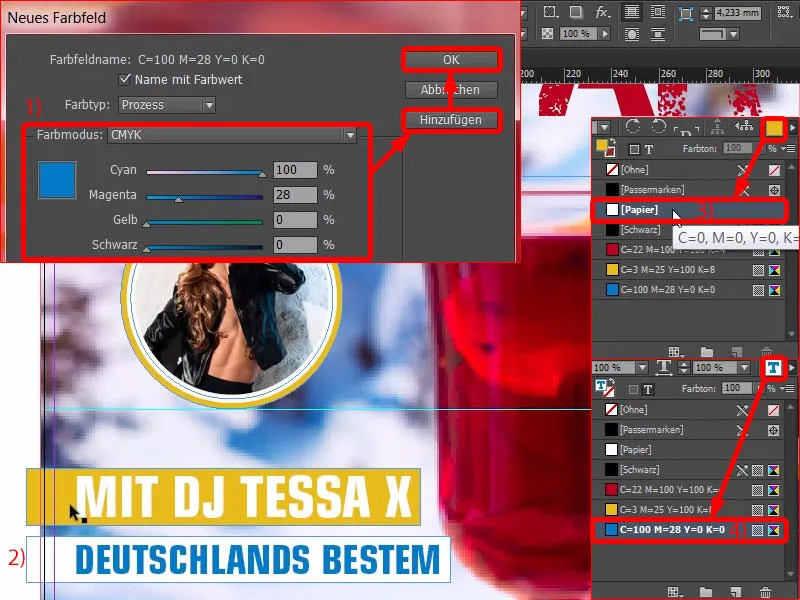
Excursus: Finding colors with Adobe Color themes
Take a look at this (1). If I manually enter the first color, the red we had here (2), then this is exactly this shade of red. If I now want to select a suitable color ratio in the drop-down menu at the top here (3) - it is currently set to Complementary, which is why the complementary color green is displayed - but if I now go to Triad (4), then take a look at which color harmony is spit out: Red, a shade of yellow, which I've adjusted a little, and shades of blue.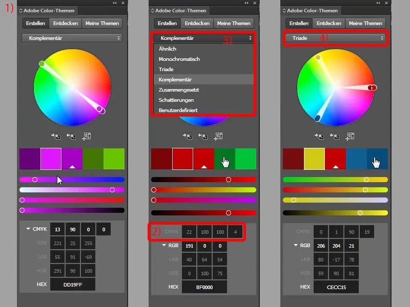
In other words, this quick trio results in a color composition that actually harmonizes very positively, and that's why I'd like to recommend it to you: Work with this tool, you can discover some really exciting content. For example, you can discover complementary colors. You can work monochromatically (1), i.e. only in one color. But you can also choose shades (2), i.e. gradations. Or you can discover your own colors, for example. For example, if we enter "winter", it spits out typical winter colors (3). This is what winter looks like for city dwellers (4), and this is what winter looks like for the guys from the village (5). You can add the colors to your color palette with one click. Now you understand why I chose the colors red, blue and yellow in this example. Red and blue were obvious, the background already has them. But why yellow? - Taken from the triad.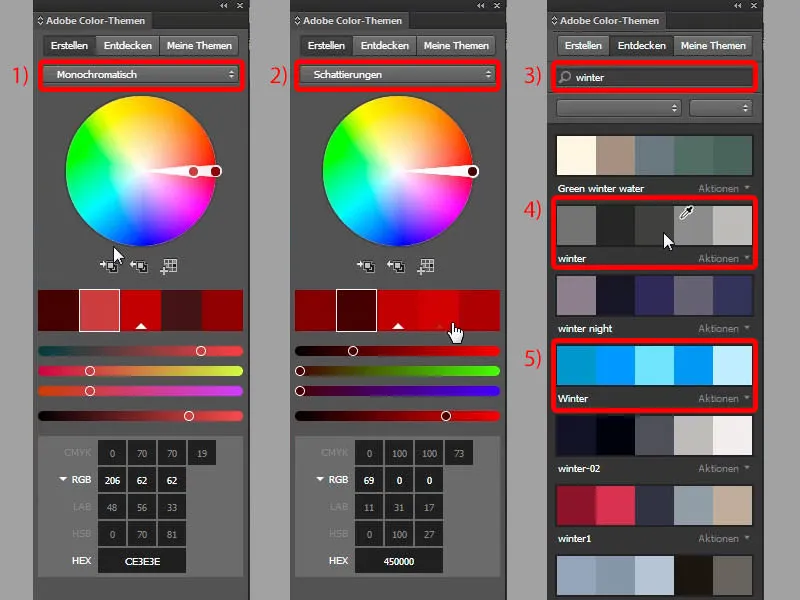
Complete the text
Let's continue with Tessa: Another copy of this, and we'll write in: "After-work DJ from" - adapt again. Once again, and I'll write in: "Radio Exciting". Of course, that should also be completely fictitious and made up. Now we have that too. I select all of that and move it up a little (result at 1).
Now I can simply enter a 6-degree rotation at the top here (2), and then we have to make sure that we stay in the bleed here (3). This is guaranteed, the white line is still in the bleed. Here too, however, we need to make a few fine adjustments.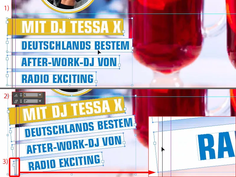
The spacing, for example, is still a little large, so I'll change that in a moment (reduce the spacing between the text boxes by moving them with Shift and the arrow key, result at 1). We might move Tessa a little further to the left (2), ...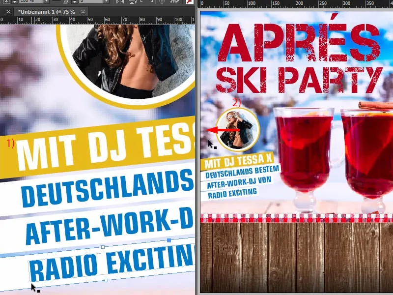
... something like that. This is what it looks like now.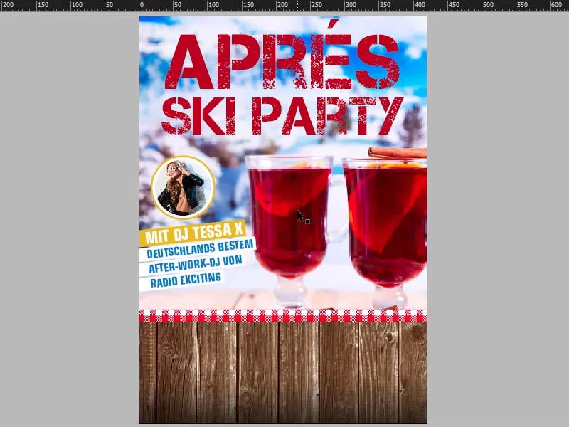
Creating a ribbon
Of course, a really big party is nothing if nobody knows where it is taking place. That's why we're going to install a so-called ribbon at the bottom of the wooden texture. This is basically a loop, a kind of ribbon.
To do this, simply select the rectangular frame tool (1), enter 340 mm for the width and around 55 mm for the height. Add white and align it in the middle, again using the intelligent guide (2).
I move it a little higher (3). I make a copy of this and lower it a little (4). I change the reference point to the left (5) and set the whole thing to 10 mm (5).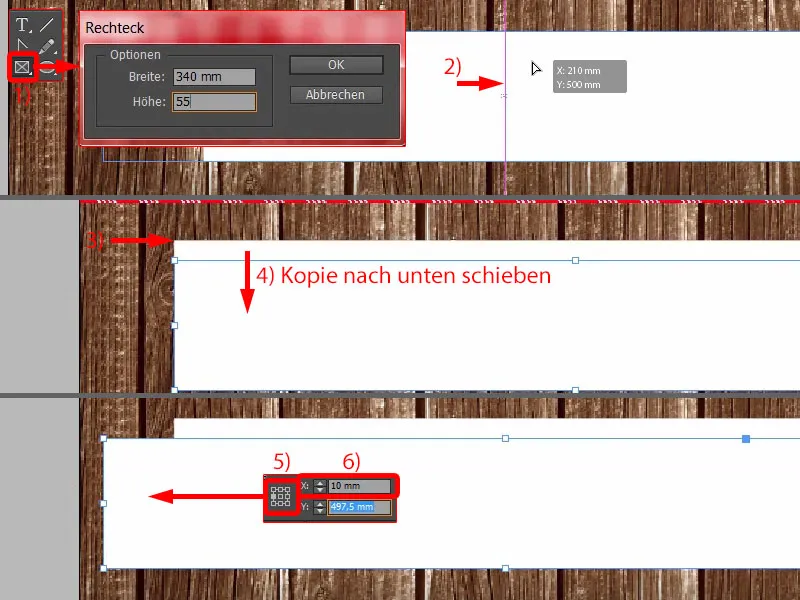
Then I reduce the width to 50 mm (1). That's how I could imagine it. I'll move the larger element to the foreground (2).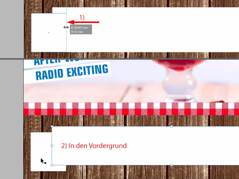
And now, of course, we need a triangle. This is available in the polygon tool (1). Draw it once (2) ... Assuming you need more triangles, for example, you can also play around a bit with the arrow keys (press the arrow keys when drawing the triangle, see 3 and 4).
Of course we only need one, I like to leave it in blue (5), but rotate it by -90° (6) and move it to this position (7) - then I adjust it to the size I need (7).
And now I use the Pathfinder, i.e. we select the blue triangle and, holding down the Shift key, the element behind it (8). Subtract from each other in the Pathfinder (9). Okay, and then we have exactly what we need (10).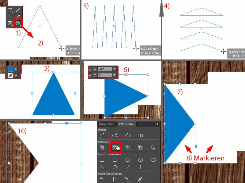
Now let's draw another rectangular frame, which will be exactly at this point down here (1). Of course, we still have to adjust the height (2). And now you can select the Delete anchor point element here on the left in your toolbar - it looks like a feather with a minus sign (3). Click on it once (4) and we have this element too.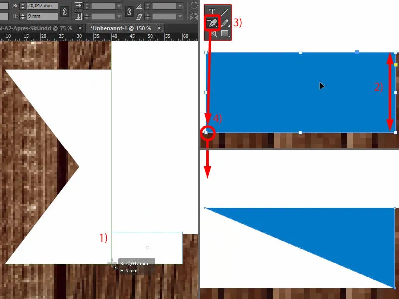
Now we need three different shades of white so that we can recognize the plasticity and the 3D character. So I'll start by selecting this element (1), which will be a bit shadier than the normal white. So let's go to 10 % for black. Add. Let's take a look at this (1). Yes, I can imagine that so well.
And then we select this element (2), also make a new color field, and we select 20 %. Add. And then you just have a look to see whether this effect is actually as desired. Looks pretty good, don't you think? The two color gradations really pull it off and create this great character.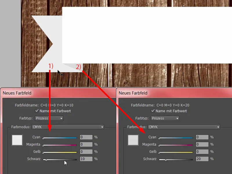
Now we can take both elements (1) - Alt and Shift key, make a copy of them - move them over here (2) and transform them once, i.e. mirror them horizontally (3). Then adjust the position and make sure that the edge is in place again (4). And then we have quickly created a clone of it and our ribbon is almost finished.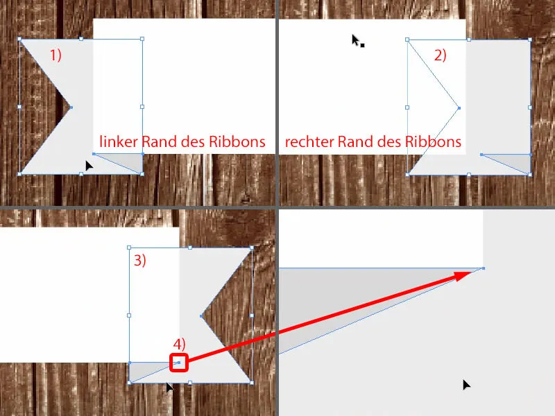
One little thing is still missing, namely the drop shadow. So select all the elements once, throw them into a group (1) and then select the drop shadow at the top of the effects panel(2).
The 3.492 mm is okay in this case (3). Here below I would like to increase it smoothly. It's very rare that you have to increase this, but this time I set it to 3 mm (4). The opacity is sufficient at 50 % (5). OK (6).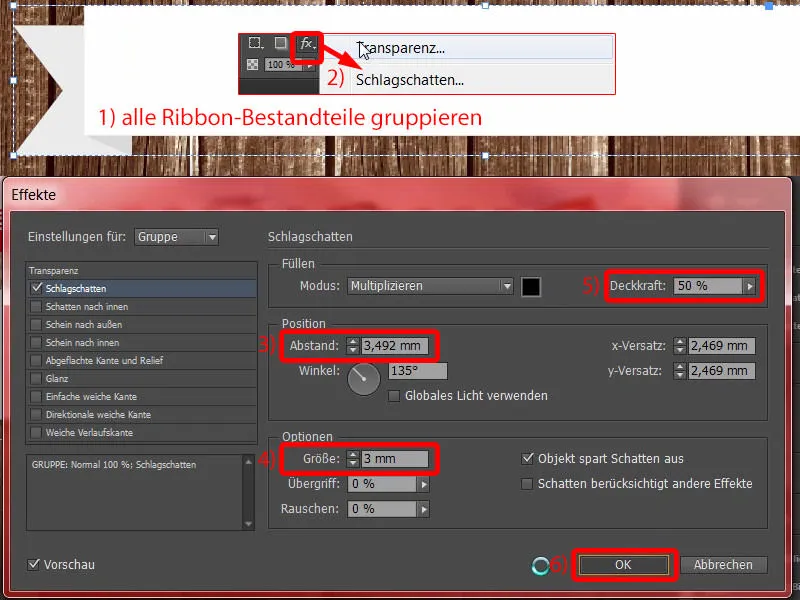
Text on the ribbon and in the lower part of the poster
Then we add a text field on top. Eurostile LT Std, Bold Condensed, font size 120 Pt in capitals, color red (settings in the picture above left). And then you can simply add a date. The two slashes are now all the rage. The matching time. Then I simply move it to this position and align it in the middle (result at 1).
We already have a drop shadow on the ribbon. So I open the effects panel(2). If I go to this fx symboland hold down the left mouse button, I simply drag this effect onto the font (3). Then, as you can clearly see, it is a little too strong (at 3).
So adjust again (4), because here the 3 mm are simply too much. So enter 1.5 mm and 1.5 mm in the size and spacing (5 and 6). Confirm. Done (7).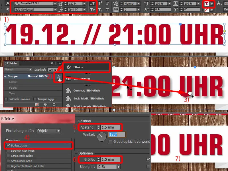
I also make a copy of this with Alt and Shift (1). The font size is set to 80 pt (2), then I write: "At the Christmas market in Hamburg Altona". Good, center the whole thing (3).
I reduce the font size of the unimportant information to 50 pt (4). This is also 50 pt (5).
I highlight the important information not only in size, but also in color (6).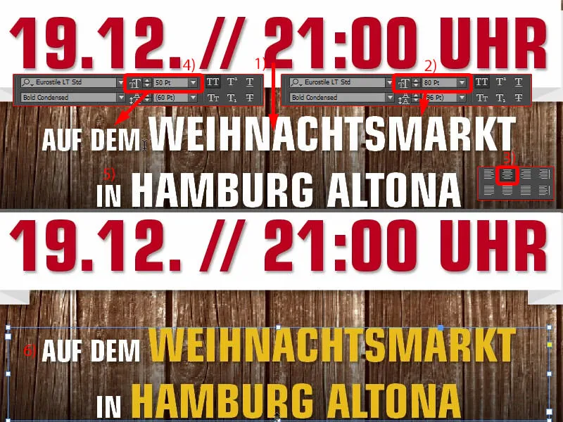
Fine-tuning the layout of the poster
Now, in the final step, it's really just a matter of fine-tuning the spacing.
This means that I will move the two elements (ribbon with text) a little higher, and I will also move this text field ("At the Christmas market ...") a little higher.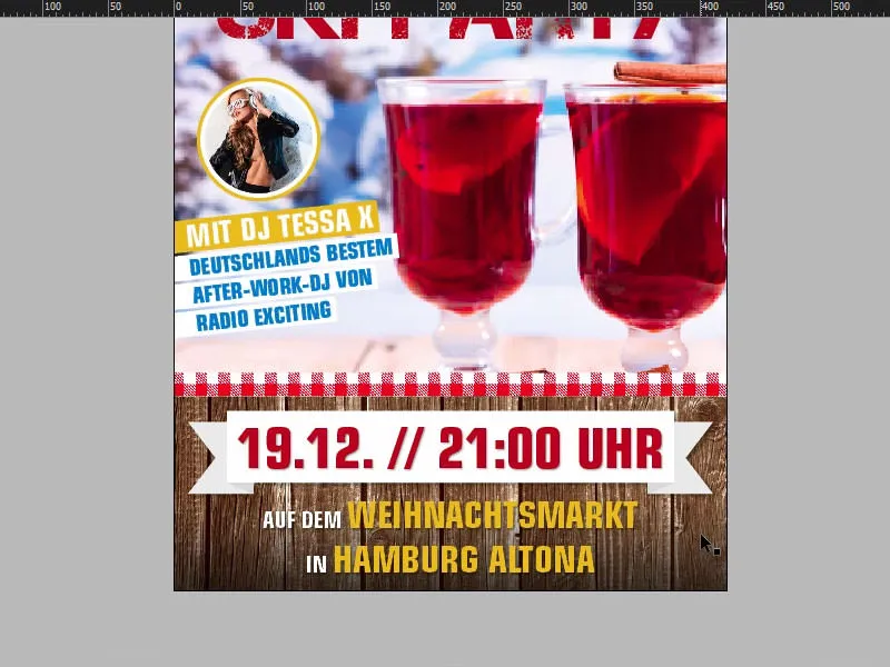
Now I will finally move the pictures: The first one is the wood texture. Double-click on the image, and then we have to be careful not to get too much black from the gradient. That's perfectly fine. We also ensure a better contrast ratio here. Yellow on black is easier to read than yellow on brown.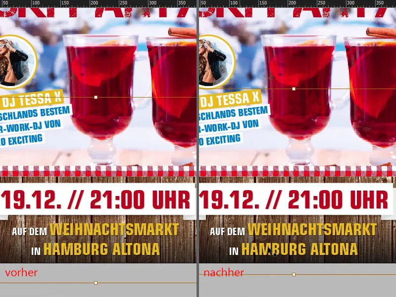
Now adjust this image a little: I would like to have the cinnamon sticks down here (1) a little more in the picture, so I move it up and then make it proportionally smaller with the top left handle and by holding down the Shift key. Excellent.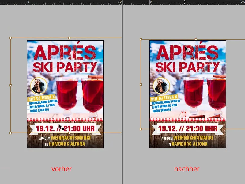
Let's take a look at the whole thing in comparison with the original ... There's still a bit of a difference. Of course, you'll immediately recognize the most drastic difference: We have a grunge style in the corners. That's the last thing we're going to add.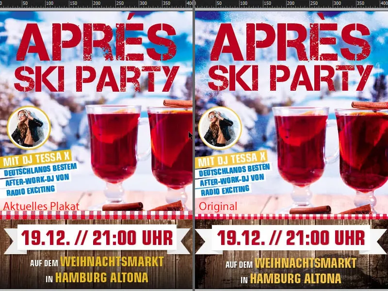
Add grunge texture
How was the grunge style created? Let me show you in Photoshop: Basically, it's nothing more than an empty layer - then wildly add your own touch with black and a few brushes in the corners and save it as a PNG so that the transparencies are retained. That's all it is.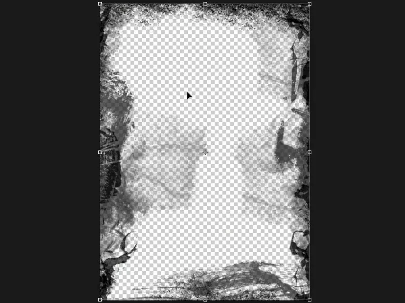
Then use Ctrl+D to show the Place dialogagain. There is our grunge PNG (1). Of course, it is important that it is in an appropriate size, so ideally create it at 300 dpi. Then we go to Place. I'll now simply drag this effect from top left to bottom right. Oh, now it's getting as dark as if the chimney sweep had been out and about. That's far too strong, of course, so I'll select the PNG image once.
In the effects control panel(2), I change the blend mode to Overlay (3). Now the whole thing looks a little more harmless. Now I drag the PNG to the right place, because we want it to be behind the text (4).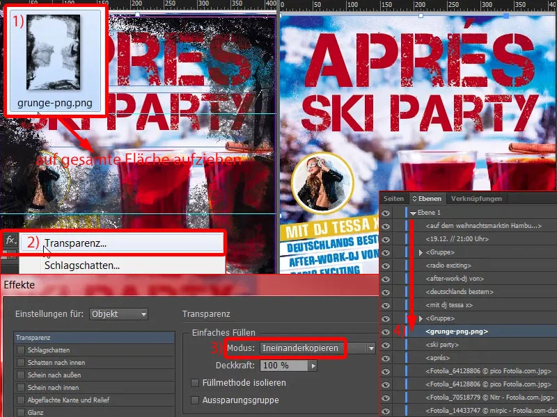
Then I make a copy of the grunge layer, i.e. Ctrl+C, thenEdit>Paste tooriginal position. Now we have the whole thing here again. And on the second layer, I reduce the opacity effect to 50% (1). This gives us double grunge at the corners.
This looks really pixelated and dirty towards the edges. Take a look at this when I scroll down here, also down here (2, 3, 4). I like it very much. It gives the whole poster a final touch.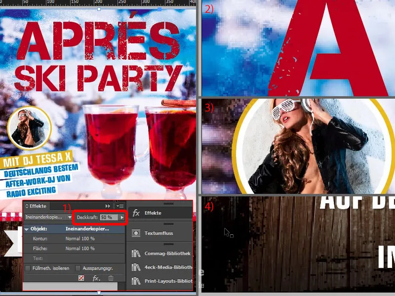
And now we've finally installed all the objects.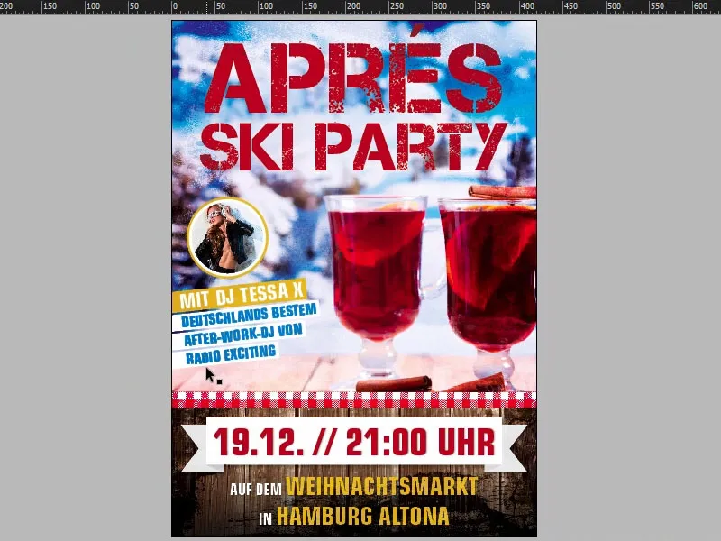
Checking the color application in InDesign
But there's one more important thing: if you're working with lots of images, layering things on top of each other and so on and so forth, then it would be advisable to check the color application. We have a maximum ink coverage of 300 % (1) for our DIN A2 poster under data note. How exactly can you imagine an ink application of 300 %? Let's go back to our poster and take a closer look: The maximum ink coverage is calculated from the sum of the individual channels, i.e. cyan, magenta, yellow and key, i.e. the black (2). And we always see the percentage values here too. According to our print shop, the maximum ink application is 300%, but in terms of production technology, the maximum is 330% for coated paper and 300% for uncoated paper. Of course, this has an impact on the drying time above all, because if this mark is exceeded, the drying time may of course be longer, which is why express delivery is definitely not advisable for such products. And on top of that, of course, the black values can then sink, which means that it becomes so deep and so dark that you can no longer recognize any structure in it. How can we check this in our document?
Quite simply, InDesign also has the appropriate tool for this: Under Window>Output>Separation Preview ... (3)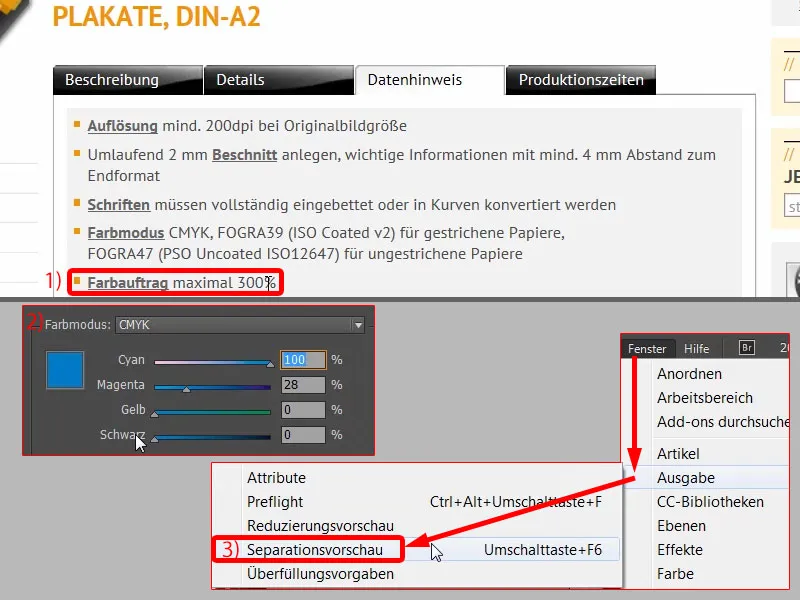
... you can select various options in this drop-down menu. Let's go to the color application (1) and enter 300 % (2) or it is already there. Now you can see: Where could it become critical? - Here on the left and of course everywhere on the edges where we have used this grunge style, but in a small amount, which is still tolerable in any case.
If we were to reduce the value to 280 % (3), for example, this would clearly increase.
If, on the other hand, we set it to 380 % (4), you can see that we don't exceed this mark anywhere.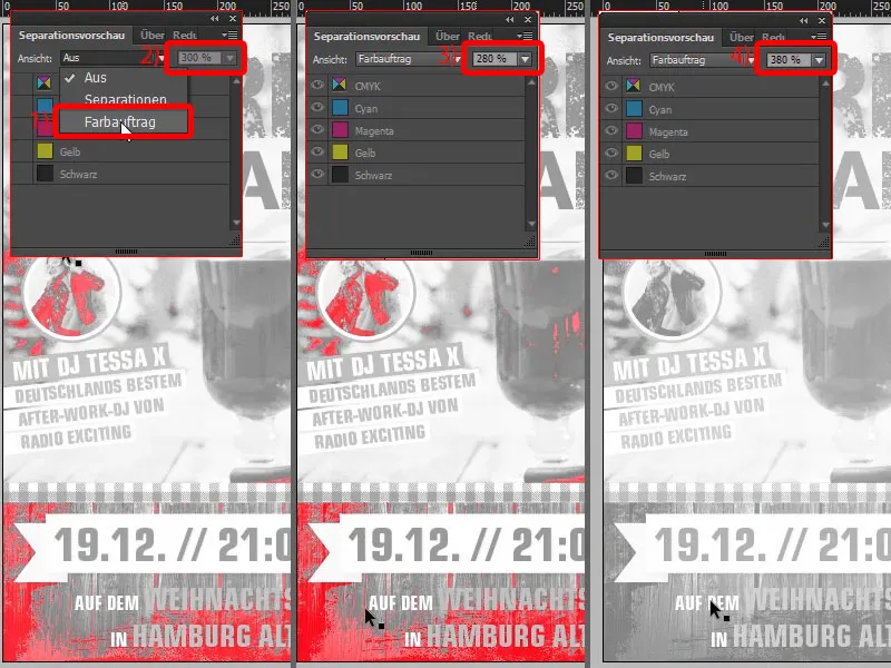
But I set it back to 300 %. What is also interesting, of course: You can open the separation preview here (1). This means that when printing with more than one color, you hand over a fully laid out document to the print shop - of course, our final PDF that we export - but in the prepress department, the colors are split into the four primary colors. As I said, this is called separation, which is why this drop-down menu is also called Separations. And a printing plate is exposed for each of these four basic colors.
You can remove the individual colors here, for example. Let's take the first printing plate, for example, which now has the color cyan (2). Then the whole thing would look like this. Now magenta is added (3), i.e. another significant amount of color. Then comes yellow as the third printing plate (4) and then black as the fourth (5).
Our final product therefore goes through the process four times so that each color can be applied once. So talk to your print shop to find out which specifications are important to you when applying color.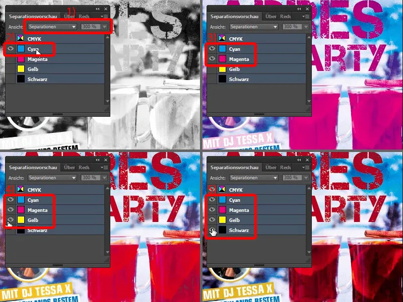
Exporting posters from InDesign
Now let's rock the export. So File>Export and save. Then the dialog opens: diedruckerei.de ISO coated, we have already created the profile (1). So just go with it. At the top you can see a process bar (2), and since this file has become quite large, it can of course take a while until the PDF has been finally created.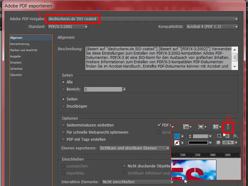
Here is our PDF. Beautifully exported.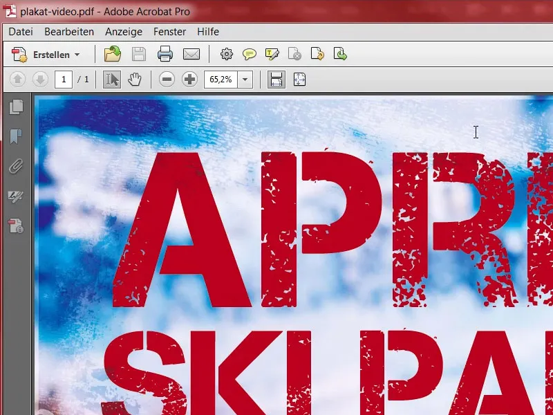
Check the resolution in InDesign
It is also advisable to take another look at the ppi to see how much we have effectively (1). Here, for example, we have 300 ppi in the original and 218 ppi due to the reduction (2 and 3). The tablecloth has 370 ppi (4), which is quite sufficient. Our background image is 190 ppi (5). The print shop wants 200 ppi from us, which means that their preflight tool will probably give us another warning. However, I think this is tolerable for this poster, because these values have of course been chosen by the printer to ensure the best possible quality. Let's take a look at Tessa (6): even in the four-digit range with 1036 ppi, say the judges. Excellent job ...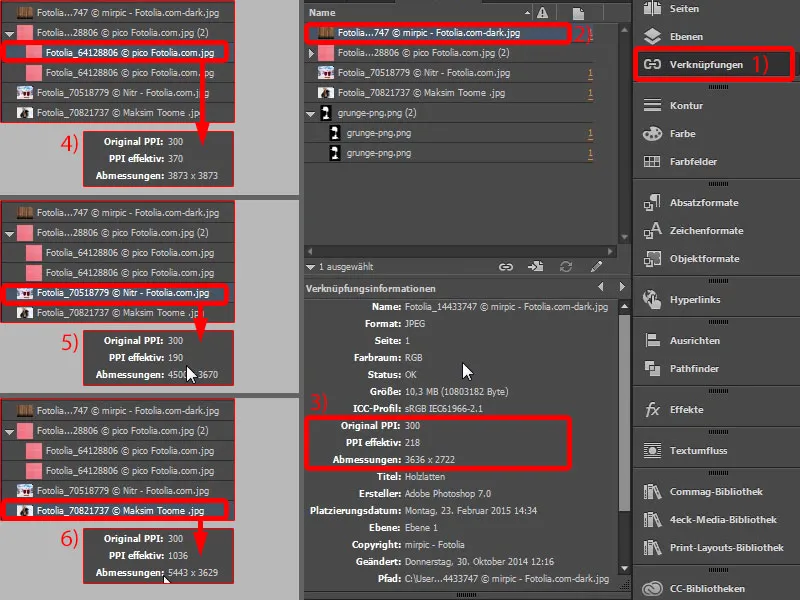
Upload poster to the print shop
And then I would suggest that we simply upload the child. In the product configuration you can of course choose your paper again. Typically, you would probably use 135 g/m² picture printing paper, but there is another interesting product here, namely 115 g/m² poster paper (1). What exactly is it? Affiche paper - read this (2): "Can be glued to the specially coated reverse side and attached to designated outdoor surfaces in a weatherproof manner." - Okay, now it's ringing a bell for us too. This is exactly the paper that is used by companies that arrive in their Sprinter just in time for the next general election, then the three of them get out and start sticking individual poster parts of the top candidates on large advertising spaces. So they paste over the previous advertising. That's what it's for, because the back is usually blue to make the paper more opaque. The whole thing is called "blueback" ... You can use it, but you don't have to. In our case, we don't want to use the poster anywhere for pasting over, so I close it again and then simply choose our 135 g/m² (3) picture printing paper. It's also a bit cheaper. The whole thing is coated with a glossy finish (4). We don't need to fold (5). We take the data check with us (6).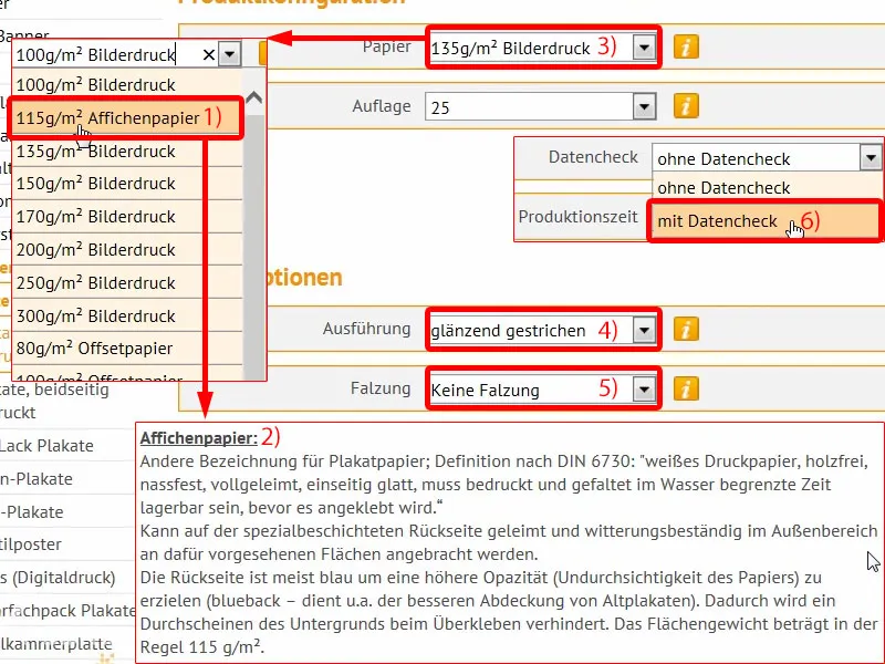
Then we can continue with the order. Again the summary, voucher code, if you have one. Next. Again the data, where the whole thing is going. Next. I set payment to prepayment. Next. Okay, of course we accept the terms and conditions and then scroll all the way down. Yes, we want to stay up to date with the newsletter. And then we click on Buy.
Now comes our well-known upload dialog, which I call up and then we simply push our PDF up to the print shop (1).
The file is at the top, all in one document (2). Here I have already announced the resolution below 200 dpi (3). We have to confirm this, I do at this point (4), and I finalize the order.
All done. Now I can't wait to see what it looks like when it arrives.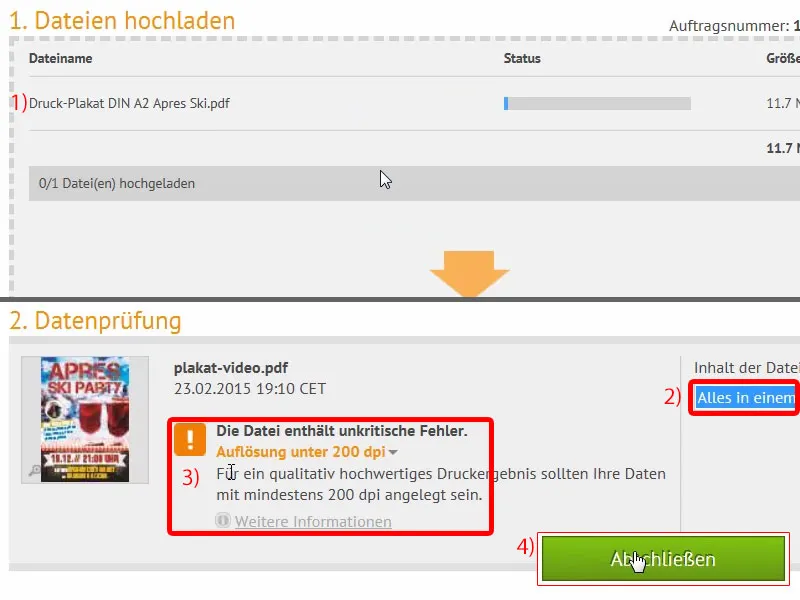
Unboxing of the printed poster
Compared to the other packages we've already unpacked, this one is a bit more lavish, as you can see. What's inside?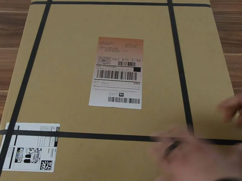
Our après-ski poster, of course. Let me open it up ... voila. Take a look at this: It makes my heart beat faster as a designer. We have a really cool grunge effect here, which really comes out well. Our Capture it, which we used as the font. It looks really cool. In terms of grammage, we have 135 g/m², which is really good and perfect for posters. And something like that is just fun, it's fun, you just realize that the work you've done is really presented in a great light. On that note, I'm off, have fun with it and good luck with your design.