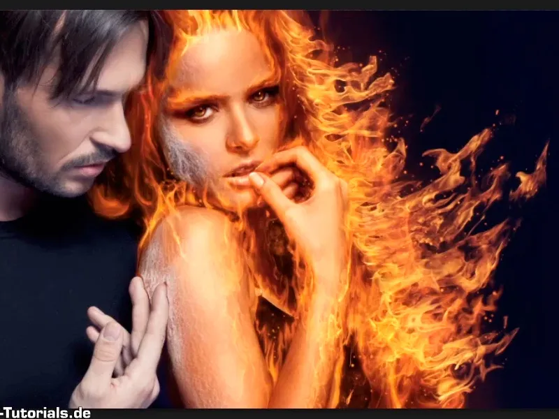
Note: The tutorial "Placing real fire in a picture" is a text version of the accompanying video training by Marco Kolditz. The texts may therefore have a colloquial style.
Here we go: Steps 1-10
Step 1
Now you are going to compose real fire into your picture and concentrate on the right-hand side. This is where the hair should really burn.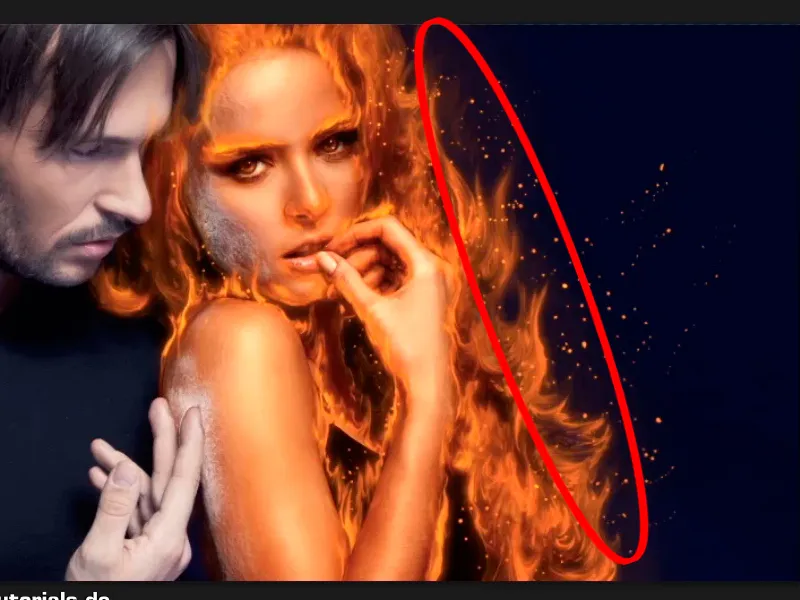
Step 2
To do this, select File>Open and choose the file you want to use.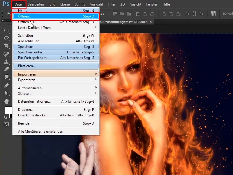
In your case, the correct file is "Fire2.jpg". Select it and click on Open.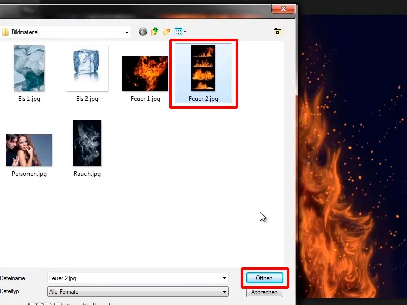
Step 3
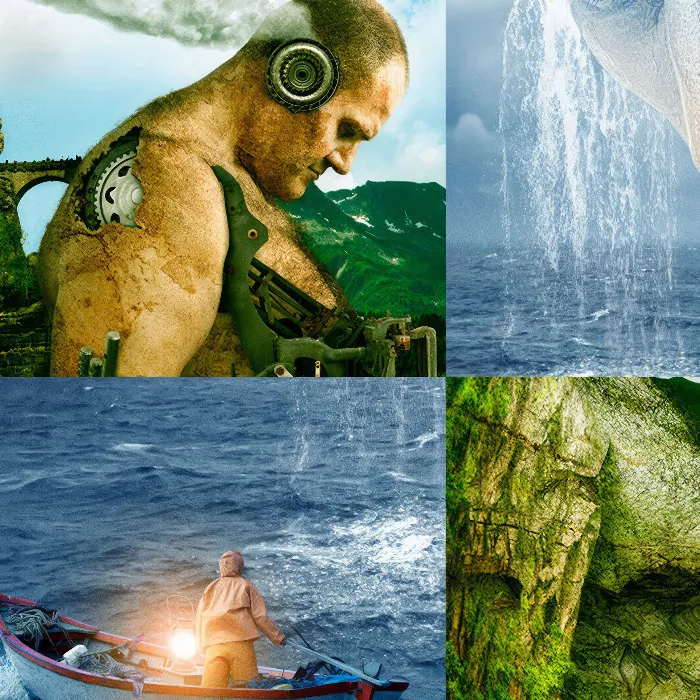
Some of you may wonder why you don't go to File>Place or simply drag in the image from Windows. This is because this image contains four different photos of fire and only this area should be used: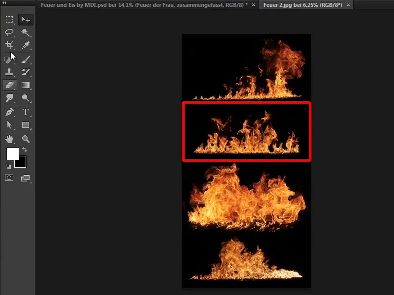
Step 4
Now click on the cropping tool and draw a frame around this fire.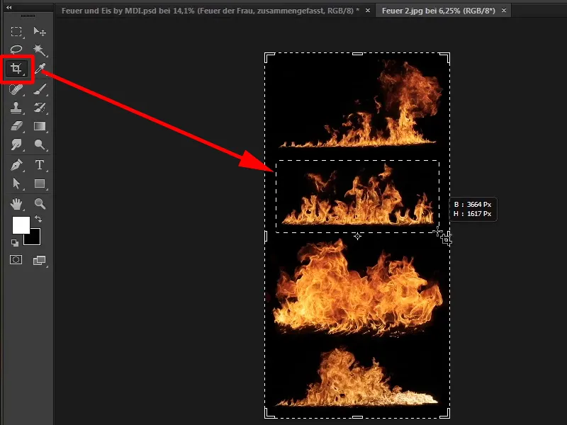
Step 5
Zoom in a little on the image. If you want, you can adjust the frame a little and double-click inside the frame to crop the fire.
Very important: Click on the checkmark next to Delete pixels outside the selection to activate it, as this will delete all pixels outside the selection.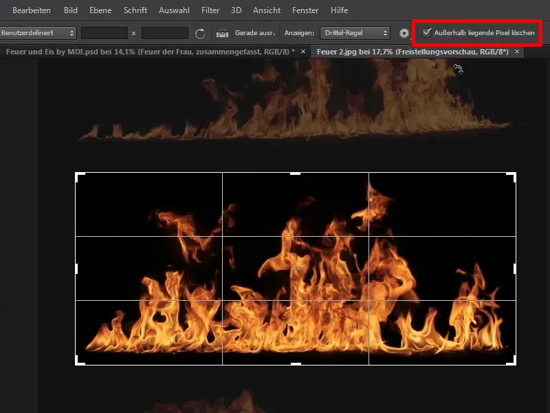
Step 6
If you were to deactivate Delete pixels outside the selection, you would basically only change the image section, but the fire would still be there. However, the fires at the top and bottom should not be used at all and therefore you click on Delete outside pixels. This will make the image file smaller and it will be easier to edit your composing.
Step 7
Now double-click in the middle of your selection and drag the image onto your composing.
Rename the layer directly to "Fire, Hair" and close your "Fire.jpg" file, you no longer need it.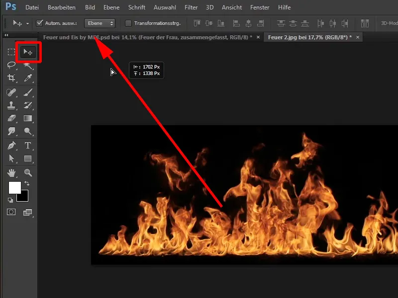
It will look like this: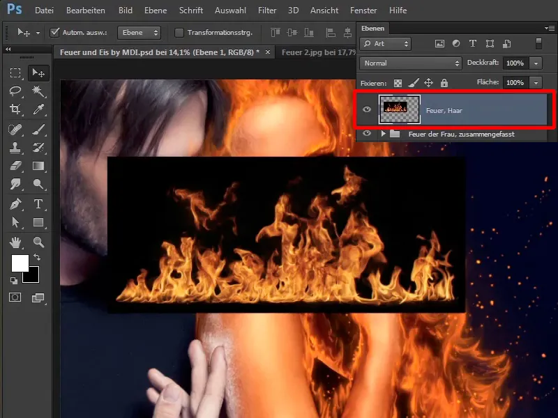
Step 8
An image that has been dragged onto a composing and is now to be deformed, scaled or whatever else is to be done with it is always converted into a Smart Object:
Right-click on the layer and select Convert to Smart Object. This allows you to scale the fire as you wish without affecting the quality.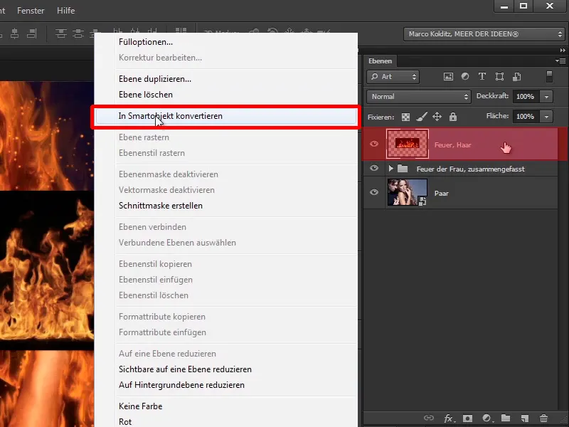
Step 9
The fire should now be placed to the right of the woman's hair and as you can see, it is quite jerky and snaps everywhere when you move the image back and forth a little. Why is that?
Exactly, the alignment function is activated via View>Align. Deactivate it and the fire can be positioned much more easily.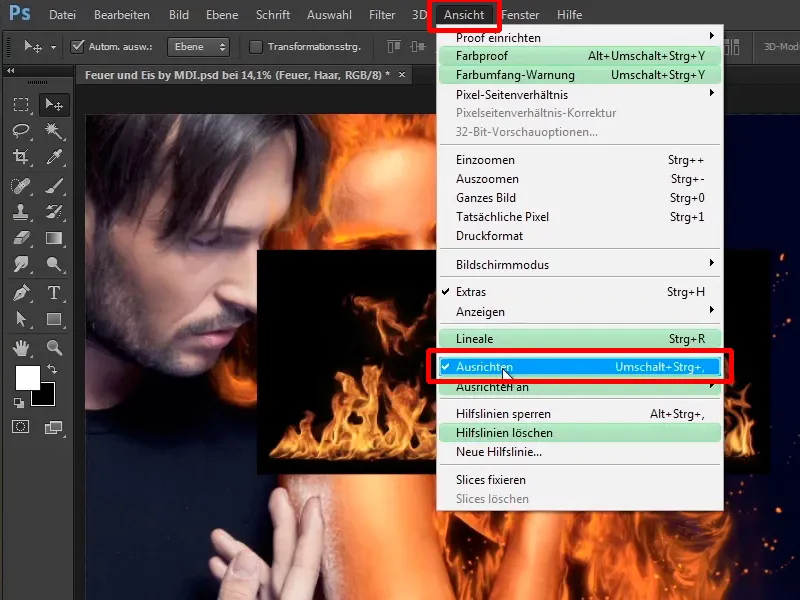
Step 10
In order to place the fire along the hair, it must first be transformed. Therefore, click on the "Fire, hair" layer, press Ctrl+T for Transform ...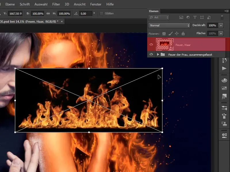
... and if you move the mouse over the edge area, you will see a curved arrow. You will now use this to rotate the image.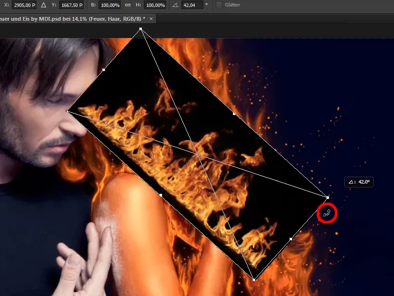
Steps 11-20
Step 11
You can also extend the fire a little and here too - as so often - you can take your time so that it really fits the picture.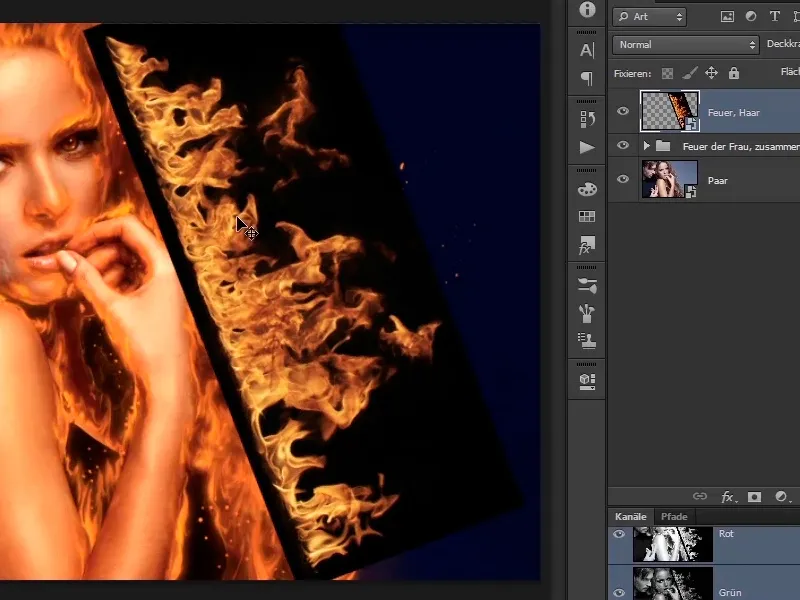
With the black background, it still looks relatively unspectacular. How can you remove this black background now?
Step 12
You could, of course, create a clipping area or use the channels palette, etc.. But maybe there's an easier way?
Click on the layer modes.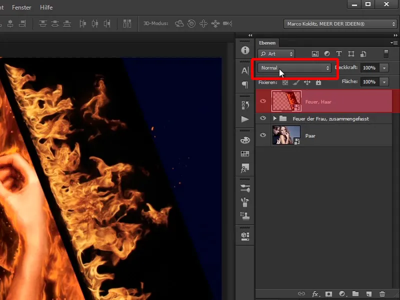
The Brighten, Multiply Negative, Color Dodge, Linear Dodge and Lighter Color layer modes brighten images. This means that if there is anything light on the current layer, the light will be offset against your image and the dark will not.
So click on Multiply negative and see what happens. And now all the black in the image has disappeared and it looks as if the hair is on fire.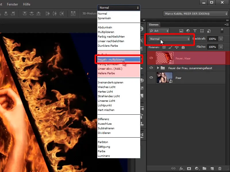
Step 13
You can now adjust this even further via Edit>Transform>Shape...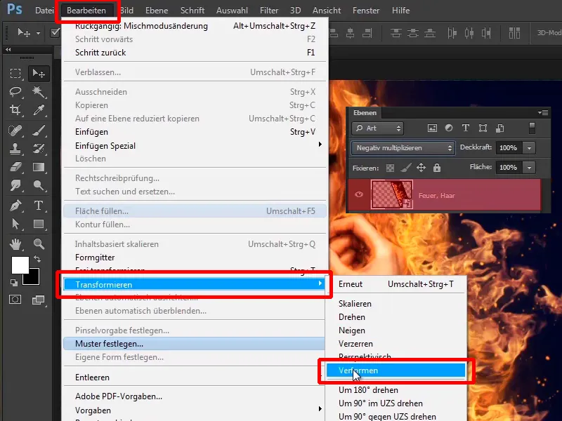
Step 14
... make it more curved and extend the fire a little further.
It already looks quite good like this and you can take your time here too.
You can also pull the fire upwards so that the image design points upwards into the right-hand corner.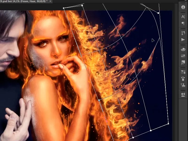
Step 15
Zoom into the picture again a little and pull the fire up really high. Of course, it should not look too unrealistic if it is pulled up too far.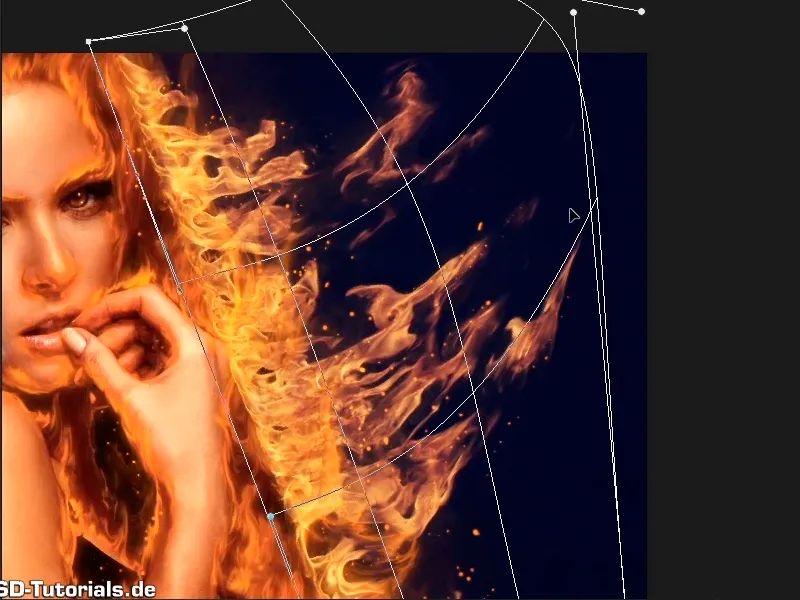
If you like it, confirm with Enter.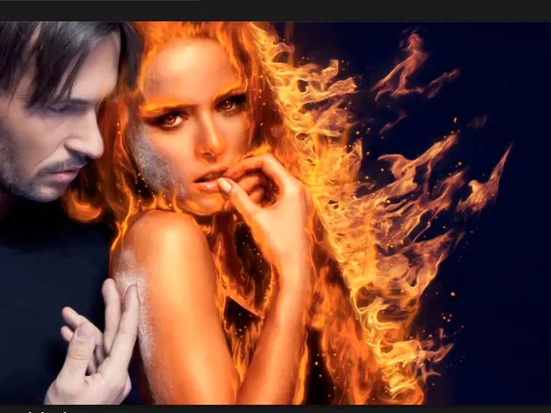
Step 16
At the moment, the fire still looks a little too bright compared to the rest of the fire, so you will now apply a tone correction.
Click on the Create new adjustment layer icon and select Tone correction.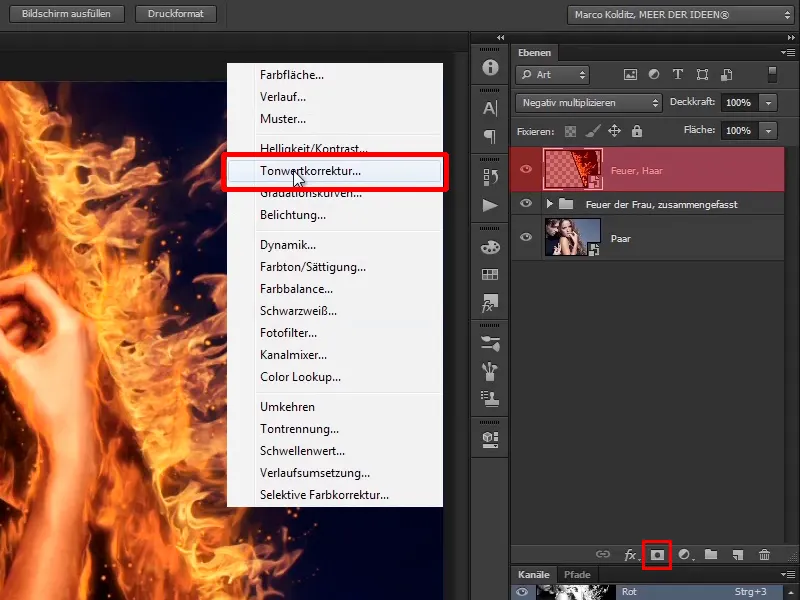
Step 17
Apply a clipping mask directly to this Tone Correction layer by clicking on the icon or by holding down the Alt key and clicking between the two layers.
This change will only affect the fire.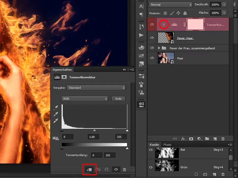
Step 18
Now drag the slider for the midtones a little to the right and you'll see how this blends into the image much more pleasantly.
It looks even better in Normal mode because it increases the saturation a little.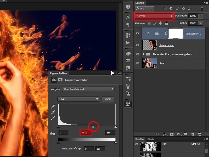
Step 19
This looks really cool. Rename the "Tone correction" layer to "Increase contrast".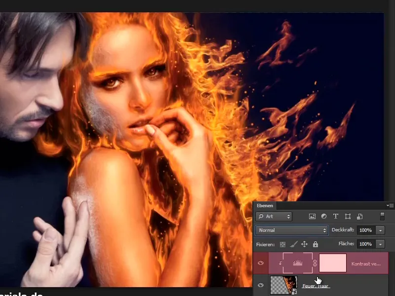
Step 20
Now do the same with other areas in the image. In other words, go to File>Open (1) again and select the next fire image, "Fire1.jpg" (2).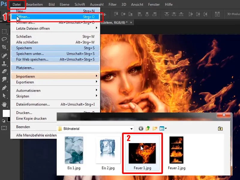
Simply continue: Steps 21-30
Step 21
In this case you could also have placed it, but you can also simply drag it into the picture.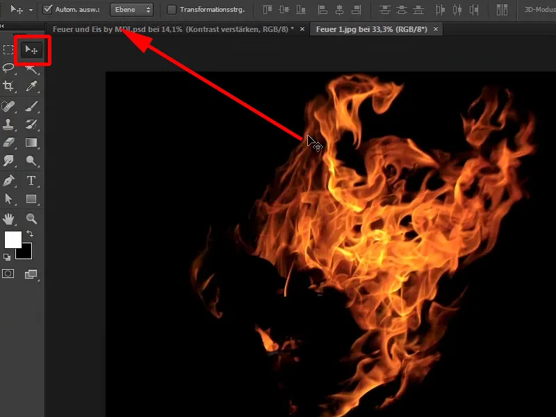
Step 22
This has been inserted here as a clipping mask, which is sometimes the case in Photoshop. This means that you now have to click between the layers again ...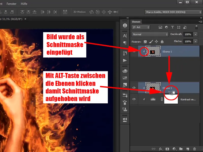
... and you'll have the image moving again as normal and not as a clipping mask in the image.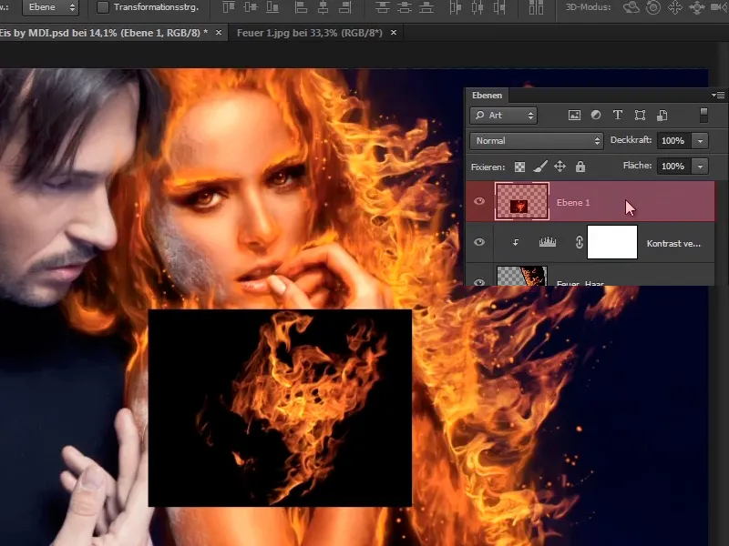
Step 23
Convert this into a smart object again (1) and then adjust it as you wish.
This time, take care of the arm. In other words, click on Multiply negative again (2).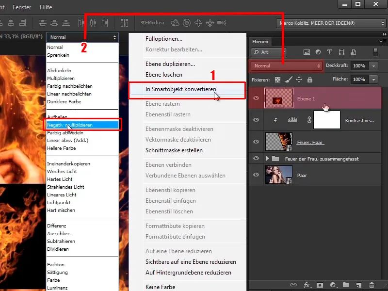
Step 24
Use Ctrl+T to place the fire the way you want it.
Then click on Edit>Transform>Shape and place the fire along the arm as if the arm were on fire.
It should really blaze up to the hand. Again, you should take your time with this.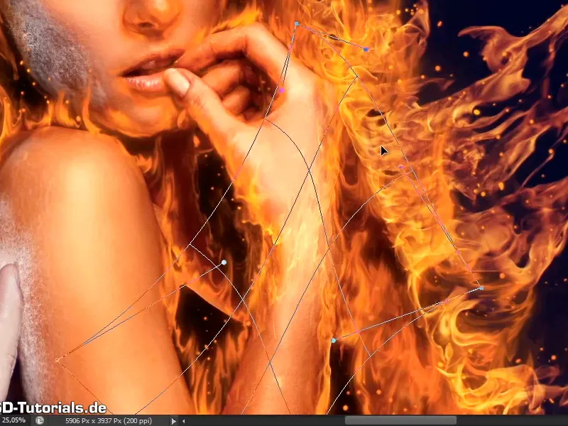
Step 25
Now it really looks as if the hand is on fire.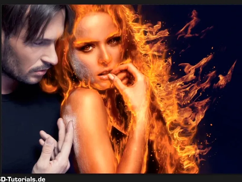
Step 26
You can now do the same thing again with the same image, on the shoulder.
You can either place the image again via Edit>Open or simply duplicate the layer, take it and press Ctrl+T.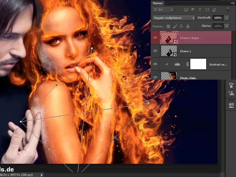
Step 27
Now you can move, flip, rotate and widen the layer a little. You'll have to see how it looks best.
Go back into the deform effect...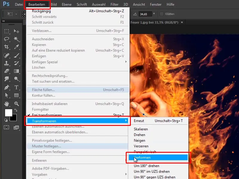
... and place the fire like this. Then confirm with Enter.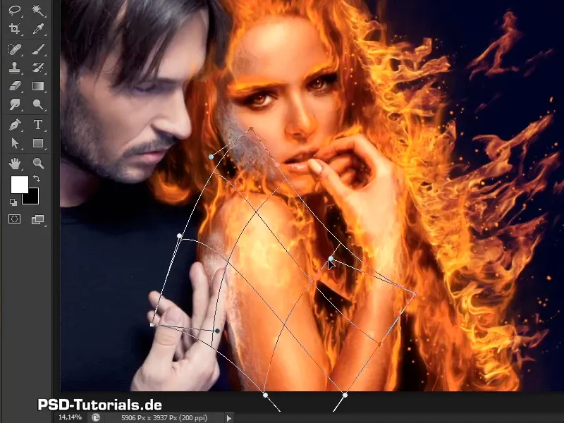
Step 28
You can of course adjust everything later using the mask and paint out some areas.
For now, leave it as it is, place the "Fire, hair" layer at the top and rename it "Fire, hairline".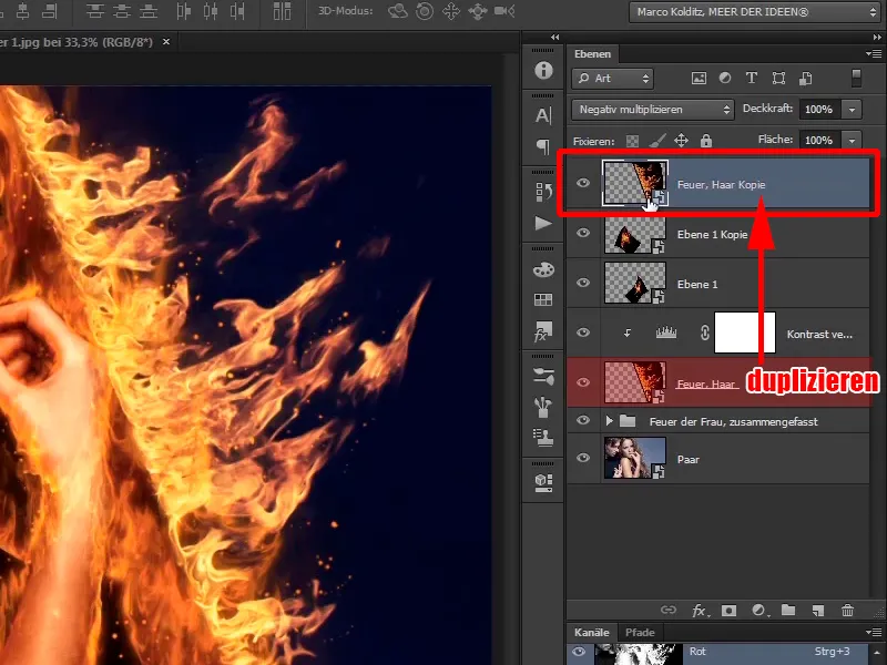
Step 29
Use Ctrl+T to transform this layer too, rotate it a little and see what you can use best for the hairline.
It is best to take this area and do not confirm with Enter...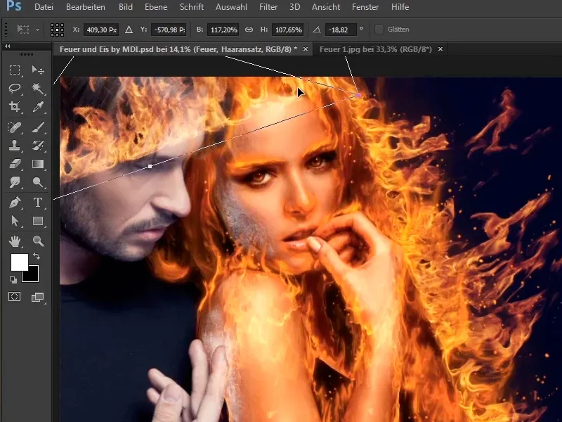
... but go back to Edit>Transform>Shape and round off the fire a little.
You can reshape it as you like it best - with a lot of time - and then confirm with Enter.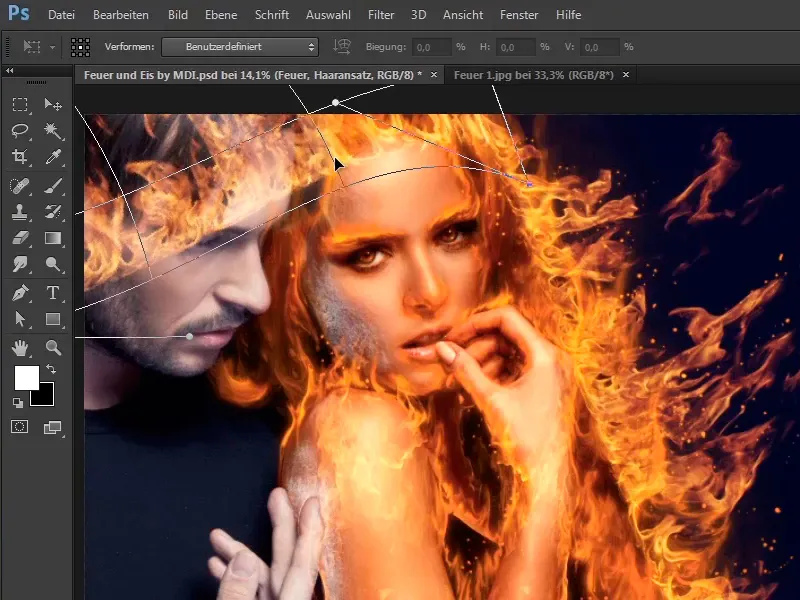
Step 30
Now a mask is created, i.e. you hold down the Alt key and click on the mask symbol ...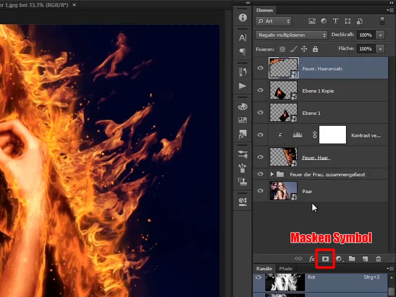
... and hide the layer for the time being.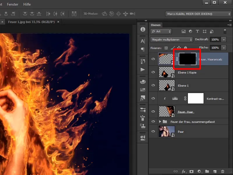
The last steps of this tutorial
Step 31
Using a soft brush and an opacity of 100%, paint this area back into the image.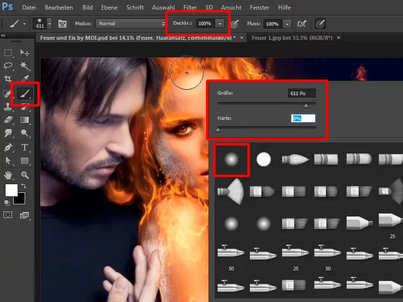
Step 32
Now you can paint the fire back into the picture.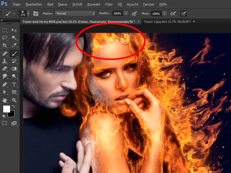
Step 33
With a lower opacity (41%) you can mask out areas again.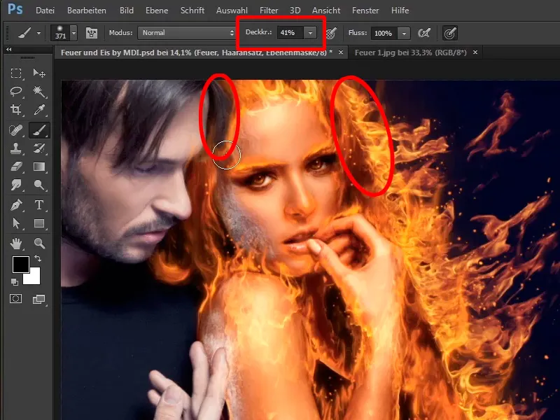
Step 34
Then apply a tone value correction again, but you don't need to create a new one. Instead, take the existing one, hold down the Alt key again and drag it all the way up.
This will create a clipping mask again and the fire at the hairline will not be as bright.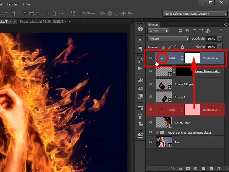
Step 35
Marco Kolditz has positioned the fire perfectly for you and also masked it a little. As I said, you can easily retouch areas of the fire using masks.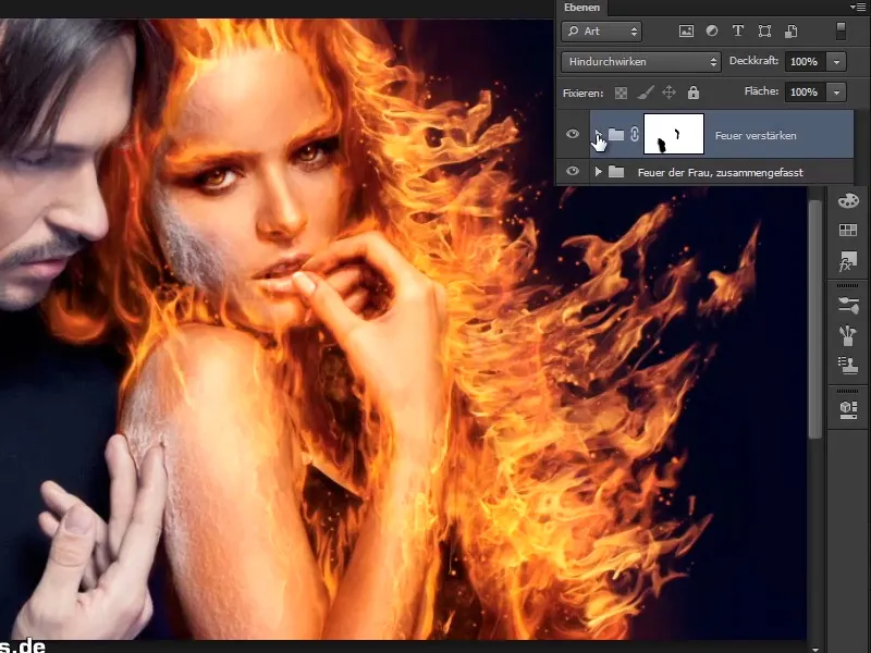
He has also adjusted the image even further, i.e. he has created a group containing all the photo files of this fire.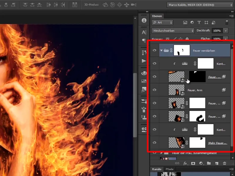
Step 36
You can hide all the layers again: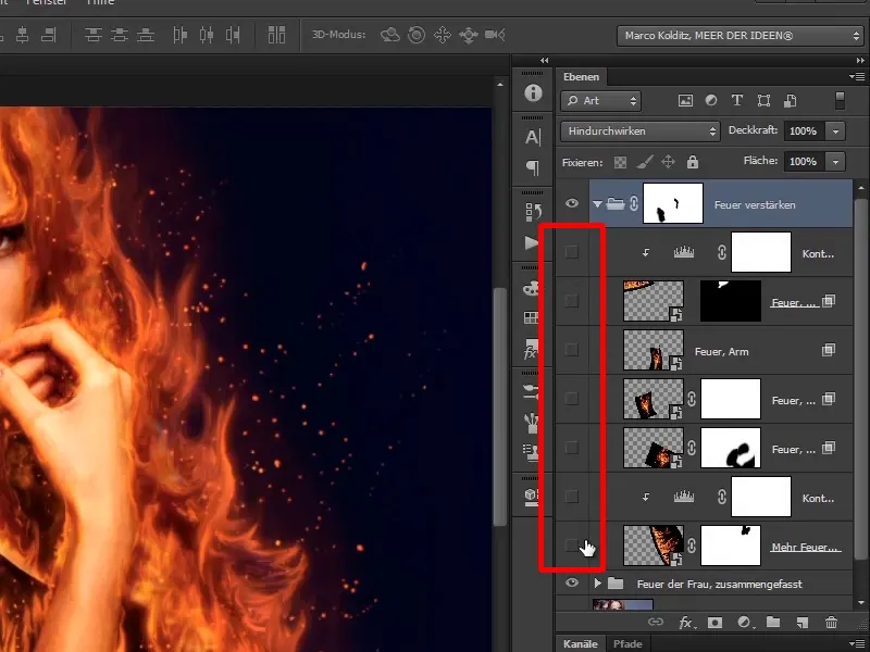
First you have the fire for the hair, then you have increased the fire a little more, then you have made the shoulder burn, then the arm, or wrist and on top you have put the little crown and darkened it a little.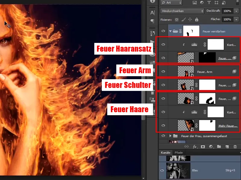
Step 37
All of this was then combined into a group and worked on a little with the mask, i.e. a little fire was removed from the hand and shoulder area.
Basically, you have now completed this chapter.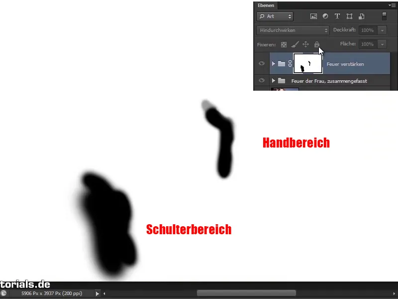
Step 38
The woman is on fire and in the next, relatively short part of this tutorial series, Marco Kolditz will show you how to add a little smoke to the picture.