A responsive web design is essential, as more and more users access the internet with mobile devices. To ensure that your website is displayed correctly on different screen sizes and resolutions, the Chrome Developer Tools offer a powerful way to test the responsive design. In this guide, I will show you how to activate the mobile view and simulate various device sizes to check the adaptability of your website.
Main Insights
- You can activate the mobile view through the DevTools to test your site's layout on different devices.
- It's helpful to choose specific devices with their standard resolutions and screen ratios.
- Functionalities like touch simulation and pinch-to-zoom are also useful to emulate the user experience on mobile devices.
Step-by-step Guide
To use the mobile view of Chrome Developer Tools, follow these simple steps:
1. Activating the mobile view
To activate the mobile view, open the Chrome Developer Tools. You can do this either through the menu or by using a keyboard shortcut. Click on the "Toggle Device Toolbar" button or use the shortcut keys Command + Shift + M (macOS) or Control + Shift + M (Windows).
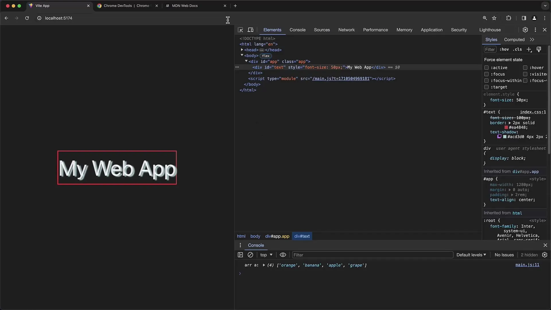
Once you have activated the mobile view, the website will switch to a mobile view. You can now see how the site looks on a mobile device.
2. Selecting and adjusting the device size
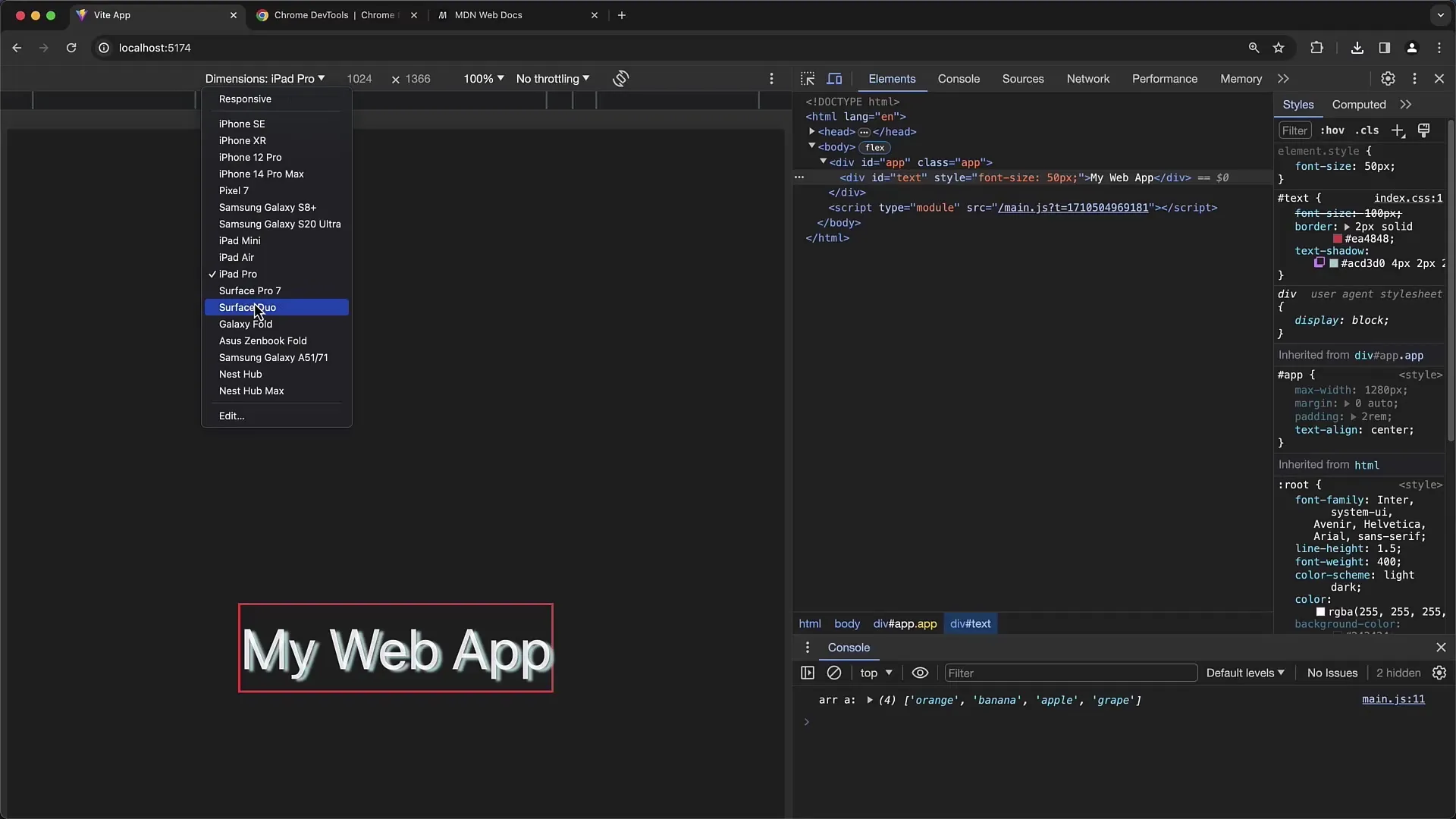
In the top bar of the DevTools, there is a dropdown menu where you can select the display dimensions. By default, the option is set to "Responsive." You can change this setting to manually adjust the resolution and size. If you are looking for a specific device size, click on the list and choose, for example, the iPhone 12 Pro or the Pixel 7 from the list.
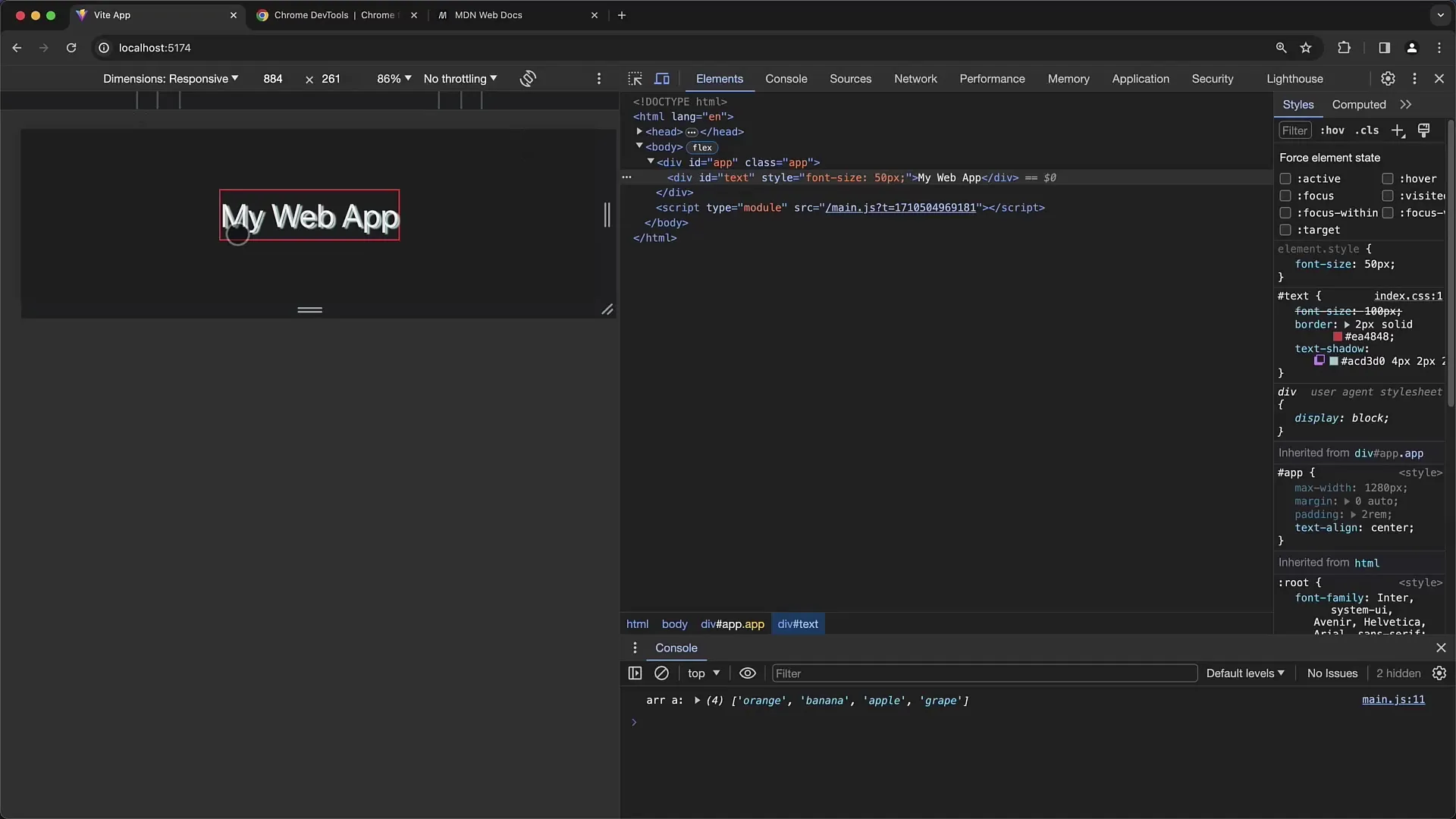
The DevTools will now display the resolution that the selected device actually has. Note that the effective resolution the browser uses may differ from the device's native resolution.
3. Understanding the Device Pixel Ratio
An important aspect when testing is the "Device Pixel Ratio." You can change the Device Pixel Ratio by opening the ellipsis menu and adjusting the corresponding values. The Device Pixel Ratio describes the ratio of physical pixels to the pixels the browser uses.
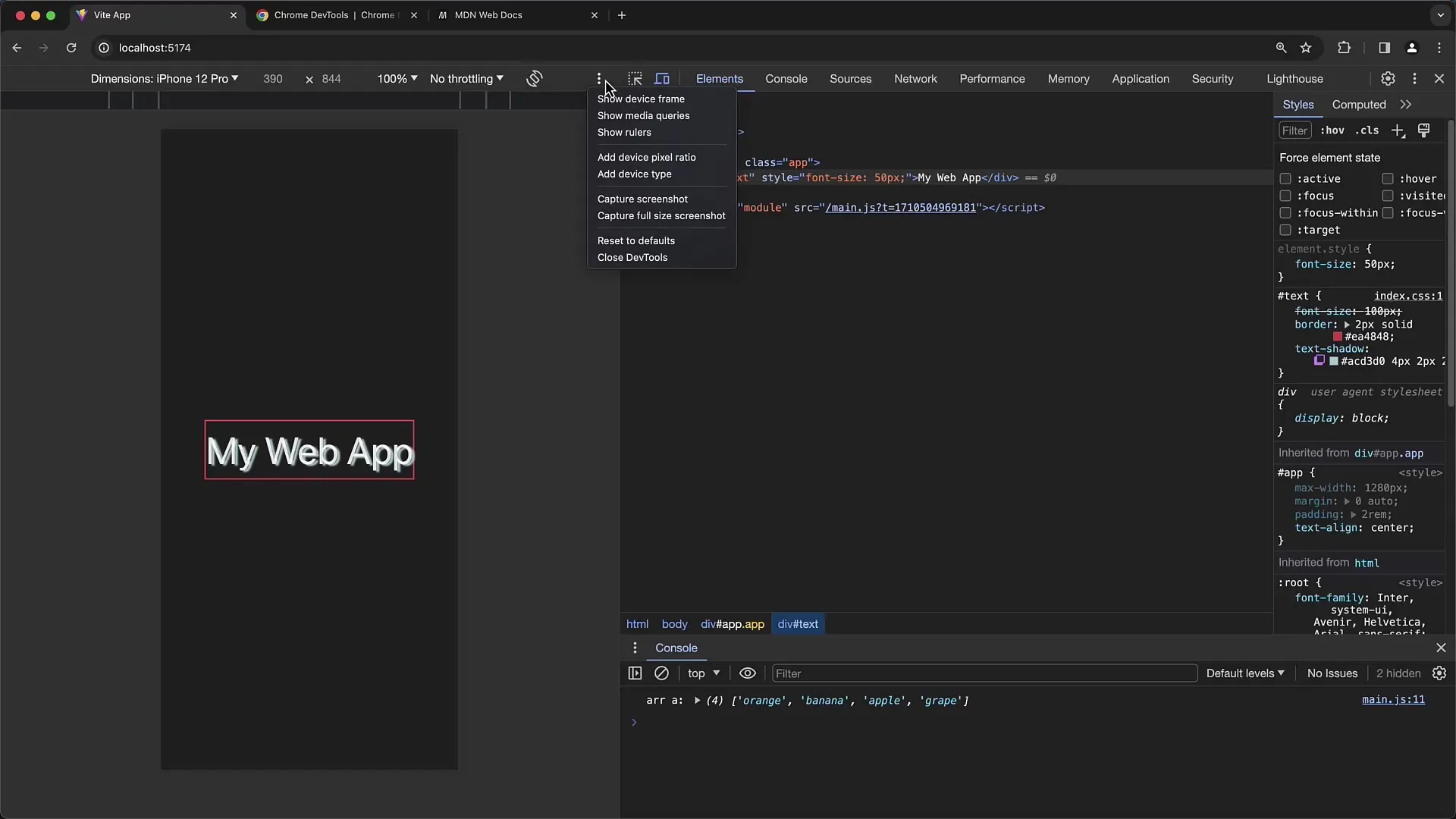
For example, for the iPhone 12 Pro, the ratio is 3:1. This means that three physical pixels constitute one unit in the browser. The native resolution is much higher to ensure images and texts appear sharp and clear.
4. Adjusting the layout and view
Now that you can test the mobile view with the selected device, you will find that you can also adjust the dimensions. Click and drag the corners or sides of the viewport to try out different widths and heights.
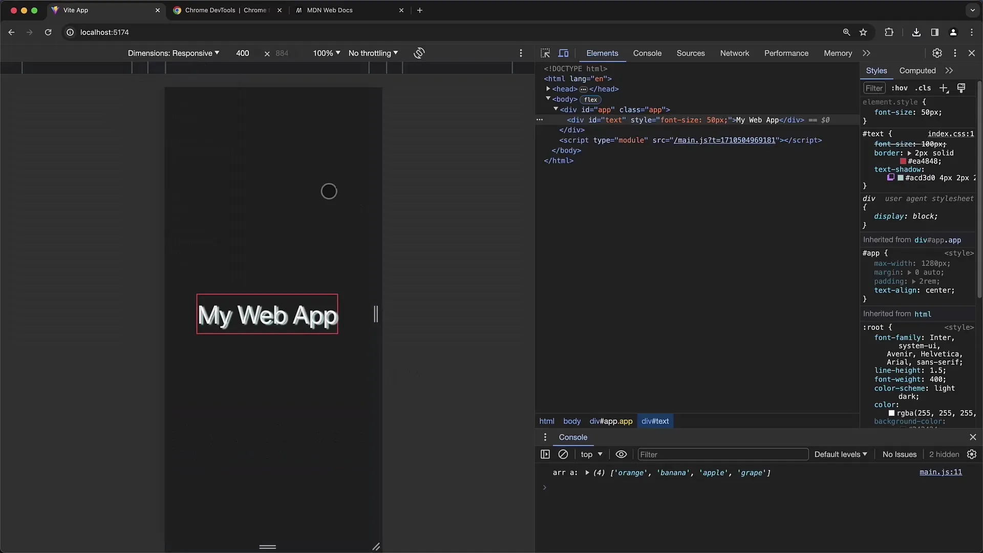
Furthermore, you can change the orientation, for example, from portrait to landscape, to see how the layout behaves under different conditions.
5. Simulating touch inputs
Another notable feature is the ability to simulate touch gestures. When you activate the mouse cursor, it will be replaced by a finger pointer. This allows you to simulate how users interact on a mobile website, such as scrolling or navigating through menus.
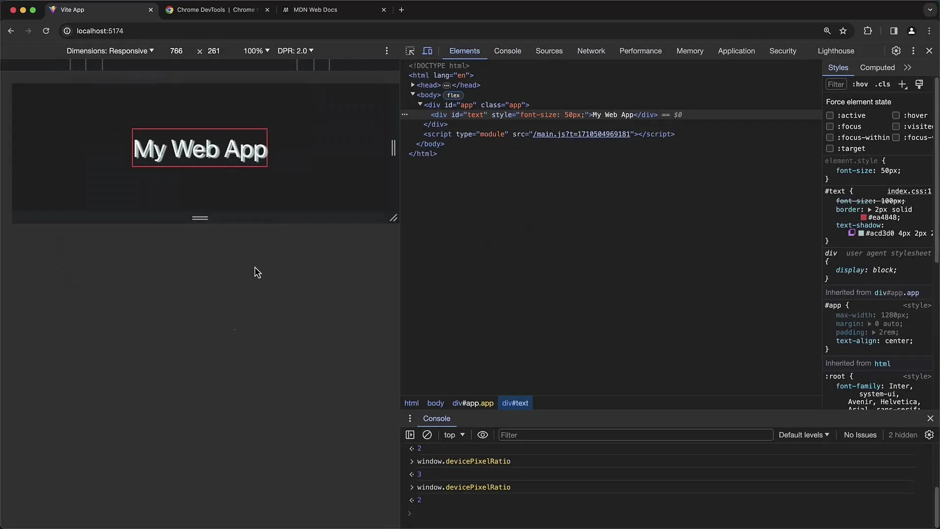
To perform a pinch-to-zoom gesture, hold down the Shift key and drag with the mouse. This emulates the gesture users would use on a real device.
6. Testing the page loading speed
To test the loading speed of the website, you can use the Throttling function. This function allows you to change the speed of data communication to simulate how your website works under poor network conditions.
Change the Throttling settings to "Low-End Mobile" or "No Throttling" to compare the effects. You will notice that the website loads at different speeds, which will help you test the user experience on slow connections.
7. Creating Screenshots
If you need a snapshot of your simulated mobile view, you can simply take a screenshot directly from the DevTools. Click on the respective option in the Toolbar to automatically download the screenshot.
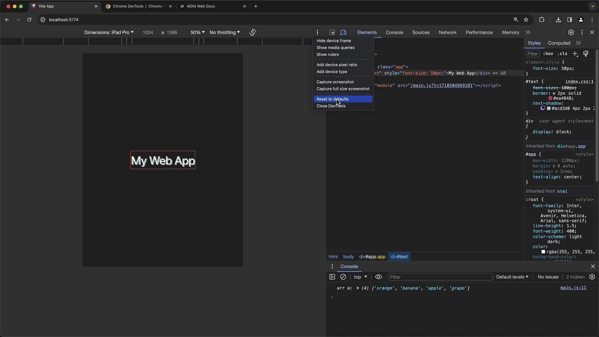
8. Resetting to Default Values
If you want to reset the settings of the mobile view, you can also do this in the DevTools. Click on the button to reset all modifications to the default values.
This way, you can quickly perform a new test with the default device settings.
Summary
In this guide, you have learned how to activate and configure the mobile view of Chrome Developer Tools. You can simulate different devices, adjust the device pixel ratio, try out touch gestures, and test the loading speed of your page. Understanding and correctly using these features will help you effectively optimize the responsive design of your website.
Frequently Asked Questions
How do I activate the mobile view in Chrome Developer Tools?You can activate the mobile view by opening the Developer Tools and clicking on the "Toggle Device Toolbar" button or using the keyboard shortcut Command + Shift + M (macOS) or Control + Shift + M (Windows).
Can I add custom device sizes?Yes, you can create custom device sizes and devices in the DevTools to perform specific tests.
What is the Device Pixel Ratio?The Device Pixel Ratio is the ratio of the physical pixels of a display to the number of pixels displayed by the browser.
How can I simulate touch gestures?To simulate touch gestures, replace the mouse cursor with a finger cursor by switching the view to a touchscreen mode and dragging the mouse in Shift mode.
How do I test the loading speed of my website in mobile views?You can use the Throttling function in the DevTools to simulate the speed of data communication and see how your website functions under different network conditions.


