Note: This tutorial is a text version of the accompanying video training by Marco Kolditz. The texts may therefore have a colloquial style.
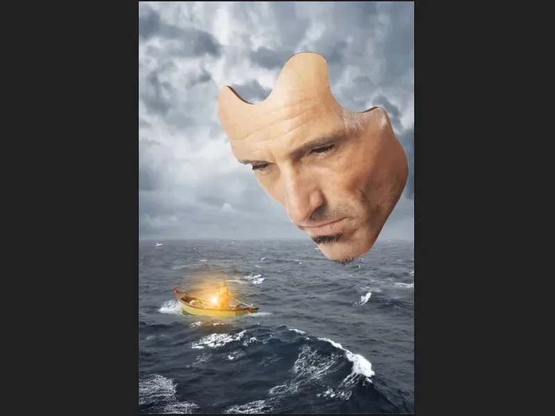
This part of the tutorial series is about giving the mask some depth.
Step 1
Activate the "Mask" layer, then click on the icon for creating a new fill or adjustment layer and select Color area... (1).
Now select a preliminary shade of brown. You can then adjust it even more precisely. If you confirm with OK, the new "Color fill 1" layer will appear above the "Mask" layer.
Grab it with the mouse and drag it under the "Mask" layer (2)..webp?tutkfid=61287)
Step 2
The layer mask is now inverted(Ctrl+I) so that the color is completely hidden.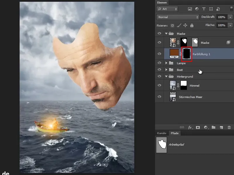
Step 3
The selected areas should now be given some depth, as would normally be visible from this perspective. At the moment, the mask is only about one millimeter thin.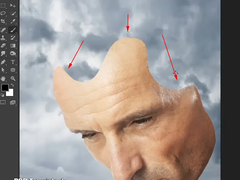
You can paint this depth into the mask in the next step.
Step 4
To do this, select the brush, set the foreground color to white and increase the hardness to around 88%.
Now paint a certain depth into the picture. It doesn't have to be perfect, of course, but the perspective has to be right. This means that the line must be thinner in the lower area.
However, this can also be erased later using a mask. The color doesn't matter at the moment.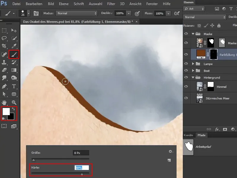
Marco points out that he works a lot with photography and normal classic retouching in his pictures. In addition, he always does a lot with illustrations or likes to use a brush and paint things into a picture that are not so easy to add as a picture.
Step 5
If you look at this as a whole, you can see that the mask has gained depth and looks almost three-dimensional. This small difference is often what creates the depth effect (1).
You can even make the line a little thicker with a steady hand (2).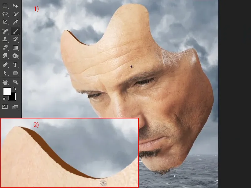
As it's much more difficult to use a mouse for such drawings, Marco uses a pencil for this.
Step 6
As you may still be looking at it slightly from above, add a fine line to this edge. On the right-hand side, look at it again from the side, where the line disappears behind the mask.
However, this area will also become more bluish later, so the effect will not be as strong here.
If you have painted too much or too thickly, you can simply change the foreground color to white and remove what is too much.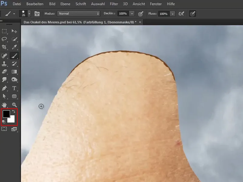
Step 7
Now paint this area on the right in the same way.
Marco reveals that this area will later be covered by the waterfall, but as he wasn't 100% sure how he would incorporate the waterfall at the time he was working on the picture, he did it just in case so that the area could show through the waterfall - because you're always happy when you've already done the work beforehand.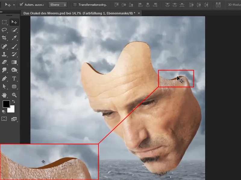
Of course, you could also do all this with paths - but why? It's also fun to work with all the different tools.
Step 8
The next step is to adjust the color. To do this, zoom into the image and select the Move tool.
Double-click on the color area to open the color picker window (solid color). Now select a relatively dark shade of the face color and confirm with OK..webp?tutkfid=61294)
Marco always likes to use colors that the image provides, which makes the whole thing more homogeneous and harmonious.
Step 9
What is noticeable now is that these newly painted lines are not as broken up as the contour of the mask. This is now made up for.
To do this, switch between the foreground and background colors so that you have black as the foreground color again. And now paint the edge so that it is not too straight.
The top left can remain a little smoother, as this is basically a cross-section.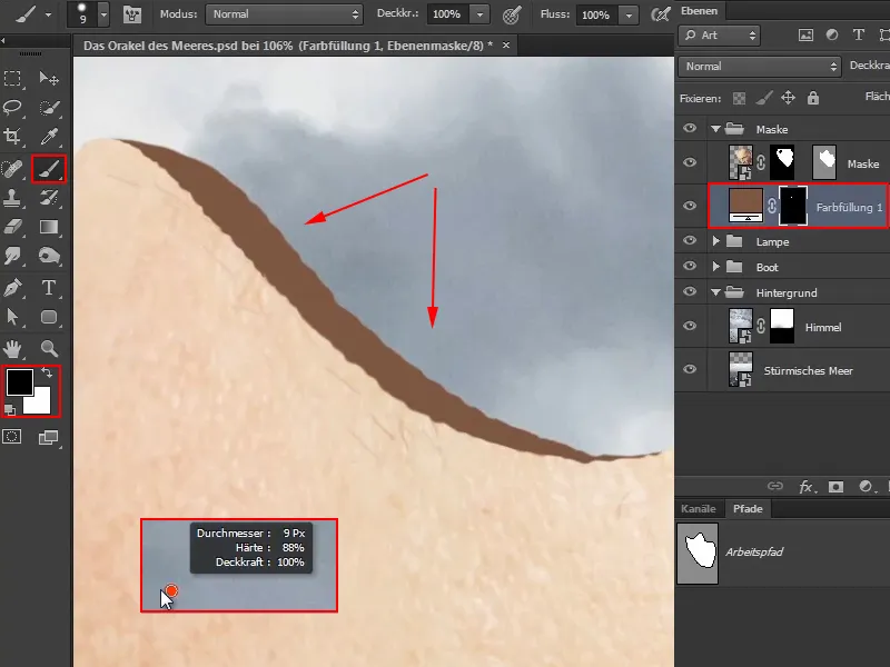
Step 10
You can use the existing indentations as a guide. This will almost look like an outline.
You can leave the last piece smooth again - just like the beginning in the previous step - because it "flows" here, so to speak.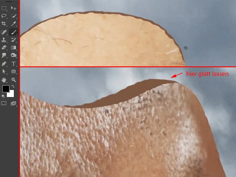
Step 11
Now the picture looks like this: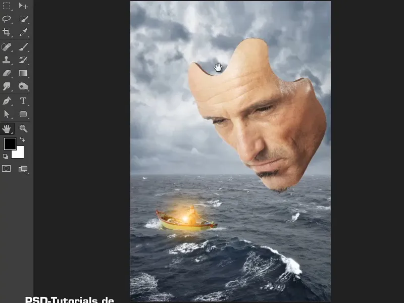
Step 12
Now you should add some shadows, because at the moment it's all one color.
This is also very easy: Activate the "Depth" layer (1) and select the tone value correction via the icon (2).
Then create a clipping mask so that the changes only affect the layer below ("Depth") (3).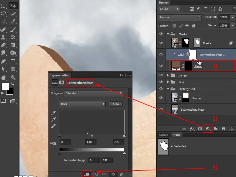
Step 13
Now move the black slider slightly to the right and set the mode to Luminance so that the saturation is not increased.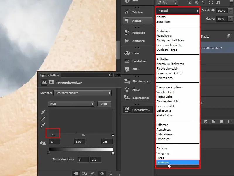
Step 14
The layer mask is then inverted again so that everything is as it was before.
Then select the brush and set the foreground color to white..webp?tutkfid=61300)
Step 15
As the light is coming from behind, the top left area should be slightly darker.
Enlarge the brush and reduce the opacity to about 56%.
Now click a few times from the outer edge of the mask outwards to darken the brown stripe to the left.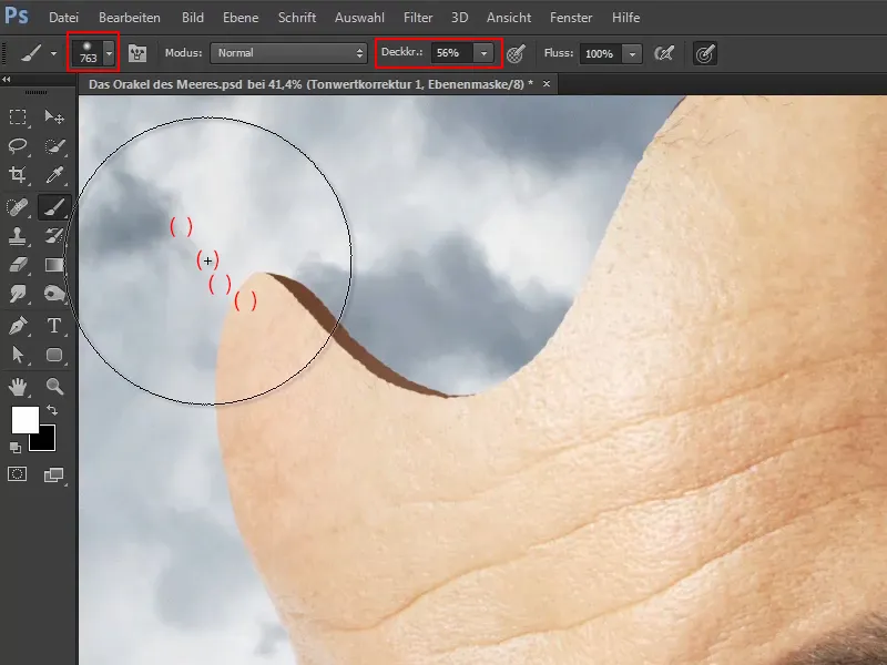
Step 16
Now do the same on the right-hand side, where you also want to darken it towards the outside because the light should come relatively strongly from behind: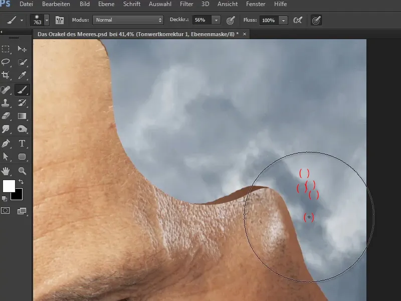
Step 17
Now rename the "Tone correction 1" layer to "Correction". Thanks to this layer, you can also soften or change the shadows at any time.
Marco shows how you can also change their color afterwards by double-clicking on the color field to open the color picker window (solid color) again and selecting any other color.
However, as he likes the shade of brown selected previously, he leaves it as it is and clicks Cancel.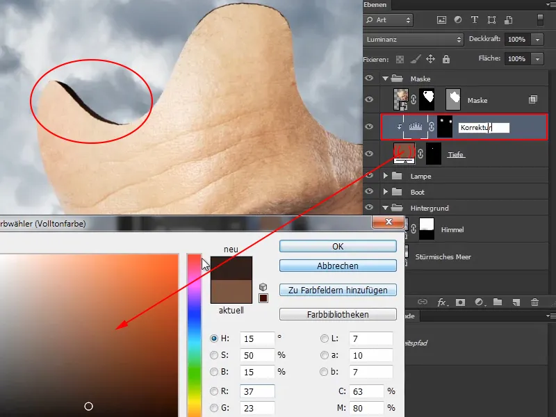
Step 18
The mask is now relatively three-dimensional thanks to this depth.
However, the magical moment only comes at the end, when everything is combined through the color mood and suddenly all the elements harmonize and fit together beautifully.
The mask is now finished and the next part of the tutorial series will be about placing the waterfall.