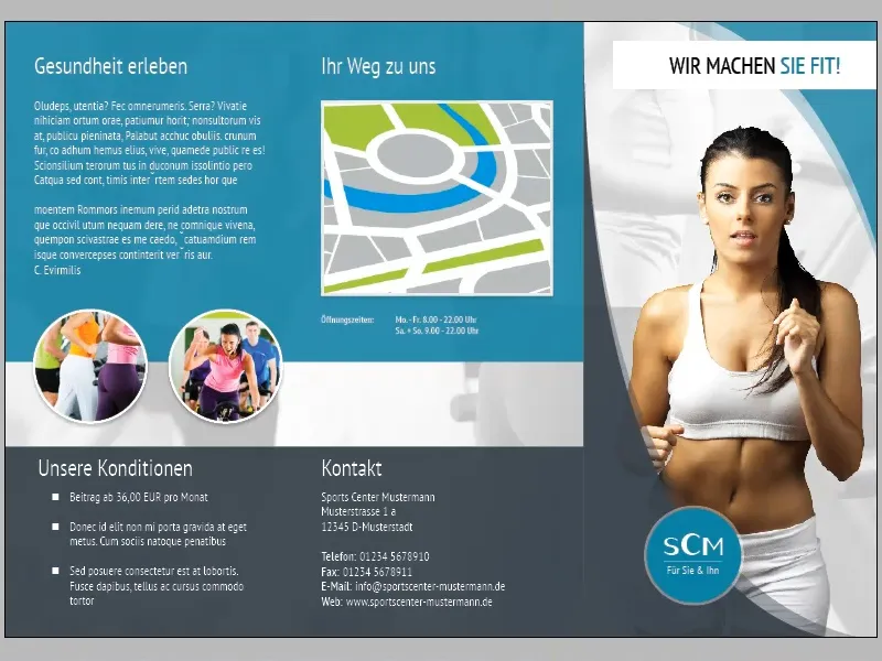
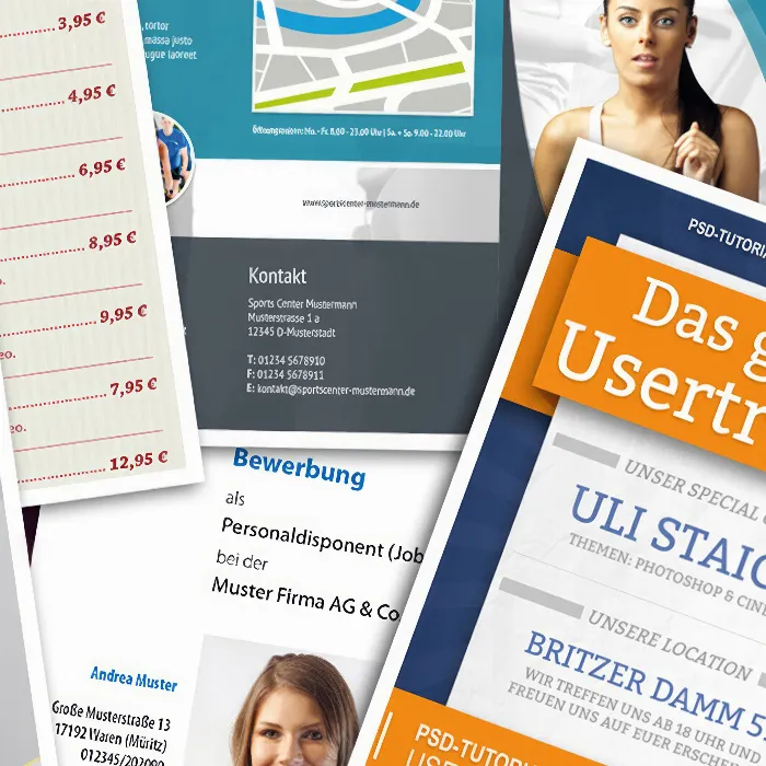
In part 02 of this tutorial series, we largely completed the cover page of our flyer. In this part, we will mainly focus on the design of pages two and three.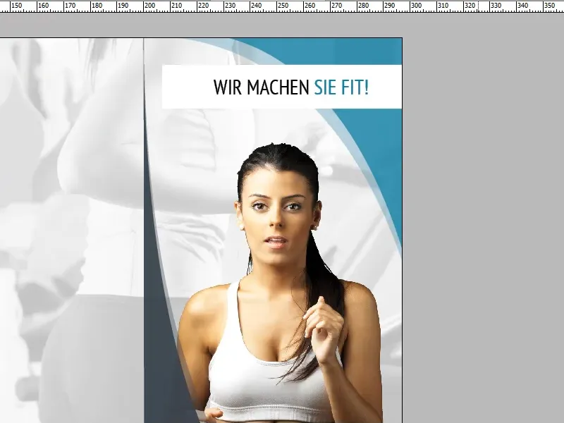
However, before we dive into pages two and three, we should make a few fine adjustments to the title page:
We can change the size and position of the title and woman without hesitation, as they are not aligned with other elements to the millimeter.
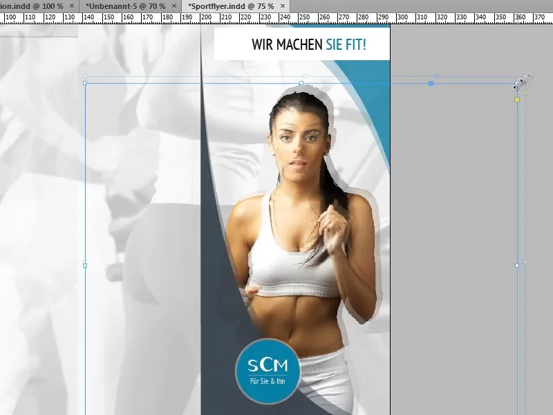
The circle with the company logo is different: To ensure that the company logo remains centered when scaling the circle, it is important that InDesign uses the center of the circle as a reference point. We can achieve this in two ways:
If we hold down the Alt keywhile scaling the circle, the center point is temporarily selected as the reference point. (The Shift keycauses proportional scaling).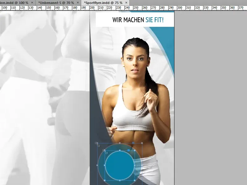
Alternatively, we can enter the values directly in the menu bar. In order for the center point to be used as a reference point, the middle point must be selected in the symbol on the left-hand side (marked in the screenshot).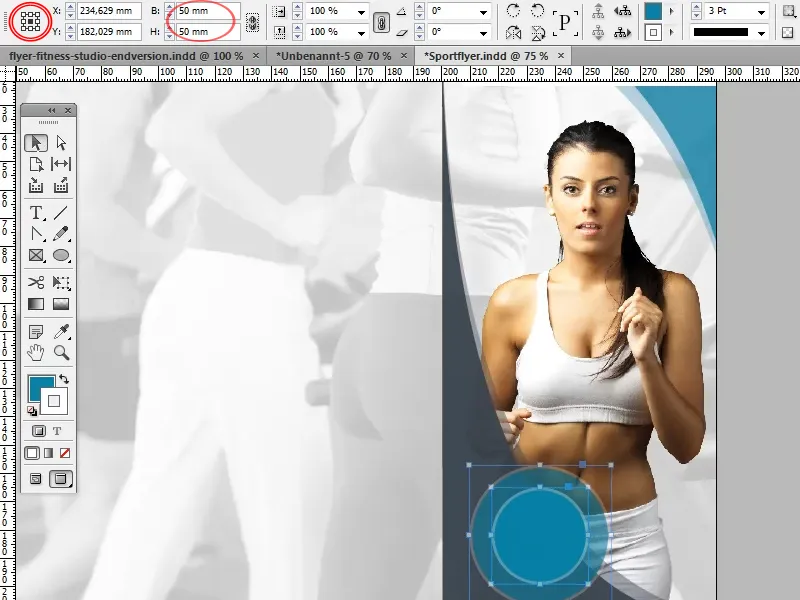
Let's now turn our attention to the two neighboring sides:
First, we create a rectangle and scale it so that it fills the top half of both pages. It will act as a background for the text and the image elements.
For the color, we choose the same shade of turquoise that we have already used several times on the title page (C=81, M=28, Y=25, K=7). We do not need an outline. To let the background image show through a little, we can reduce the opacity to around 90%.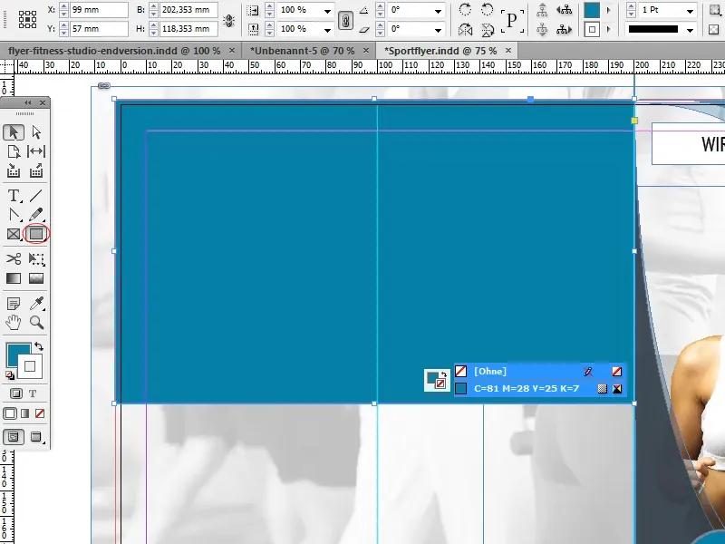
Next, we create the headings.
It is always nice when the titles of a page are aligned. We can achieve the exact alignment of the titles in different ways:
The first variant is to use a guideline. To do this, we create a horizontal guideline that ends with the bottom edge of the heading on the title page. Now we can simply snap the other headings to this guideline.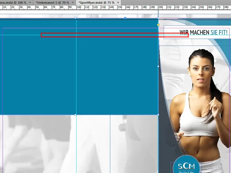
As the heading of the title page and the other headings have similar formatting, we can create a copy of the existing heading by holding down the Shift and Alt keysand dragging it to the desired position.
The Alt keycauses the text field to be copied, while the Shift keyensures that the copy is based on the position of the original, which means that the guideline is not required.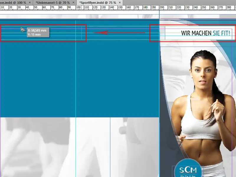
If the title is located behind the previously created rectangle after copying, we can use Ctrl+E to move the title forward in the object hierarchy step by step.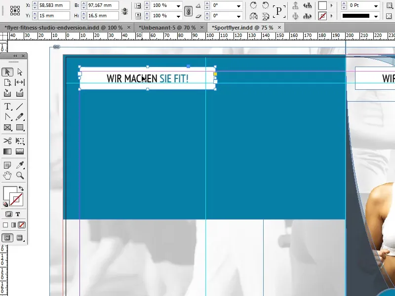
In this example, the left-hand page is given the title "Experience health" and the right-hand page is titled "Your way to us".
We need to make a few adjustments to the formatting: Font>PTSans Narrow and font size>22 Pt remain unchanged. We use white as the font color, the solid color is deactivated and the text is left-aligned.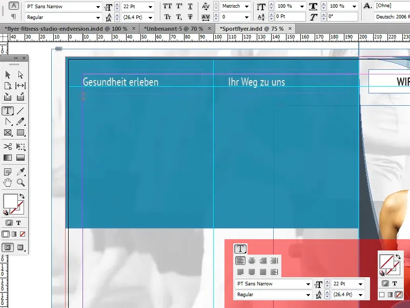
Under the heading "Experience health", we now create another text field for the description of the fitness center. You should leave a few millimeters of space to the right and left of the text field.
To ensure that the spaces to the right and left are the same size, we create a small auxiliary rectangle to which we align the text field. Of course, we can also position an auxiliary line accordingly and align the text field with it.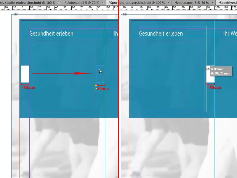
For this example, the text field is filled with dummy text. InDesign has a function that can automatically fill a text field with such text: Font>Fill with placeholder text.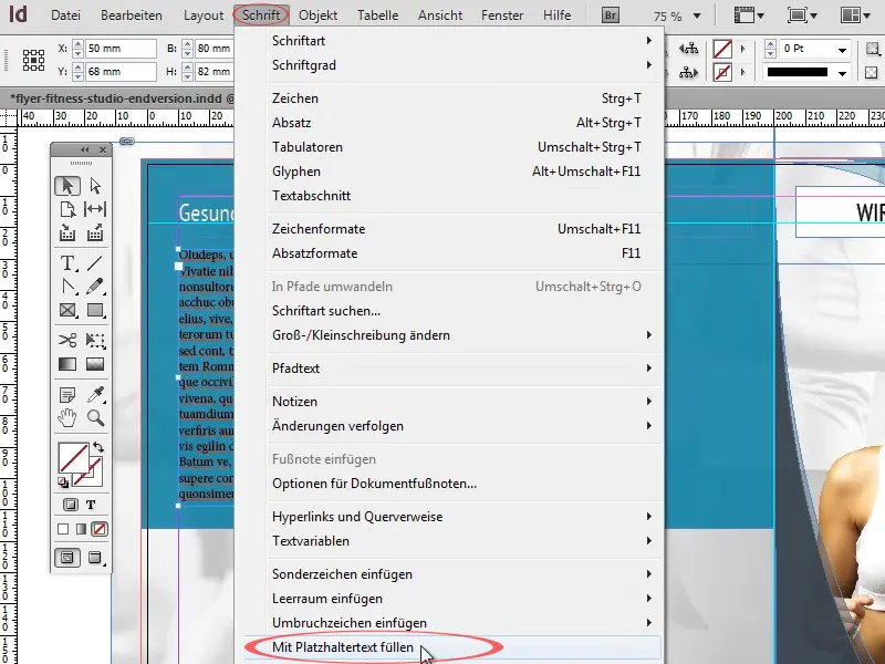
We format this text with the font>PT Sans Narrow in white . We leave the font size at 12 pt and set the line spacing to 14.4 pt.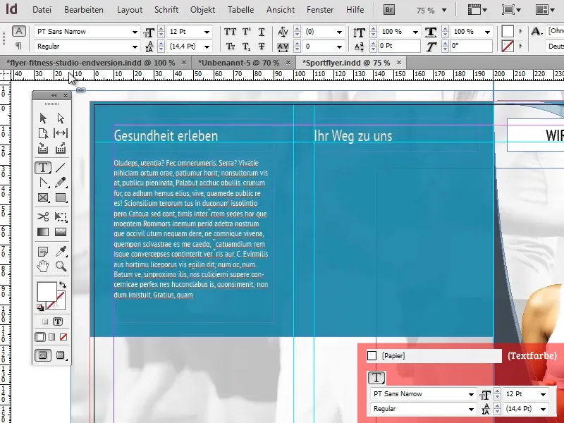
Now insert a map under "Your way to us". Please do not copy a map from Google Maps or similar applications, but rather use a map that you have drawn yourself (e.g. in Illustrator) and for which you are sure that you own all the rights. Otherwise you could very quickly run into legal problems.
Here we add a light gray outline to the map with a width of 3 pt as well as a subtle drop shadow with an opacity of 15%, a distance of 1 mm, an x-offset of 0 mm, a y-offset of 1 mm and a size of 1 mm via Object>Effects> Drop Shadow.
The values were all chosen relatively low to achieve a more refined effect without the card standing out too much from the flyer.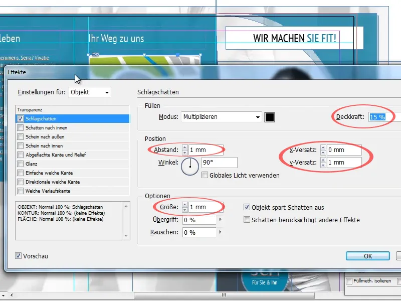
In the next step, we will add two circular images below the description text. To do this, we first create a circle with the Ellipse tool and the Shift keyheld down, which should be about half as wide as the text field above it.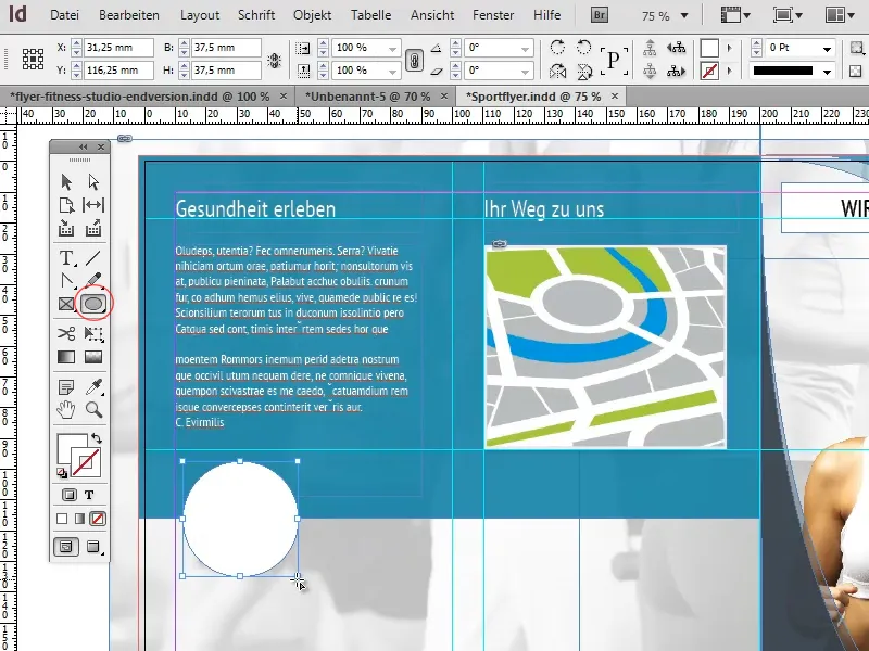
Hold down the Alt keyand press the right arrow key (only press the arrow key once, otherwise several copies of the circle will be created!
By using the arrow key in combination with the Shift key, we can move the circle in larger steps and therefore faster.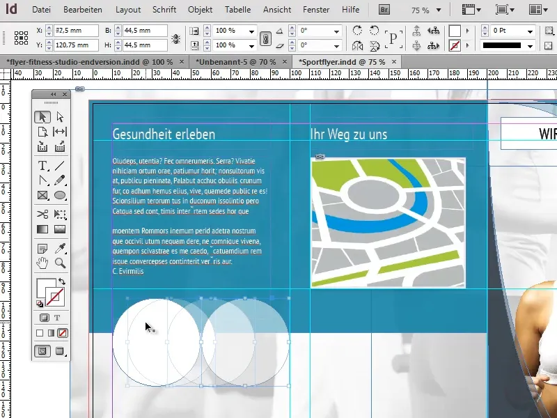
If the circle turns out to be a little too big, we can select both circles by holding down the Shift key, scale them down a little and reposition them.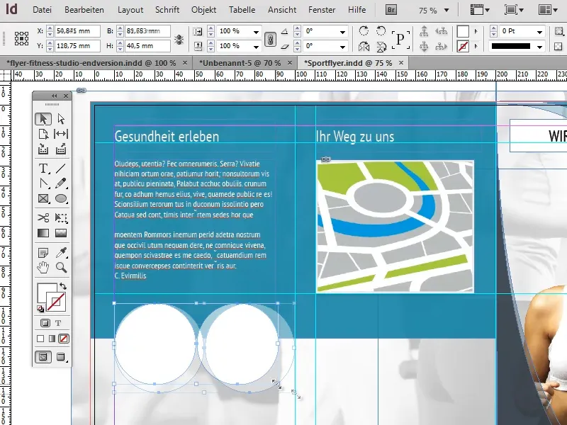
If the two circles are the right size, we can temporarily remove the second circle. We add a drop shadow to the first circle - with the same settings as for the card - and a white outline of 3 pt.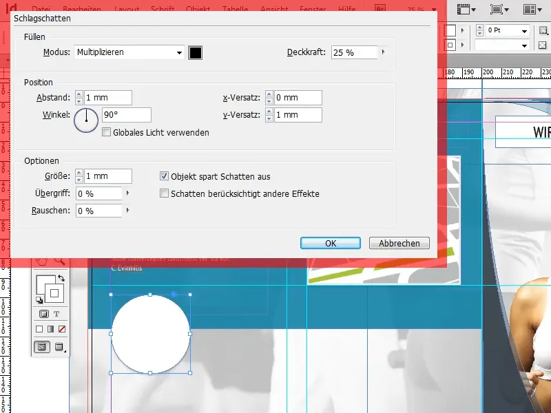
Now we need to insert the image into the circle. We first load the desired image into InDesign via File>Place.
As soon as the image appears and has been placed for the first time, we can cut it out again using Ctrl+X and then insert it into the circle using the Edit>Insert into selection option.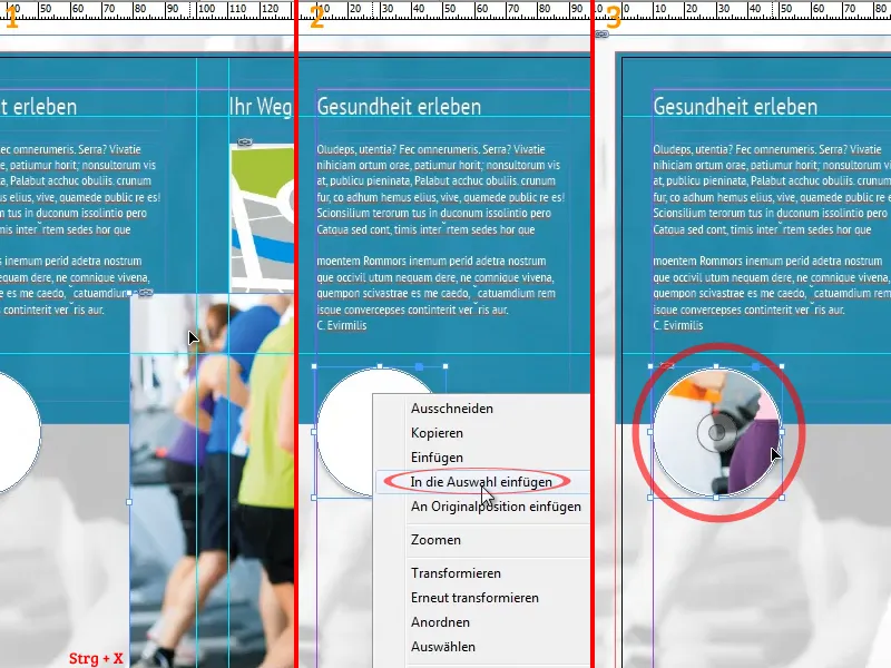
By clicking on the CD-like symbol that should appear in the middle of the circle (see screenshot), the image can be moved within the circle and also scaled.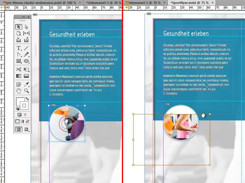
If we now copy and position the edited circle, the linked image in the circle and all the effects used will also be copied.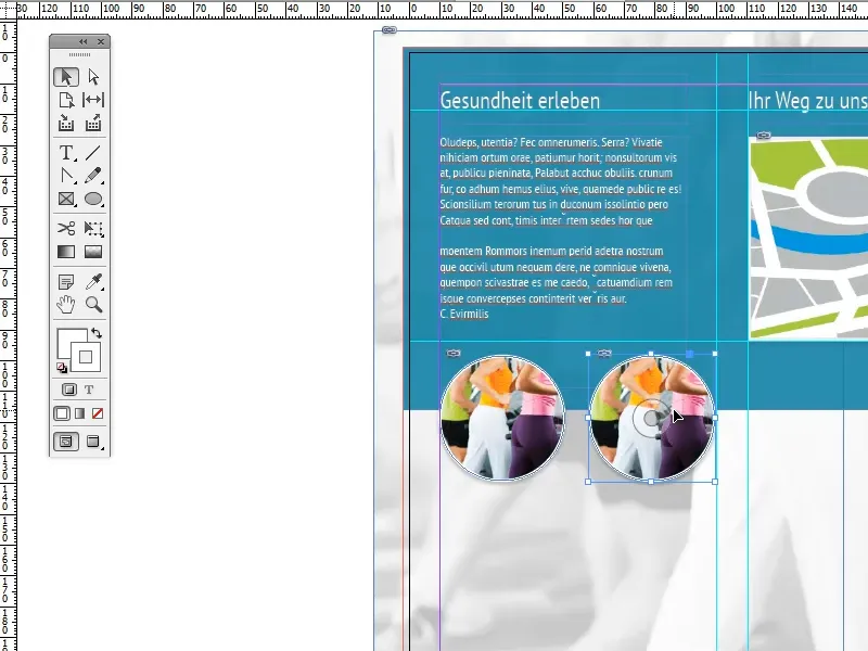
To replace the image with a new one, we need to switch back to edit mode using the CD icon, click on the Re-link button in the link panel and select the desired image.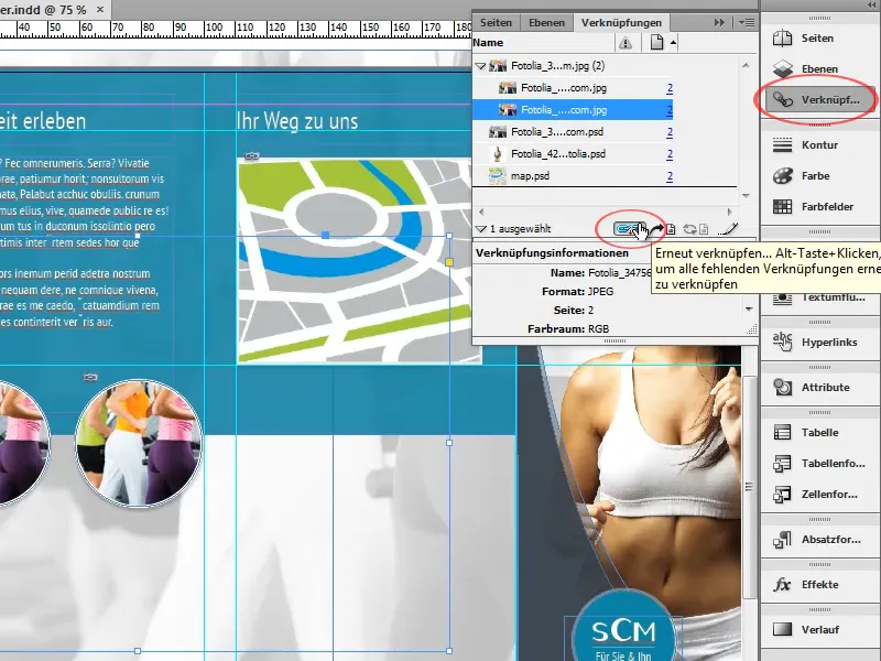
The new image should now appear in the circle with all the previously added effects and already scaled accordingly.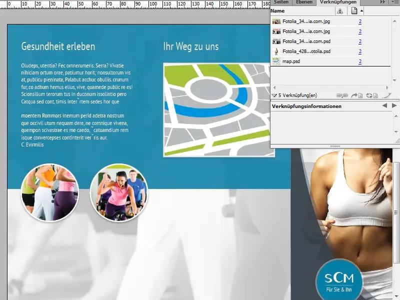
Below the map, the opening hours are now inserted in a new text field and provided with the font>PT Sans Narrow, the font style>Bold, a font size of 9 pt and a white font color.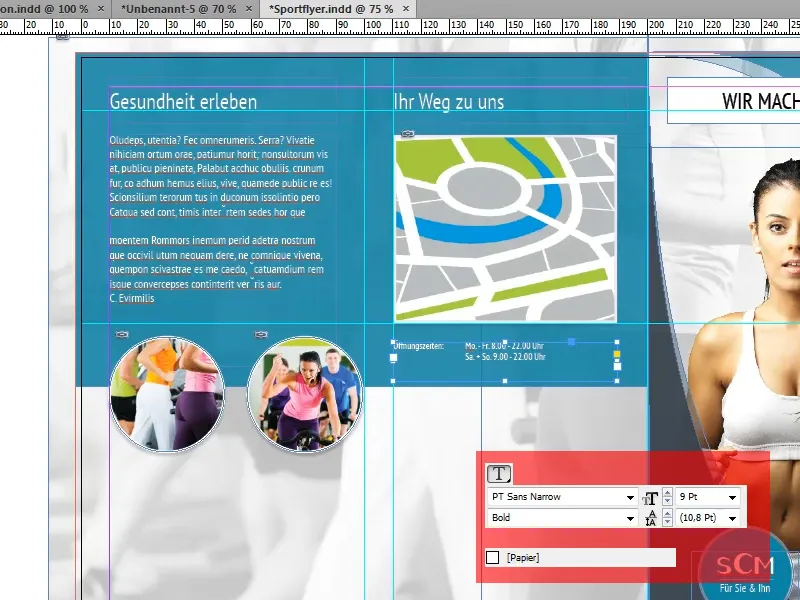
We now create a gray border with 90% opacity at the bottom of both pages. We use the same shade of gray that has already been used several times on the title page (C=73, M=59, Y=48, K=47).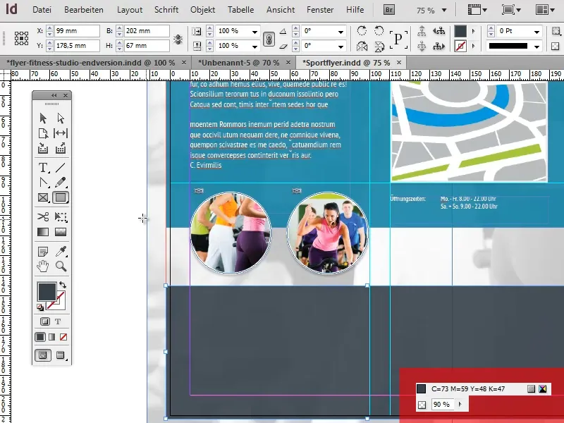
This brings us to the end of the third part of this tutorial series. In the fourth and final part of the series, we will complete the design of the second and third pages and take care of the back of the flyer.