Before we move on to our first animation, the bouncing ball, I would first like to do a technical challenge: The text should be drawn in as if it had been written by hand. The Fig Leaf Rag has a beautiful introduction with an accent at the end, where we will place the point of the exclamation mark.
There are several methods that are more or less good, depending on the situation we have. Since I'm working with a graphics tablet, I'll draw the font and show you how to animate it. But before that, I'll show you how you could also do it, which is not my favorite here:
Steps 1-10
Step 1
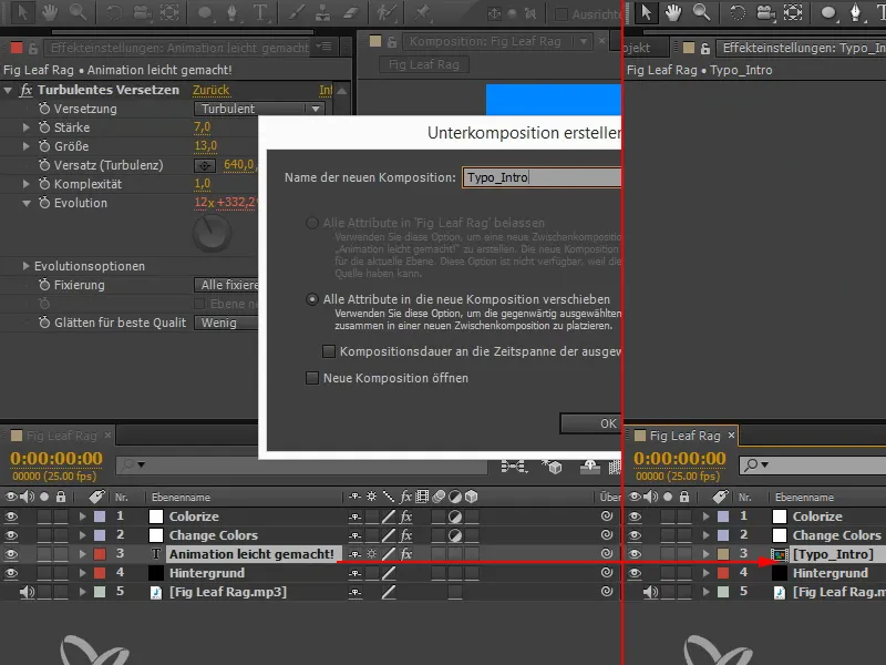
I want to get rid of the text layer and use a composition layer instead, a normal pixel layer on which I can paint. The text should be in the layer. So I make a sub-composition with Ctrl+Shift+C or via Layer>Create sub-composition. I call this "Typo_Intro".
Step 2
The attributes have all been taken along, including Turbulent Offset.
As I don't want this, I click on Turbulent Offset, press Ctrl+X and insert the whole thing again one composition further up ("Fig Leaf Rag").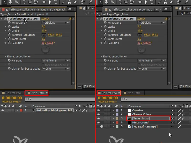
Step 3
Let's go back to the "Typo_Intro" composition. Here we have exposed the text and can animate the whole thing.
The first option would be via paths. I take the pen tool and trace the first line of the letter A on the font. Then I set down and, holding down the Ctrl key, click somewhere in the black to end the current path before tracing the second line of the A.
I set down again, click into the black with the Ctrl keypressed and then draw the next line and so on until the entire font has been traced.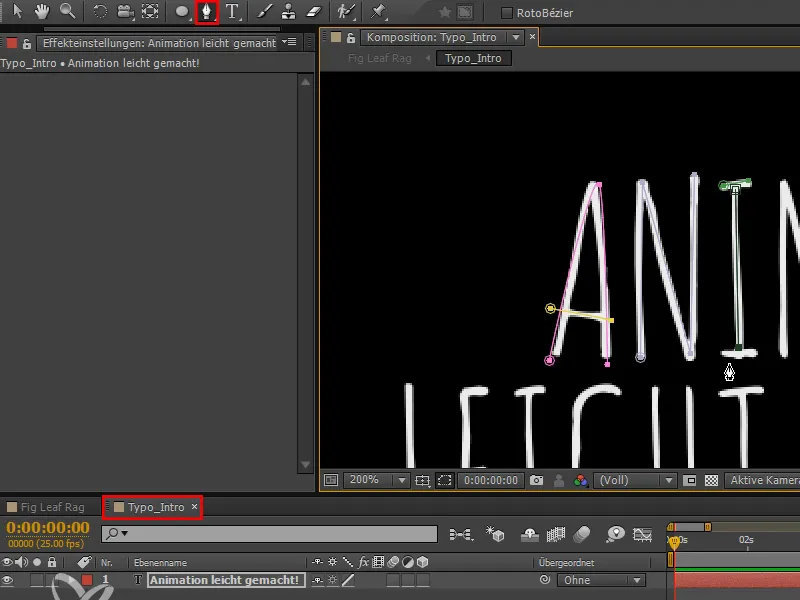
Step 4
Now I'll add an effect. We can find this as an outline in the CC version under Generate. Up to CS6 it was called Stroke effect.
We select a mask or check the All masks box and can then have these masks drawn.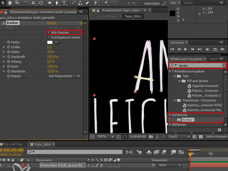
Step 5
I hide the masks with this little symbol and color the path red. I can also change the size, but only globally for all masks.
And when I show the masks again, I can still move and adjust the individual points so that all the white text underneath is covered.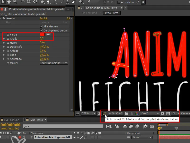
Step 6
The nice thing is that I have a start and end sliderhere: I drag it from start to finish and can thus have the entire text drawn.
This works very well, but you don't have exact control. For example, you always have to use the same line width, so you can't even draw thinner and thicker lines.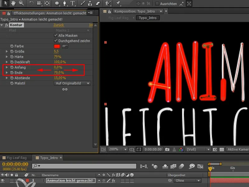
That's why I'd like to show you another method, which I think is a bit quicker than tracing everything individually ...
Step 7
In this case, I prefer the slightly quicker method with the brush.
However, this brush cannot be used on text layers. So we have to create another sub-composition and name it "Typo_Static". We can work in this sub-composition straight away.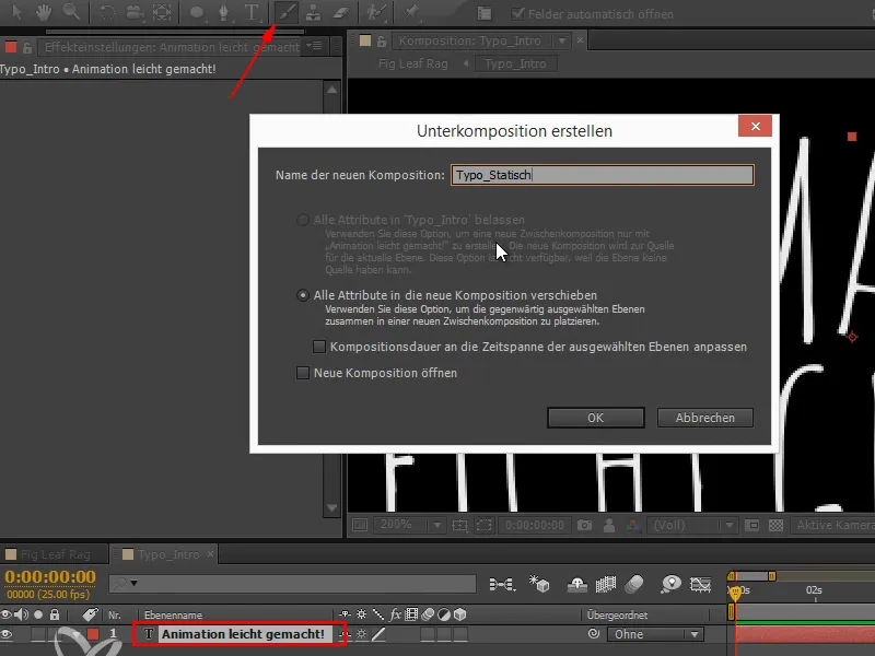
Step 8
As soon as we want to work with the brush and double-click in brush mode, the layer tab opens and this is the only place where we can work with the brush.
Two new panels have also been created: Brush and Paint. In the brush panel, we can set the size, hardness etc. of the brush.
And in the painting panel, we can select the type of painting. Duration is initially set to constant, but I change this to animate painting.
I make a stroke and another and another - but as soon as I have finished a stroke, it strangely disappears.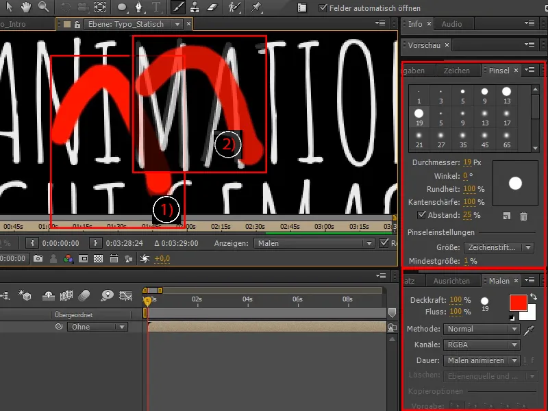
Step 9
If I go back to the other tab and move along the timeline, I can see that all the strokes are there and they are all drawn automatically.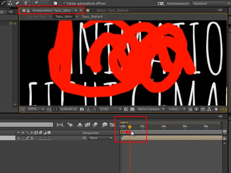
Step 10
If you press UU for all changed properties, we get a lot of sub-properties down here.
The start and end are also displayed for each one.
We can also change the individual spacing, hardness and even the position of each stroke - even after it has been drawn.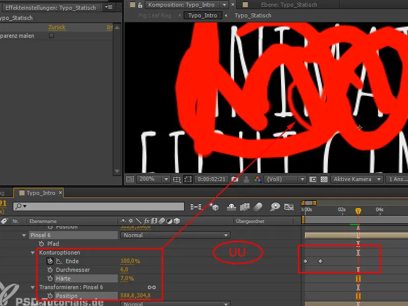
Simply continue: Steps 11-20
Step 11
I'll delete everything again so that we have a better overview.
I'll draw another new stroke and if you're in the layer view, you'll see the path. This is what will be saved.
If I don't like the stroke I've drawn, I can paint over it by selecting it and then simply repainting it. It will be updated and simply overwritten.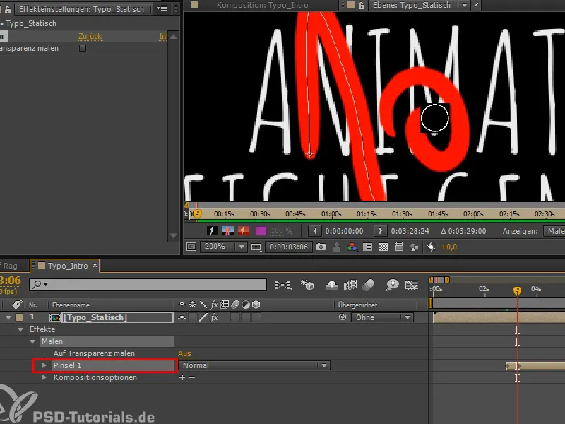
Step 12
I want to trace the text in the same way, because that's the quickest way to animate something like this.
So I make my diameter a little smaller and trace the text with the graphics tablet and draw it in here.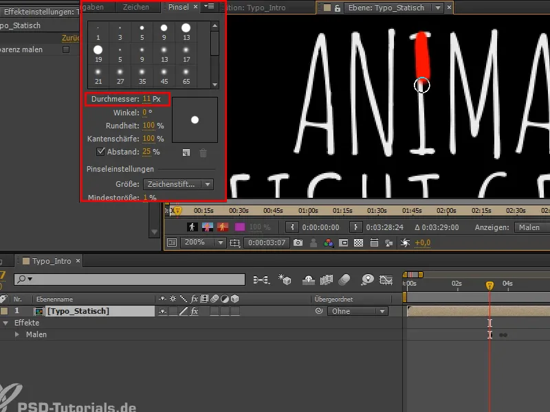
Step 13
I've drawn all the strokes and if we play the whole thing back in the timeline, we can see that everything is there.
If I press U, we have all the keyframes there again.
Step 14
If I press the Ü key, the window over which the mouse is currently moving is maximized. In this case, the timeline. This gives me more space and makes it easier to see the elements that stand out. I take them back a little so that they all take about the same amount of time.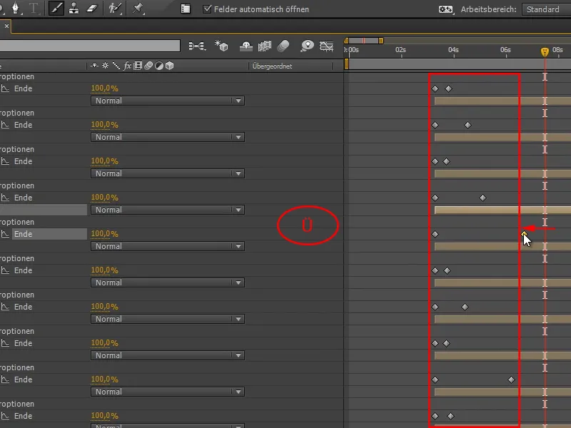
Step 15
Let's let that play.
By the way: If you accidentally press the Caps Lock key, After Effects will no longer update. You will then get the message Deactivate Caps Lock to update the view.
If we play this now, After Effects will start drawing all letters at the same time. But it should start at the front and then go through to the back. And that's the crux of the matter. To get it to work the way I want, I would have to time the whole thing by hand - one stroke at a time. That's quite a lot of work. I would like to do it faster.
I'll explain exactly how in the next step - but first we'll mark all the strokes.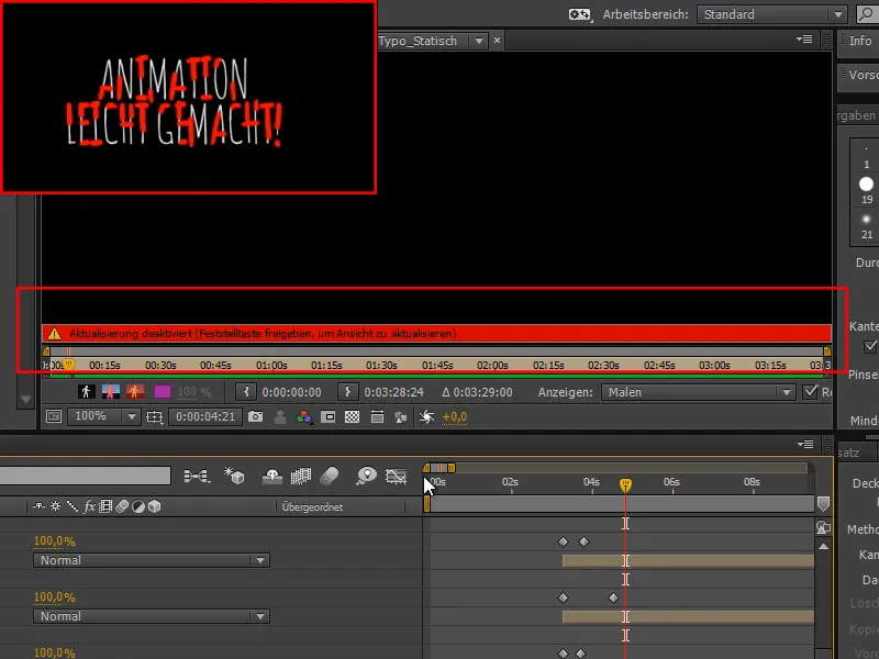
Step 16
That's why I use a script that sets these keyframes one after the other.
I have written this script myself and have of course also given it to you. You can find it in the scripts folder with the name Sequence strokes. If you know the movie "Sequence strokes from After Effects", you can imagine what the script does.
I open the script in the Extend Script and execute it.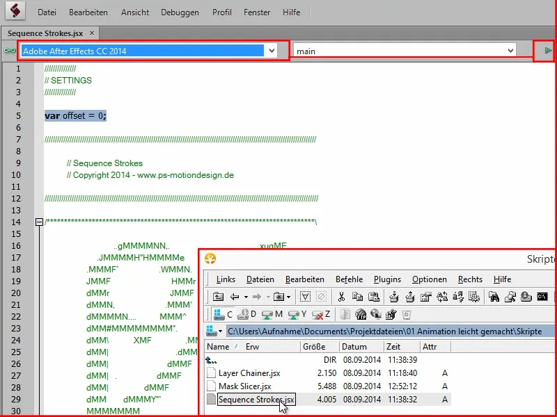
Step 17
Now we have a staircase of keyframes and the text is drawn step by step. However, it is still yawning slowly.
We need to speed this up. To do this, we select everything, take the last keyframe we find, press the Alt keyand drag the ran to 5 seconds.
This will speed things up considerably.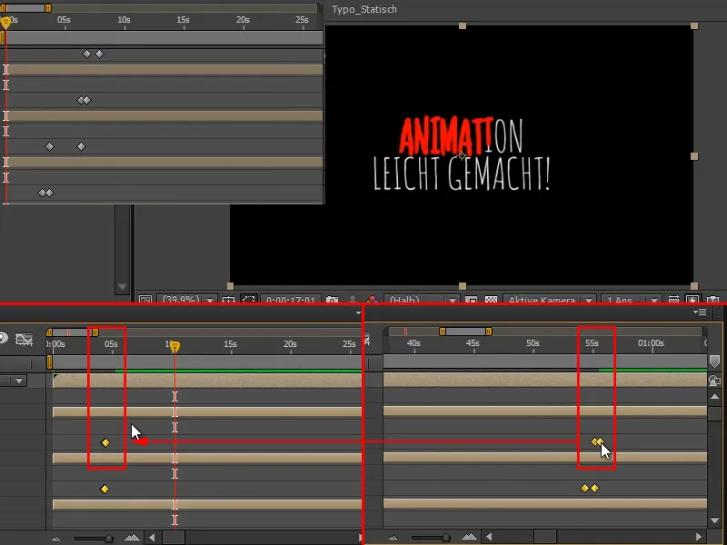
The last point still needs to be delayed a little, but we'll take care of that in a moment.
Step 18
I would like to talk about the offset value. This affects the keyframe transitions:
If we look at the keyframe transitions currently, the next one always starts exactly where the previous one ends (a).
If I don't want this and would rather have two frames of pause between two strokes, for example, then I enter a 2 for offset.
Of course, I have to select all brushes again before I can activate the script. With Ctrl+A I can select them all at once.
Or I want the frames to overlap, then I set offset to -2. Then it would always go two frames behind the actual one. However, if you have shortened it as quickly as we have here, then that makes no sense. I'm quite happy with this and leave it at 2.
Step 19
What I definitely want to change is the timing of the exclamation mark. I would like to place it better on the music.
I therefore also need the music in the composition. So I go to the "Fig Leaf Rag" tab and copy the file.
Then I alt-clickback into the composition and paste it here.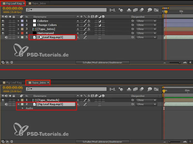
Step 20
Now let's see where the two positions we need are. To do this, I use the num pad and press the comma keyto create a preview. I press the asterisk key * on the Num-Pad to set a marker. On devices without a num pad, especially on the Mac, it would be cmd+comma for the preview and cmd+8 for the marker.
I now play the music and place the markers exactly where the dash and dot of the exclamation mark should appear (1). Namely exactly at the two accents of the melody.
So I have set two markers: At the first, the stroke of the exclamation mark should be finished and at the second, the dot should be placed.
I place the guideline on the first marker and switch to the "Typo_Static" composition. There I move the frame onto the guideline that indicates the line of the exclamation mark (2).
I do the same with the second marker, which shows the position of the dot: I place the guide on the marker, switch to the composition and move the frame accordingly.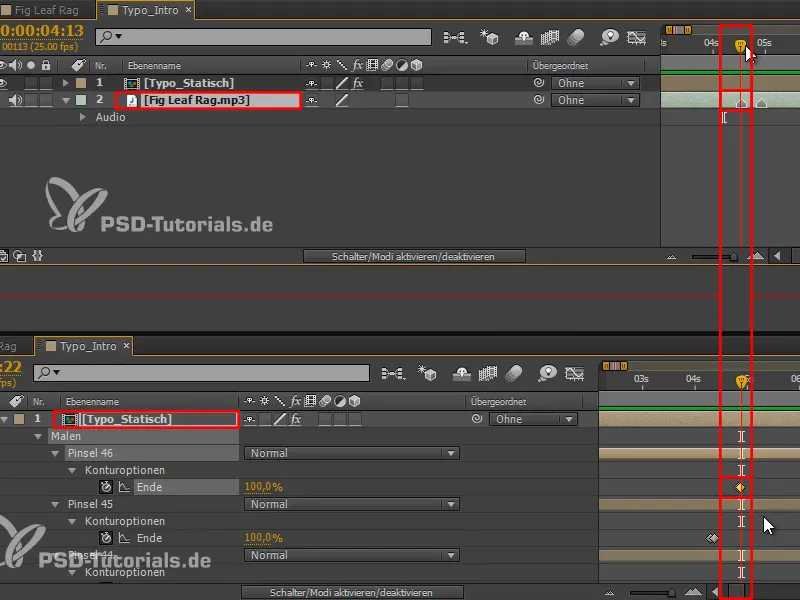
The last steps
Step 21
I would like the stroke of the exclamation mark to be drawn more slowly than the font in front of it, so that we have a more accentuated exclamation mark (1).
And the font should be finished a little faster overall. So I mark everything in front of it (2) and drag it forward a little (3).
The timing is perfect.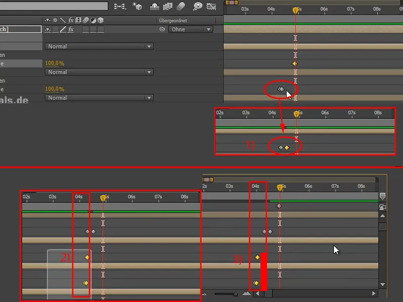
Step 22
We have painted the font over the text and will now make some changes to it.
I first duplicate the "Typo_Static" layer and delete the paint effecton the lower layer.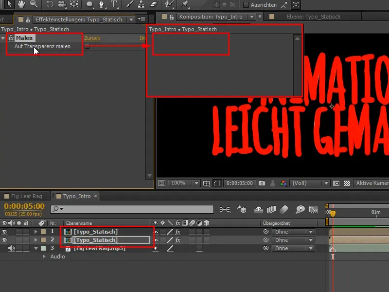
Step 23
In the top layer, we now have the painted text with the white original underneath.
In the bottom layer we have the normal white text.
If we check the " Paint on transparency " box on the top layer, only the painted red lines will remain.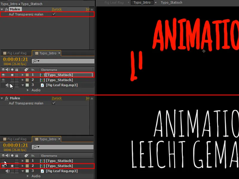
Step 24
The upper layer is to be used as a mask for the lower layer.
If the mask is not displayed, simply click on Activate/deactivate switch modes at the bottom and the moving mask BewMas will be displayed.
I can then select an alpha mask and achieve exactly the result I need. In other words, wherever these lines are drawn, my original lettering is also visible.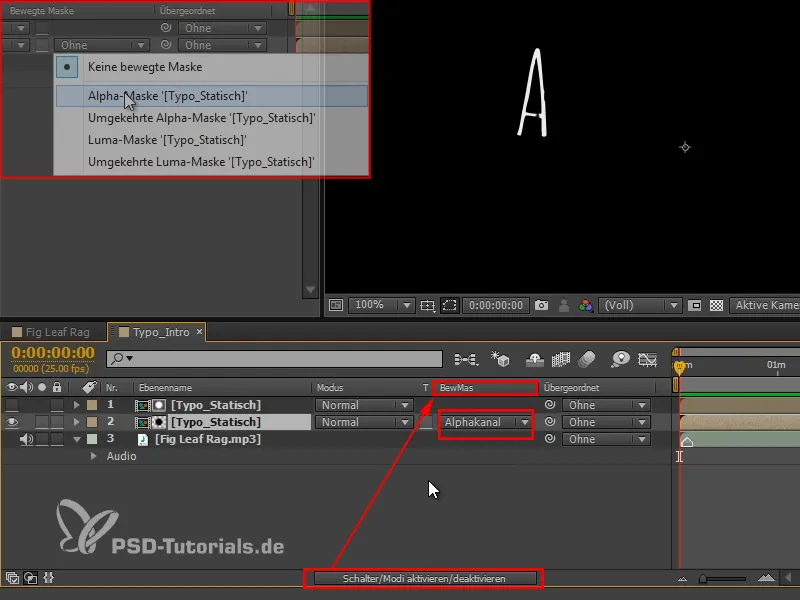
However, I have slipped something, because the A is already there right at the beginning.
Step 25
So let's select all the brushes again with a rectangle selectionfrom the bottom to the top (1) and then remove the two frames of the exclamation mark with Shift+select(2). The two are already perfectly positioned in time.
Then we move the first frame at the bottom a little to the right so that the A at the very beginning is not yet visible.
Now it fits.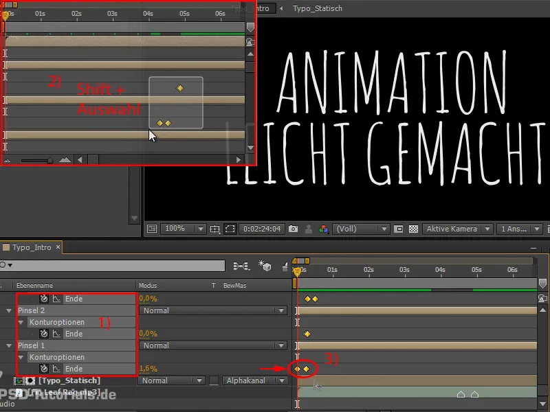
Step 26
We've done this in the sub-composition, where we still have the Turbulent Offset effect.
If we look at the whole thing in this composition, we not only have it in yellow and the color changes, but it also wobbles.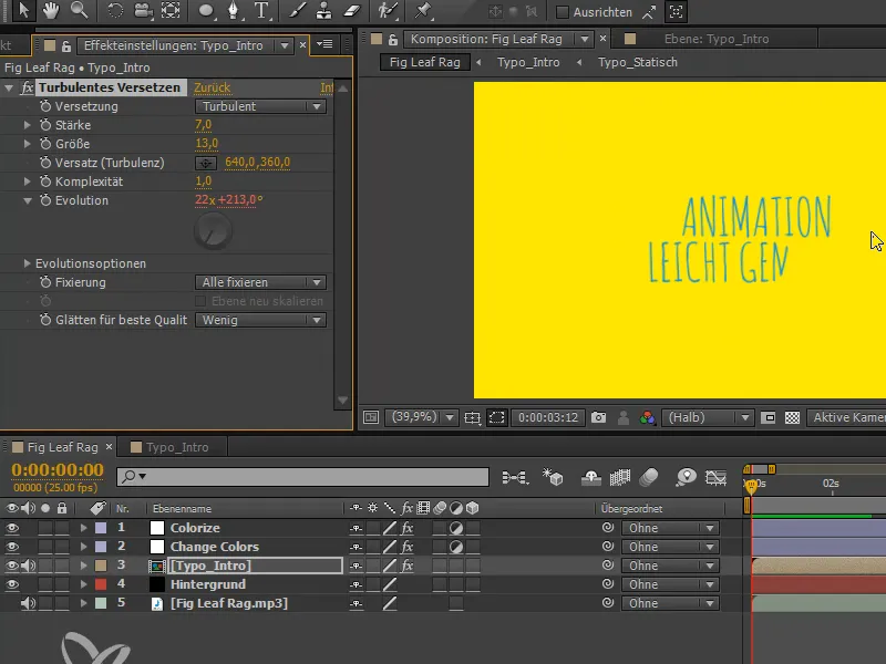
Step 27
It is wonderful and fits perfectly, but the color should only change afterwards or not at all. Change Colors is therefore not used for the time being.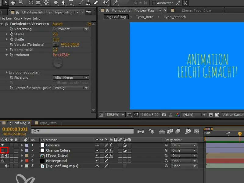
So we've finished the first 4 seconds of the trailer and we'll see you again in the next part of the tutorial, with the bouncing ball.
