Now that we have almost completed pages two and three in the third part of this tutorial series, we will only make a few small corrections and additions in the following fourth part and then take care of the design of the remaining pages.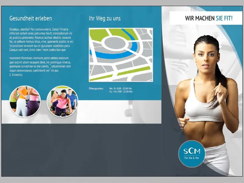
If we take a closer look at the transition between the grey area on the title page and the grey strip on the adjacent page, we can see that there is a hard edge. This effect is caused by the fact that the gray area on the title page is overlaid by a second area with greatly reduced opacity (35%), while this is not the case with the gray stripe.
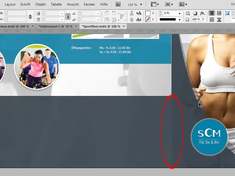
We have several options for eliminating this unwanted effect:
Firstly, we could dissolve the edge using the soft gradient edge tool. To do this, we simply select the area with 35% opacity that creates the effect and use the tool to create a soft gradient edge running from right to left.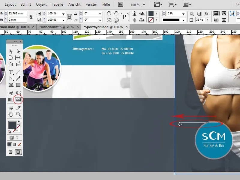
The disadvantage of this variant is that the soft gradient edge can also appear in places where we did not actually intend it. In our example, it can easily happen that the opacity-reduced double edge on the title page is also faded out towards the top.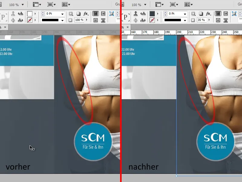
The second option would be to duplicate the grey strip and reduce the opacity of the duplicate to 35% so that when the two areas are superimposed, the same color value is created as on the title page and the hard edge disappears.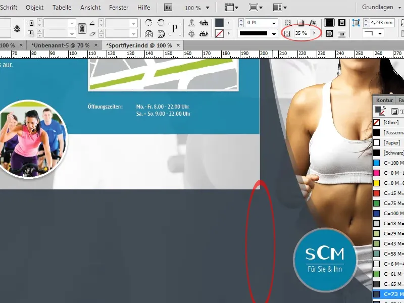
In the next step, we insert the text on the gray strip:
The formatting of the headings and the body text correspond to the formatting of the headings "Experience health" and "Your path to us" already inserted above and the body text below them respectively.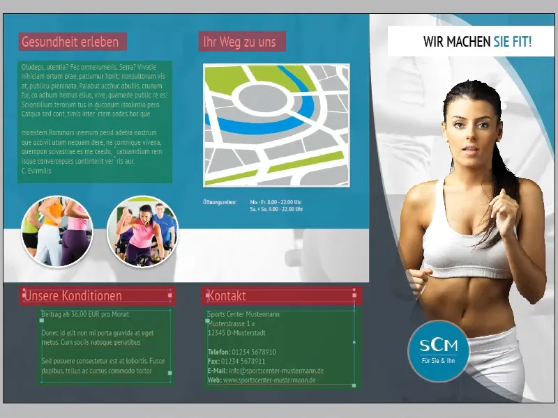
As we will also be inserting some text with the same formatting on the following pages, it would make sense to create a separate paragraph format for the body text and the headings:
To do this, first open the paragraph styles panel (Window>Formats>Paragraph Styles). Now select a section of text with the corresponding formatting and click on the New icon. InDesign automatically imports the formatting of the selected text into the newly created paragraph format. Now you can select any text and give it the appropriate formatting by clicking on the paragraph format.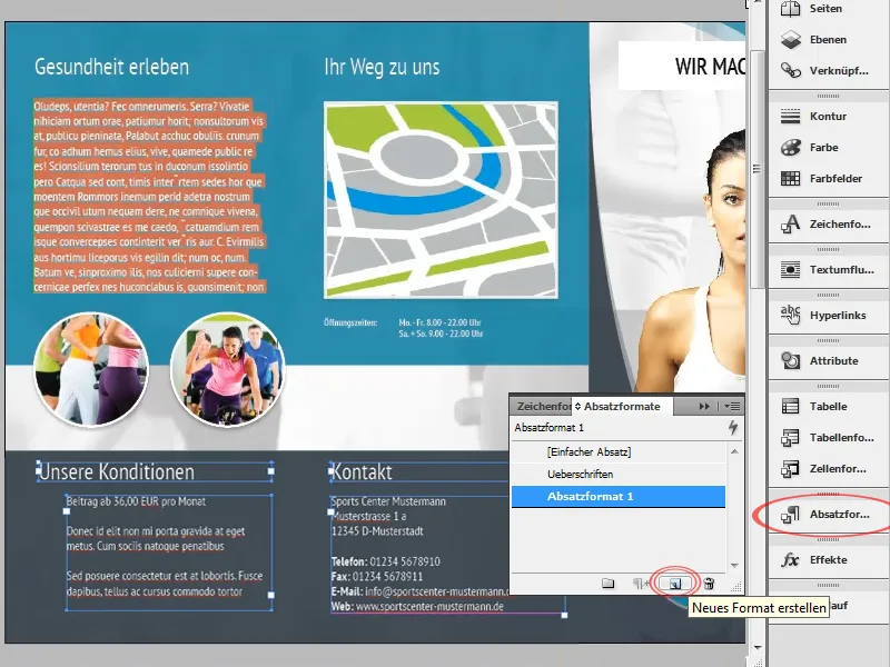
The text at the bottom left should now be provided with bullet points. We also have several options for this:
On the one hand, we could simply create the bullets as a shape or vector and manually move them to the appropriate position. The advantage of this is that any vector can be used. However, the bullets would have to be repositioned with every small change to the text.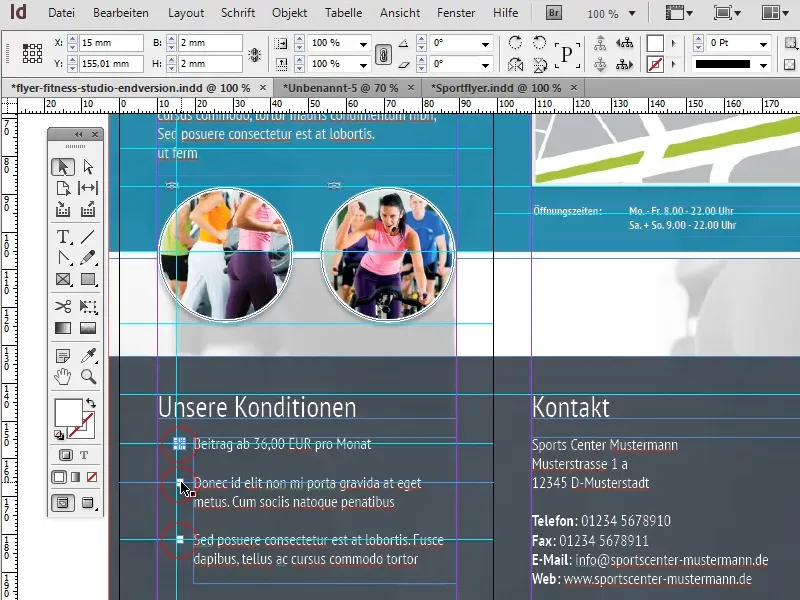
The second, far more flexible option would be to use a standard bullet point. The advantage is obvious: every time the text is changed, the bullet points are automatically adjusted. However, the desired character must be available as a character in this case. If, as in our case, it is just a simple square, this is of course not a problem:
First, we select the text that is to be provided with bullets and click on the List with bullets icon in the menu bar.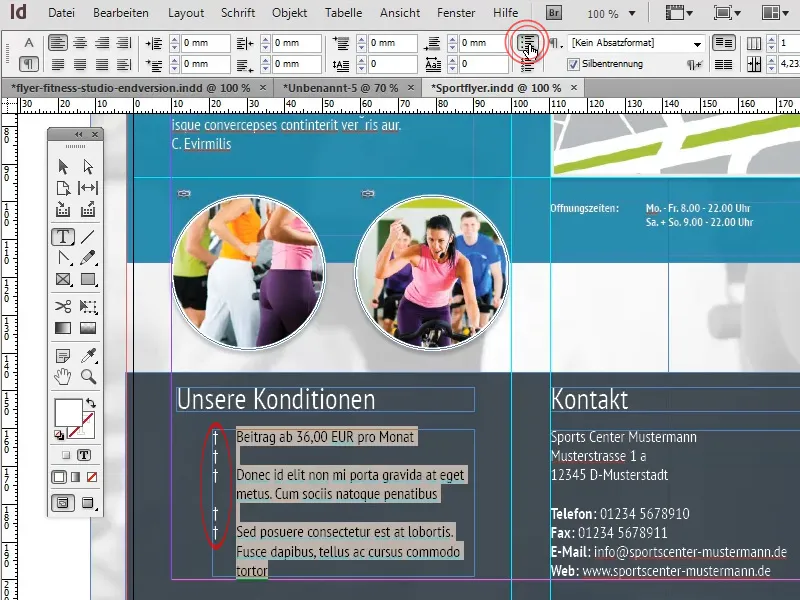
To specify a different character as a bullet point, we open the paragraph panel (Window>Font and Tables>Paragraph) (1) and select the menu item Bullets and numbering ... from the other options (2).
In the window that appears, we can select any character by clicking on the Add button (3) (4). A suitable character can be found in the Windings font, for example.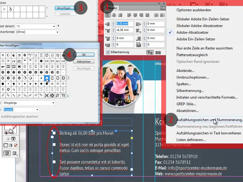
When I was creating the training, I mixed up the front and back sides. This plays a role because the section that is folded inwards is slightly shorter in the case of the fold. However, correcting such a mistake shouldn't be too difficult, as the dividing lines only need to be moved slightly and individual objects need to be adjusted a little.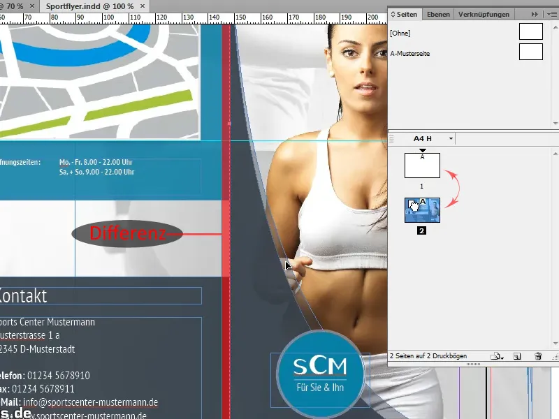
So that we don't get confused with the many guides, we can also recolor guides that represent important dividing lines. To do this, we simply select the relevant guide and choose the desired color under right mouse button>Guides.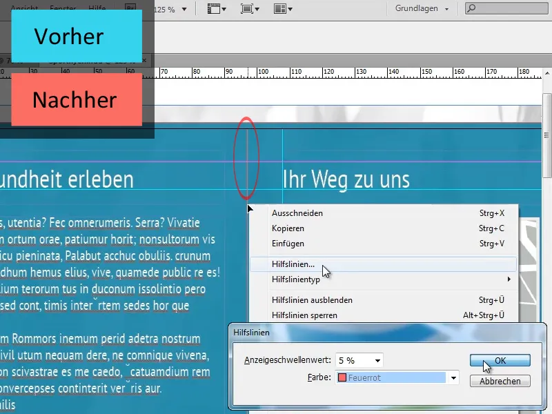
Let us now turn our attention to the remaining pages:
As the basic features of the layout of the following pages correspond to those of the pages already created, we can simply copy many of the basic elements. For example, we can copy the background image one-to-one, while other background elements, such as the turquoise and gray areas, only need to be adjusted minimally.
The circular images do not have to be created from scratch either. It is sufficient to copy the existing images and update the links.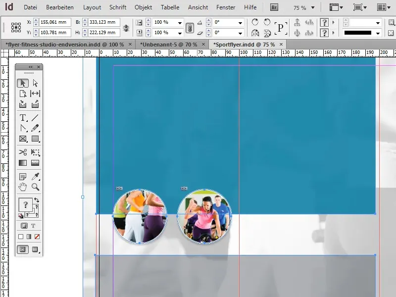
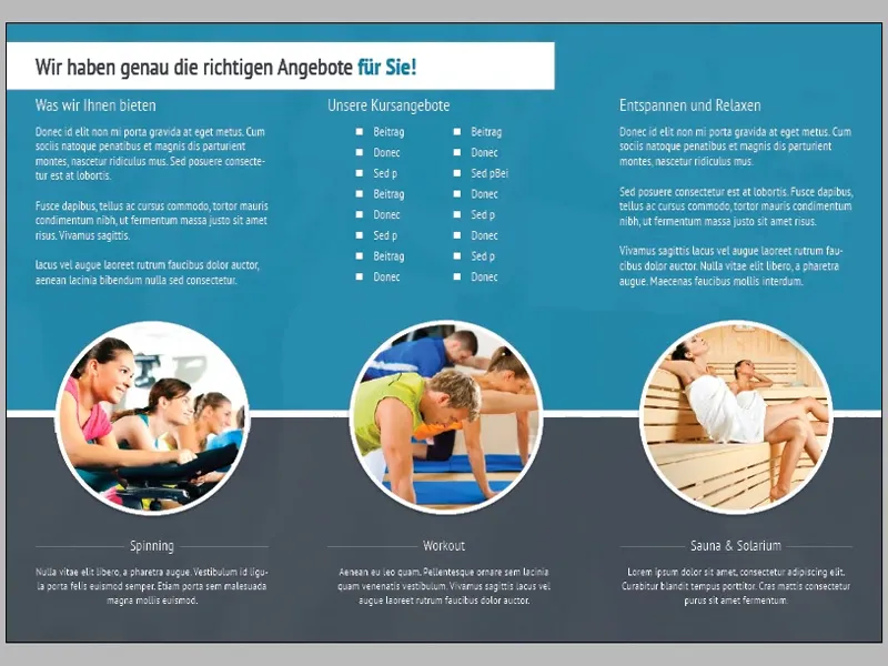
For the heading, we create a text field near the top of the document that extends over the first two sections of the folder and set the area color to white. The formatting of the text "We have just the right offers for you! " is based on the heading on the title page of the folder: So here too, the last two words, formatted in Bold font style, are colored in the dark turquoise that was also used for the area in the background.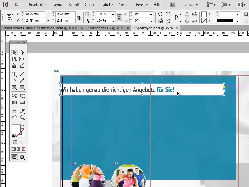
To prevent the text from sticking to the edges of the text field, we can set the Vertical alignment to Center in the text frame options (Object>Text frame options) and add a left indent of approx. 12 mm. When setting the indent, we must ensure that the button to equalize all settings is deactivated.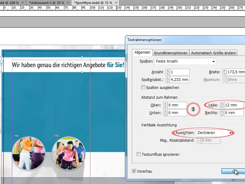
In the upper half of the flyer, we now insert various texts to which we apply the previously created paragraph formats.
To ensure clarity when using bullet points, we should make sure that there is enough space between the individual points. Depending on the application, we can achieve this, for example, by increasing the line spacing, inserting blank lines or defining a spacing after each paragraph in the paragraph control panel (Window>Font and Tables>Paragraph).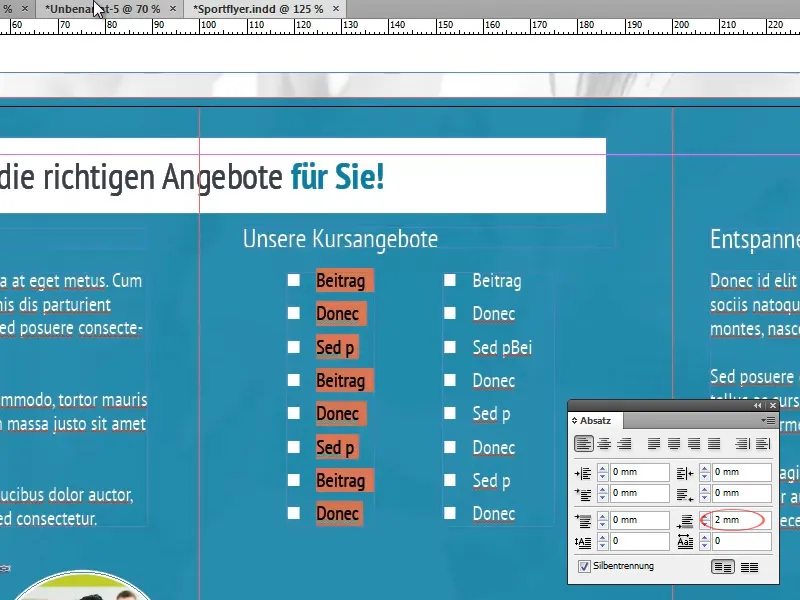
Before we continue with foreground elements, however, we should ensure that the background takes on its final shape:
To do this, we scale the turquoise area in the background so that it roughly fills the top two thirds of the folder.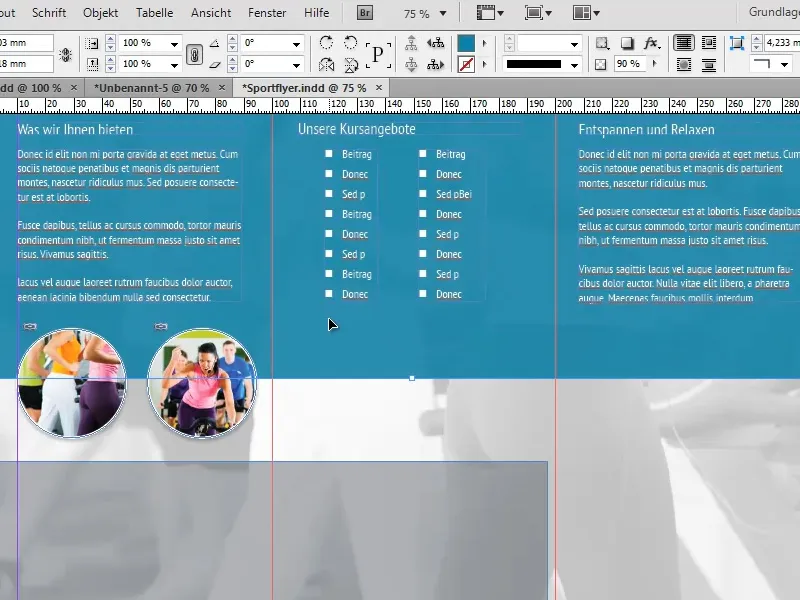
We now want to create a white dividing line at the bottom edge of the turquoise area. But instead of creating a separate line for this purpose, we can use a little trick:
It is sufficient to give the turquoise area a white outline with a thickness of approx. 7 pt. As the area extends beyond the edge of the document on three sides, it will only be visible at the bottom edge.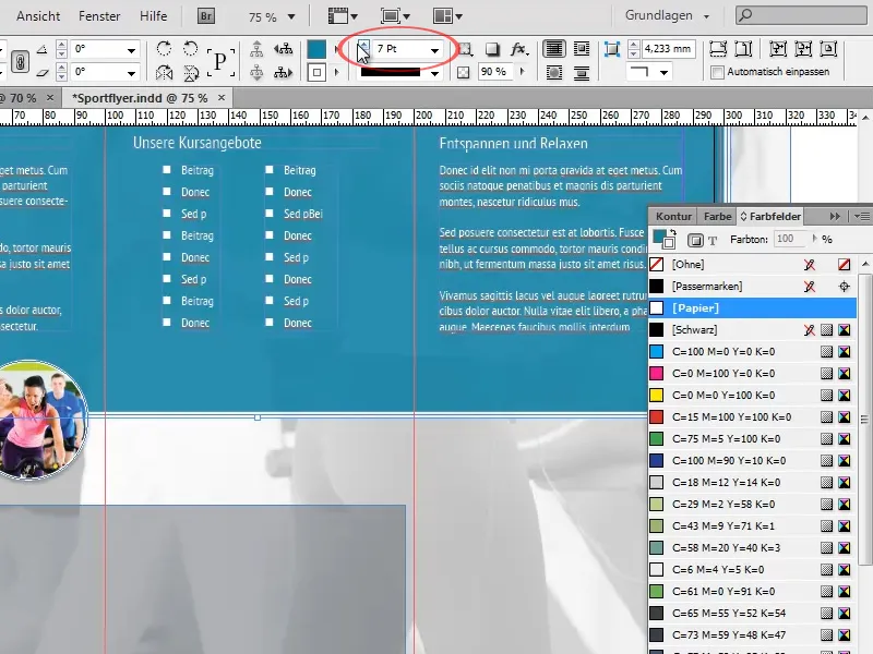
In the Effects panel, we now set the object opacity to 100% and reduce the area opacity to 90%. This means that the opacity of the outline remains completely intact, while the surface becomes slightly transparent. The object opacity would change both settings equally.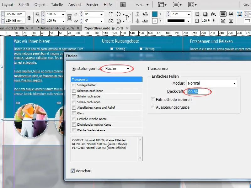
Now we enlarge the previously copied gray area so that it is flush with the white dividing line and fills the lower third of the folder. We also increase the opacity of the area to around 90%.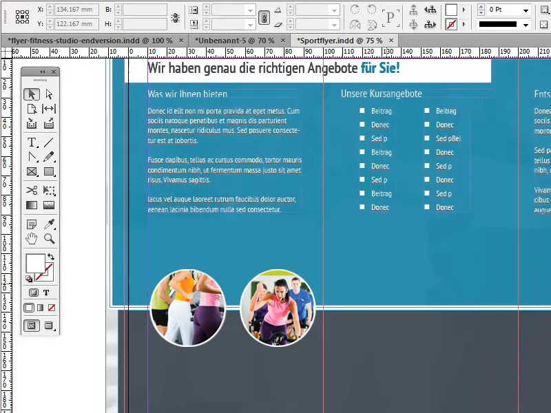
Now let's take care of adjusting the images:
Overall, we want to create a large, centered, round image with a white frame in each of the three sections. To do this, we will use one of the images that we have previously copied from the completed pages as a template.
First, we enlarge the image so that it fits well on a page without making it look crowded and align the center of the image with the white dividing line.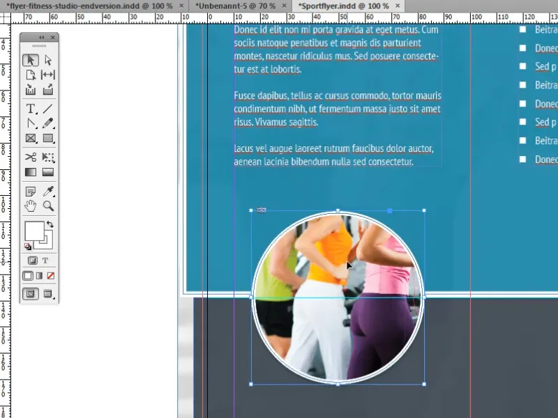
Then we duplicate the image twice and replace the linked image with a new one using the link panel.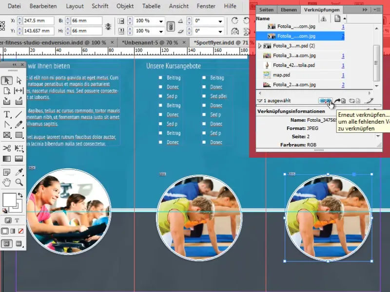
There are a few tricks to position the images as easily and exactly centered as possible:
One of these tricks is to use the so-called intelligent guides. These can be an extremely practical tool. They automatically create references to other objects and important points such as centers. When your object approaches such a point or the horizontal or vertical extension of such a point, the object automatically snaps into place.
You can activate the intelligent guides under View>Grid and Guides>Intelligent Guides.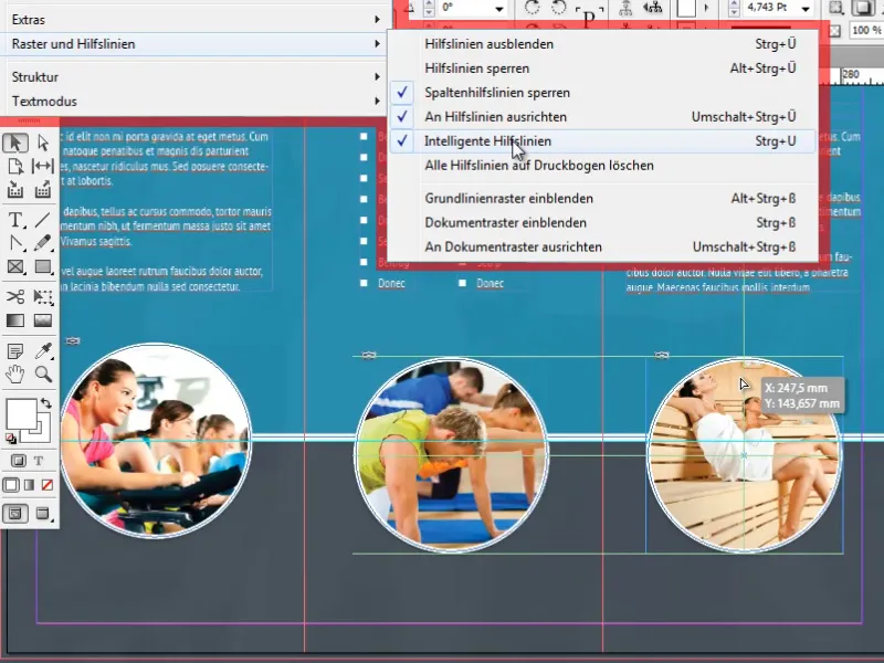
Further practical options for aligning objects can be found in the Align panel under Window>Object and Layout>Align.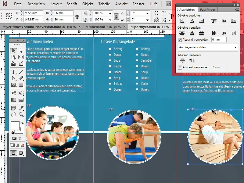
Last but not least, we now insert small info texts under the circular images. The formatting once again corresponds to our standard continuous text formatting (paragraph format). The headings are centered and otherwise only deviate slightly from our standard format in terms of font size.
We also create a line to the right and left of the headings to create a nice visual effect. Creating and aligning these lines should not be difficult with the help of the line tool and the intelligent guides.
This brings us to the end of the fourth and final part of this tutorial series. I hope you were able to take away a lot of interesting and useful information from these tutorials and won't give ugly flyers another chance from now on!